Inside A Cosy $45k Renovation Of A Tiong Bahru HDB: How A Couple Self-Designed Their European/Jap-Inspired Home
October 29, 2022
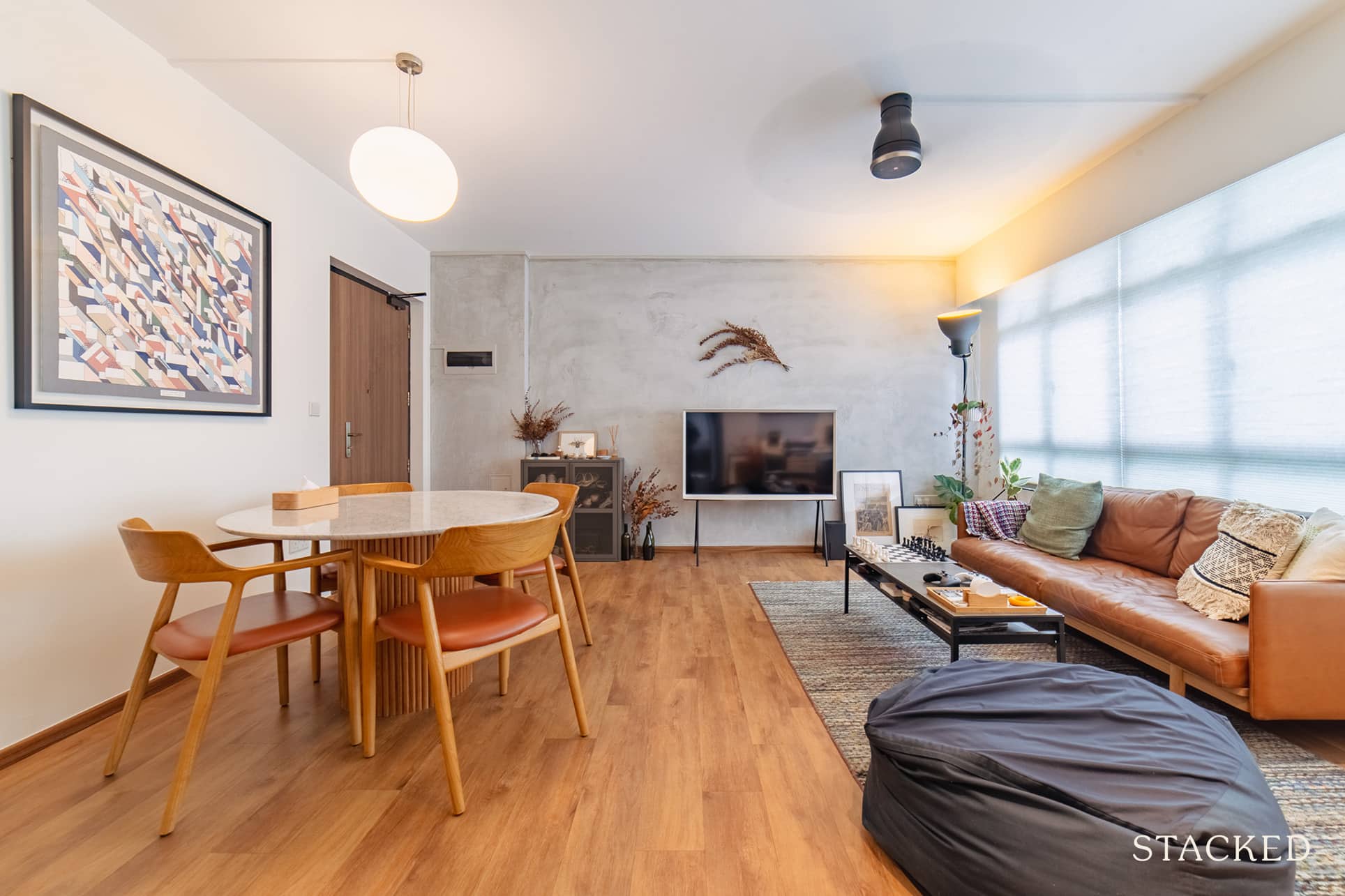
“Funny story with our furniture is that unlike most homeowners, we moved into our home with no furniture… only a bed.”
It takes a brave soul to move into a newly completed home with practically no furniture, but for Marcus and Beatrice (@stayhomenotice), this was born out of the delays of Covid-19, and not by choice.
Still, this turned out to be a blessing in disguise, as you’d see further on.
The pair’s home is a 4-room resale flat located on Kim Tian Road at Tiong Bahru. Marcus said that the flat was only completed in 2013, so it was only seven years old when they took over in 2020.
“We wanted a central location,” he said. “So we prioritised finding a flat with a relatively young lease to give us flexibility. This way we’ll have options to either make it our forever home or, if we ever want to, move on to a different property in the future.”
They also looked at another unit within the same block, but the one they chose in the end was on a higher floor. It also had the advantage of minimal built-ins, which they both knew would help them optimise their renovations.
He said the previous owners had mainly kept the original structure and interior. There were only a few additional built-in wardrobes in the living room and the bedrooms.
Currently, only Marcus and Beatrice are staying at their home. However, since they love to host and invite their friends and family over for meals and board games, they created a home that would accommodate these activities.
Let’s explore further as the couple shares how they created their home.
So many readers write in because they're unsure what to do next, and don't know who to trust.
If this sounds familiar, we offer structured 1-to-1 consultations where we walk through your finances, goals, and market options objectively.
No obligation. Just clarity.
Learn more here.
How The Renovation Journey Turned Out
The couple initially allocated a budget of $35K for their renovation. However, as they had given the previous owners an extension of stay, they could only see the flat again six months after viewing it.
And so during this waiting period, the couple ended up changing their minds about some of their initial design ideas. As a result, Marcus said they spent about $45K on renovations instead. He said the additional changes included overlaying some of the bathroom tiles. They also had to change the bedroom doors to better suit the overarching design of their home.
Their core vision for their home was to create a space that they would be comfortable in. It would be a space that would change, grow, and adapt to their needs at different moments and phases of their lives.
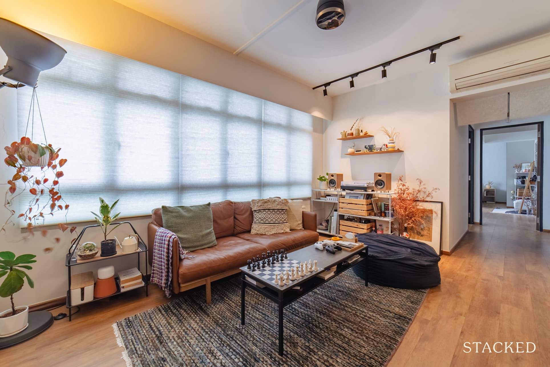
“When we started conceptualising our home, we had initially started off with a very minimal and Japanese-influenced aesthetic,” Marcus recalled. However, as they continued to discuss ideas with each other, their home design started to take on a warmer and cosier feel, with more European influences.
He said that they considered two important factors for every design decision they made. One is that it should not be based on trends, and two, the design choices and principles should be justifiable.
“We eventually ended up with a space that we like to think has the charm and character of a European apartment, and the functionality and simplicity of a Japanese home,” Marcus said.
To implement their design, they made two key changes to their home.
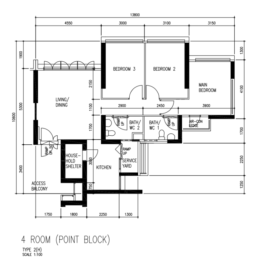
The first modification involved combining their kitchen and service yard to expand the space. “When we initially saw the flat, the kitchen was one of the areas that we were on the fence about. It was a slightly tight space with structural walls surrounding it.”
Since both of them cook quite a bit at home and love to host, they knew they would need a bigger kitchen. By levelling the service yard and removing the walls, they were able to redesign and expand the kitchen space. This move created a more open working area for the couple.
The second key change they did was to remove the wall between the master bedroom and bedroom #2. Their goal was to create a larger master bedroom with a wardrobe and a work area.
“The original main bedroom felt small and quite separated from the rest of the home,” Marcus said. “By removing the wall between the two bedrooms, we were able to create an open and expansive master bedroom that better suited our lifestyle.”
Let’s go ahead and tour their renovated home for a more visual experience.
Living Room & Dining
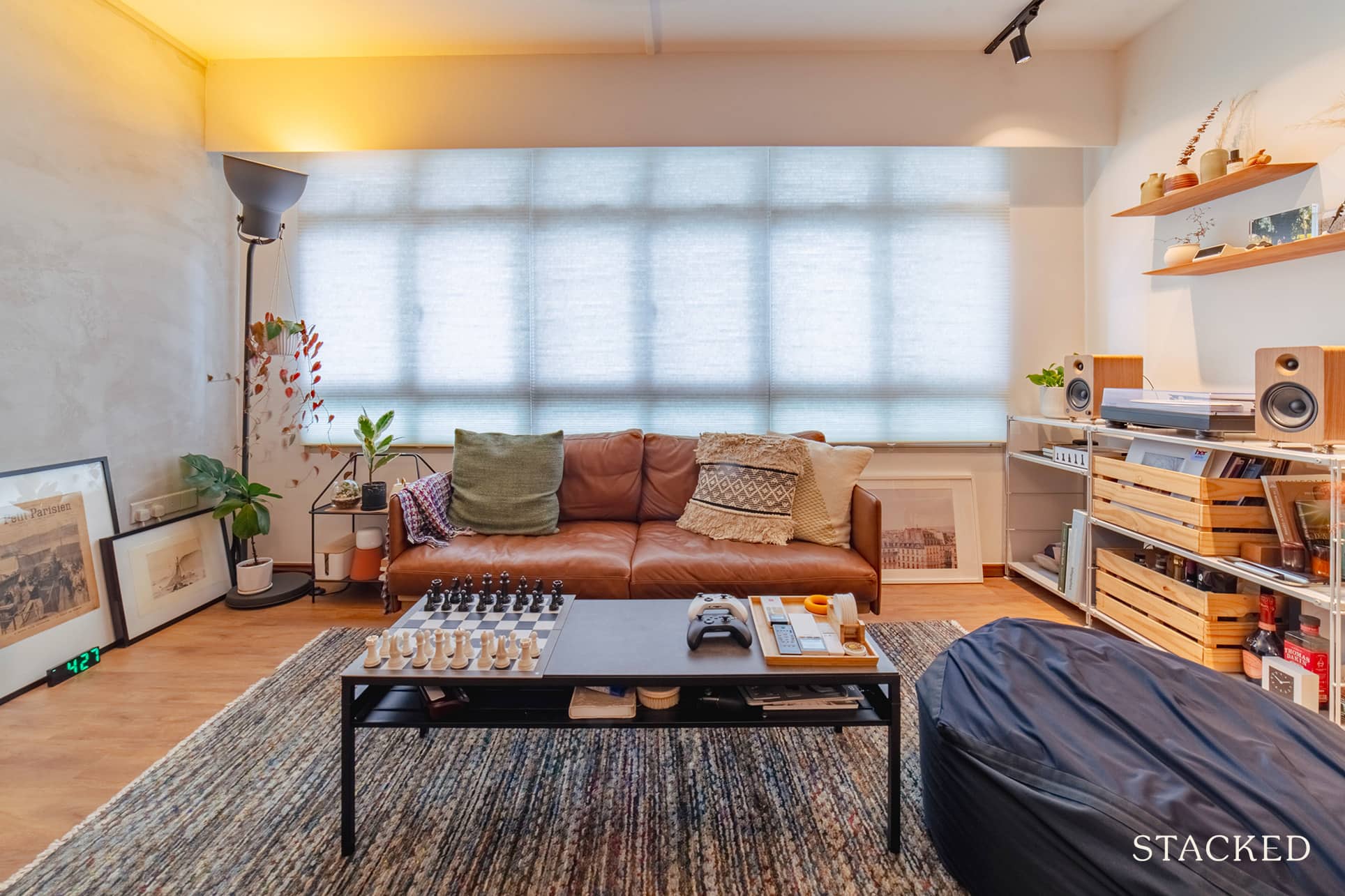
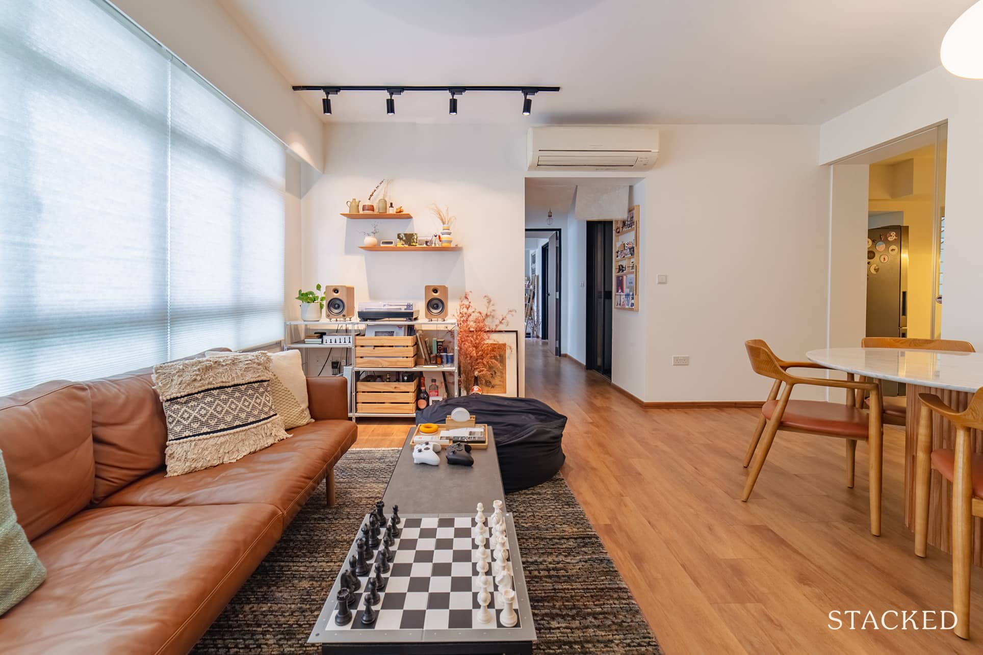
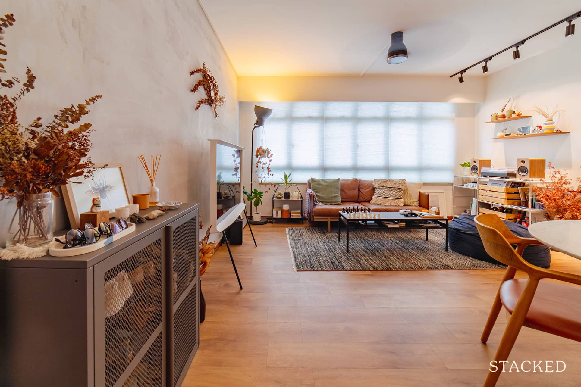
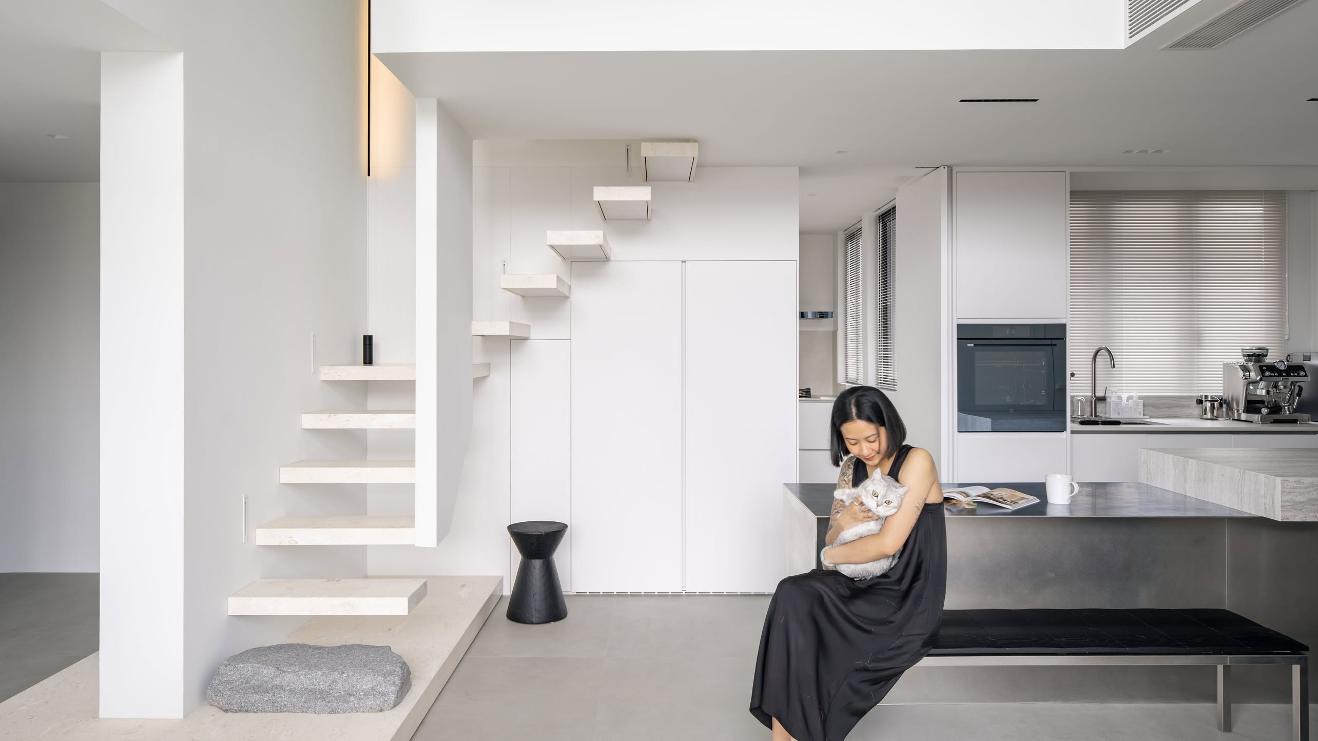
As the couple wanted to keep things flexible, you’d notice that the living room has nothing built-in. Everything is either modular or movable such that they would be able to reconfigure the space easily in the future if they ever want a new look.
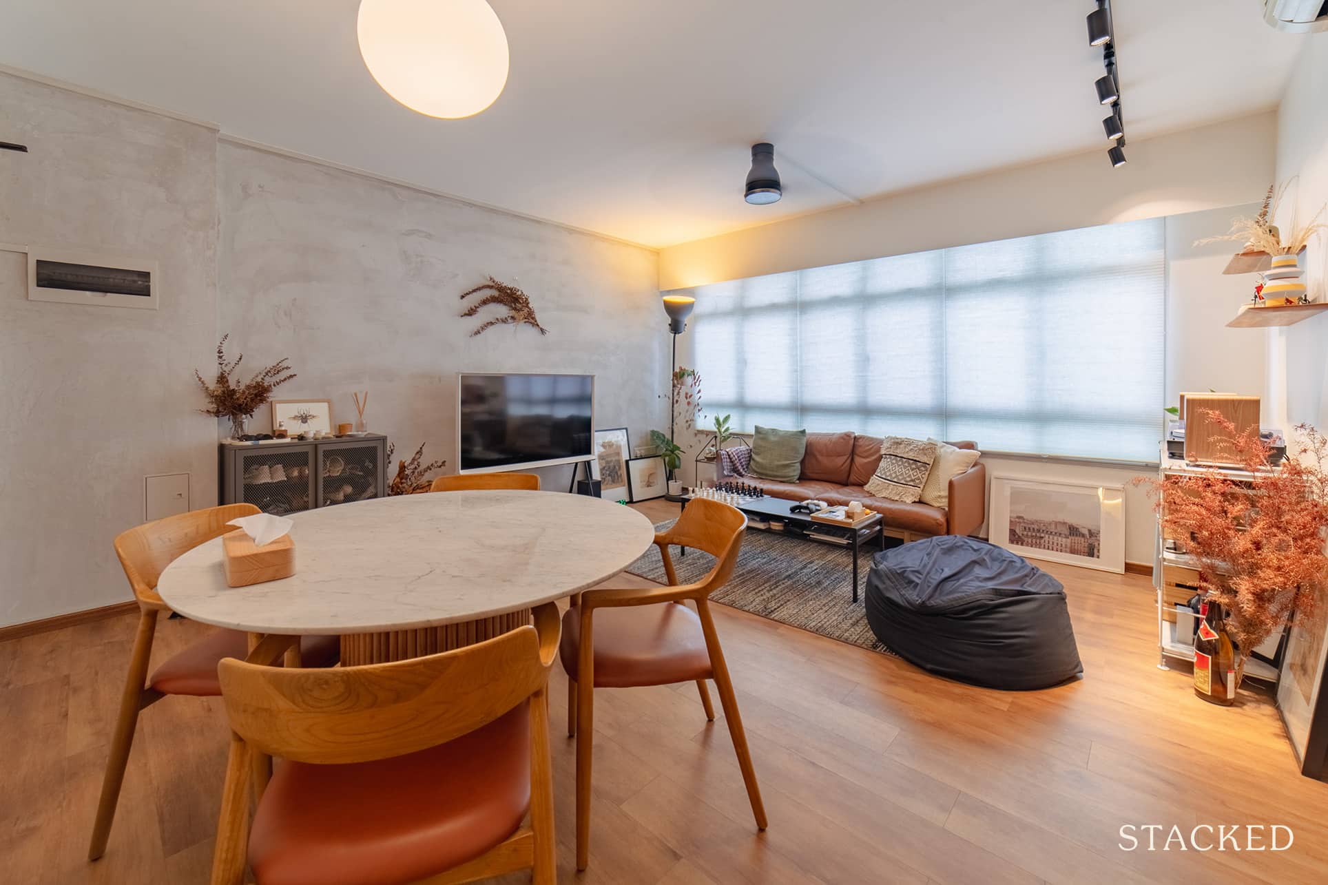
There was one thing that they carefully considered, “Due to the squarish layout of the living room, we contemplated for a while before deciding on a round dining table. This helped to ensure that our living and dining spaces did not feel separately demarcated but instead were spaces that were fluid and integrated with each other, to facilitate and encourage conversations and socialisation.”
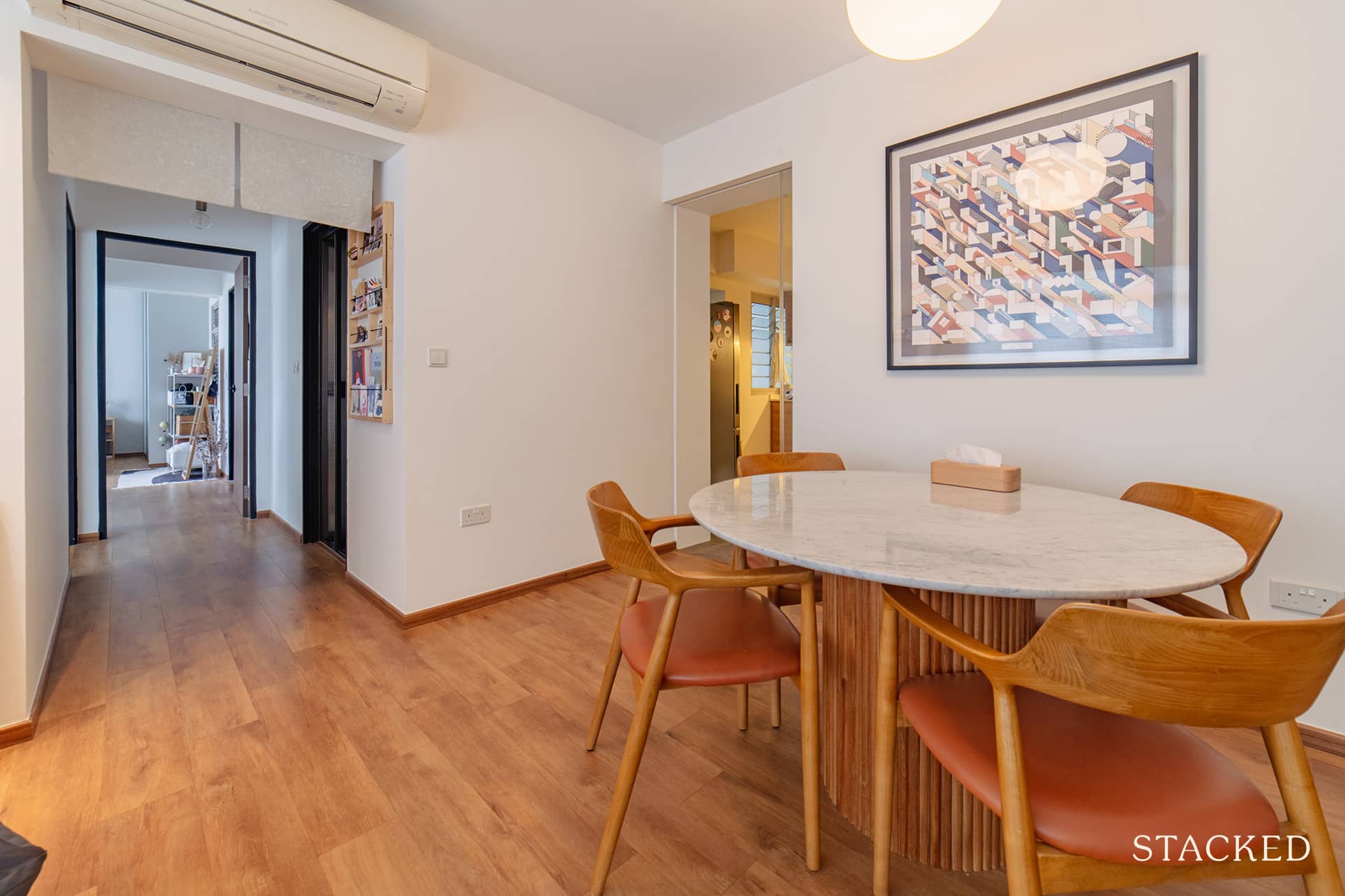
They also decided on a vinyl overlay throughout the home so as to create a seamless and consistent flow between the spaces.
Kitchen
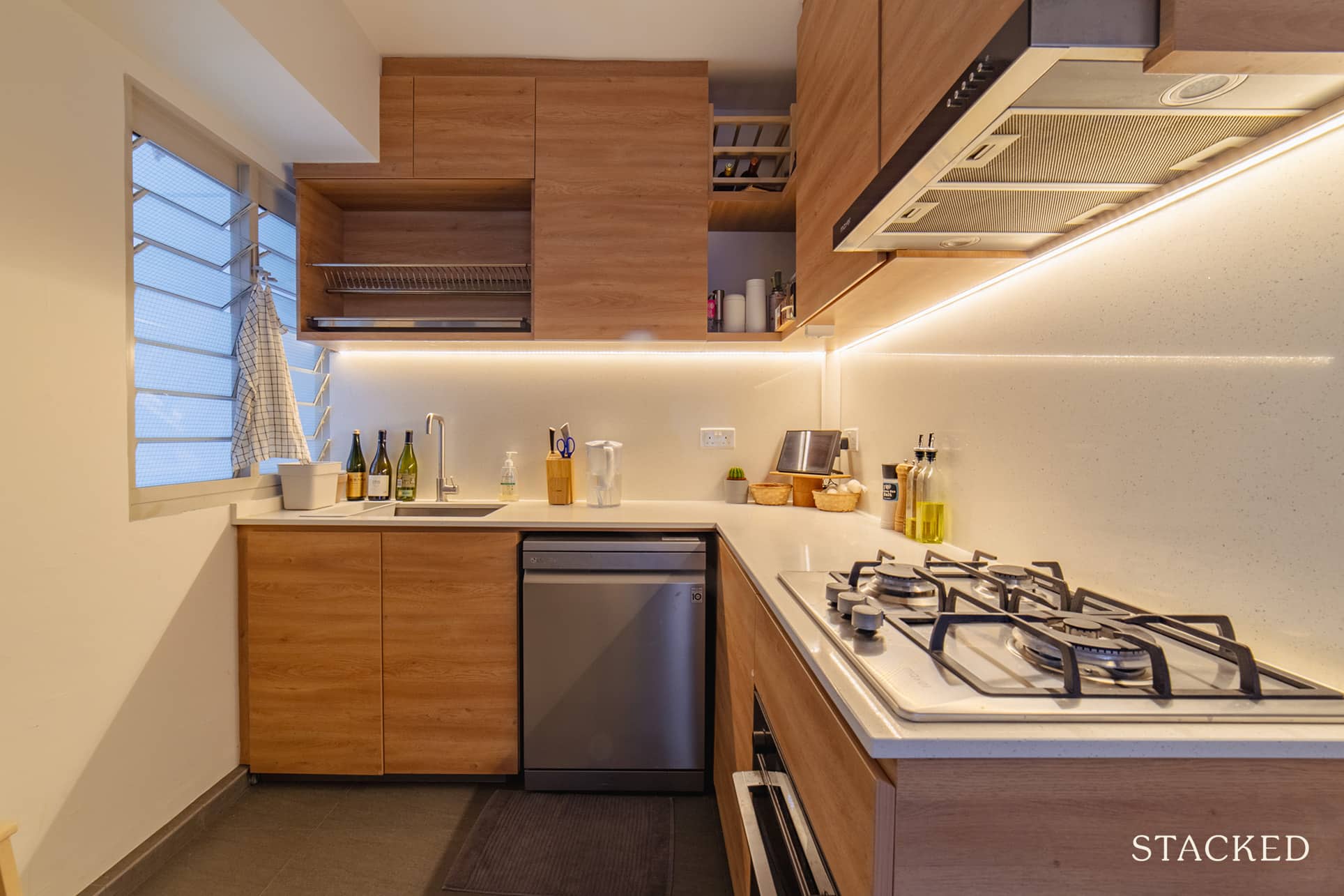
It was the same case with the kitchen, where they removed all the previous built-ins.
This was the space that featured the biggest change. “We completely reorientated and redesigned the layout of the kitchen to create more space and allow us to move around more freely in the kitchen,” Marcus shared.
Master Bedroom & Bedroom 2
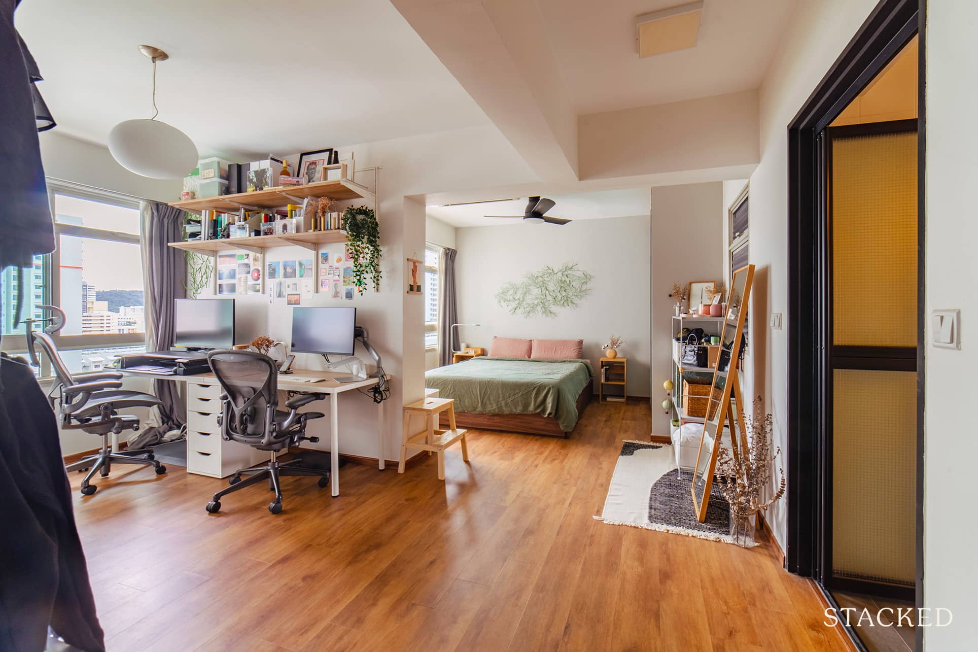
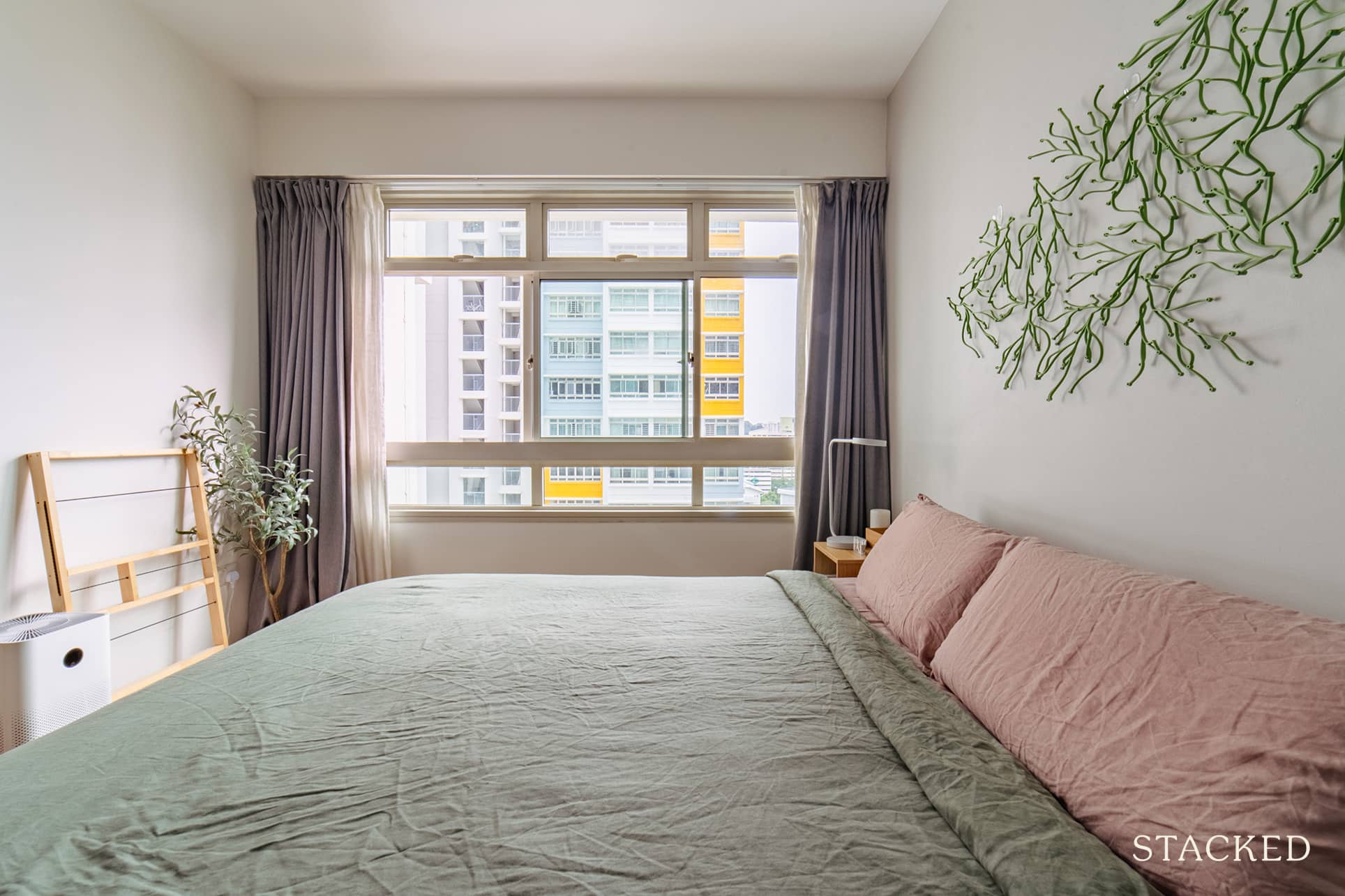
The couple wanted a bigger space for their master bedroom, and combined two bedrooms into one large master bedroom. The existing built-in wardrobes were hacked but they did keep one wardrobe in the main bedroom from the previous owners. They also changed the doors to keep a more cohesive look to the space.
More from Stacked
How I’d Invest $12 Million On Property If I Won The 2026 Toto Hongbao Draw
Every time a large TOTO jackpot makes the headlines, everyone starts contemplating what exactly they’d buy if that money materialised…
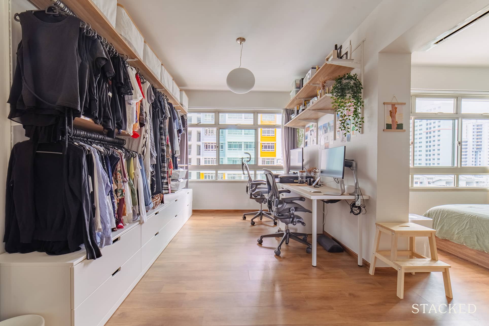
They chose to create an open wardrobe and shelving design from IKEA as it helped to make the room feel larger. As a byproduct, this also means that you’d be forced to keep the place tidy as everything is visible!
Bedroom 3
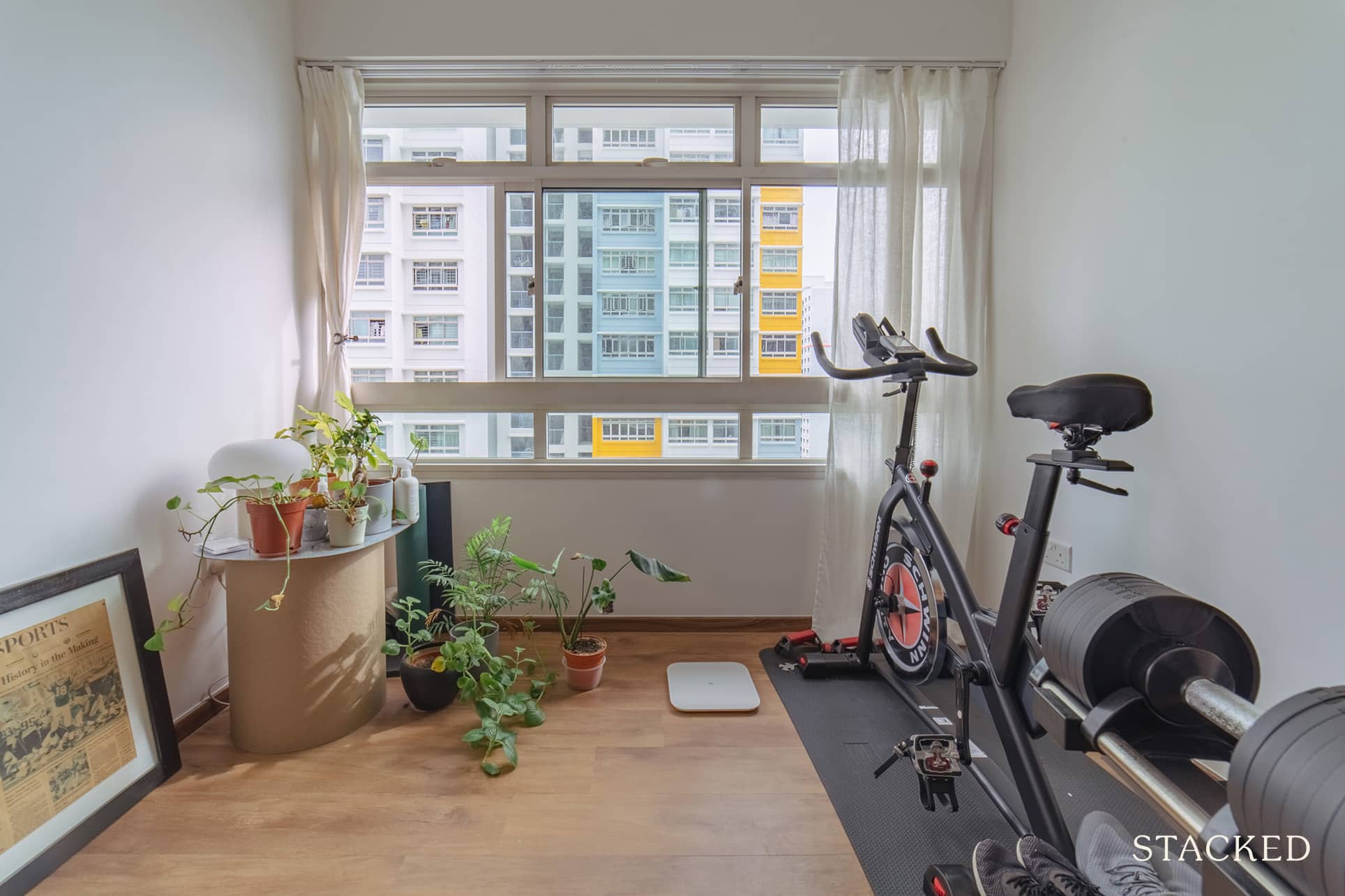
Given the couple didn’t have a need for the last bedroom at this point in time, it’s been turned into a hybrid of a home workout area, and a space for what looks to be a growing collection of plants.
Bathrooms
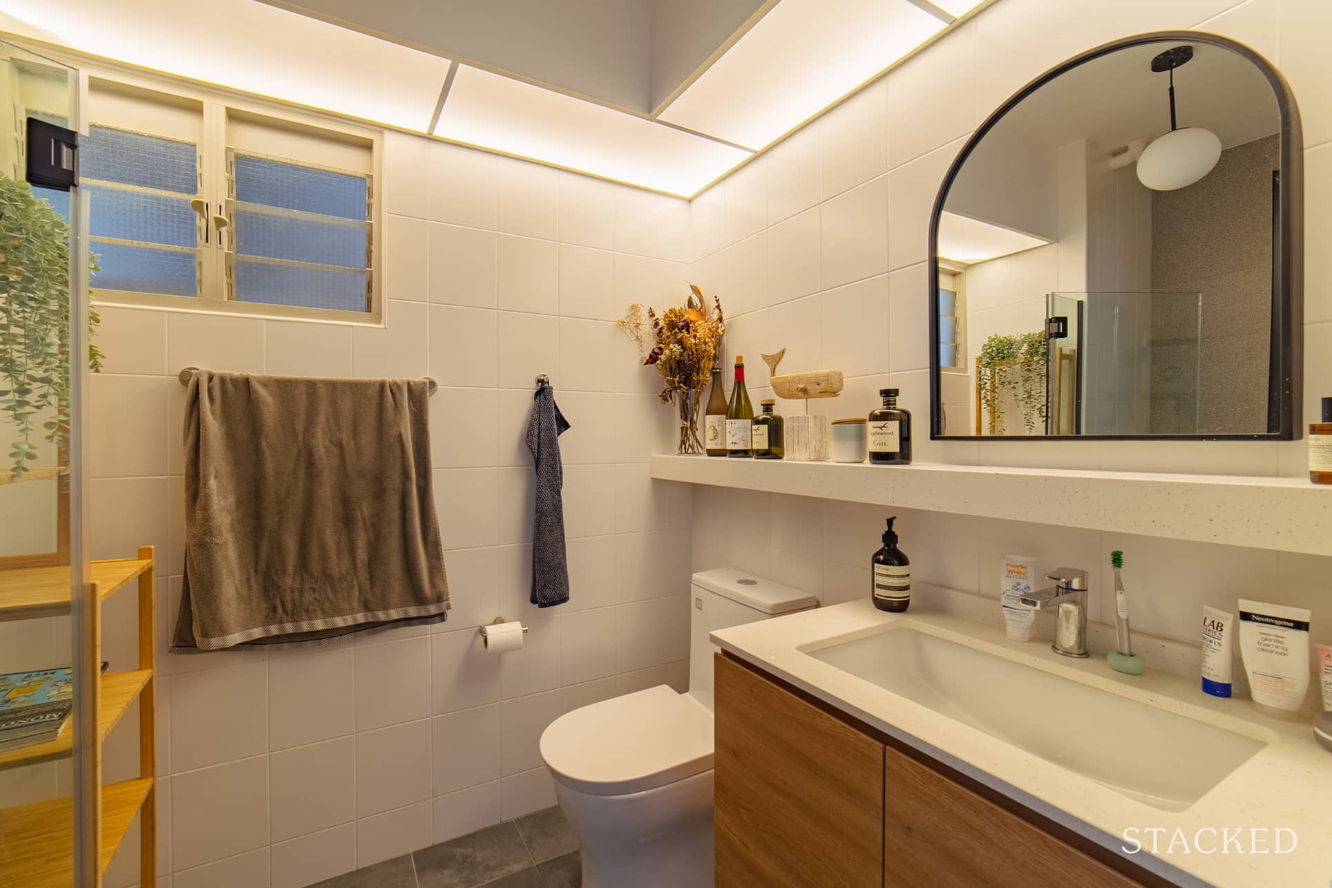
For both bathrooms, they decided to overlay the floor tiles and walls in the bath area. Like most bathrooms, the sink was built-in with cabinetry for more storage as well.
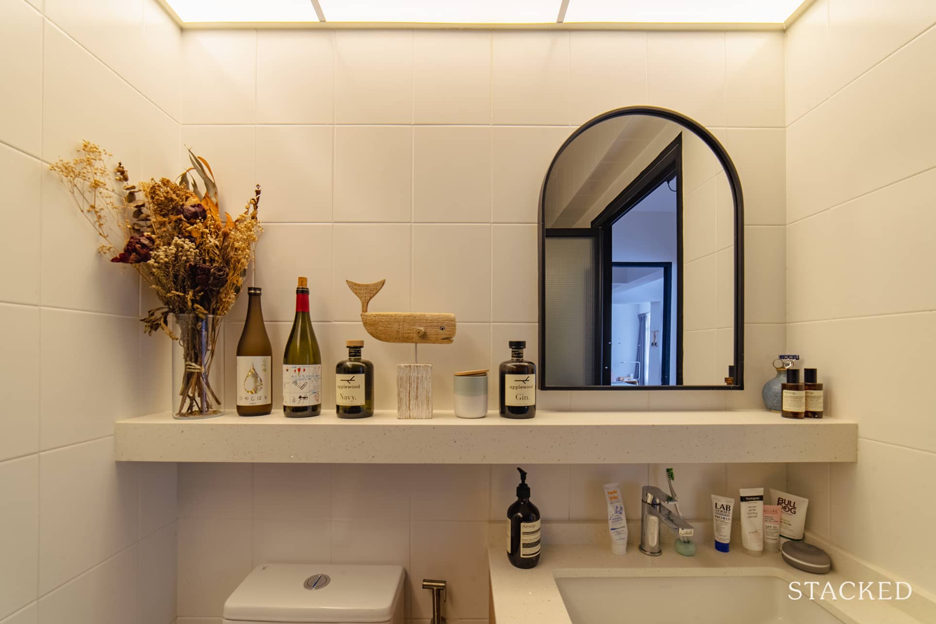
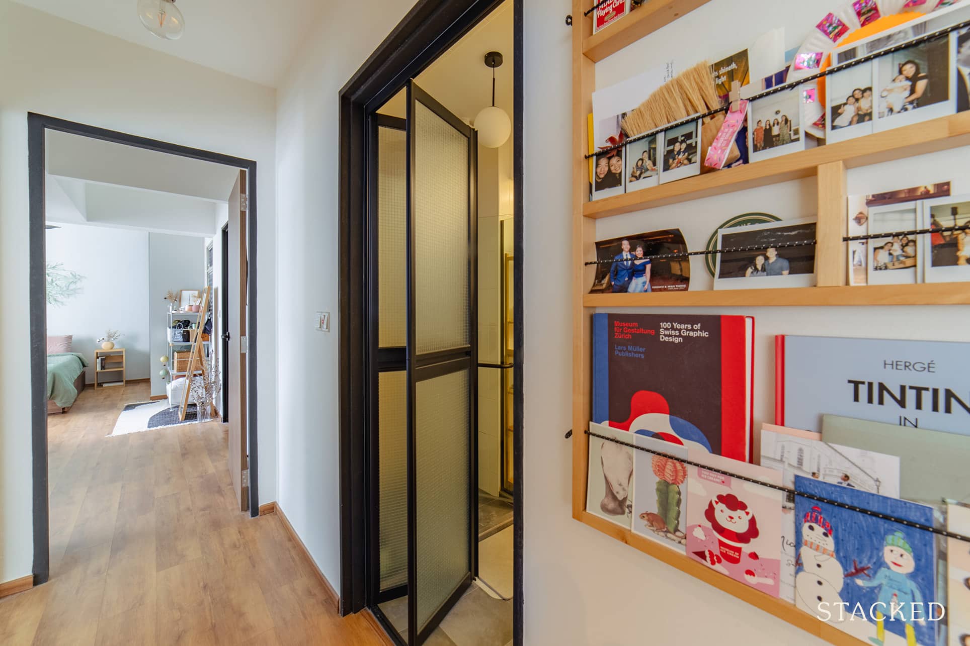
They also changed the bathroom doors, and were initially considering fluted glass for some texture. In the end though, they “ended up using the wired glass as it was a cheaper alternative and still allowed us to achieve the effect we wanted.”
Bringing The Vision To Reality
Marcus said the final outcome was primarily similar to what they had envisioned. They were able to achieve it by reducing the number of built-ins. Instead, they focused more on updates they could make to the home’s structure and core foundation, ensuring it aligned with their vision and design style.
Both Marcus and Beatrice are designers, so they already have a good handle on what they want for their home. As such, they chose to look for someone who can provide more on project management and contractor services.
“We employed Brandon from Conception Studios to help us with our renovations,” Marcus said. Brandon was recommended to the pair by a friend. Aside from matching their budget, he proved to be very prompt in replying, and he was great with communication as well.
“He was able to provide useful and practical suggestions, which was an added bonus. He also helped compensate for our lack of experience in certain areas.”
The pandemic and the renovation delays made it difficult for the couple to fit in furniture sourcing at the same time. He said that delays in production and shipping made the timelines even longer. As a result, their living and dining room were empty for a month.
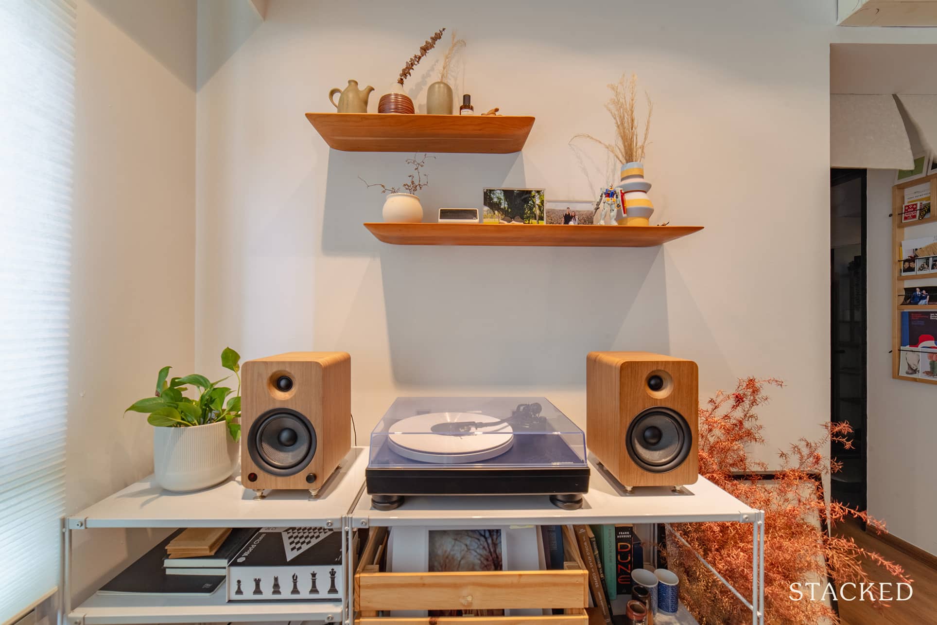
They both wanted to choose pieces that not only fit their style but also worked well in their space. But in the end, Marcus admitted that it was a blessing in disguise. “We were able to live in the space before we sourced for our furniture. This really helped us better understand our needs and how we used the space in our day to day lives.”
So when the time came for them to be able to start selecting pieces, they were able to balance their ideal designs with their budget. They looked for items that were not only well-made and unique but also practical for their day-to-day living.
Marcus shared that they made trips to Tan Boon Liat building, visiting local brands. They also browsed through some designer products in stores to get a better understanding of the differences and balance of function and design.
“What helped us make our final decisions was finding a balance between items that were easily maintained and that were built well.”
For products that cost a little more, he said that they made sure these were items that would work well even in a future home, should they ever decide to move.
When it comes to the best part of their home, the couple both agreed that it would be their living and dining area. “We took a chance with a feature cement screed wall and that has become a distinct feature in our home.”
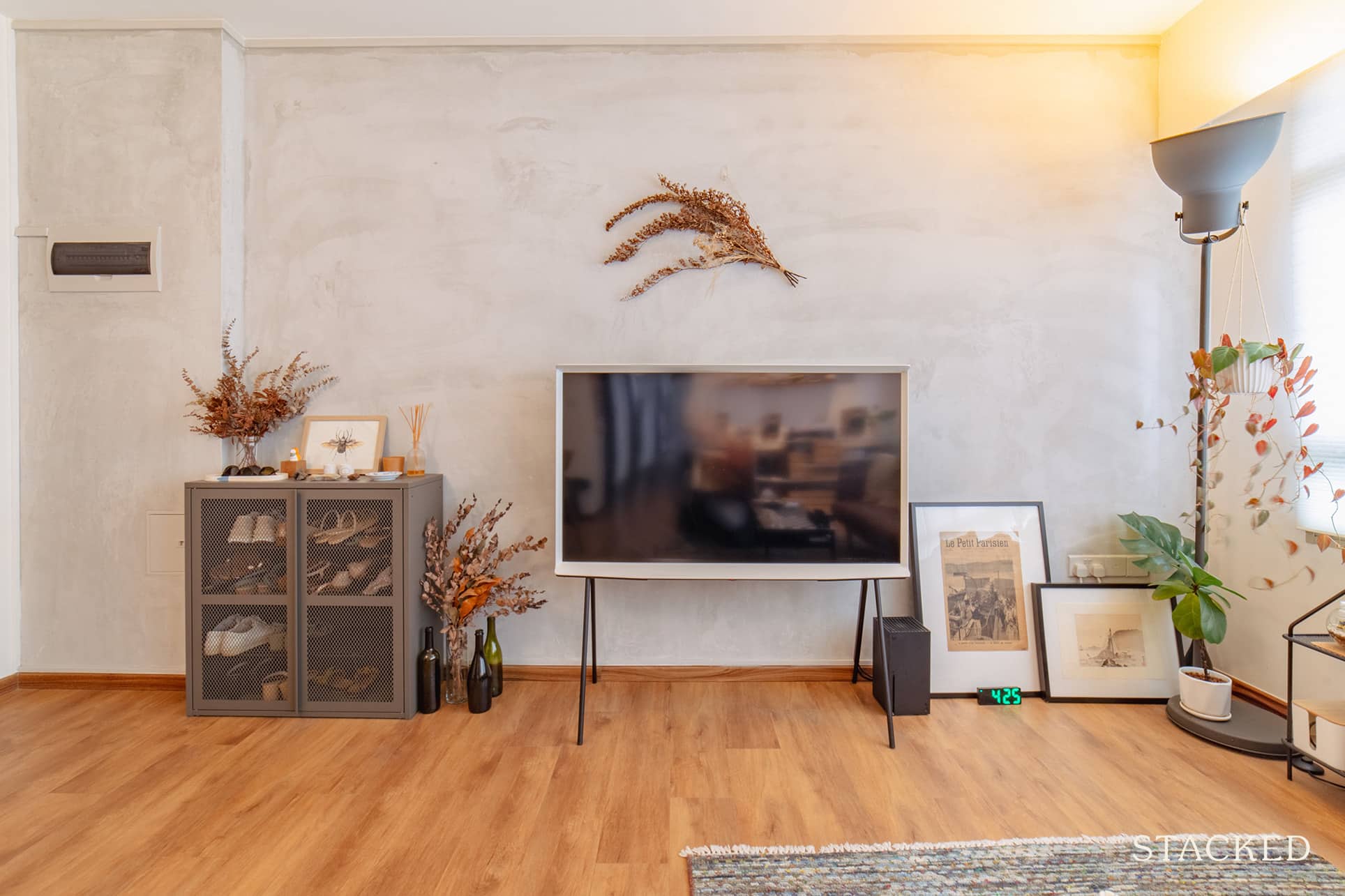
While they were having second thoughts if they took a gamble with it, it all came together once their furniture and other items were in place. As Marcus puts it, the wall helped bring the entire space together and added charm to the area.
Lessons Learned From A Successful Reno Journey
Marcus and Beatrice’s reno journey happened right as phase 2 of the pandemic started. Delays and the struggle to meet their initial timelines were inevitable. It became even more difficult for them to plan and design their home without being able to see and feel materials firsthand.
“Most of our design discussions had to happen during the circuit breaker,” Marcus recalled. “This meant we were unable to meet each other to discuss our ideas and source for materials as well.” As such, they had to trust most of the recommendations from their contractor, and were very thankful Brandon’s suggestions aligned with their needs and budget.
But if there’s any mistake they vowed never to repeat again, that would be giving more consideration to their cabinets – they would be more detailed and give more thought to heights and shelving for their cabinets. Marcus said that although they are functional, slight adjustments based on their specific needs would definitely help to optimise the space better. Still, they don’t have any regrets.
Marcus offers this excellent advice to homeowners about starting their reno journey.
“Definitely take your time with the process! Don’t feel the need to have the perfect home immediately when you move in.”
He added to take the time to figure out what you really need, find pieces you really love, and stuff that can help tell your story over time.
At Stacked, we like to look beyond the headlines and surface-level numbers, and focus on how things play out in the real world.
If you’d like to discuss how this applies to your own circumstances, you can reach out for a one-to-one consultation here.
And if you simply have a question or want to share a thought, feel free to write to us at stories@stackedhomes.com — we read every message.
Need help with a property decision?
Speak to our team →Read next from Homeowner Stories

Homeowner Stories We Could Walk Away With $460,000 In Cash From Our EC. Here’s Why We Didn’t Upgrade.

Homeowner Stories What I Only Learned After My First Year Of Homeownership In Singapore

Homeowner Stories I Gave My Parents My Condo and Moved Into Their HDB — Here’s Why It Made Sense.

Homeowner Stories “I Thought I Could Wait for a Better New Launch Condo” How One Buyer’s Fear Ended Up Costing Him $358K
Latest Posts

Singapore Property News HDB Resale Prices Fell — But A Third Of Buyers Still Paid $800K+ Last Quarter. Here’s Why

Singapore Property News Three Strata Office Floors In Suntec Priced From $135M

Singapore Property News This Freehold Desker Road Shophouse Is Going For $10.5M












0 Comments