All reviews on Stacked are editorially independent. Developers can advertise with us, but
cannot
pay
for,
edit, or preview our reviews.

New Launch Condo Reviews
The Commodore Review: More Exclusive + Surprisingly Premium Fittings For Its Price
November 21, 2021 34 min read
| Project: | The Commodore |
|---|---|
| District: | 27 |
| Address: | 59 – 69 Canberra Drive |
| Tenure: | 99 Years from 08/06/20 |
| No. of Units: | 219 |
| Site Area: | 143,324.70 sqft |
| Developer: | JBE (Canberra) Pte Ltd |
| TOP: | 31 December 2024 |
Has there ever been a more challenging time to be a developer? Sure, from the outside, most people still think developers are swimming in money – and are pricing properties high to make the most profit. But the truth is, rising land costs, construction delays, and the rising power of property agencies have made profit margins for developers at an almost unsustainable level.
The one shining light? Demand for properties has almost been at an insatiable level, especially so with Outside Central Region (OCR) projects.
And with that, it brings us to today’s property in question – The Commodore.
With quite intense competition in the area (the recently launched Watergardens at Canberra is just next door, for example), they have their work cut out to set the project apart.
Which is why they are trying to do things a little differently here.
Let’s start with the name.
So unless you are a huge Singapore history buff, I’d bet most people wouldn’t know that the coastal Sembawang used to be a naval base for the British Navy’s fleet before and after World War II. As such, many roads and areas are named after the different Royal Navy inspirations. A few more well-known examples include Beaulieu House, which was used as a residence for senior naval officers and is now a restaurant. Likewise, the former Admiralty House which was initially the residence of the Commodore Superintendent of the Royal Navy Dockyard. There are plans for it to be the Canberra House Library and will be part of the Bukit Canberra integrated development (I’ll touch more on that later).
So for those wondering, the name Commodore is actually the rank above Captain and just below Rear Admiral.
If there was a list of unusual new launch condo names in Singapore, The Commodore is sure to feature pretty highly on it. It’s quite a departure from the usual Residences, or Park that you’d usually see.
Next, the fittings and brands included are not what you might normally see in an OCR project. OCR properties usually set themselves apart in terms of price points. And with Watergardens as such a close competitor, JBE had to try to differentiate this project from the rest.
As a result, the brands used in the kitchen, rain showers even in the common bathrooms, and some of the fittings and finishings are what you might see in a CCR project – which does add to the upmarket image that The Commodore is gunning for.
So with all that, let’s take a closer look at The Commodore with our usual insider tour!
So many readers write in because they're unsure what to do next, and don't know who to trust.
If this sounds familiar, we offer structured 1-to-1 consultations where we walk through your finances, goals, and market options objectively.
No obligation. Just clarity.
Learn more here.
The Commodore Condo Insider Tour
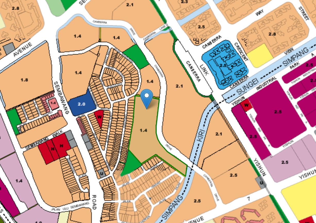
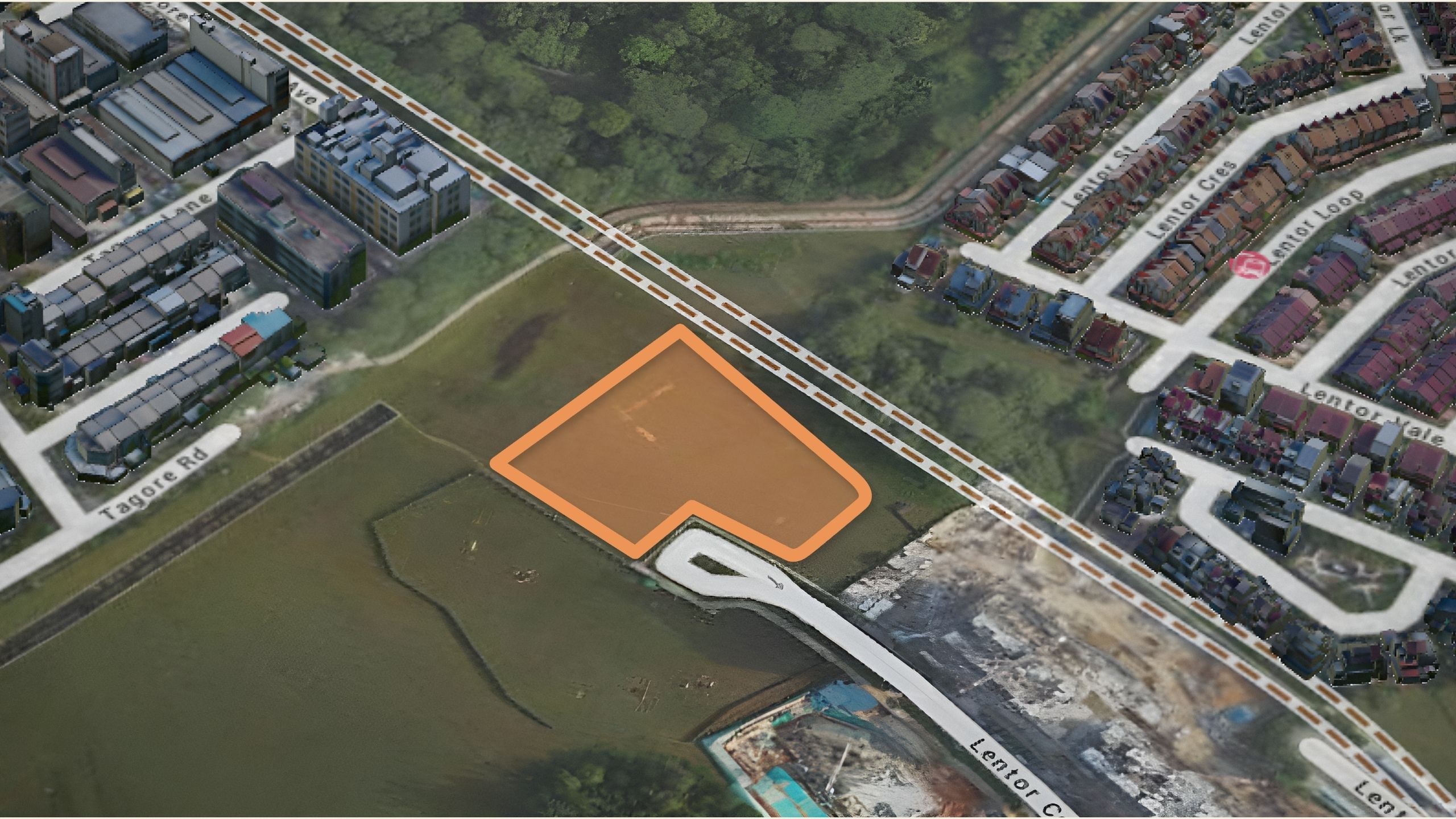
The Commodore is located along Canberra Drive in what I would say is arguably the better-situated plot between the two (for now, at least). For one, it is next to Jalan Sendudok Park so you do get to enjoy a little bit more greenery. Plus it is closer in distance to both Sembawang Shopping Centre and to Canberra MRT station.
Frankly, it’s marginal – but if you had to walk the route every day it’s quite a simple decision on which to choose. And if you can’t choose between the two, this could be one to find your conclusion – fine lines indeed.

But perhaps I should caveat here that in the Masterplan, the future of Jalan Sendudok Park isn’t quite as rosy. The plans are that its current size would be halved, with the closer end to Commodore zoned as a residential plot. It is very likely that the price of the land here is going to be purchased at a higher price (which is good for you), but the bad side is you will definitely have to endure construction noises sometime in the future – of which no one can predict exactly when it may happen.

So one of the main differences between The Commodore and its neighbour, The Watergardens at Canberra is the size of the development. The Commodore is nearly exactly half the size, with just 219 units as opposed to 448 units next door. Likewise, it does have about half the land size as well, with 143,326 square feet, compared to the 296,722 square feet of The Watergardens at Canberra.
These two pieces of land were part of the two land parcels (Parcel A and B) that were part of the Government Land Sales in November 2019. The price of The Commodore was at $129.2 million ($644 psf ppr), as compared to the UOL joint venture of $270.2 million ($650 psf ppr). With such identical pricing, you can be sure that the pricing economics for both will be very similar. As such, the price points for the 2 will be followed very closely too, given that they were bought and launched at very similar timelines too.
And so while 448 units isn’t a big size by any means (especially in today’s context), 219 units is actually really a sweet spot for me in terms of a small development. It’s a small enough size that you still get a decent amount of privacy and exclusivity. But it’s not too small that you’d have to compromise on facilities and a high maintenance fee. Some might point out that there’s a lack of tennis court, but when your bigger sized next-door neighbour wasn’t able to incorporate one too – it’s hard to really complain too much.
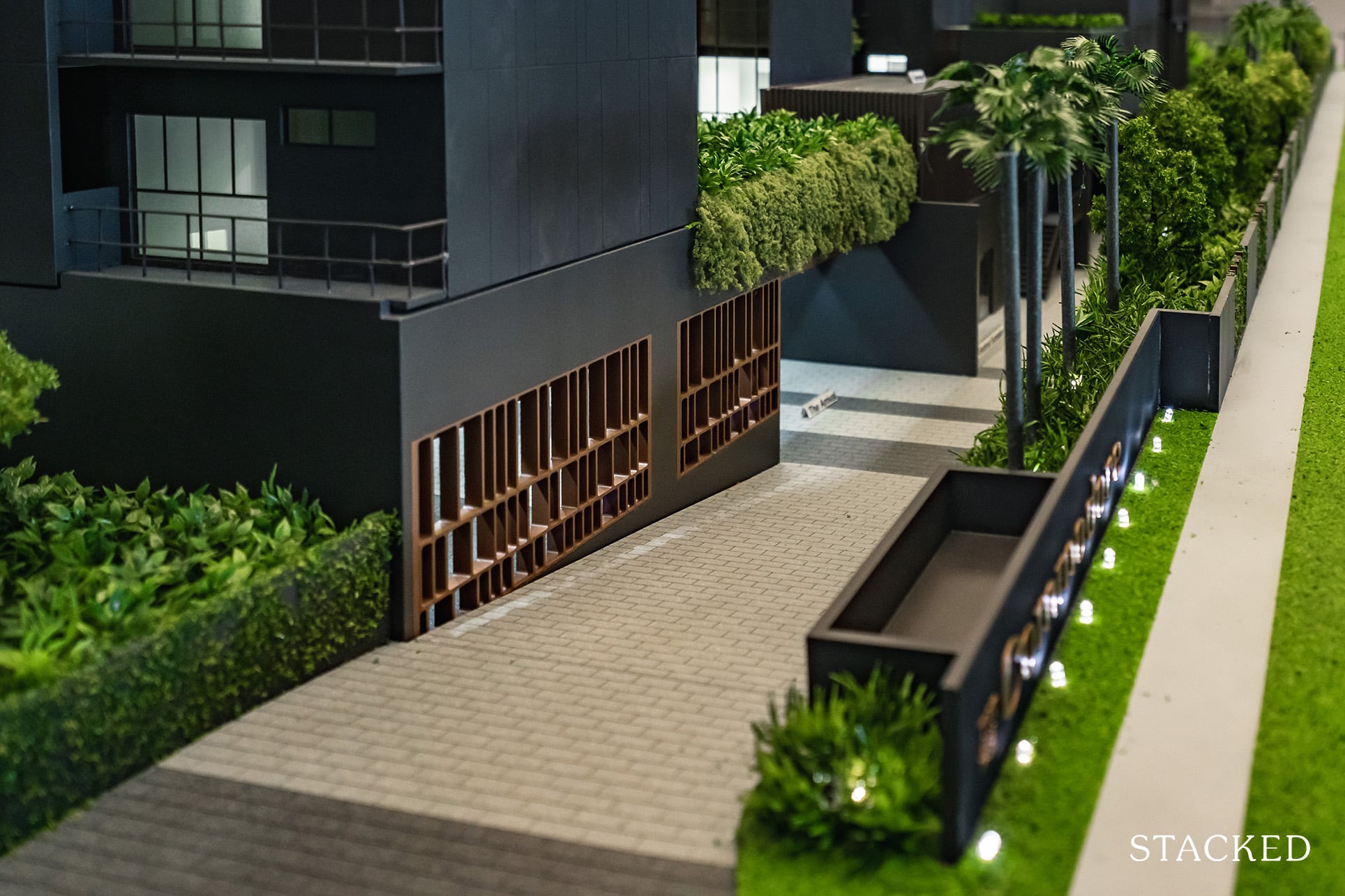
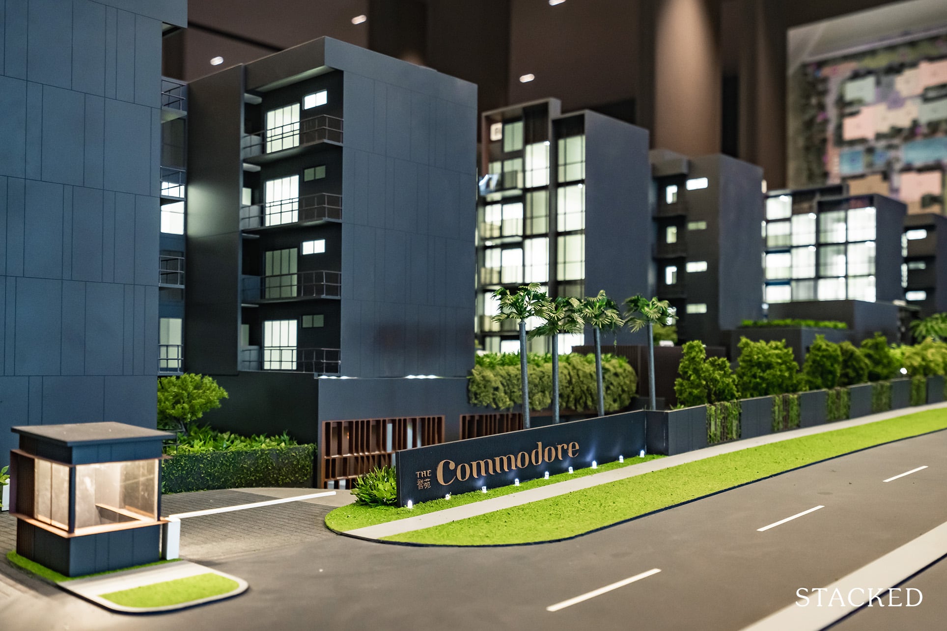
As you might expect from the size of the project, there’s only one entrance along Canberra Drive. Born out of a need to maximise the land space, the arrival area isn’t the expansive open type that you might usually find. Instead, the arrival hall is an enclosed version (almost like entering a basement hotel lobby – it is inspired by the Armani Hotel after all). It does look quite upscale from the renders, but I would definitely almost always prefer to have the arrival area as an open expansive one instead – it’s just more welcoming. As always, this is more of a subjective preference than anything else.
You do also have an on-demand concierge available here, a service usually only reserved for luxury developments.
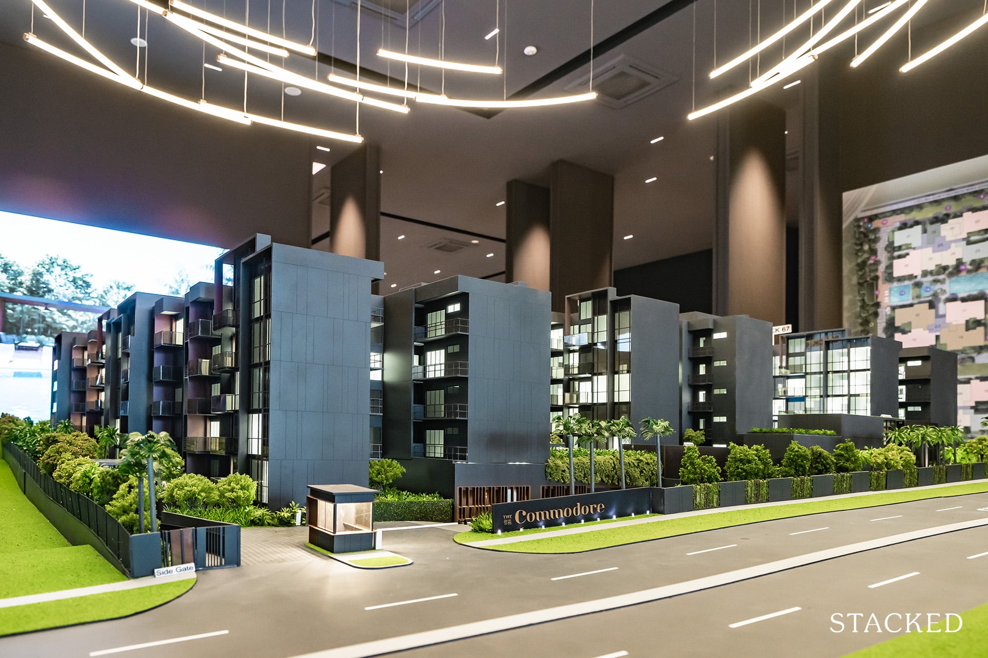
Since we are on the topic of the entrance, let’s talk about the car park availability here – a pertinent topic considering this is an OCR project and most people looking to live here would be reliant on a car. Thankfully, there’s nothing negative to touch on here given that you get a 1:1 car park lot availability – the maximum standard today for new launches. To be fair, you are in close enough walking distance to Canberra MRT station too, so having a car isn’t as crucial as you may think here.
For those hoping to make the move to an electric car in the future, you’d be happy to know that there will be 3 electric car lots provided from the get-go.
One of the main differences between The Commodore and Watergardens at Canberra is the unit mix. The Commodore offers a range between 1 to 5 + study bedroom types, with the 1 bedroom units here being the main highlight as they have a starting indicative price of $700,000 (The Watergardens doesn’t offer any 1 bedroom units). I’ll be touching more on that in our pricing section later on, but for now, it is clearly the cheapest entry price you are going to get in a new launch project today.
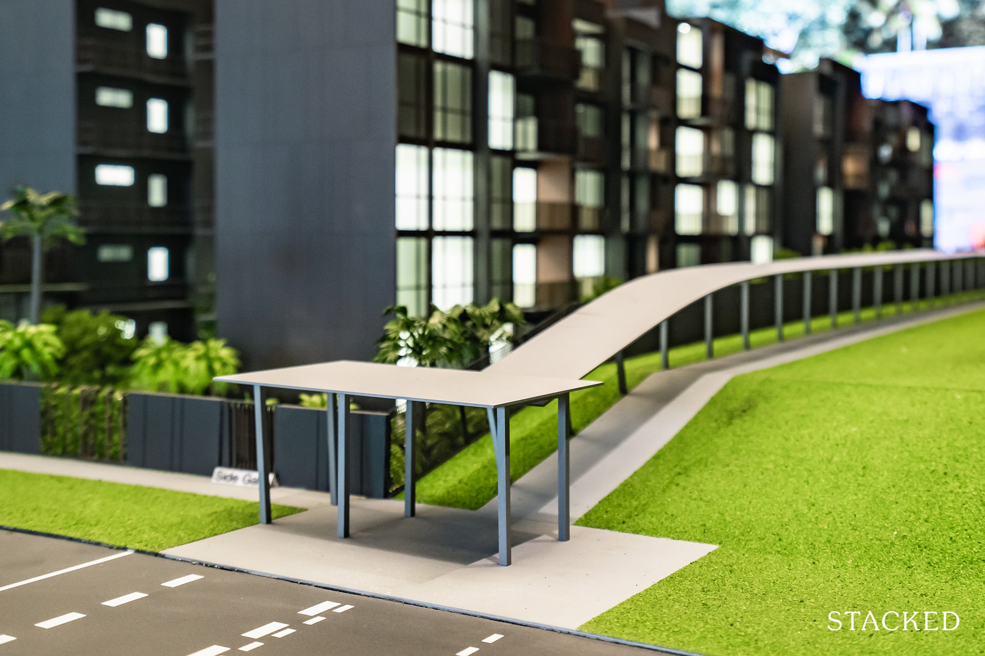
For younger singles that are looking to move out from their parent’s home, it’s an affordable quantum in today’s market especially given you are within walking distance to an MRT station. To add the cherry on top, there is a proposed covered linkway to the MRT – a feature that is very welcome indeed in Singapore’s tropical weather.
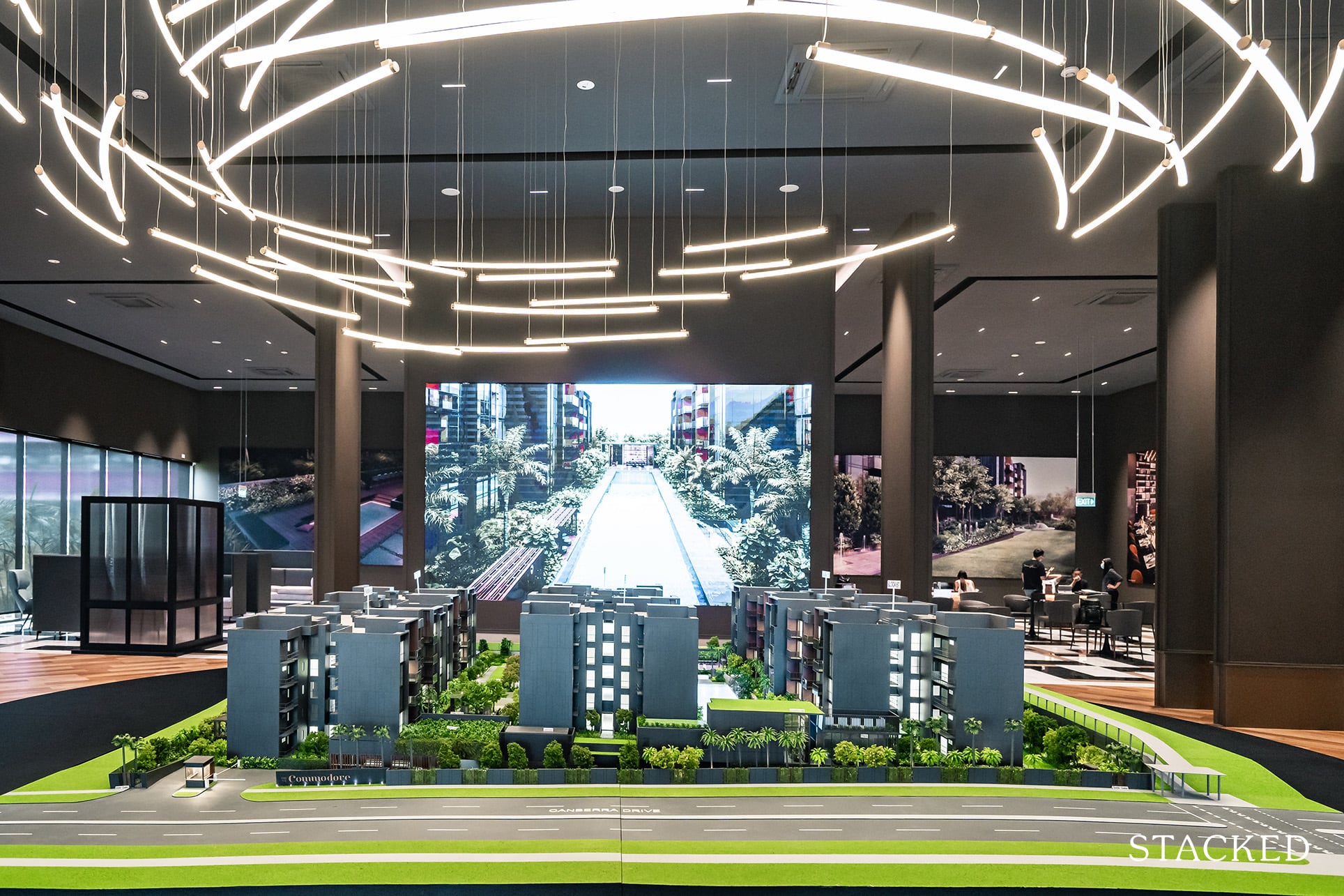
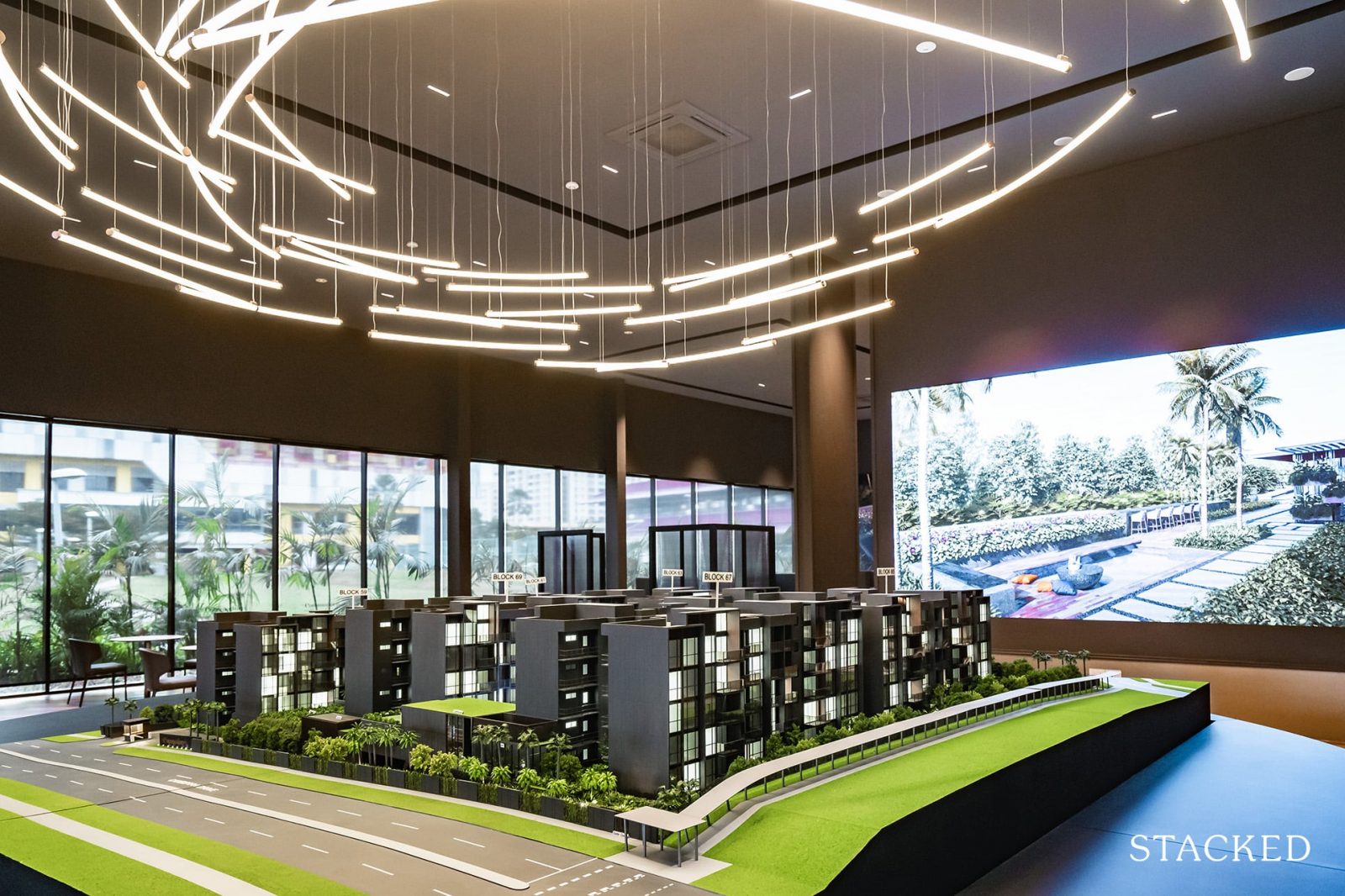
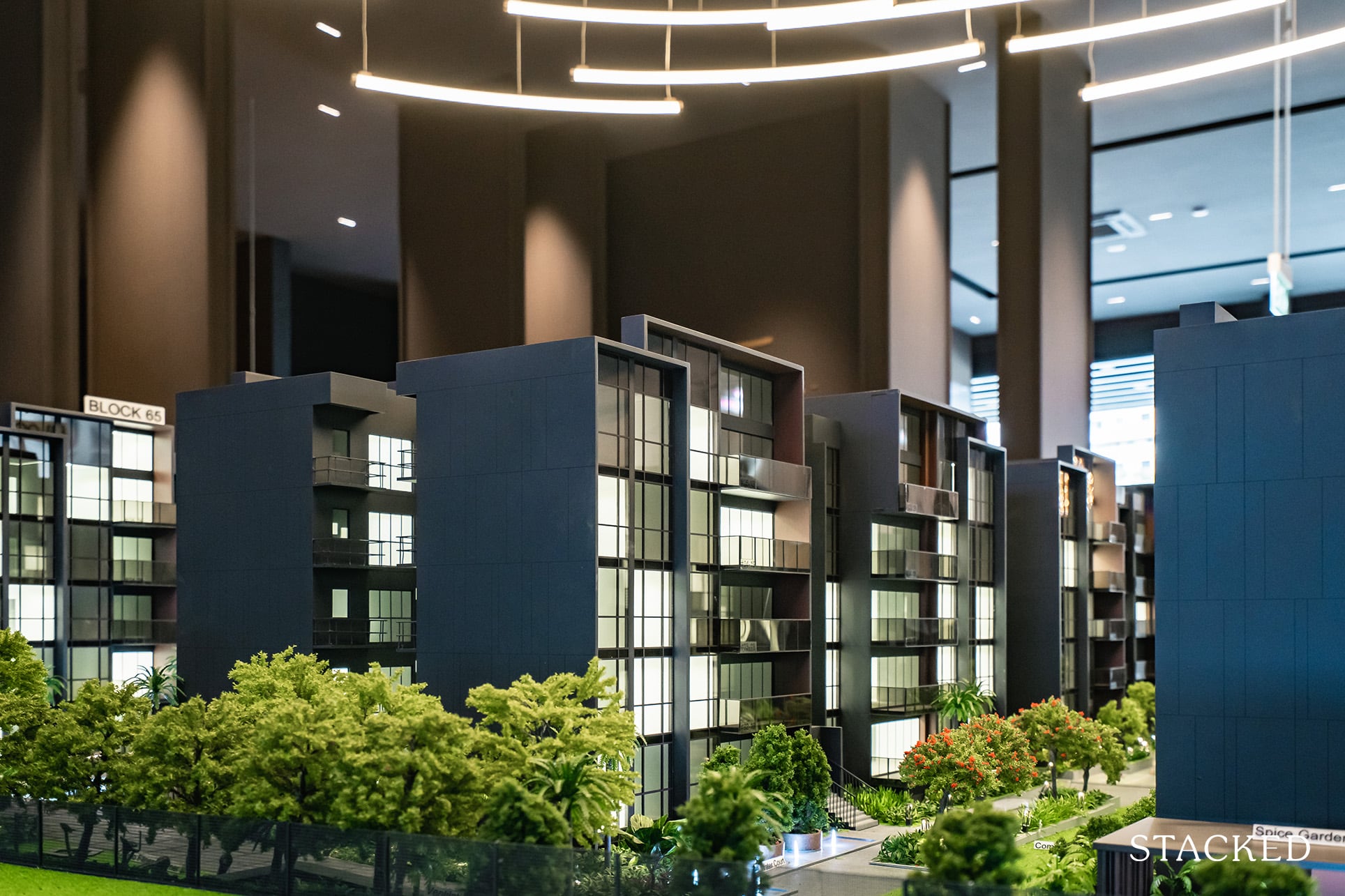
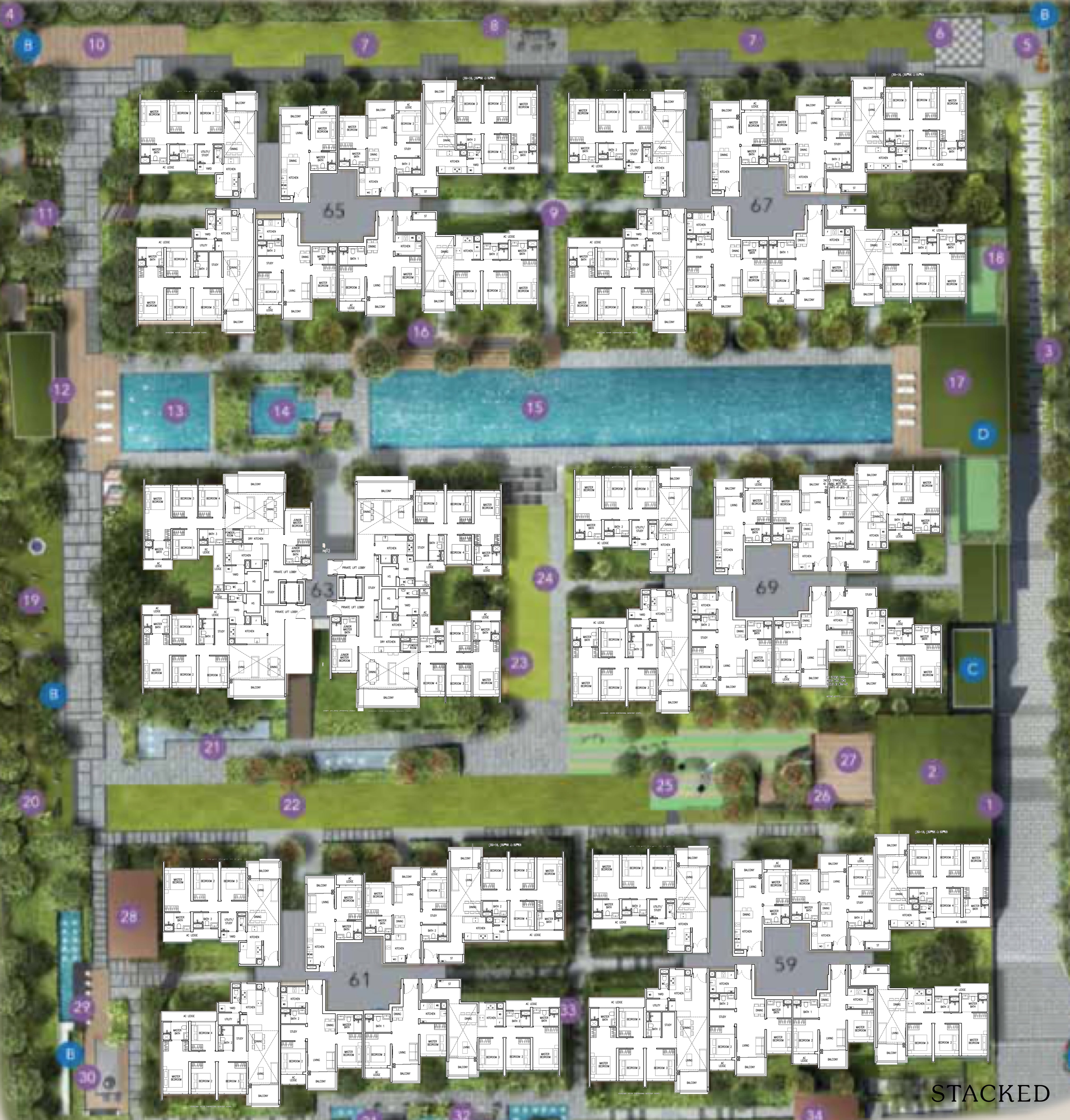
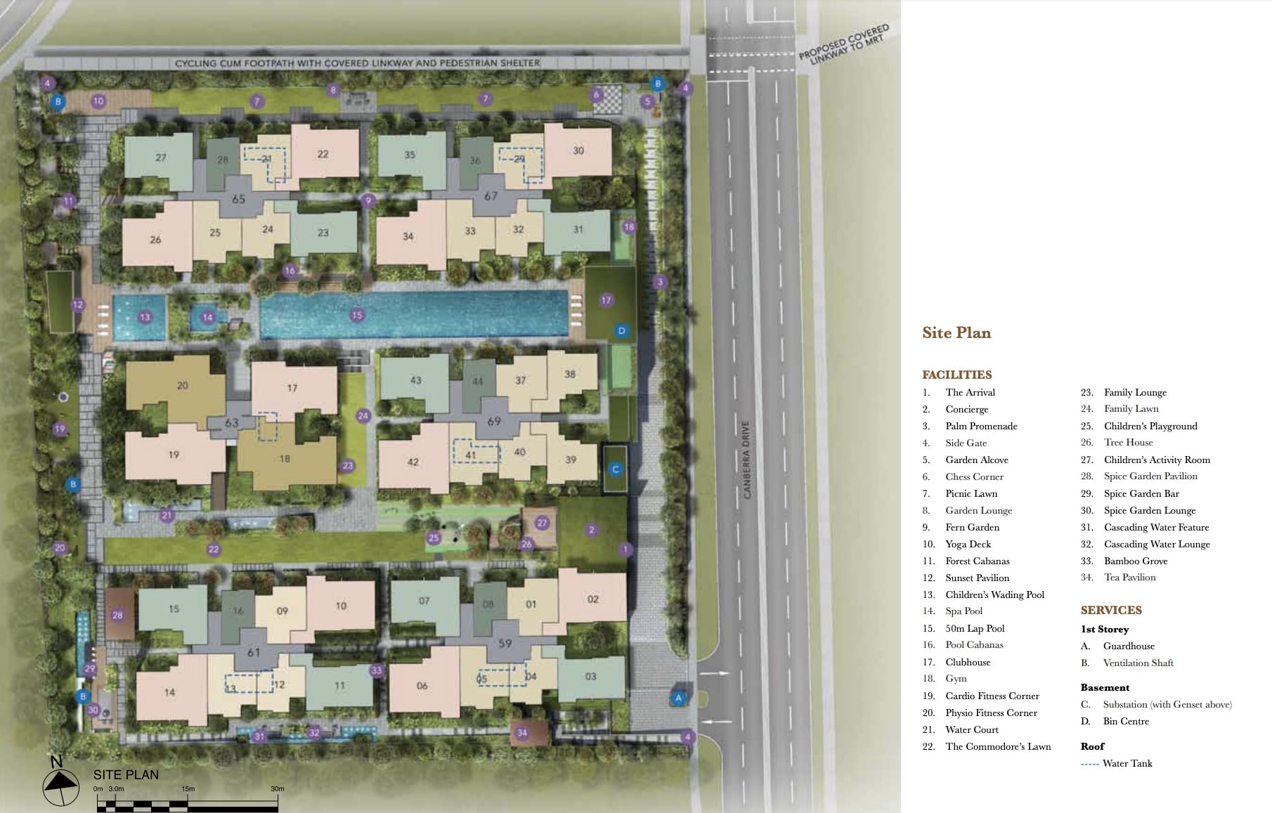
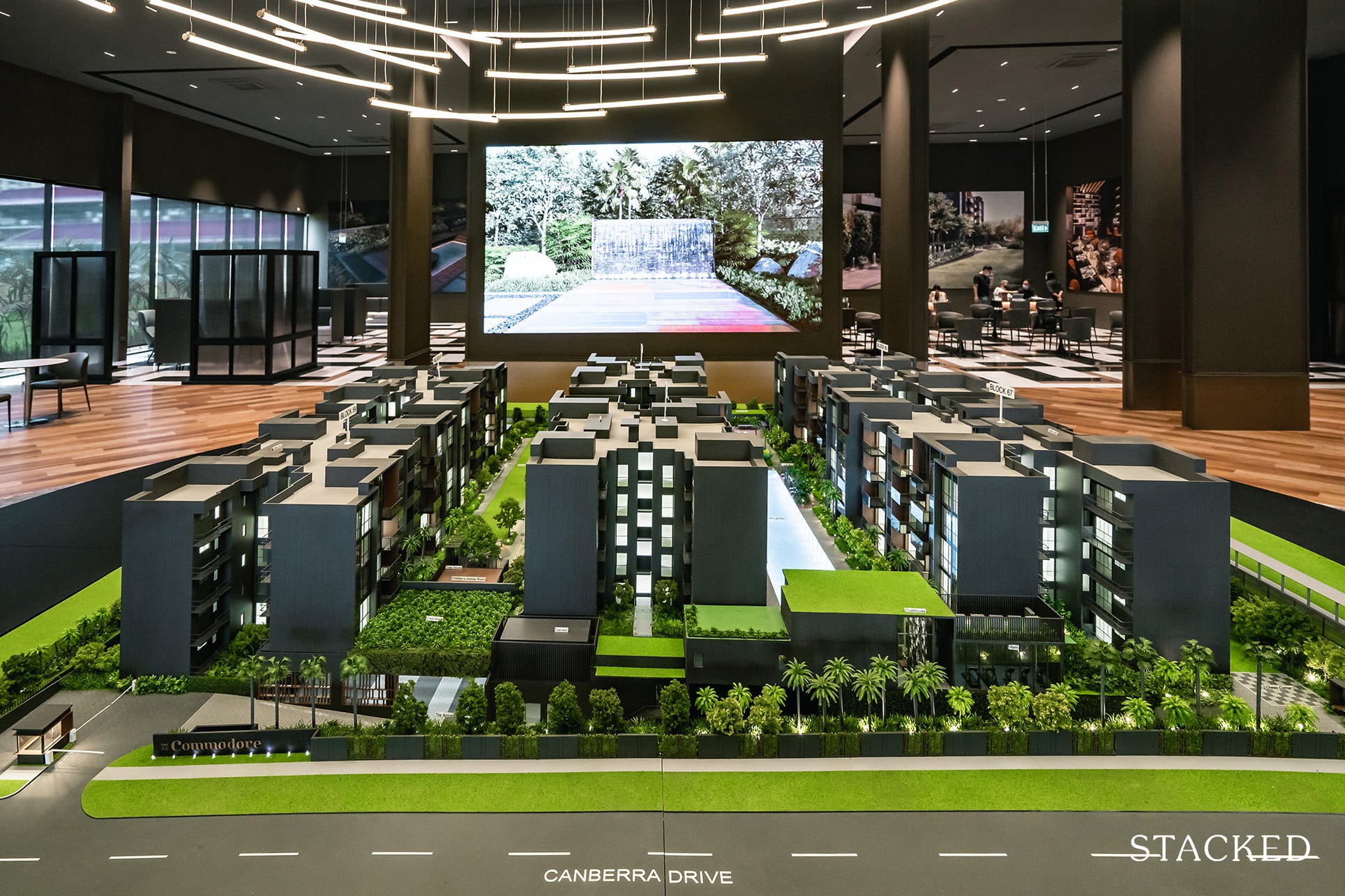
The blocks of residential units at The Commodore are laid out in a straightforward fashion of 3 rows. While the plot of land is a regular squarish shape, I don’t suppose much could have been done differently as it’s not a big piece of land, to begin with. As such, the facilities will be constrained to the middle sections of the blocks and the peripheral edges of the estate.
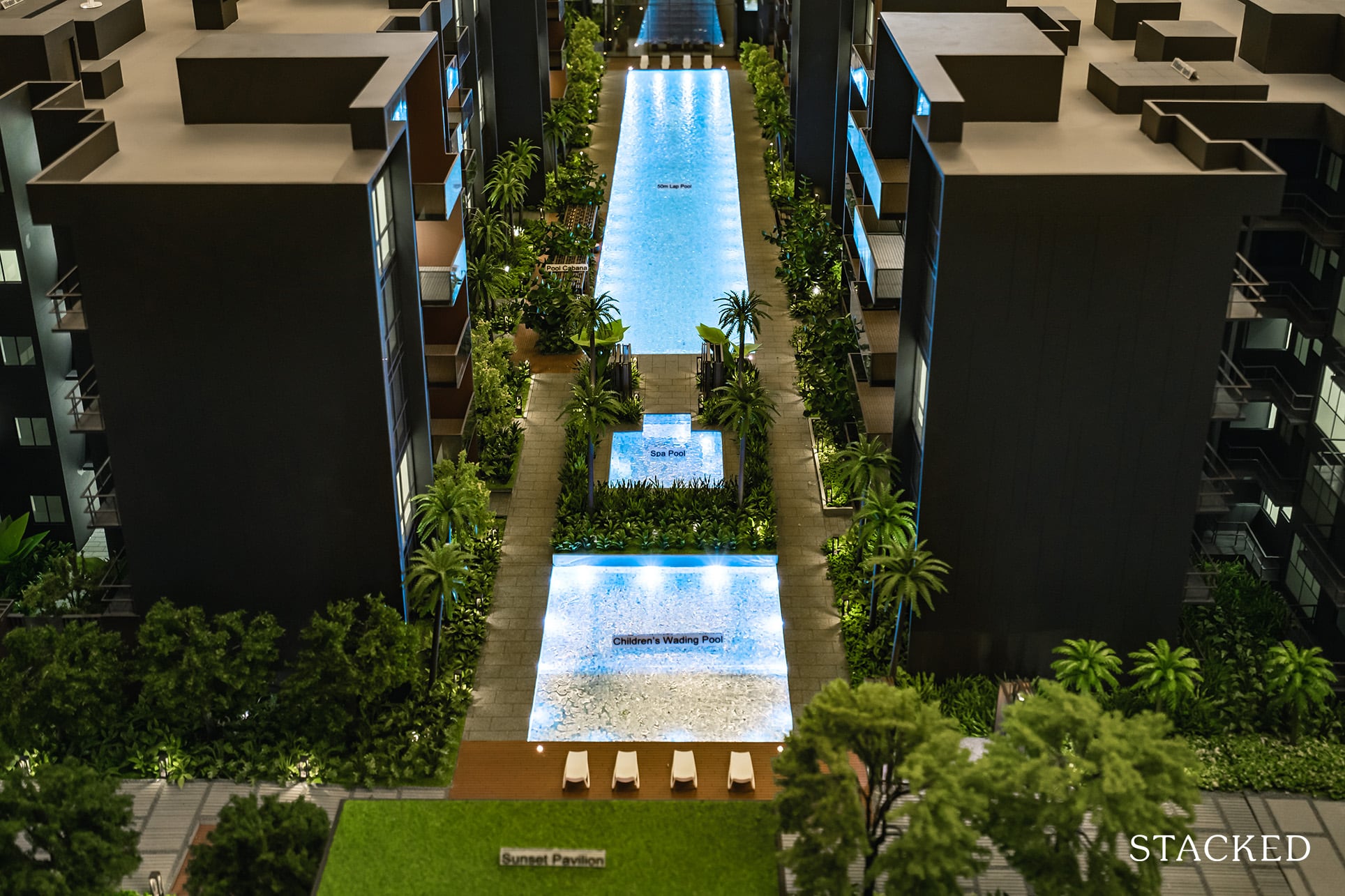
Now, onto the facilities. Let’s start with the good bits first. A very generous 50m swimming lap pool is the main highlight. It’s certainly a very good offering for 219 units, and I think pool sessions could be quite enjoyable given you don’t have to squeeze with too many people.
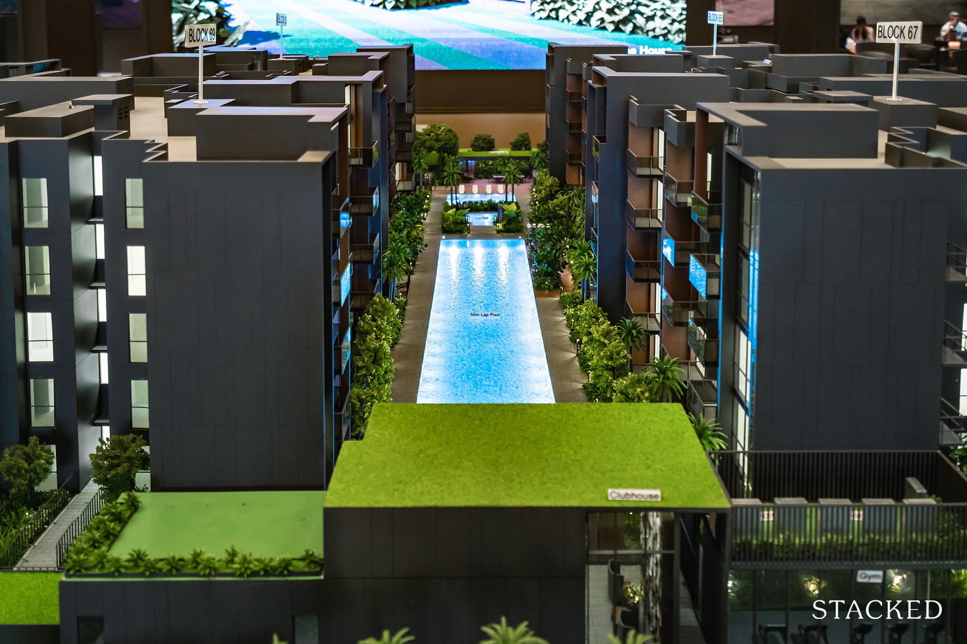
To put things into perspective, a luxury development like Rivière with slightly more than double the number of units has a smaller 36m swimming pool. So if you are the sort that spends half your life by the swimming pool, you’d definitely be very happy with the offering here.
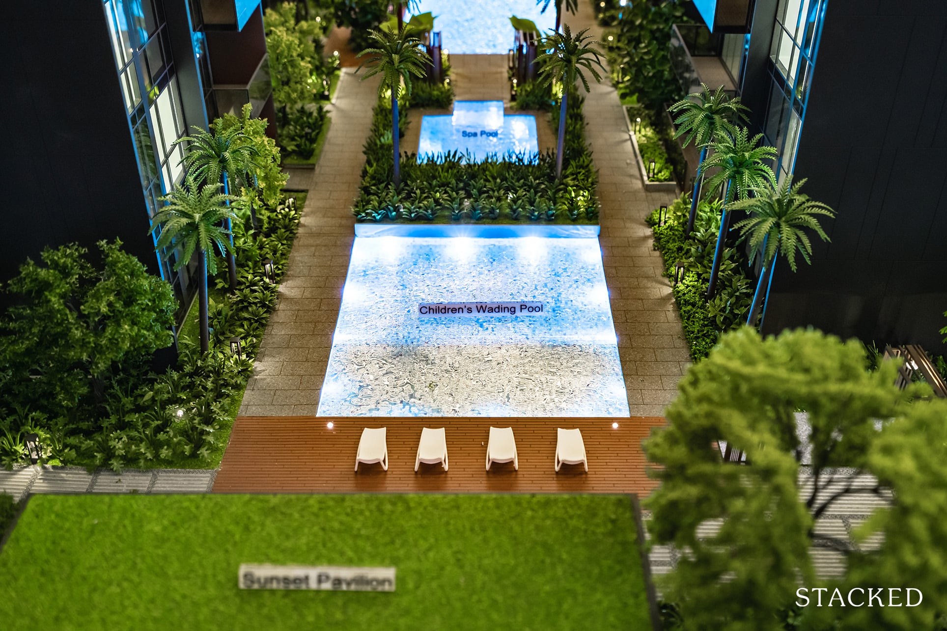
In addition to the main swimming pool is the children’s wading pool and spa pool. You do also have a Clubhouse on one end, and a pavilion on the other, along with pool cabanas by the side of the pool.
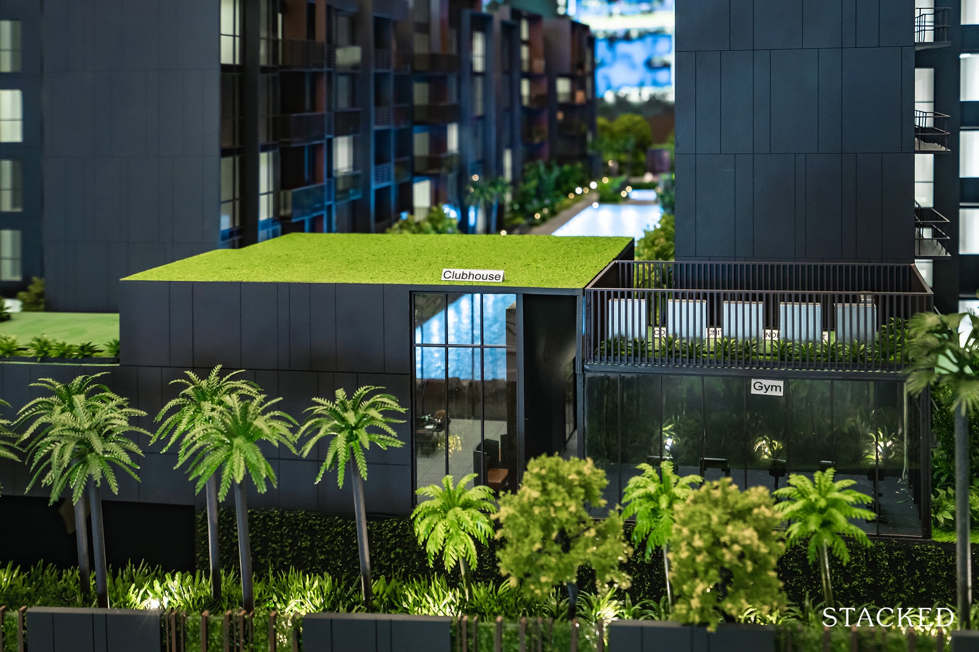
And since the pandemic doesn’t seem that it is going to go anywhere soon, developers have been jumping on the WFH bandwagon, with every new development offering some sort of hot-desking option. I definitely think it’s useful, as it does serve as a separate area to work away from your home (especially so if you are living in a 1 bedroom apartment). After all, it’s nice to have a change of scenery once in a while.
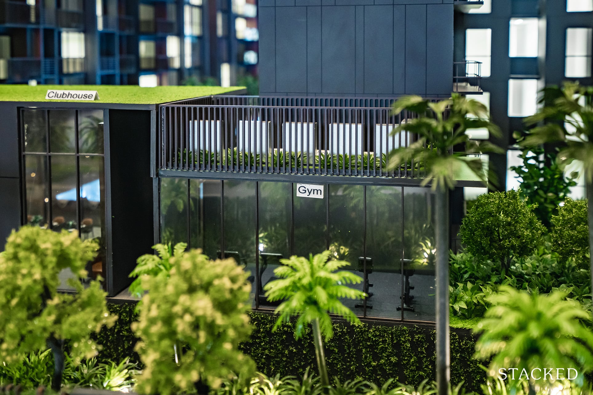
The gym is located right next to the Clubhouse, and I’m happy to report that it does feature floor-to-ceiling windows, even though it doesn’t quite enjoy the swimming pool view – it faces Canberra Drive instead.
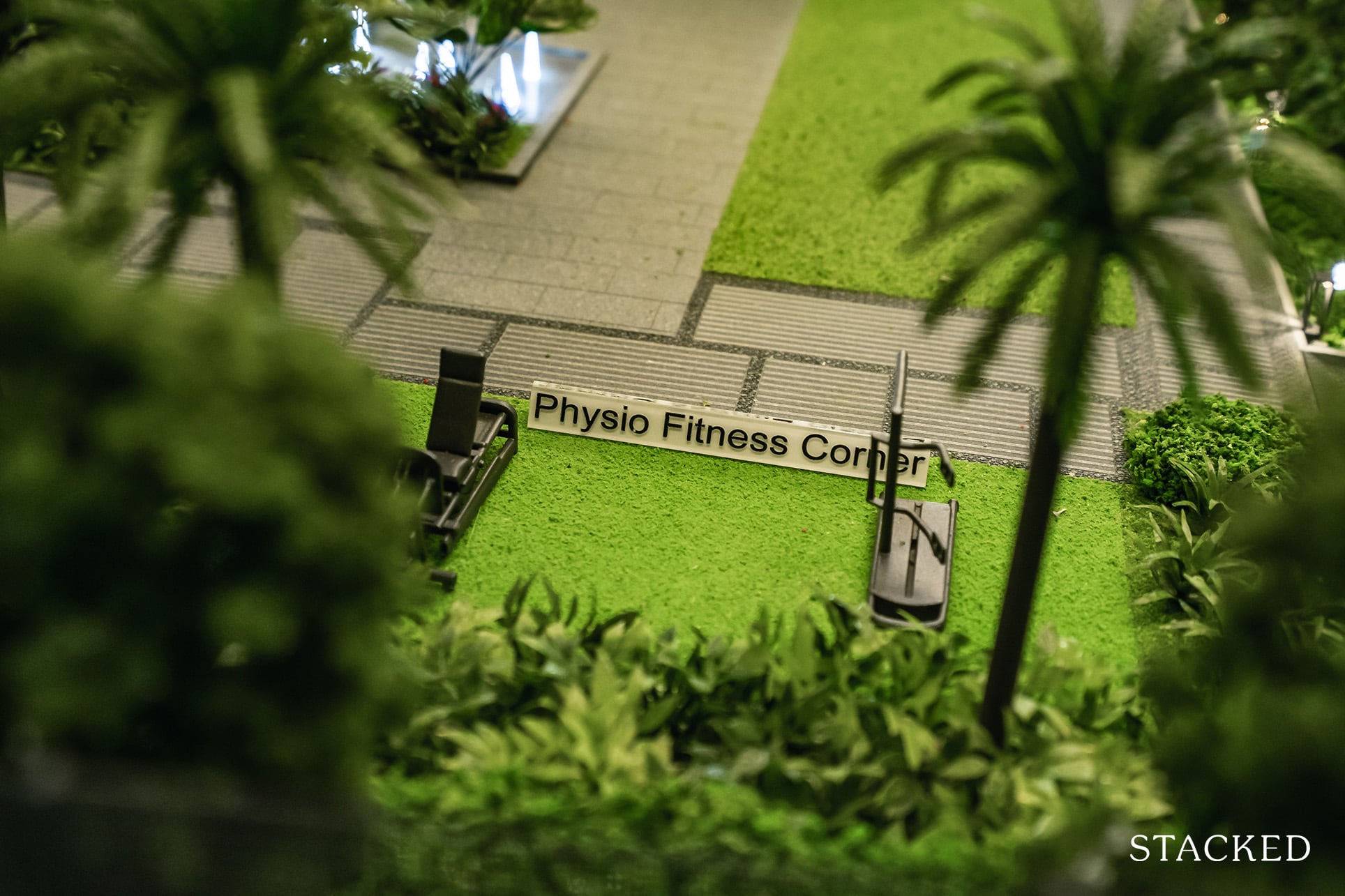
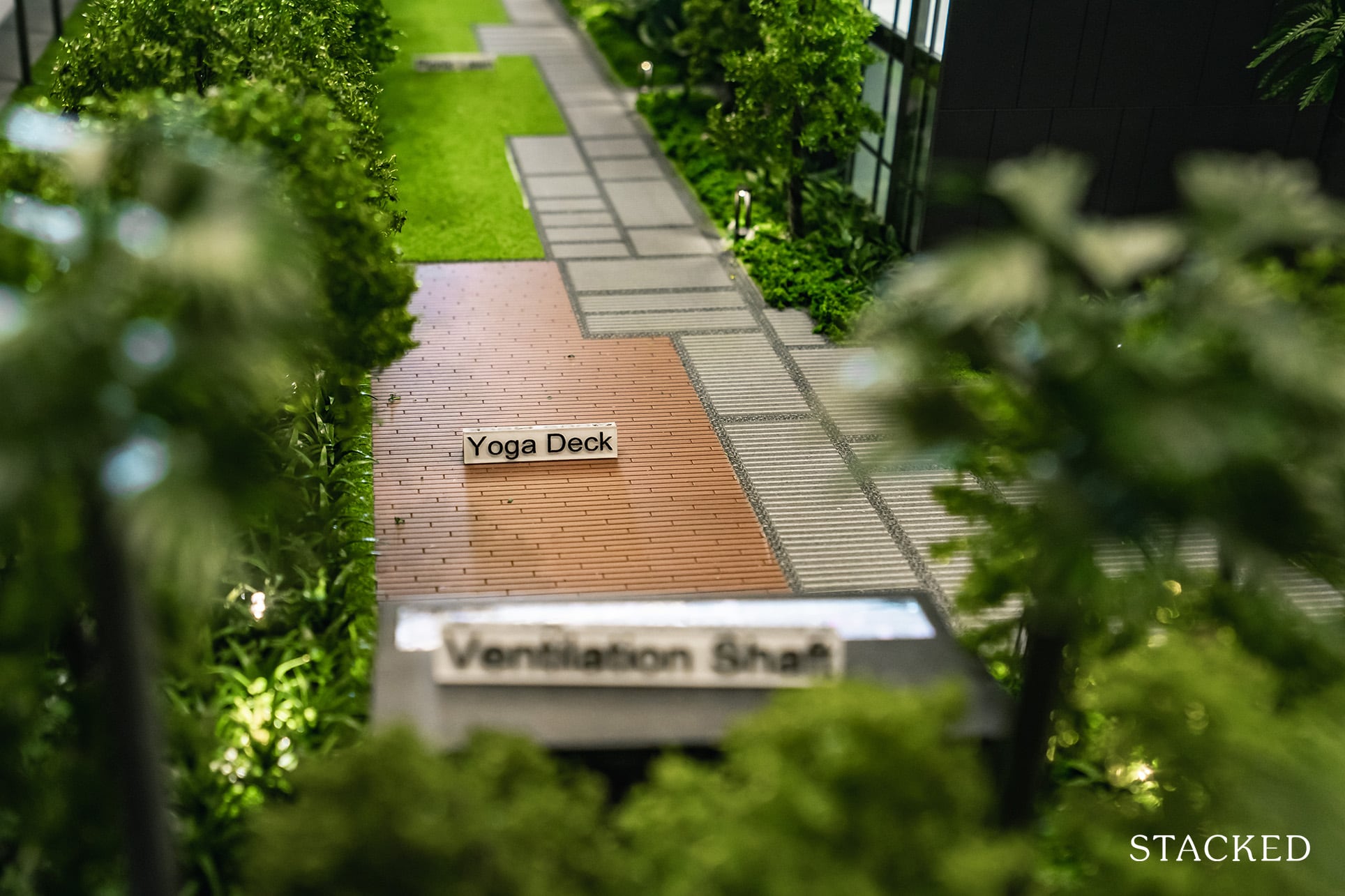
That isn’t the only place you can exercise too. There’s an outdoor physio fitness corner, as well as a dedicated yoga deck.
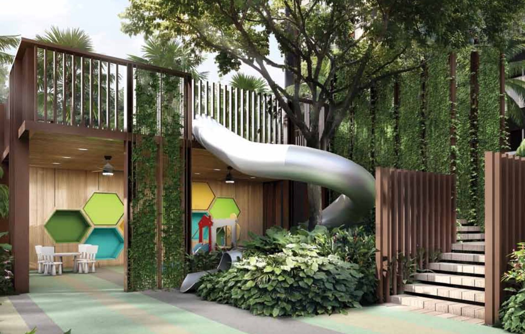
OCR projects are naturally always catered to families upgrading from HDB’s, and The Commodore is no different. With that, special attention has been given to curating children-focused activities. Of course, you have your ubiquitous playground (which is quite a decent size). But what’s unique here is the Tree House (that comes complete with a slide), Chess Corner, and Activity Room.
Again, given the upgrader target market ambitions of The Commodore, it’s great to see the effort put into sprucing up the play areas for children. Having an area to entertain kids is a godsend – so I’ve no doubt this would be a popular hotspot.
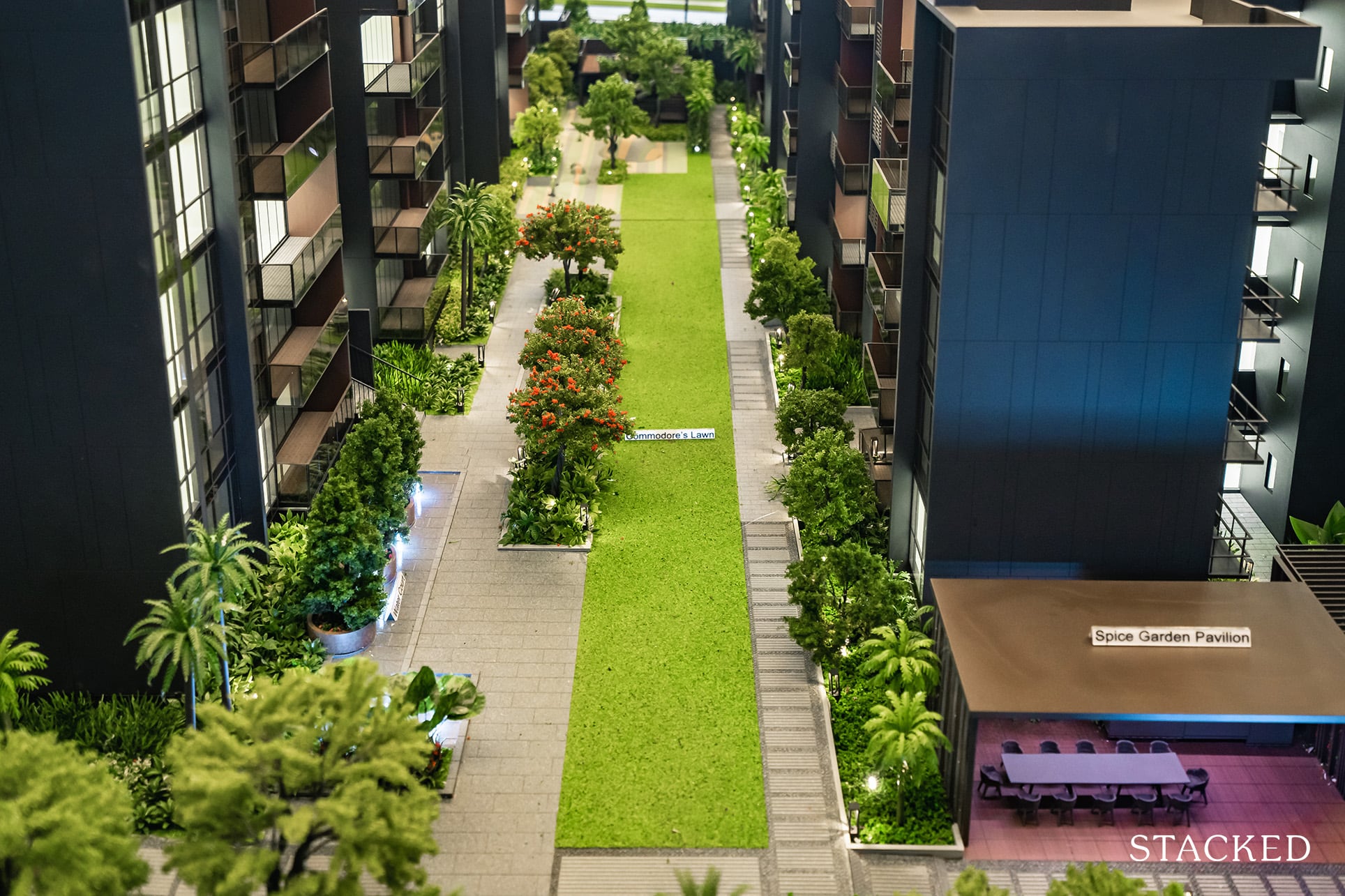
Next up is the lawn area, which is quite a sizeable space. As The Commodore isn’t a big development, it’s good to see that some space has been dedicated to an open area (even if it is sandwiched between the blocks). It’s a safe environment for the younger kids to run around, which will be much appreciated by parents.
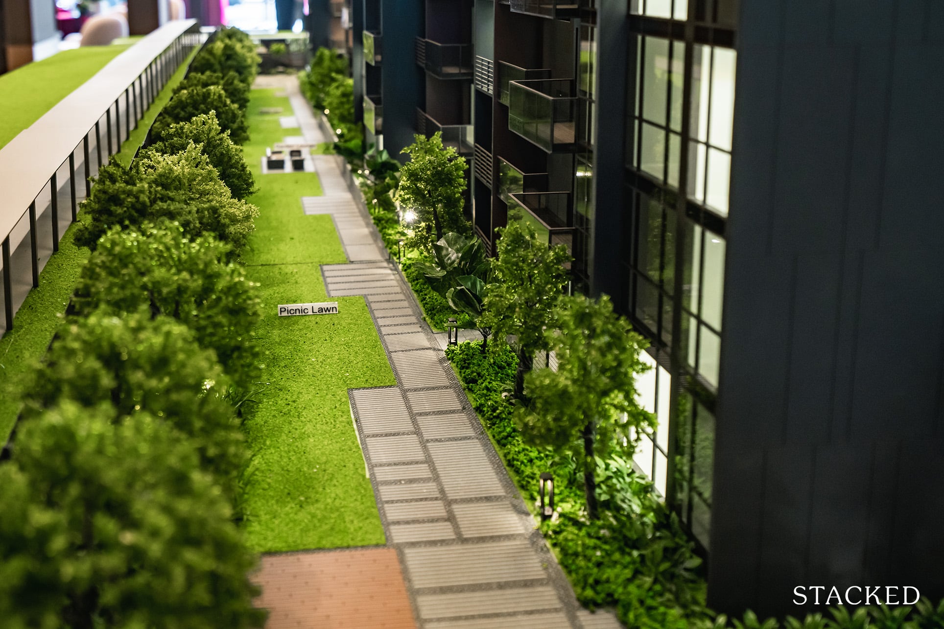
That’s not the only lawn you get, as there is also a Picnic Lawn located on the edge of the estate. It’s just a long strip of a grass patch – it’s not the widest, but nonetheless any open space is always much appreciated.
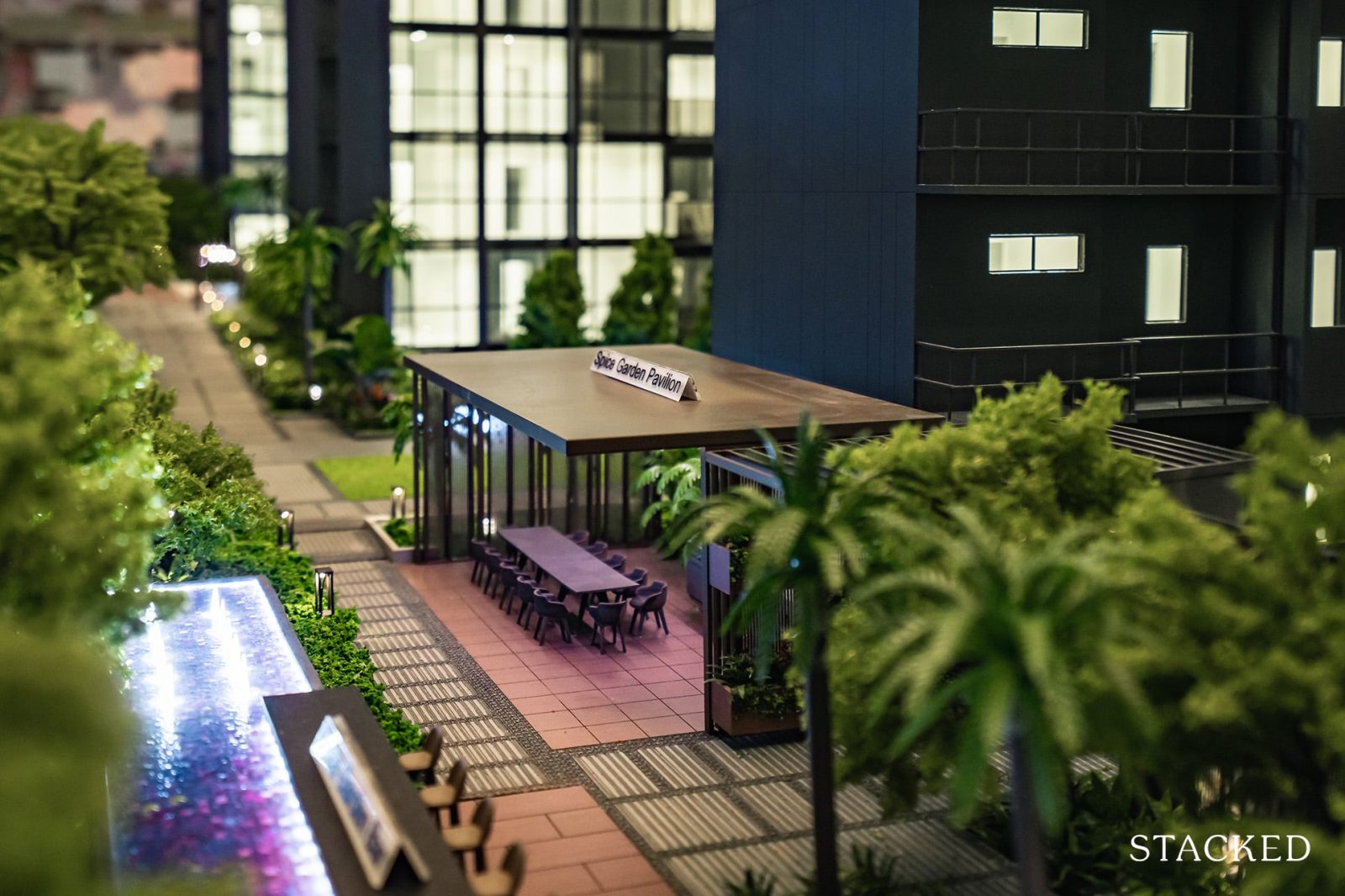
Beyond that, you will enjoy multiple dining pavilions located around the estate.
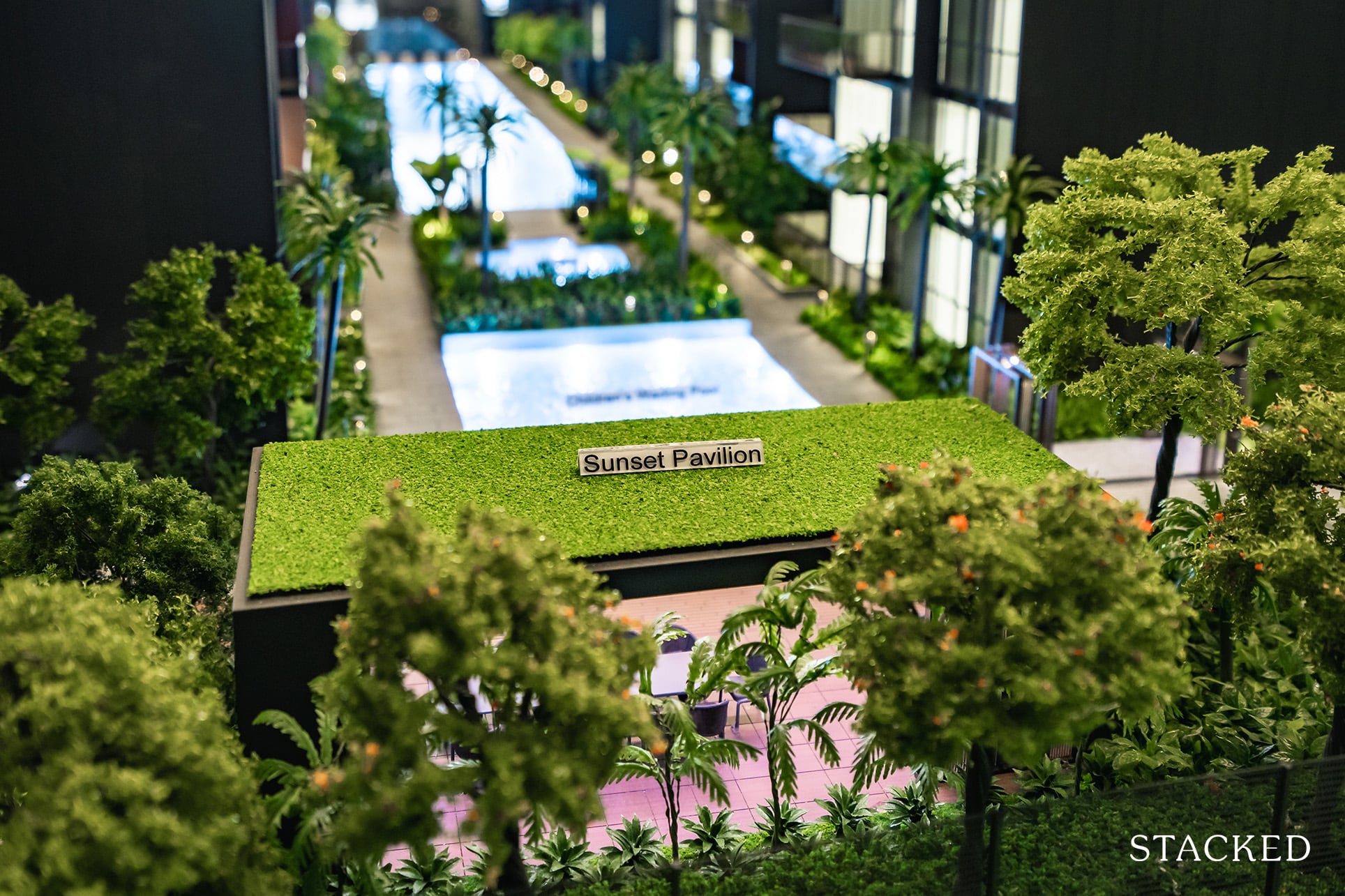
These are completely sheltered too, which is certainly practical.
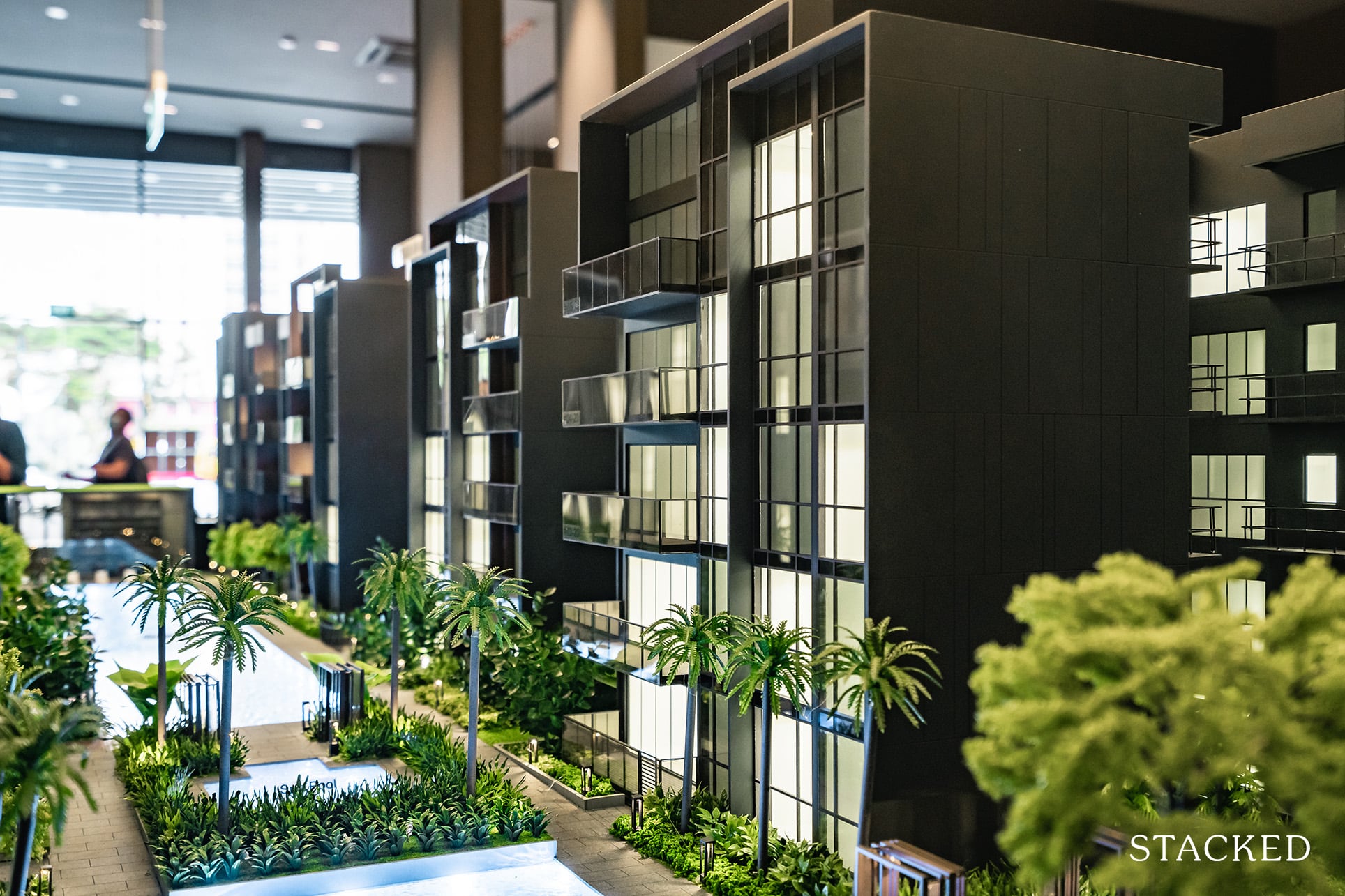
Positives aside, one possible point of contention would be the distance between blocks (as a consequence of the layout and smaller plot of land). With a range between 13 – 17 metres, it’s rather close and not everyone would like to have to face their neighbours all day. This also means that most internal-facing units will face some sort of noise, given the swimming pool and playground will be located in the centre.

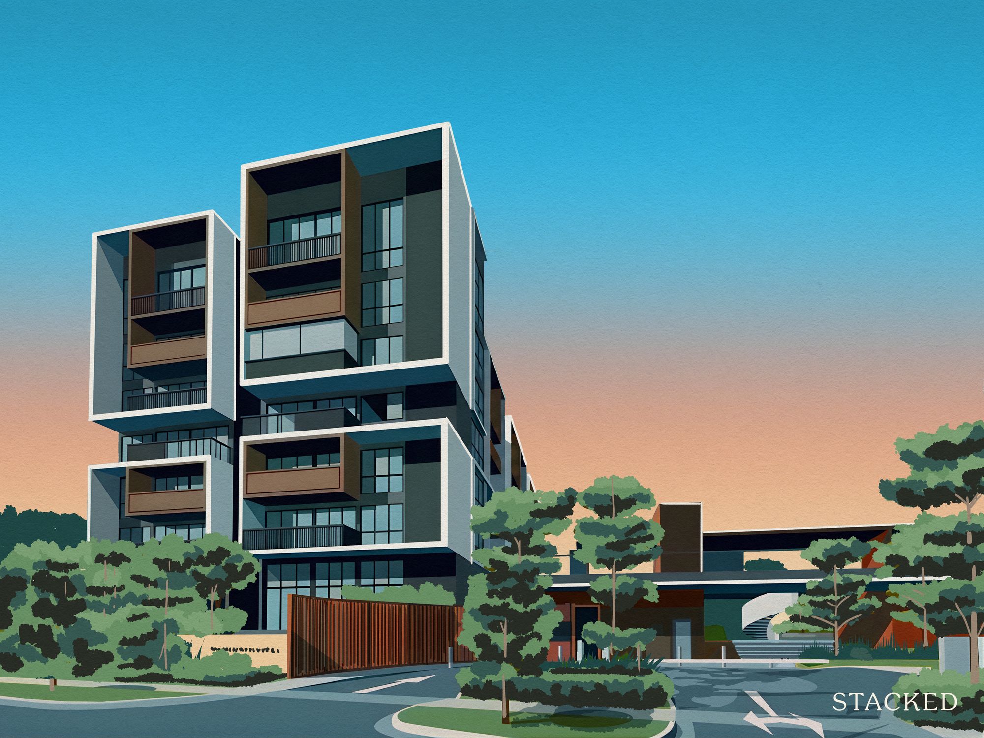
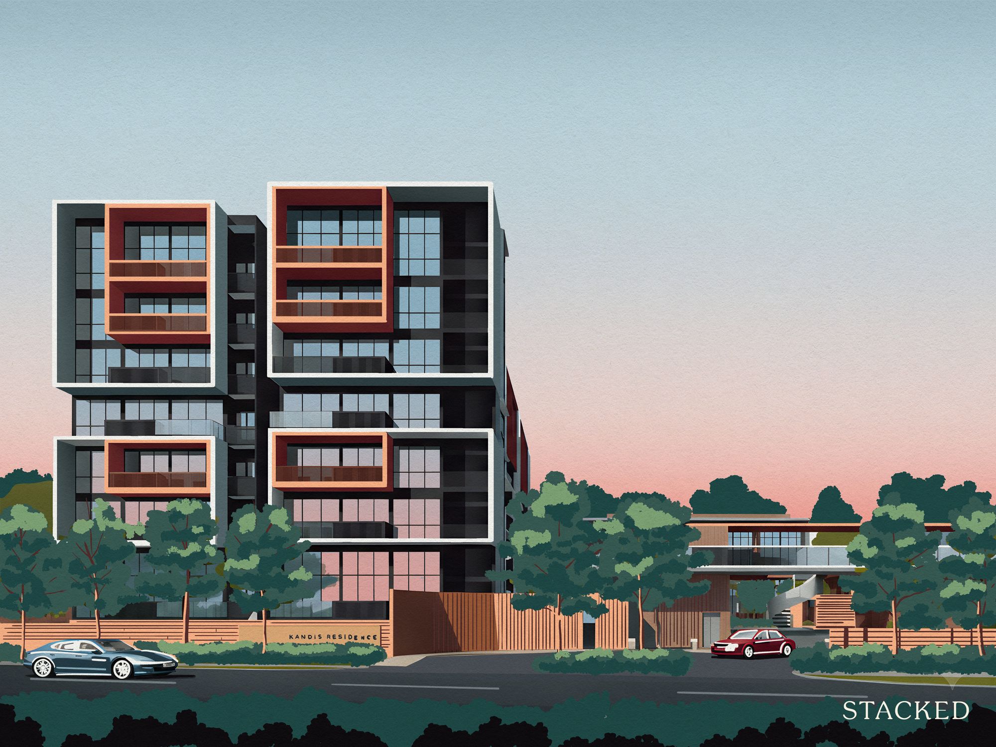
Last but not least, the design of The Commodore adopts a dark exterior which is rather sleek looking. It’s a colour palette that has been widely used by quite a few developments in the prime districts and certainly gives you that more premium feel that the developers are going for. I do prefer the look as compared to the more unremarkable exterior of The Watergardens at Canberra – it’s quite a safe choice.
The Commodore 2 Bedroom Premium + Study 753 Sq ft Review
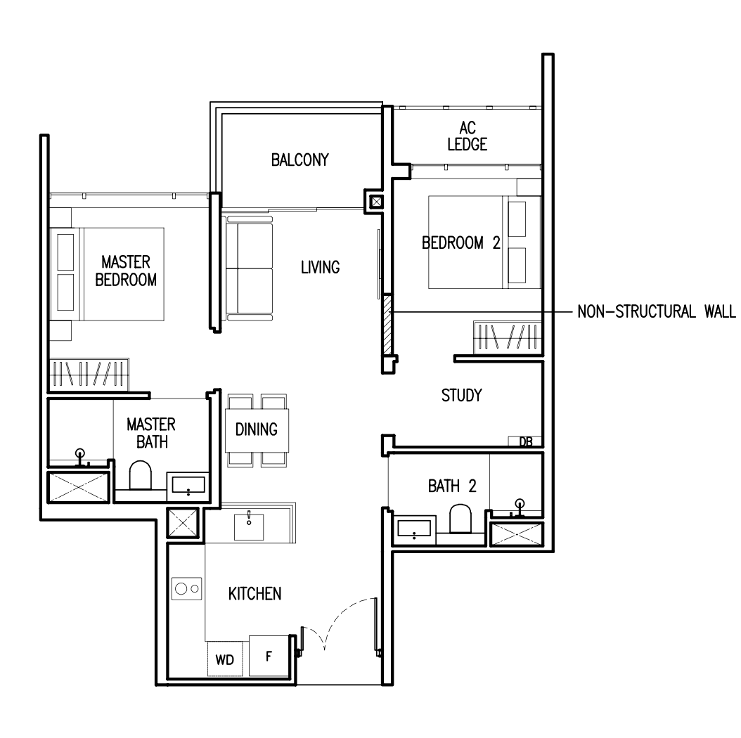
The 2 bedroom units at The Commodore range from 624 sq ft to the largest 915 sq ft (actually 786 sq ft with the inclusion of the high ceiling for the top floor unit). As the smallest 2 bedroom unit only comes with one bathroom, and the biggest 2 bedroom premium unit has an awkward entrance sharing study layout – this show flat unit is definitely the pick of the bunch practicality wise.
All in all, it’s an efficient dumbbell layout, with a semi-enclosed kitchen, decent-sized bedrooms, and a study room. At 743 sq ft it is bigger than your average new launch 2 bedroom unit so you will get larger living spaces here. For the common areas, the flooring will be porcelain tiles, with the bedrooms the usual engineered wood. Ceiling heights in the living/dining areas will be a slightly above average 2.9 metres, while the bedrooms are at 2.8 metres.
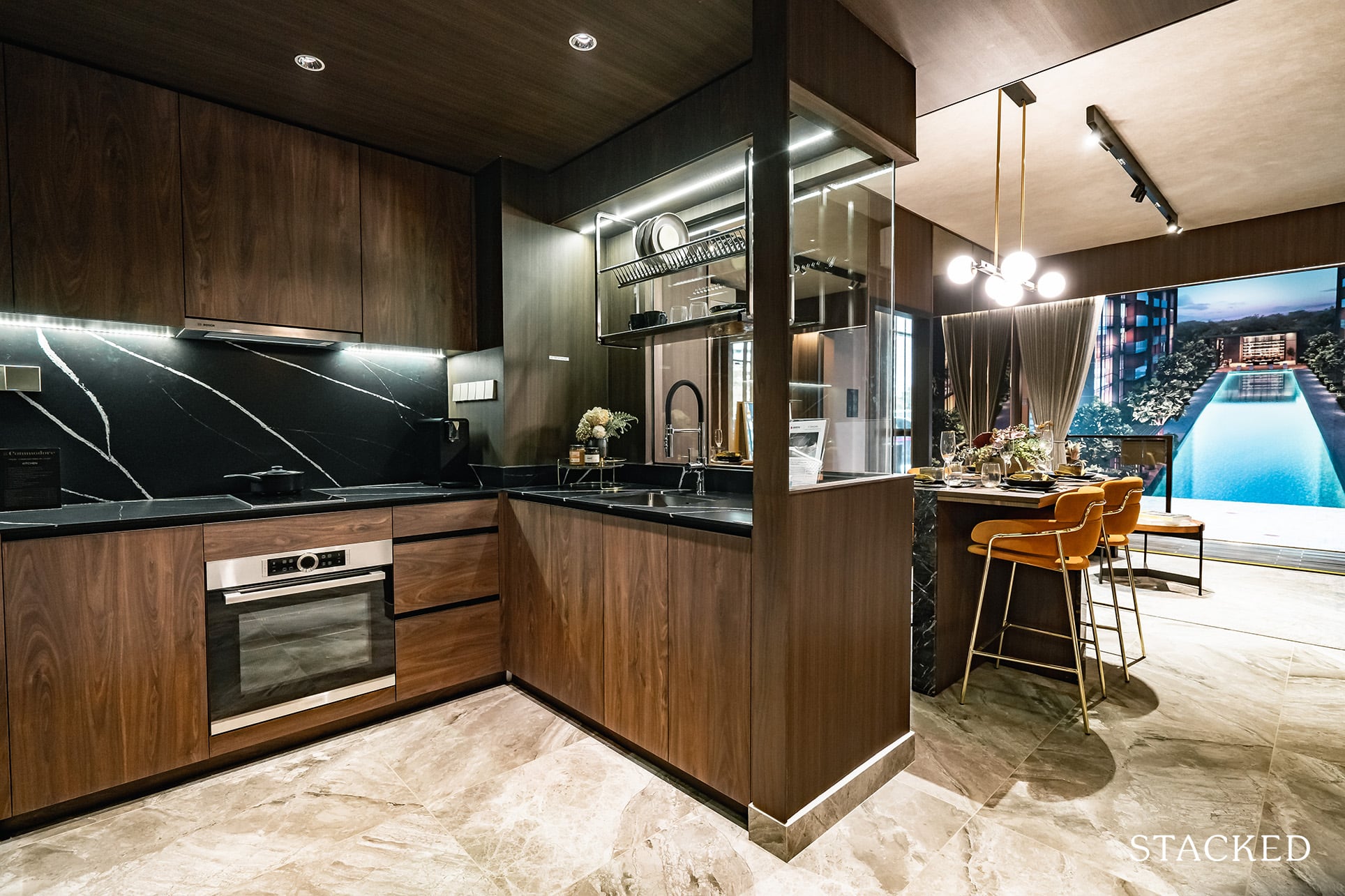
Once you step in, it’s immediately the semi-enclosed kitchen on your left and you get a good open view of the living/dining area. I’d say the dark tones of the unit (while in keeping with the exterior) doesn’t do a smaller unit any favours, but the large cutaway glass at the kitchen certainly helps with making the space feel more open.
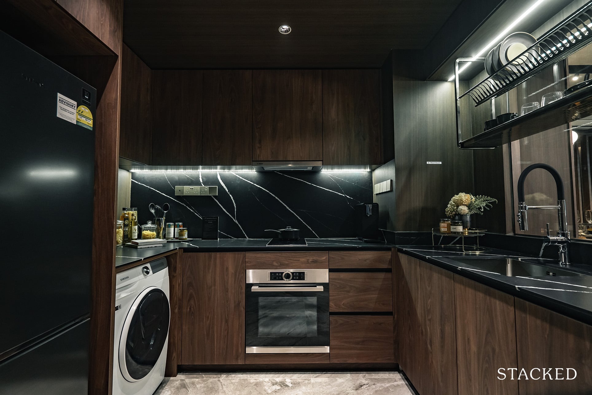
For me, the kitchen is probably the highlight of the unit. You can enclose it if you’d like, and although there isn’t a window for proper ventilation, I do generally still prefer this layout. It’s a snug space for 2 to cook in, but as mentioned above, the glass cutaway does wonders in making the space brighter and more open. Countertop space and storage is very reasonable too.
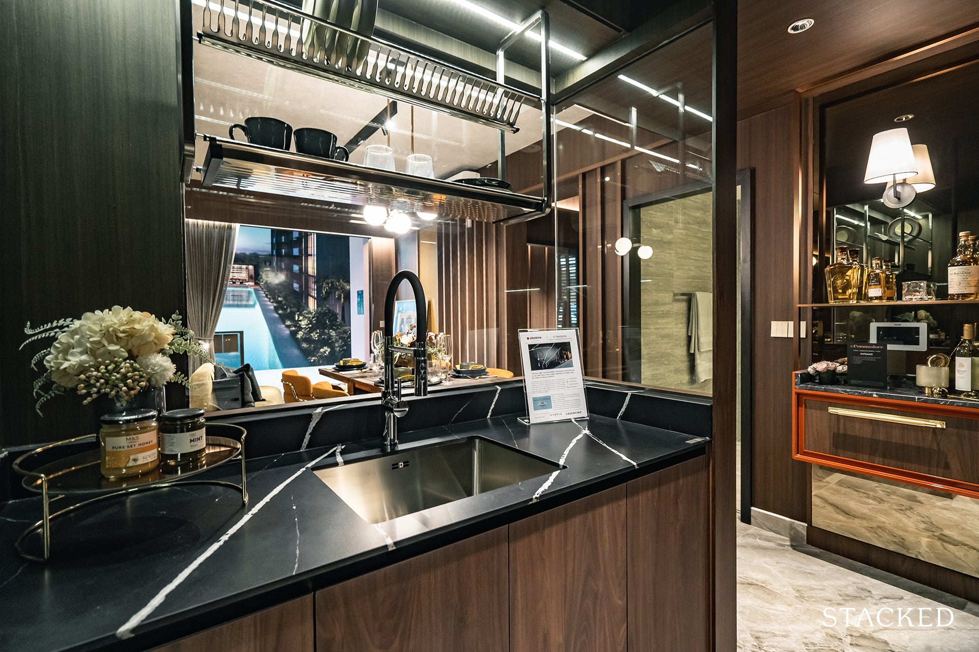
The best part is the materials and equipment used here, which reads more like a list of a luxury property instead. First up, you have a quartz countertop and backsplash from Silestone by Cosentino, it feels good to the touch and the dark colour tones does give it an overall upmarket look. The sink and tap are by Blanco, while the induction hob, hood and oven will be supplied by Bosch. The kitchen even comes with a Blum drawer system, and to cap the list of impressiveness, even the hanging dish rack that you see is included (it’s usually an ID treatment).
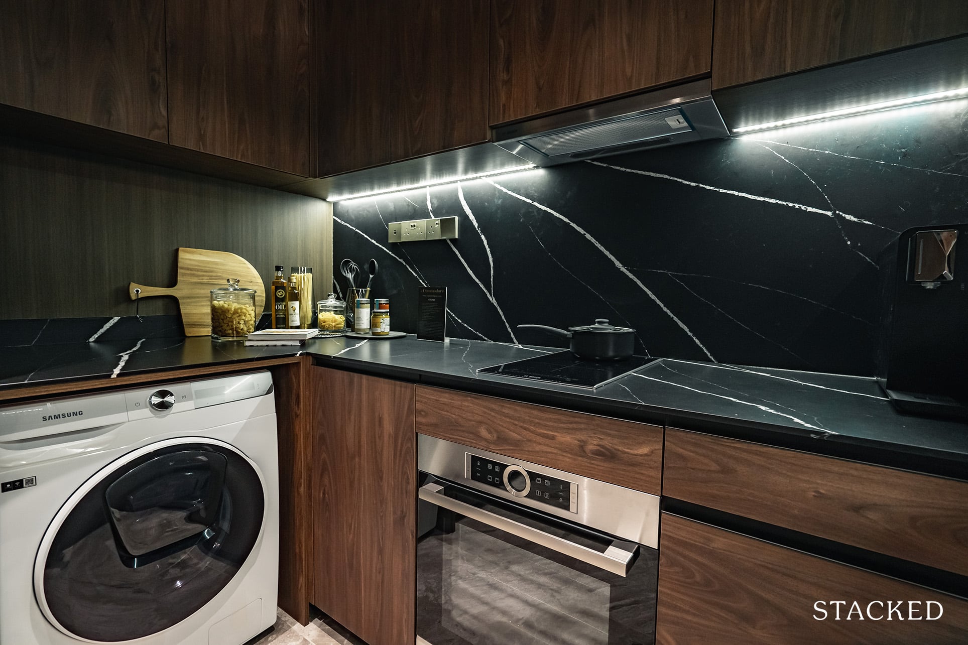
Perhaps the only weak point is the fridge, washer/dryer being supplied by Samsung. But given everything included above, I don’t think one can really complain here.
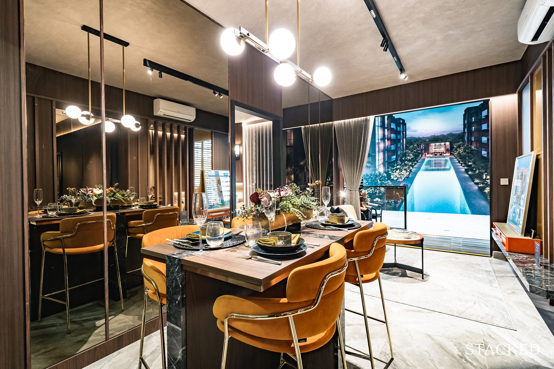
Moving further in is the dining and living areas. You’d normally see an L-shaped bench set up to preserve space so the fact that they’ve gone with a regular setup does go to show that the dining space available is rather decent. That’s not to say you can go crazy with your dining table, you’d still have to exercise some caution in a suitable size.
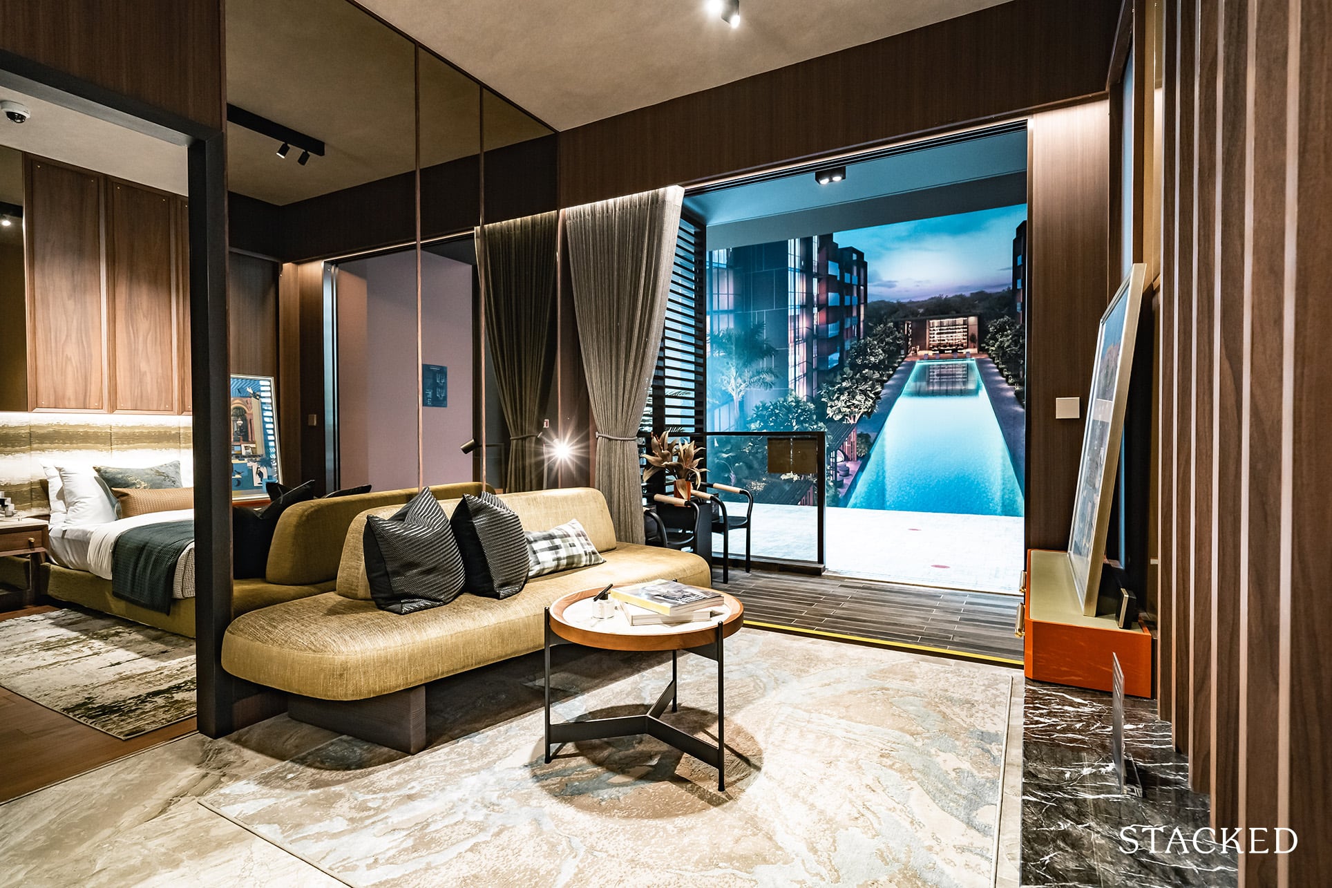
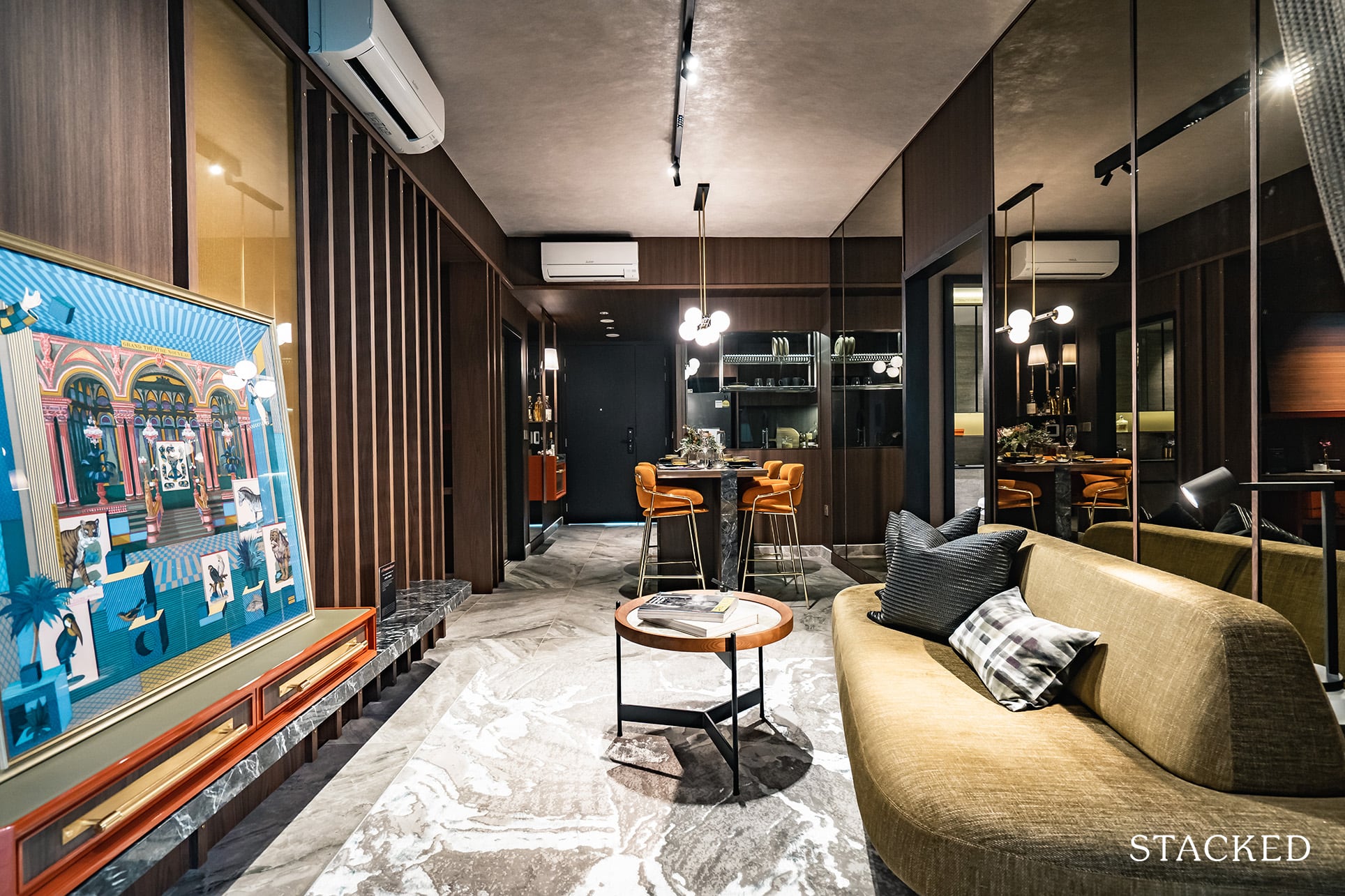
As for the living room, it’s also not bad as even with the usual suspects of a couch, TV console, and coffee table you are still able to walk to and fro from the balcony comfortably. It’s lengthwise that you have more constraints as the wall behind the sofa will be your limiting factor as to how long your sofa can be.
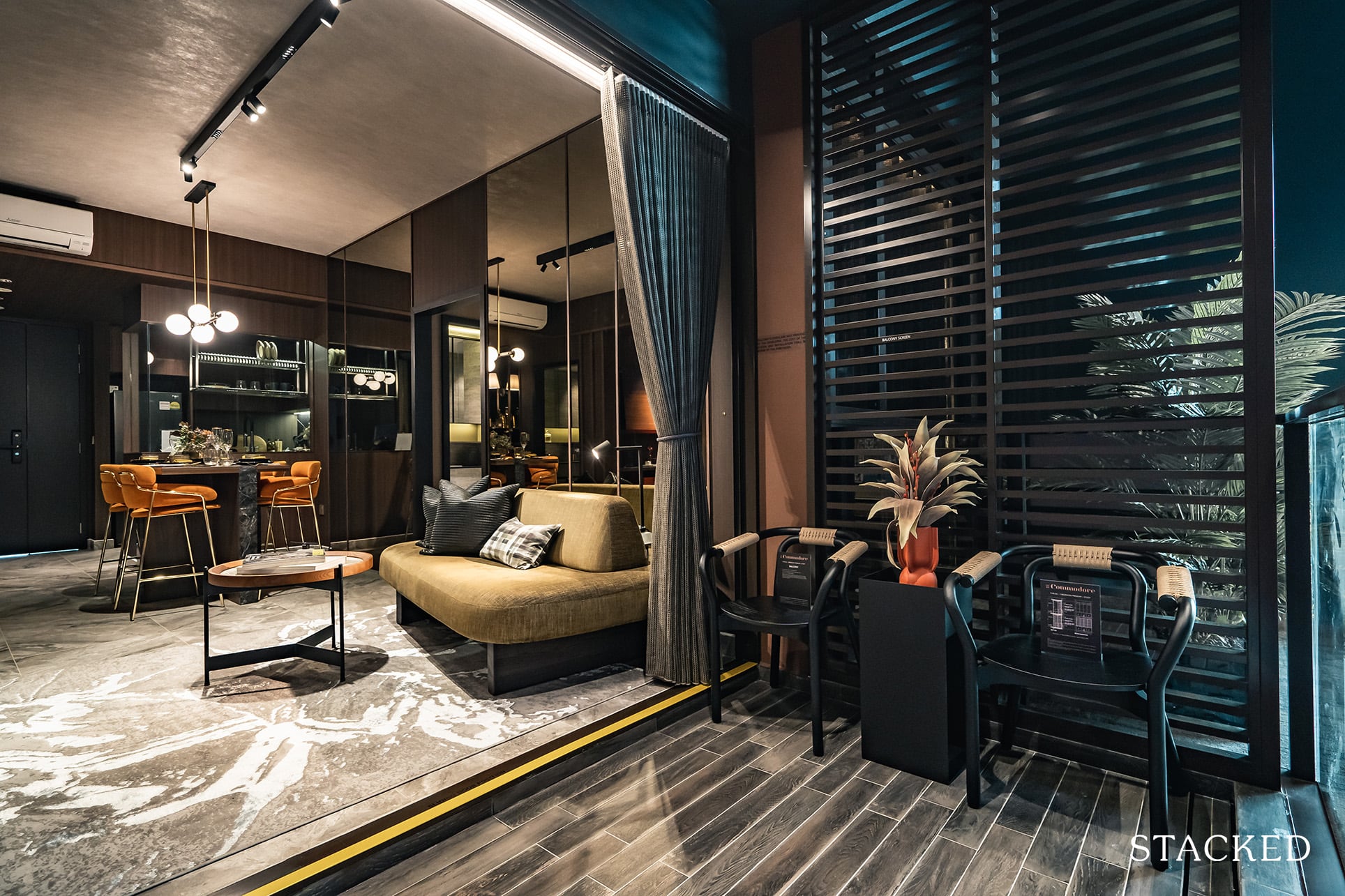
Beyond the living room is the balcony, where you can see that the size will be more than sufficient for a coffee table and two chairs. You could even dine here (albeit at a small dining table) if you so wished. As per usual, the AC ledge is located on the side, so there will be some noise emanating from it when it’s on.
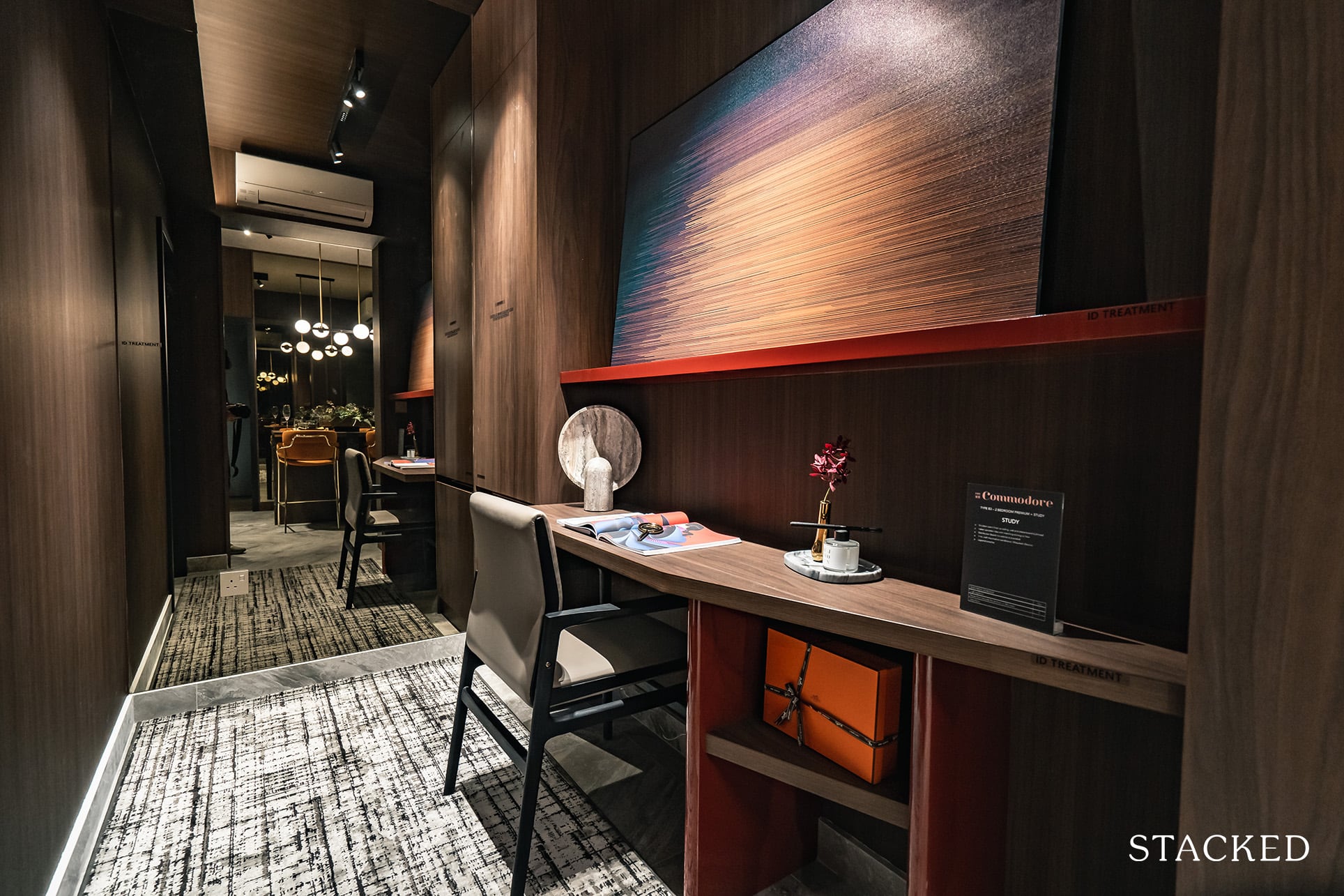
In terms of the rooms in the unit, let’s start with the study first. It’s a fair amount of space for a study area of a 2 bedroom unit, and will certainly come in very handy for those that will be in a work from home situation for some time. Of course, there are no windows here, so sadly there’s no natural light (typical in the market).
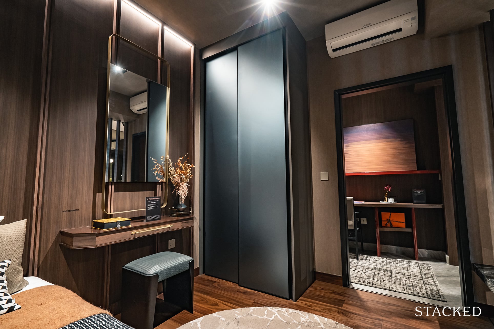
At present, you’d have to navigate through the study to get to the common bedroom, which could make sense for some. But if you’d like to separate the two, the wall is thankfully a non-structural one that can be swapped around.
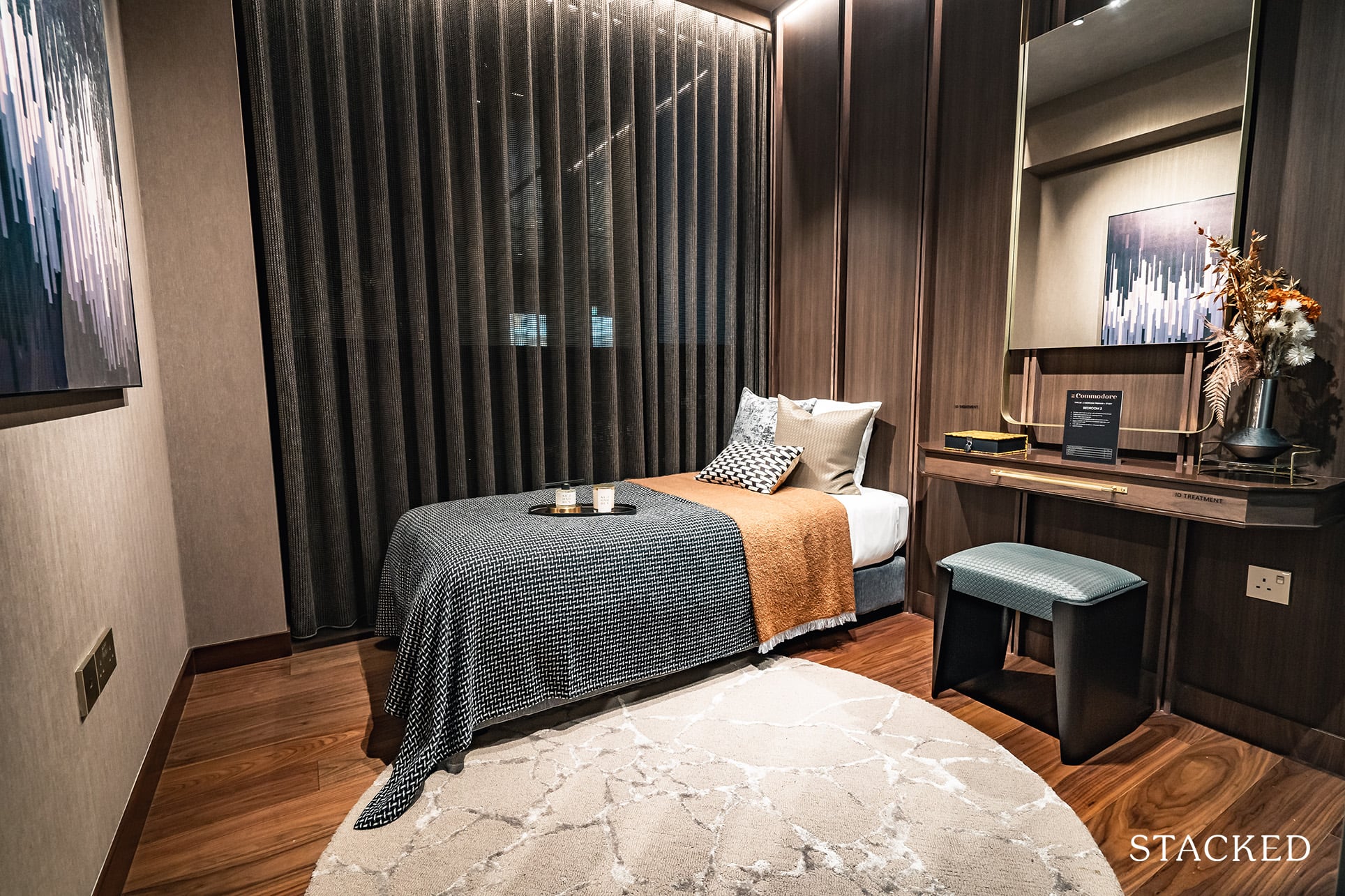
The common bedroom is very reasonably sized. You can fit in a Queen sized bed, but with this set up of a single bed and study table, it does give you a good sense of how much space there is. As mentioned earlier, the AC ledge is located on the outside, so no full-length windows here I’m afraid.
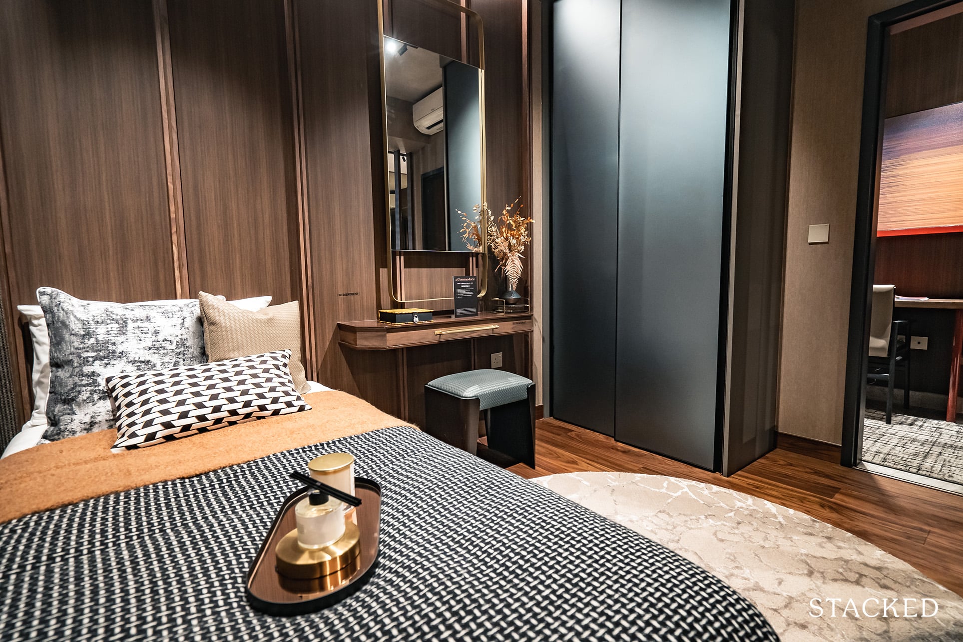
What I really like is the design of the 2-panel wardrobe. It comes with an aluminium-framed satin glass door and a melamine finish inside. It’s a really nice blue shade too, very smooth to the touch and it feels premium. As you might expect, the storage space is very typical – it’s never enough but that will always be the issue with the new launch condos of today.
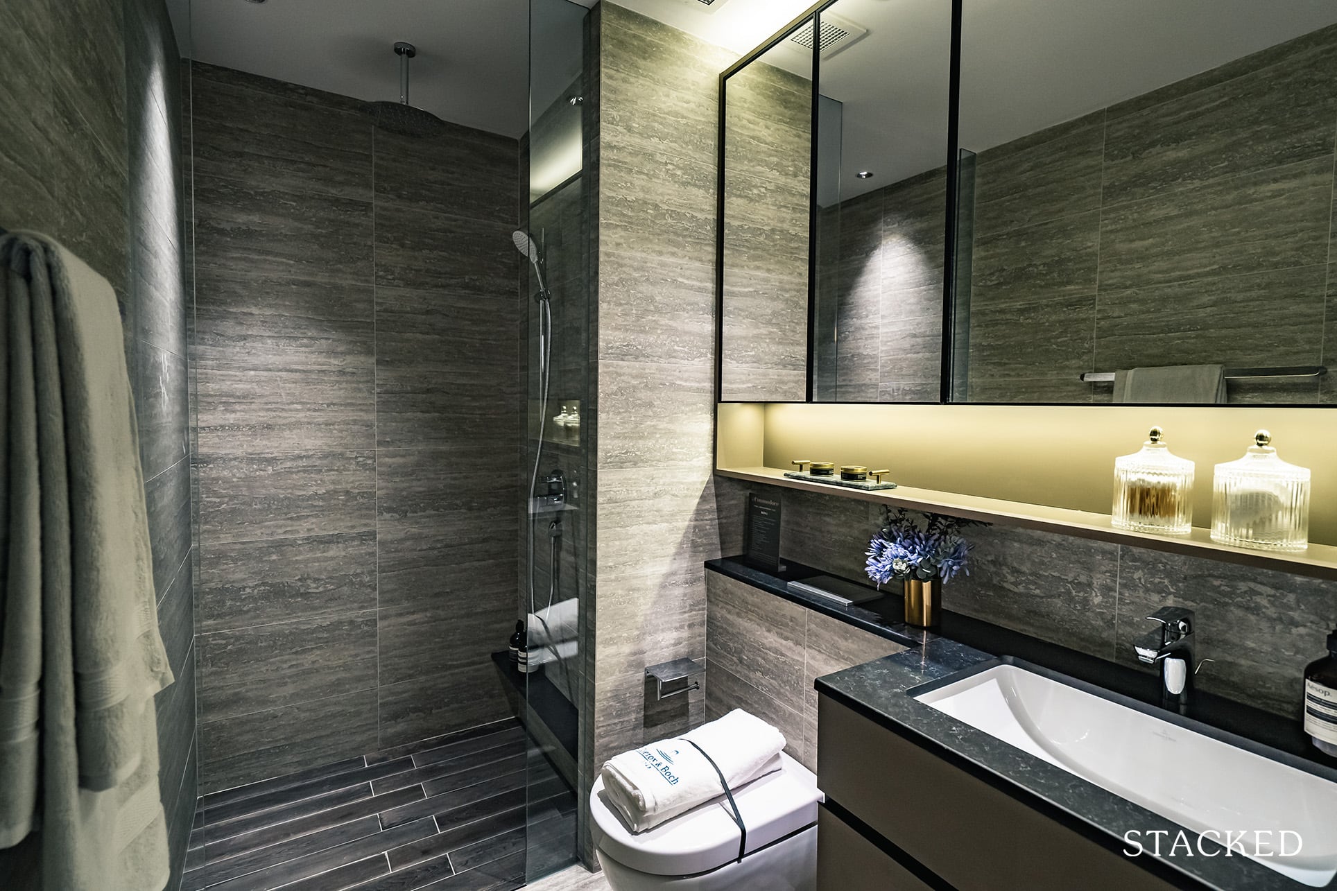
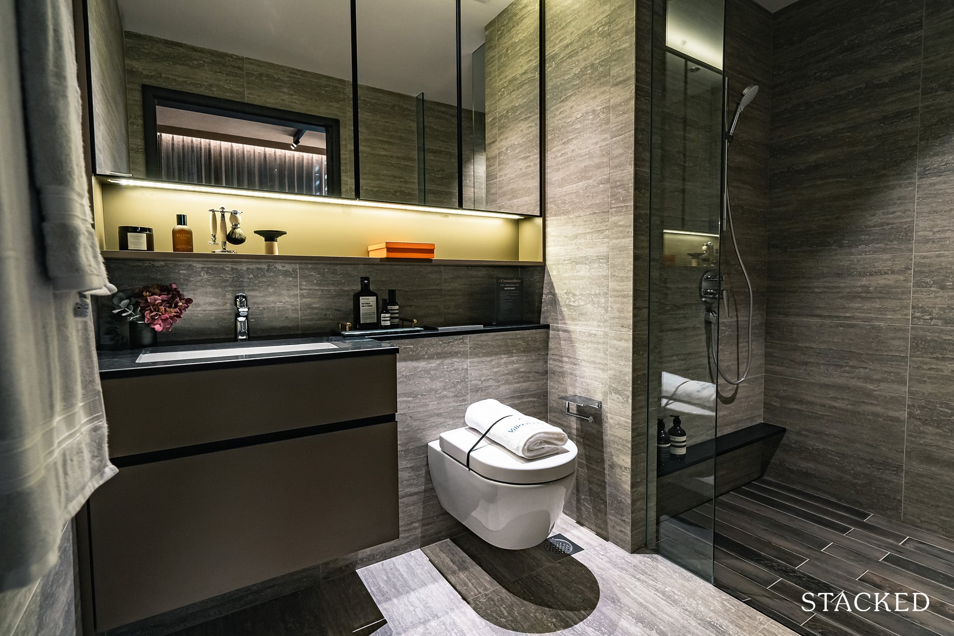
The common bathroom is located next to the study (hence, not a jack-and-jill layout). It’s not the biggest, and neither does it come with a window for natural ventilation. As for the bathroom fittings, they are supplied by your usual suspects Hansgrohe and Villeroy & Boch – so no real surprises there. A big, and pleasant surprise here is the inclusion of a rain shower. Yes, even in the common bathroom!
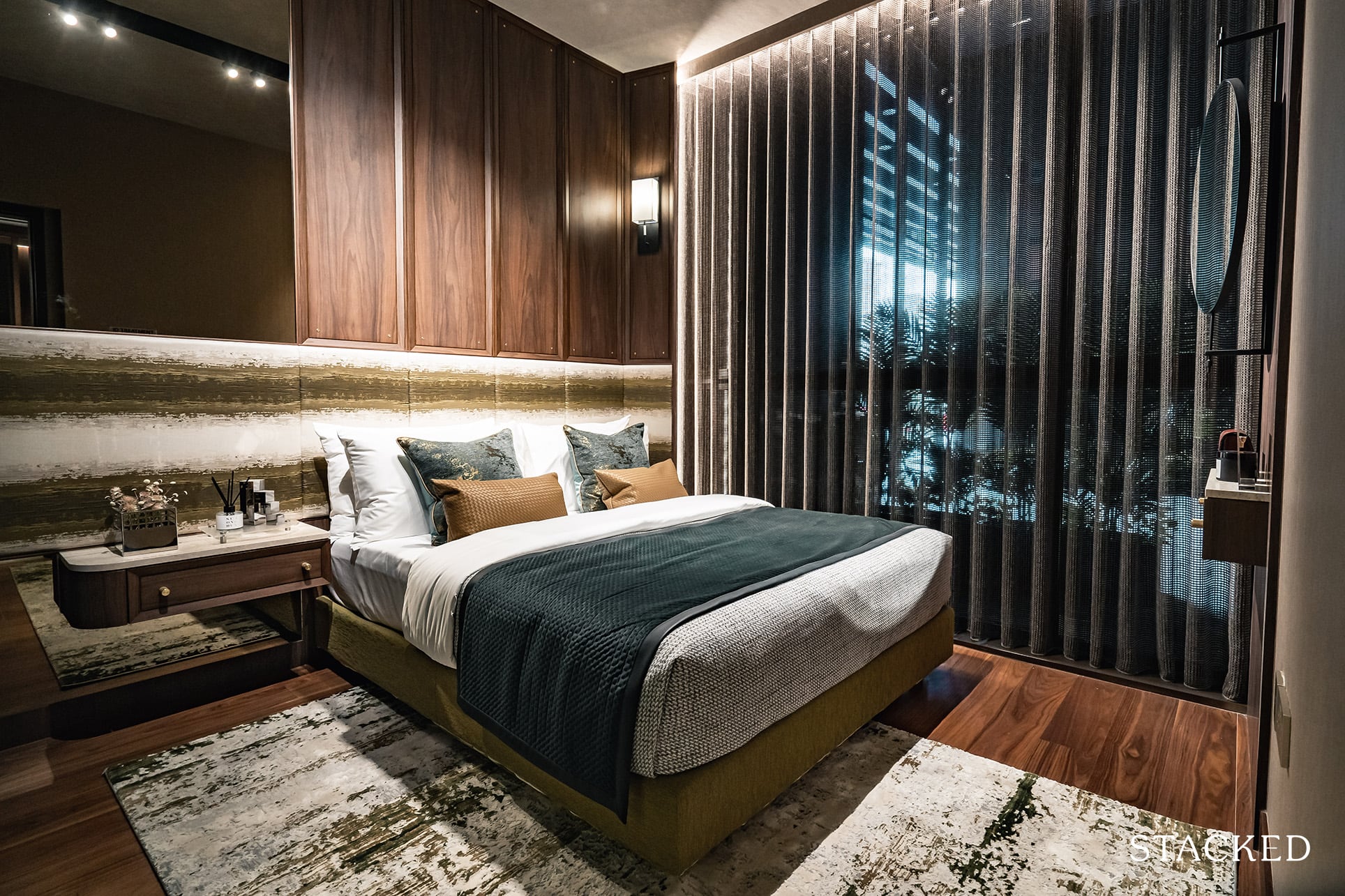
Last but not least is the master bedroom. It’s very decently sized, even with a King sized bed involved. You do get the luxury of floor-to-ceiling windows here, and the 2-panel wardrobe comes with that similar satin glass finish that you’ve seen in the common bedroom.
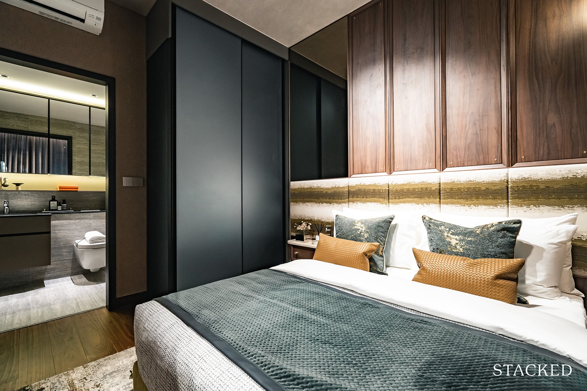
In most other new launches I’ve seen, the common bedrooms will get a more economical treatment to the wardrobe than the master bedroom – so it’s good to see that they’ve been consistent throughout.
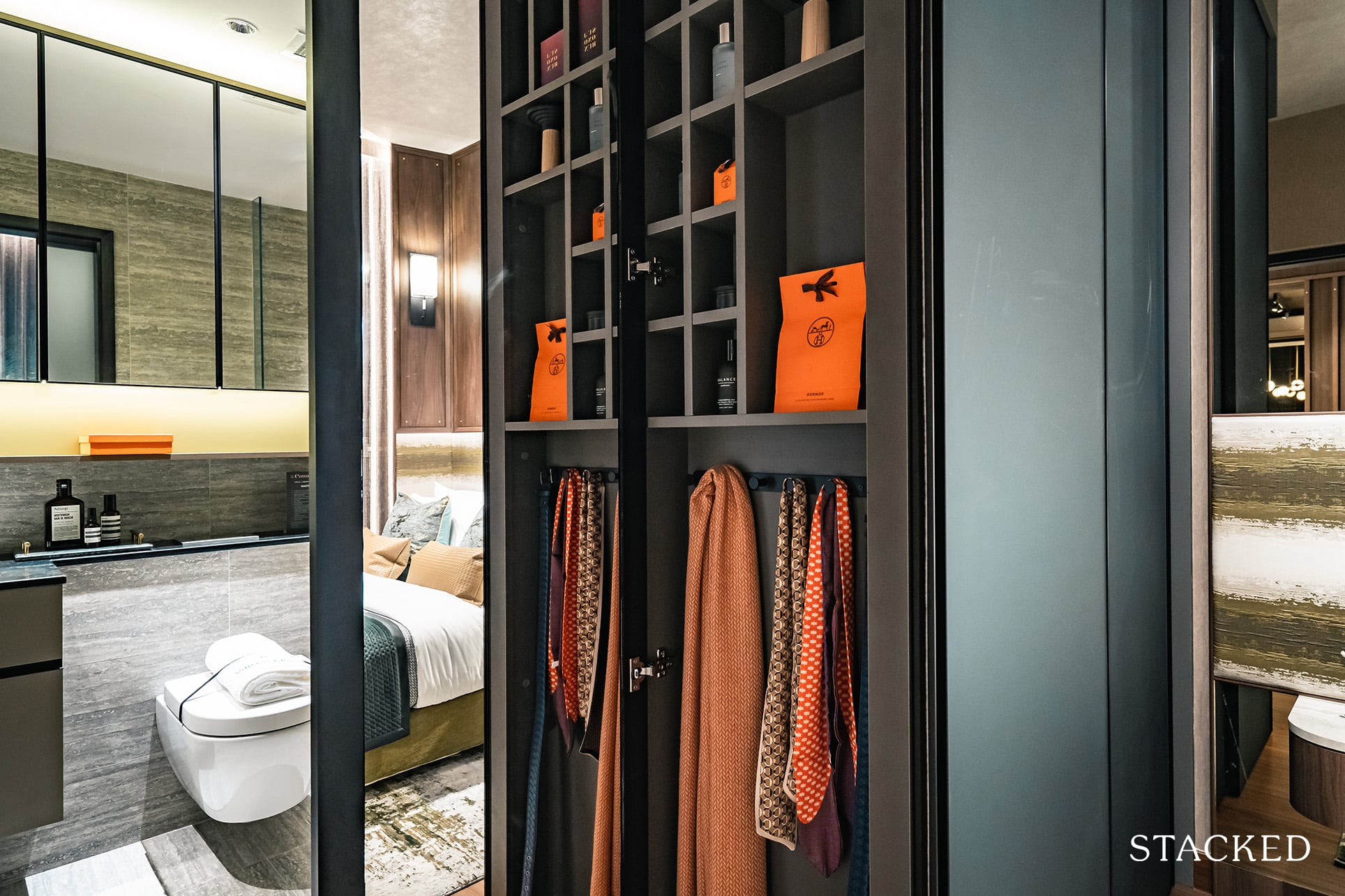
Special mention will have to go to the accessories panel that is accessible from the side of the wardrobe. Although it must be said, this is becoming an increasingly standard feature across most new launches today.
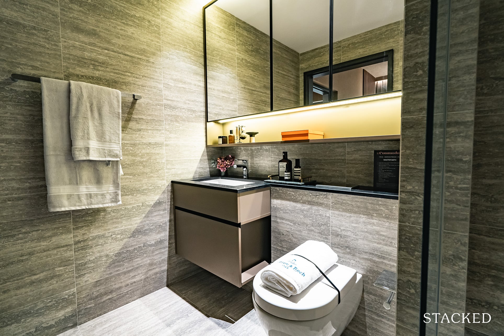
The master bathroom is an average size. Bathroom fittings will be provided by the same Hansgrohe and Villeroy & Boch, and of course, you have a rain shower included here as well. Similarly to the common bathroom, there’s no window here so you’d have to be careful when it comes to ventilating the space properly.
The Commodore 4 Bedroom Exclusive + Study 1,647 Sq ft Review
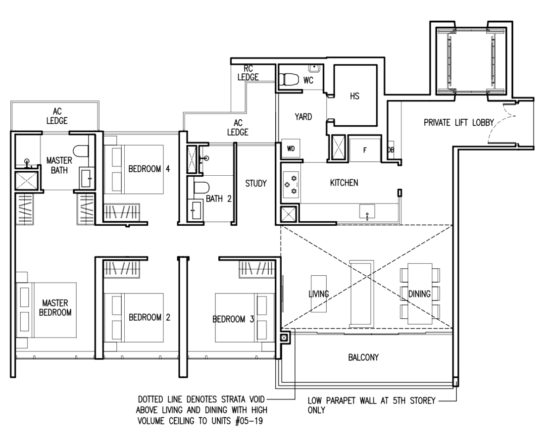
As for 4 bedroom options at The Commodore, you do have a range of options to choose from. From a compact 1,184 sq ft to the biggest available unit at 1,658 sq ft. The show flat unit is a 1,647 sq ft Exclusive series, with the biggest difference in the provision of a private lift. They’ve also chosen to show the penthouse unit, as this shows the addition of the high ceiling in the living area. It’s a good 5.2 metres high, but do note that the void space is included – so the total usable floor area is effectively 1,421 sq ft.
For the common areas, the flooring will be porcelain tiles, with the bedrooms the usual engineered wood.
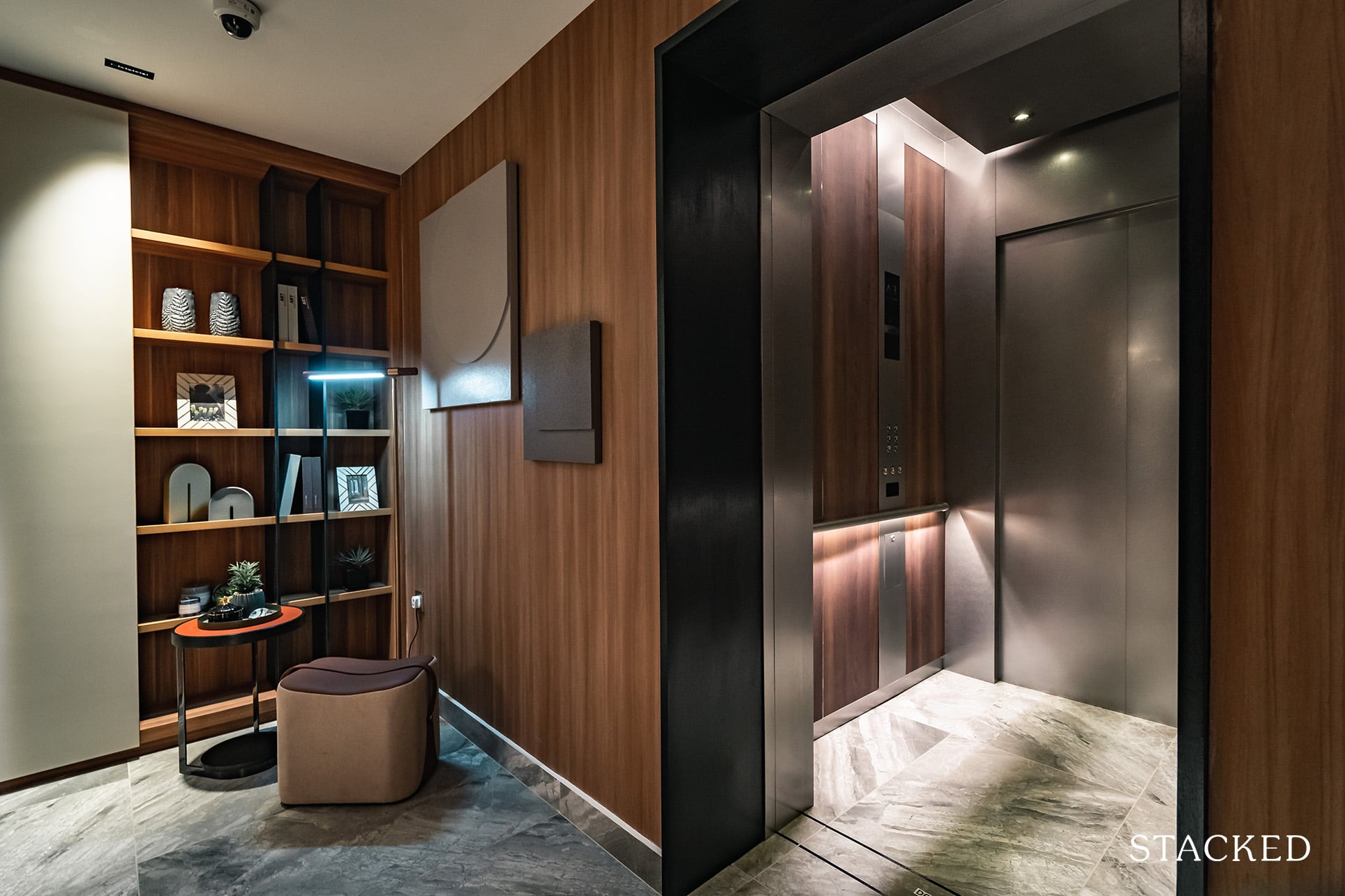
Stepping into your unit, you’d first be greeted with the entrance on the right, and the secondary entrance on the left. This is quite a different layout from the usual as the second entrance is usually located in the yard area instead. So while you do get more use out of the yard in this instance, I do prefer the second entrance to be by the yard instead for privacy reasons.
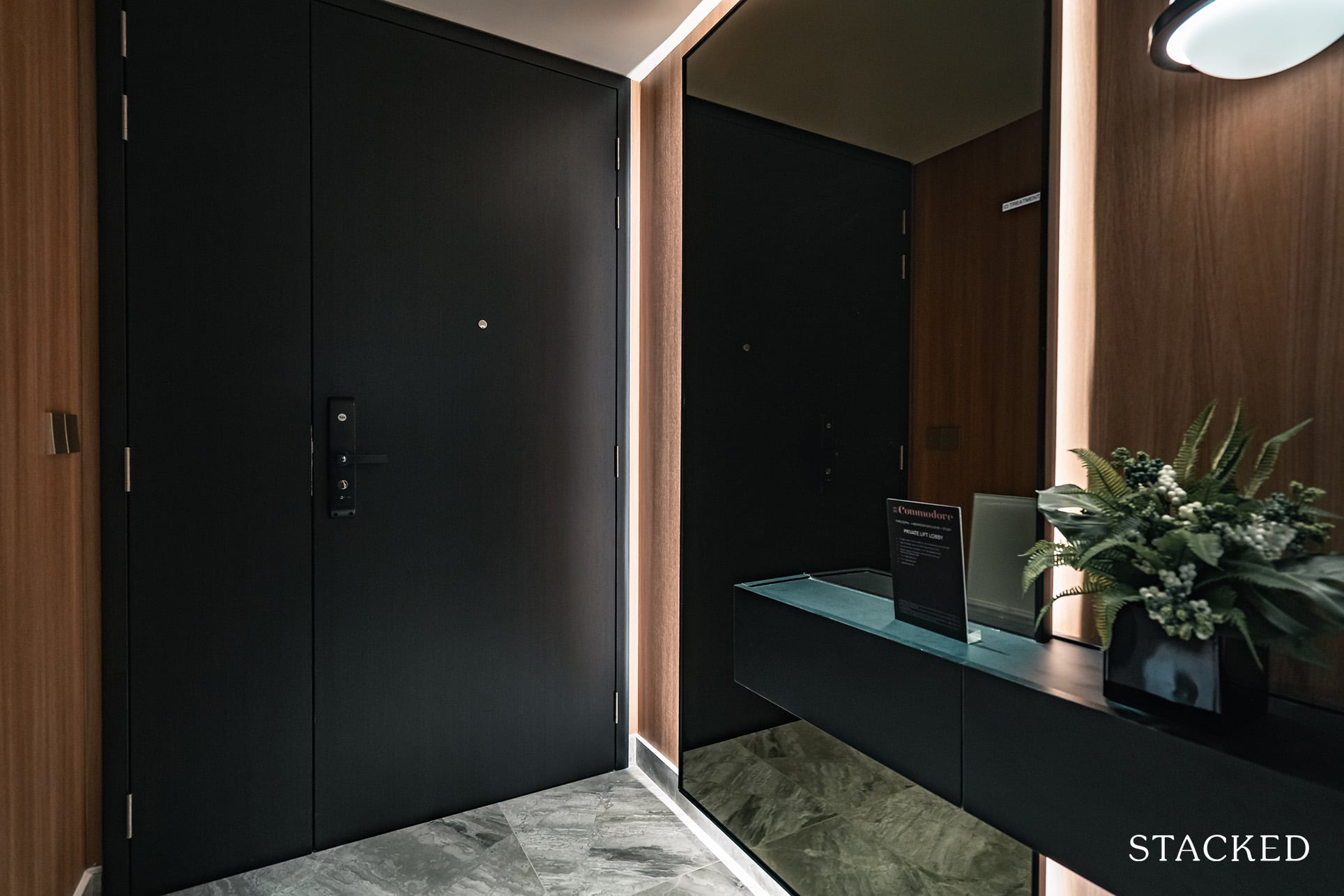
Having the luxury of a private lift access is definitely not common in OCR projects, and so this sets it apart from others (particularly its close competitor, Watergardens at Canberra).
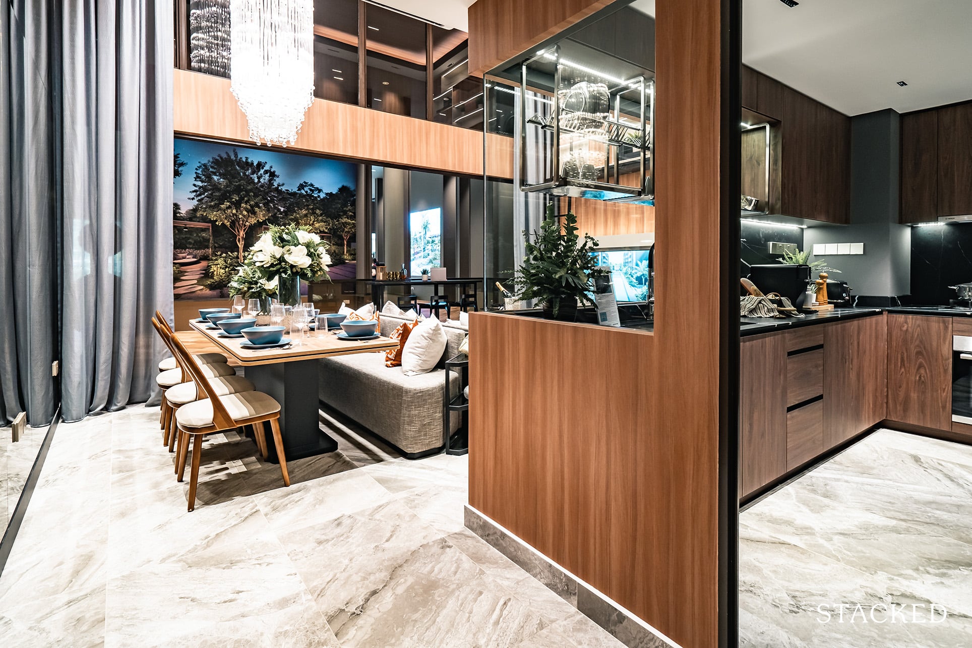
Next up is the kitchen, where like the smaller 2 bedroom unit – a big part of the kitchen involves a glass cutaway. Again, it’s smart to do so here as it makes the space look less tight and a lot brighter. I’d say it’s even more important here given the darker tone of the kitchen, otherwise, it could just look too enclosed and claustrophobic.
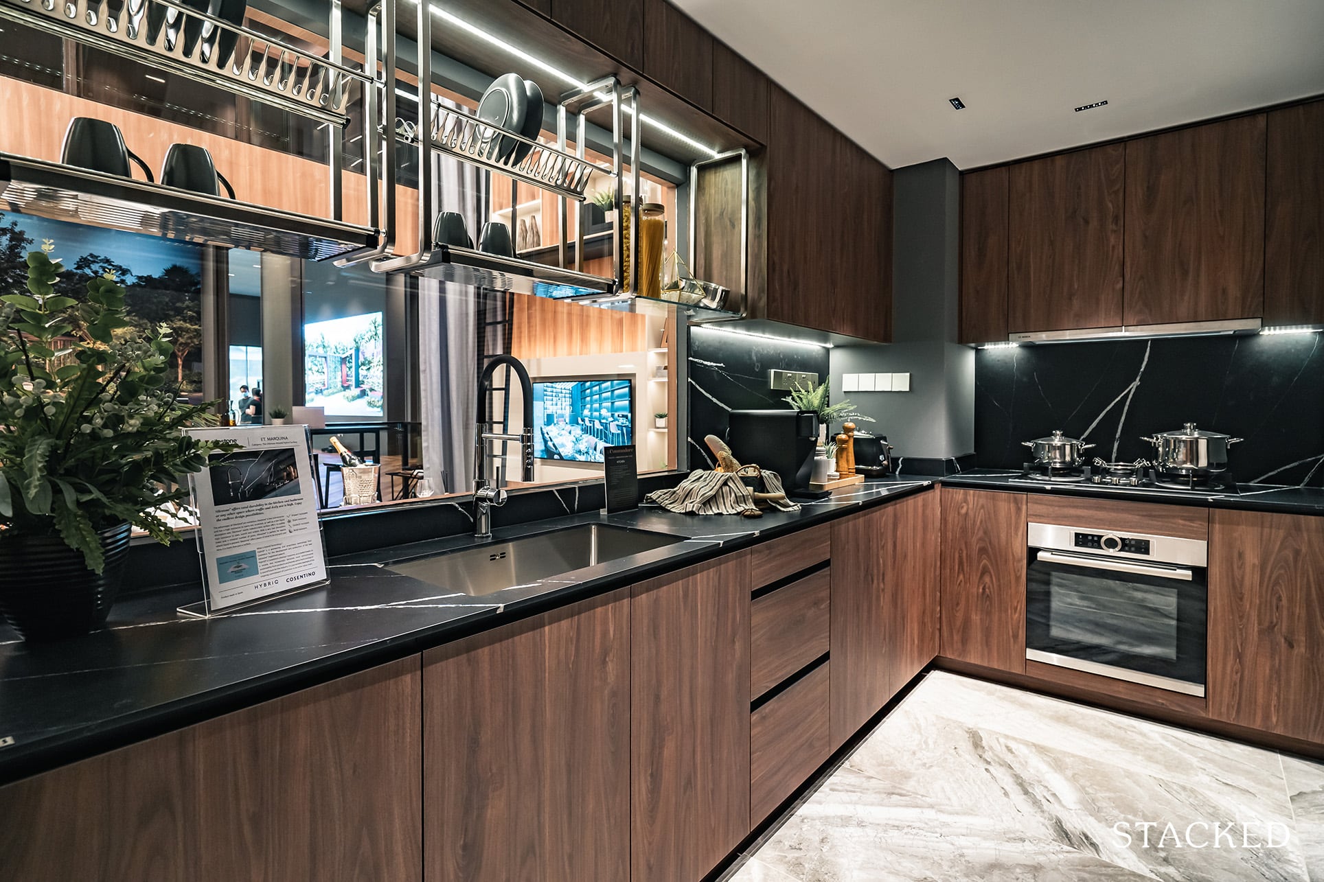
The kitchen itself is an okay size when you match it up to its 1,421 sq ft size (not 1,647 sq ft remember). Those who are looking out for a wet and dry kitchen will probably be disappointed to learn at this point that there isn’t such an arrangement. As compared to the smaller 4 bedroom unit at Midwood this is perhaps a little disappointing, even though you do get larger bedrooms at The Commodore.
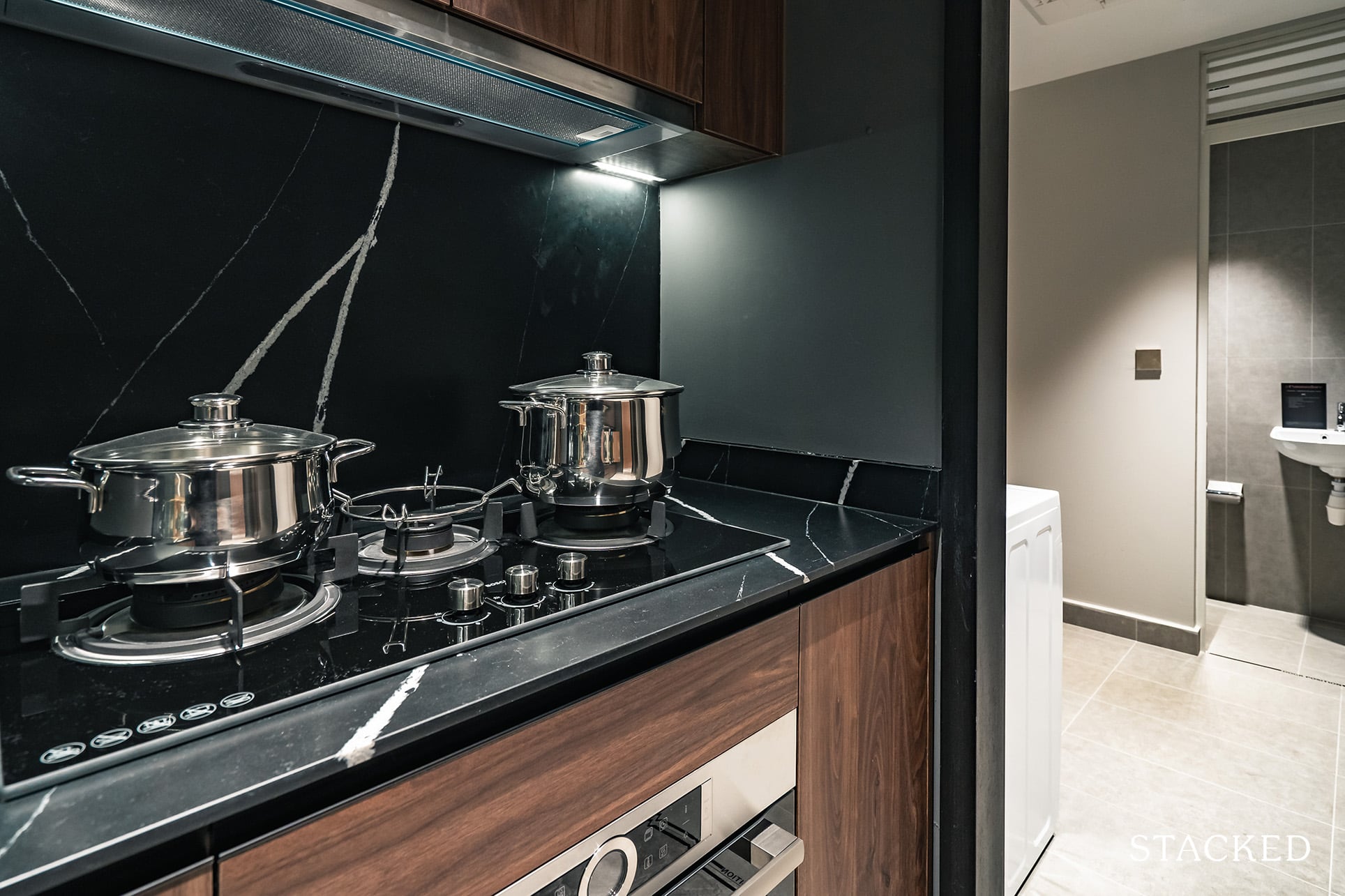
Besides the size, you do get all the bells and whistles here too. It’s very similar fare to the 2 bedroom unit, with a quartz countertop and backsplash from Silestone by Cosentino. The sink and tap are by Blanco, while the fridge, washer/dryer is provided by Samsung. Instead of an induction hob, this 4 bedroom unit will come with a gas hob (which is usually expected for the larger units). So the hob, hood, and oven will be supplied by Bosch.
Rounding the features will be the Blum drawer system, as well as the very useful and conveniently placed hanging dish rack above the sink.
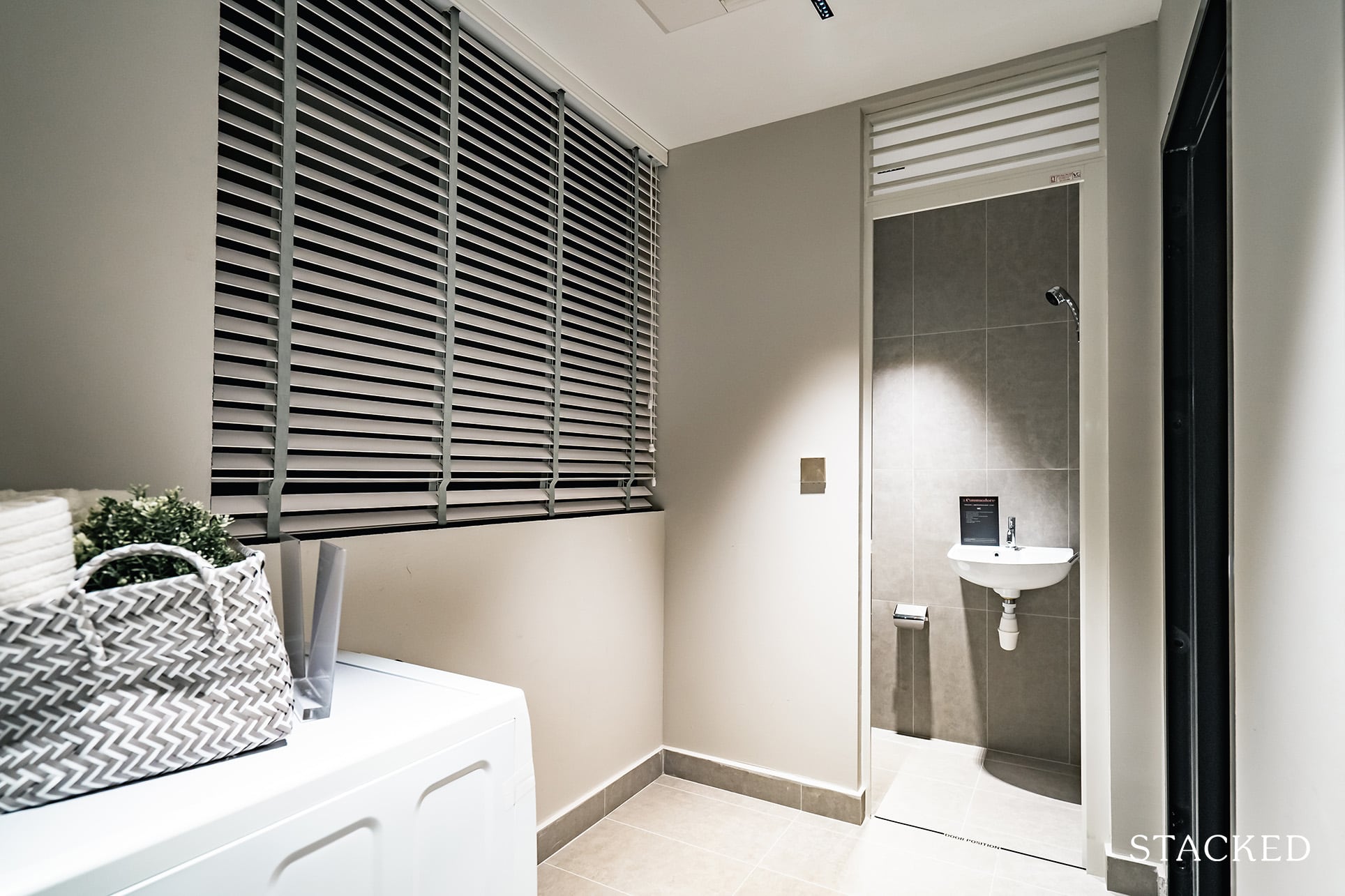
Beyond the kitchen is a proper yard. Many people forget about the practical needs of having to dry clothes, and usually, the balcony ends up having to be sacrificed as the clothes drying spot. So it’s great to see that there’s a dedicated yard here.
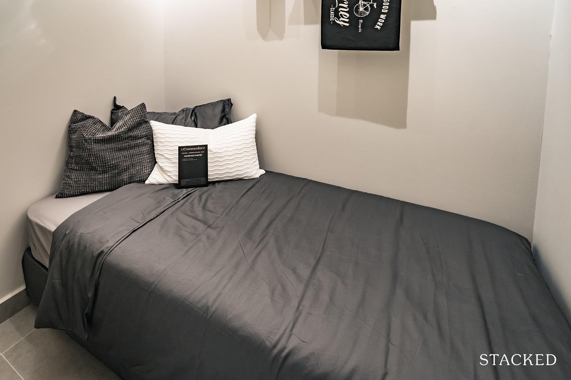
Continuing the theme of practicality is the household shelter which can double up as more storage but would probably be used as a helper’s room. You do have the usual WC located here too.
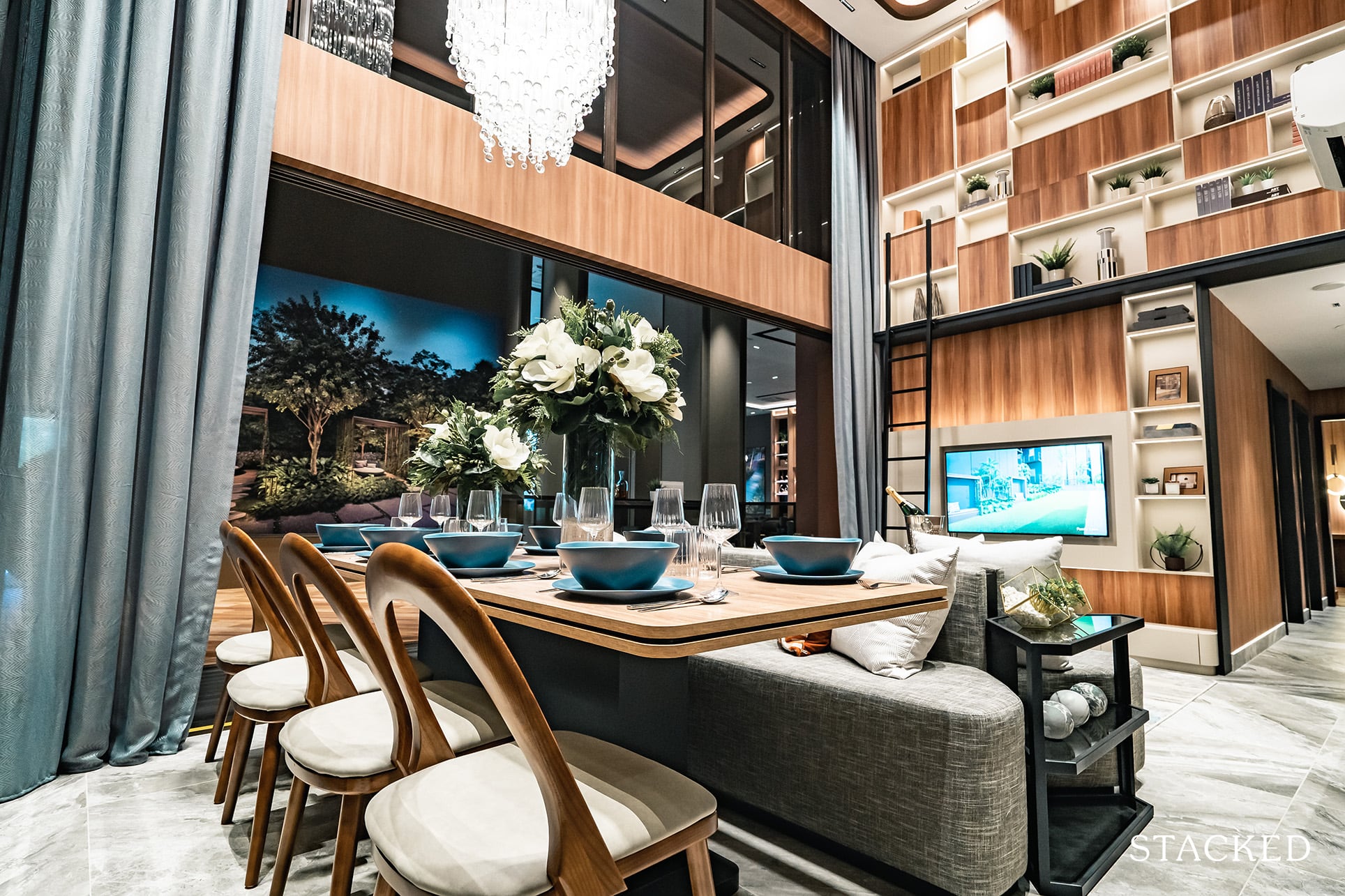
Moving back out to the living area, you’d get to the jewel of this unit, that 5.2 metre high ceiling in the living and dining area. It’s always just more majestic to have in a home, and even though not everyone would be willing to pay the premium for it – the sense of space and openness that it can bring to a home is something that I would splurge on. Especially with a showpiece chandelier, it just adds that extra bit of specialness to your home.
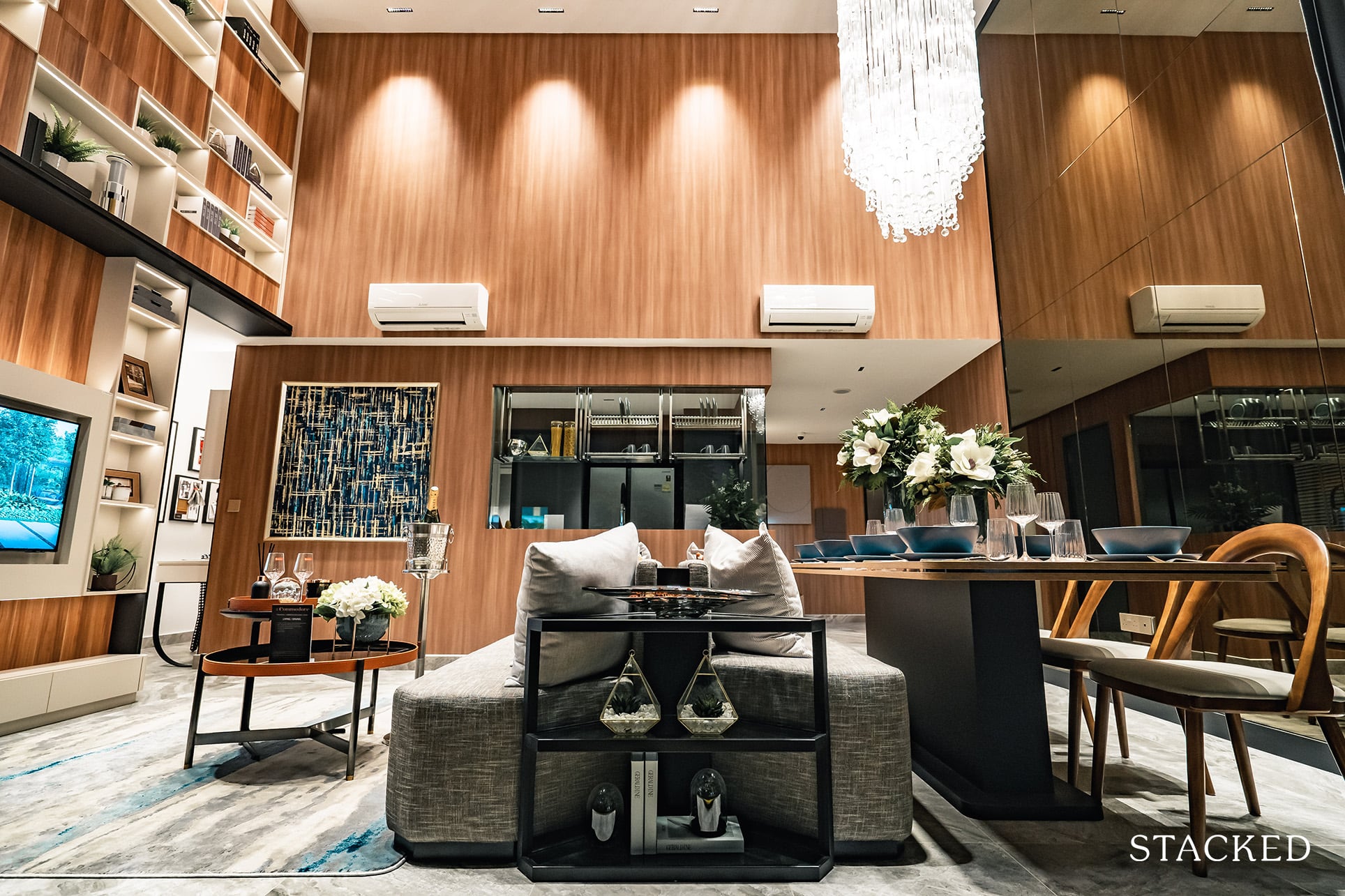
The living and dining areas are set in parallel fashion, so you do have some freedom in terms of how you’d like to allocate the space.
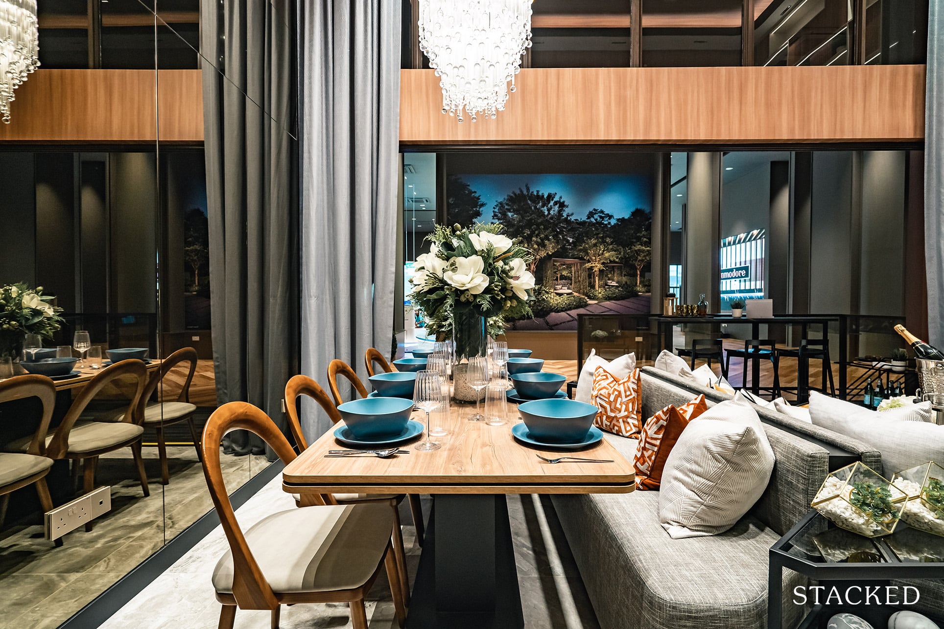
As shown from the dining table, you can seat 6 quite comfortably – but 8 people will be a stretch unless you are comfortable with having seats spill out to the walkway and balcony. But given the position by the balcony along with the majestic high ceiling, it definitely accentuates the space even more.
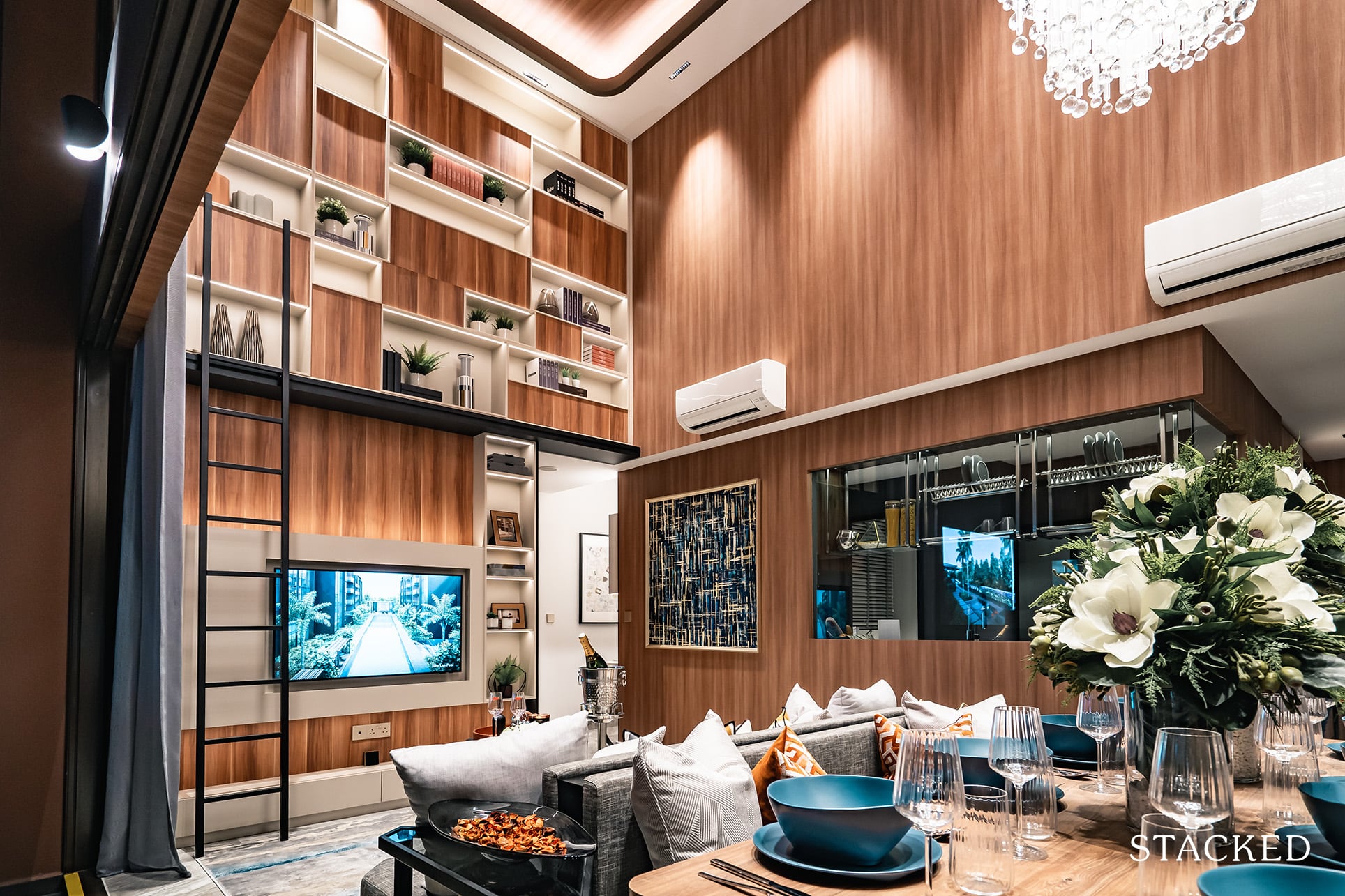
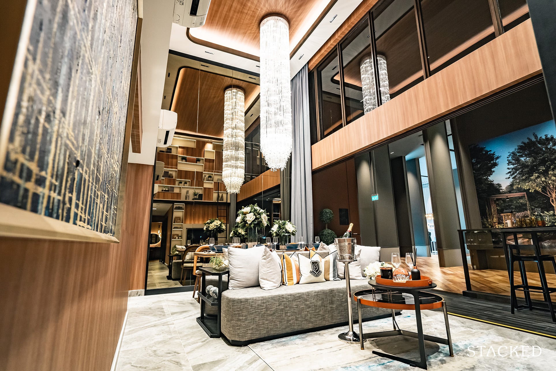
It’s a similar story in the living area, where the space between the couch and TV is quite comfortable if you’ve chosen to allocate half the space to the living room. You’d still have to be careful with the length of the sofa though, as the innermost section will be the walkway to the bedrooms.
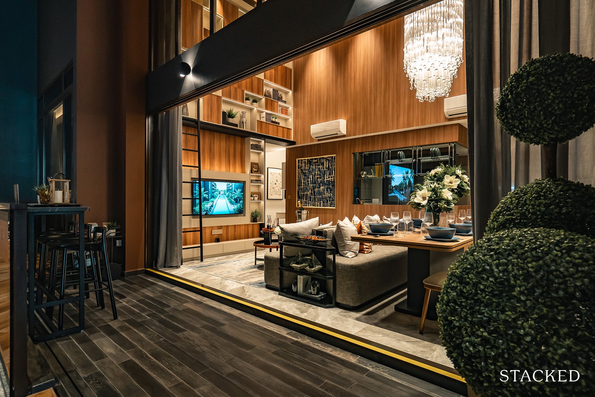
The balcony spans the entire length of the living and dining areas, so it is quite a long one. It’s not too shabby either in the width department so you could quite easily have a meal out here too if you’d like.
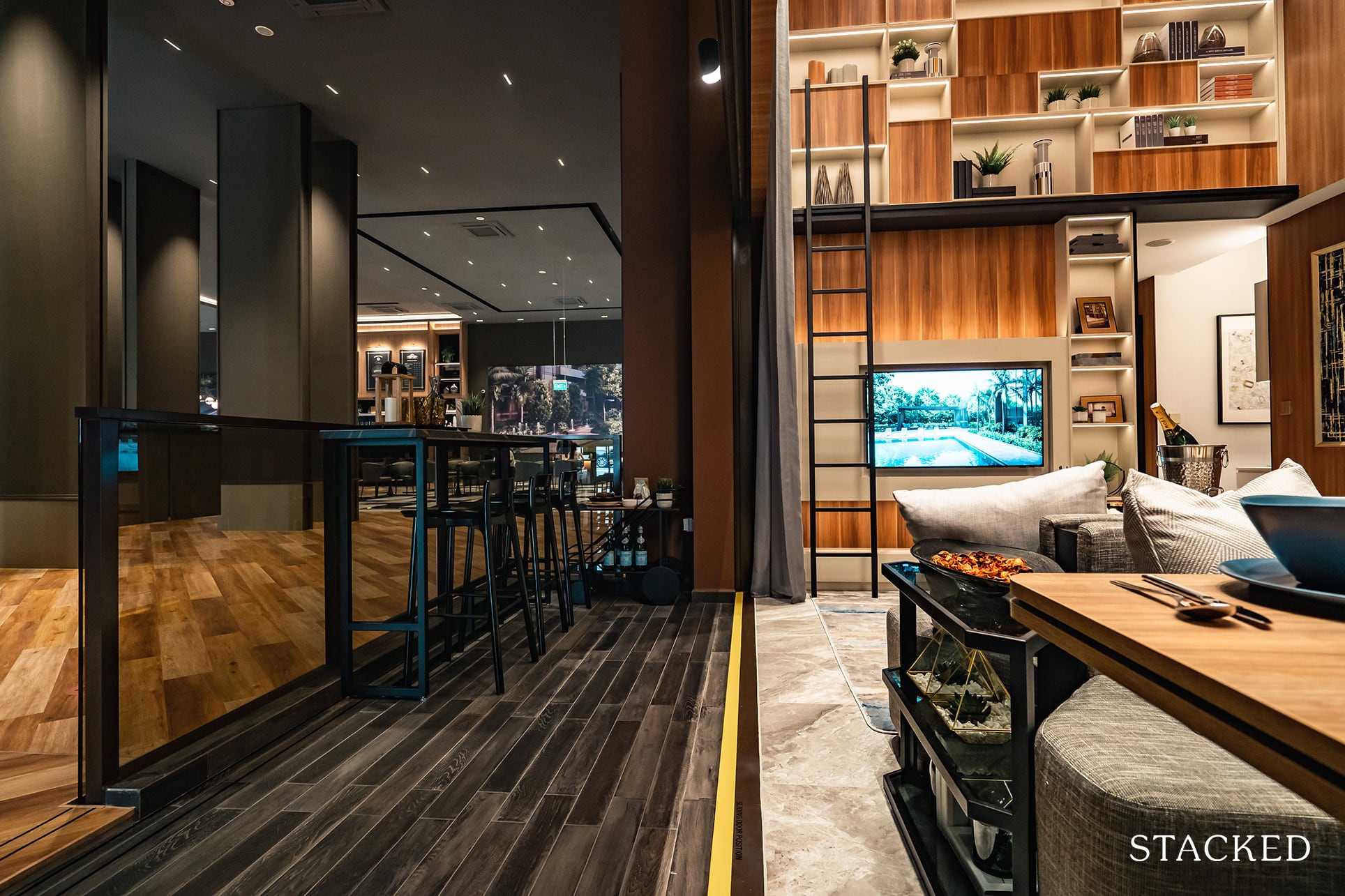
I’d probably do half with some outdoor seating, and the other half as a mini-garden as having greenery outside can be a real treat for the eyes.
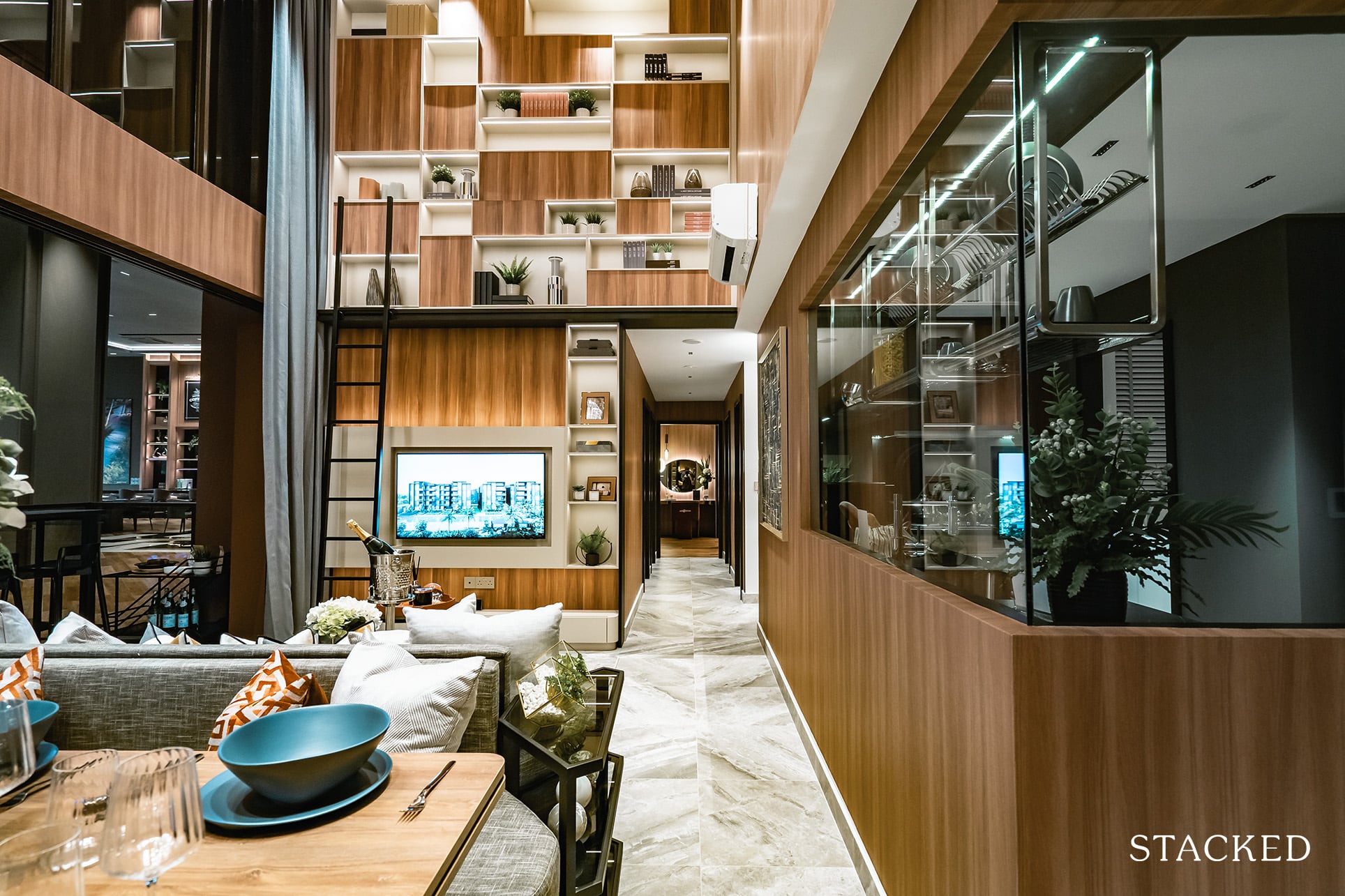
Now, let’s head to the rooms – which are all located down this walkway.
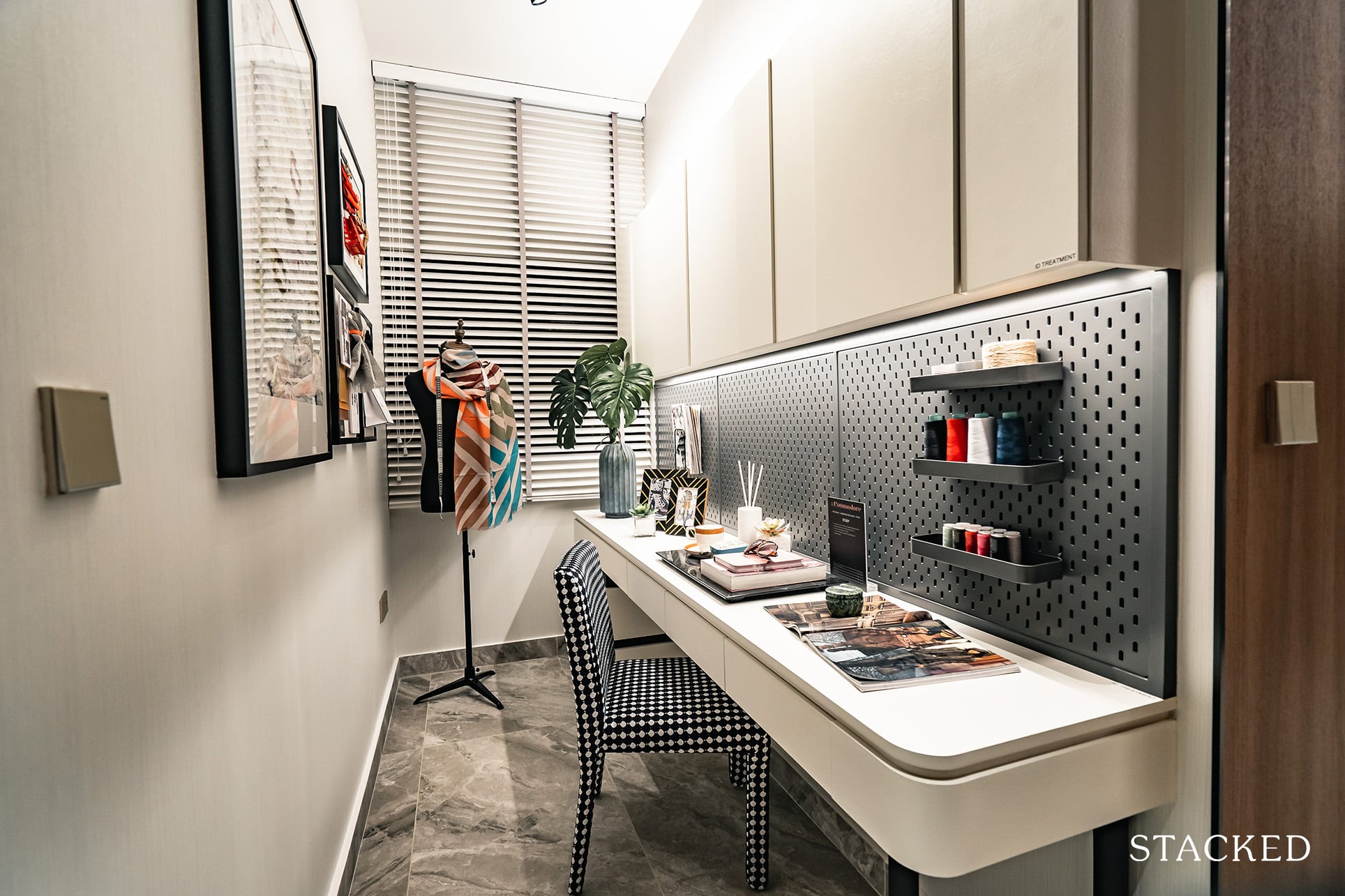
First up, the study room. Again, if you will be permanently working from home even as the pandemic subsides this will be a very useful spot indeed. And unlike the 2 bedroom unit, this will have a window which will help a ton with light and dare I say with your general wellness too. That said, this study does come with the compromise of just the 1 common bathroom to be shared among 3 common bedrooms – so pick your poison.
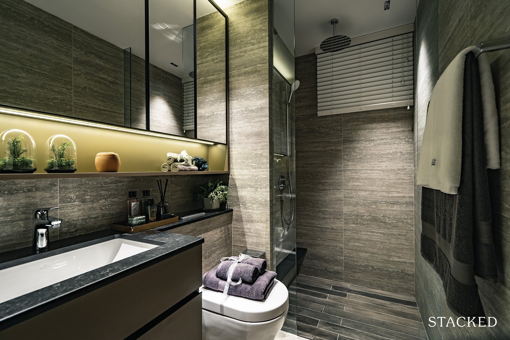
The common bathroom is right next door, and it’s an averagely sized one. Bathroom fittings will be provided by Hansgrohe and Villeroy & Boch, with the generous addition of a rain shower. You do also get the bonus of a window for natural ventilation given that this will be a corner stack unit. That said, given the smaller 4 bedroom unit at Midwood managed to fit nearly a bathroom per bedroom (albeit with a tiny yard, smaller spaces, and without a study), it does seem a bit of a letdown this could not have been achieved here.
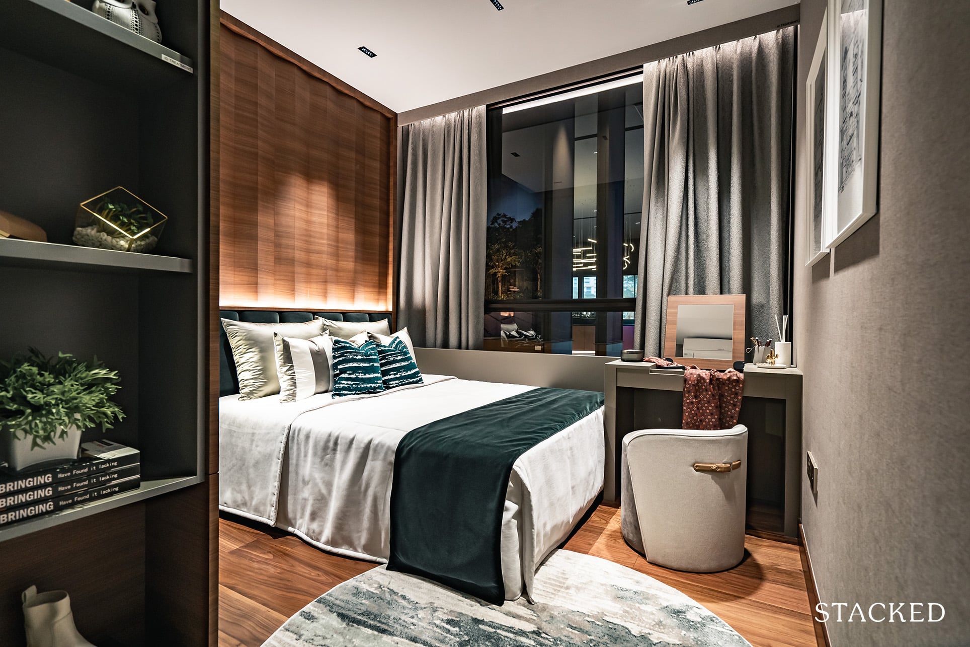
Bedroom 3 is located just opposite the bathroom, and once you step in you can immediately sense the positive aspect of these 4 bedroom units – that the space allocation has gone into at least a decently sized bedroom.
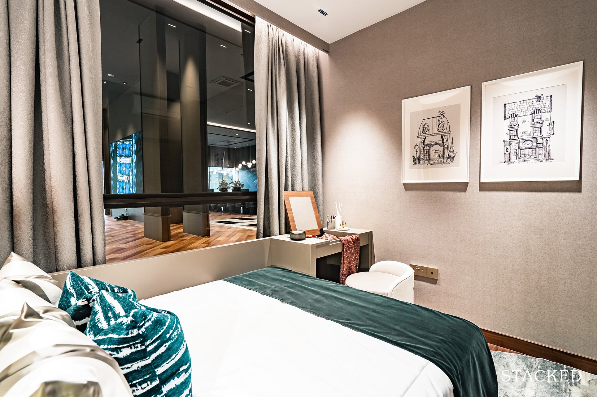
Even with a Queen sized bed installed, walkway space is still of an acceptable standard as you can see the space at the foot of the bed still affords you to place a small dresser. Unlike what the bedroom depicts, you do get full-length windows here so I’m a little puzzled at why the ID would choose to block the window out with that extension.
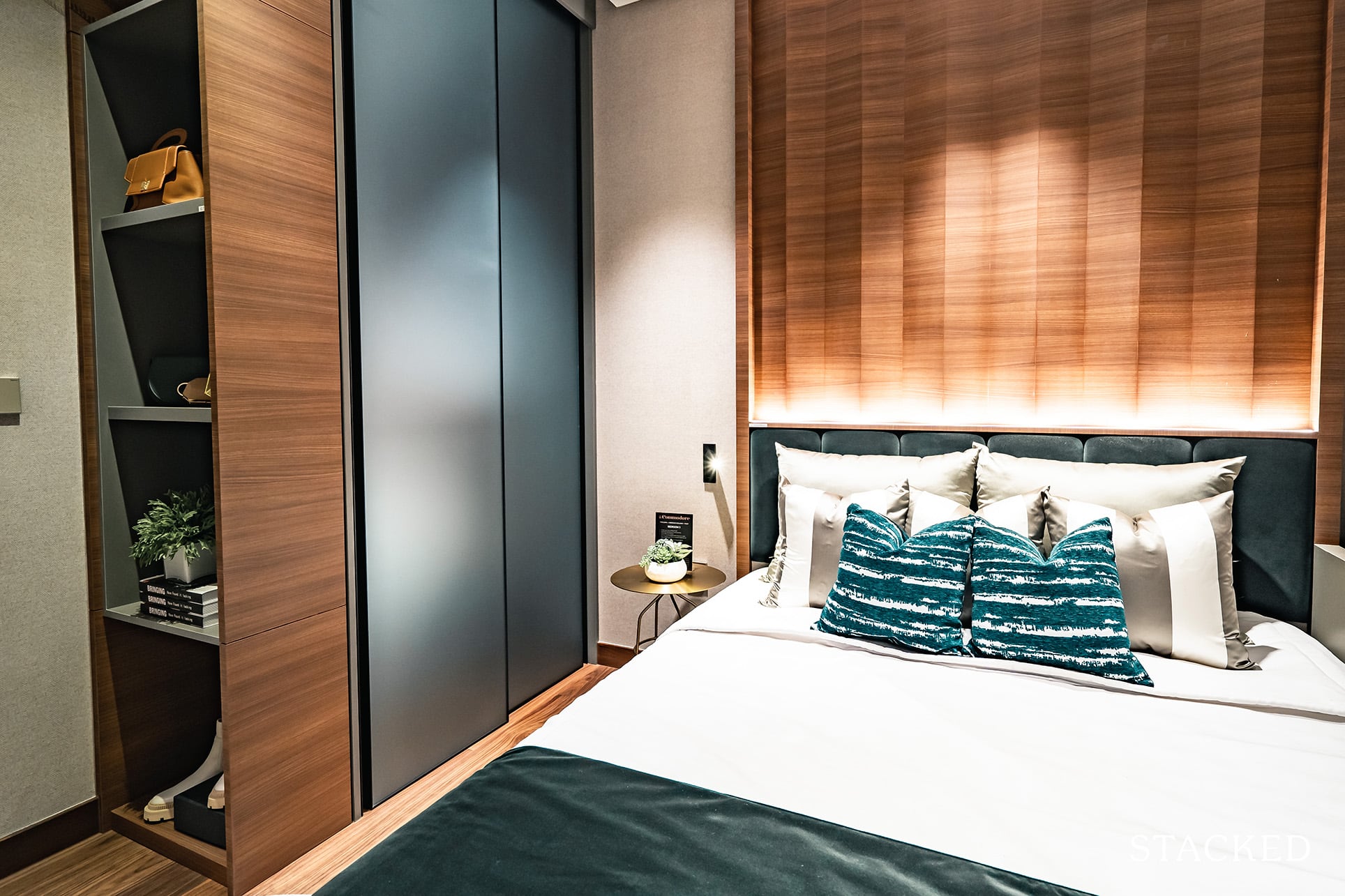
Storage space is provided by the smoky blue satin glass-panelled wardrobe, which I do like and thankfully is a common provision throughout.
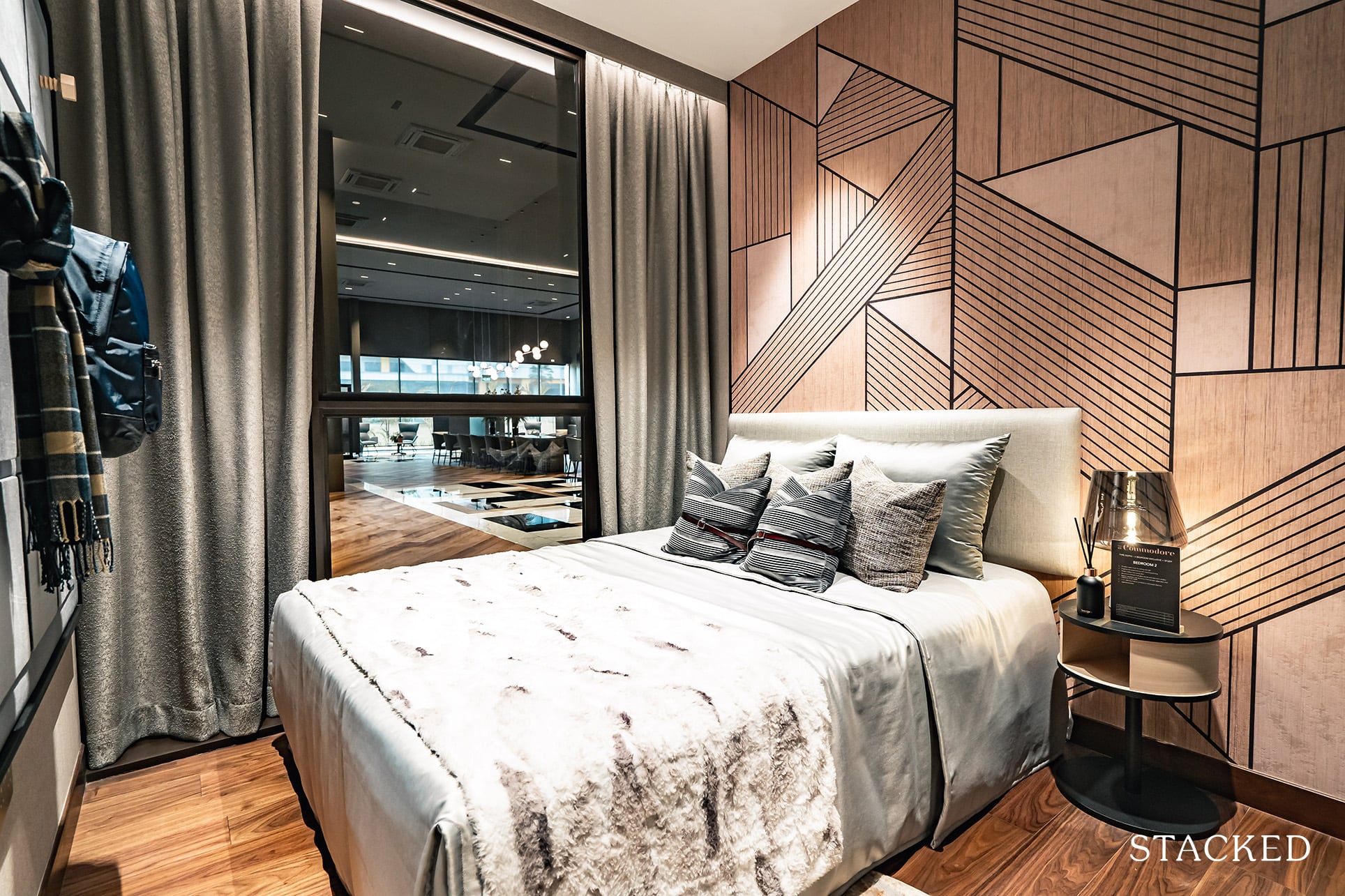
Bedroom 2 next door is slightly smaller (shorter) as compared to the first bedroom. This is more like your typical new launch bedroom, with not enough space to place something like a small dresser or study. You do at least get a full-length window here, which is always very helpful in getting more light into the room.
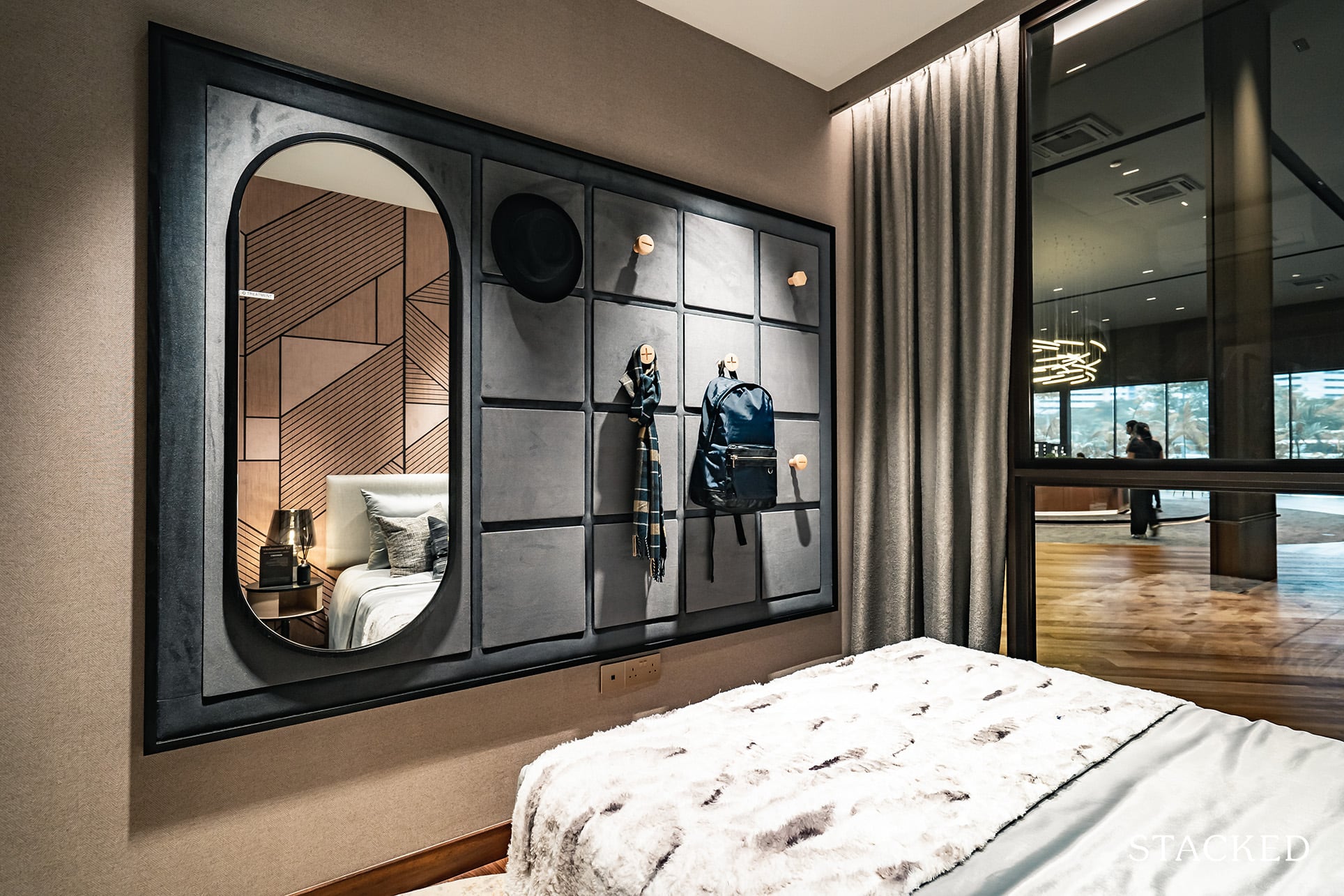
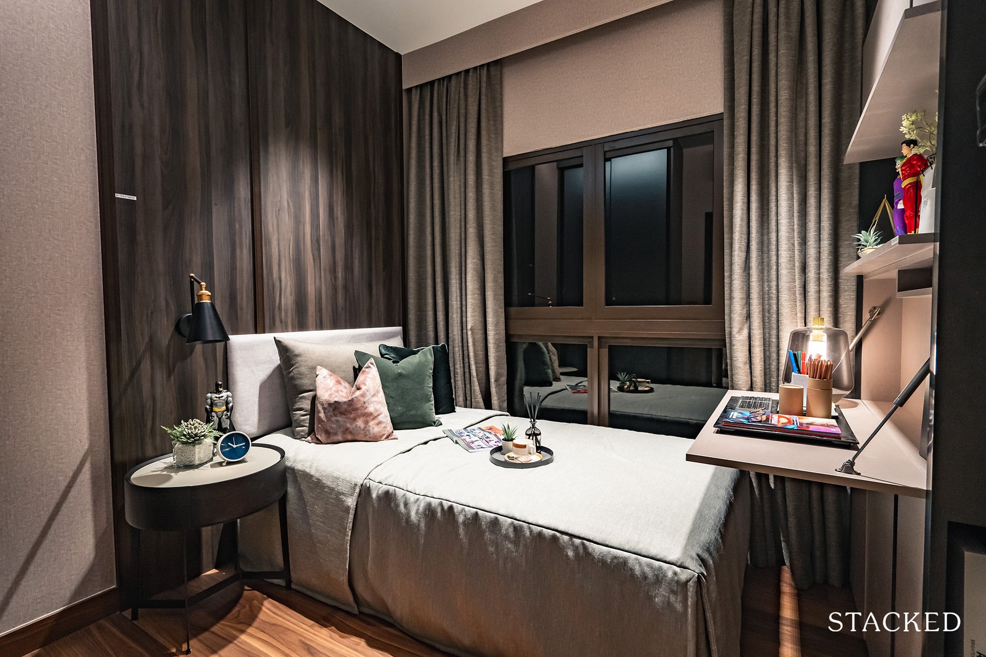
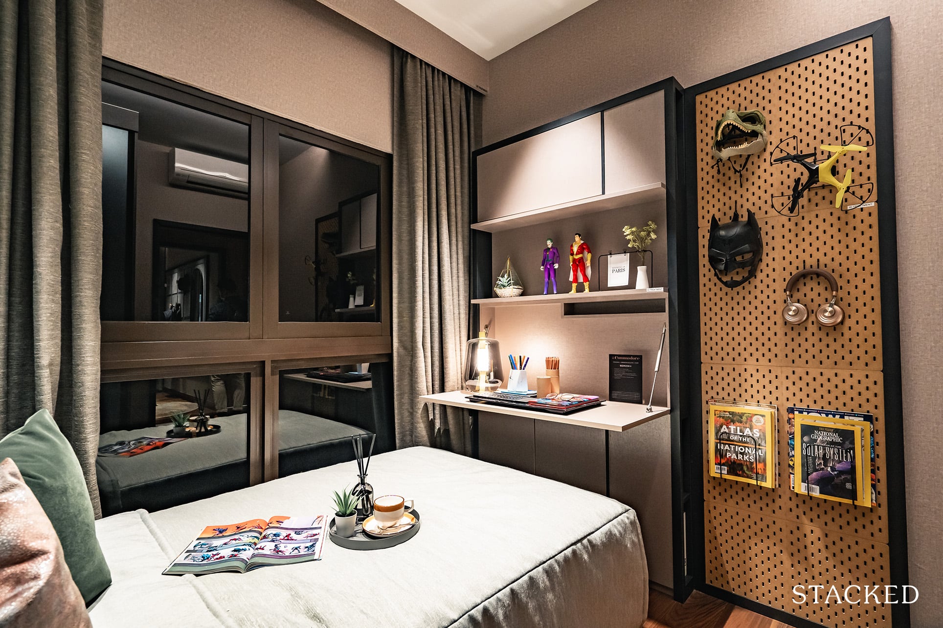
Across the hall is the final common bedroom, and the smallest of the lot. You could still fit in a Queen sized bed, but that wouldn’t leave you much room to move about at all. A single bed is a much more sensible idea, even so – it does give you much wiggle room for anything else.
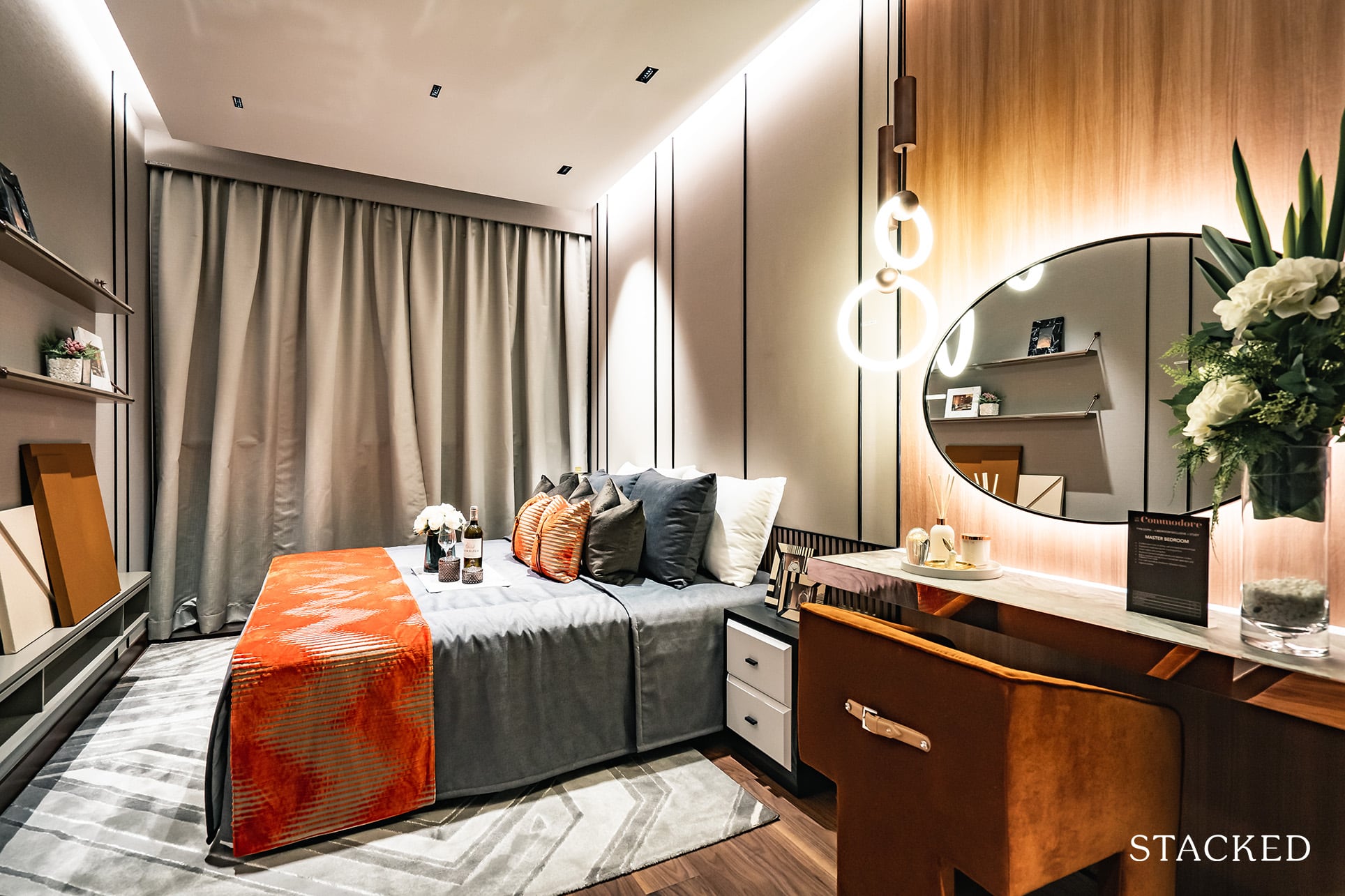
Lastly, we’ll wrap it up with the Master Bedroom. Thankfully, this is a much bigger space worth extolling about. In the show flat unit, the room is shown fitted with a King sized bed with ease, and this is with a proper dressing table, big circular mirror, and chair included by the side. You could think about a separate armchair here too if you so wished.
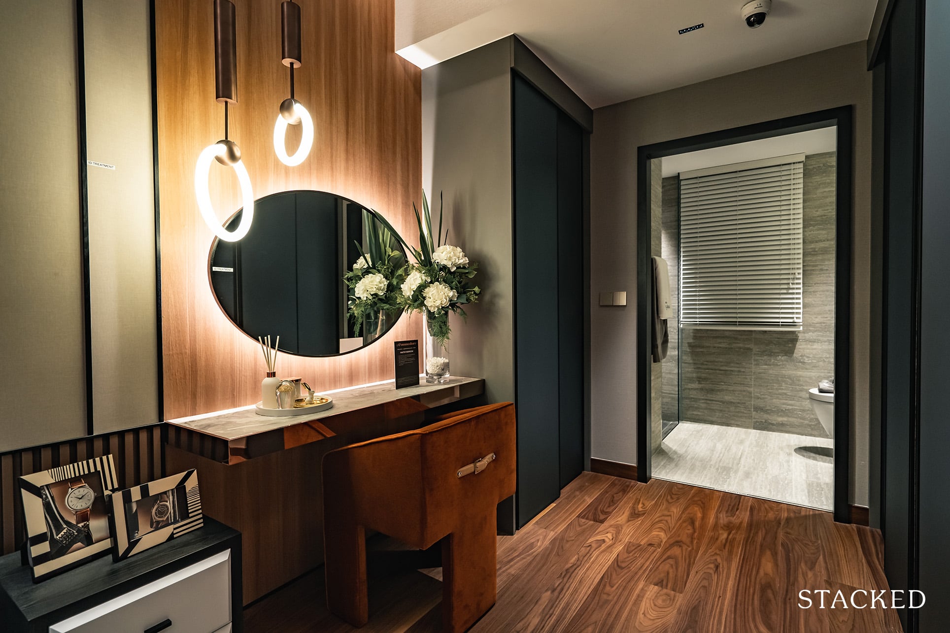
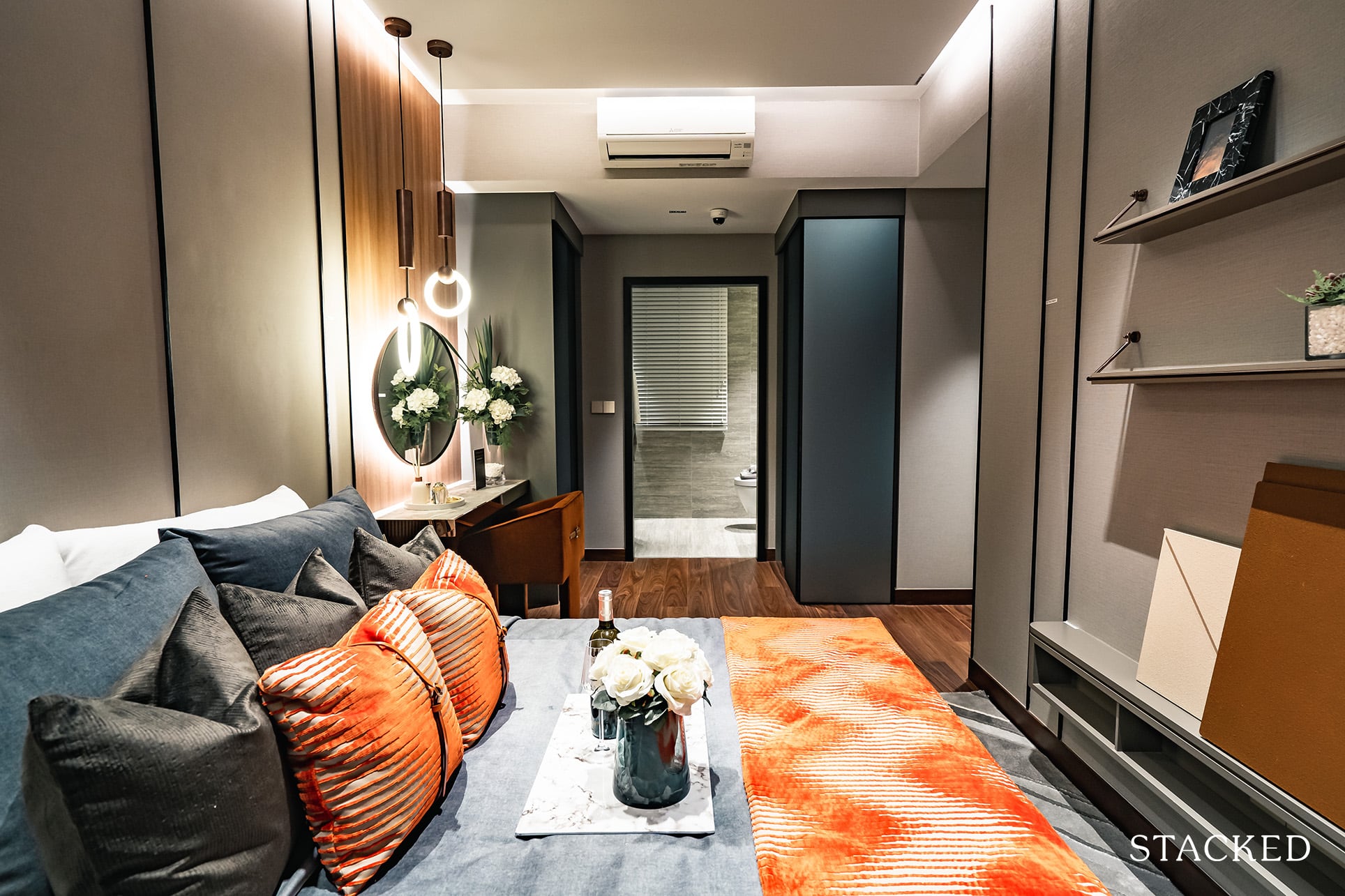
And yes, you do have full-length windows provided here too – certainly a minimum requirement for a Master Bedroom.
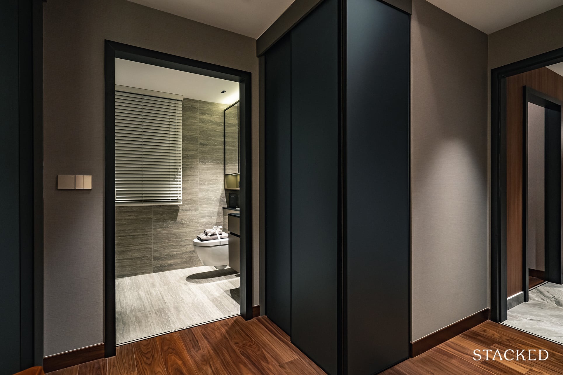
Storage space is provided by means of a “walk-in” wardrobe. Well, it isn’t what you’d usually describe as a walk-in wardrobe, but there’s no mistaking that you’d actually be “walking into” one as there will be wardrobes on both sides of the entrance to the bathroom. It’s undoubtedly more storage space than a regular bedroom, which does give reasons for some cheer for the ladies.
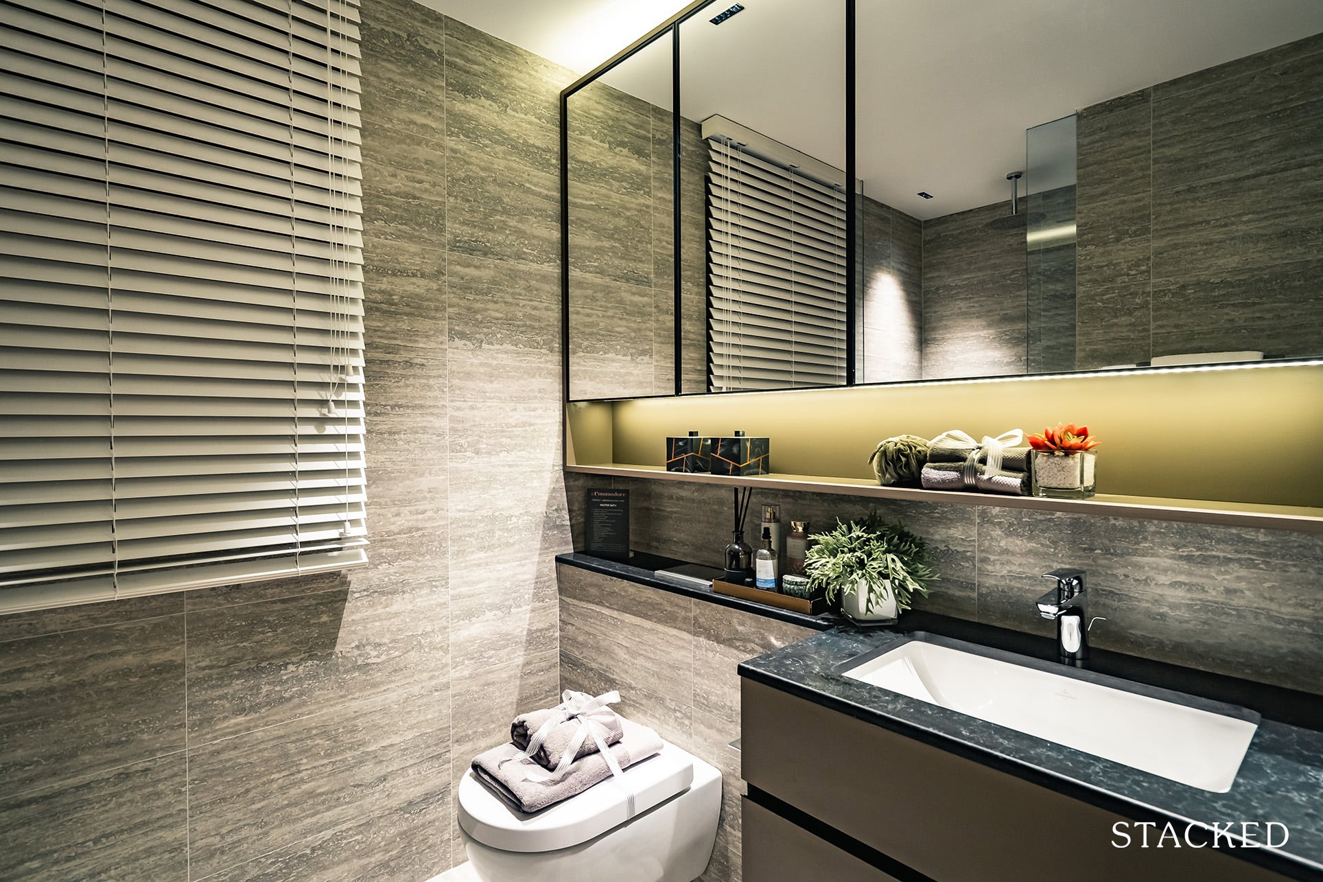
The Master Bathroom isn’t quite so impressive in comparison, and is very averagely sized too. While the fittings are provided from the usual Hansgrohe and Villeroy & Boch, the fact that the Common Bathroom has a rain shower included too means that there is really nothing special here with regards to the Master Bathroom. First-world problems indeed.
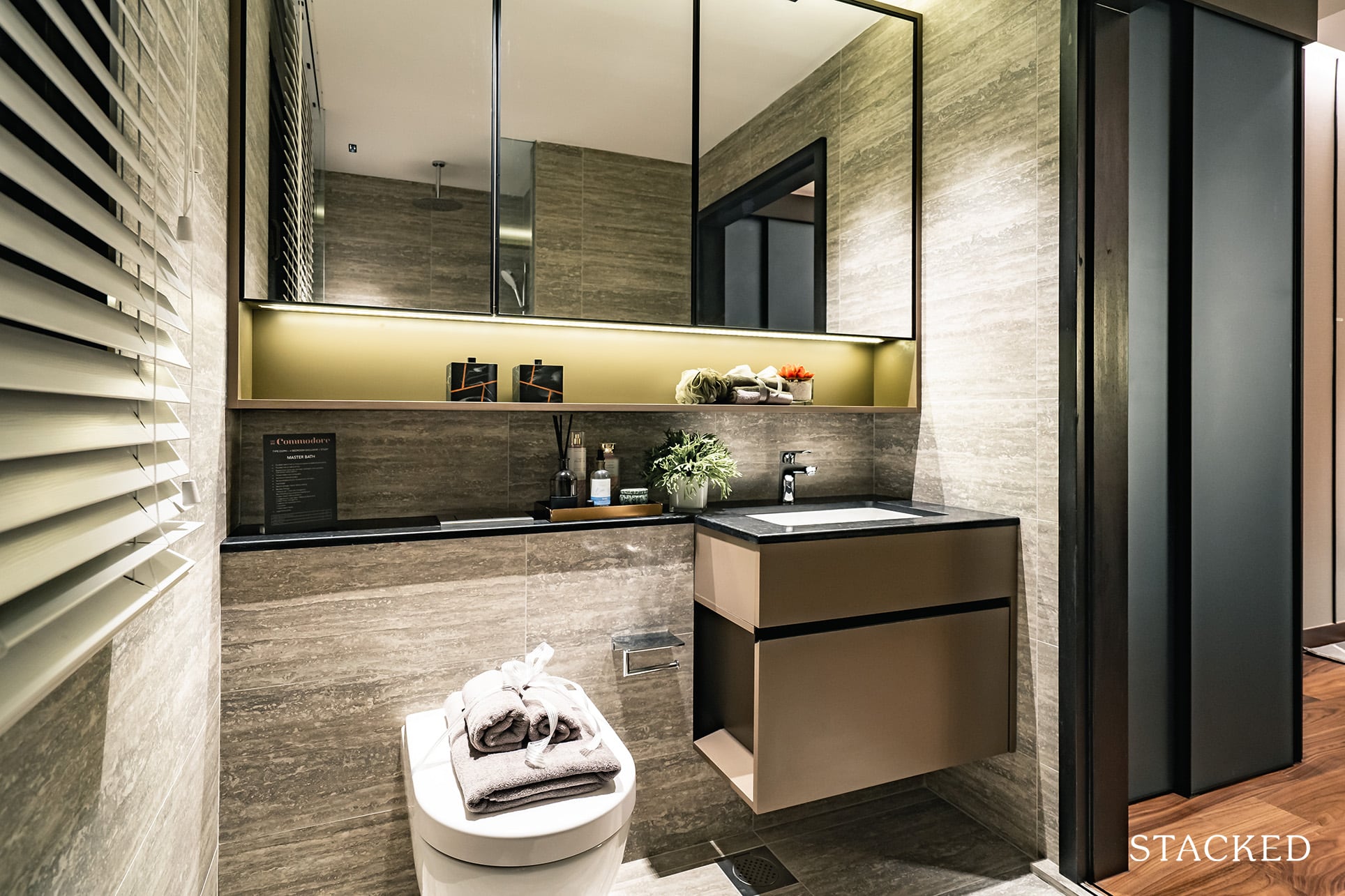
Since the AC ledge is located on the outside and this is a corner unit, you will have a window placed here for natural ventilation purposes.
The Commodore Location Review
For those relying on public transport, the major plus point here is that you will be within walking distance from Canberra MRT on the North South Line. You should be able to get there comfortably within 3-5 minutes via the proposed covered walkway – which again, will be fantastically convenient in Singapore’s unpredictable weather. From there, you will be able to get to Bishan (17 mins), Orchard (29 mins) and City Hall (36 mins) without having to change trains at all.
It is in close walking distance to Sembawang Shopping Centre too. While it obviously isn’t going to rival the selection of shops that you’re going to find in Orchard, it does have enough restaurants and shops like Daiso, etc that will keep things interesting. It also has a Giant supermarket which would be ideal for your weekly grocery shop.
Besides Sembawang Shopping Centre, you do also have Canberra Plaza as it is located right next to Canberra MRT station. In a similar fashion, it’s more of attending to practical needs than it is for retail therapy. Notable tenants here include NTUC Fairprice as well as McDonald’s (among other popular food chains in Singapore).
But if you are willing to put in a bit of effort and take the train, Sun Plaza and Northpoint City are actually just one stop away. Northpoint City is actually pretty fantastic, and you do have a wide range of retail and food options. So much so that you’d probably don’t really have to go to Orchard anymore.
On the other hand, for drivers, The Commodore’s location really isn’t ideal. It’s a trade-off that you always have to be mindful of – price versus distance. As Singapore decentralises even more, places like Canberra while much further out, will naturally start to look more appealing because of the more affordable price points.
Amazingly (and not in a positive way) the drive times are even more incredible than Pasir Ris 8. Of course, these timings are taken as of the peak hour time of 830am on a weekday and are calculated as an average of the predicted timing given.
It’s really less about the peak hours but more about its accessibility. The major expressways are all about a 10-minute drive away, which is not helpful since Canberra isn’t already central, to begin with. For me though, I do hope that the upcoming North South Corridor (NSC), which will be built to ease congestion on the CTE, will help to significantly reduce drive times.
Nearest MRT: Canberra MRT (350m, 3-5 mins walk)
Public Transport
| Bus Station | Buses Serviced | Distance From Condo (& Est. Walking Time) |
| Canberra Stn Stop ID: 58549 | 117, 169, 883, 883B, 883M | 350m, 5 mins |
| Opp Canberra Stn Stop ID: 58541 | 117, 169, 883, 883M | 450m, 6 mins |
Amenities
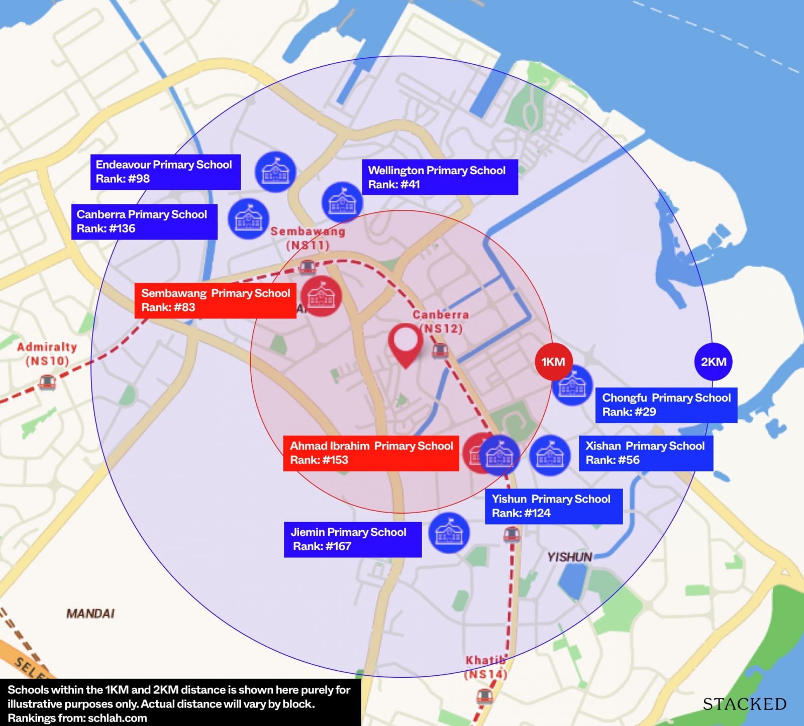
Schools
| School | Distance From Condo (& Est. Walking Time) |
| Sembawang Primary School | Within 1 km |
| Ahmad Ibraham Primary School | Within 1 km |
| Ahmad Ibraham Secondary School | 750m, 9 mins |
| Yishun Secondary School | 1.8km, 23 mins |
Retail Outlets
| Mall | Distance From Condo (& Est. Walking Time) |
| Canberra Plaza | 600m, 4 mins |
| Sembawang Shopping Centre | 800m, 6 mins |
| Sun Plaza | 1.9km, 24 mins |
| Northpoint City | 1.5km, 19 mins |
Private Transport
| Key Destinations | Distance From Condo (Average Time at Peak Hour [0830] Drive Time) |
| CBD (Raffles Place) | 24.3 km, 38 mins |
| Orchard Road | 21.9 km, 37 mins |
| Suntec City | 22.7 km, 34 mins |
| Changi Airport | 25.2 km, 34 mins |
| Tuas Port (By 2040) | 41.8 km, 55 mins |
| Paya Lebar Quarters/Airbase (By 2030) | 21.2 km, 34 mins |
| Mediapolis (and surroundings) | 30.2 km, 42 mins |
| Mapletree Business City | 29.5 km, 50 mins |
| Tuas Checkpoint | 31.7 km, 42 mins |
| Woodlands Checkpoint | 11.6 km, 34 mins |
| Jurong Cluster (JCube) | 25.2 km, 41 mins |
| Woodlands Cluster (Causeway Point) | 6.8 km, 24 mins |
| HarbourFront Cluster (Vivo City) | 27.2 km, 42 mins |
| Punggol Cluster (Waterway Point) | 12 km, 34 mins |
Immediate Road Exits:1 – Canberra Drive, which is not exactly close to any major expressway. It will take about 10 minutes via Yishun Avenue 7 before you are able to get onto CTE, SLE or TPE.
The Developer Team
Developer
JBE Holdings probably isn’t the most recognisable developer around for most casual property buyers as they aren’t a household name like your usual Far East Organization or CDL etc. That said don’t underestimate them either as they have actually done a number of projects in Singapore already.
Their portfolio includes Luxe Ville, a freehold condominium at Pasir Panjang, 53 terrace houses at Sembawang, and executive condominiums SkyPark Residences and Signature at Yishun.
JBE is also the owner and developer of The Luxe, a mixed-use development at Handy Road in the Orchard area. The development concept of The Luxe is to enable city living amidst artistic ambience in Singapore’s centrally-located art and heritage district.
Unit Mix
| Unit Type | Size | No. of Units | Share Value | Est Maintenance |
| 1 BR | 463 sqft | 25 | 5 | $275 |
| 2BR | 624 sqft | 25 | 6 | $330 |
| 2BR Premium + Study | 743 – 786 sqft | 58 | 6 | $330 |
| 2BR Premium + Study PH | 915 sqft | 2 | 6 | $330 |
| 3-Bedroom | 969 sqft | 16 | 6 | $330 |
| 3-Bedroom Penthouse | 1,152 sqft | 4 | 6 | $330 |
| 3-Bedroom Premium + Study | 1,023 sqft | 20 | 6 | $330 |
| 3-Bedroom Premium + Study PH | 1,184 sqft | 5 | 6 | $330 |
| 4-Bedroom | 1,184 sqft | 15 | 7 | $385 |
| 4-Bedroom PH | 1,356 sqft | 4 | 7 | $385 |
| 4-Bedroom Premium + Study | 1,270 – 1,378 sqft | 22 | 7 | $385 |
| 4-Bedroom Premium + Study PH | 1,464 sqft | 5 | 7 | $385 |
| 4-Bedroom Exclusive + Study | 1,421 – 1,432 sqft | 6 | 7 | $385 |
| 4-Bedroom Exclusive + Study PH | 1,647 – 1,658 sqft | 2 | 7 | $385 |
| 5-Bedroom Exclusive + Study | 1,668 – 1,679 sqft | 8 | 8 | $440 |
| 5-Bedroom Exclusive + Study PH | 1,905 – 1,916 sqft | 2 | 8 | $440 |
Considering the smaller size of the development, the unit mix at The Commodore is rather comprehensive. It starts from the smallest 1 bedroom unit of 463 square feet all the way up to the biggest 5 bedroom penthouse unit of 1,916 square feet. It’s not a lopsided spread by any means too, with 49% of the units dedicated to 1 and 2 bedroom units, and the rest to the 3, 4, and 5 bedroom units.
I do also think it’s smart to include 1 bedroom units here, as Watergardens at Canberra deliberately left them out of their selection. Some people believe that OCR projects in further out locations such as these should not be catering to the smallest unit type as there is a lack of rental demand, but I do believe that given the entry price there will be increasing demand for singles that are unable to buy an HDB because of their age, but want to move out from their parents home because of the Covid-19 situation.
With regards to the 2 bedroom units, you do have a decent mix of a 2b1b and 2b2b layout types although I’m less keen on the biggest 2 bedroom premium units as I find the entrance into the study first an awkward one.
The bigger units here are slightly better-sized in comparison to their competitors, although again do note that the top floor units will have the void space of the high ceiling in the living factored into the size.
Maintenance wise, you do have an edge when it comes to the smaller units as compared to the Watergarden, although surprisingly this relationship changes for the bigger units as these will be a little more expensive.
Stack Analysis
The Commodore Site Plan
The Commodore Best Stacks
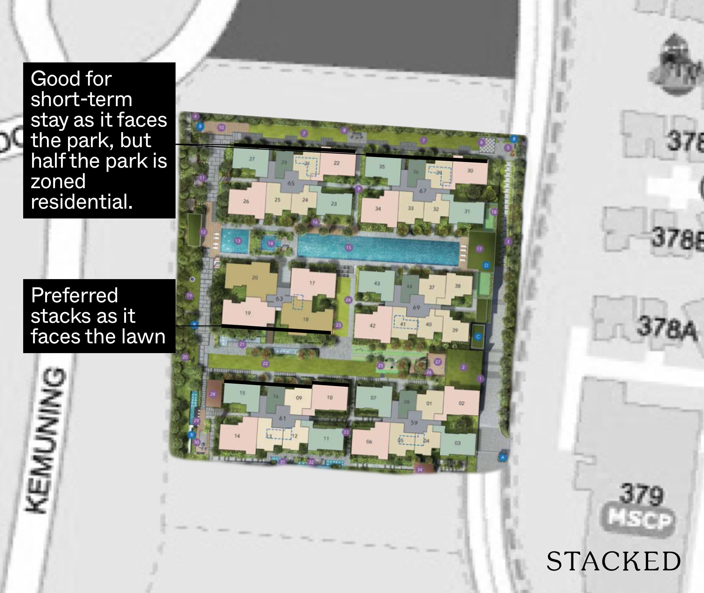
In terms of best stacks, it’s quite simple to look at given the straight-natured layout of the blocks. For those looking at the bigger units (4 bedroom/5 bedroom), I’d definitely go for Stacks 18 and 19 as they face the Commodore’s Lawn – which is likely to be the least crowded area.
Beyond that, I’d probably go for Stacks 15, 16, 9, and 10 for the smaller 1 to 4 bedroom units as again these will face the Lawn area.
The rest of the facings will be a pick your poison type thing – as it really depends on if you’d prefer a pool facing or facing the quite extensively sized children’s play area.
The outer facing blocks of 65 and 67 can be ideal if you are looking for a shorter-term exit horizon as for now, this will be facing Jalan Sendudok Park. But as mentioned earlier, half of the park (and unfortunately, the side closer to The Commodore) is slated in the Master Plan as a residential plot. We can’t say when this would go, so, for now, you will enjoy greenery views.
The Commodore Afternoon Sun
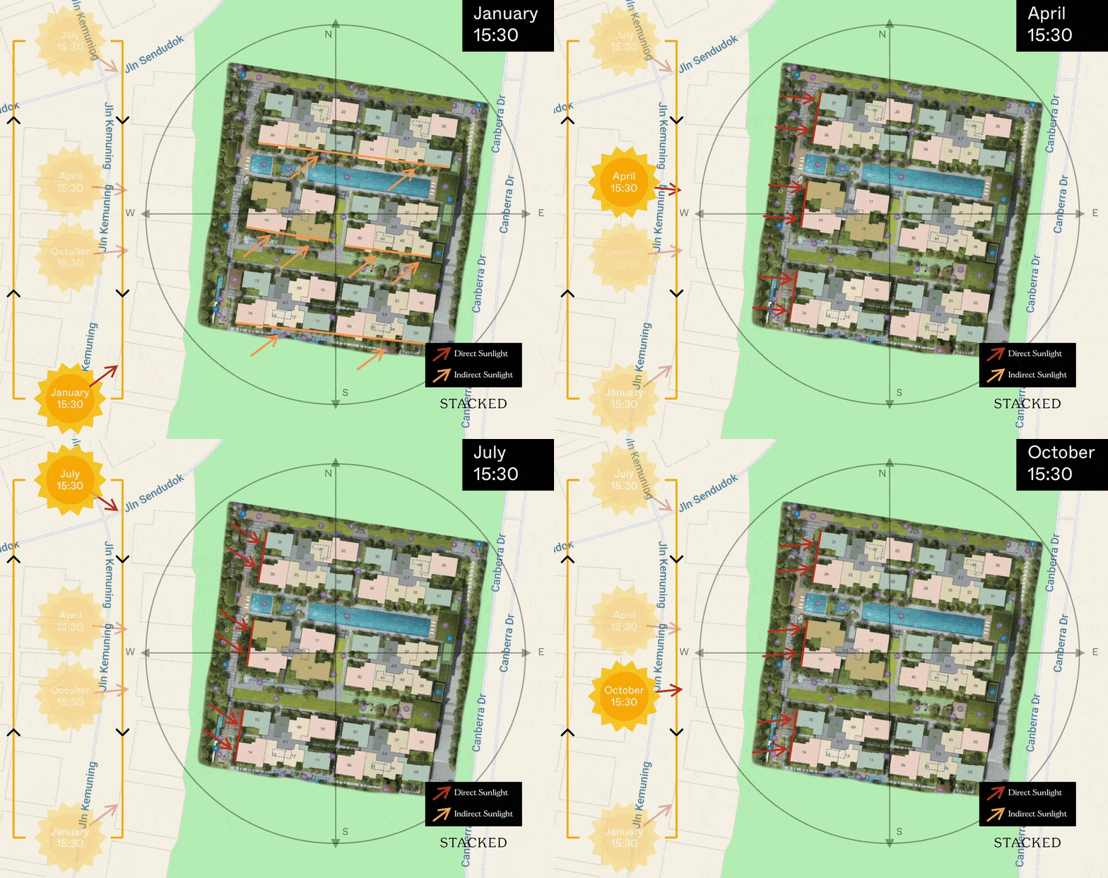
All stacks here have a north-south orientation, with a slight tilt towards the west side. As such, units facing south would have some indirect afternoon sun coming in towards the end/start of the year. Otherwise, I would not concerned about having afternoon sun in this project.
Those wanting to avoid the afternoon sun should consider all the north-facing and north east-facing stacks.
The Commodore Pricing Analysis Review
Matt has previously written about the prices of private residences in the Canberra area in The Watergardens At Canberra review, so this pricing review would just be an update on that based on the latest resale prices as well as a comparison to The Watergardens At Canberra itself.
As mentioned in the previous review, the northern region has a limited offering of private residences, while the Canberra area has quite a few resale (and now, new launch) options.
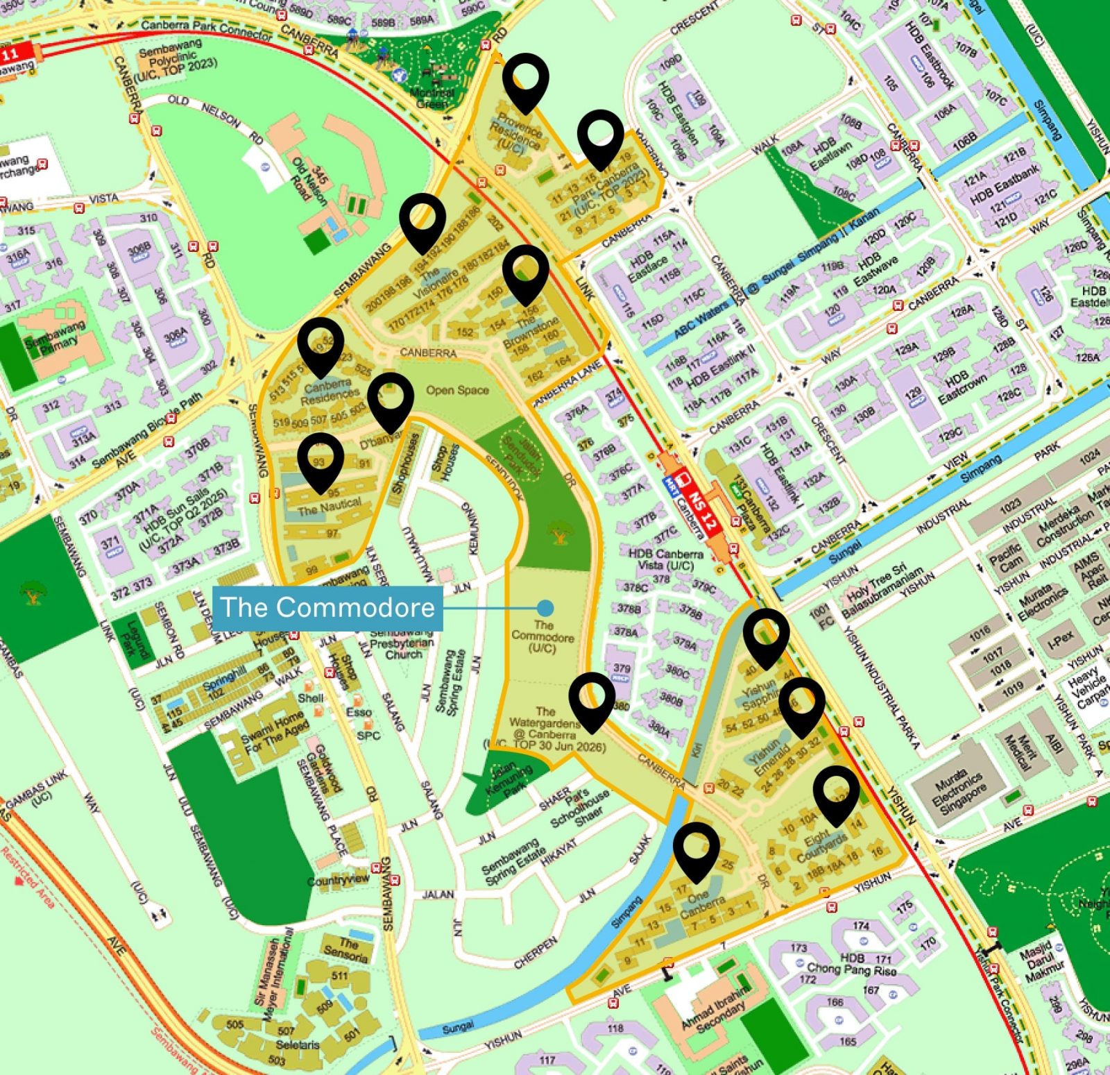
These are the projects around The Commodore that are within walking distance to the MRT:
And here’s the updated prices of resale condominiums around:
| Project | Tenure | Completed | 1 Bedroom | 2 Bedroom | 3 Bedroom | 4 Bedroom | 5 Bedroom |
| 1 Canberra | 99 yrs from 30/01/2012 | 2015 | – | – | $988,227 ($928 psf) | $1,597,000 ($782 psf) | – |
| The Brownstone | 99 yrs from 28/04/2014 | 2017 | – | – | $955,944 ($954 psf) | $1,190,000 ($1,079 psf) | – |
| The Visionaire | 99 yrs from 09/01/2015 | 2018 | – | $760,000 ($1,054 psf) | $955,667 ($1,000 psf) | – | – |
| Yishun Sapphire | 99 yrs from 16/02/1998 | 2001 | – | $767,667 ($781 psf) | $932,500 ($788 psf) | $997,727 ($783 psf) | – |
| The Nautical | 99 yrs from 29/08/2011 | 2015 | $556,600 ($1,261 psf) | $808,933 ($1,059 psf) | $1,118,427 ($943 psf) | $1,580,000 ($923 psf) | – |
| Yishun Emerald | 99 yrs from 16/02/1998 | 2002 | – | $814,000 ($809 psf) | $939,667 ($750 psf) | $998,308 ($747 psf) | – |
| Canberra Residences | 99 yrs from 08/09/2010 | 2013 | $607,500 ($928 psf) | $842,500 ($891 psf) | $1,184,878 ($875 psf) | $1,560,000 ($812 psf) | – |
| Eight Courtyards | 99 yrs from 20/09/2010 | 2014 | $577,500 ($1,161 psf) | $846,413 ($997 psf) | $1,056,417 ($996 psf) | – | – |
| The Commodore | 99 yrs from 08/06/2020 | Dec 2024 | $700,000 ($1,512 psf) | $920,000 ($1,474 psf) | $1,300,000 ($1,342 psf) | $1,700,000 ($1,436 psf) | $2,300,000 ($1,379 psf) |
| D’Banyan | 999 yrs from 26/03/1885 | 2005 | – | $933,000 ($803 psf) | – | – | – |
| Seletaris | Freehold | 2001 | – | $961,900 ($843 psf) | $1,206,571 ($879 psf) | $1,551,333 ($895 psf) | $1,730,000 ($883 psf) |
| The Sensoria | Freehold | 2007 | – | $996,000 ($919 psf) | $1,372,667 ($930 psf) | – | – |
*Indicative starting prices only. Average prices are expected to be higher. Do note that for 3-5 bedroom units, indicative prices could be more.
This table was ranked by overall 2-bedroom quantum since that is the biggest portion of flats at The Commodore. In terms of quantum, The Commodore ranks the highest among all leasehold projects around and 4th highest among all projects (including freehold):
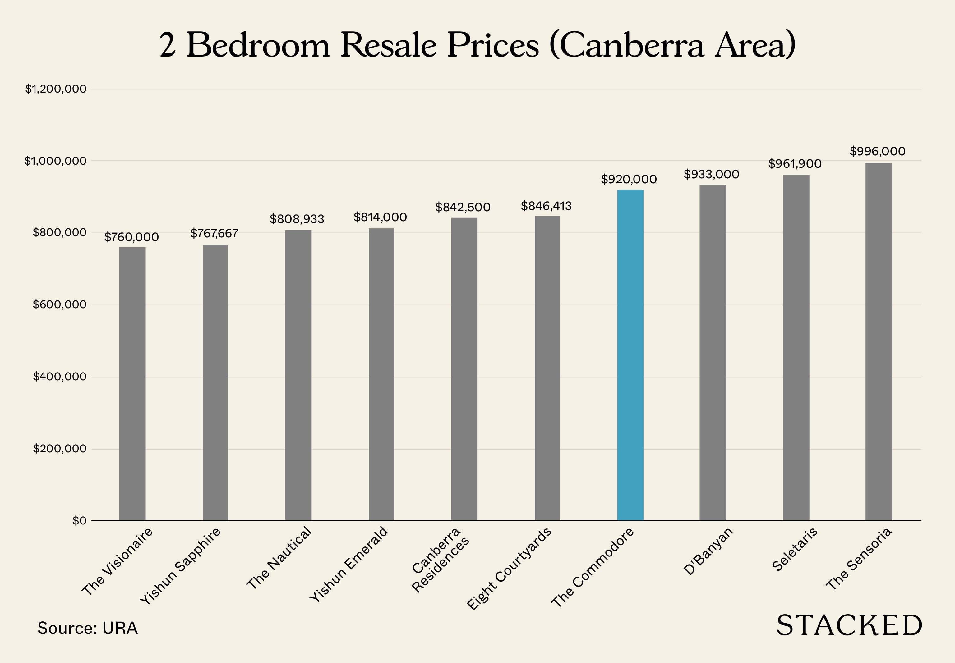
At this quantum, owning a brand new full-fledged facility condo that’s within walking distance to an MRT does seem pretty decent. However, it’s the $PSF data that would probably spook a lot of potential buyers:
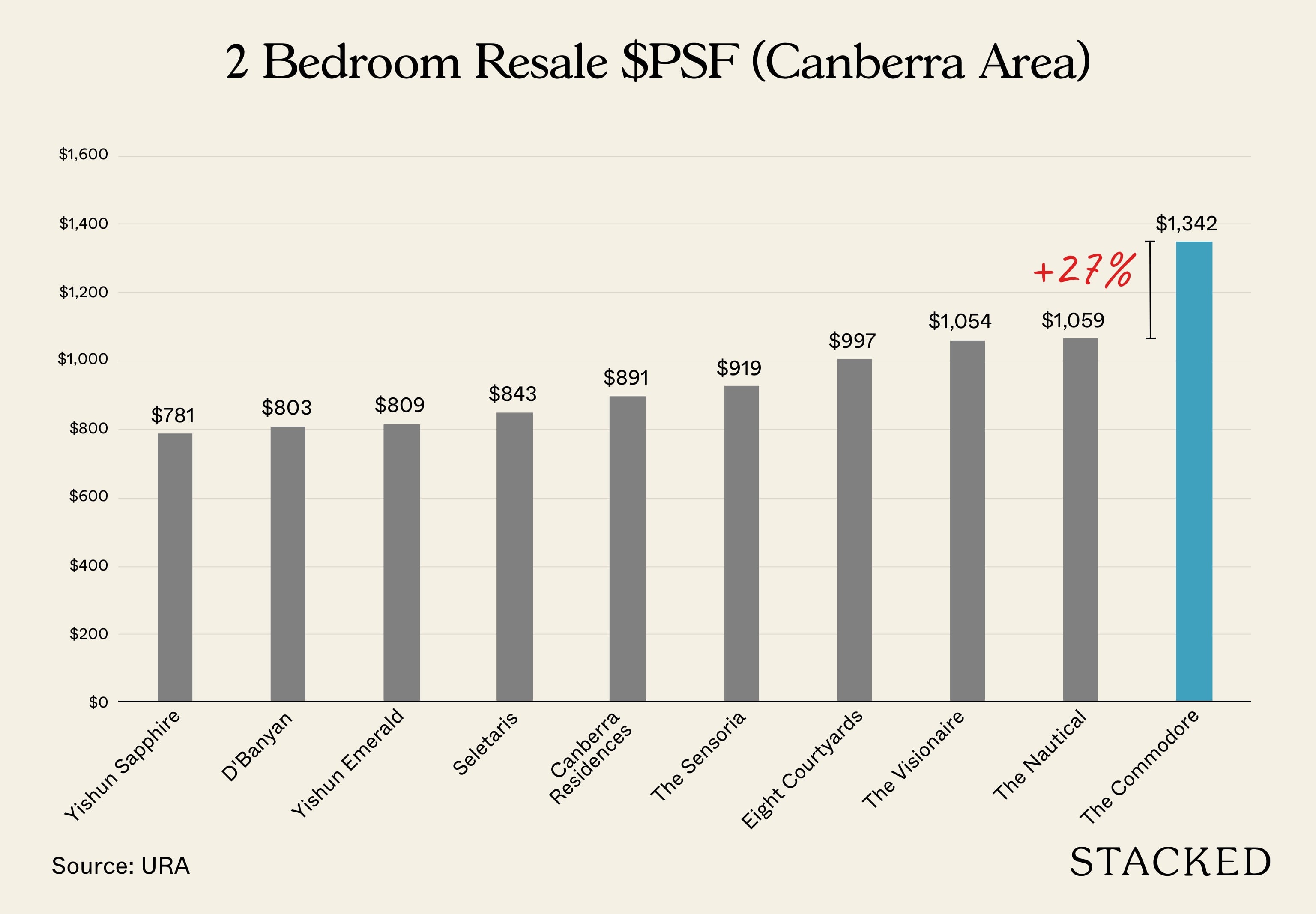
At its indicative price, The Commodore would be trading at around a 27% premium to the next most expensive development – The Nautical.
The Nautical is 9 years older (lease-wise) and is also further away from Canberra MRT station.
The latest 2-bedroom unit here went for $780,000 in October 2021 and was for a 2nd-floor unit (which explains the lower quantum). The unit is 764 sqft in size. Here’s what it looks like:
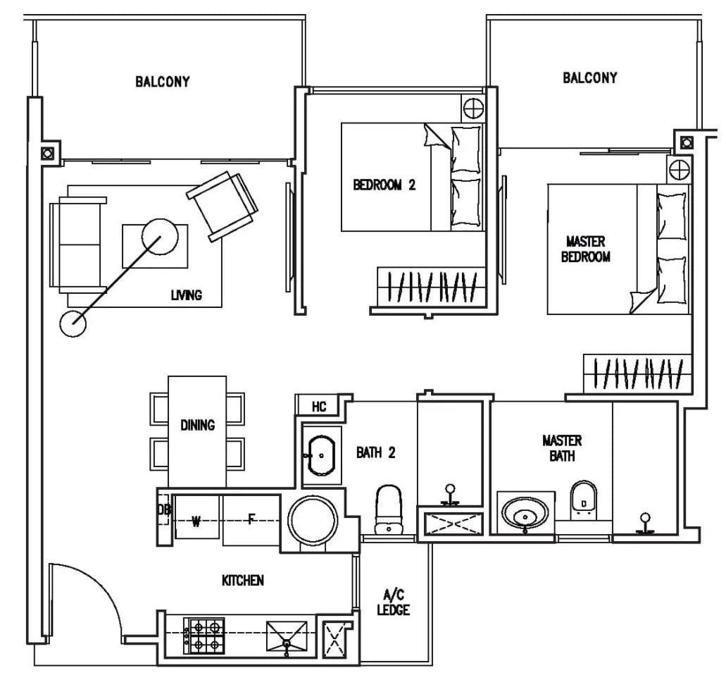
At 764 sqft, the 2-bedroom here features an enclosed kitchen with natural ventilation (a rare trait!), a pretty decent separate dining area, a narrow living area, and 2 balconies. Both bathrooms also feature natural ventilation and a very well-positioned air-con ledge too.
There’s no bay window or planters here, however, the 2nd balcony is an issue for those who do not appreciate this much outdoor space.
For around $800,000, this does seem very decent! So how does the 2-bedroom (624 sqft) compare?
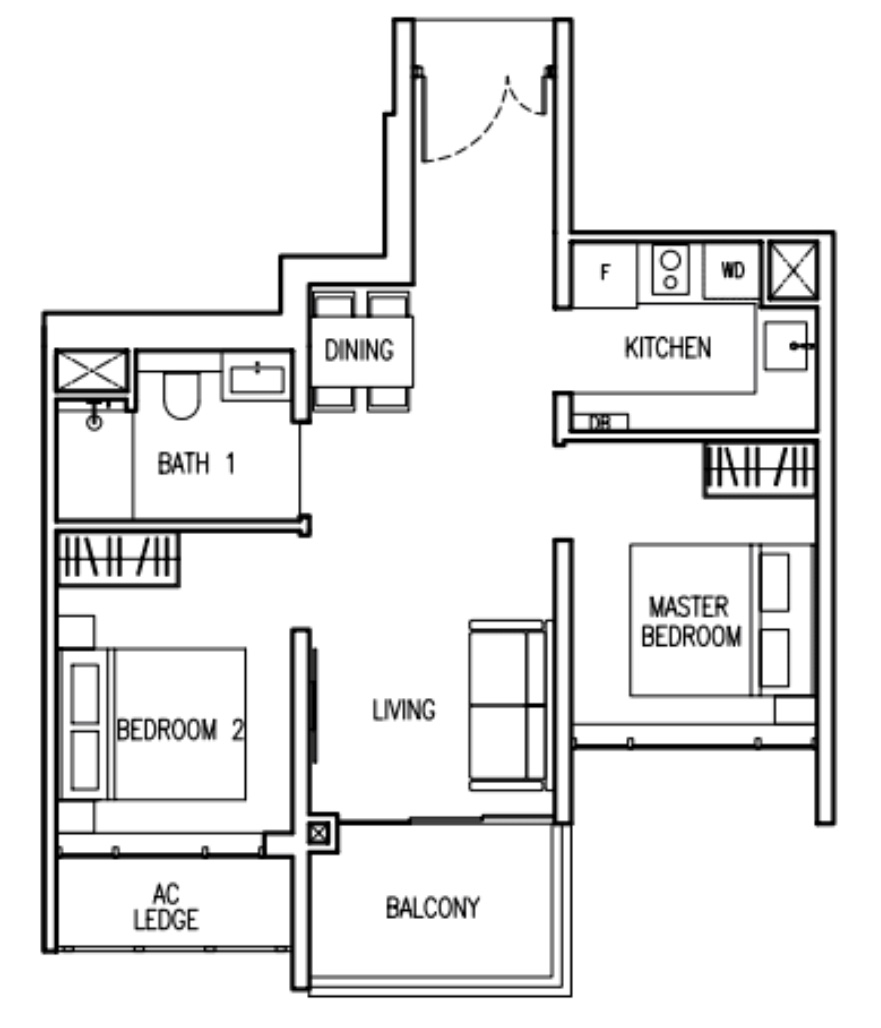
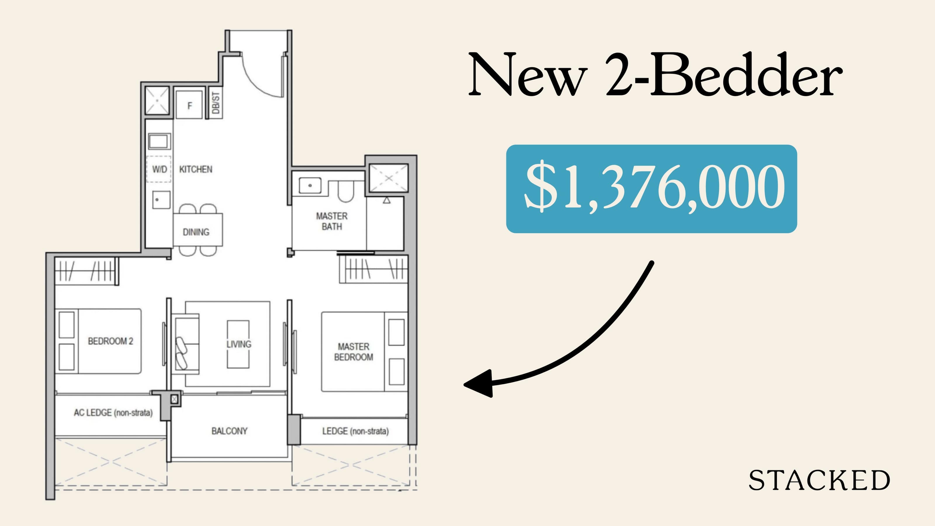
The smallest 2 bedroom here is of a more efficient dumbbell layout. However, I feel that this was negated by the unnecessarily long entranceway here.
The dining area is also right outside the only bathroom in the unit, making it quite undesirable. It’s great that the kitchen is enclosed, however, The Nautical offers natural ventilation. In fact, there is natural ventilation in all the rooms unlike the one at The Commodore. The second bedroom also has an air-con ledge right outside unlike the unit in The Nautical.
If this layout looks familiar to you, it might be because you saw the 2 bedroom unit at The Watergardens At Canberra. It also sports a similarly long entranceway, dumbbell layout, a lack of natural ventilation in all bathrooms, and an AC ledge right outside the common bedroom:
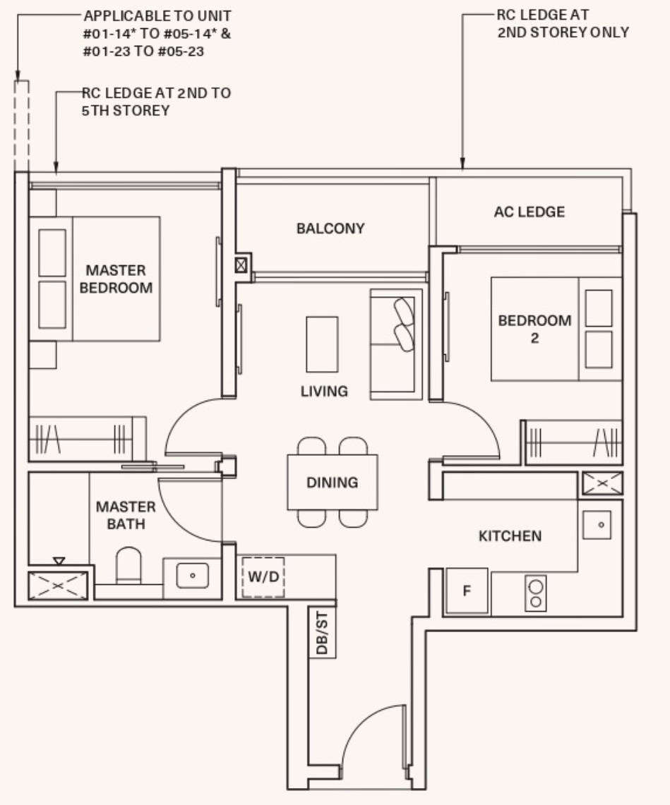
Between the two, I do prefer the layout at The Nautical over The Commodore. It’s increasingly rare to find natural ventilation in all bathrooms and an enclosed kitchen for a 2 bedroom unit. Perhaps that’s why The Nautical has recorded 118 profitable transactions, with only 9 unprofitable ones so far!
And usually, with a $PSF gap, I am quite okay if the $PSF gap is a result of the new being more efficient than the old. This is the case when I compared Amber Park to the much older resale condos around.
However, when the $PSF gap is wide compared to a property that is also relatively efficient and perhaps more functional, then it does leave me wondering about the performance later on when it hits the resale market.
That being said, the $PSF premium of 27% over an older leasehold property is still pretty much an acceptable level on average for a new launch development that is closer to the MRT by about 5 minutes. My only caution here is that the presence of a better layout and more affordable options, in the long run, would mean that perhaps this premium gap would close.
Next, let’s look at the 3 bedroom prices.
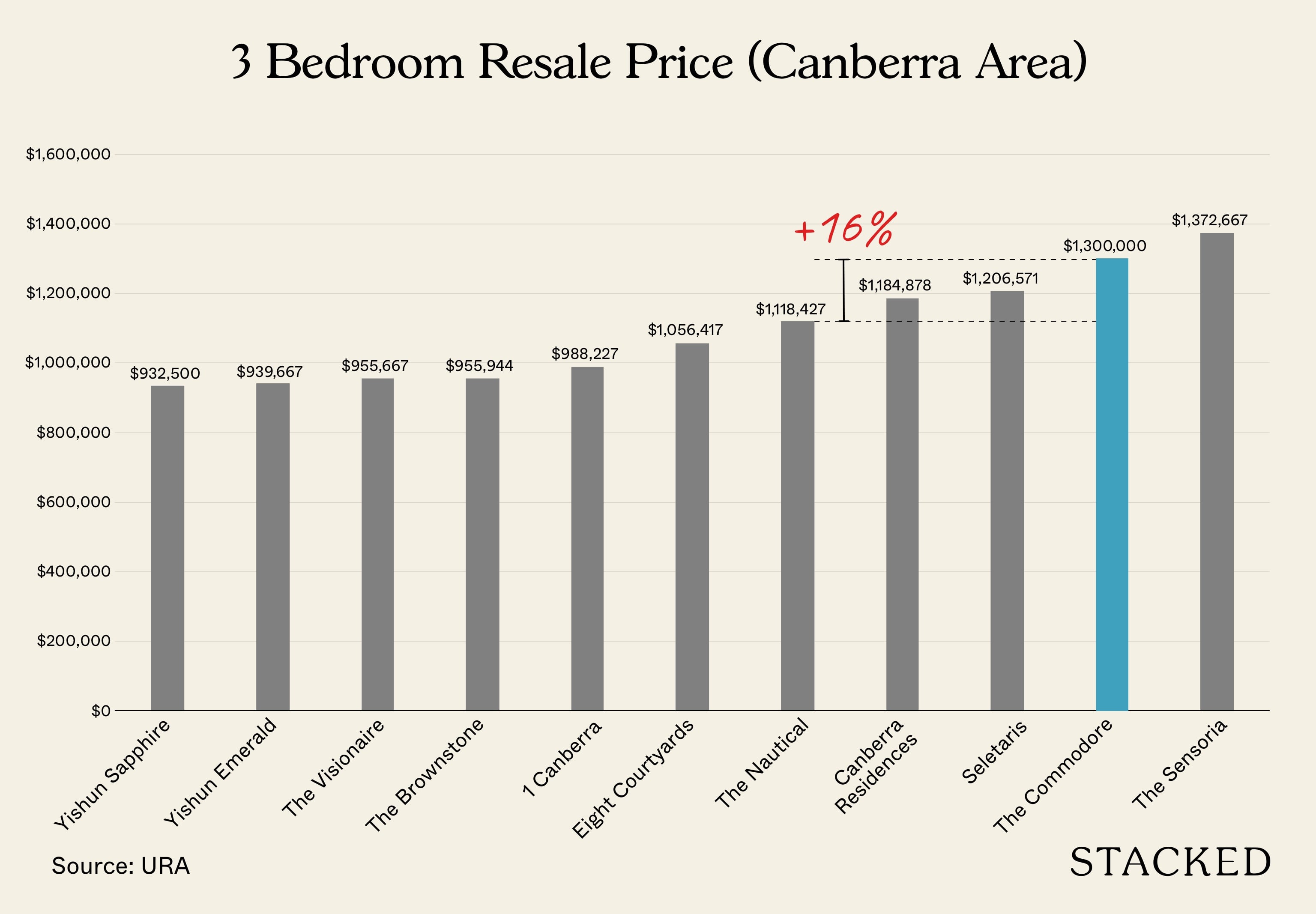
I will make the comparison to The Nautical again given it is the newest in terms of the lease start date (2011) and built year (2015).
In terms of quantum, The Commodore costs 16% more than The Nautical. This is actually quite acceptable for a new launch development. Now let’s look at the $PSF comparison:
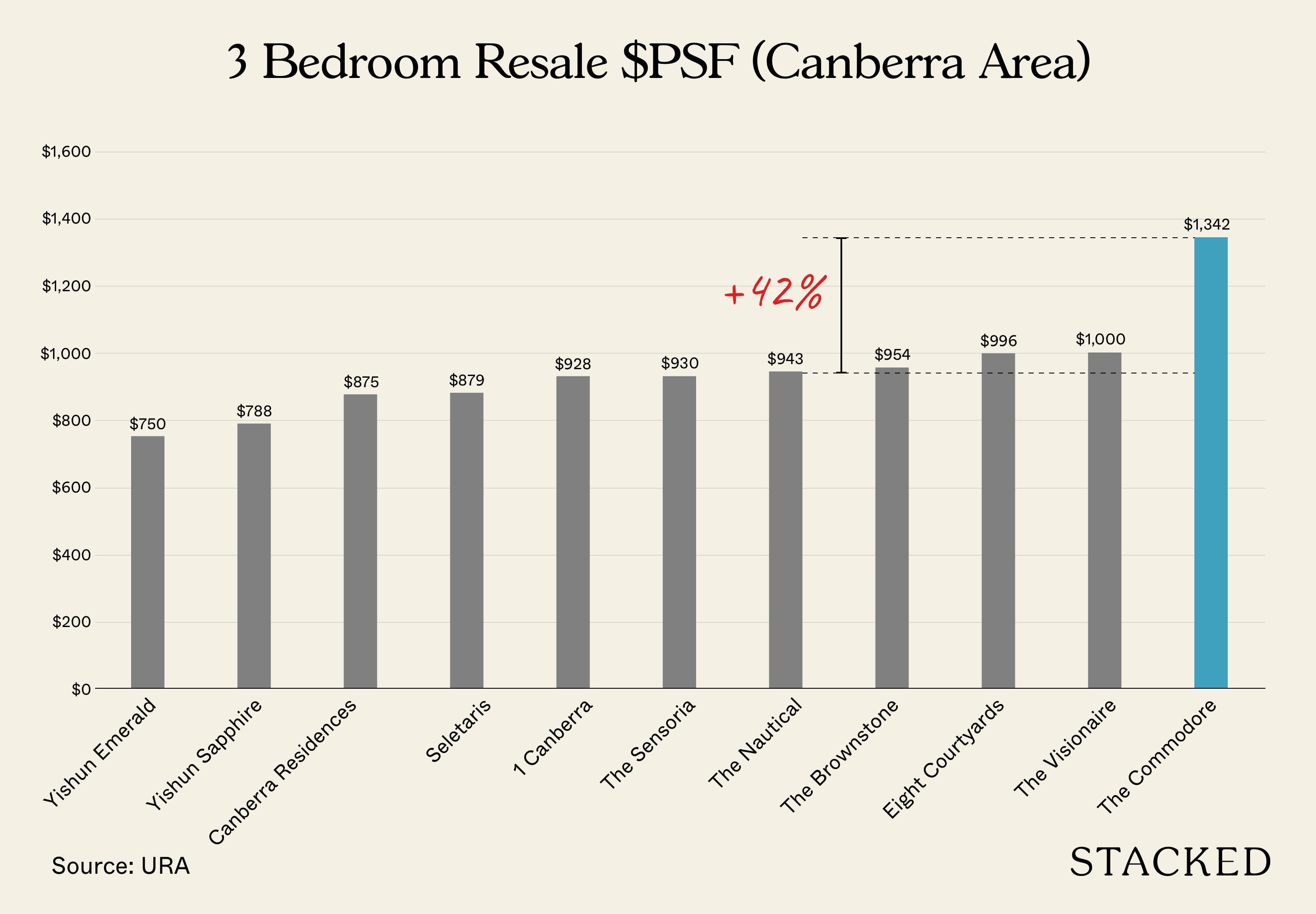
This is where things are really starting to heat up. In terms of $PSF, The Commodore is asking for a premium of at least 42% over The Nautical. Let’s see what the 3-bedroom at The Nautical looks like:
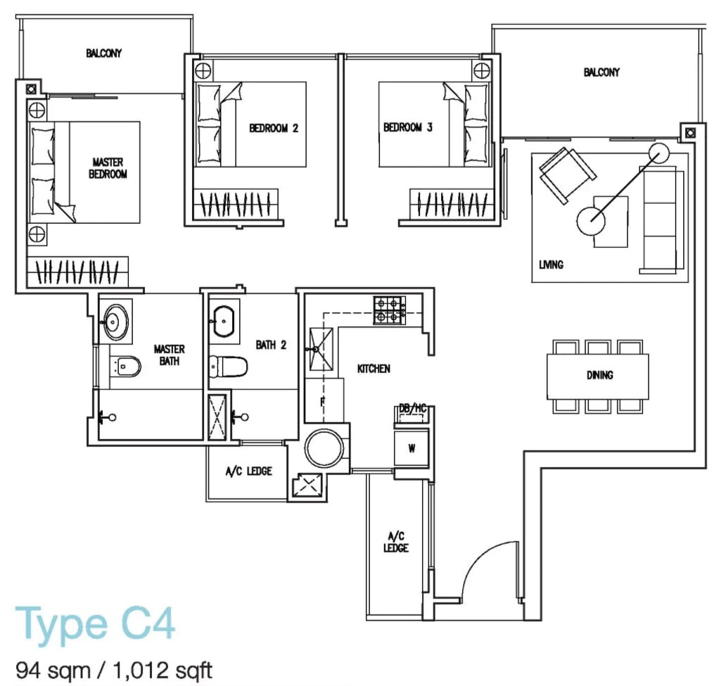
This 3 bedroom unit went for $960,000 ($949 psf) on 26 March 2021. The unit has a long entranceway which somewhat helps with privacy, but it’s not very practical given the air-con ledge next to it, meaning storage cannot be built here. It has a spacious dining area, but the living area is really narrow such that the sofa cannot even be at the center of the living room. It has an enclosed kitchen and both bathrooms have natural ventilation. It also lacks a service yard as well. As with the 2 bedroom unit, both the living and the master bedroom has a balcony.
Let’s see what the smallest 3 bedroom at The Commodore looks like:
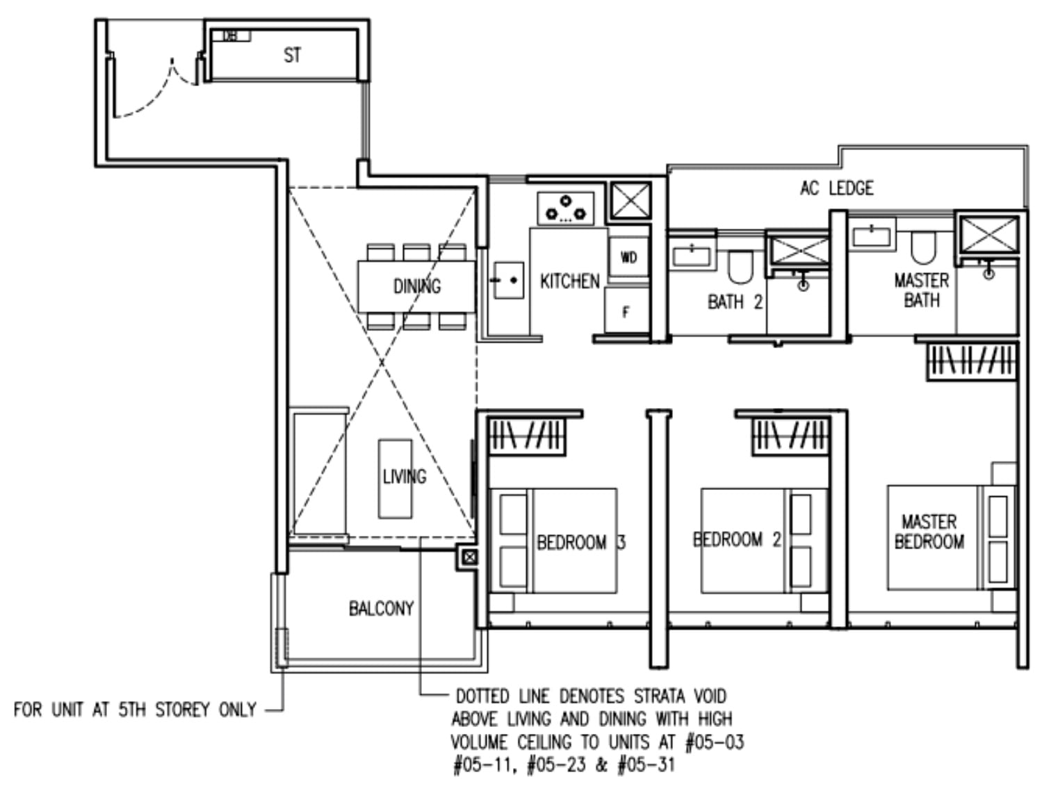
The Commodore has an entranceway that kinks left, very helpful for privacy. It also has a section for storage which is great considering the lack of a household shelter here. Unlike the 2 bedroom unit, there is natural ventilation in the kitchen and both bathrooms. In addition, the living room here is at least of decent width – enough to fit a couch unlike that in The Nautical.
Between the two, I do prefer The Commodore’s 3 bedroom layout here. The space proportion between dining and living here seems more appropriate than the one at The Nautical. Furthermore, I do like that the entranceway here provides full privacy while having the option for storage unlike that at The Nautical. In this case, the kitchen and bathrooms have natural ventilation too unlike the 2-bedroom unit.
However, the price is starting from $1.3x (minimally $1,300,000 at a $PSF of $1,342. This puts in at a premium of minimally 35% over the one at The Nautical in terms of price, and 41% in terms of $PSF.
Is this premium justified? For a development that’s 9 years newer and closer to the MRT by about 5 minutes, I feel that the gap is quite wide. As with our review of The Watergardens At Canberra, I think that people may willing to accept this level of pricing on the resale market given it would be the newest in the area, however, I am not positive about the capital appreciation in the short and long-term period.
Buyers in the resale market would make a comparison similar to what I did here, and it would not make much sense to pay this much more just because it is newer if it does not offer that more efficiency or anything else unique besides being a couple of minutes closer to the MRT.
Now that we’ve looked at the resale options, let’s compare them to the new launches in the area.
| Project | Tenure | 2 Bedroom | 3 Bedroom | 4 Bedroom | 5 Bedroom |
| Parc Canberra (EC) | 99 yrs from 10/12/2018 | $868,000 ($1,047 psf) | $1,047,824 ($1,105 psf) | $1,279,970 ($1,081 psf) | $1,552,182 ($1,052 psf) |
| Provence Residence (EC) | 99 yrs from 08/01/2020 | – | $1,146,513 ($1,153 psf) | $1,692,900 ($1,210 psf) | – |
| The Watergardens At Canberra | 99 yrs from 08/06/2020 | $1,069,313 ($1,487 psf) | $1,404,841 ($1,418 psf) | $1,779,368 ($1,400 psf) | – |
| The Commodore* | 99 yrs from 08/06/2020 | $920,000 ($1,474 psf) | $1,300,000 ($1,342 psf) | $1,700,000 ($1,436 psf) | $2,300,000 ($1,379 psf) |
*Indicative prices here are likely the lowest it can be, so the average would be higher.
The only fair comparison here would be with The Watergardens At Canberra since Executive Condominiums are subsidised already – and you can see how prices traded at a discount of as much as 25% for a 3 bedroom unit compared to The Watergardens At Canberra.
Both developments are situated side by side and share the same lease start date. The Commodore is slightly more convenient as it’s situated closer to the MRT.
The prices between The Watergardens At Canberra and The Commodore are very similar. In fact, once prices are staged up, it’s likely that both developments would have traded around the same price. Hence, we think of this as a 2nd chance for buyers looking to get in early on if they missed out on The Watargardens At Canberra.
Given their similarities, there really isn’t much we can draw on which is better here. This would ultimately boil down to the layout and facing.
Overall, I feel that the pricing of new launches in the Canberra area diverged quite far from its resale counterparts, but as I have stated in my earlier review, the relatively high $PSF of the new ECs is encouraging to say the least, so I do expect prices to at least hold in the short-term.
Appreciation Analysis
Matt has written about this in his The Watergardens at Canberra review, so obviously since the locations are so similar, this was lifted from his review:
The North hasn’t been the most talked-about region in Singapore for obvious reasons (it’s far from all the action) but that’s about to change with several development plans announced by URA that will make Canberra a more liveable and desirable place to live, work and play.
1. North South Corridor (NSC)
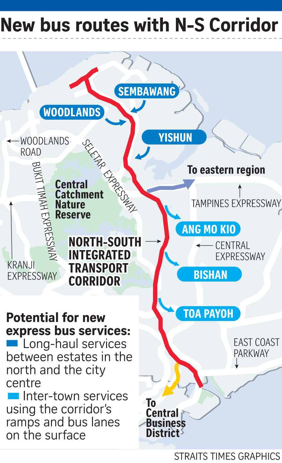
The NSC will connect the North to the City and help to ease the ever-crazy congestion on the CTE and arterial roads such as Thomson and Marymount Road. At 21.5km, the NSC will feature dedicated bus lanes, cycling trunk routes, and pedestrian paths. I wouldn’t call this a point that would directly lead to a capital appreciation for The Commodore, but having less congestion and reducing drive times (especially considering its distant location) will go a long way in helping residents have a better overall experience.
2. North Coast Innovation Corridor (NCIC)
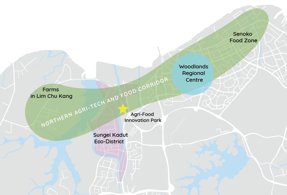
The NCIC will stretch from Woodlands and Sembawang to Seletar and Punggol Innovation Cluster and will be anchored by the Woodlands Regional Centre. Woodlands is set to become a strategic economic zone in the North especially for companies with business links to Malaysia, with the Woodlands Regional Centre yielding some 700,000 sqm worth of commercial space. Among the exciting features would be the Agri-Tech & Food Corridor, which will combine high-tech farming with R&D facilities. Transport connectivity to our neighbours is supported by the Thomson-East Coast Line and rail services to Johor. With more job opportunities in the North, the hope is that there will be greater demand for homes in nearby areas such as Canberra too.
3. Bukit Canberra
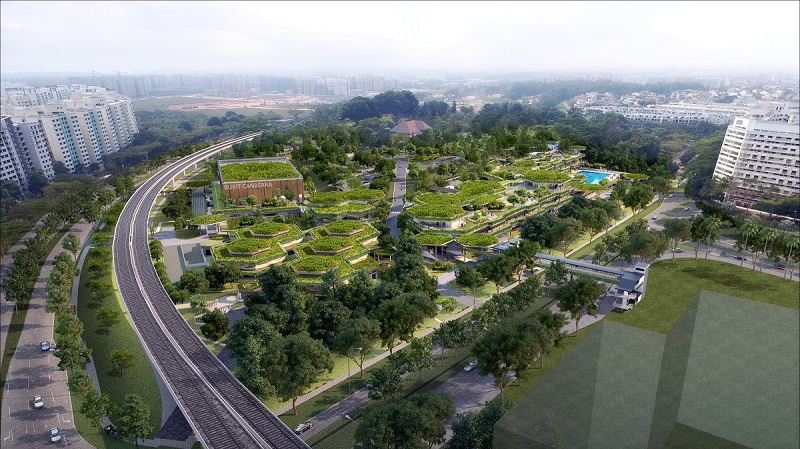
Bukit Canberra will be a 5-minute drive or 1.6km walk away from The Commodore. It will be an integrated sports and community hub or in other words, a modern community centre. There will be good landscaping all around with a solid array of sporting facilities for the community. This includes an 8-lap pool, indoor sports hall with 500 seats, gym, and fitness studios. There will also be a polyclinic, senior care centre, and a hawker centre housed in it. For the history buffs, the most impressive part of Bukit Canberra to me is the Old Admiralty House, built in 1939 in Arts & Crafts architecture and formerly the residence of Australia, New Zealand, and the United Kingdom (ANZUK) forces.
What we like
- 50m swimming pool
- Just 219 units
- Rain shower in every bathroom
- Premium fittings in kitchen
What we don’t like
- –Still far away to travel
- –Facings for each unit isn’t the best
Our Take
As much as developers do try to differentiate themselves at the mass market level, it’s often difficult to do so as the nature of the current industry (low margins, and higher risk) means it is usually more of a safe monkey see monkey do approach.
Still, you can see from the final product that JBE has tried to change things up a little – from the brands used, fittings in the bathroom, and private lift access for the bigger units – there has been effort put in to position The Commodore as a more luxe option for OCR upgraders.
And so by and large, I’d have to say they’ve succeeded in that regard. The dark sultry tones of the exterior, to the hotel-like arrival area, and the overall look and feel of the Clubhouse and dining areas – it does look the part.
The biggest contention to The Commodore would still definitely be its location – it still is admittedly far from almost everywhere else. Of course, if you’re already used to the area and are looking for something new, this will represent a more exclusive and private option over The Watergardens at Canberra.
To sum it up, I’d say the entry prices for the 1 bedroom units here are attractive in comparison to the current rest of the new launch market today. Resale comparison in the area can still be a bit murky depending on your objectives. But if you are in the market for a 1 bedroom unit and looking for a new launch option today, it’s a pretty compelling option.
What this means for you
You might like The Commodore if you:
-
• Believe in the North’s growth story:
Many plans are in the pipeline to make the North a more exciting place for industry and leisure
-
• Have a strict budget:
Especially for a one bedroom unit, you aren’t going to get any new launch at the same price in the market today.
You may not like The Commodore if you:
-
• Like open spaces:
While they’ve done admirably in terms of adding lawn spaces, the small plot of land and short nature of the buildings does mean that truly open spaces here are at a premium.
-
• Value convenience the most:
If you work in the CBD or in town this probably be the biggest downside. I’m not sure if the travelling times are worth it, but that will be quite a subjective topic for many
End of Review
At Stacked, we like to look beyond the headlines and surface-level numbers, and focus on how things play out in the real world.
If you’d like to discuss how this applies to your own circumstances, you can reach out for a one-to-one consultation here.
And if you simply have a question or want to share a thought, feel free to write to us at stories@stackedhomes.com — we read every message.
Frequently asked questions
What is the location and size of The Commodore development?
The Commodore is located along Canberra Drive in District 27, with a site area of approximately 143,325 square feet and 219 units.
How does The Commodore differentiate itself from nearby projects?
It offers more exclusive fittings and a unique name inspired by naval history, along with larger unit sizes and premium brands in fittings compared to typical OCR projects.
What amenities are available at The Commodore?
The development features a 50m swimming lap pool, children's pools, clubhouse, pavilion, outdoor fitness areas, playground, lawn spaces, dining pavilions, and a gym with floor-to-ceiling windows.
What is the unit mix and pricing for The Commodore?
Units range from 1 to 5+ study bedrooms, with 1-bedroom units starting at about $700,000, making it an affordable entry point in today’s market.
How is the layout and design of The Commodore's units?
The 2-bedroom units have an efficient layout with a semi-enclosed kitchen, decent-sized bedrooms, and a study, with materials and finishes that resemble luxury properties.
Our Verdict
72%
Overall Rating
The Commodore is one of the most attractively priced new launches on the market today. With premium fittings for an OCR project and a well-sized swimming pool for 219 units, it is a good option as long as you are accepting of its further away location.
Documents
Join our Telegram group for instant notifications
Join Now













0 Comments