Inside An Interior Designer’s Own 1,645 Sqft Executive Apartment
September 3, 2023
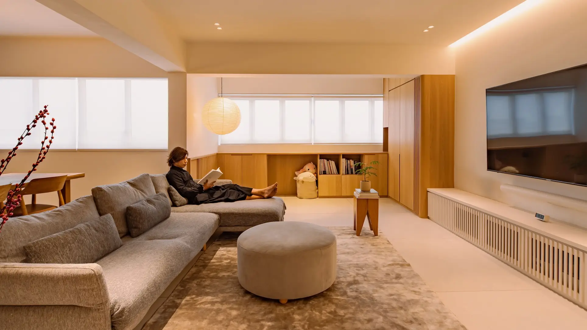
In this week’s episode, we take a closer look at an executive apartment, spanning approximately 1,645 square feet.
The layout of this residence offers versatile possibilities, with the potential to reconfigure rooms and merge the living hall space with one of the common rooms.
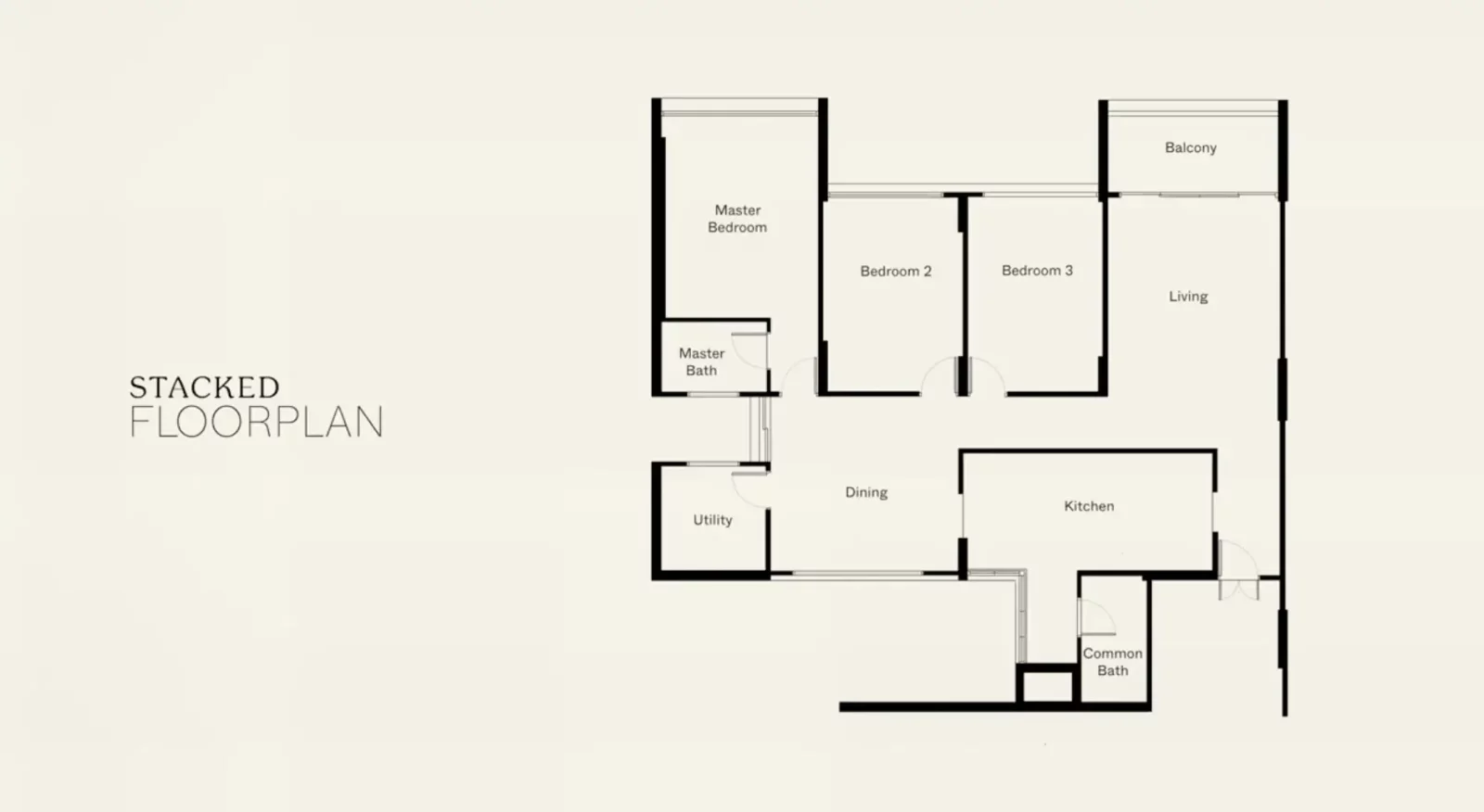
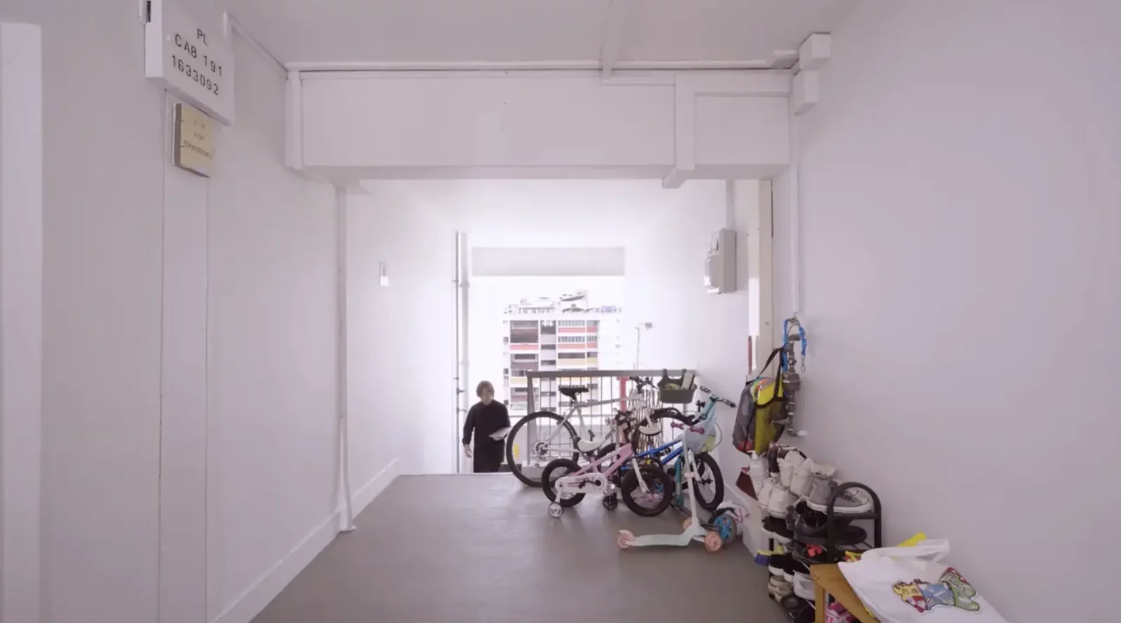
Located conveniently near the parents-in-law and a school, the choice of this spacious unit aligns with the preference for ample living space. Notably, this apartment occupies the entire floor, boasting a private lobby that provides both space and practicality. The spacious entrance lobby offers a seamless transition into the interior and ample room for storage.
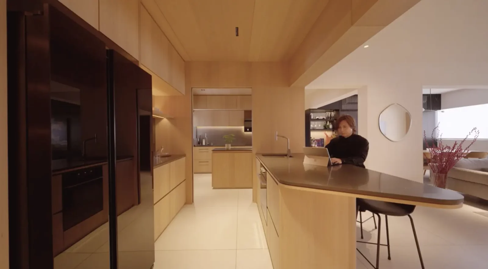
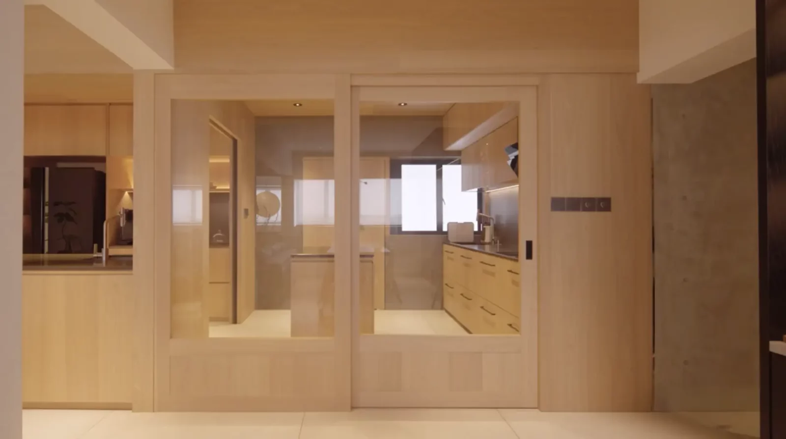
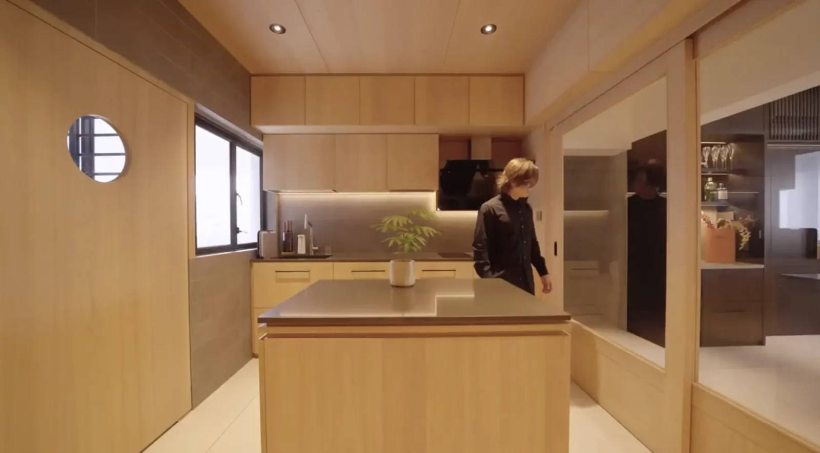
Upon entering, you’re welcomed by a dark foyer, creating an impressive contrast with the bright, open living hall beyond. The foyer flows seamlessly into the dry pantry and wet kitchen, making it an ideal hub for family activities such as breakfast and baking.
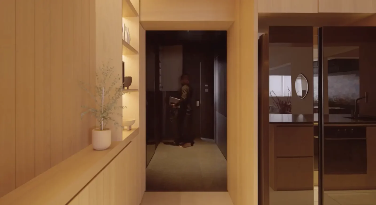
The design emphasizes spaciousness and functionality, with an open shelf connecting the dry pantry to the wet kitchen.
The living space extends further by incorporating the former balcony area, creating more storage opportunities without compromising on aesthetics.
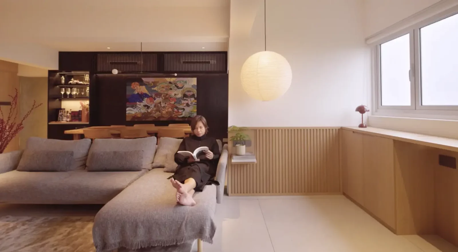
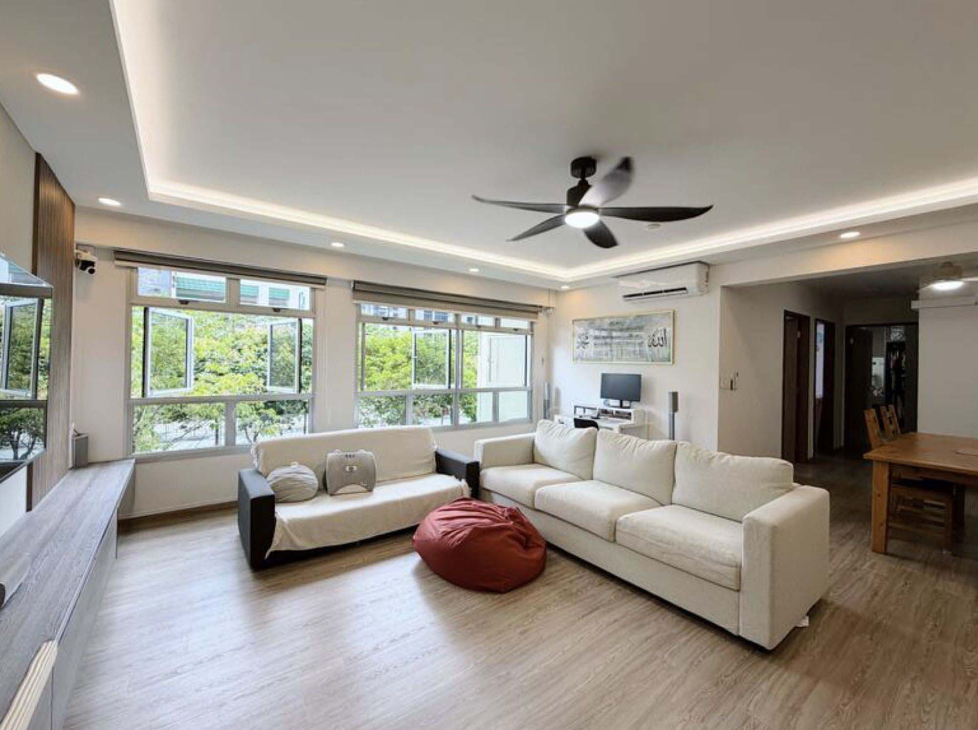
Minimalism is the key theme here, with strategically placed storage solutions like the low console, adding to the practicality of the space. The white walls contribute to the overall sense of openness, ensuring the living area remains uncluttered.
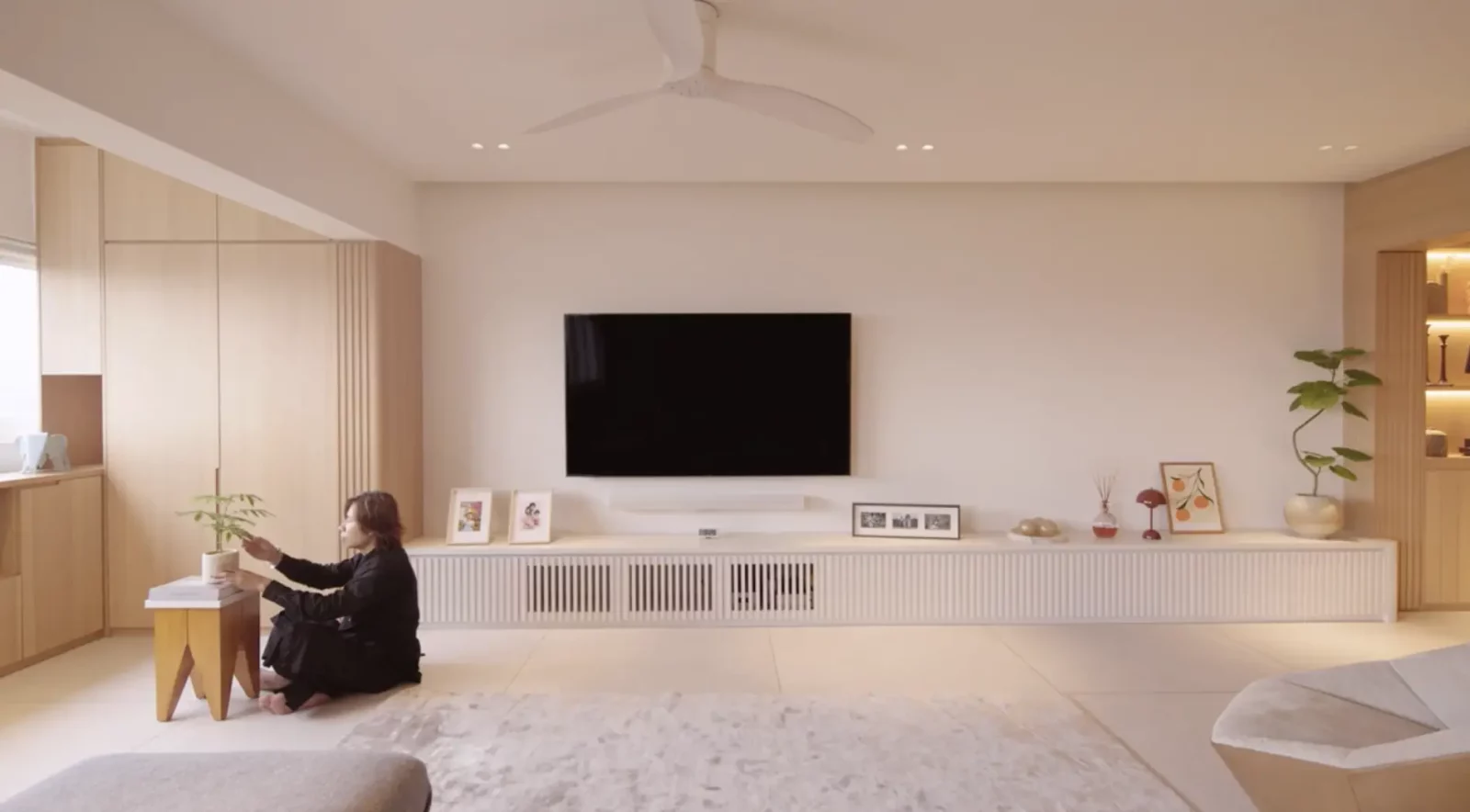
The dining area, once a separate bedroom, now seamlessly integrates with the living space, facilitating gatherings and communication.
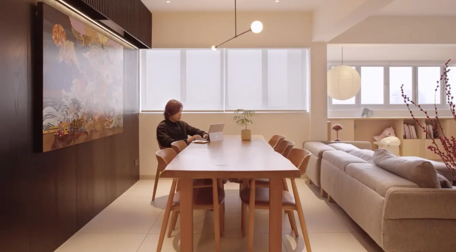
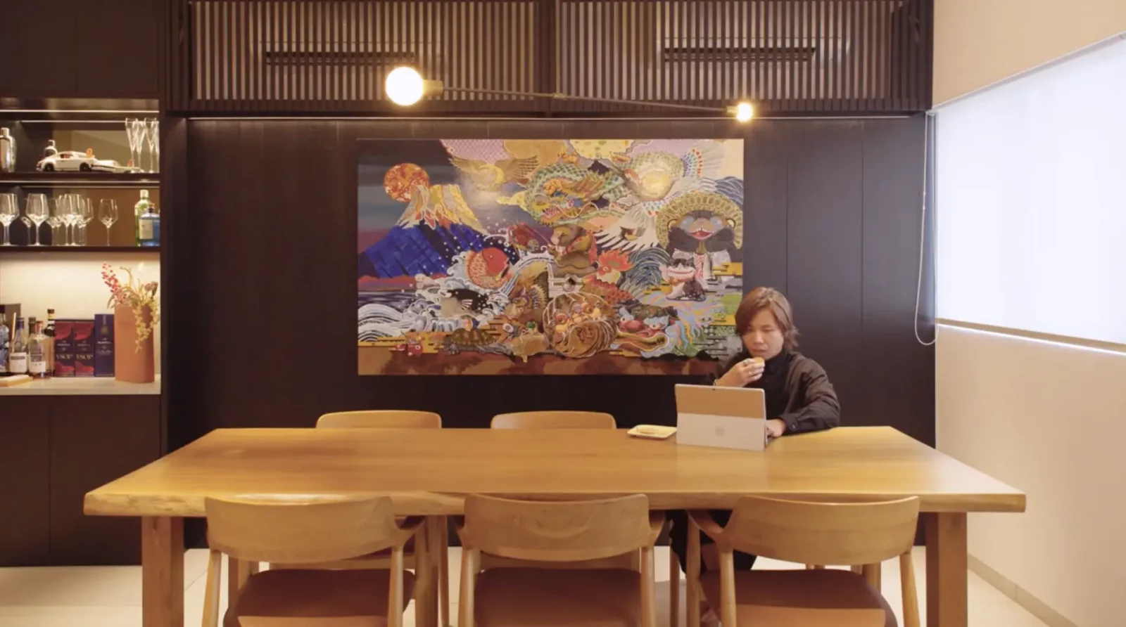
A vibrant art piece serves as a focal point against a black backdrop, creating a striking visual contrast.
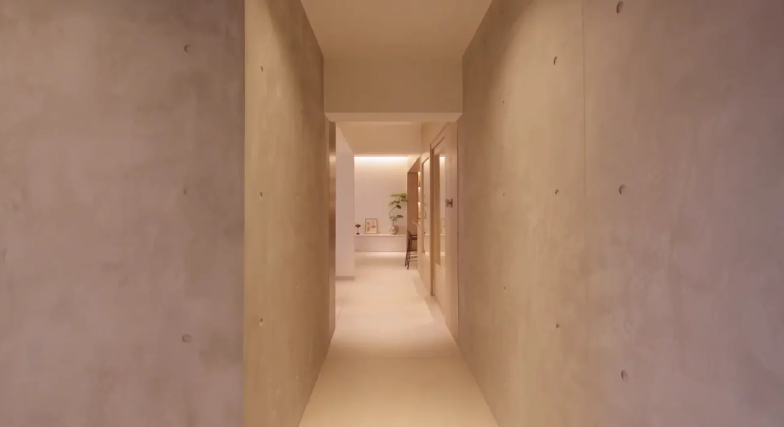
Throughout the apartment, thoughtful design choices prevail. The corridor, inspired by Tadao Ando’s style, features a cement wall effect, contributing to a cool and timeless ambience. This corridor leads to the various rooms, which have been cleverly reoriented to optimize space.
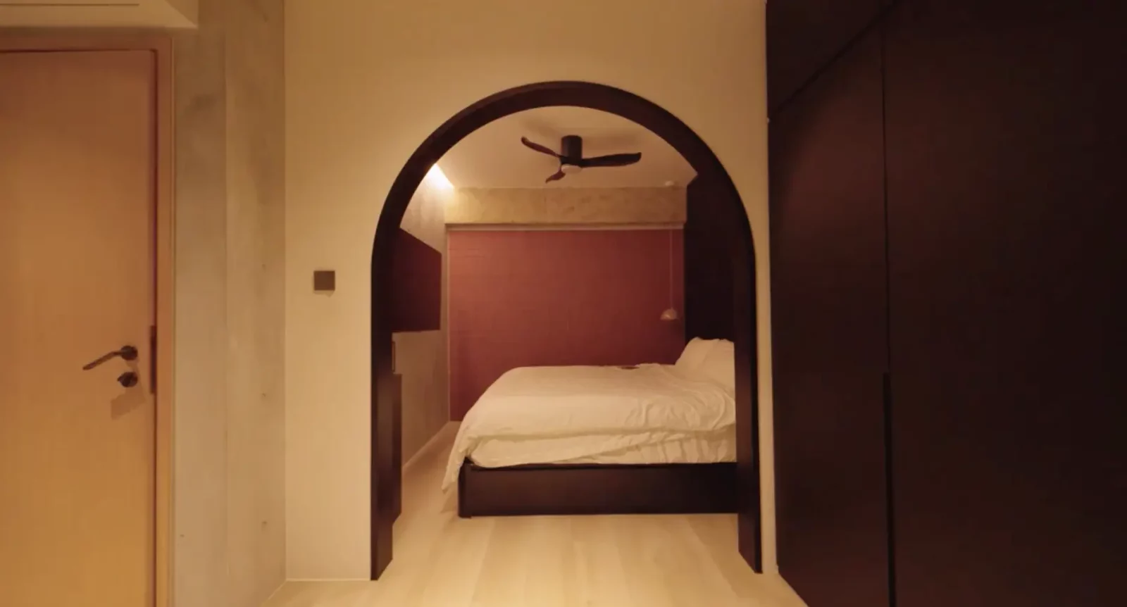
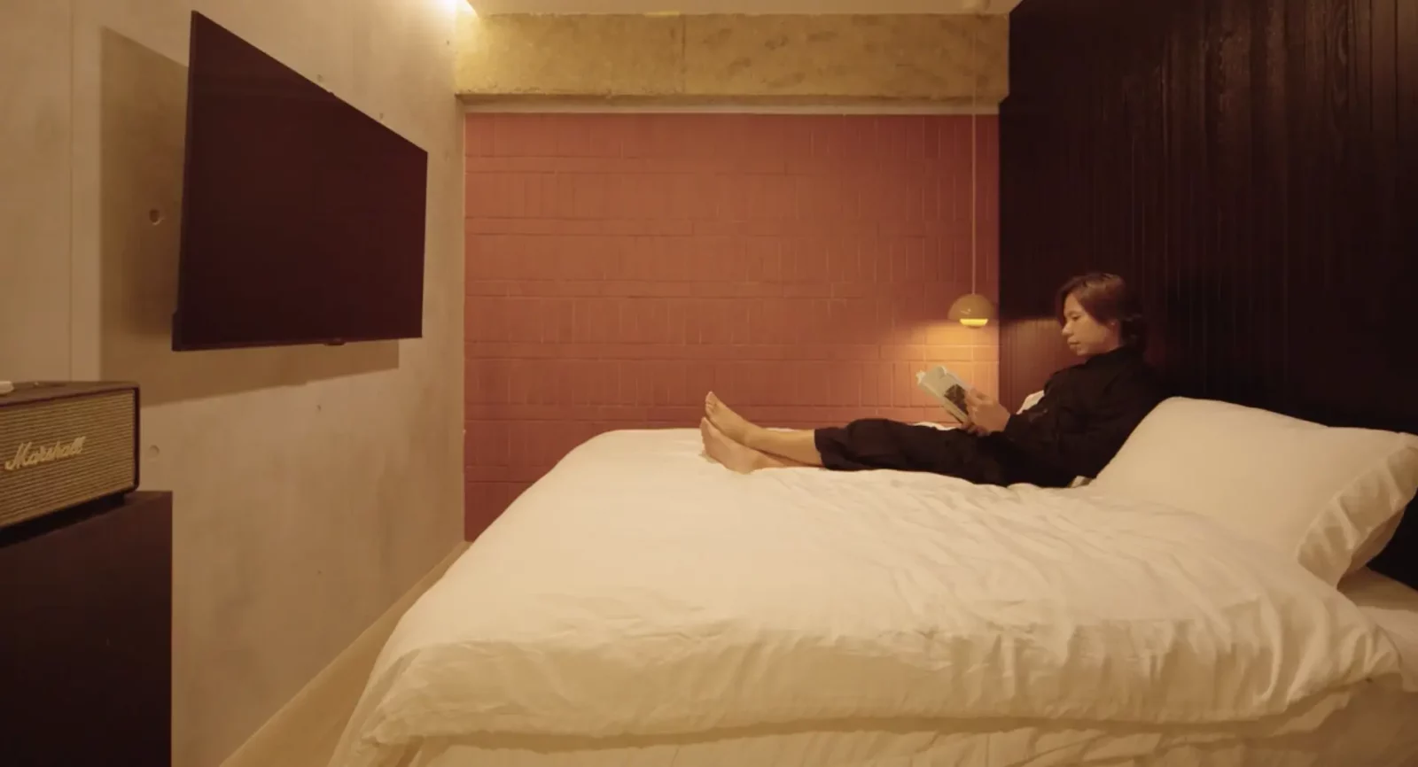
The master room, once a dining area and storeroom, stands out with its distinct arch design. Black tones create an elegant contrast against materials like bricks and cement walls, resulting in a warm yet intimate atmosphere.
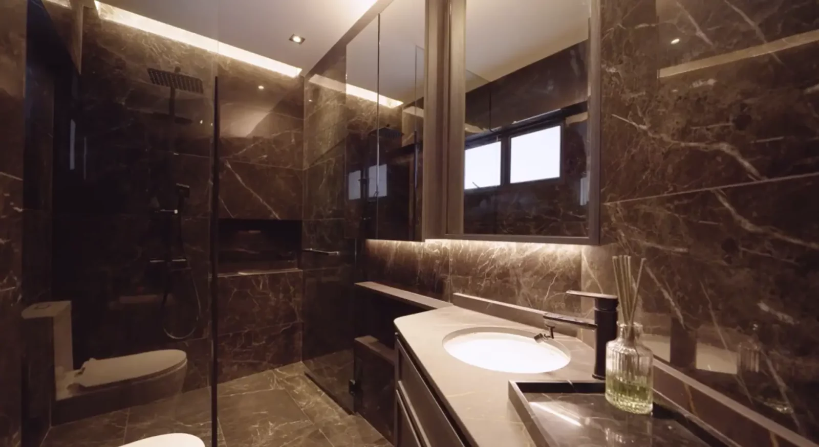
The master bathroom boasts a generous size, allowing for a well-planned layout and thoughtful placement of fixtures.
The shower area’s strategic positioning prevents condensation on the shower screen, ensuring practicality and comfort.
This design project reflects the designer’s firsthand experience in understanding homeowners’ needs and the importance of practicality in design. By moving into the space they’ve designed, they’ve gained valuable insights into how functionality and aesthetics must harmonize.
Special thanks to the homeowners for opening up their home to us. If you’d like to get connected to him for the design of your own home, you can reach out to him via this link. Receive a $500 Stacked Store credit upon successful sign-up and completion of the project.
At Stacked, we like to look beyond the headlines and surface-level numbers, and focus on how things play out in the real world.
If you’d like to discuss how this applies to your own circumstances, you can reach out for a one-to-one consultation here.
And if you simply have a question or want to share a thought, feel free to write to us at stories@stackedhomes.com — we read every message.
Need help with a property decision?
Speak to our team →Read next from Home Tours
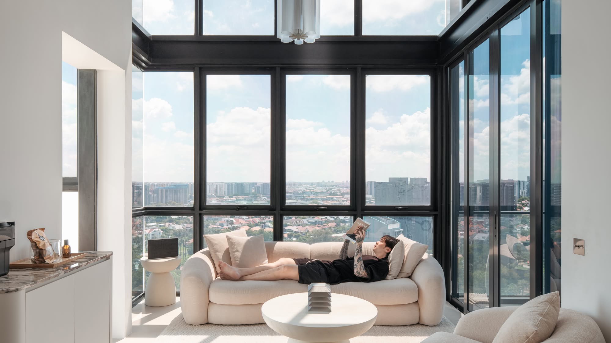
Home Tours Inside A Minimalist’s Tiny Loft With A Stunning City View
Editor's Pick This Beautiful Japanese-Inspired 5-Room HDB Home Features an Indoor Gravel Garden
Home Tours A Family’s Monochrome Open-Concept Home with Colour Accents
Home Tours A Bright Minimalist Condo Apartment With A Loft
Latest Posts
Singapore Property News 4-Room Flat at Bedok South Horizon Sets New Bedok Record at $1.17M
PRO Pro Where To Buy A Condo In Serangoon: Prices, Best Areas And Growth Trends In 2026

Property Advice Hundred Palms, Riverfront Residences Or Tampines Trilliant — Which Is The Better Buy For A Young Family Today?













1 Comments
This 1,645 sq ft executive apartment is a masterclass in minimalist design. Every inch is purposeful and serene.
The smooth flow from foyer to kitchen and the clever use of space show how functionality can be beautiful.
A true example to how thoughtful design elevates everyday living proof that less is more.