How A Couple Transformed Their Sengkang BTO Into A Modern Scandinavian Home
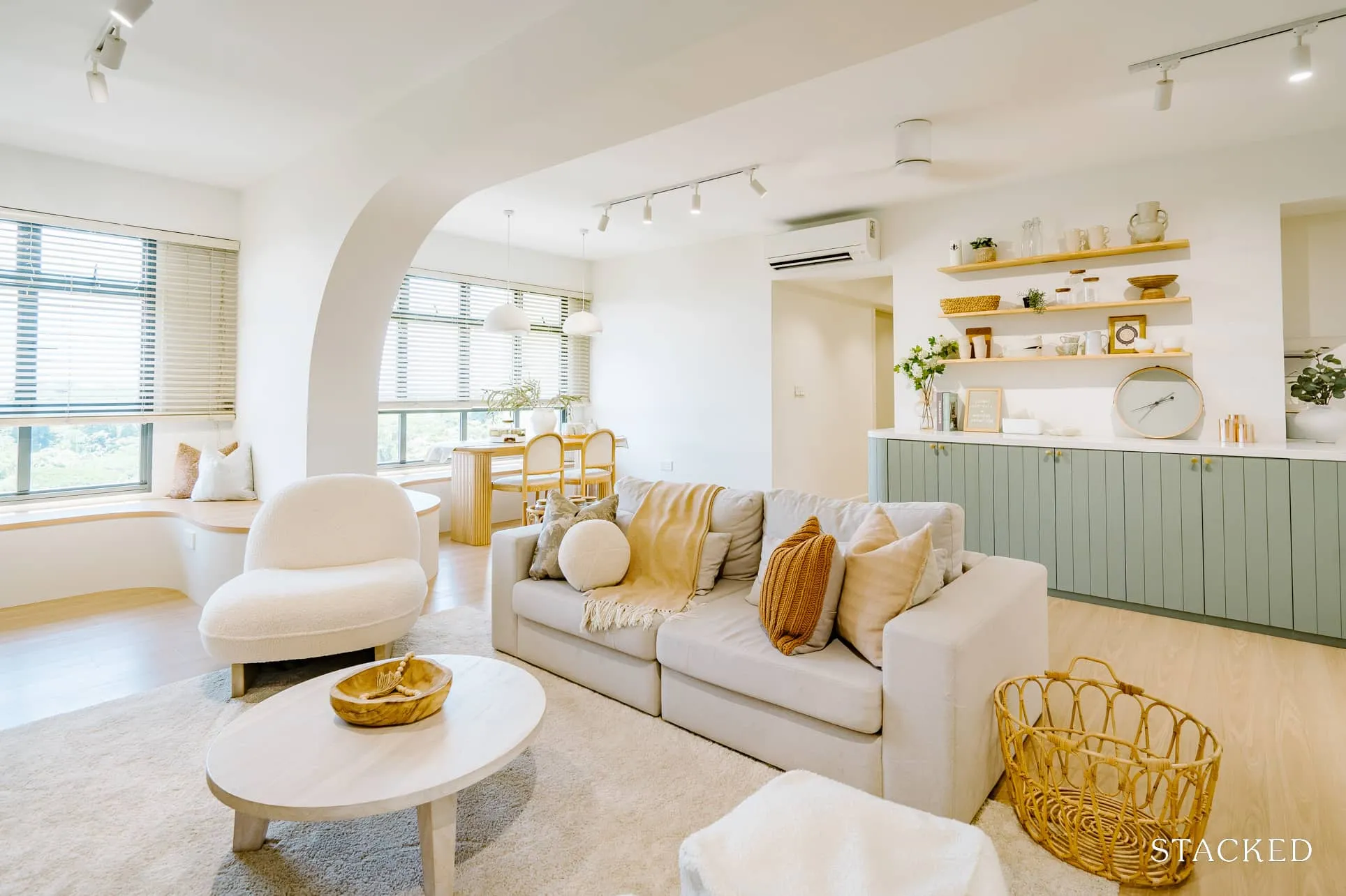
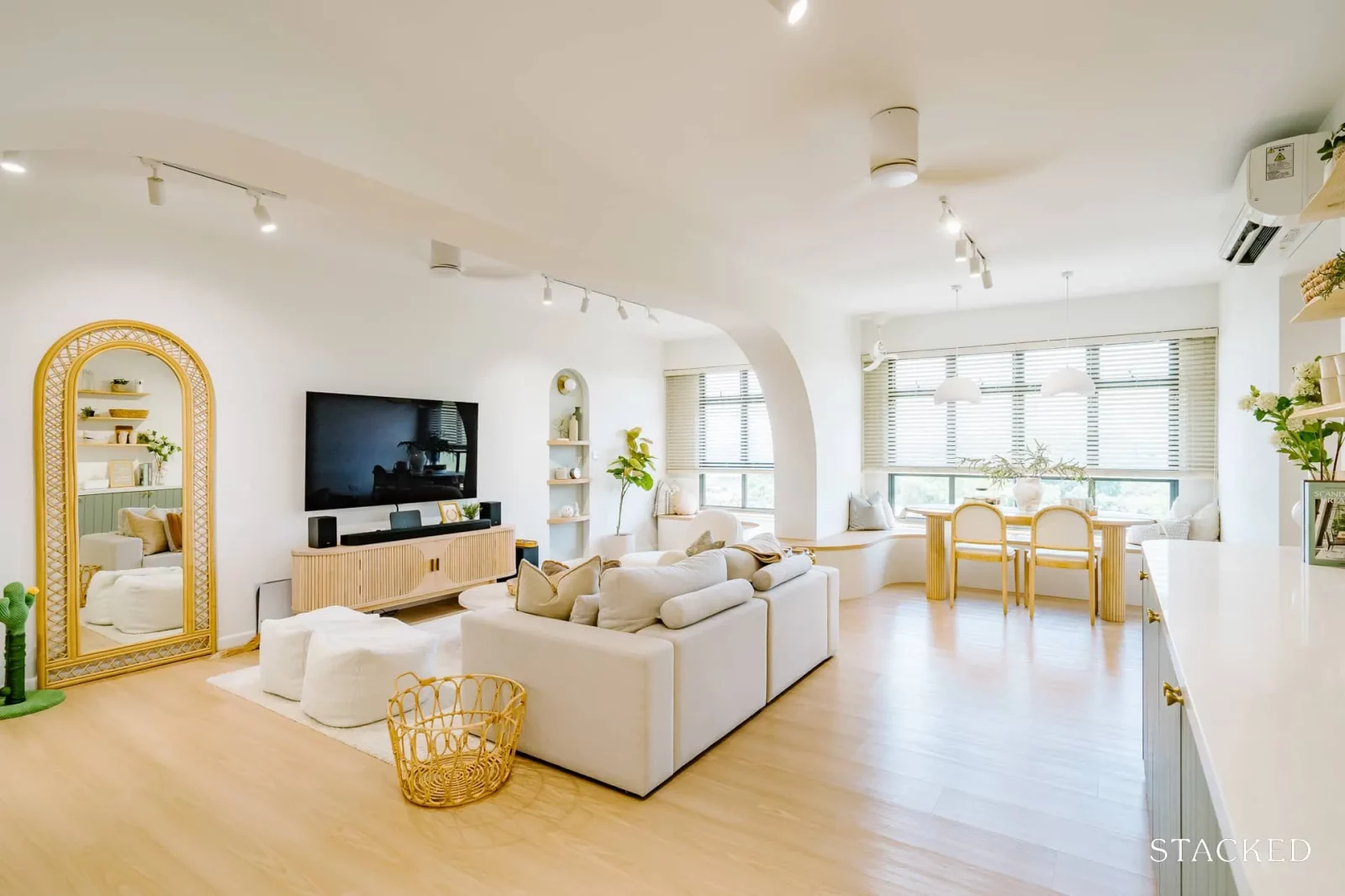
Sometimes, home renovation isn’t as simple as one might imagine. Constraints like immovable walls and architectural quirks can become obstacles to our dream design. This was the case for A (@ohhmyy.home) and her husband, who had to work around a structural pillar in their living room while renovating their home in Sengkang West Way.
What they wanted for their home was a mix of modern Scandinavian, but with this dilemma, they had to make some adjustments since they couldn’t remove the pillar out of the way.
Their home is located in Sengkang West Way, where they applied during a BTO launch in August 2017. “We wanted to stay in the Sengkang area as back then our parents and siblings were in the same location,” A said, “but they have all shifted since then.”
Presently, only the couple and their 2-year-old toddler are staying at their place, together with their 3 cats.
Let’s join them as she shares their experiences on how they went through their home renovation and the outcome of their journey.
How The Renovation Journey Turned Out
Initially, A and her husband budgeted $50,000 for their home renovation. However, as they delved deeper into the process, they found themselves needing to allocate additional funds for elements they deemed essential for their comfort and happiness.
For example, they initially didn’t mind visible aircon trunking in their hallway, but they changed their minds upon seeing the unsightly setup. They also decided to add an extra ceiling fan to their living room for increased comfort.
They also catered for 1 ceiling fan for the living room, but a few weeks later, they decided to add another one.
The couple’s inspiration for their home design was mainly from Pinterest. They also got some of their ideas from home accounts that A followed on social platforms. “We would say that the style of our home is a mix of modern Scandinavian.”
While they wanted a bigger space, they did not choose to make any major changes to the floor plan because of the possibility of their family growing. “We did not want to sacrifice hacking any of the room’s walls in case we have more kids in the future,” A said.
Living Room
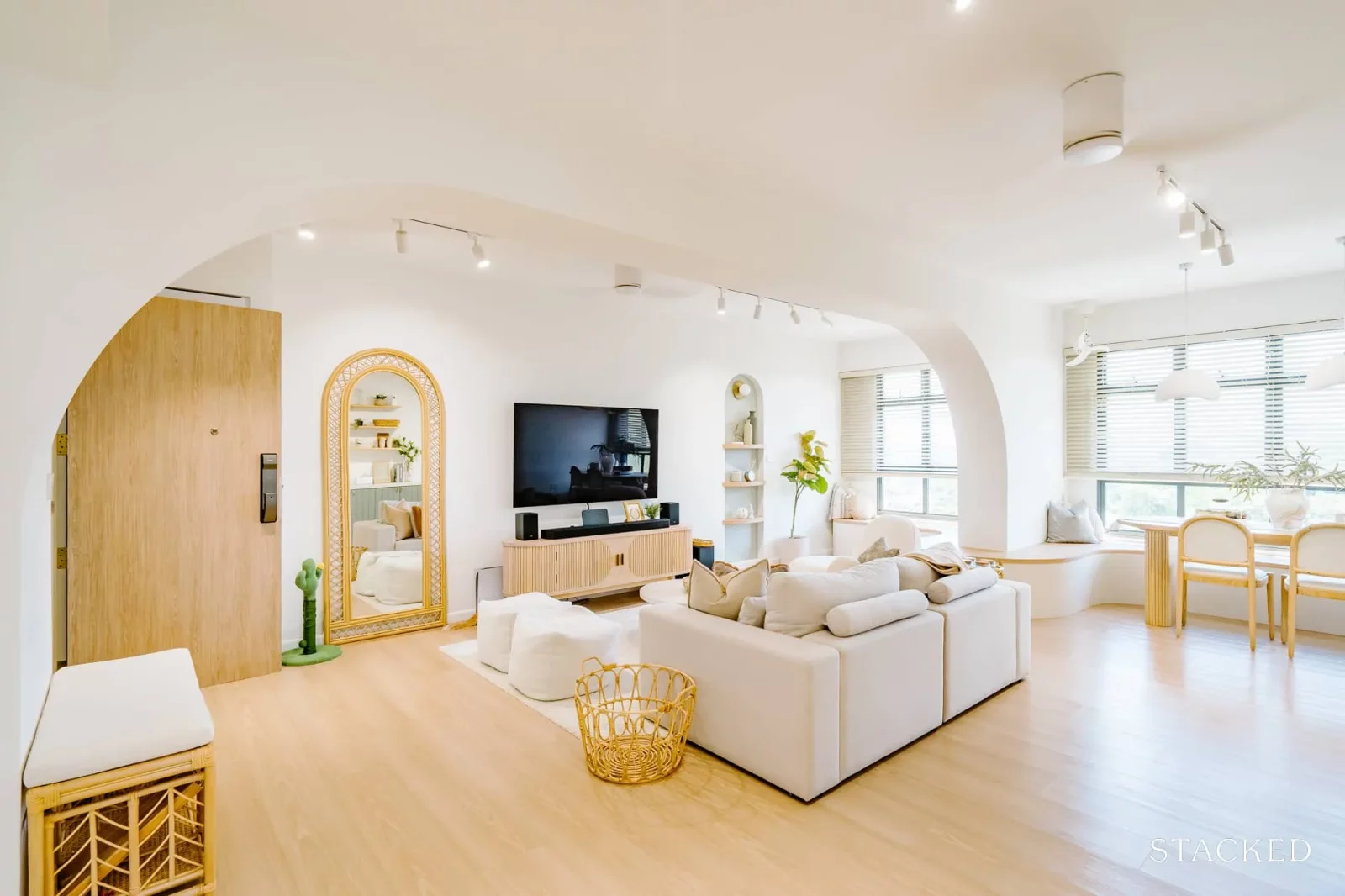
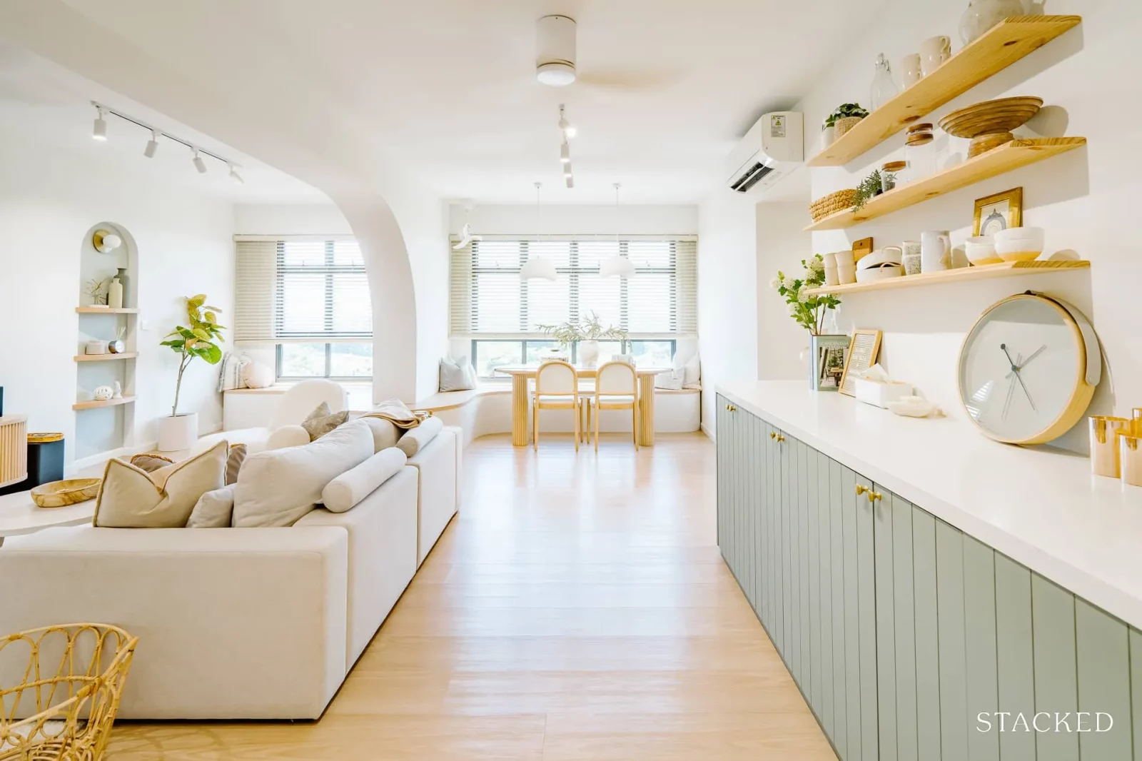
Besides the arched beams, another unique feature of the home is definitely the bay window seats that connects the living and dining area.
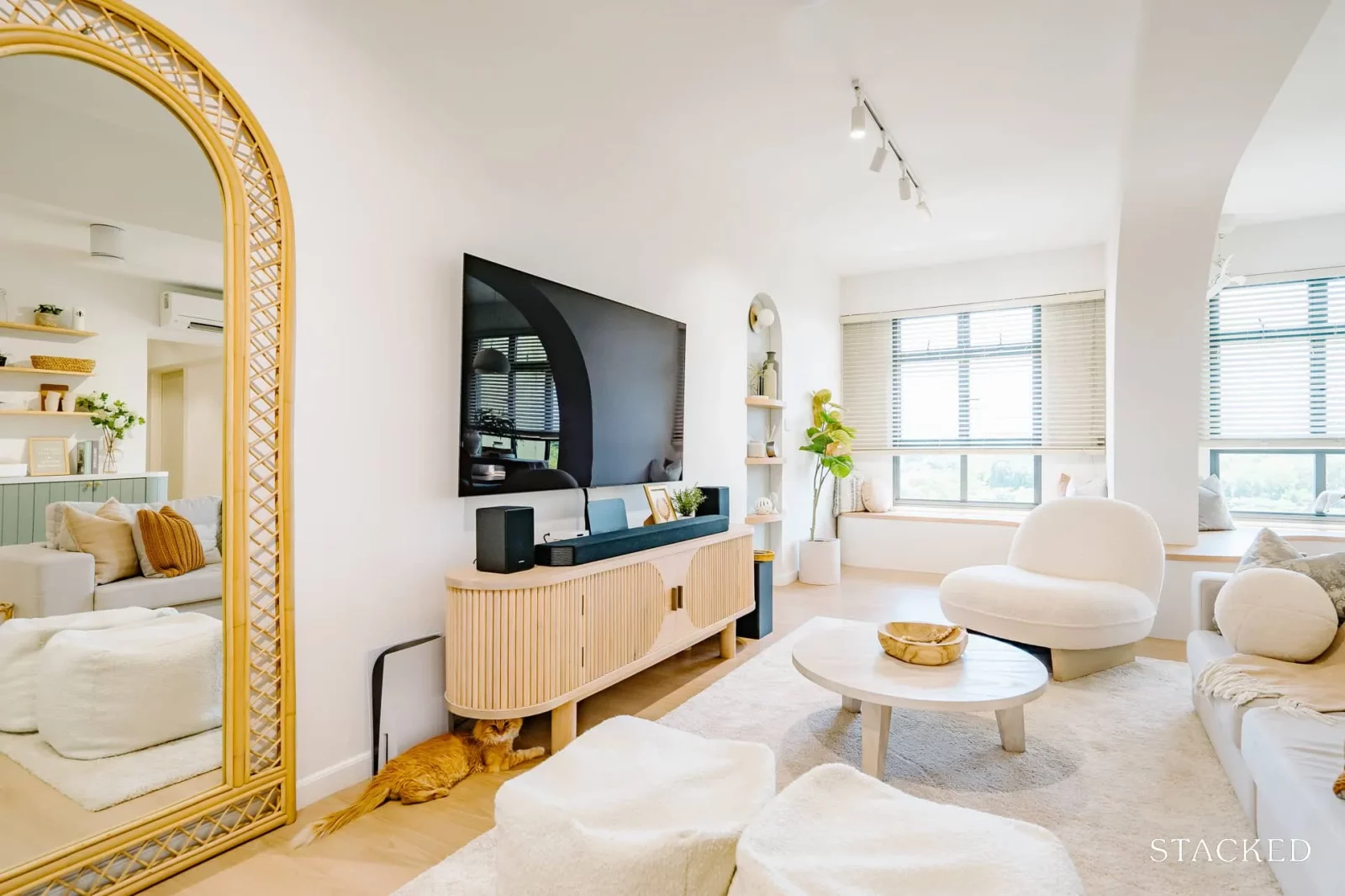
“We decided to have the bay window seating flowing through the living room area to the dining room area,” A explained. This was a perfect solution for them as they enjoyed having family and friends over.
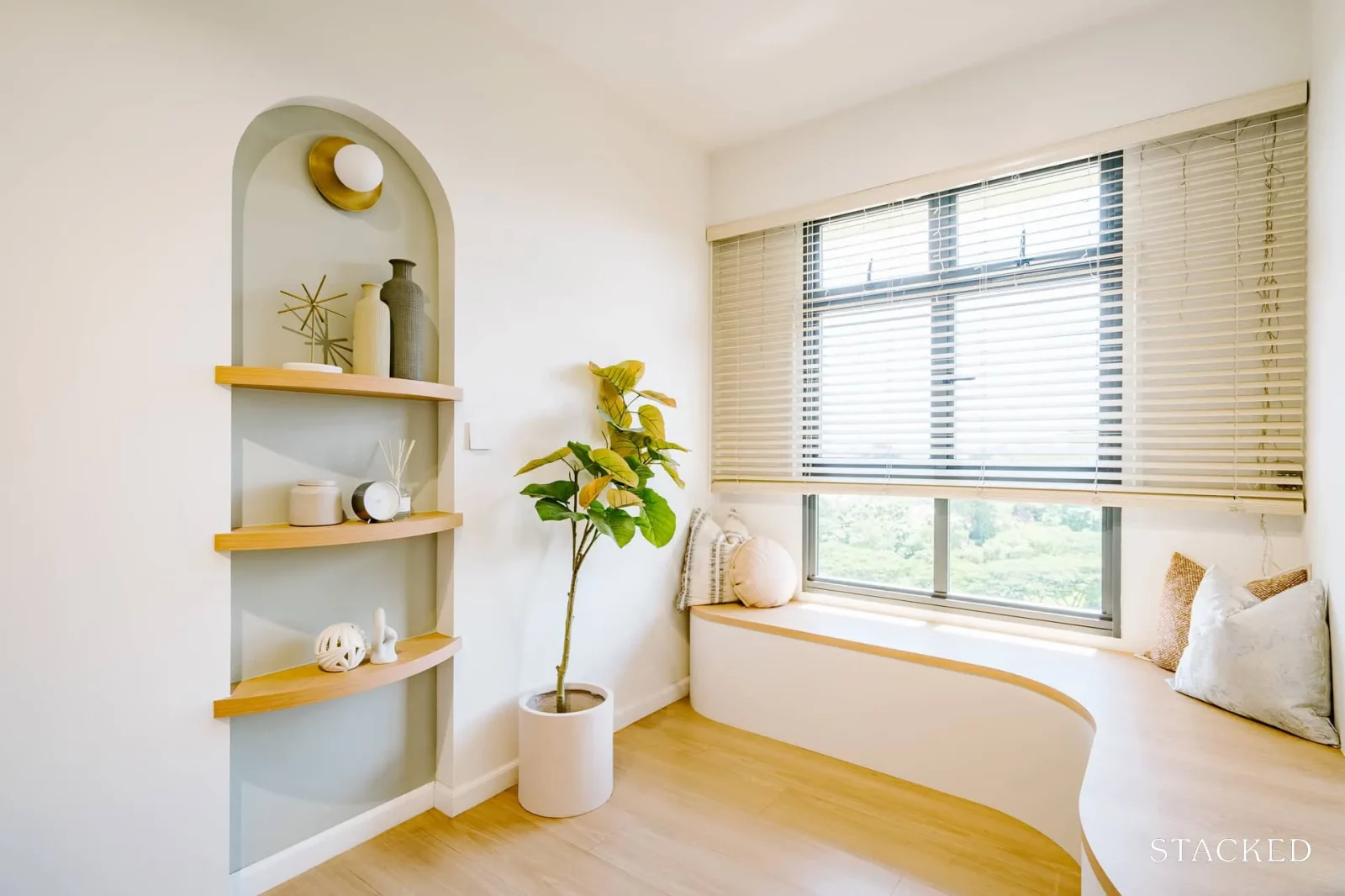
As such, they could provide more seating for everyone without having to store foldable chairs when they had more people over. Plus, the look really tied in with the rest of their home.
Dining Room
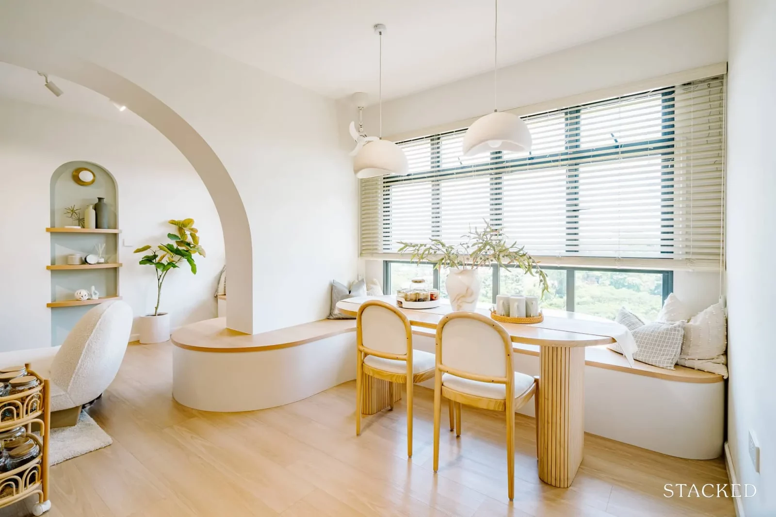
Because of the bay window seating, the dining area was flushed closer to the window. This allowed them to save on more space and provided that cosy “booth-like” dining feel.
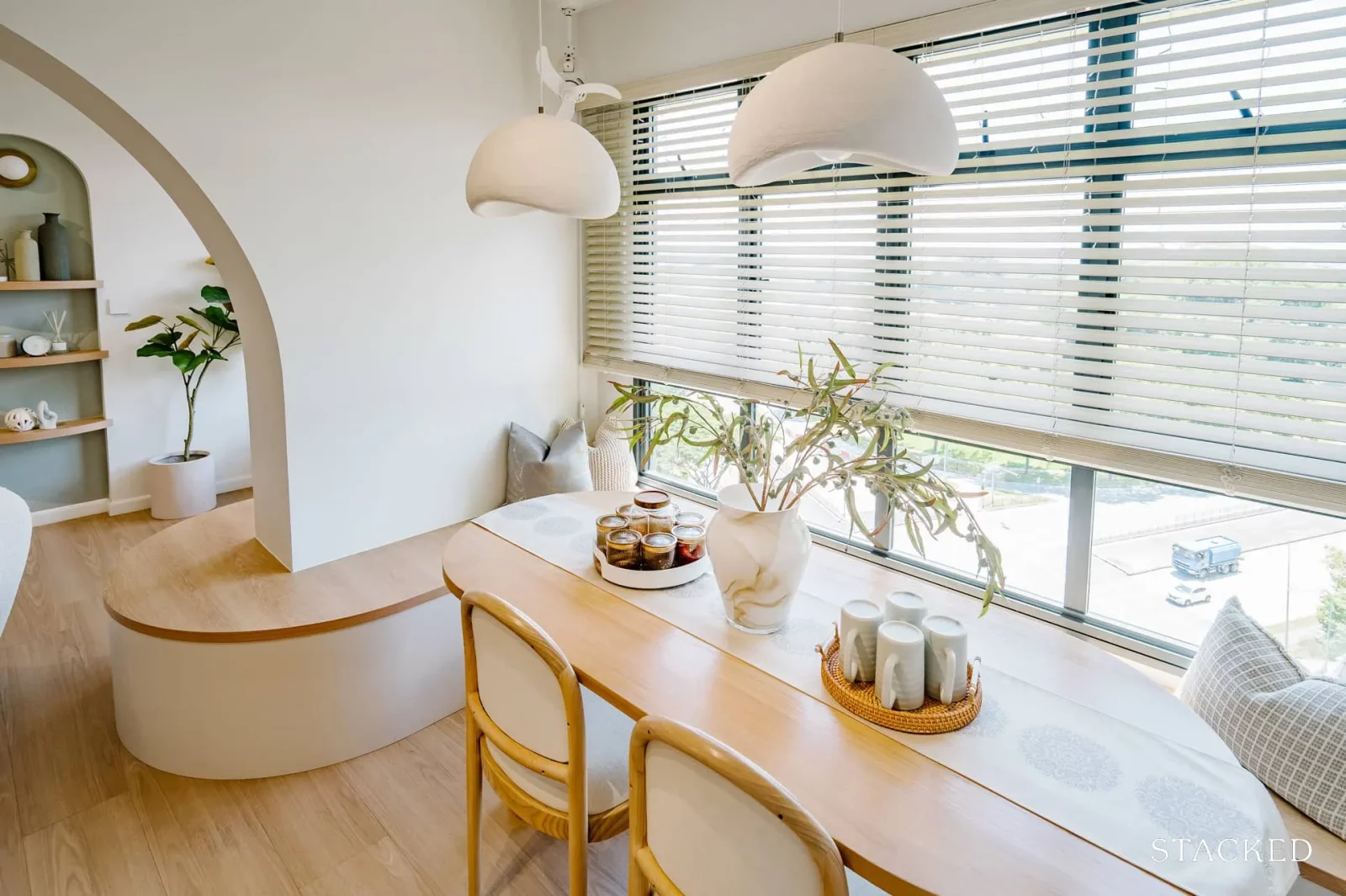
Also because the bay window seating curves around the pillar, this arrangement was great as it formed the end seating for the table.
(The cute white Bestar corner fan really completes the look).
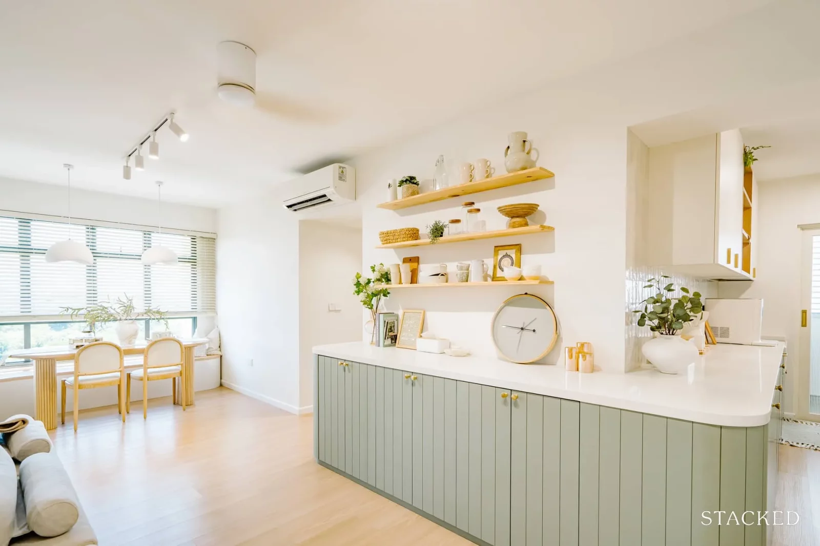
Some people may not like bench seatings because of the rigid nature of it (you can’t move the dining table around), but you can see how much space it saves here as it doesn’t intrude on the walkway space to the living or kitchen.
Kitchen
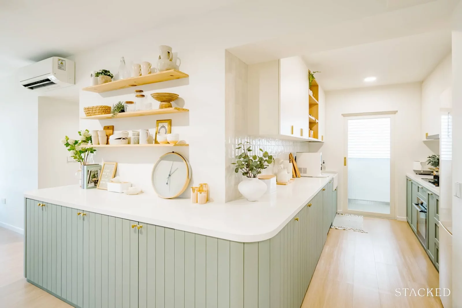
Like most homeowners today, the couple initially wanted an open-concept kitchen, but their layout wasn’t flexible enough to incorporate it.
“We decided to extend the kitchen cabinet out to the living area as a dry pantry,” A explained. This gave the impression of a bigger kitchen, and also gave them more countertop space to work with.
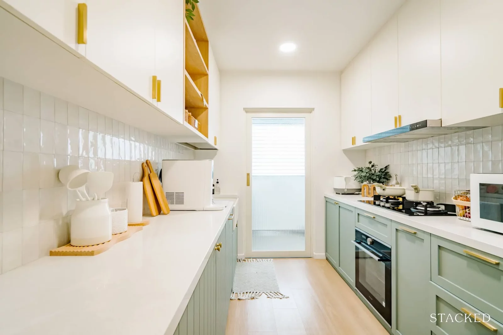
Other work was done here to remove the louvre window between the kitchen and service yard for a cleaner overall look.
Bedroom/s
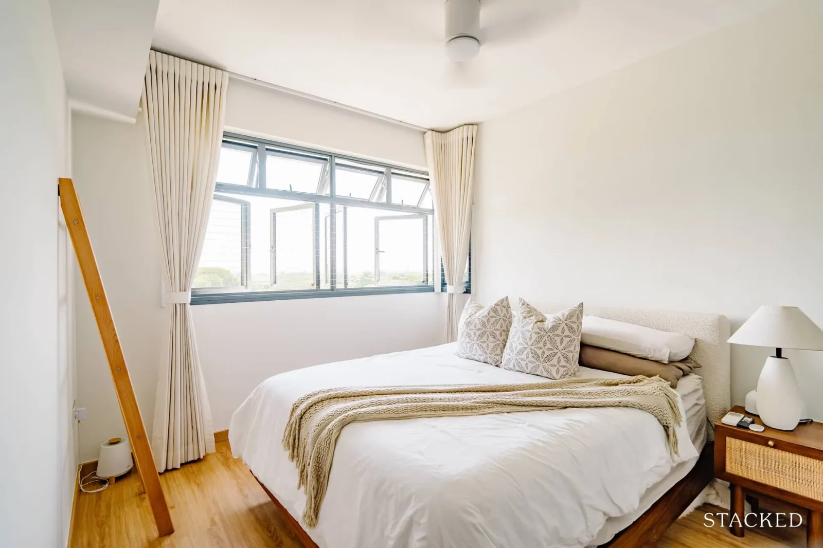
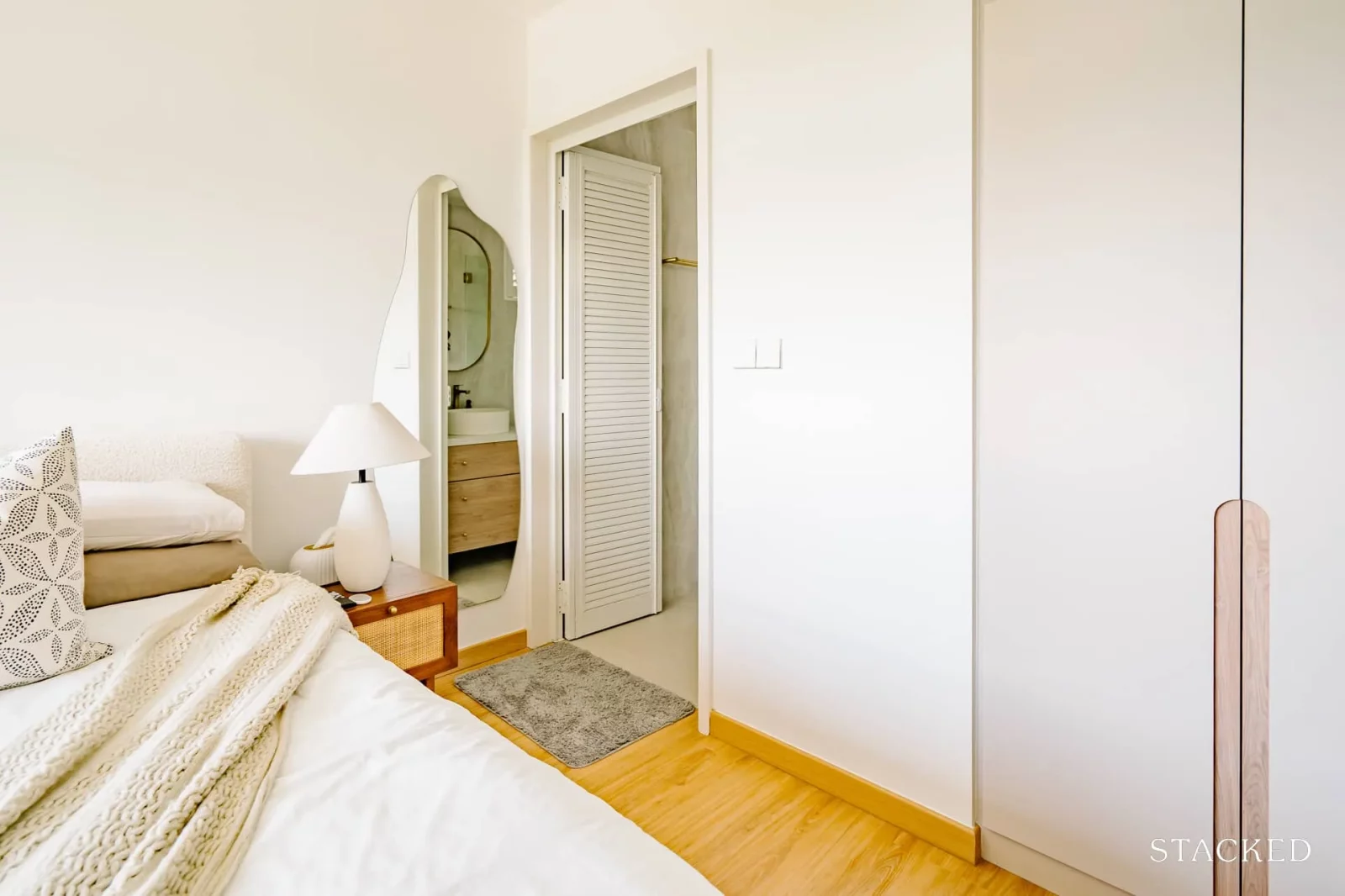
For the master bedroom, their hands were tied in terms of the space of the wardrobe because of the structural beam. As such, they had to make some adjustments to the design of the wardrobe to accommodate.
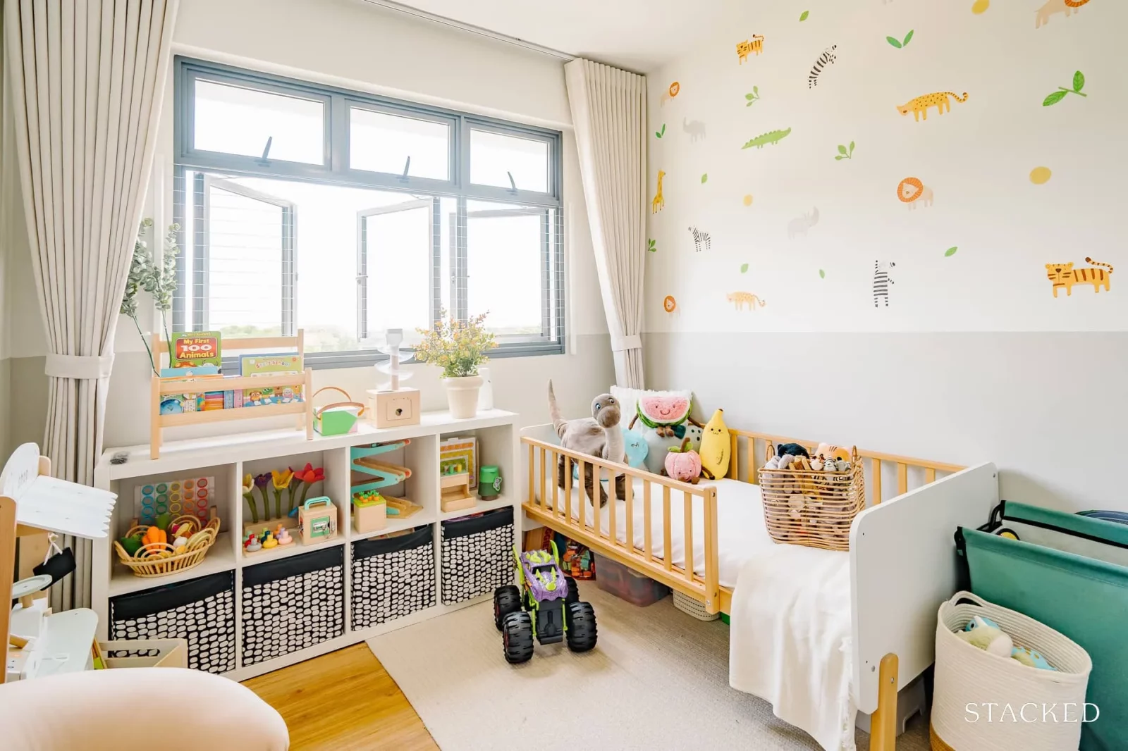
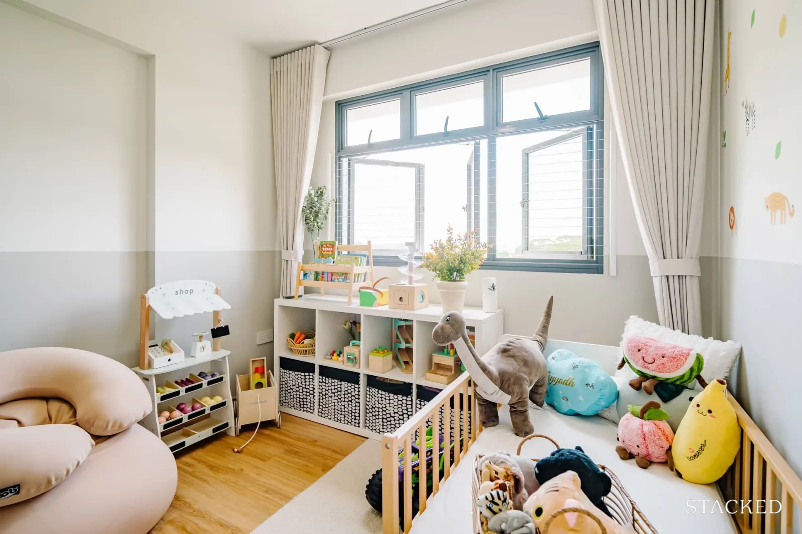
As for their kid’s bedroom, they kept things simple here for flexibility in the future as their child grows up. Besides the animal decals and built-in wardrobe, everything else is loose furniture pieces that can be changed up when the time comes.
Bathroom/s
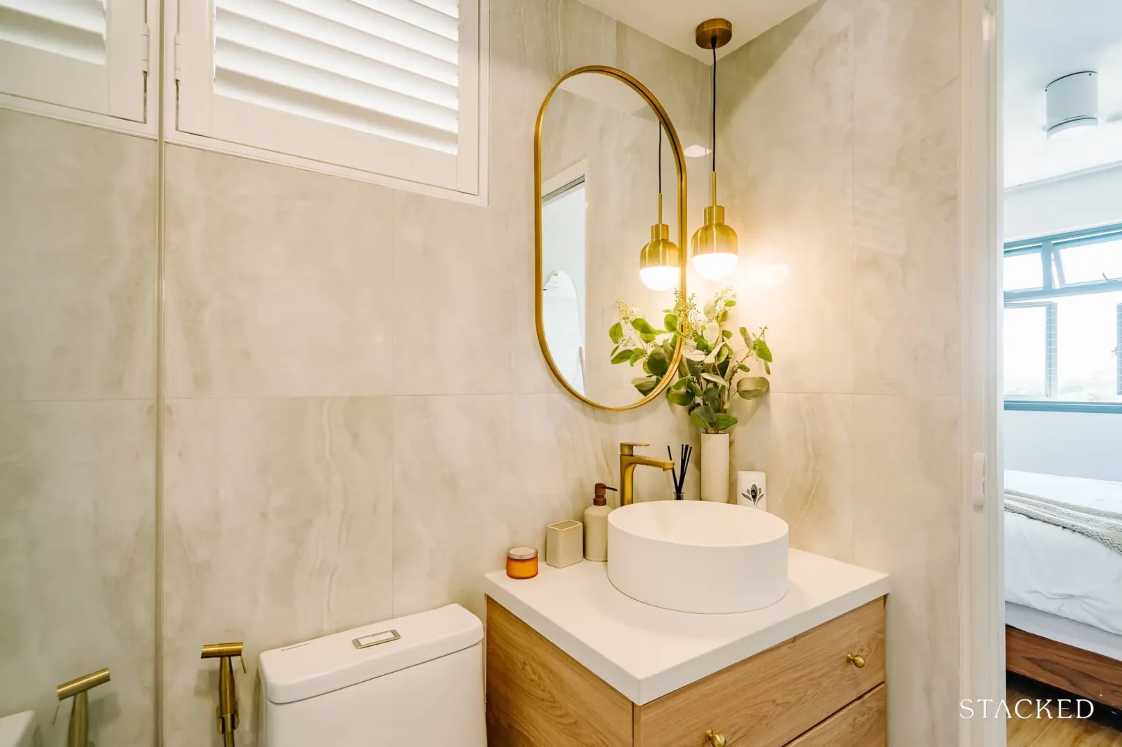
Likewise, the work in the bathroom was kept minimal. “We overlaid all the walls and the floor with a glass panel segregating the wet and dry area.”
Bringing The Vision To Reality
So was the final outcome similar to what the pair envisioned? A said that she was very happy with how it turned out. “We felt that it looks even better than what we envisioned it to be,” she added.
For their ID, the couple engaged The House of Chais and worked with Majestic Construction Engineering as their contractor.
“We reached out to potential IDs and contractors after checking on their website and social media pages, as well checking Qanvast and their corresponding Google reviews. We had a few criteria that we have laid out, so after the 2nd round of discussion, we were able to narrow down our prospects to a few of our requirements.”
A shared four of their criteria when they chose their ID and contractor, and they are connection, costing, layout planning, and mood board/design.
“Connection was important for us as we needed someone that could connect with us on a certain level and are open to share ideas with,” A explains. She recalled that there was one instance when they felt the engagement with one of the IDs they reached felt a bit cold to them, and so they found it hard to envision them as someone they could bounce off ideas with.
A admitted that she had experience doing interior work for galleries and schools, so she had a rough idea of the market rate of certain items. This background helped them in evaluating the 2nd criterion, which is cost.
The couple scrutinised the quotations they received from their prospects by checking on every line of items to the extent of checking the metre run cost against the market rate. Doing so helped them to better identify who gives better transparency in their quotations.
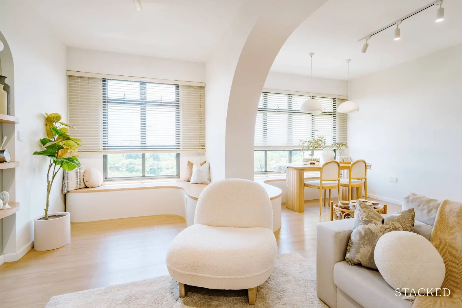
Since their home has a structural beam and pillar, most of the IDs and contractors they spoke to gave them a similar layout. Most of the advice they got was to place their sofa and the dining table where the pillar is. However, this made the couple feel that their space was limited. She said there were only 2 out of 8 prospects that gave them a different layout, which is what they were looking for.
A and her husband did up a mood board that they created off Pinterest and shared them with the candidates during their initial discussion. This allowed them to better match the theme they were going for with the ID’s design ideas. “When they came back with their own mood board and design during the 2nd round, some of them used back the same images as ours, which we felt that there wasn’t enough effort being put in,” she recalled.
Before they received their keys, A was already following several Singapore home accounts, which turned out to be a big help for her. “I was able to find a lot of information shared from them on different brands and stores,” she added.

One place she would recommend checking out is the Tan Boon Liat building. “We could spend hours as there are so many things to see.” However, since the couple already had a rough idea of how they wanted the furniture to look, which was mainly white, wood, and somewhat cat-proof, every visit to Tan Boon Liat was time well-spent.
When it comes to what they consider the best area of their home, A said that it is definitely their dining area. “We love having a space where we can just wind down after a long day of work looking out the window.”
Lessons Learned From A Successful Reno Journey
As you may have guessed already, the greatest challenge the couple encountered was the structural pillar in their living room.
“We wanted our living room space to be as bright and airy but felt disappointed with the structural pillar in our living room, which segregates the proposed study room and living room. As we couldn’t hack it, we decided to incorporate it into the home design, and we love how it turned out.”
A reno journey is always a learning experience, and A has a few things in mind that she would consider doing next time.
First is more storage space. She would have loved to be able to extend the DB box to cater more space for their shoes and have more drawers for their kitchen cabinets as well.
She’ll also want to overlay the whole common toilet next time and opt for herringbone tiles too. For furnishings, she would have liked to choose a longer sofa and a king-size bed next time.
Finally, A shares these 5 specific pieces of advice to those who are looking up to spruce up their homes.
One is to decide if you would like to engage an ID or contractor. Then check on their website, reviews, and past works. The third is to prepare a mood board. Make sure not to rush and do your research beforehand. And last but not least, simply enjoy the process.
If you’d like to get in touch for a more in-depth consultation, you can do so here.
Read next from Homeowner Stories

Homeowner Stories Buying A Walk-Up Apartment In Singapore? Don’t Overlook The Shops Below – Here’s Why

Homeowner Stories I Almost Sold My Home In Singapore—Here’s Why I’m Glad I Rented It Out Instead

Editor's Pick Why This Singapore Homeowner Wakes At 5AM To Commute – And Has Zero Regrets

Homeowner Stories “We Treated Our Flat As A Liability” How One Couple Paid Off Their HDB In 15 Years
Latest Posts
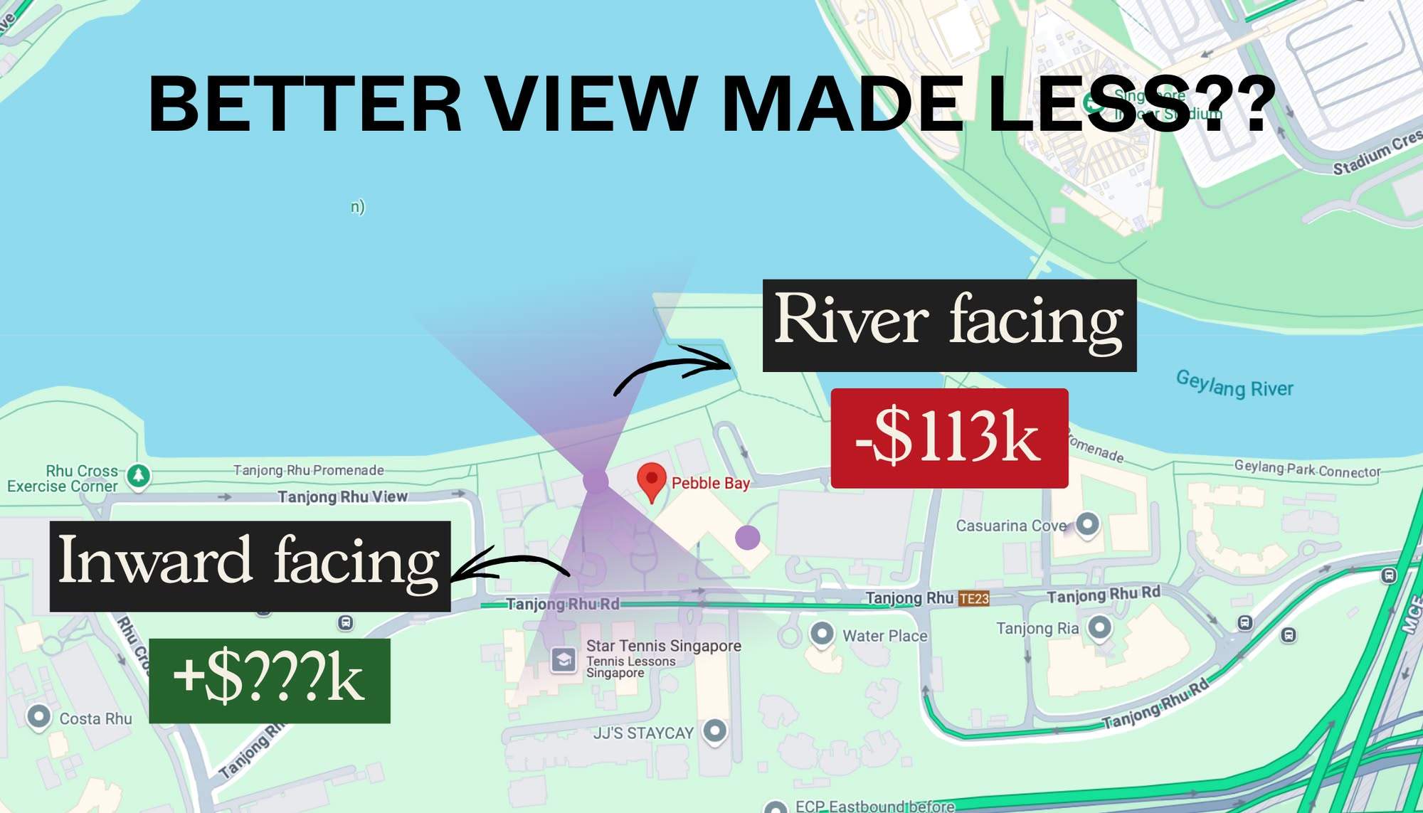
Pro How Different Condo Views Affect Returns In Singapore: A 25-Year Study Of Pebble Bay
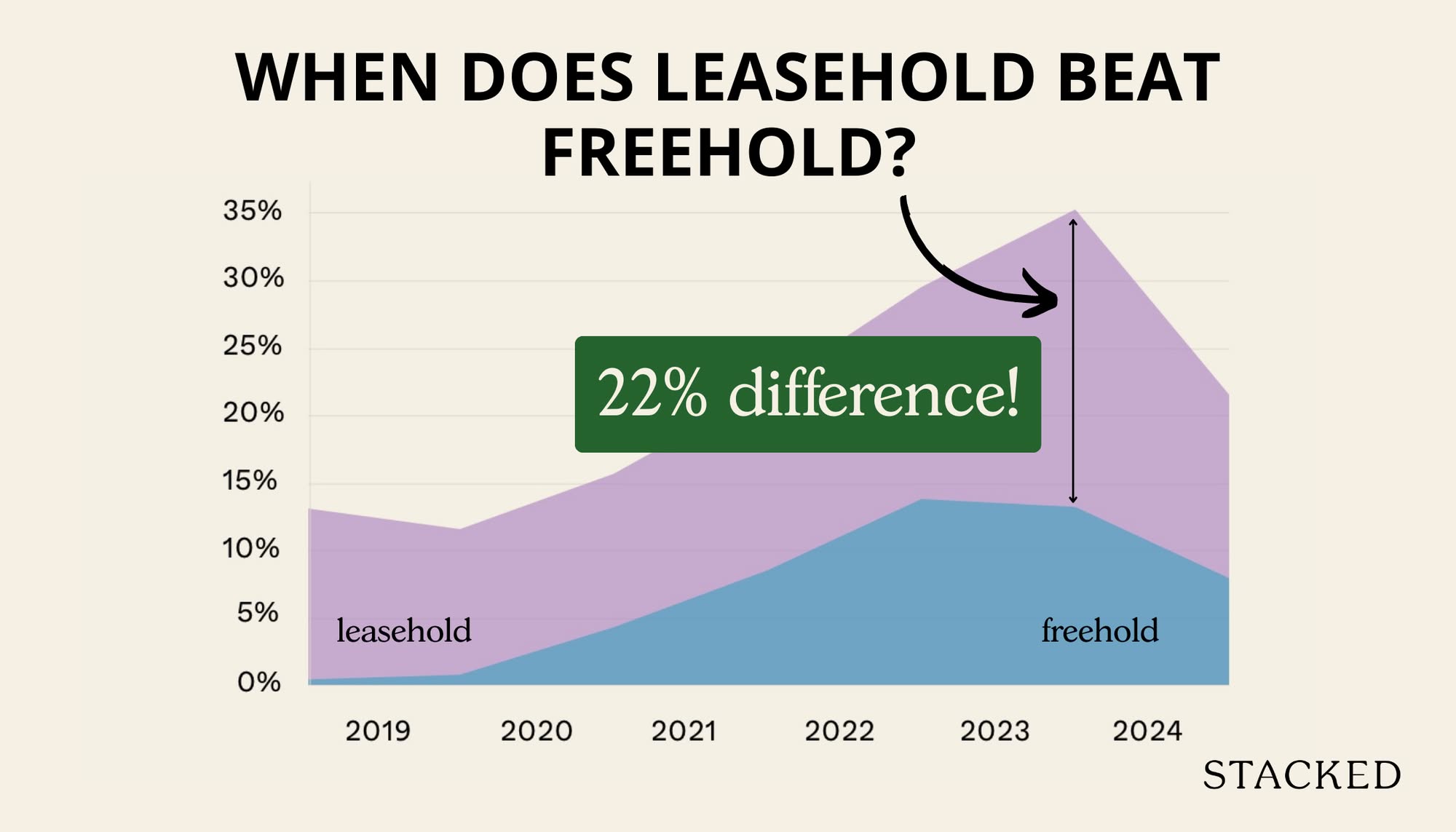
Pro Can Leasehold Condos Deliver Better Returns Than Freehold? A 10-Year Data Study Says Yes
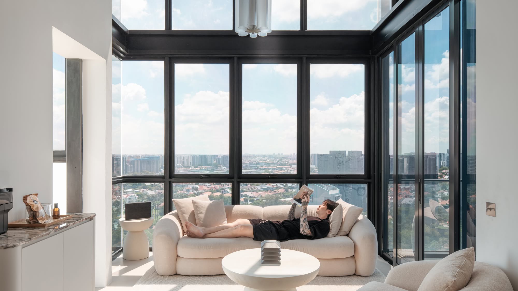
Home Tours Inside A Minimalist’s Tiny Loft With A Stunning City View
On The Market 5 Most Affordable Newly MOP 4-Room HDB Flats From $585k

Property Market Commentary Distressed Property Sales Are Up In Singapore In 2025: But Don’t Expect Bargain Prices

Singapore Property News This $1.5M Bukit Timah Executive HDB Flat With 62-Years Lease Left Just Set A Record: Here’s Why
Editor's Pick How A Clement Canopy Condo Buyer Made $700K More Than Their Neighbours: A Data Breakdown On Timing
Editor's Pick Where To Find The Cheapest 2 Bedroom Resale Units In Central Singapore (From $1.2m)
Property Picks 19 Cheaper New Launch Condos Priced At $1.5m Or Less. Here’s Where To Look

Property Advice The Ultimate Work From Home Homebuyer Checklist (That Most People Still Overlook)
Editor's Pick These $4m Freehold Landed Homes In Joo Chiat Have A 1.4 Plot Ratio: What Buyers Should Know

Editor's Pick Now That GE2025 Is Over, Let’s Talk About The Housing Proposals That Didn’t Get Enough Scrutiny

Property Advice When ‘Bad’ Property Traits Can Be A Bargain For Homebuyers In Singapore
Property Picks Here’s Where You Can Find The Biggest Two-Bedder Condos Under $1.8 Million In 2025

Property Market Commentary Why Do Property Agents Always Recommend New Launch Condos? Is It Really About The Money?


Is this a 4 room bto ?