Our tastes as homeowners have changed over the years, and so have regulations. From the experimental era of the ‘70s, to the developers “min-maxing” profits with giant air-con ledges in the early ‘00s, condo unit layouts have seen many trends come and go. Here’s a glimpse of how they’ve changed over time, and what you might expect from a condo built during a certain era:
So many readers write in because they're unsure what to do next, and don't know who to trust.
If this sounds familiar, we offer structured 1-to-1 consultations where we walk through your finances, goals, and market options objectively.
No obligation. Just clarity.
Learn more here.
1. Mimosa Park (1979)
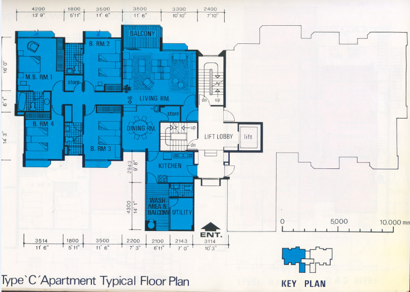
The 1970s was when the condo concept was first introduced to Singapore. At the time, condos were conceptualised as “bungalows in the sky.” That’s partly why units in these old projects could be radically different in size and shape:
The developers didn’t see units as uniform, cookie-cutter apartments, but as literal attempts to build landed-style private homes, just upward instead of horizontally.
Mimosa Park, from 1979, shows how diverse the mix could be. It consists of both townhouses and apartments, with the usual shared facilities. Do note the squash court, which is usually the sign of an older condo.
(We’re not trying to mean to squash players, but the sad truth is that fewer people play squash these days, and you almost never find squash courts in projects after the 2000s).
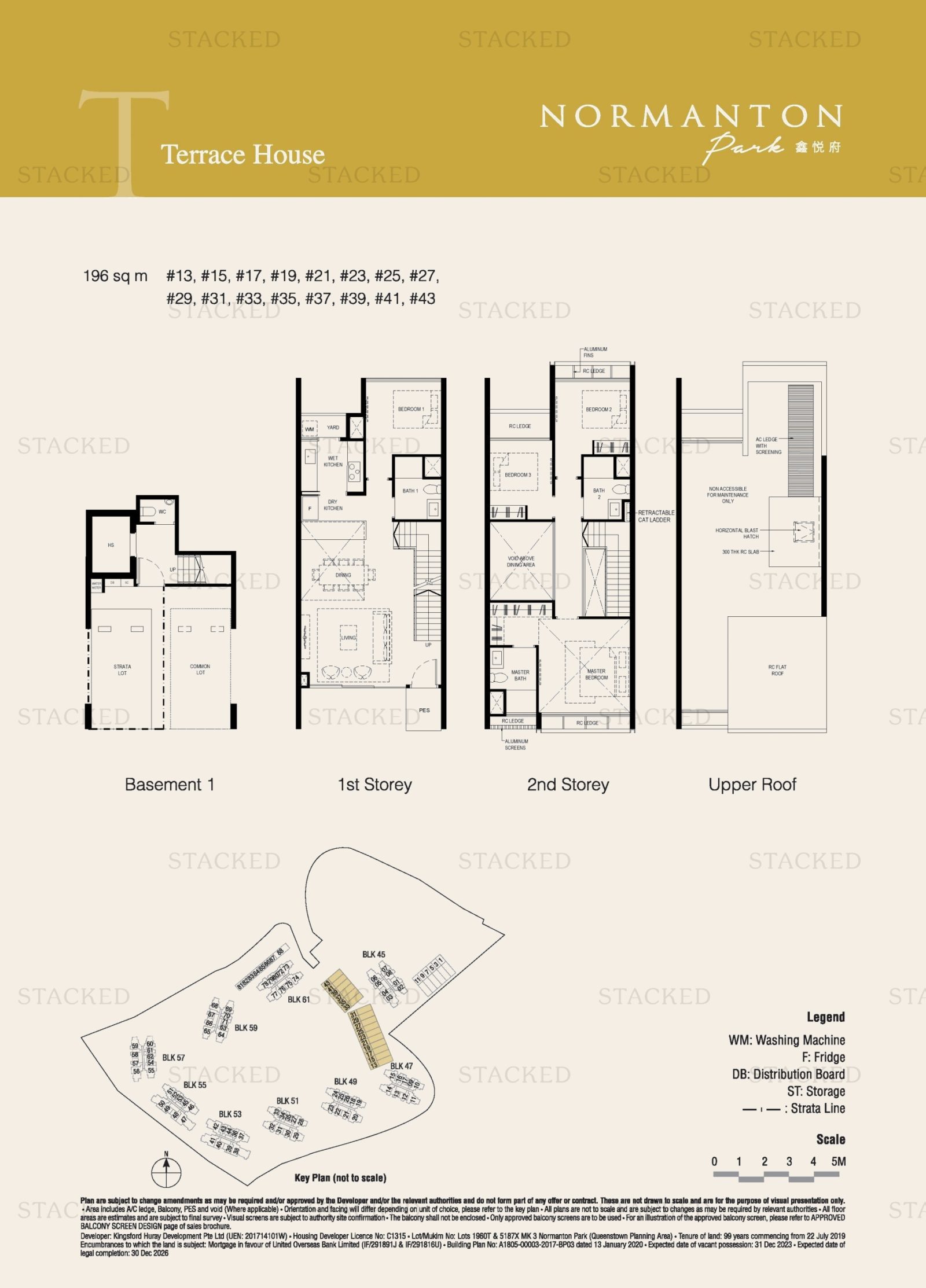
While we still have condos with strata-titled landed homes today (e.g., Normanton Park has landed villas), the landed portion is typically tiny, such as just four landed units in a large project. But in Mimosa Park, no less than 31 of the 175 units are three-storey townhouses.
Within the apartment units, note the clear separation between the living and dining rooms. This is rarely seen in newer condos, where the living and dining spaces are seldom partitioned off from each other.
The kitchen is also fully enclosed, as the preference for open kitchens came later (also because of a lack of space, an open kitchen helps to make the space feel bigger).
The hallway running from the living room to the bedrooms would be considered inefficient today, as it’s wasted square footage. Also, where a hallway is needed, a newer project will usually have a natural light source (e.g., the balcony) positioned to light the entire hallway. That’s not the case here, so installed lighting is probably needed for the hallway.
A traditionalist, however, might prefer this kind of layout. We know some families still want to have a “proper” enclosed dining space and kitchen.
In any event, it’s hard to characterise condos from the ‘70s, because it was such an experimental time. Homeowners who like being different might, ironically, find greater uniqueness in the oldest rather than the newest condos.
2. Sommerville Park 1985


Condos from the ‘80s and ‘90s were known for sheer size. We don’t just mean raw square footage, we mean they were aesthetically designed to impose a sense of grandeur and spaciousness the moment you walk in.
With the multi-storey townhouse units in Sommerville Park, sliding glass doors divide the living/dining space from the outdoor terrace. The doors open such that the entire width of the living room opens to the terrace; this seamlessly connects the outdoor and indoor space. The same is done for balconies, where the floor-to-ceiling glass sliding doors open all the way.
This lets in a lot of natural light, while creating an imposing sense of size. Interior designers used to complement this further by adding mirrors, although that may be seen as a bit old-school today.
Notice the master bedroom has a large dressing corner, which in later years will be replaced by walk-in wardrobes. On the upper floor, two side-by-side bathrooms (with two separate bathtubs!) are separated from each other. If done today, they would probably be joined up as one larger bathroom, with a jack-and-jill configuration that can open to both rooms.
3. Tanglin Regency (1998)
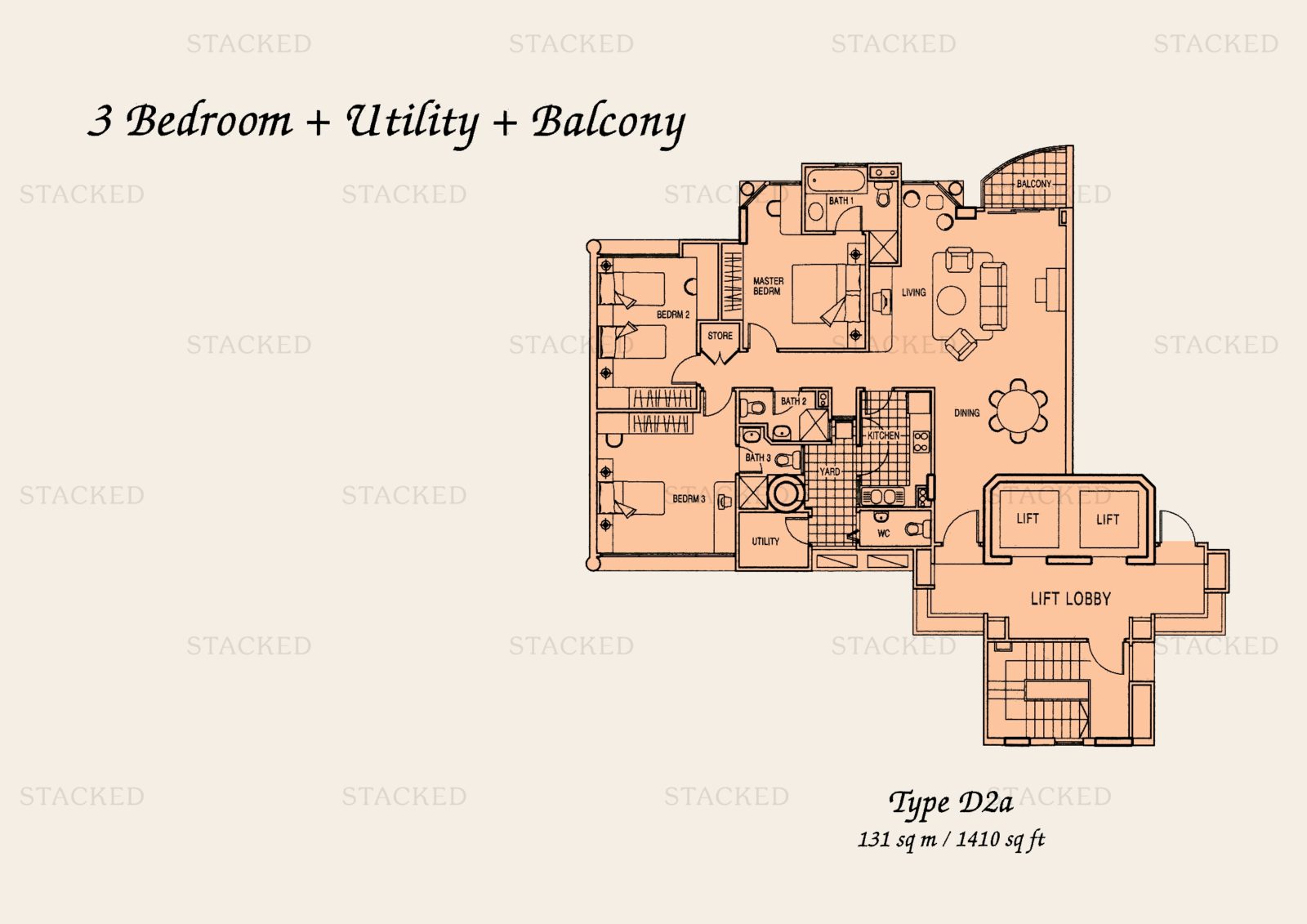
We can see by the ‘80s and ‘90s, having the living/dining areas as a joined space had become the norm.
As an interesting aside, we spoke to a former executive in a development firm, who told us:
“The dining room used to be a centre of attention like the living room, but toward the 90’s the dining room lost a lot of importance.
More Singaporean families use the kitchen as the dining room, because it’s more convenient. We’re less formal than western style homes; we will say no need to bring out the plates and cutlery all the way to the dining room, then we got to bring it all back later.
Also Singaporeans were getting wealthier, they tended to eat out more often; so if they had a gathering with friends it was more often in a restaurant, and they didn’t need these big and grand dining rooms anymore.”
Note that in Tanglin Regency’s layout, the intention would be to have the front door open into the dining room rather than the living room. That’s less common these days (but you can just rearrange it so the dining room is next to the balcony if you like, then it still opens into the living room).
If you look at the entrance, you’ll also see there’s a small lead-up from the front door to the living/dining area. Today we might call that wasted space, but some homeowners prefer that the front door doesn’t open directly into the living/dining space. It does give a better sense of privacy.
Some homes from the ‘80s and ‘90s even had an antechamber – a small room where people could put their shoes, umbrellas, coats, etc. before entering the living room.
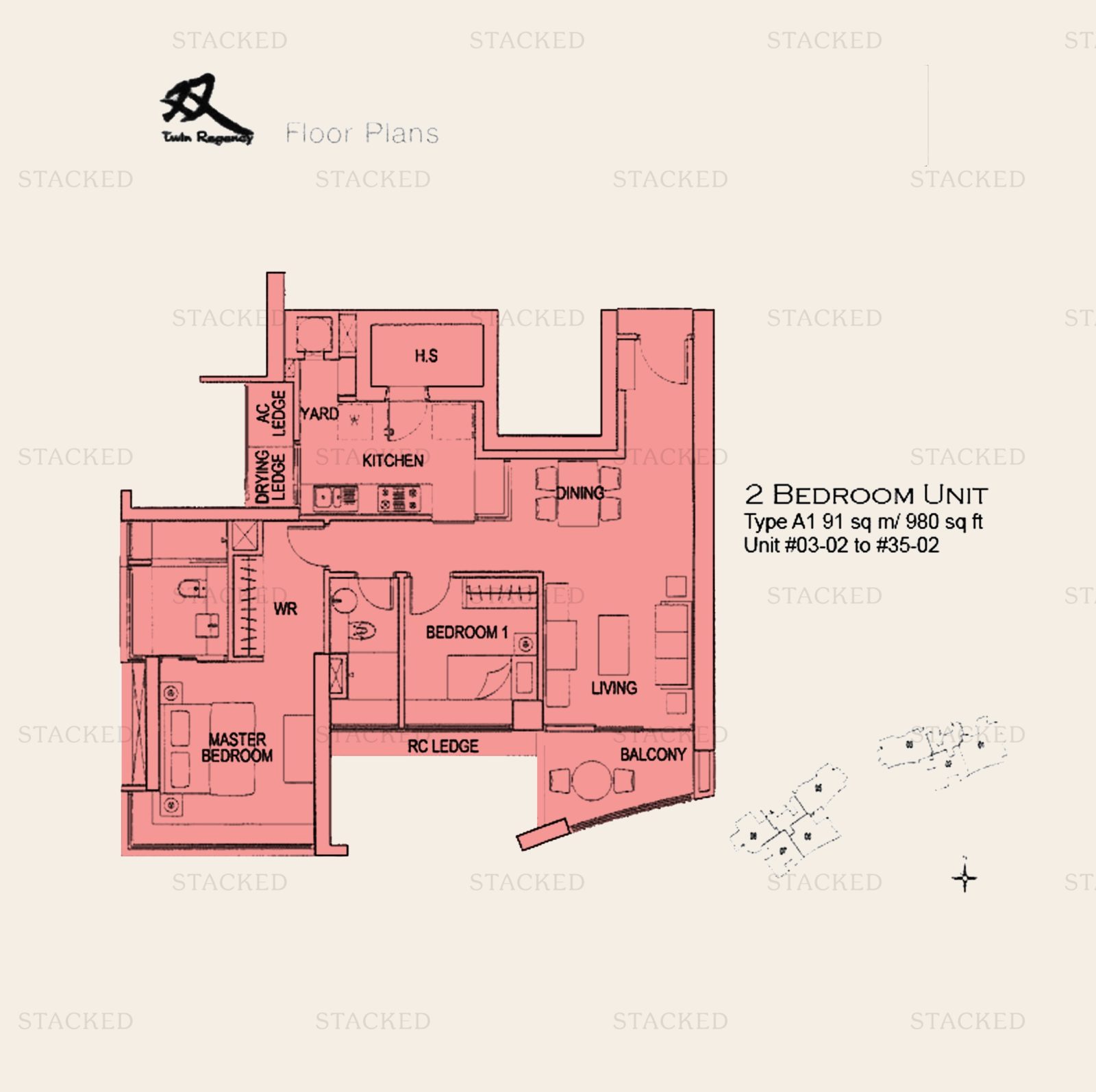
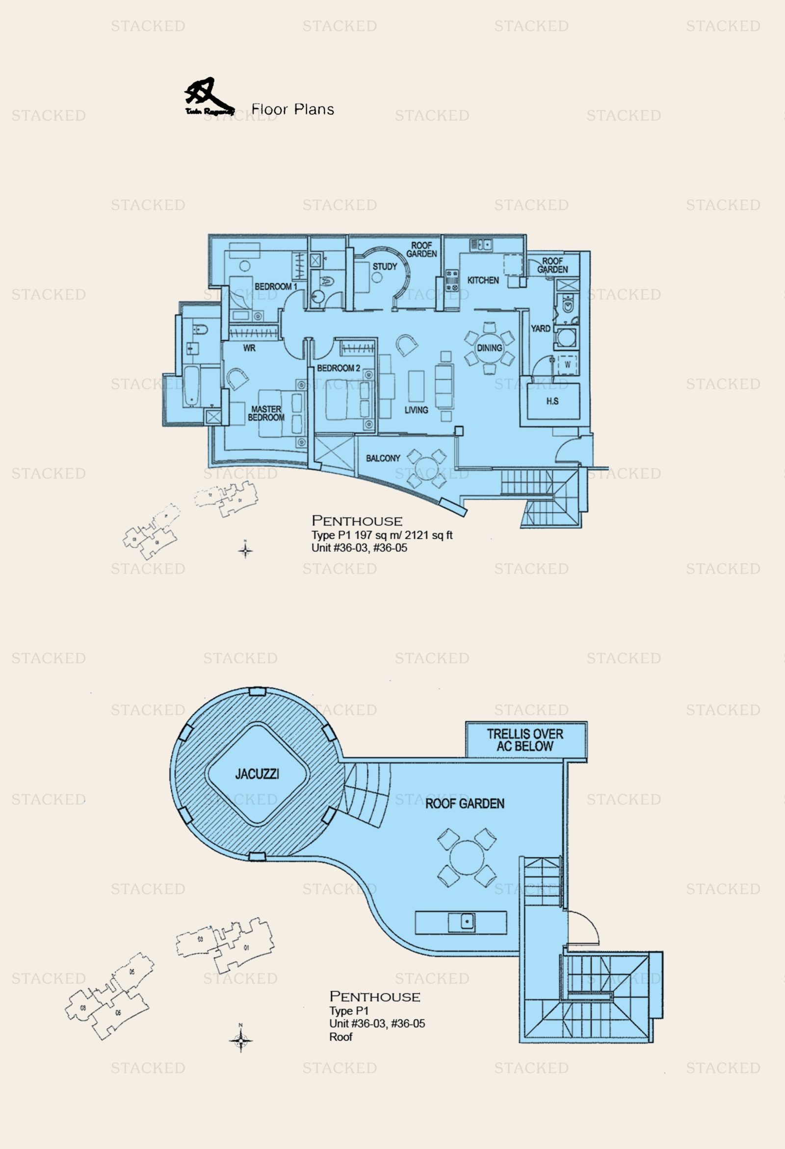
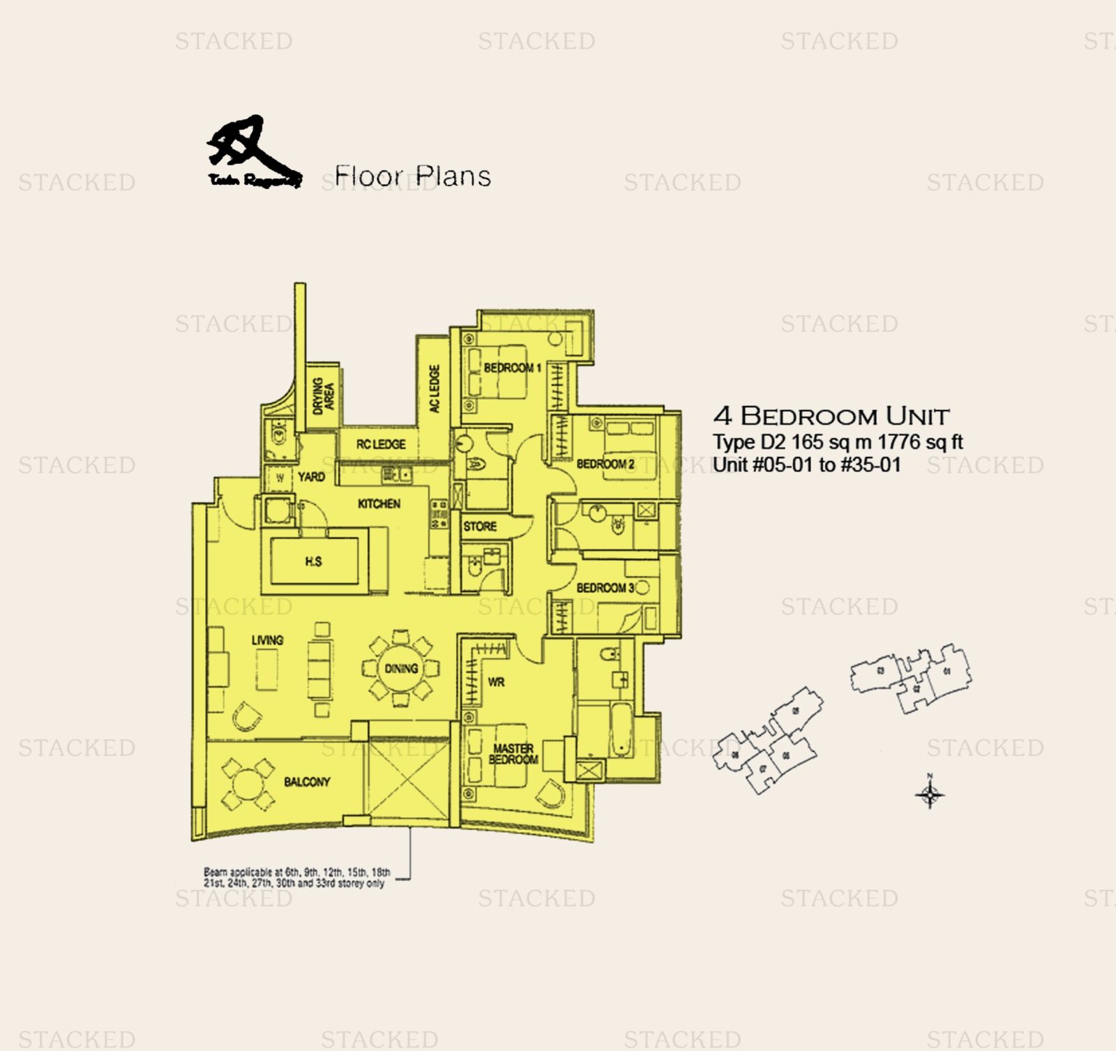
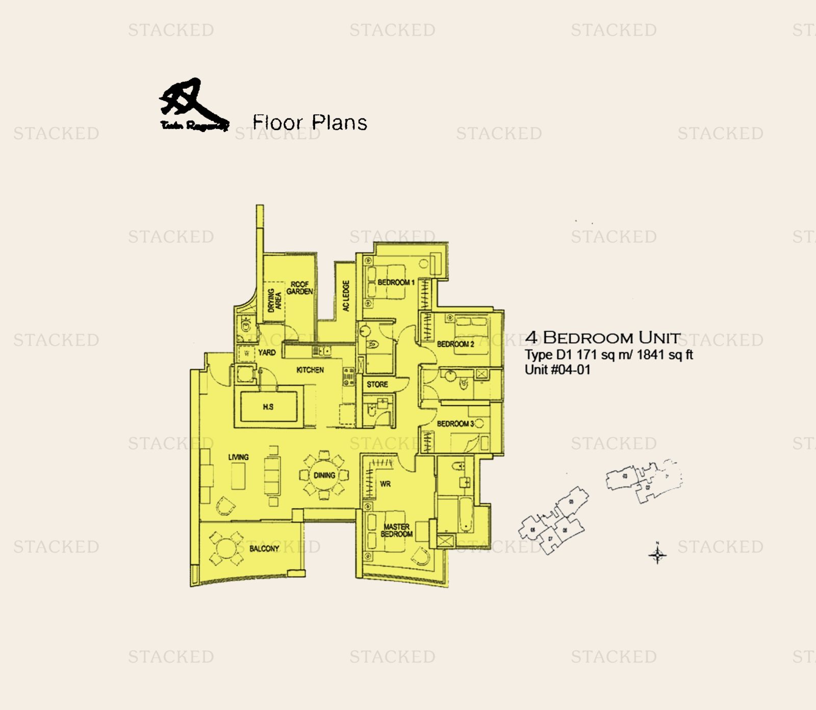
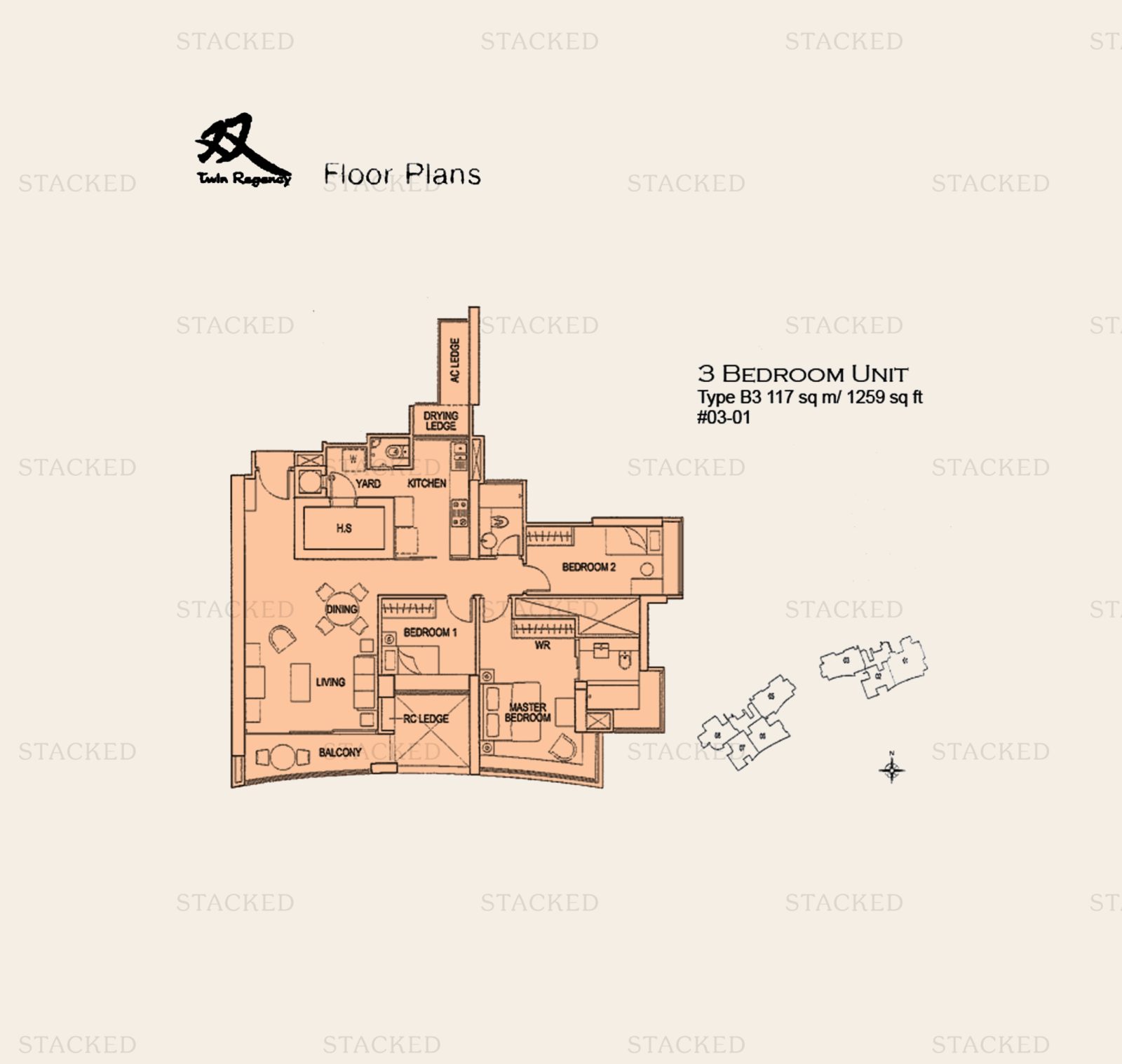
4. Twin Regency (2007)
The period between 2008/9 (just after the Global Financial Crisis) and 2013 is seen by many as a golden age of the property market. It’s no coincidence that the bulk of cooing measures today originated from this period.
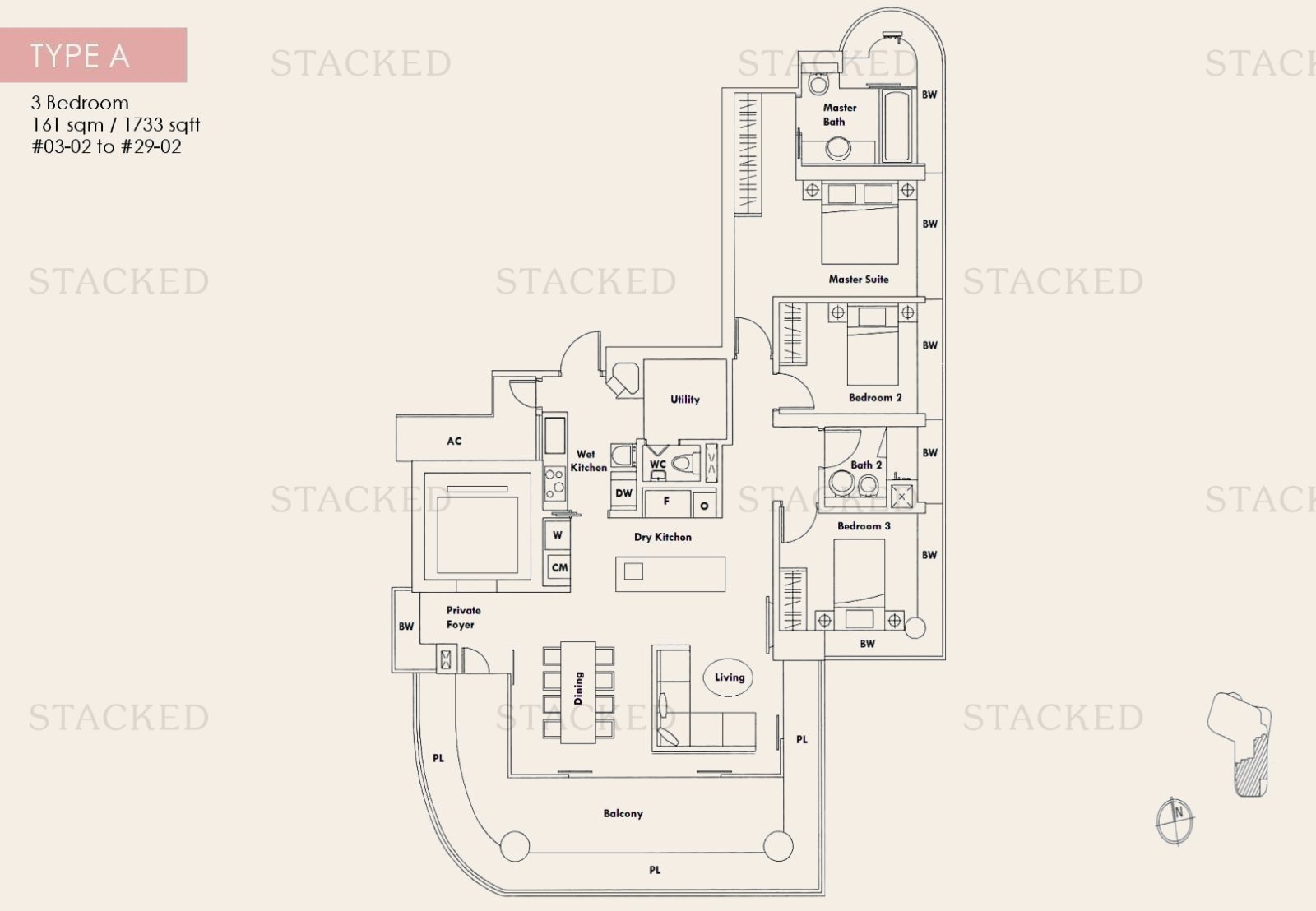
Unfortunately, it was also a time when developers used several shenanigans to optimise their profits. Chief among these were gigantic air-con ledges and bay windows, which added square footage that home buyers had to pay for, but developers didn’t.
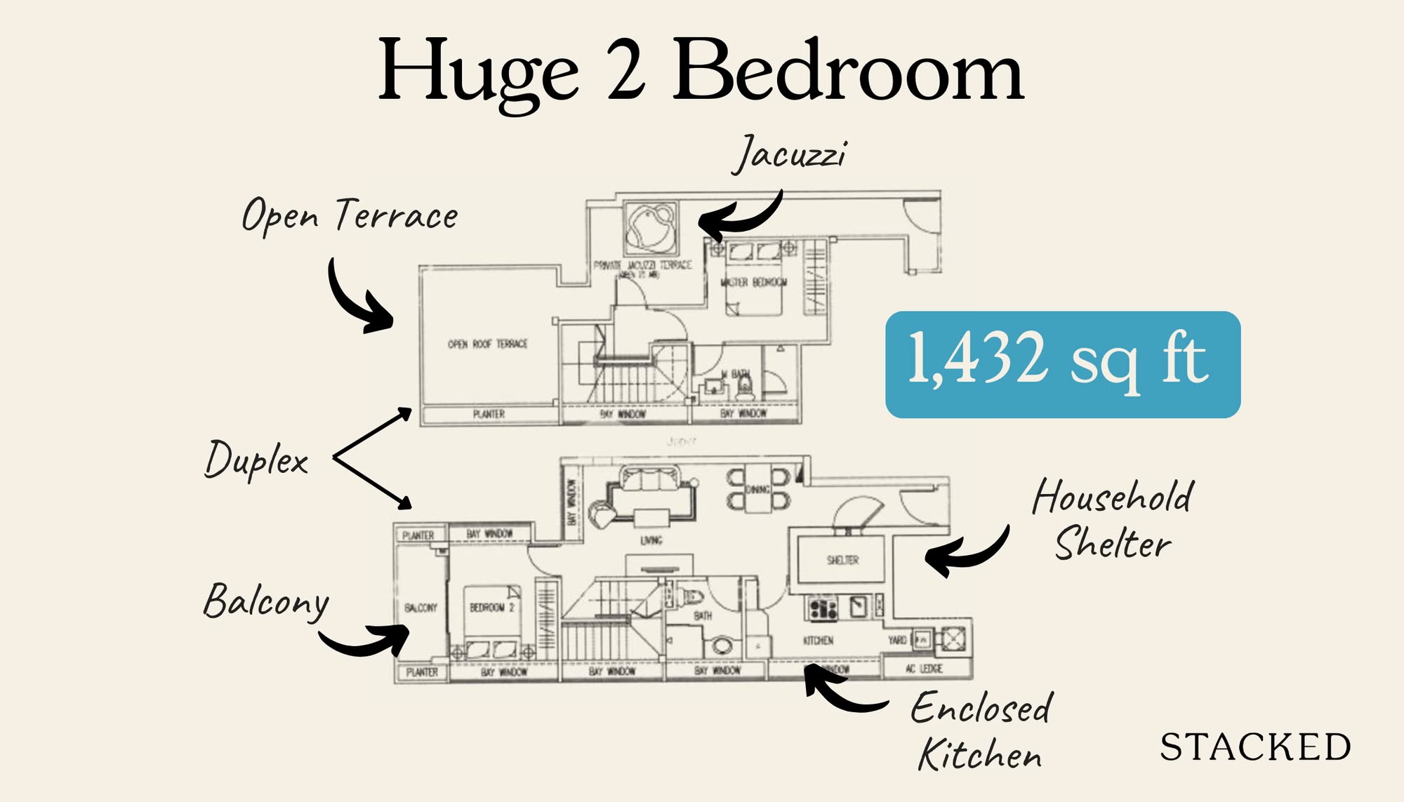
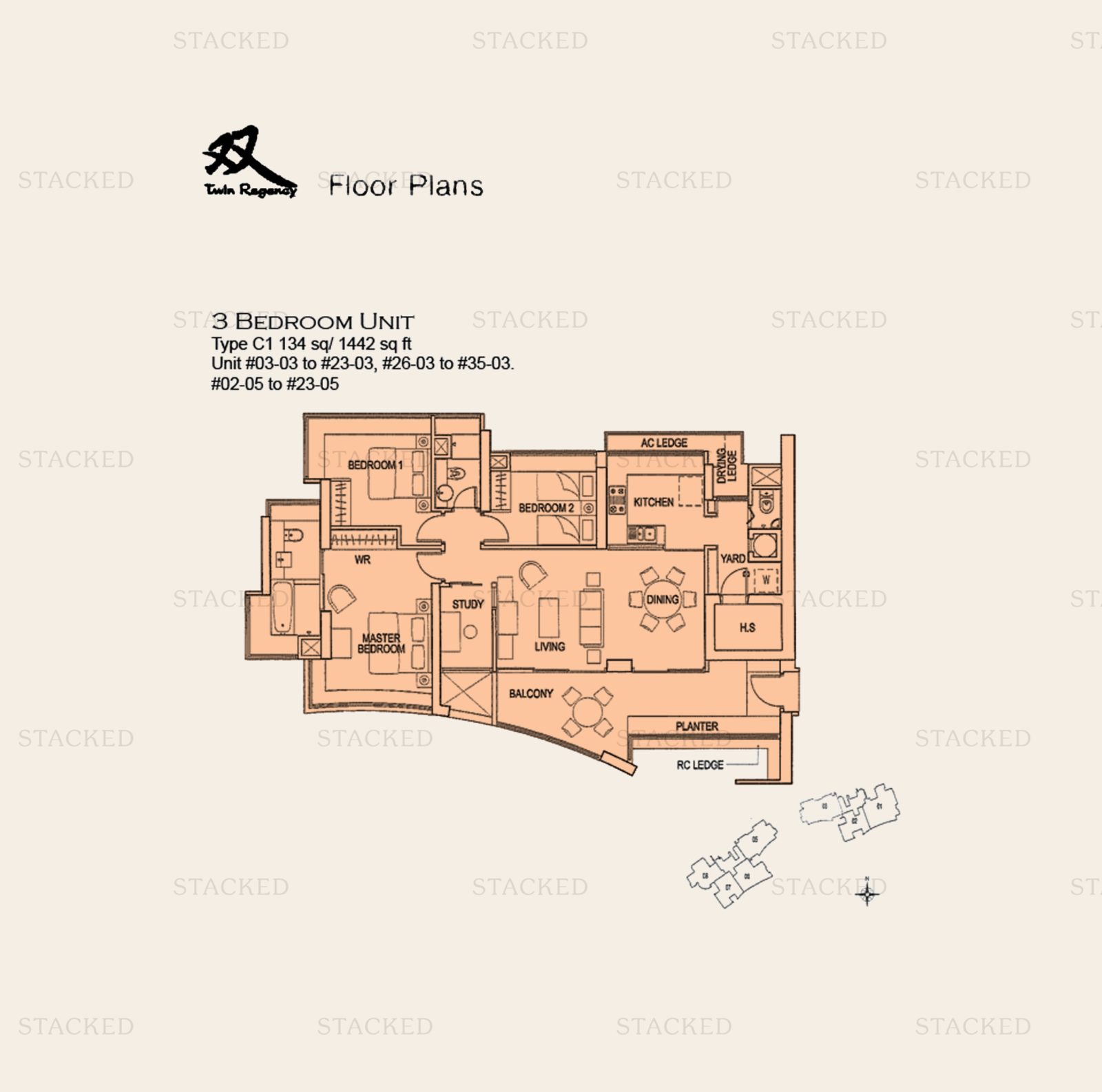
Another quirk at the time was planter boxes. This was well-intentioned, as there were efforts to promote greenery and some form of vertical gardening. If you look a the three-bedder at Twin Regency, you can see the planter box on the rather sizeable balcony.
This may have been better appreciated in its day; we wouldn’t be surprised to know it was marketed as a big plus point. But in the current era, buyers would frown on that feature as a waste of space.
(Also, hideous if you don’t maintain the plants, and they all die there – it mostly forces you to do the gardening).
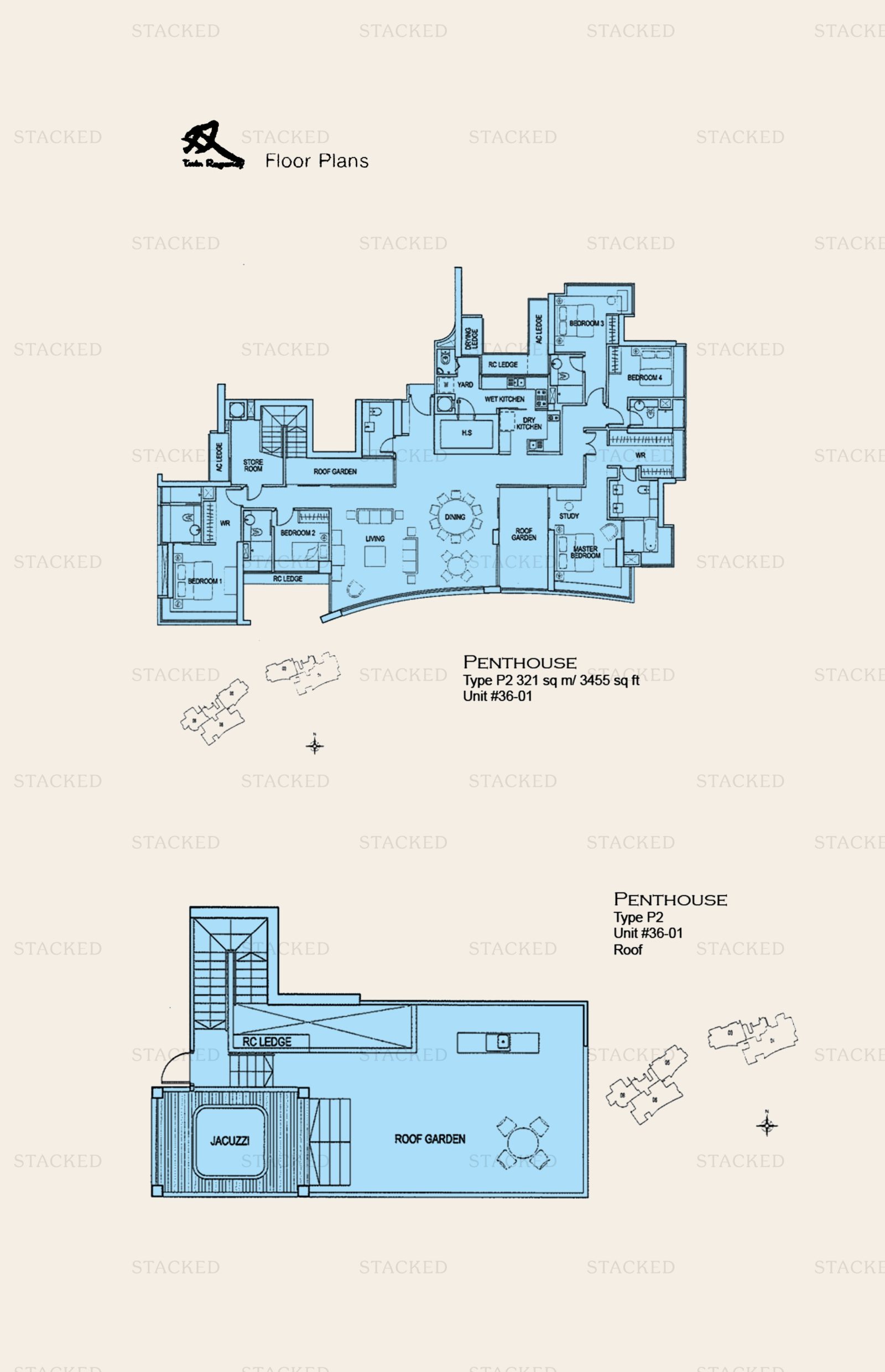
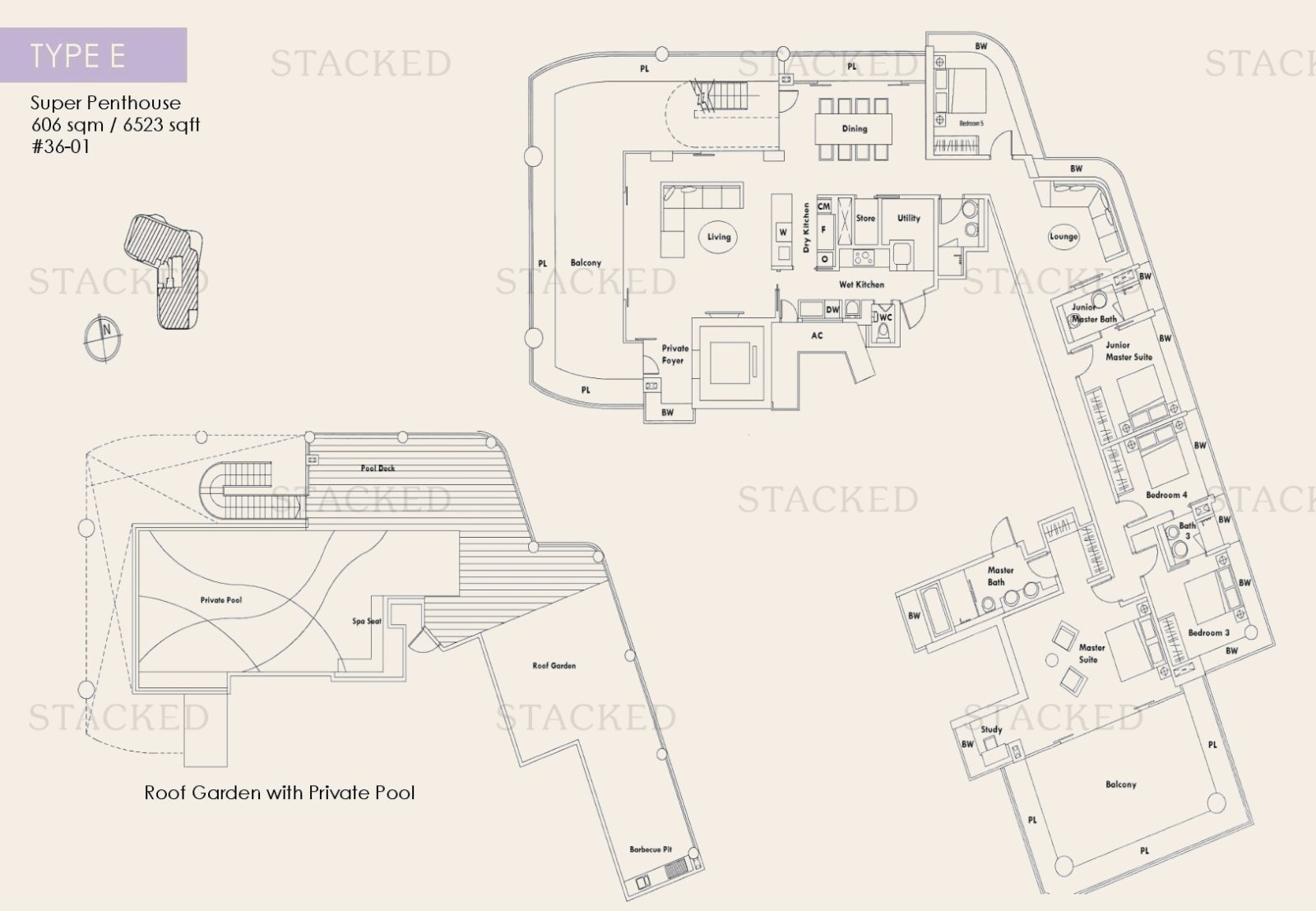
The same issues could be made for the roof garden components of the penthouse, which are not as well-liked today. The private jacuzzi in the penthouse, at the time considered a great luxury, also seems to have fallen out of favour over the past few years. We see fewer and fewer penthouses with this feature now.
In fact, most penthouses that you see in new launches today are basically just the top floor units with double-storey height living rooms. There’s few and far between that have the open rooftops that you’d find in the older eras.
5. Skyline 360 @ St. Thomas Walk (2012) & Seaside Residences (2018)
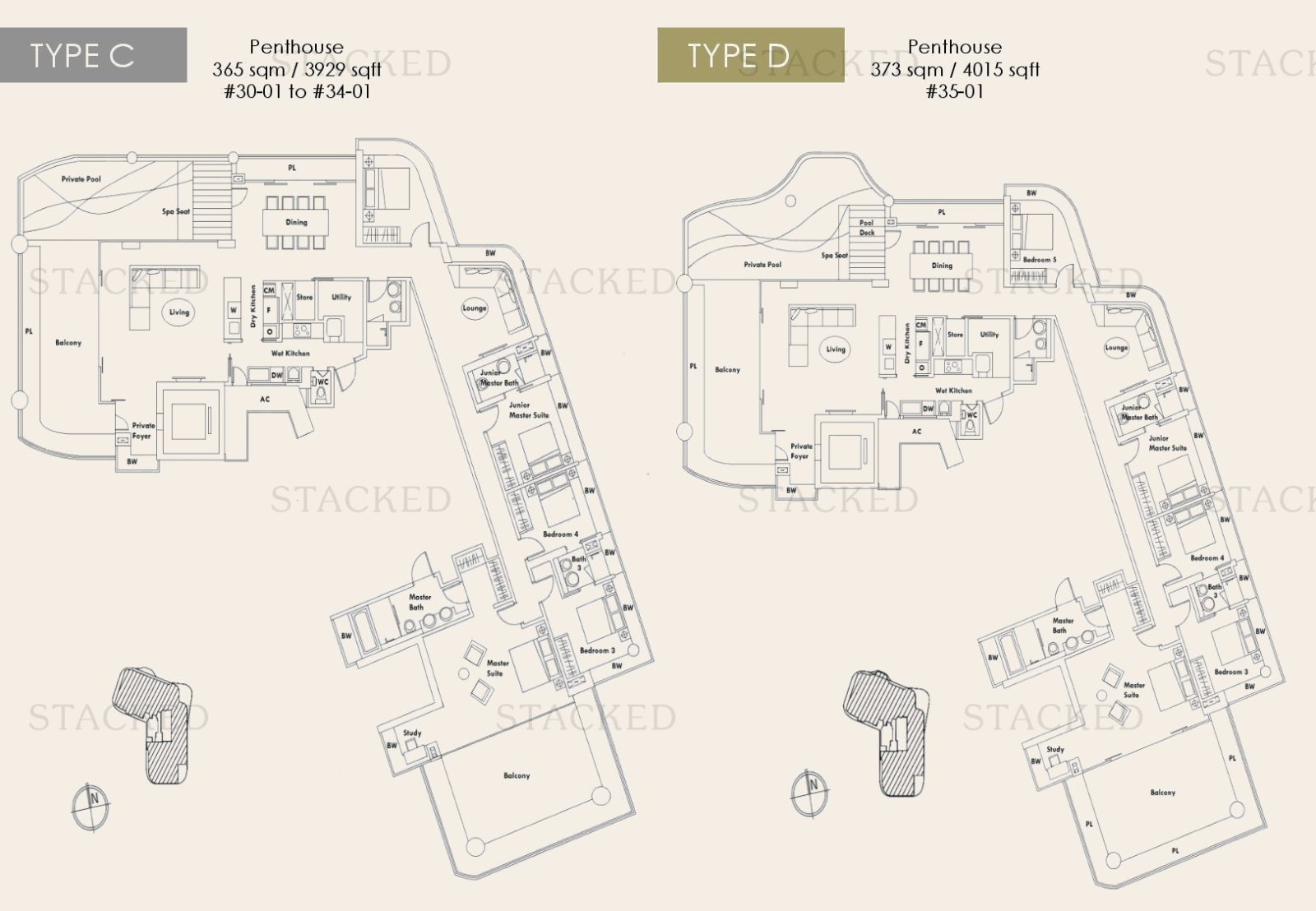
By around the previous decade, open kitchens had become more common than enclosed kitchen; a fact that infuriates some serious home cooks (we know there’s a whole group of home buyers out there who refuse to join in this trend).
This even took place in HDB projects. Within the same decade (2018), open kitchens would become the default for new flats.
We can see the concept at work here in Skyline 360, where there’s both a dry kitchen and a wet kitchen; but note that neither are enclosed spaces. This is the same for the three and four-bedders alike.
For the penthouse unit, notice the roof garden and private pool leave out the jacuzzi, which it probably would have had if it was built a decade prior.
What’s uncommon for this era is the space given over for the private foyer; this is something we’d expect in an older condo. But Skyline is a luxury development, so perhaps they wanted an extra touch.
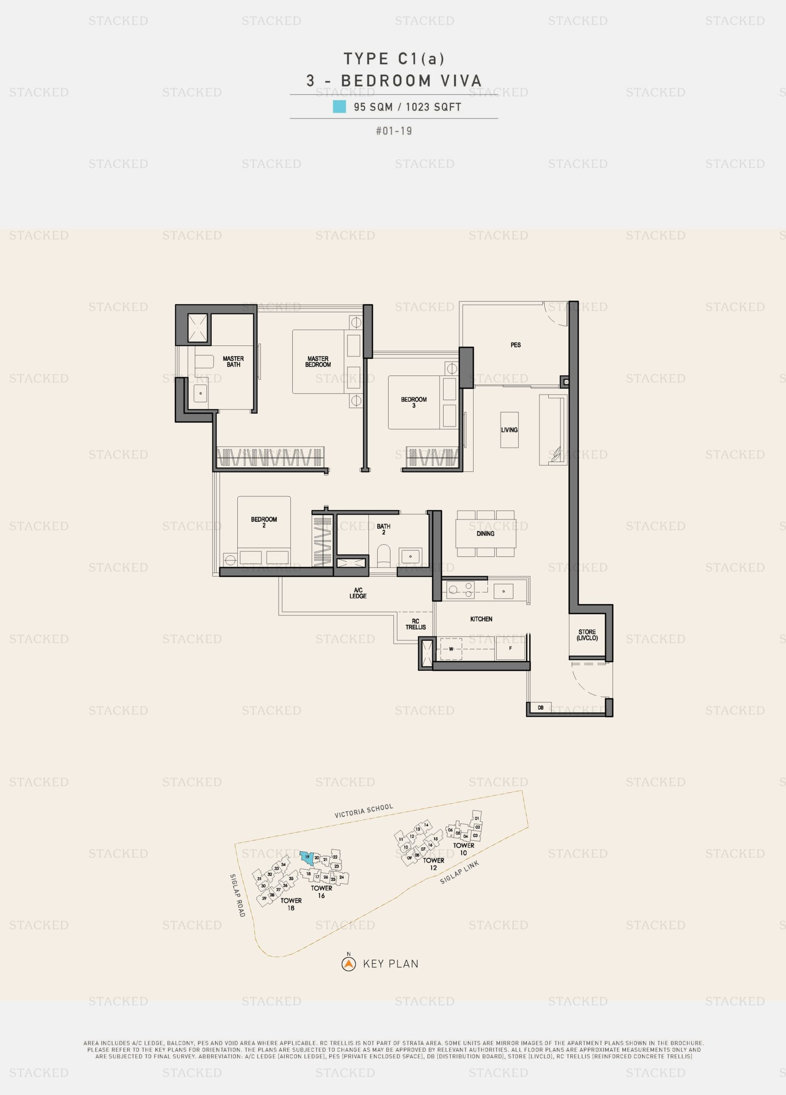
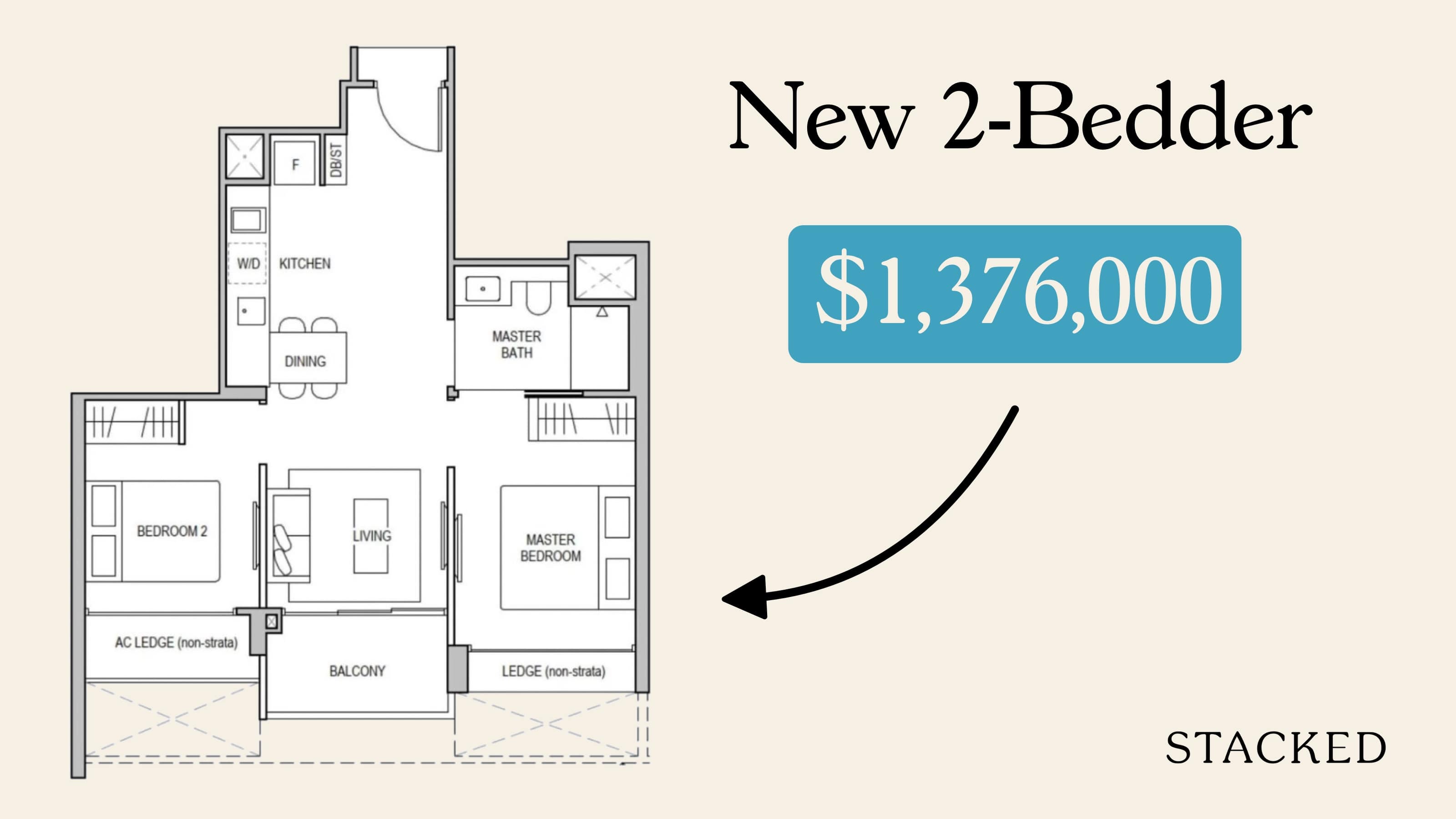
The long hallways in Skyline are an atypical feature though; and Seaside Residences better shows the evolution toward efficiency. Note the three-bedder layout here, where the living/dining area connects the different parts of the unit (the kitchen and bedrooms). This is the dumbbell layout that will get used with increasing frequency, as it omits the need for long connecting hallways.
Also note the dining space, which is pushed up against a corner. It’s an example of how the dining “room” is now truly just a dining “space,” only an extension of the living room rather than a room in itself.
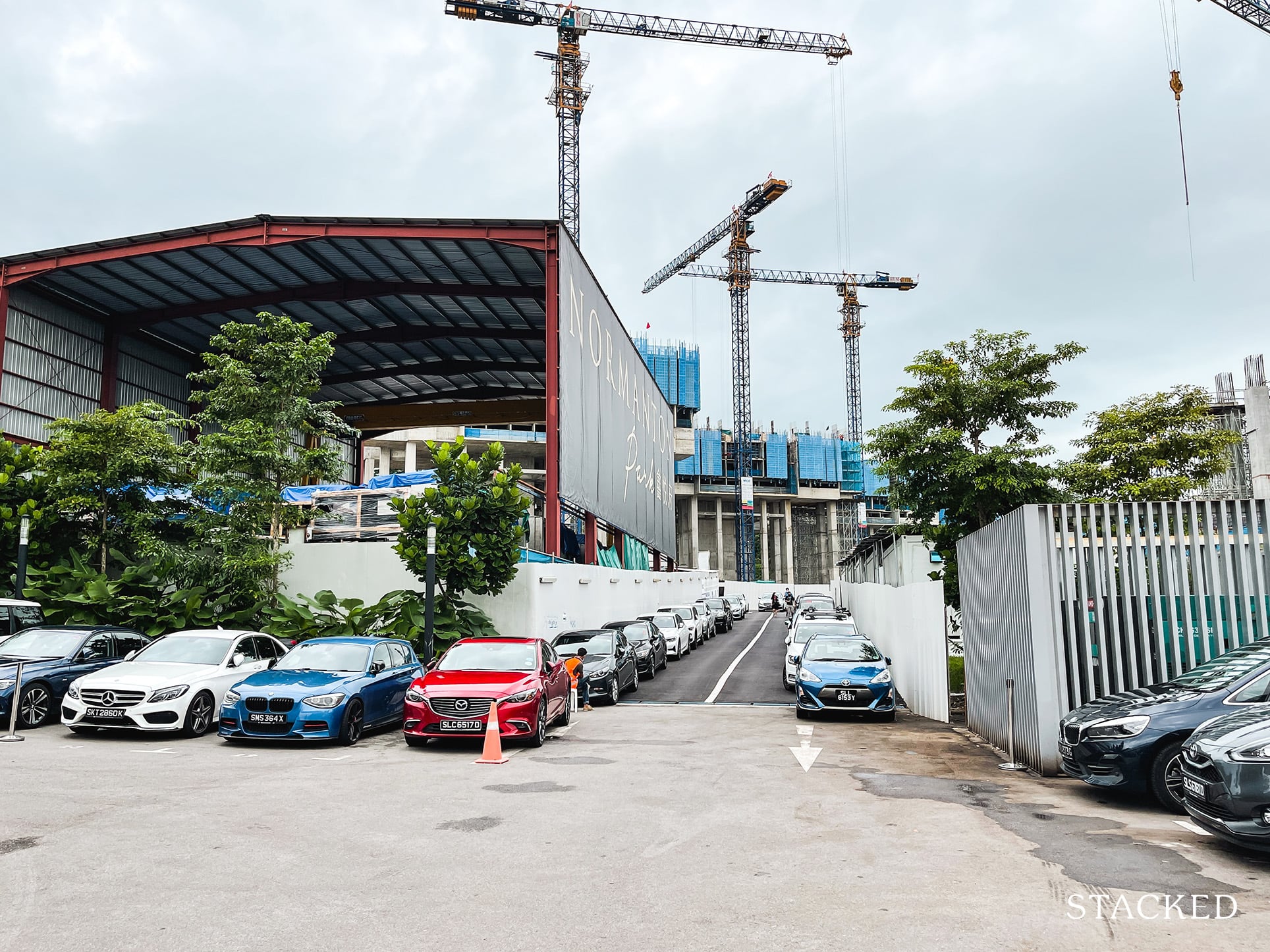
This was also around the period when Prefabricated Prefinished Volumetric Construction (PPVC) started to get more widely adopted (here’s an explanation and why it’s important to know about).
Property Market CommentaryPPVC Construction : Why It Matters For Investors (The Good, Bad, And Ugly)
by Sean Goh6. Normanton Park (2021)
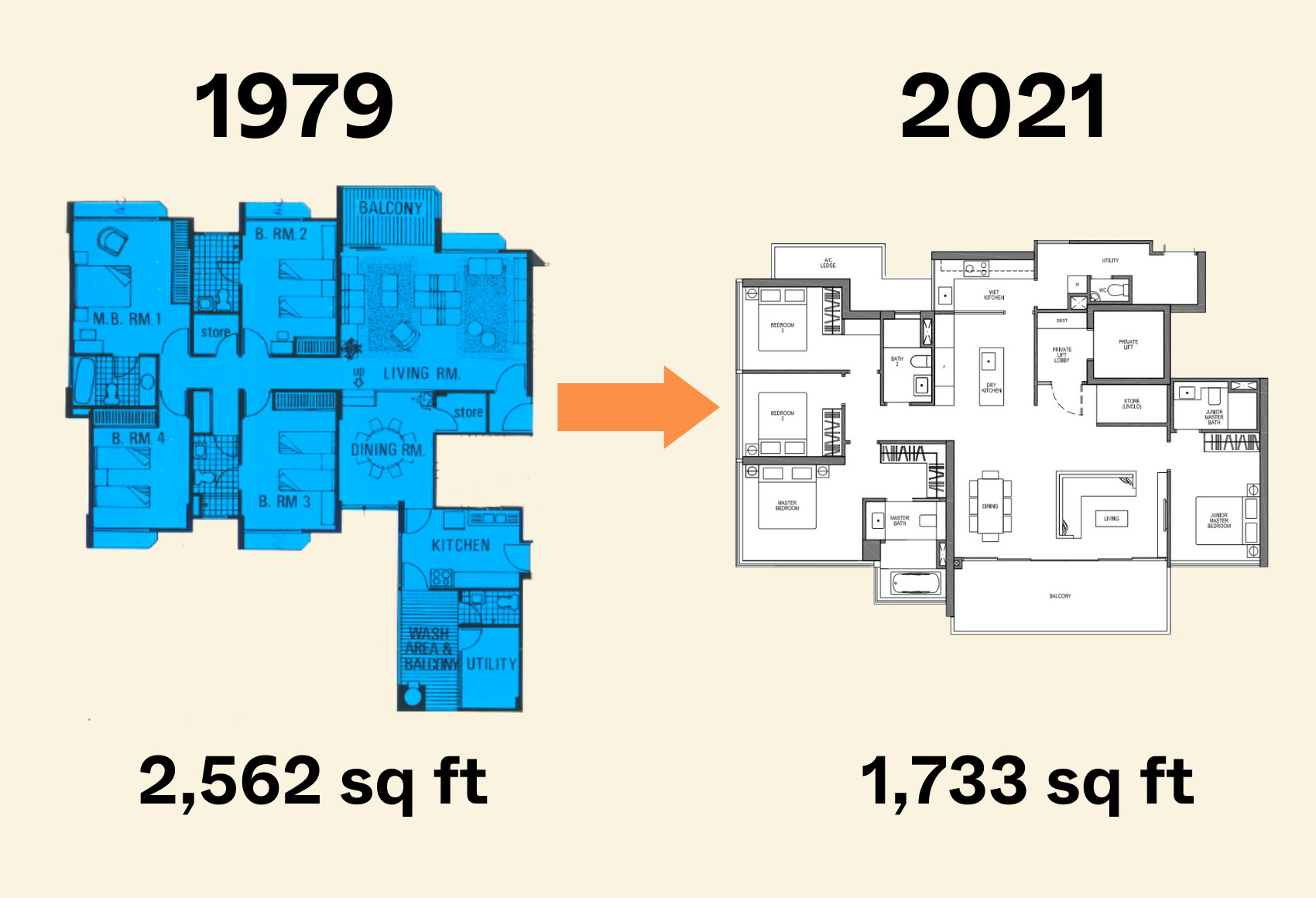
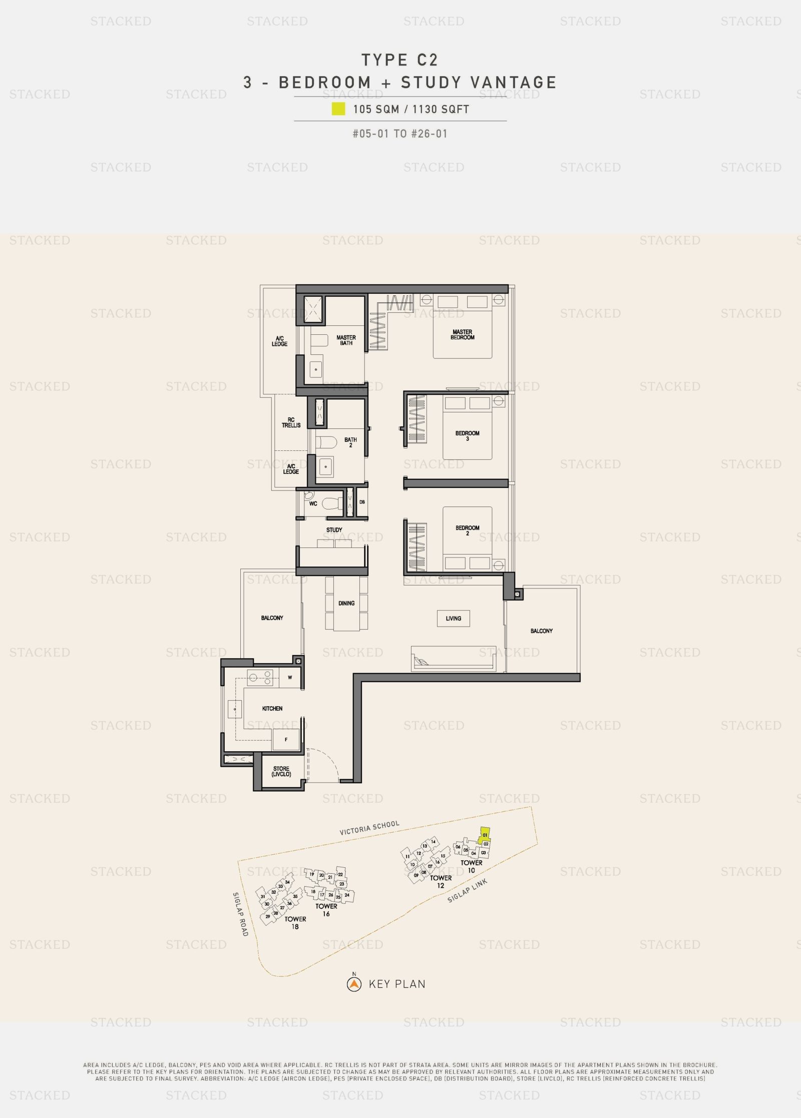
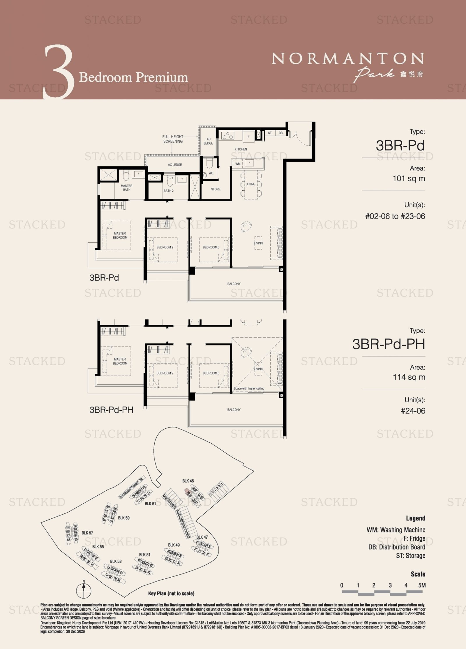
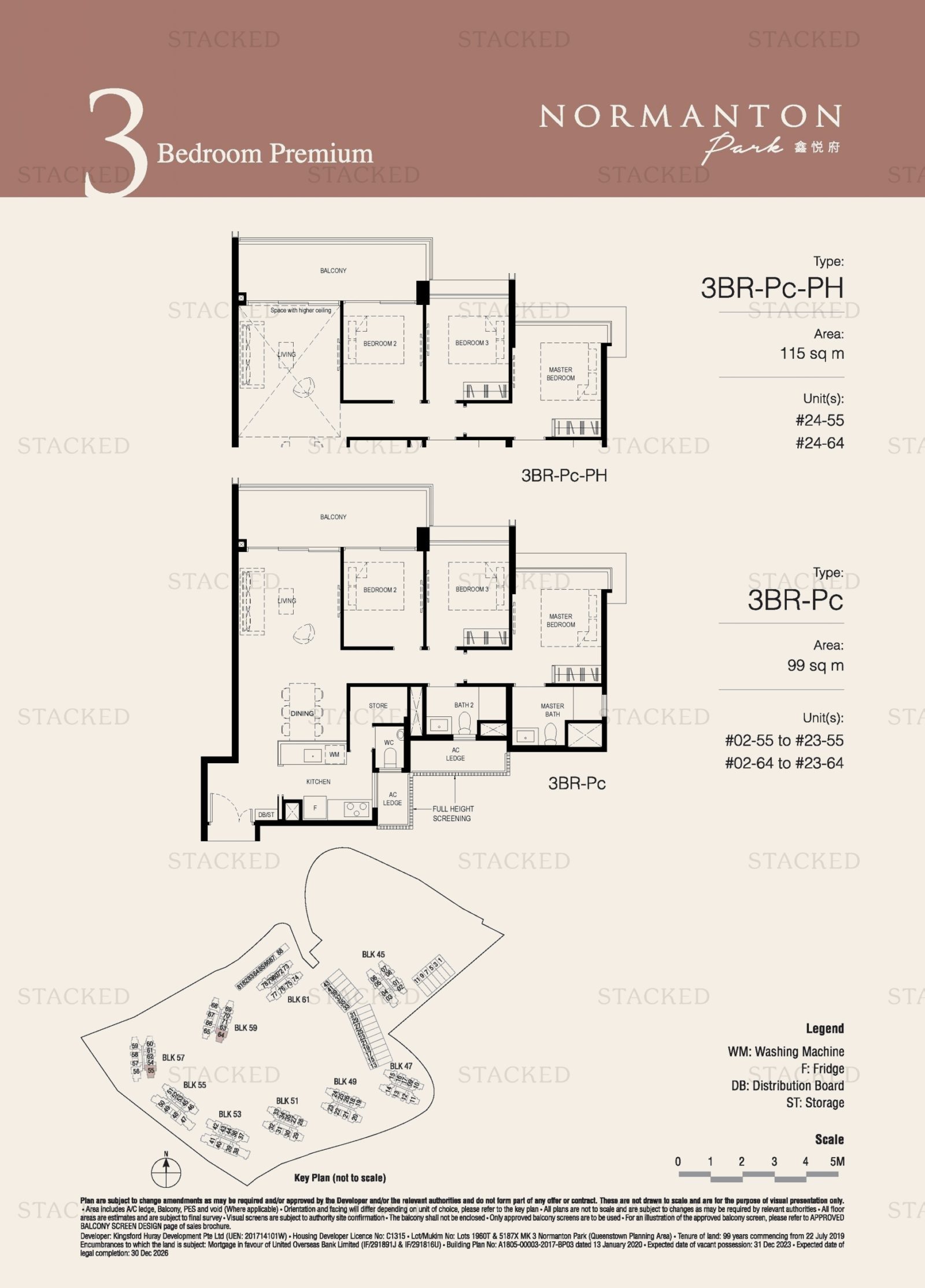
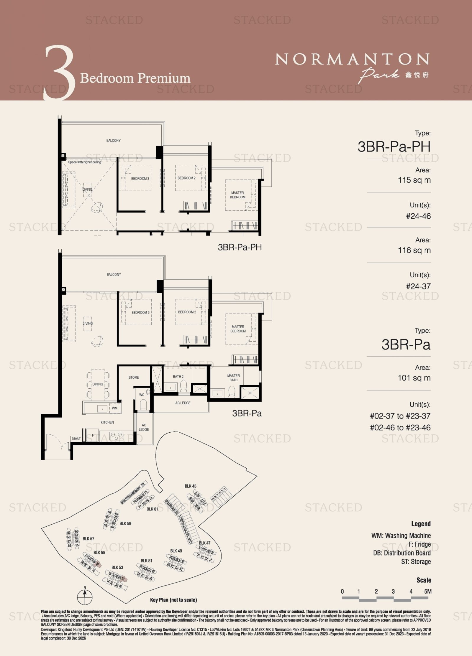
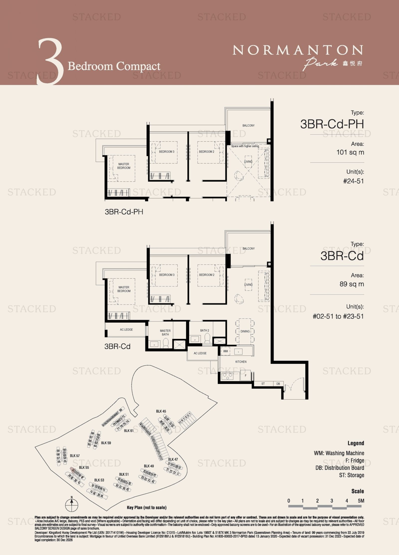
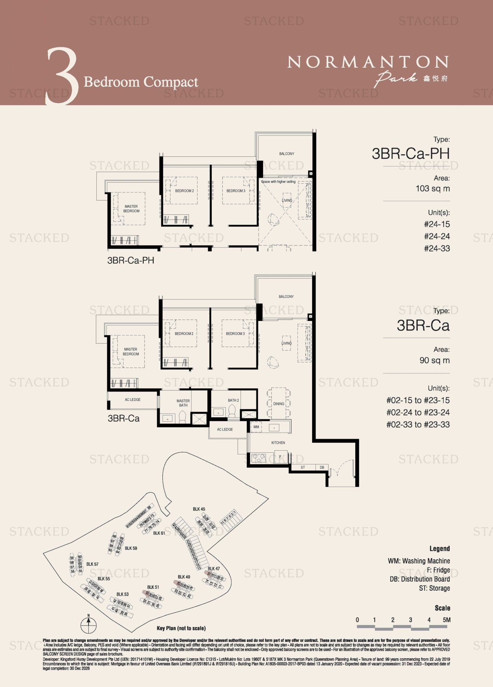
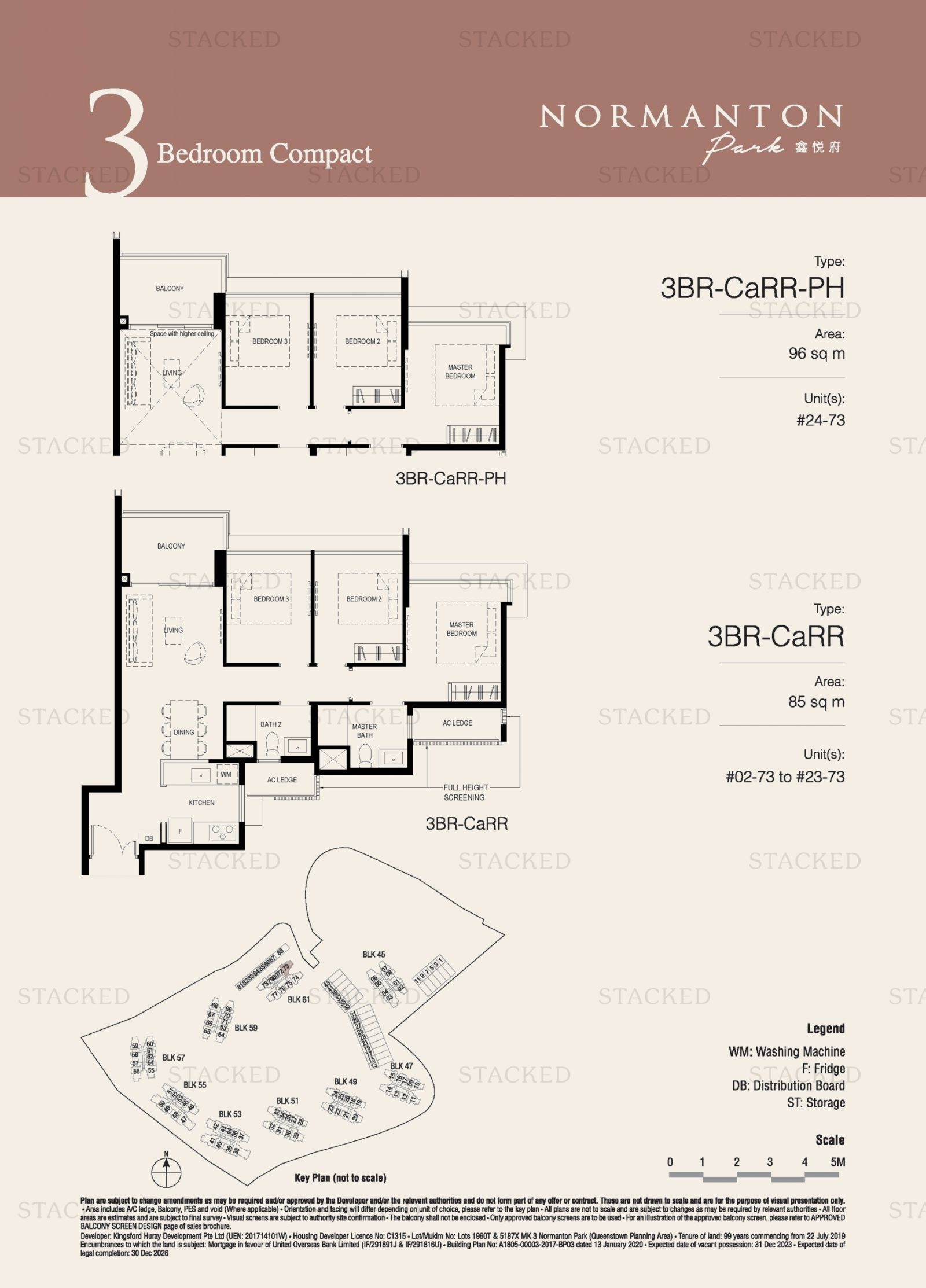
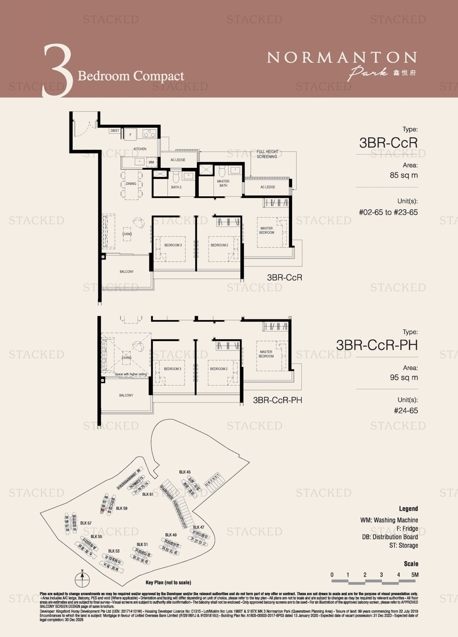
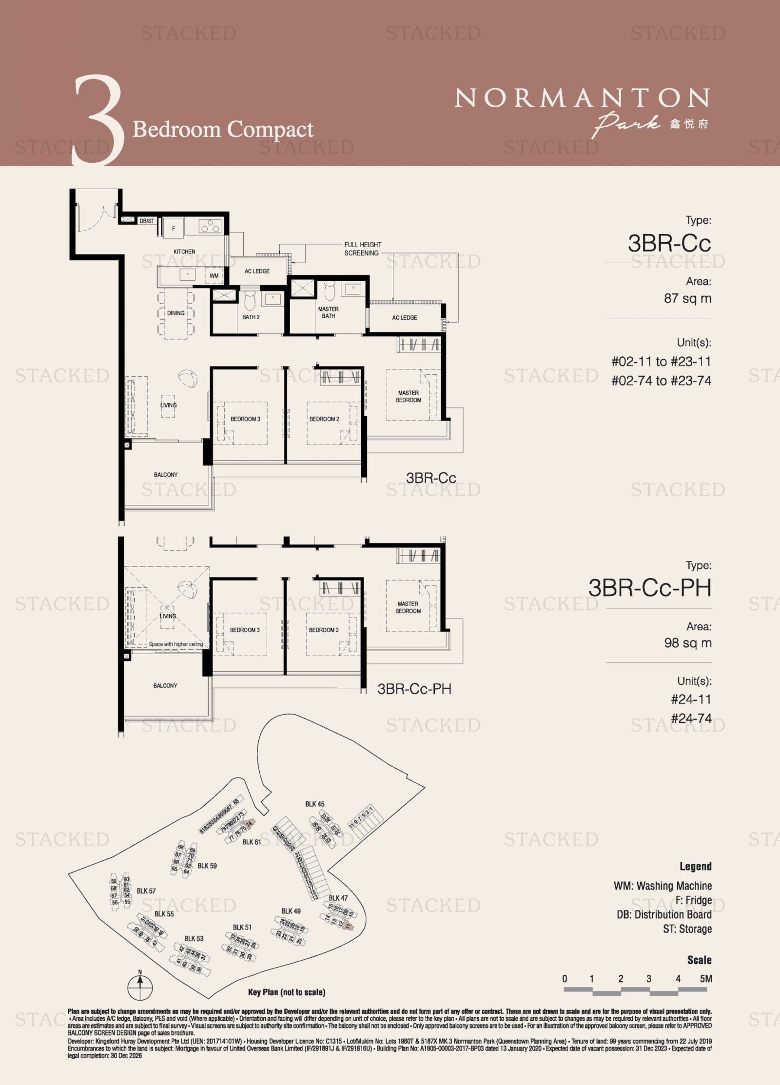
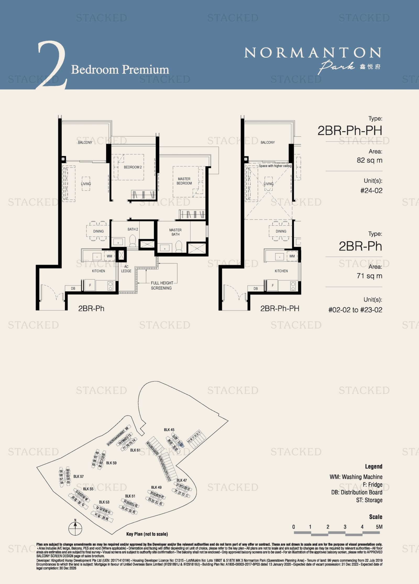
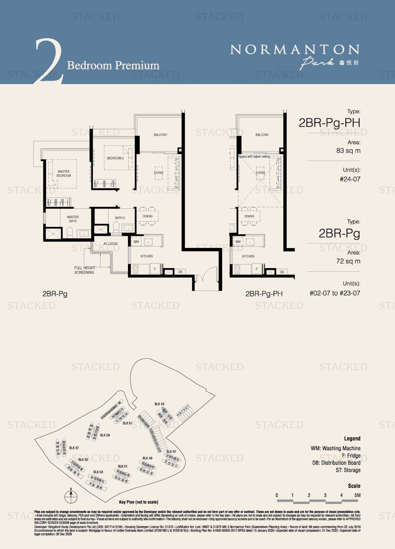
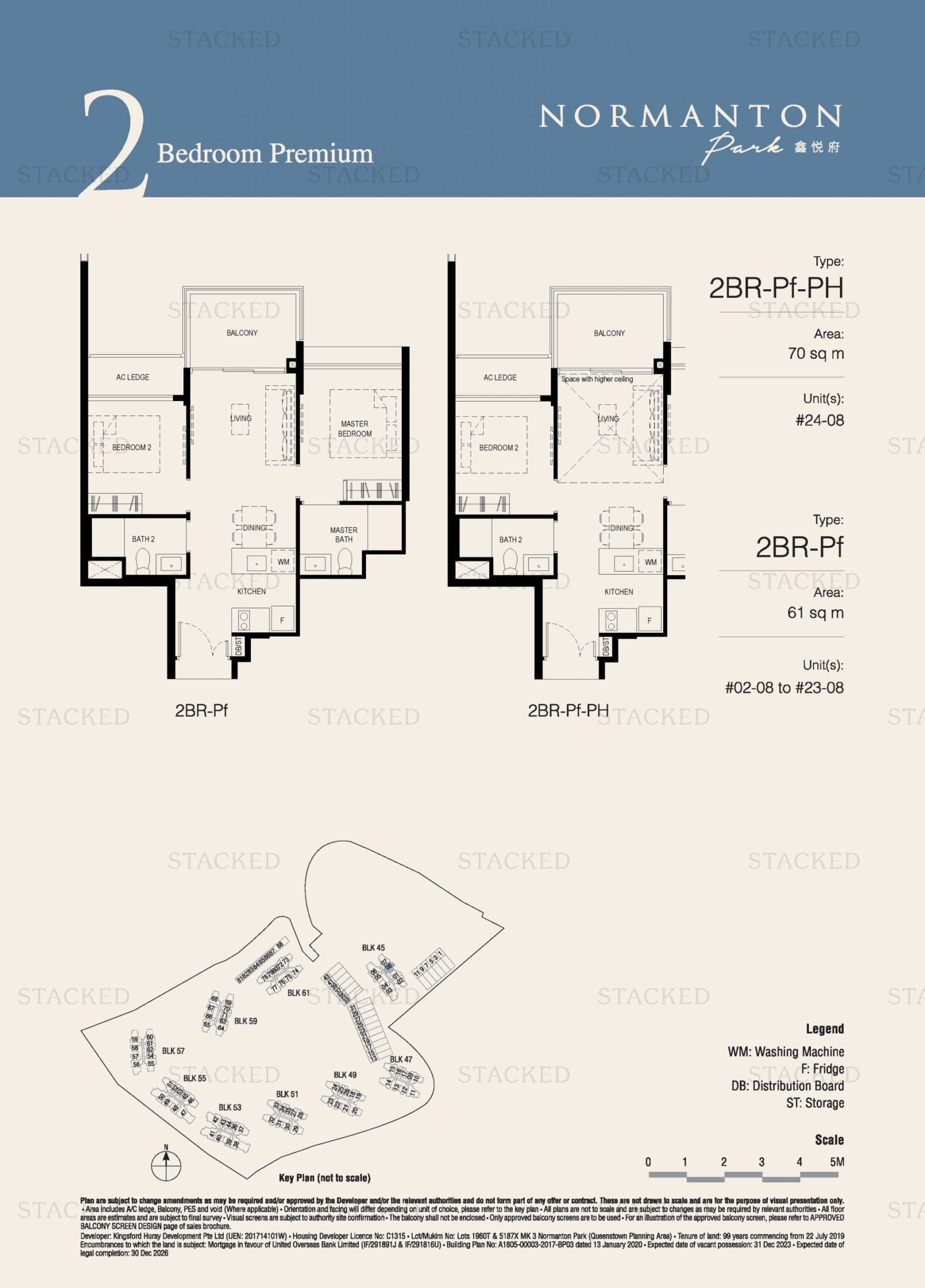
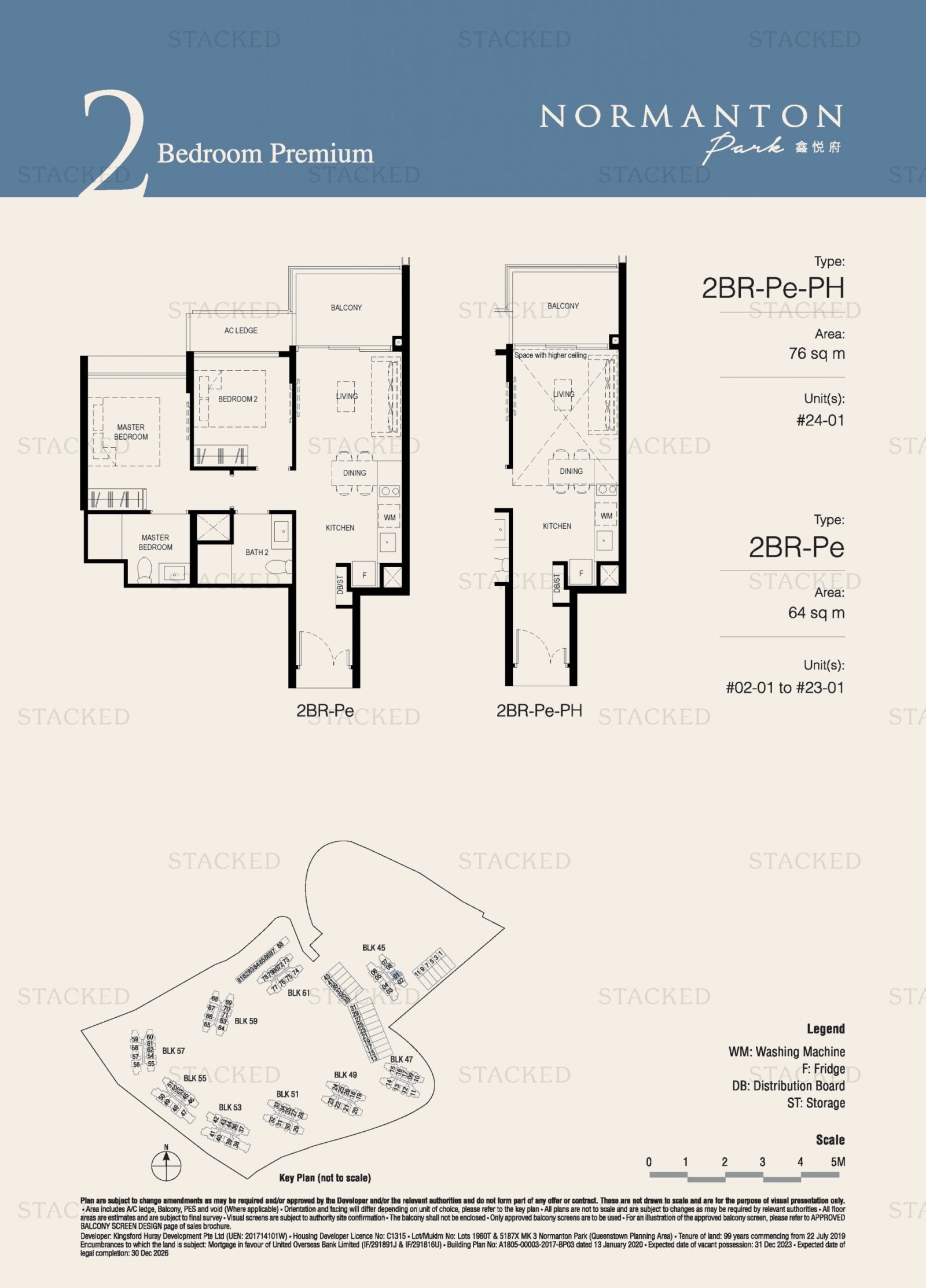
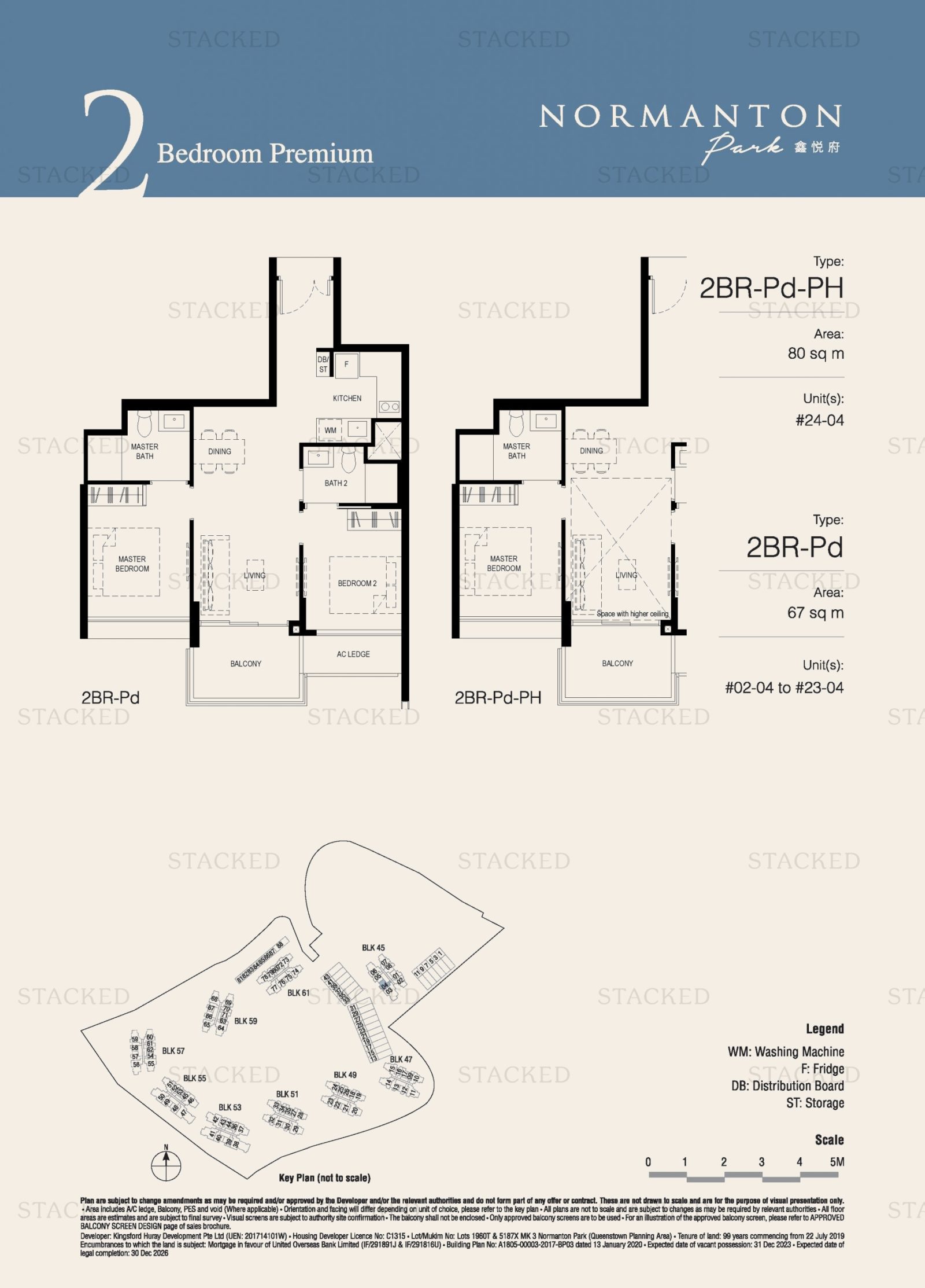
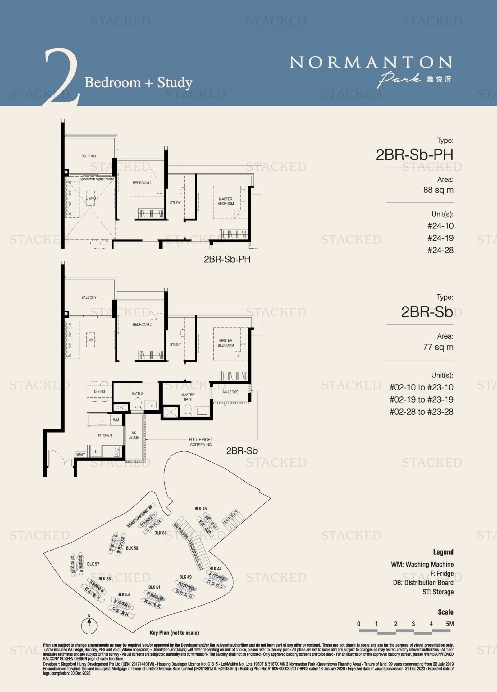
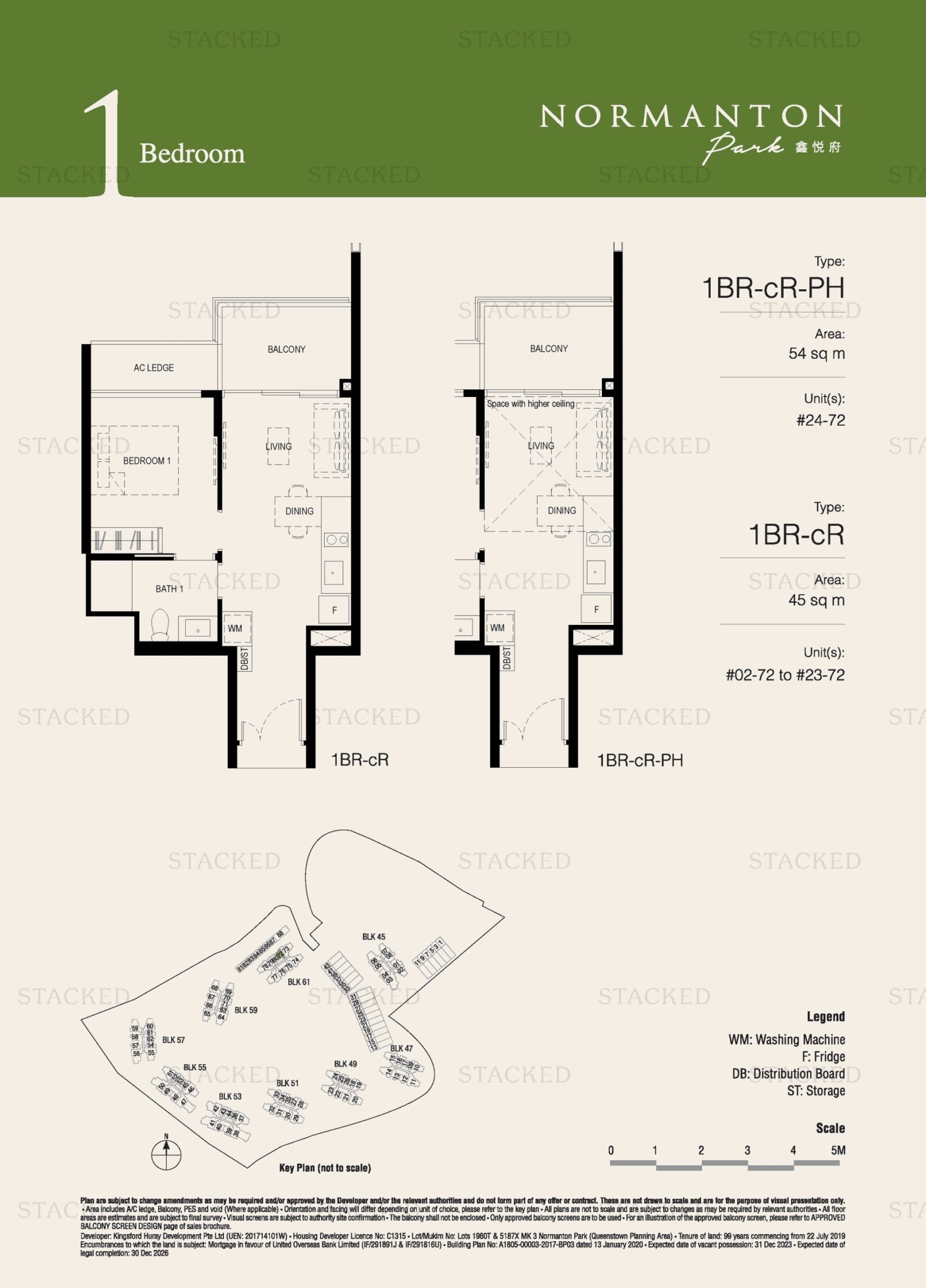
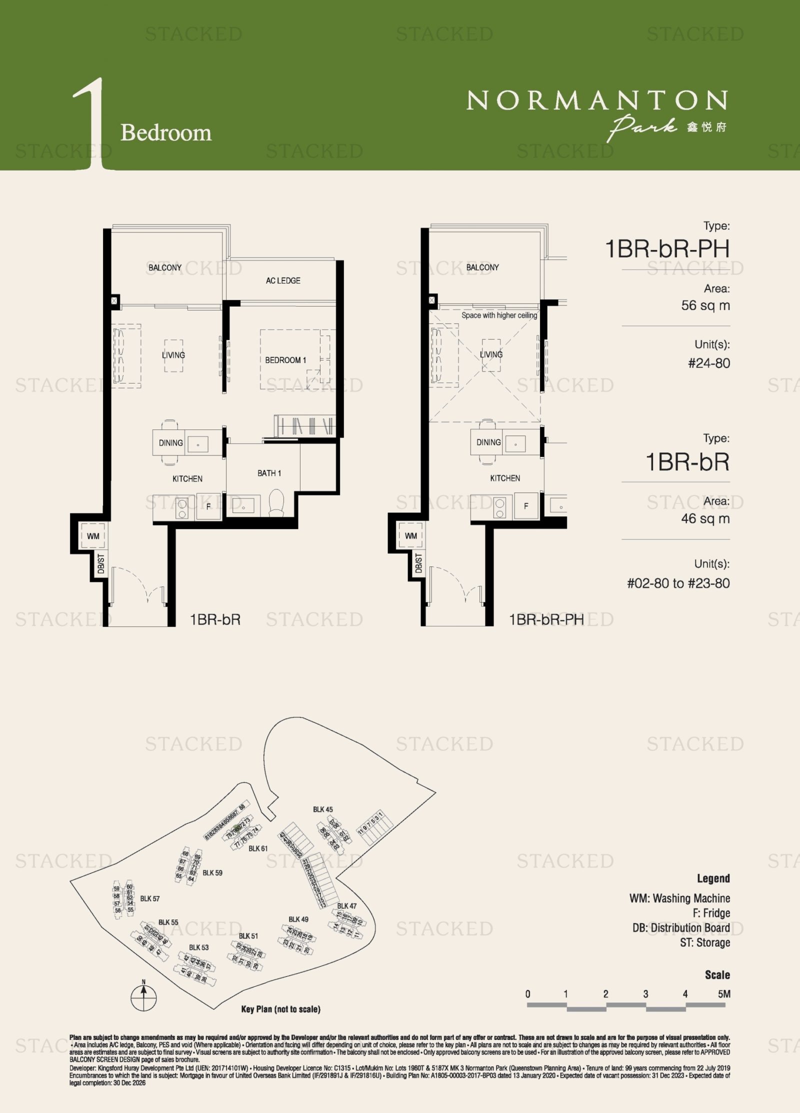
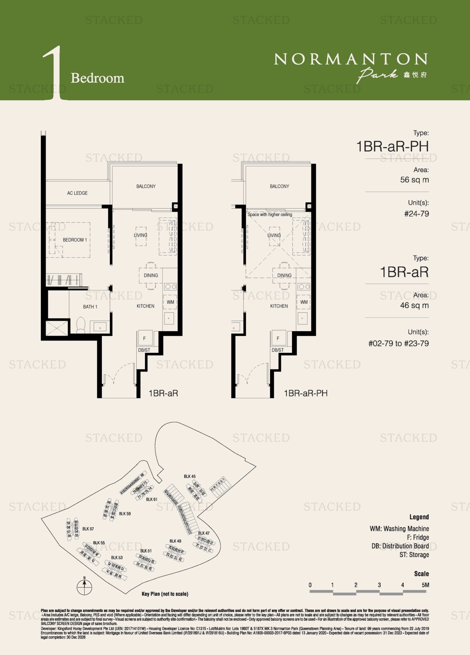
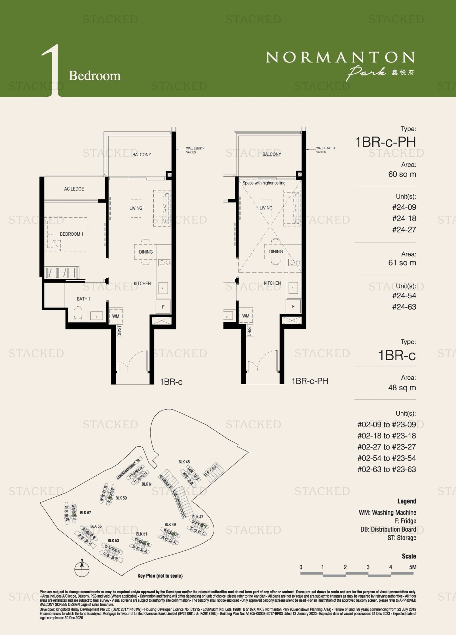
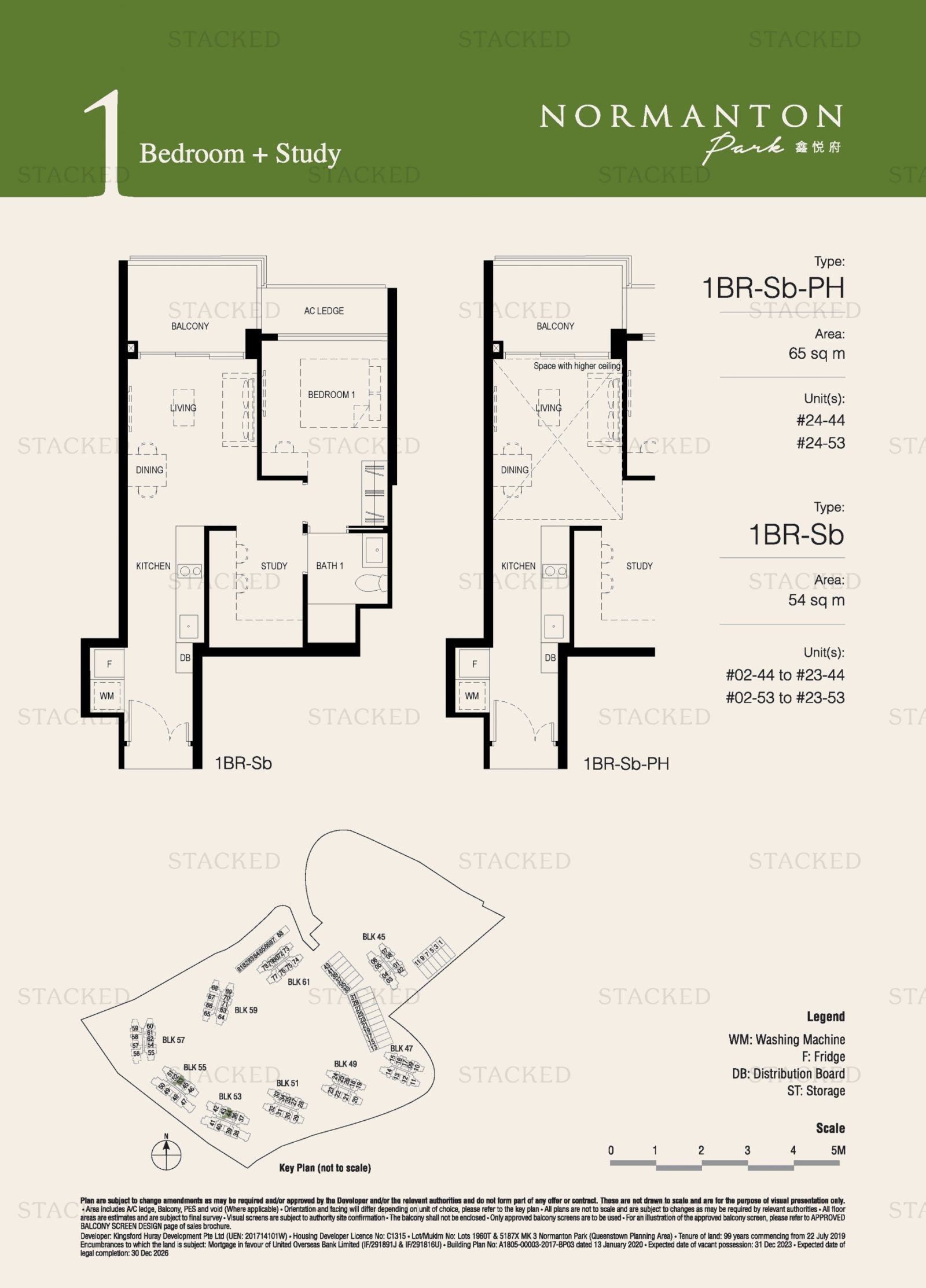
Interestingly for a new condo, Normanton Park units still have a lot of hallways (depending on the unit type in question); but this is for a good reason. Some of the units are designed to easily merge the living rooms with another bedroom, to open up the space.
While property agents generally advise against this (reducing the number of rooms is, loosely speaking, bad for resale value), pure owner-occupiers do appreciate the option. As such, an increasing number of units are built with versatility in mind, and are marketed as “flexi” units.
Note the total lack of bay windows and planter boxes, as buyers are now savvy enough to avoid such features.
Private lifts are also appearing more often. Once the sole province of luxury condos, we’re now seeing them in more mainstream options too. Normanton Park, for instance, is more practical than mass-market; and yet it has some units with this feature.
Newer homes have grown more efficient, but the appeal still varies. If you’re a traditionalist, all these dumbbell-layout “efficiencies” can strike you as cold and cookie-cutter; and you might still prefer an older style.
Conversely, some might feel that – despite the smaller square footage – newer homes have more living space, after cutting out wasteful hallway spaces and planter boxes.
This can be seen when pitting new developments against older ones, where you can see that the new projects are about as efficient as they can get – because the rising costs and smaller homes dictate the need to be so.
So what about the next evolution of floor plans?
Well, given there’s only so much space left to play with, floor plans can only change by so much. But with the new Gross Floor Area (GFA) rules that have taken into effect from 1st June 2023, one big change would be the saleable area that developers can charge for (see here for the full explanation).
If you’re uncertain, check out our in-depth reviews that break down each unit layout where possible. You can also contact us on Stacked, for any questions on the Singapore private property market.
At Stacked, we like to look beyond the headlines and surface-level numbers, and focus on how things play out in the real world.
If you’d like to discuss how this applies to your own circumstances, you can reach out for a one-to-one consultation here.
And if you simply have a question or want to share a thought, feel free to write to us at stories@stackedhomes.com — we read every message.
Frequently asked questions
How have condo layouts in Singapore changed since the 1970s?
What features were common in Singapore condos from the 1980s and 1990s?
Why did newer condos in Singapore tend to have open kitchens and fewer hallways?
What are some features of Singapore condos built after 2000?
How did the design of penthouses and luxury units change over time?
What impact did new regulations in 2023 have on condo layouts in Singapore?
Ryan J. Ong
A seasoned content strategist with over 17 years in the real estate and financial journalism sectors, Ryan has built a reputation for transforming complex industry jargon into accessible knowledge. With a track record of writing and editing for leading financial platforms and publications, Ryan's expertise has been recognised across various media outlets. His role as a former content editor for 99.co and a co-host for CNA 938's Open House programme underscores his commitment to providing valuable insights into the property market.Need help with a property decision?
Speak to our team →Read next from Property Trends
Property Trends The Room That Changed the Most in Singapore Homes: What Happened to Our Kitchens?
PRO Property Trends Condo vs HDB: The Estates With the Smallest (and Widest) Price Gaps

Property Trends Why Upgrading From An HDB Is Harder (And Riskier) Than It Was Since Covid
Property Trends Should You Wait For The Property Market To Dip? Here’s What Past Price Crashes In Singapore Show
Latest Posts
Property Market Commentary Yishun 10 Could Be Redeveloped Into Mixed-Use Housing Near Yishun MRT
Singapore Property News 30-Year-Old Singapore Investor Buys Ang Mo Kio HDB Coffeeshop After Owning 13 Properties
Singapore Property News Tropicana Metropark’s 80% Take-Up Signals Strong Demand for Integrated Living







0 Comments