Tour An Old 1980 Everton Park Transformation: How A Couple Achieved A Monochrome Look With A $110k Reno Budget
September 28, 2022
The term monochrome is often very much misunderstood when it comes to interior design.
While it’s true that the word monochromatic literally means just one colour, it doesn’t exactly mean that you have to use just one specific colour tone throughout the space.
To be more precise, this denotes using colour variations taken from a single base. For instance, if your chosen colour is grey, you diversify by varying the shades, tints, and tones – making it either lighter or darker.
One of the biggest benefits is that it makes decorating much easier. However, you have to be careful as these colours can sometimes end up blending altogether. As such, if you’re aiming for this decor in your home, you need to add some contrast. And the safest yet most beautiful contrast you can use is one we find from nature – the colour green.
Jo and Sam (@evertonenclave) always knew they preferred a monochrome theme, but the inclusion of numerous plants has really made the space come alive. With their flat located in Everton Park, a mature HDB estate, it even makes more sense to craft their home with the same vibe.
“We decided to buy resale as we were not eligible for BTO and loved the area,” Jo shared. We also wanted an older HDB for higher rental yield potential as we don’t intend to resell for capital gains.”
Currently, only the couple and their cheerful Shih Tzu are staying in their home. Let’s join them as they share their reno journey and reveal their take on monochromatic home design.
So many readers write in because they're unsure what to do next, and don't know who to trust.
If this sounds familiar, we offer structured 1-to-1 consultations where we walk through your finances, goals, and market options objectively.
No obligation. Just clarity.
Learn more here.
How The Renovation Journey Turned Out
“We allocated $80k for the renovation but ended up spending $110k,” Jo answered when we asked her how much they had to shell out. “This is because our contractor was on the pricier side,” she added.
To be clear, this amount didn’t include their expenses for the furniture. And even when they tried using different vendors for a few areas, like with their window, aircon, countertops, and bathroom fittings, it didn’t significantly bring down the cost either.
Still, as you will learn soon, they were very pleased with the outcome.
Jo said that the look they were aiming for was heavily inspired by monochromatic design. “We find it calming and an easy backdrop for more elaborate homeware.”
While they wanted to change the look of the home completely, she said they did not want to deviate too much from the original floor plan. Here’s a quick look at how they did it for the kitchen.
For the couple, it’s all about creating a functional layout that suits their lifestyle.
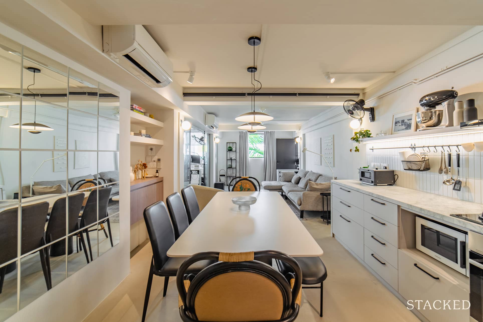
For instance, they kept a single-wall kitchen and got a complimentary dining table as an extended workspace. “In order to maximise the space, we did not follow the trend in other 3-bedroom apartments where they separate the dining and kitchen area.”
Since their unit has low ceilings, they decided to knock down the bedroom walls, except for one. Doing so helped enlarge the space in the common area both physically and visually.
Here’s the transformation that took place in their home, room by room.
Living Room
Jo and her husband wanted to interact with their guests while preparing food. To make this possible, they had the wall between the kitchen and living rooms knocked down to extend the spaces and blend them seamlessly.
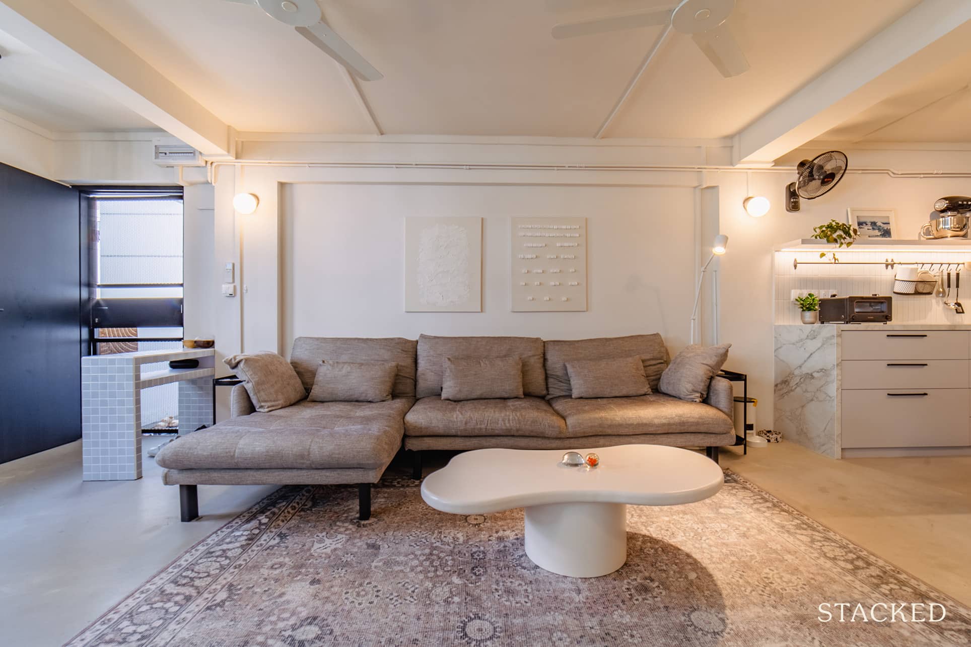
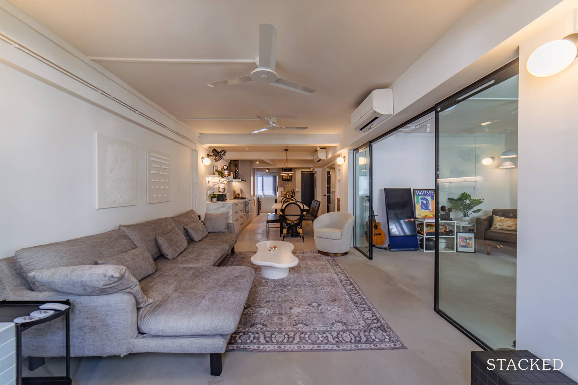
They also created a glass sliding door partition between the living room and the study, allowing them to view the art pieces hanging in the study.
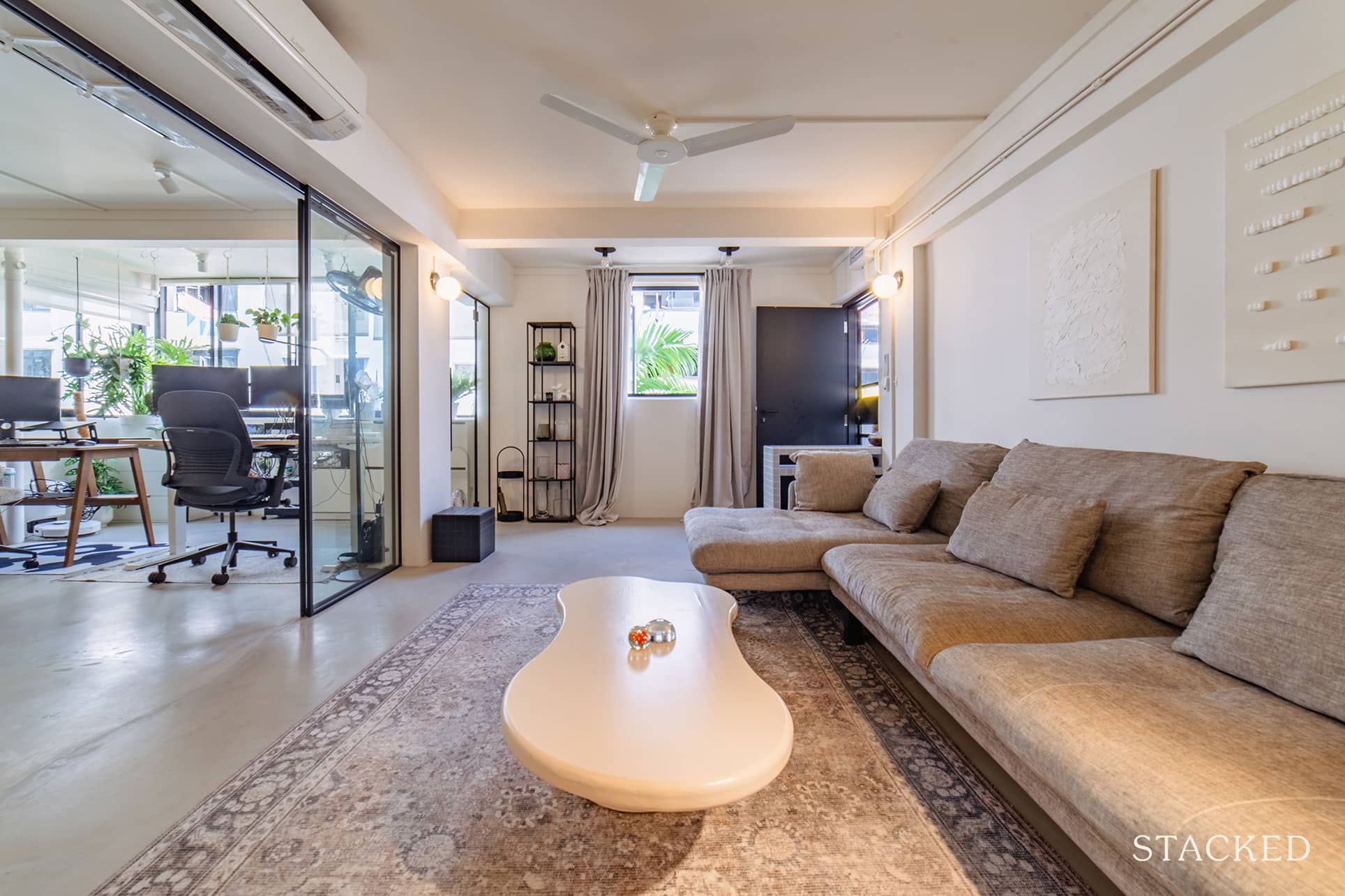
As a result, the TV and console are not the only centrepiece of the area but the entire living space. “This allows us to interact with guests who prefer to sit around the coffee table,” Jo explained.
Study Room
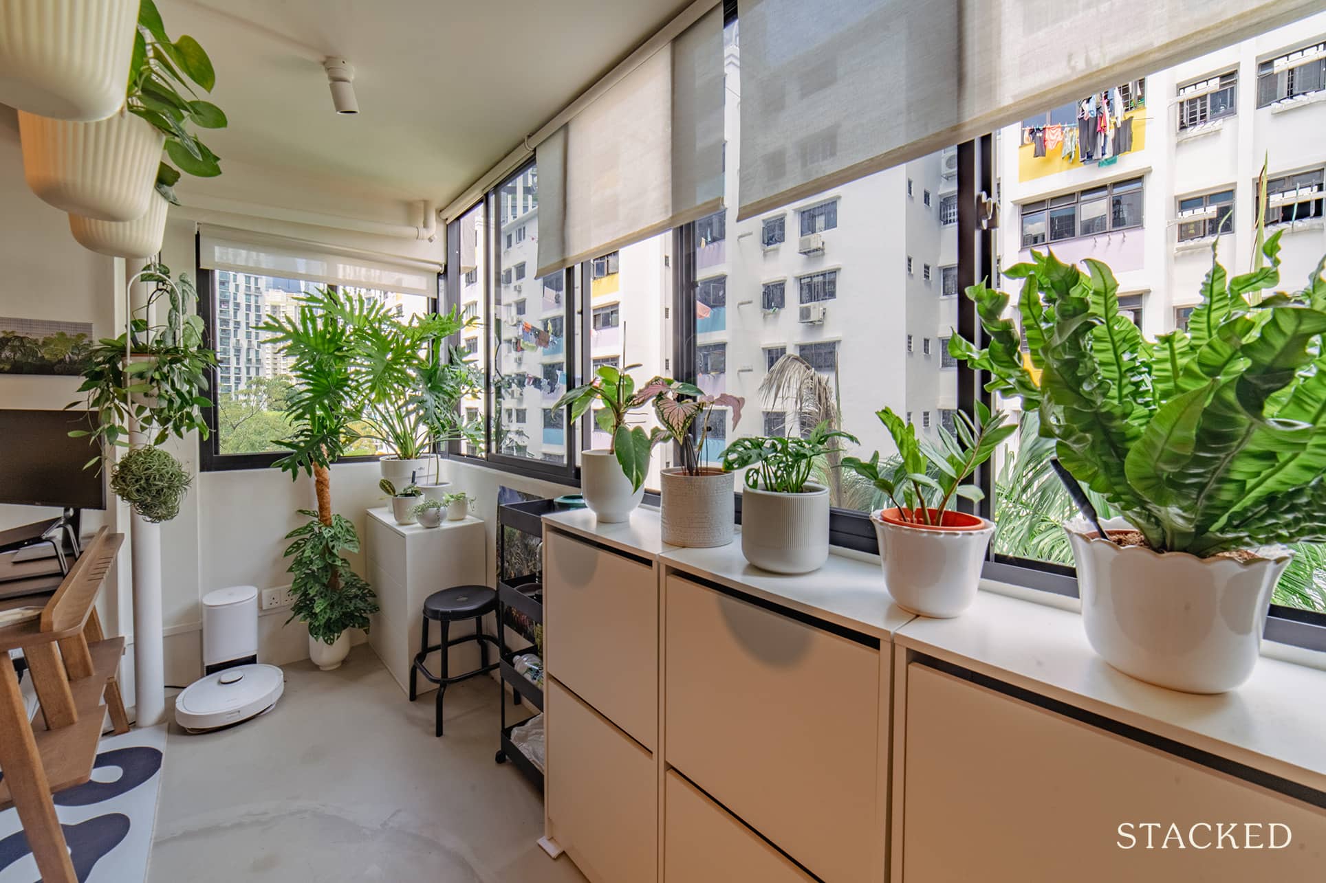
The study room was initially a bedroom, and they wanted to make more space for it. So it wasn’t only the wall between the living room and study that they had to knock down. They also hacked the wall leading to the balcony to extend it.
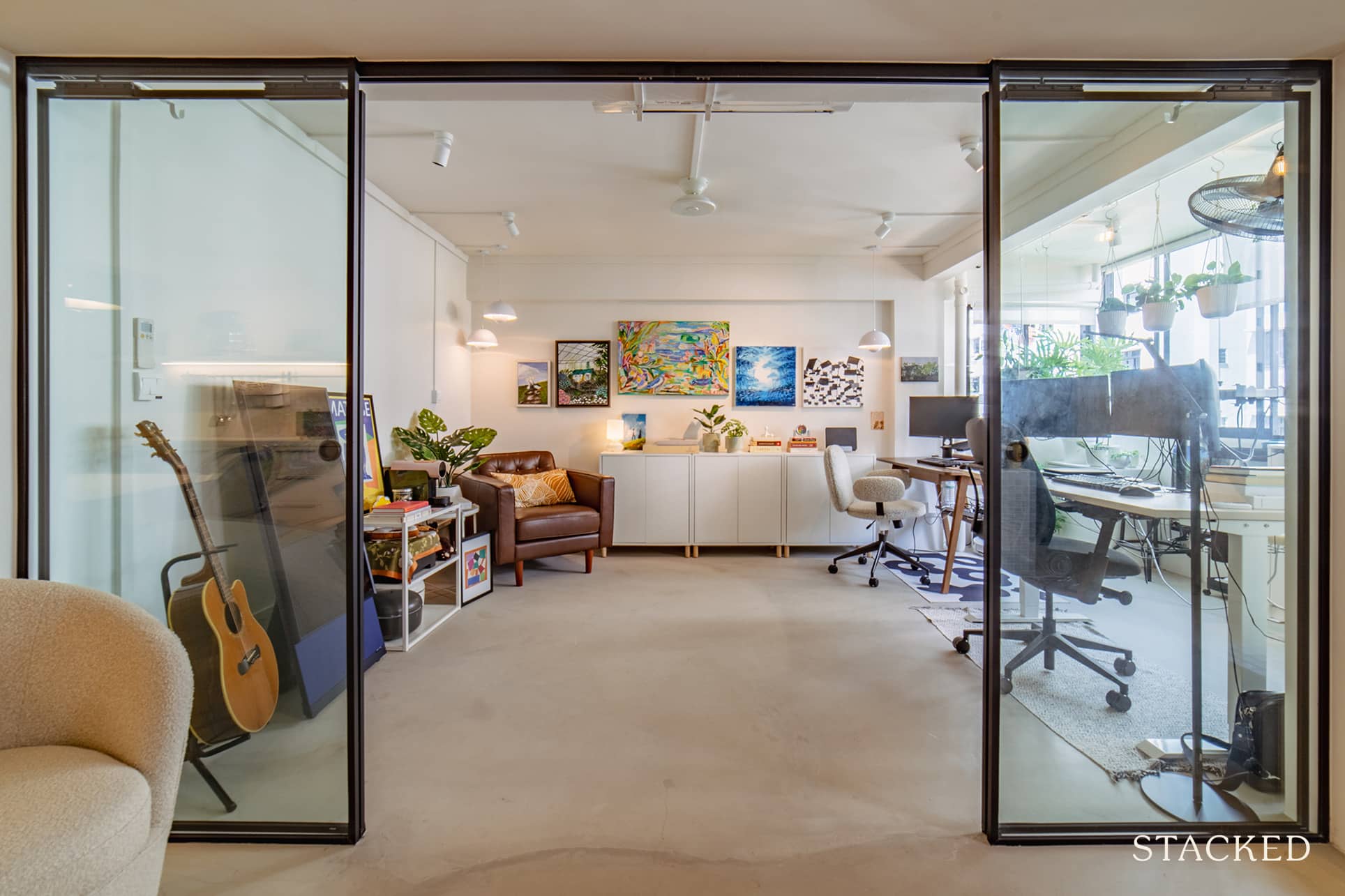
She said this setup allowed them to roll their TV in and out of the living room and into the study when not in use. “We can also roll our office chairs into the living room when we have a larger number of guests sitting around the sofa.”
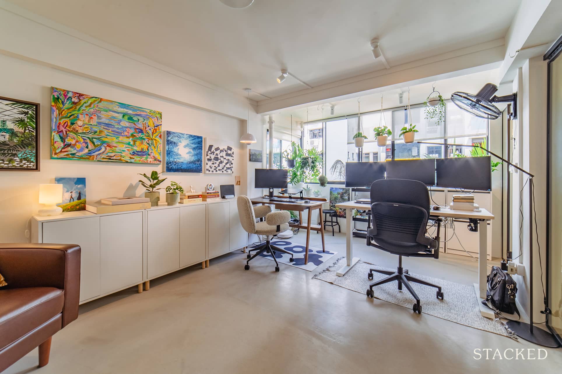
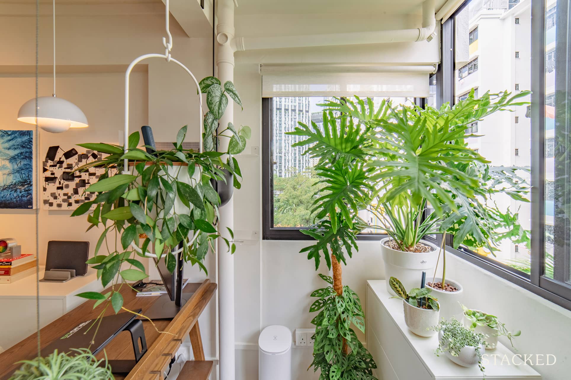
Their balcony functions as a green room and offers them a nice view from their desks. Plus, it adds the contrast needed for a monochromatic home design, adding naturalness to the sophisticated design.
Dining Room
As with most older 3-bedroom apartments, the dining room was previously in the kitchen area. The couple decided to keep it that way but made sure to upgrade the space’s design.
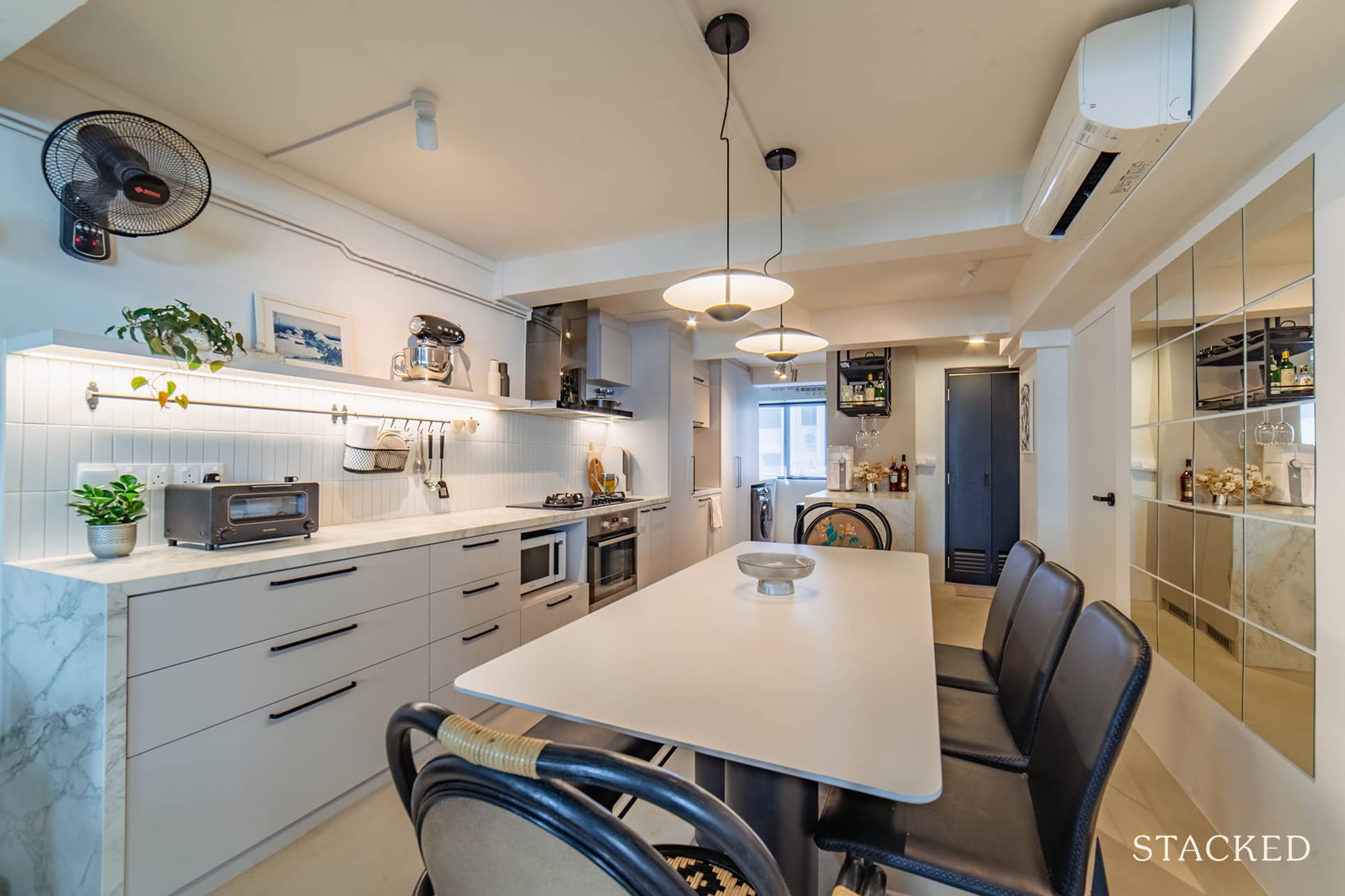
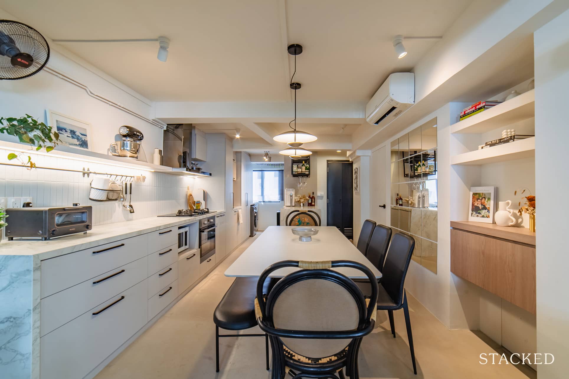
The centrepiece in this room is the dining table which also functions as an extended workspace. The table was also a practical choice as it was made of an engineered stone similar to the kitchen counter, and is resistant to stain, scratch, and heat.
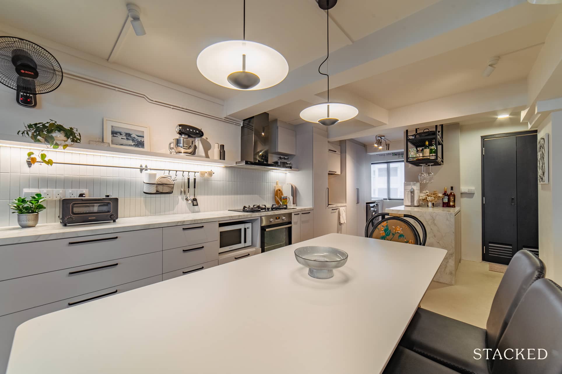
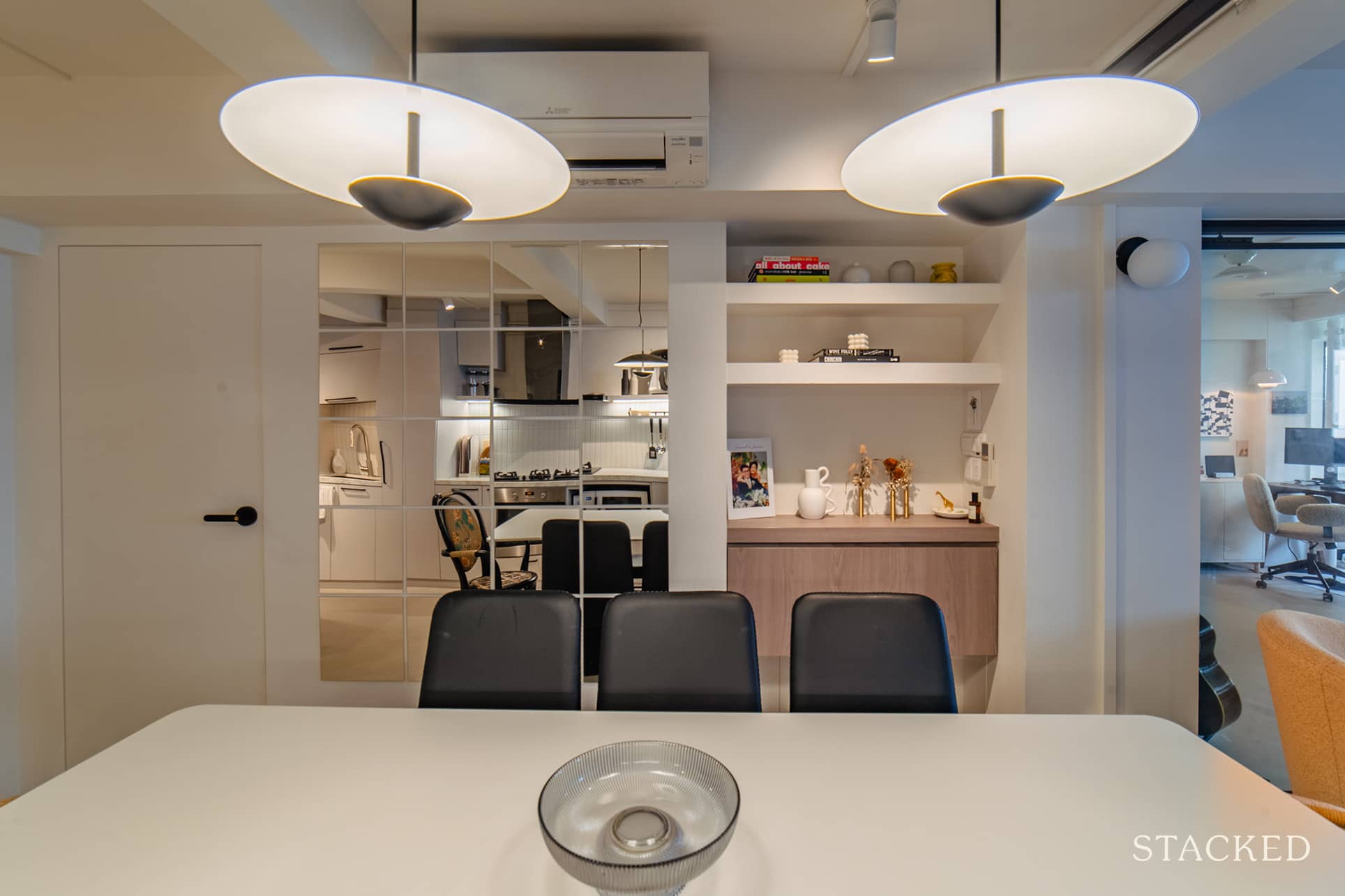
The drop lights add a great degree of elegance to the space, while the multi-panel mirrored wall helps to make the area appear larger visually.
Kitchen
The original layout of the kitchen is single-wall, which the couple kept to maximise the space. Of course, the entire space has been rebuilt to suit the theme of the home.
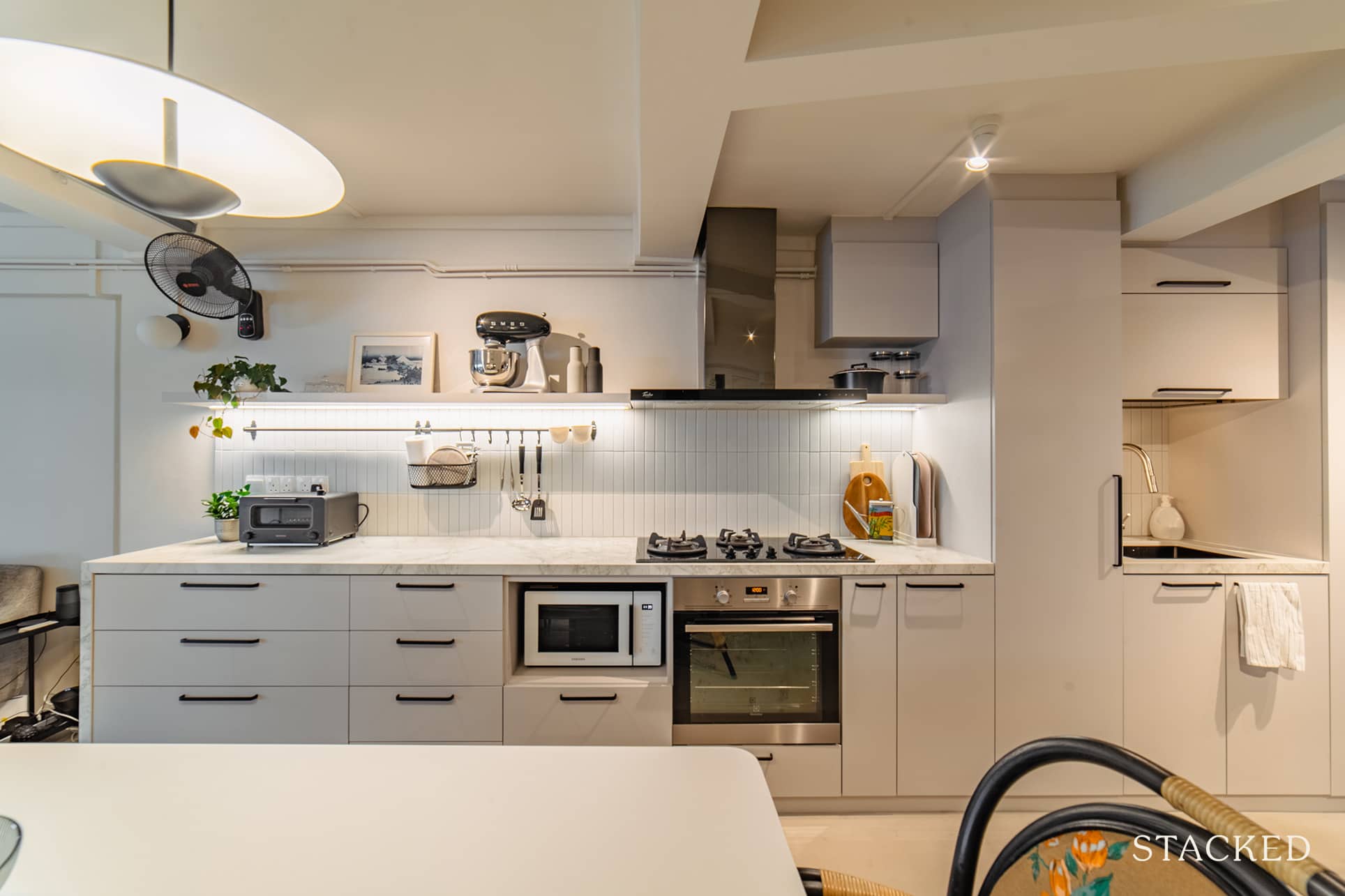
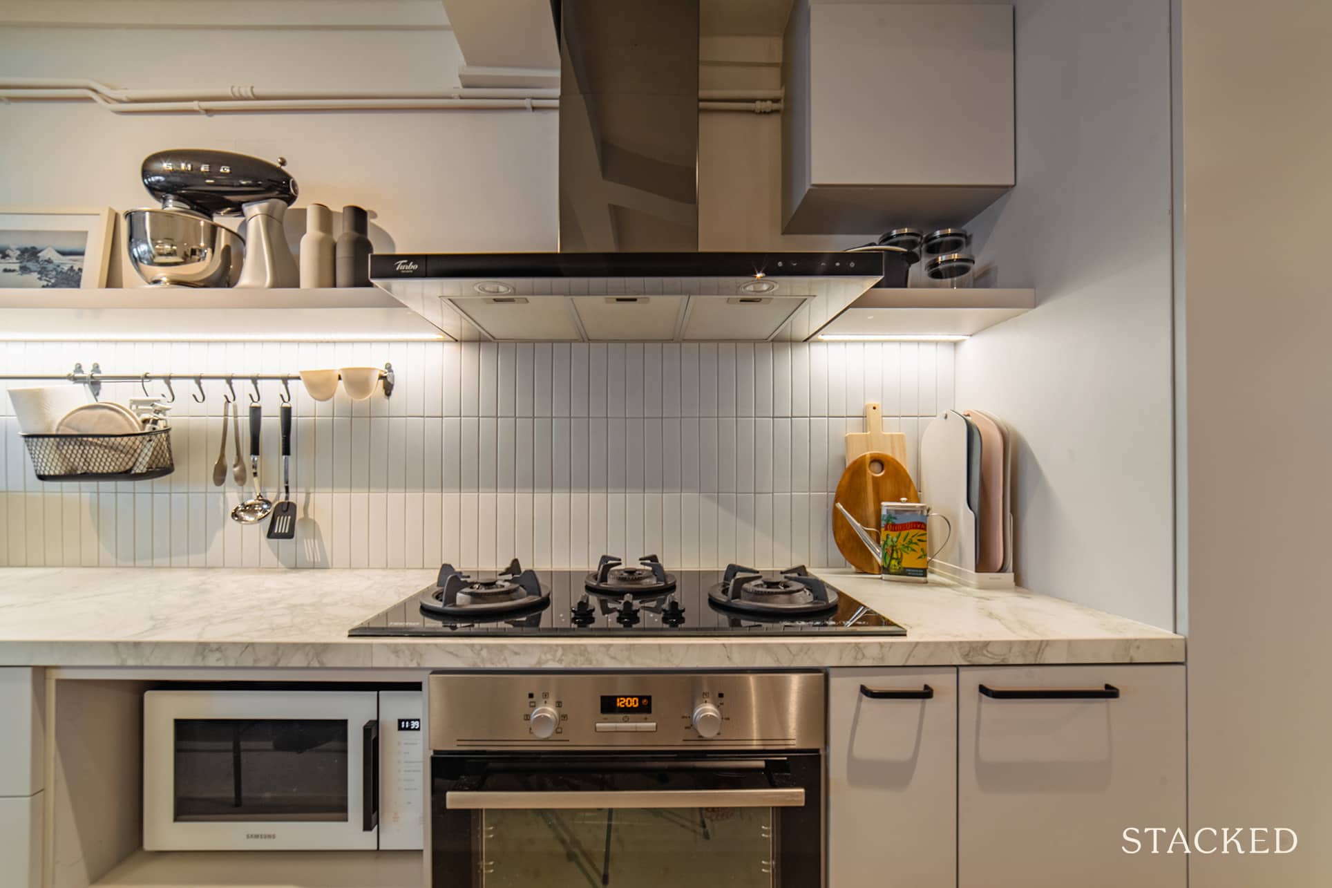
They also added a kitchen island to house their dishwasher and wine fridge, which was further extended for their main fridge as well.
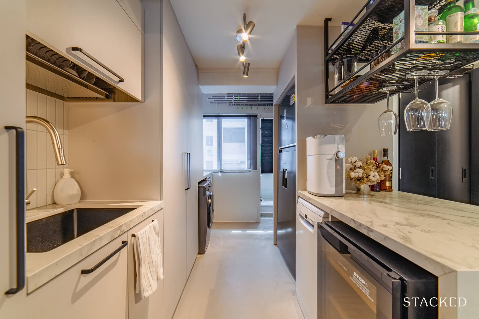
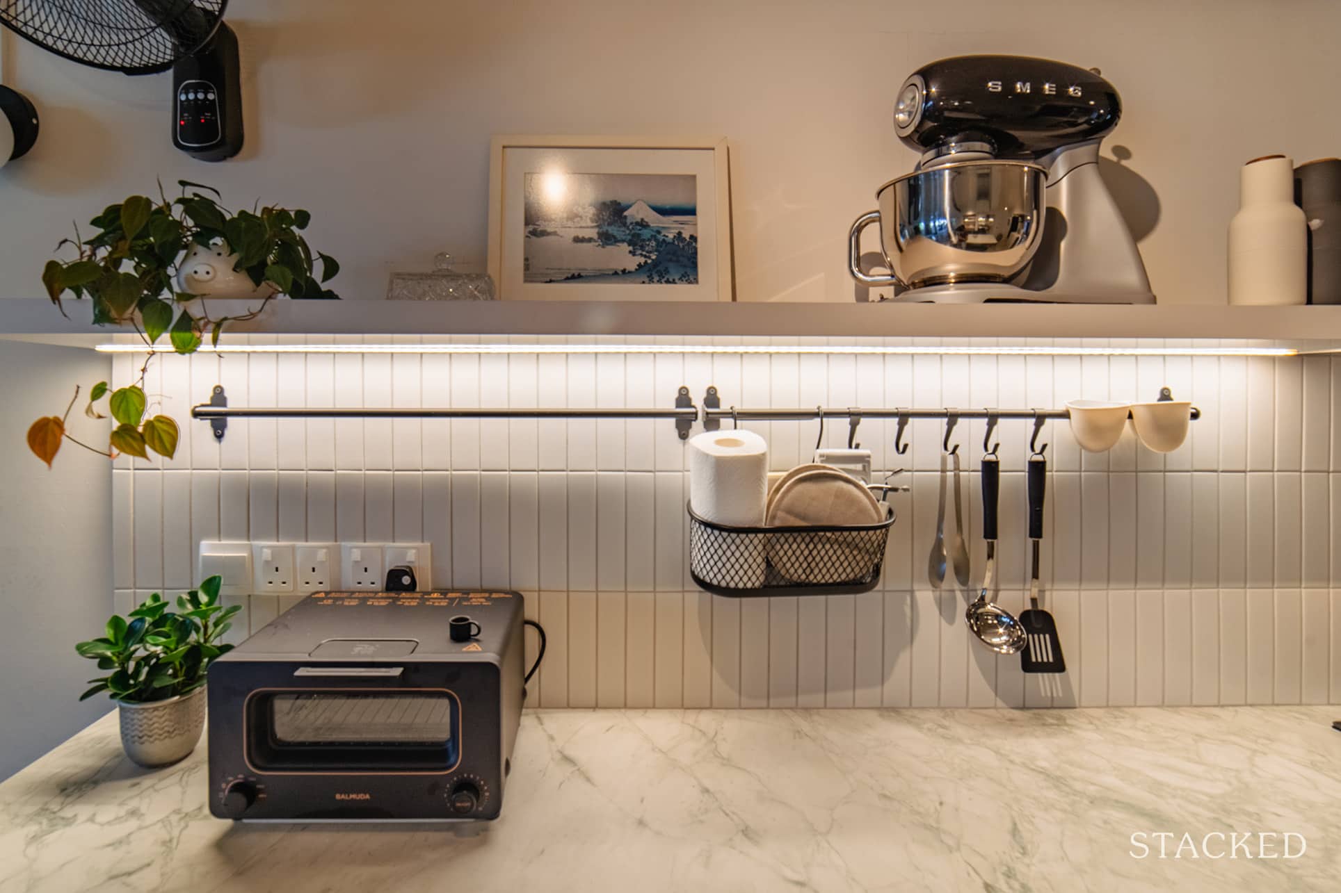
They also switched out the closed cabinets with open shelves for a more modern vibe. Another reason they went for this style is that the couple felt “things would be forgotten if not easily accessible or visible to the eye.” Furthermore, open shelves offer less room for bugs to nest and hide.
More from Stacked
When Renting In Singapore Is The Smarter Move — And Buying Can Wait
There’s a certain taboo in Singapore toward renting, though a good deal of it is self-inflicted. I’ve never actually heard…
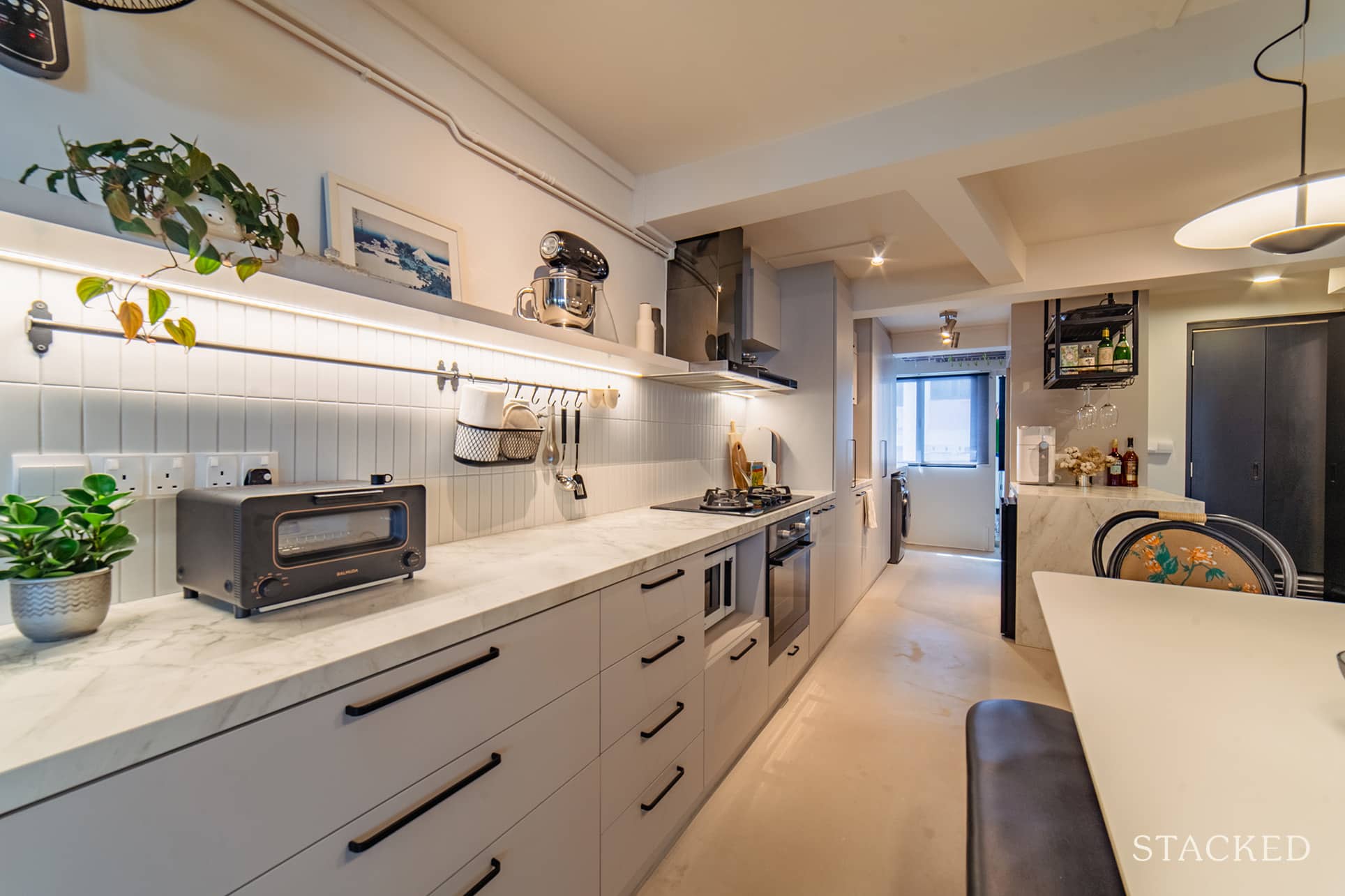
Instead of traditional cabinets, they opted to use drawers for their kitchen storage as they felt it’s more ergonomic and easier to see everything inside when pulled out.
Bedrooms
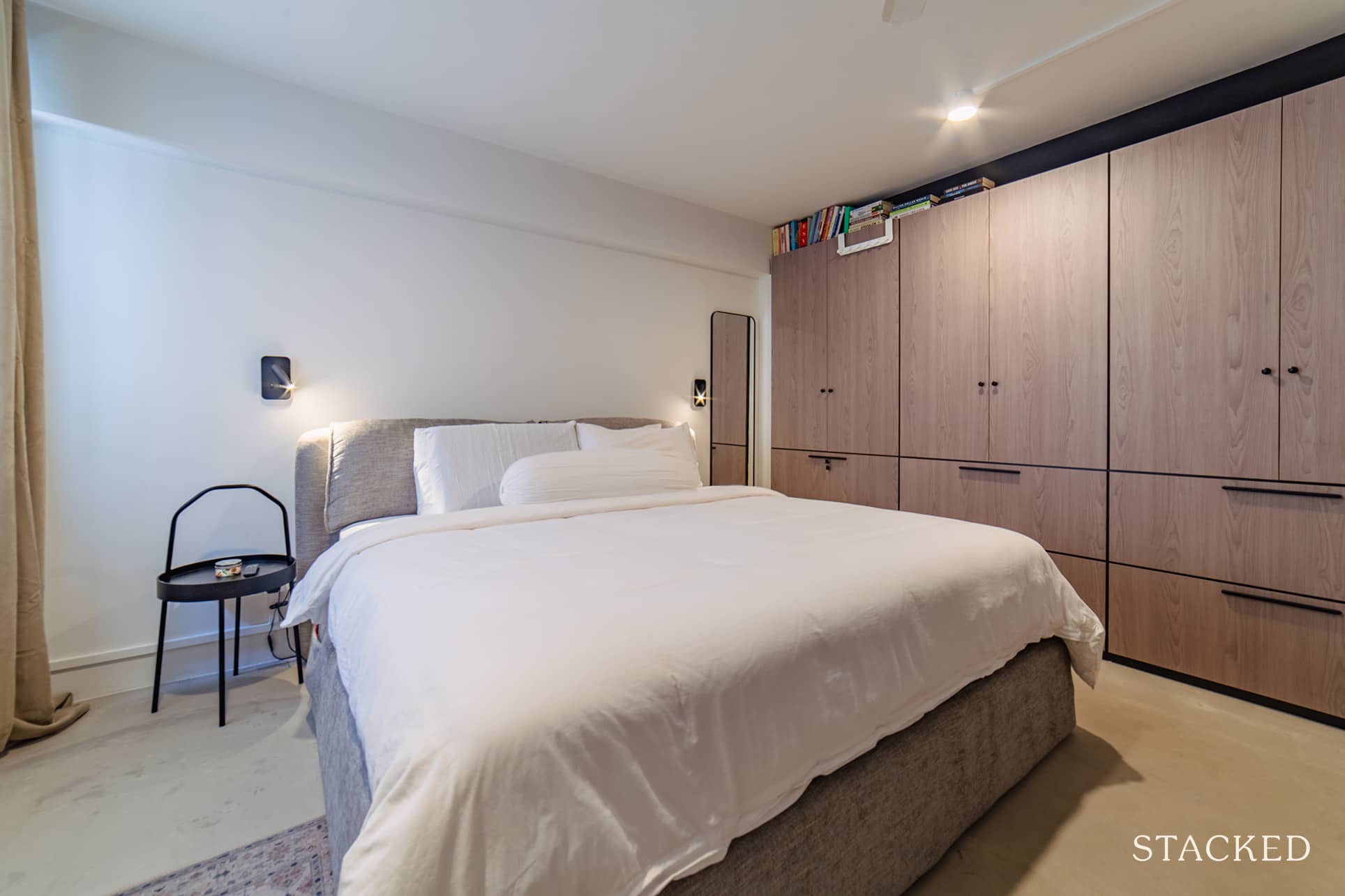
Jo said that the only change they had in the master bedroom was extending the wardrobe space. They also flushed their bedroom door to the wall.
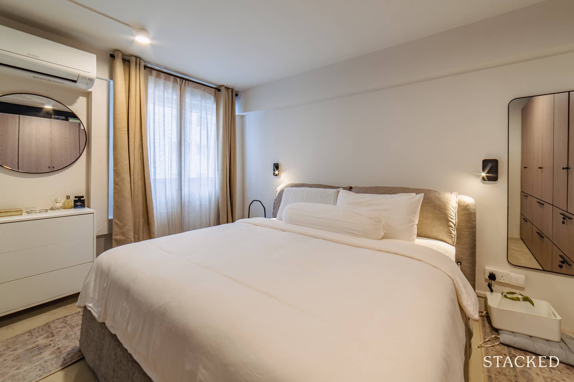
They did feel that it was a waste to box up the area on top of their wardrobe. The space was too small to put hanging rods, though, so they converted it to a bookshelf instead.
Bathrooms
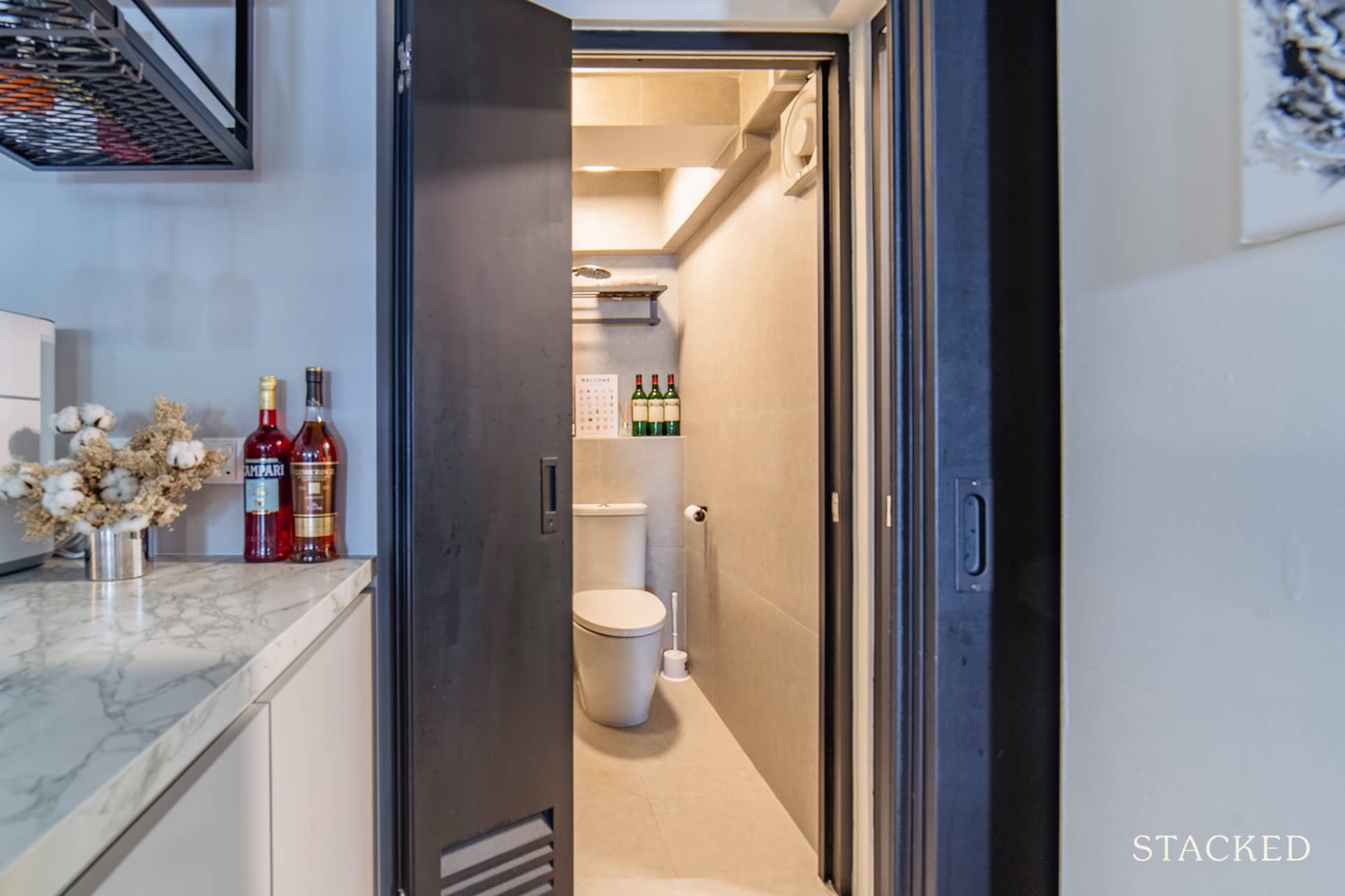
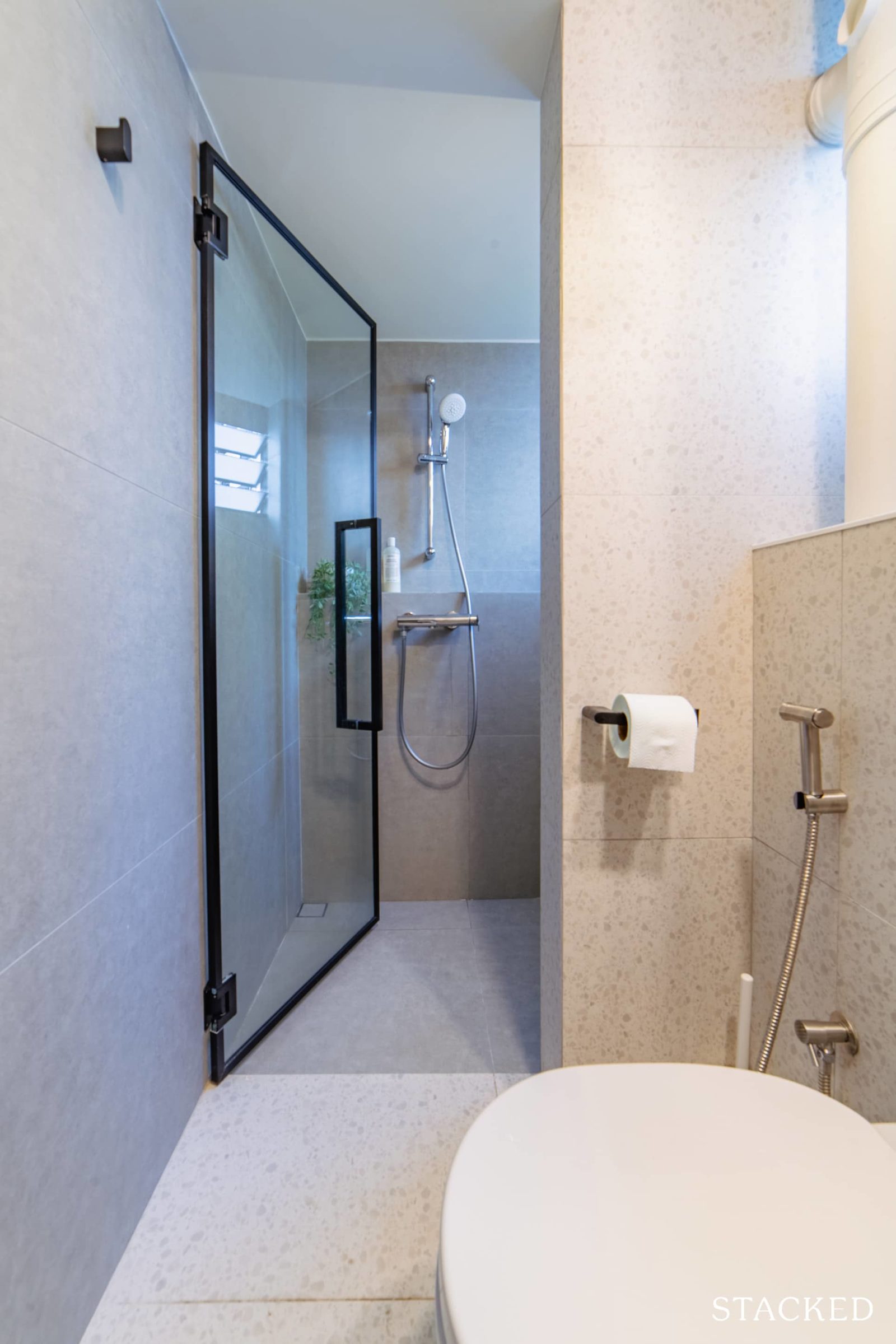
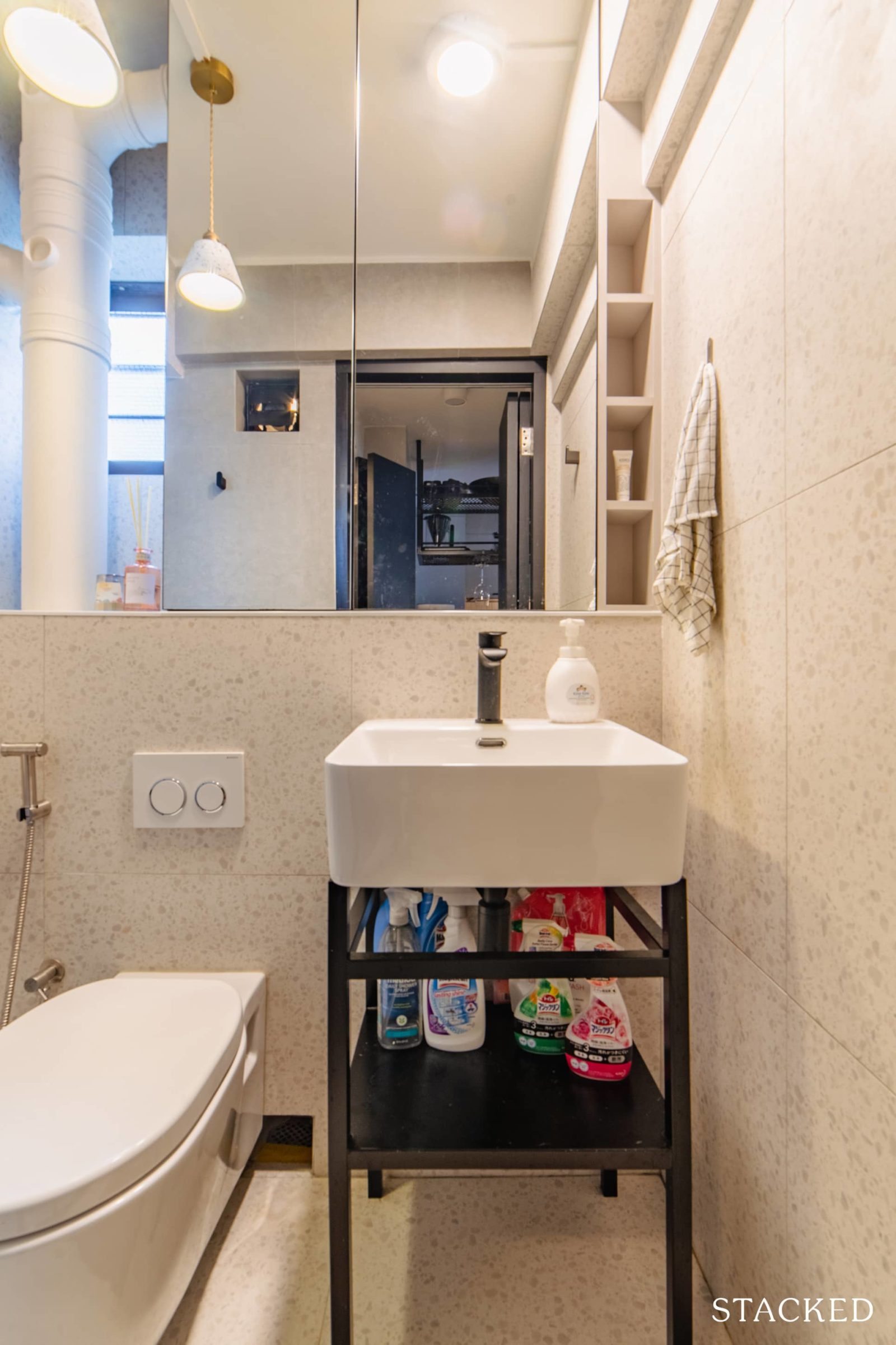
The original bathroom was split into two spaces – one to house the shower and the other for the toilet. “We reorganised the two spaces to fit a toilet and a shower each, which is a better use of space,” she said.
The smaller toilet was designated as a guest toilet, which faces the open space. It’s also easily accessible by their guests. They installed wooden bifold doors here, which saves space while giving a sense of privacy compared to a swing door.
Store Room
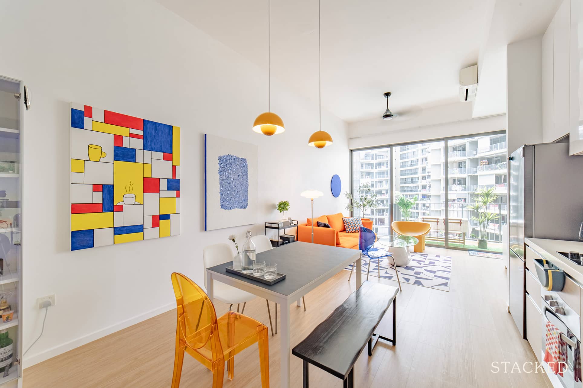
Everything was kept in its original condition except for the added ceiling light and fan. They also removed the door from the store room to get natural air and light in.
Homeowner StoriesA $13k Condo Renovation Breakdown: How This Creative Homeowner Self-Designed & Decorated Their 732 Sqft Home
by StackedBringing The Vision To Reality
Most of the design changes were finalised before the construction started, so Jo said that it helped to ensure the outcome was similar to what they envisioned.
For their renovation contractor, the couple chose Just Build.
“Our criteria for picking Just Build was mainly based on our ID’s recommendation,” she said. “They were also said to have good workmanship and reliability. We wanted those that won’t run away or stop working if there were items to rectify.”
In terms of furniture, she said that they sourced furniture based mainly on comfort and colour scheme. “We ended up buying most of our furniture from Commune as it was the most convenient way to shop,” she revealed, “plus we got a 20% discount from spending over a certain amount.”
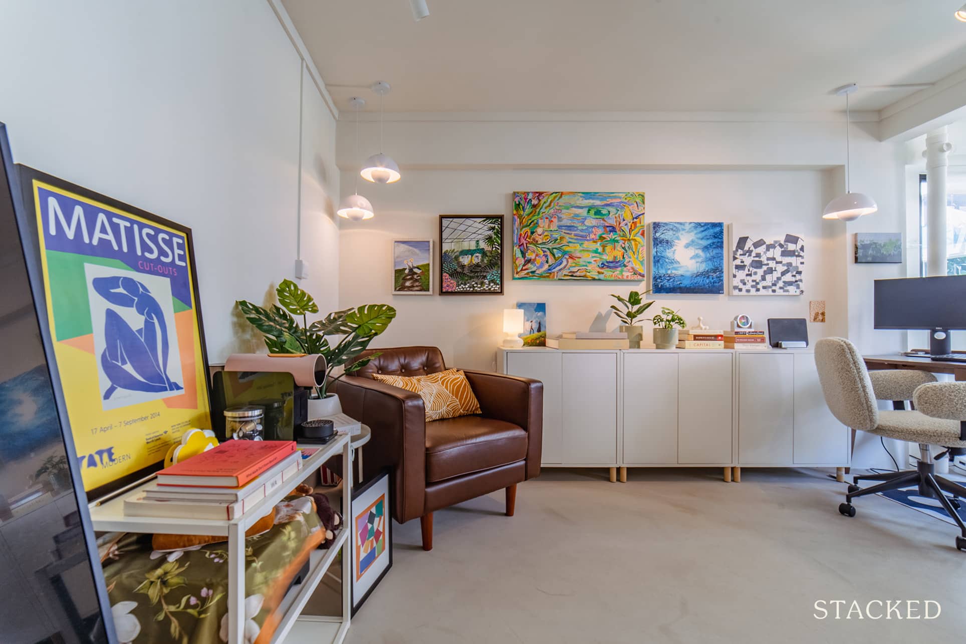
Since they have an older HDB with weird kinks and low ceilings, they needed to have other pieces of their furniture custom-made. “We visited random warehouses to source these items. For example, our ceiling fan is only a 15-centimetre drop from the ceiling. What we got was a very rare find, and we got it in an industrial estate,” she recalled.
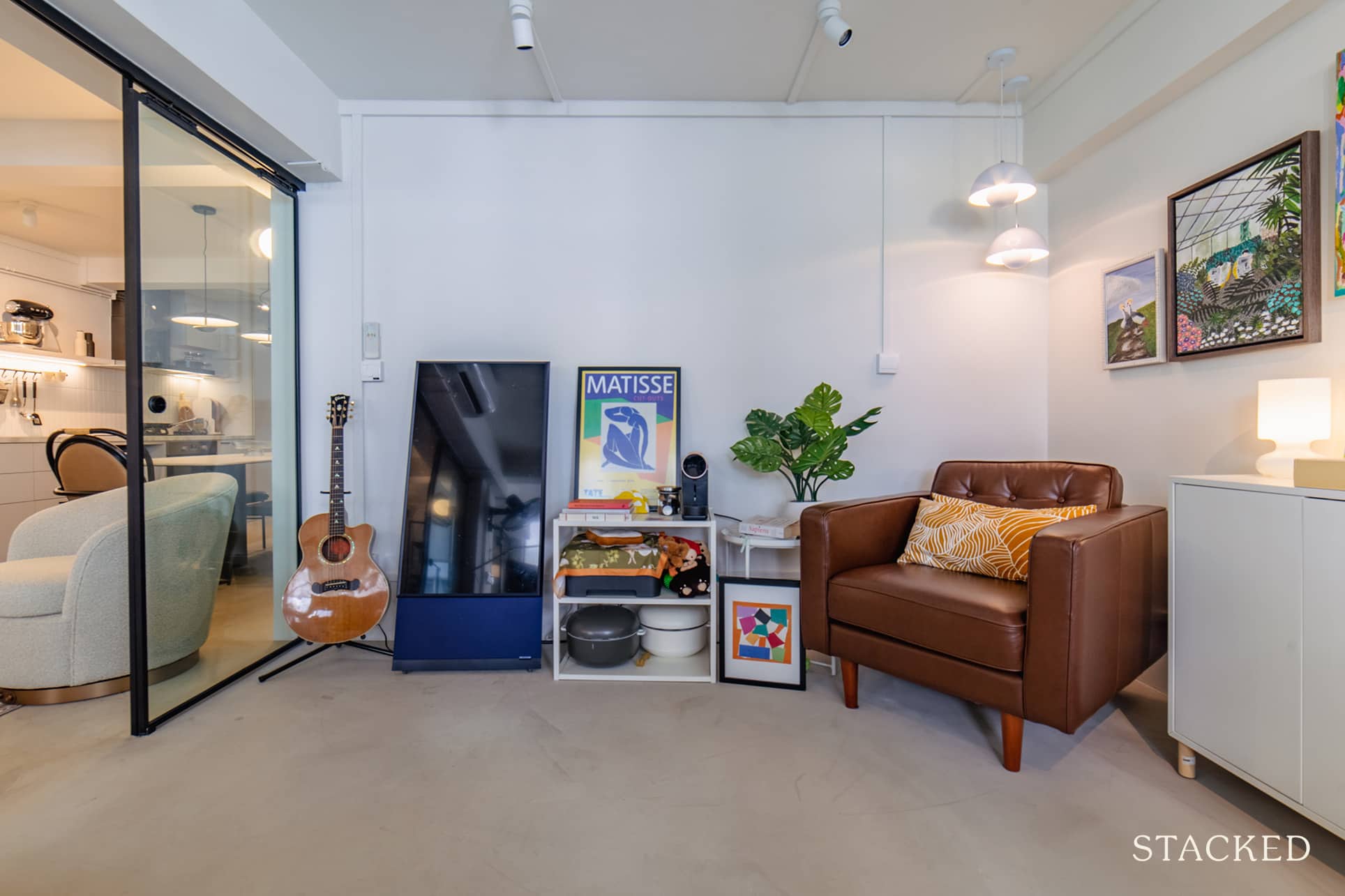
Similarly, they had their stone dining table custom-made from a warehouse shop they found online. Jo said that even their console in the entry was handmade by a couple they found online. It’s exactly 30 centimetres – the same width as the depression next to their door.
The couple’s favourite area after the reno is their kitchen and dining space. “We made much better use of certain kinks which wasn’t utilised before.”

She further elaborates on the improvements they were able to achieve in the space. “Where our sink is now was a random depression in the wall that had nothing built. It was only used for placing food containers. There is storage above the chute now for all our cleaning products and a proper service yard that did not exist before.”
Jo also said that the dining area is much larger than before, comfortably accommodating a 2-metre dining table. They also love the pendant lights hanging in the dining area as it “gives the space a touch of sophistication that it did not have before.”
Lessons Learned From A Successful Reno Journey
Of all the challenges they went through during their reno journey, Jo picked two of the greatest. One was the outcome of not visiting the site too often. “We spotted quite a number of mistakes and defects, but this was so because we came onsite almost every day the final two weeks only.” It’s still a great thing they spotted this before the handover.
The other challenge was a matter of technicalities. “Measurements were not accurate until construction started, meaning some minor changes had to be made.”
Fortunately, she said their ID was able able to solve the issues and even gave them good suggestions and alternatives. “It did work out, especially the problems around the random pipes and columns we discovered, which is quite common for a mature HDB unit.”
Jo and Sam learned a couple of valuable lessons in their reno journey. First was that they realised the importance of functionality, giving more emphasis to it even before designing the home. She also admitted that they were probably too relaxed in thinking about their reno costs. “We would budget and compare more options for contractors and ID the next time around,” she said.
If you’re looking into renovating your home anytime soon, Jo gives this one piece of advice worth its weight in gold.
“Make sure you have a design-savvy contractor. Remember that not all contractors appreciate aesthetics and may want to do the job quickly without thinking about how it would look overall.” She said they were lucky to have a contractor that was good at giving alternatives about making things look nice without compromising functionality. “A good proof of how experienced they are,” Jo concluded.
At Stacked, we like to look beyond the headlines and surface-level numbers, and focus on how things play out in the real world.
If you’d like to discuss how this applies to your own circumstances, you can reach out for a one-to-one consultation here.
And if you simply have a question or want to share a thought, feel free to write to us at stories@stackedhomes.com — we read every message.
Need help with a property decision?
Speak to our team →Read next from Homeowner Stories

Homeowner Stories We Could Walk Away With $460,000 In Cash From Our EC. Here’s Why We Didn’t Upgrade.

Homeowner Stories What I Only Learned After My First Year Of Homeownership In Singapore

Homeowner Stories I Gave My Parents My Condo and Moved Into Their HDB — Here’s Why It Made Sense.

Homeowner Stories “I Thought I Could Wait for a Better New Launch Condo” How One Buyer’s Fear Ended Up Costing Him $358K
Latest Posts
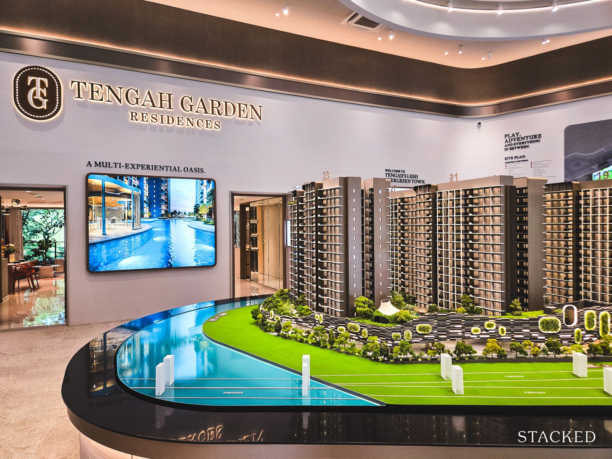
New Launch Condo Reviews Tengah Garden Residences Review: New 863-Unit Tengah Condo From $980,000 Near Hong Kah MRT

Singapore Property News HDB Resale Prices Fell — But A Third Of Buyers Still Paid $800K+ Last Quarter. Here’s Why

Singapore Property News Three Strata Office Floors In Suntec Priced From $135M













0 Comments