10 Unique Interior Design Features To Steal From Our Home Tours
January 7, 2023
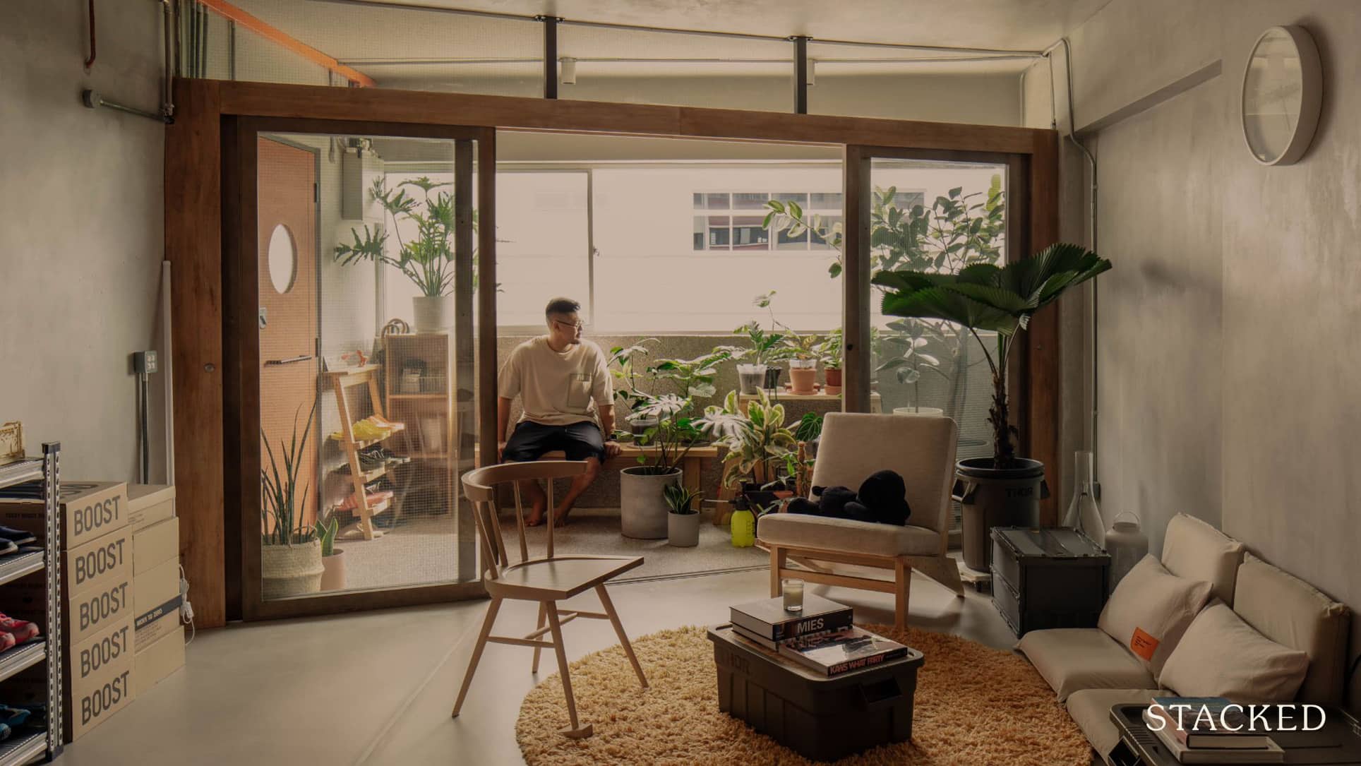
Through our Living In series on YouTube, we’ve seen some of Singapore’s best-designed homes. And it’s been lovely to see how homeowners have really added little (and big) intriguing details that make the home one that is unique to them.
Here are 10 cool design details that we’ve picked out that you can take note and check if your interior designer can manage something similar!
So many readers write in because they're unsure what to do next, and don't know who to trust.
If this sounds familiar, we offer structured 1-to-1 consultations where we walk through your finances, goals, and market options objectively.
No obligation. Just clarity.
Learn more here.
1. Pottery studio within a walk-up apartment
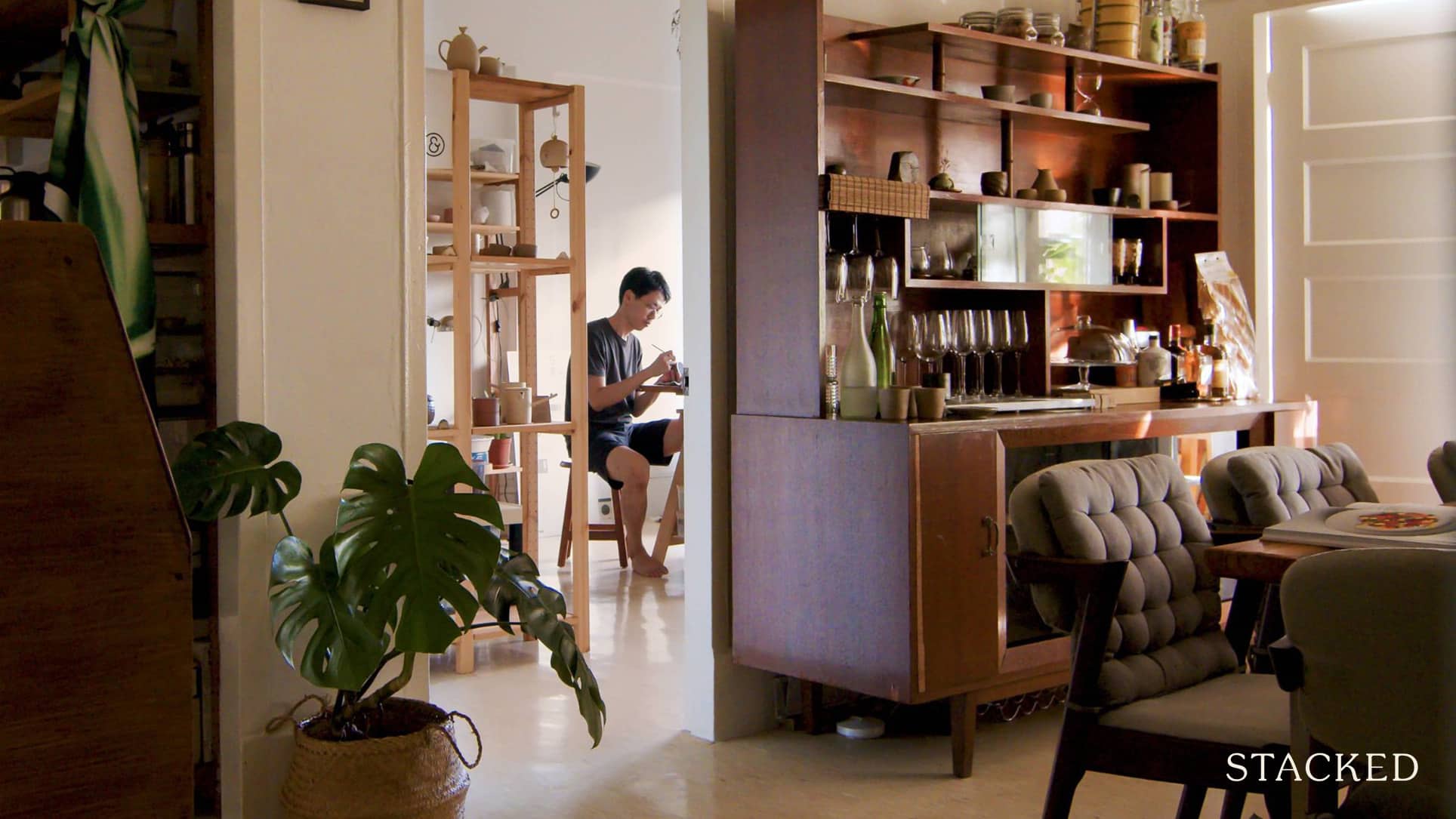
There are a lot of bold and unusual choices that make this walk-up apartment work.
First, for those who think the dining room is dead in Singapore, this set-up is a good response. Turning the whole living room into the dining room is an unusual move; but it works a lot better than our usual habit of “just eat in the kitchen, lah.” This makes for a much better ambiance when hosting.
Second, this is a good example of what you can really do with a sizeable balcony. Besides gardening, it can be a genuine hangout spot, with the best of the outdoors and indoors.
The highlight here is the pottery studio in the actual apartment. A lot of Singaporeans like to say we have no room for our hobbies or passions; but often we’re just not as willing to commit to the space. A pity, since having a working set-up will also encourage you in such pursuits.
Watch the full episode here.
2. “Greenhouse” dining room
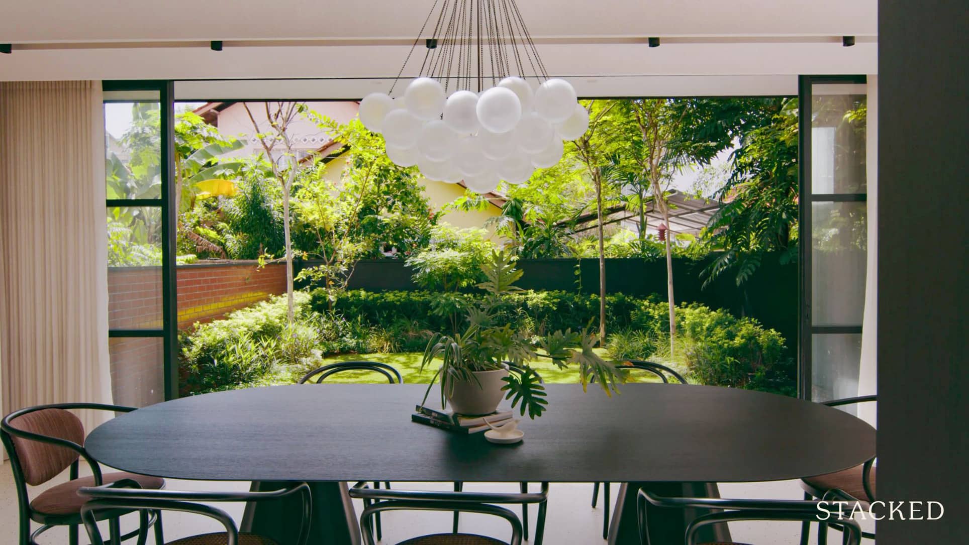
Dealing with older ’70s-style layouts can be challenging. A common concern is that these older units are, by contemporary standards, a bit less efficient and too enclosed. But this setup shows there are strengths to older floor plans as well.
While the elongated layout would usually be considered unfavourable, this house is built to showcase the garden on the ground floor. Partitions don’t completely block the flow, instead acting as features that allow visibility through to the end of the unit.
We particularly like the dining room by the garden; an unexpected visual break in Singapore’s usually dense urban landscape.
Also check out the upper-floor atrium, which manages to be sun-lit but without trapping the heat. We feel this is a better alternative to the usual set-up, which is to try and cover up the windows with heavy blinds and curtains. The trick in a climate like Singapore is to work with the sun, not try to hide it.
Watch the full episode here.
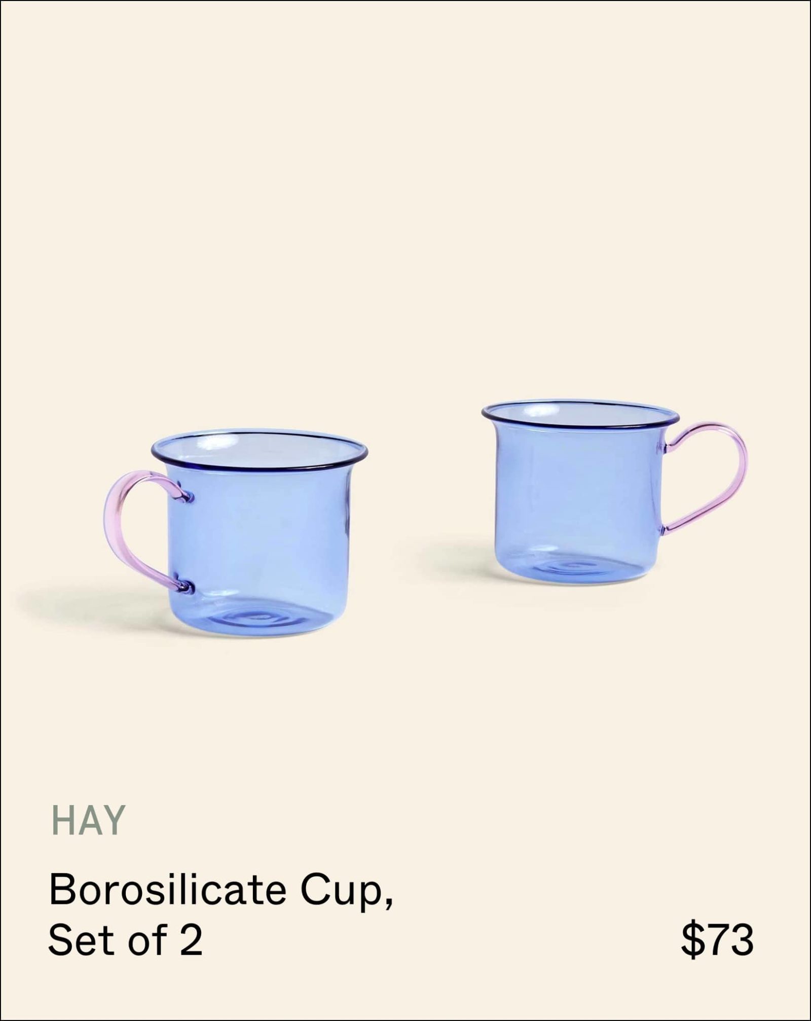
Products inside the home
3. Balcony converted to an outdoor corridor
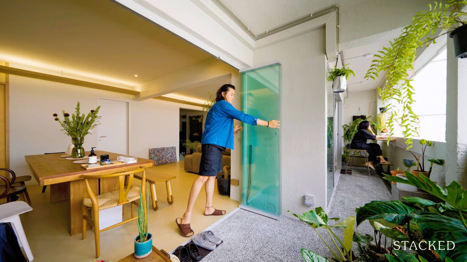
Another great example of how balcony spaces can make a huge difference. This couple wasn’t content to just throw some chairs and a tiny table out there and call it a day; they’ve turned their balcony into a tiny sky garden.
What we especially like is that this was done in an HDB flat – that really showcases how much can be done with a good design effort, even if you don’t have a big landed property.
We also like the use of movable glass panels to maximise the view of the greenery; this really opens up the space visually, and allows for so much more than the usual sliding door.
Watch the full episode here.
4. Treehouse within a penthouse
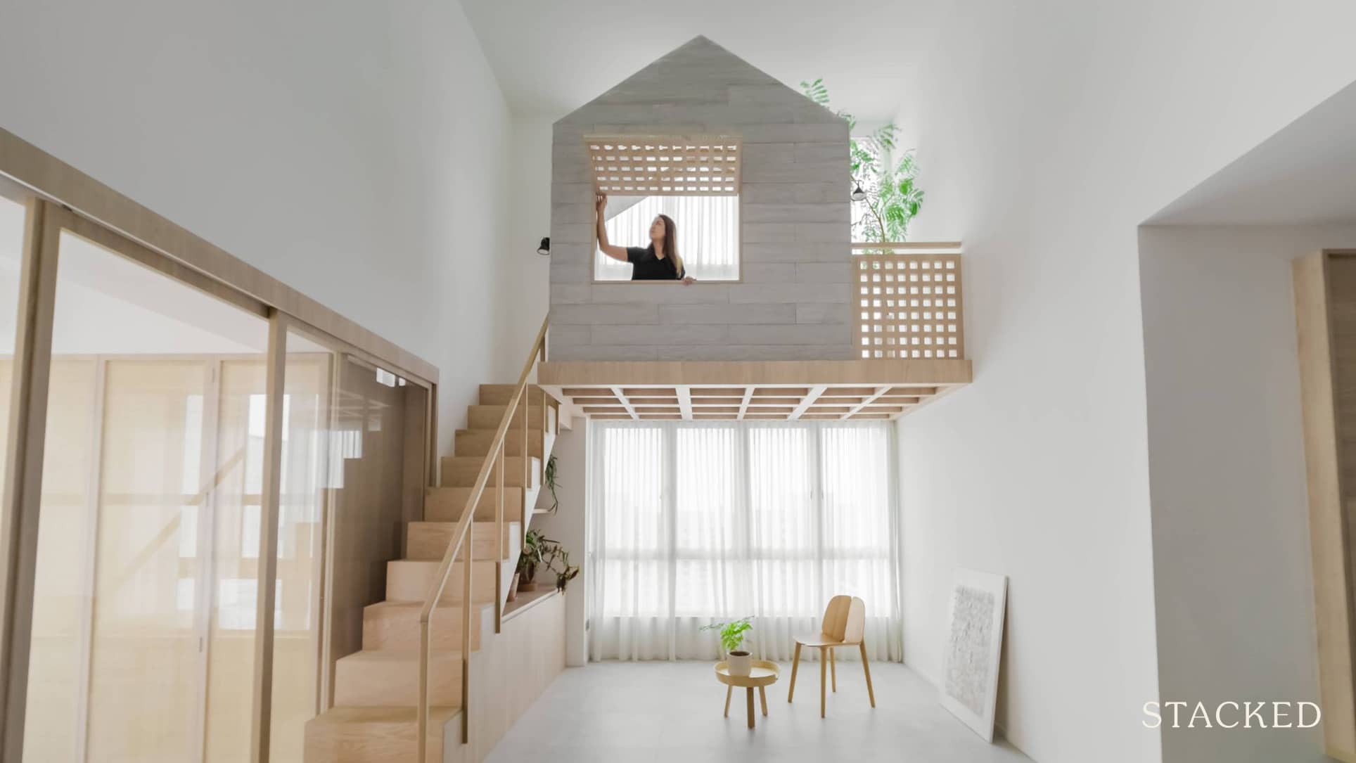
This unique layout is an exploration of the word “penthouse” – which literally just means an attached (append) house. The concept is made visible in the unique loft, which playfully incorporates a second little “house.” The little min-house even includes skylights that open.
What also gets our interest is the roof access, which makes for a good rest + dining area. The set-up is simple so it’s easy to maintain, and it provides a breezy, above-ground alternative to hanging out in the living room.
Watch the full episode here.
5. Indochine-inspired living room with a double-cellar
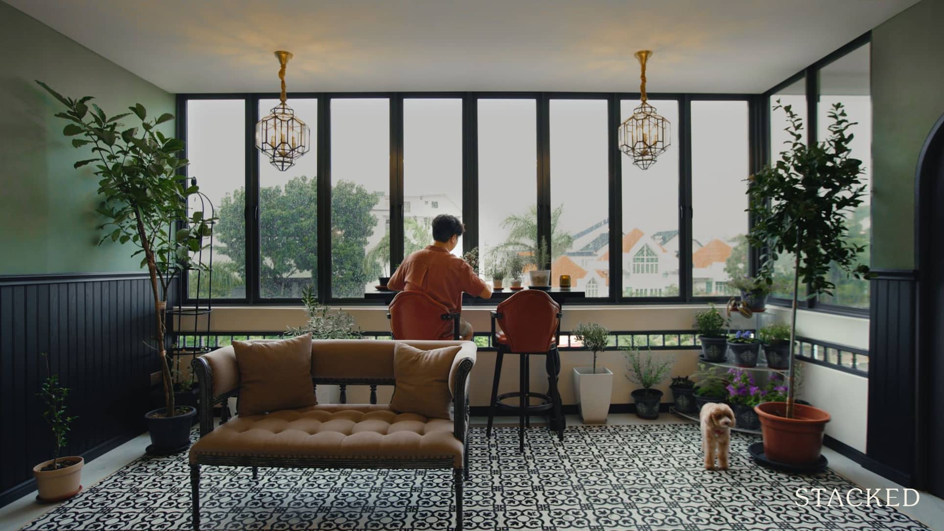
No, not the restaurant! This unit is based on French-Indochina styles (from way back when France was still in Vietnam). It’s always tricky to pull off these older colonial-era designs because the devil’s truly in the details – and we can respect the amount of research and familiarity that makes it work.
Also of note, is the use of different tiles to demarcate different parts of a room. This is a reminder that you don’t need walls to divide up a space, and not doing so helps to maintain spaciousness and natural ventilation.
A degree of freeform creative license is expected in interior design – but this unit shows how a historical grasp of any given theme really pays off.
Watch the full episode here.
6. Zen garden in a terrace house
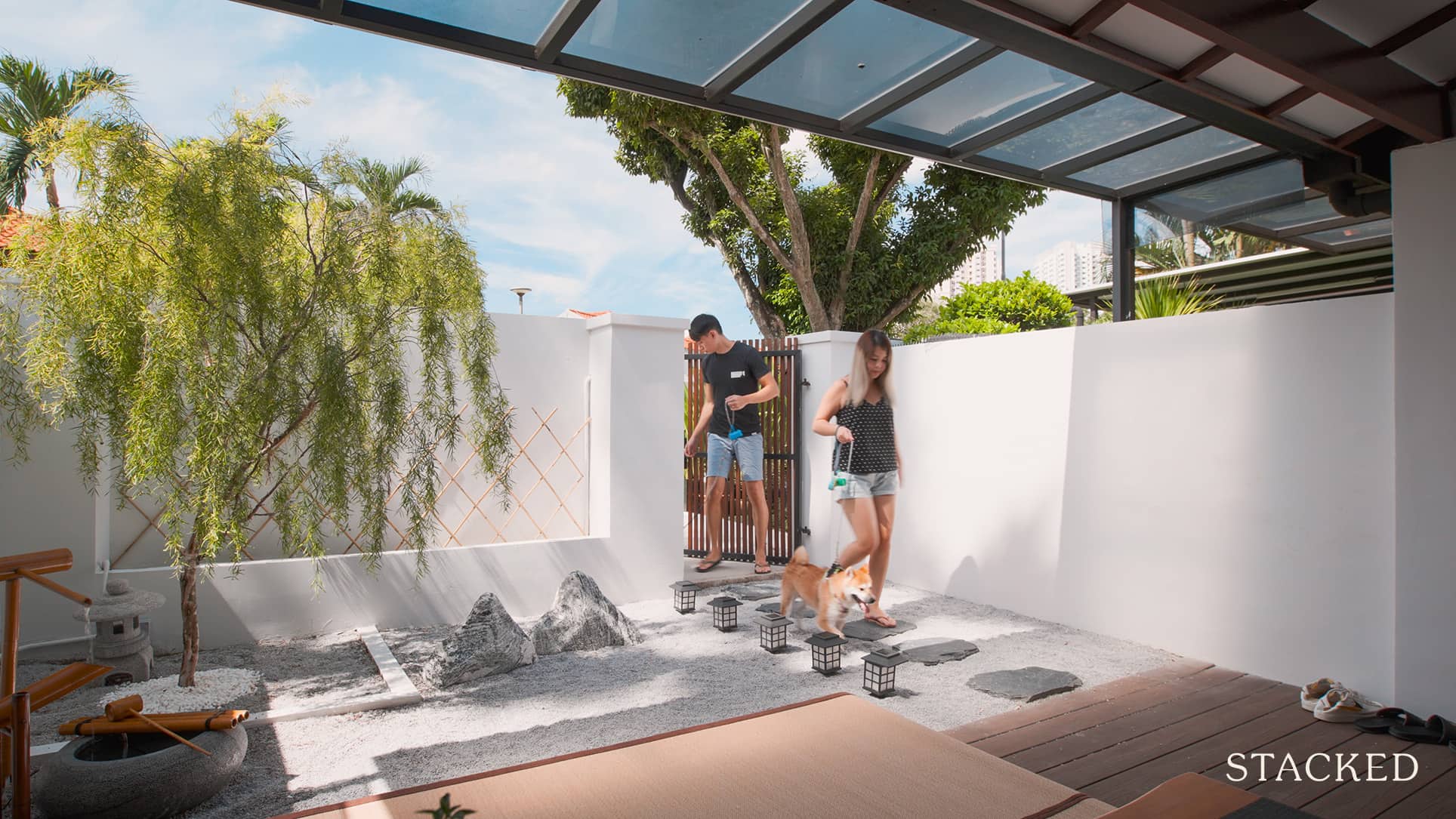
The idea of a Zen garden is an interesting alternative, and we have to say it looks great compared to the mess of potted plants that often overtakes a yard. A lot of homeowners are so focused on interior themes, they forget the garden or yard also needs a theme to tie it together.
It’s also unusual because most Singaporeans tend to locate “zen areas” within the house rather than outside (e.g., the Stacked editor finds his zen in listening to the drone of the air-con, given the heat). But if you have a shaded area with the right facing, this is a more rustic and natural alternative.
Watch the full episode here.
7. Second-storey lap pool with an underwater window
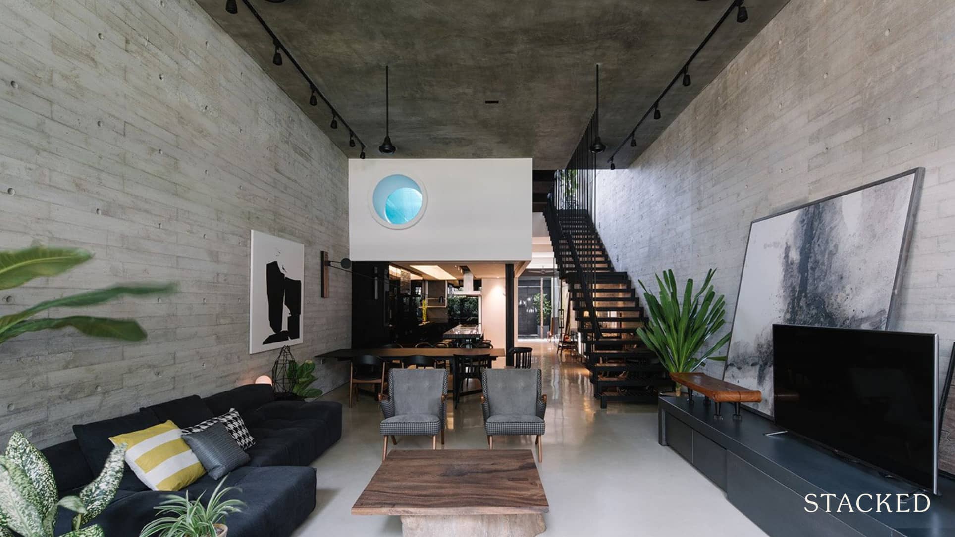
We think a similar setup to this might actually work great for aquarium lovers, but here it’s for people. The second-floor lap pool actually goes for an impressive 13-metres, and it’s nicely complemented by the garden.
Most pools do feel a bit artificial, with any plants set back pretty far and the surroundings just being tiles and deckchairs. Here’s a reminder that a pool set-up can be much more organic in feel.
Also interesting is the aperture to peek through, which just adds interest to both the pool and the room below. If you’re an aquarium fanatic though, you can probably see much more potential in a design like that.
Watch the full episode here.
8. Ramp around the exterior of the house
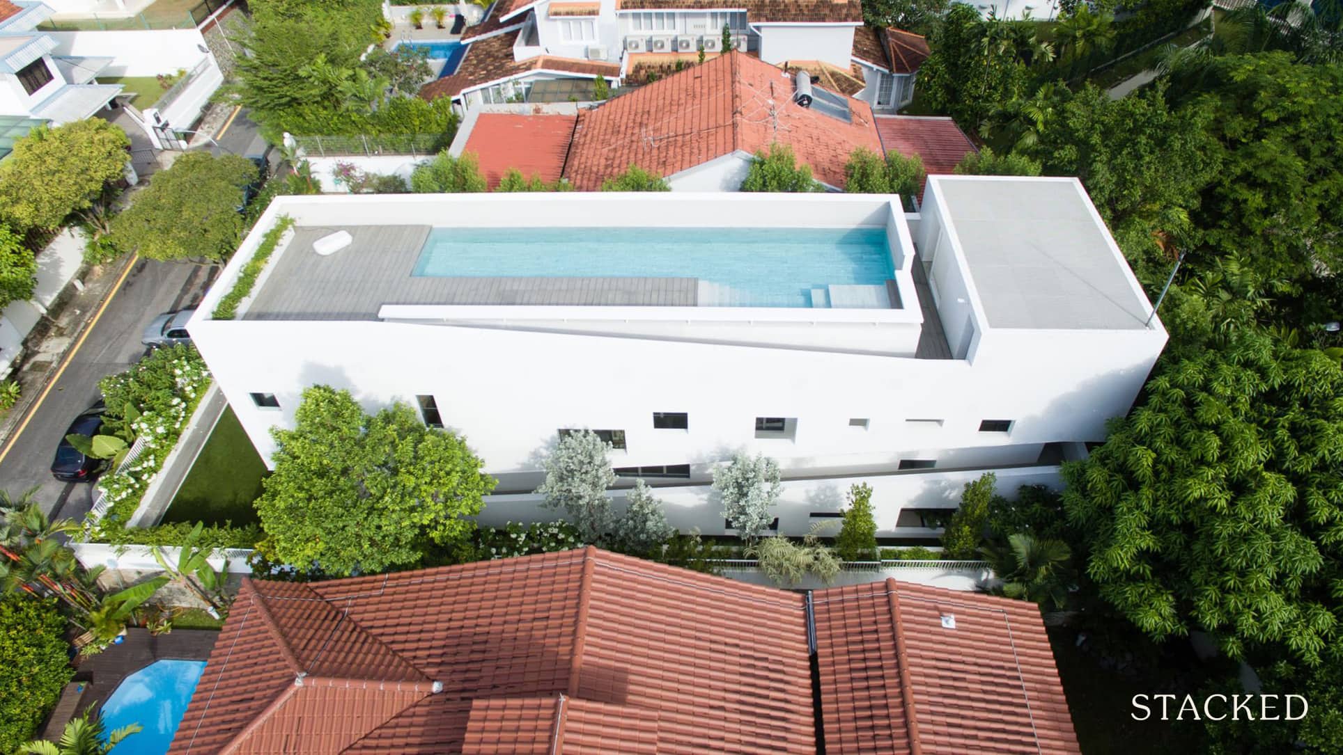
This design idea was partly driven by necessity. The house is a bungalow, but not one with sizeable outdoor plots, and yet the owner did want space for the children to run around freely.
The solution was to make the most of the available space, by including a ramp that wraps around the house. This not only improves access, but also forms a multi-level space for the children to run up and down. We’d say this actually ends up being more interesting than the usual patch of grass to play on.
Watch the full episode here.
9. Split-coloured kitchen
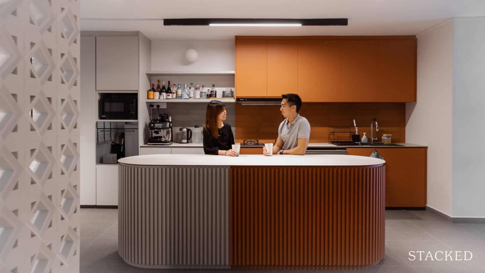
We can get a bit too obsessed over uniformity in our design themes, and that creates a lot of cookie-cutter designs. This kitchen is quirky and individual, without needing to resort to pricey gimmicks: it just uses a change in colour.
From different angles, it can look almost like two different kitchens; so if you can’t pick a single colour palette, here’s a “have it all” solution. The rounded kitchen island is also an interesting touch, and contrasts nicely with the harder angles in the rest of the kitchen.
Watch the full episode here.
10. Entryway carved out to be a balcony

We love interesting takes on HDB flats, as they run contrary to the notion that we “can’t do much” with the same layouts. In this one, the architect-owner has carved out part of the entryway to be a balcony; a small reminder of landed living.
The greenery and outdoors also make for a nice contrast to what is, otherwise, a pretty heavy industrial/street feel (notice the seemingly bare walls and floor, to go with the street art collection).
To be sure, this is a lot of work for an HDB flat – but if you’re certain you’ll be living there for the long haul, this is a great way to personalise things.
Watch the full episode here.
There are a few more interesting designs we’ve seen, so follow us on Stacked for our next round of highlights. In the meantime, you can check out our in-depth reviews that include interior layouts, so you know which projects to shortlist.
At Stacked, we like to look beyond the headlines and surface-level numbers, and focus on how things play out in the real world.
If you’d like to discuss how this applies to your own circumstances, you can reach out for a one-to-one consultation here.
And if you simply have a question or want to share a thought, feel free to write to us at stories@stackedhomes.com — we read every message.
Ryan J. Ong
A seasoned content strategist with over 17 years in the real estate and financial journalism sectors, Ryan has built a reputation for transforming complex industry jargon into accessible knowledge. With a track record of writing and editing for leading financial platforms and publications, Ryan's expertise has been recognised across various media outlets. His role as a former content editor for 99.co and a co-host for CNA 938's Open House programme underscores his commitment to providing valuable insights into the property market.Need help with a property decision?
Speak to our team →Read next from Property Advice
Property Advice Should We Sell Our Freehold Condo For A $2.2M Leasehold Landed Instead?
Property Advice Should I Buy A Freehold Condo In A Landed Enclave — Or Look Elsewhere For Better Growth?
Property Advice We Own A 2-Bedder Condo In Our Early 30s: Should We Upgrade To A New Launch Or Resale With $2.2M?
Property Advice What A Family Of 5 Can Really Buy With $2 Million In Newton And Redhill
Latest Posts
Singapore Property News I Reviewed River Modern’s 3- And 4-Bedroom Units — Here’s What Buyers Should Know
PRO Pro How Condo Prices Differ Across Tampines — And Where Buyers May Still Find Value In 2026
Singapore Property News Bought In 2023 For $172.5M, Sold For $250M — Thomson Plaza Retail Block Deal Explained






0 Comments