| Project: | Waterway Terraces I |
|---|---|
| HDB Town | Punggol |
| Address: | 308A-C Punggol Walk |
| Lease Start Date: | March 2016 |
| No. of Units: | 1,072 |
In 2010, Waterway Terraces I launched with much hype in the 2010 BTO exercise.
At that time, there weren’t really any “standout” HDB projects in the Punggol Precinct that drastically shifted away from the traditional HDB design.
So when HDB launched Waterway Terraces I with its stunningly refreshing design concept, the project ended close to 18 and 12 times oversubscribed for the 5-room and 4-room units respectively.
And why wouldn’t it? With its allure of waterfront living, unique architecture and its proximity to Punggol MRT, it was truly a standout from the typical BTO releases that you might usually see.
Moreover, Waterway Terraces I launched not just with a different architecture, but with a novel design narrative in mind: as a blueprint for 21st century sustainable mass housing given the increasing awareness of climate change.
This rides on the 2010 announcement for Punggol to be Singapore’s first Eco-Town.
The design inspiration looked back to the 50s and 60s when SIT (Singapore Improvement Trust) was in charge of public housing. Back then, homes were designed and built with the tropical climate in mind.
But with the increasing usage of air-conditioning and appetite for greater privacy, public housing started to become more unsustainable and anti-social.
Group8asia (the first foreign company to design an HDB in Singapore) designed Waterway Terraces as a modern response to this trend.
And the award-winning development has achieved this quite successfully through effective layout to maximise ventilation, energy-efficient lifts/lights and solar panels to name a few.
With so much positives going on, does Waterway Terraces live up to the expectations today? Let’s find out.
So many readers write in because they're unsure what to do next, and don't know who to trust.
If this sounds familiar, we offer structured 1-to-1 consultations where we walk through your finances, goals, and market options objectively.
No obligation. Just clarity.
Learn more here.
Waterway Terraces Insider Tour
In what is a departure from the norm, I’ll begin the tour with the carpark – more so because it isn’t something you’d normally see in other HDBs.
Upon driving in, you’ll be greeted by a ramp that would take you down to the basement carpark.
In fact, The Pinnacle@Duxton which I just covered in my previous review is another one, however, unlike the latter, Waterway Terraces’s carpark is not fully underground.
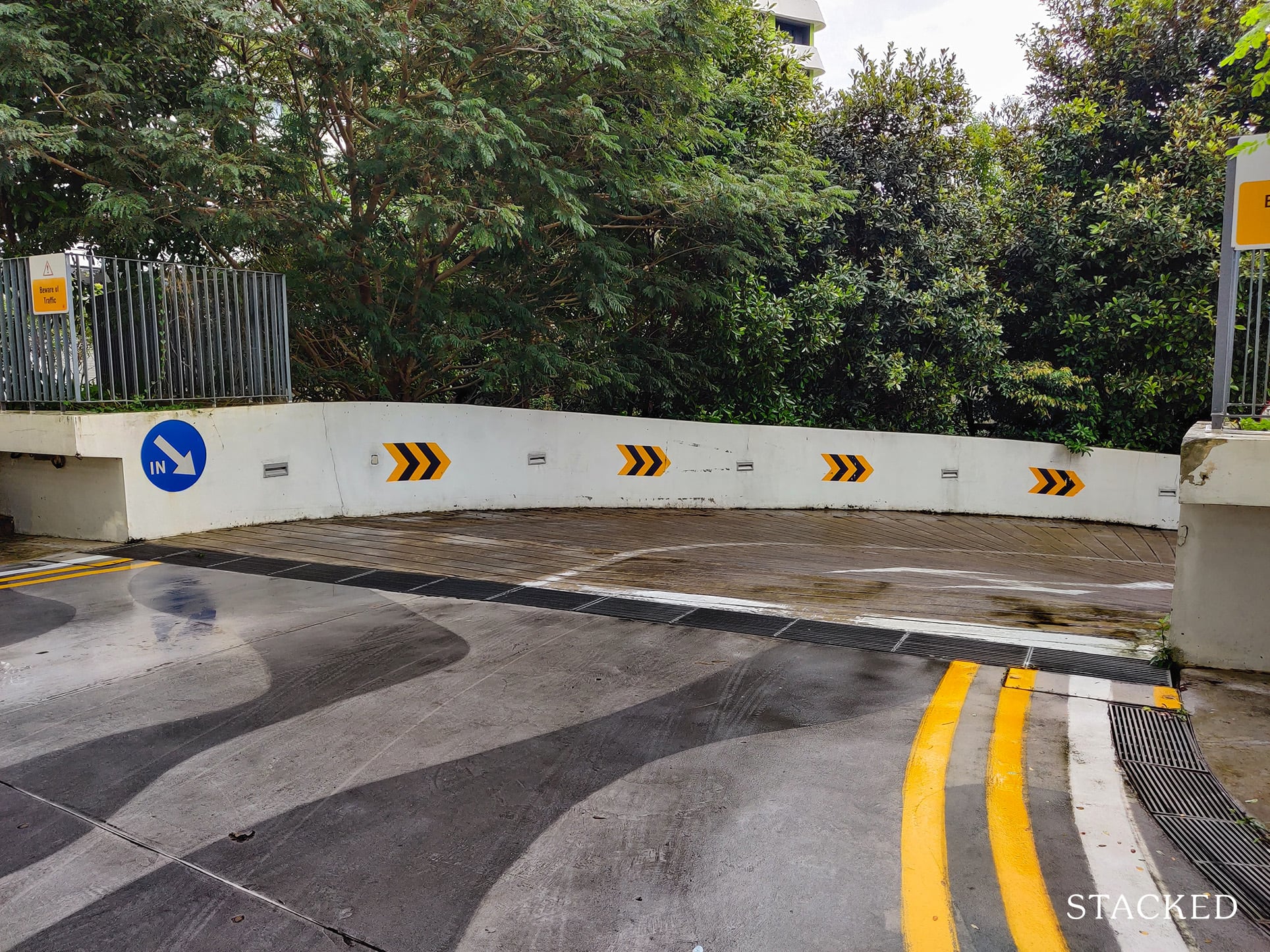
Instead, it’s partially sheltered as you can see below.
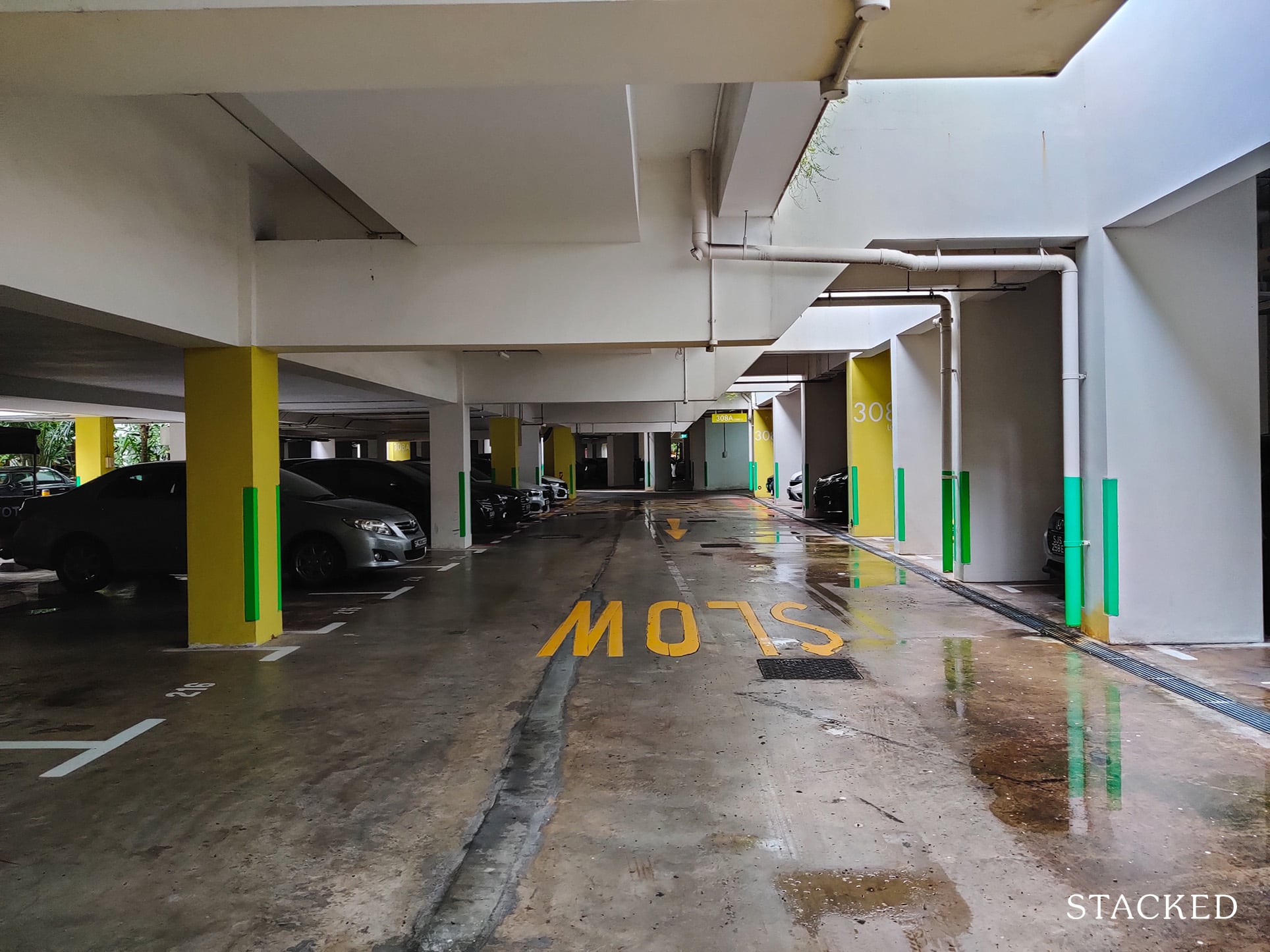
While being fully underground would’ve been the preferred choice for car owners, I do think that having natural light here serves a much better purpose as it saves on electrical costs – both from the mechanical ventilation and from using the lights in the day.
This after all, is supposed to be an eco-centric development, so it makes plenty of sense.
And if being partially sheltered isn’t sufficient, the development also features a unique sunpipe system to bring in more natural light and reduce its reliance on electricity.
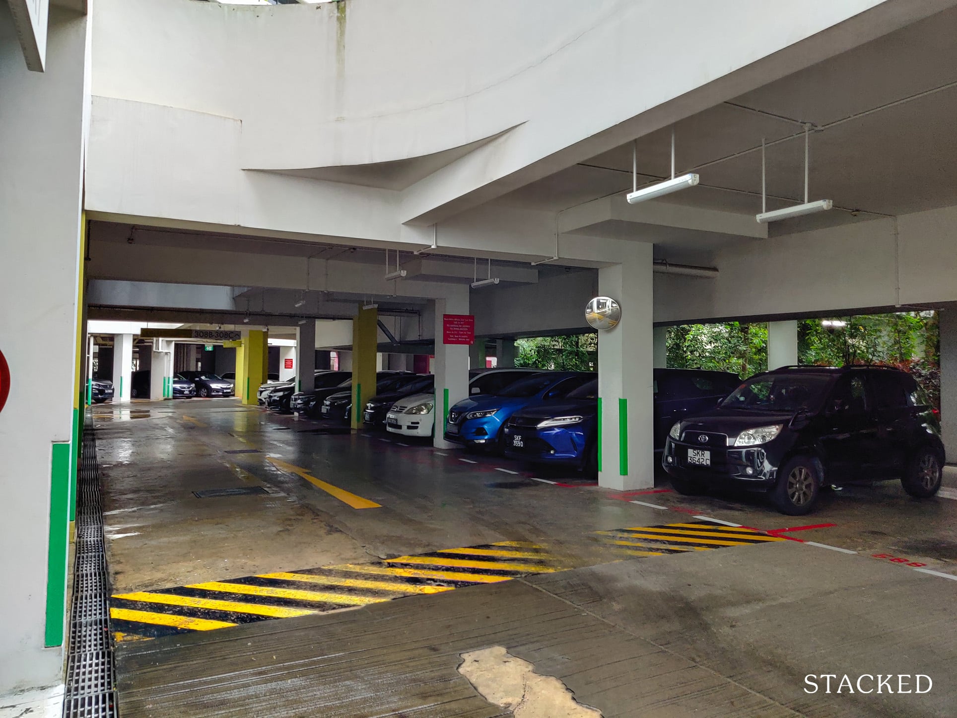
As you can tell from the wet surface, I came on a gloomy and rainy day, so the natural light really goes a long way to brighten up the place.
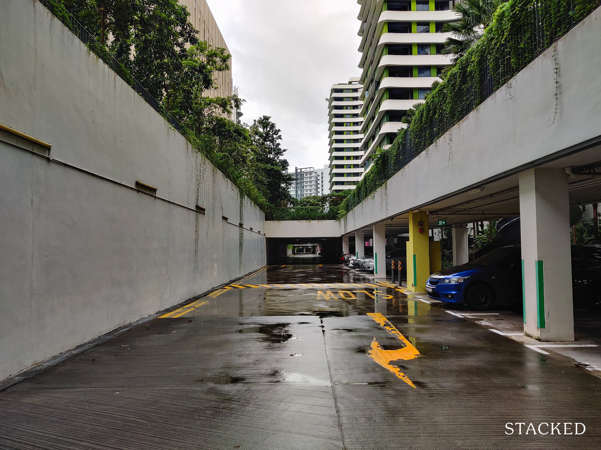
I also noticed that even though it is not fully sheltered, residents are able to take sheltered paths through the carpark, so those who park here would never need to fully brave the rain.
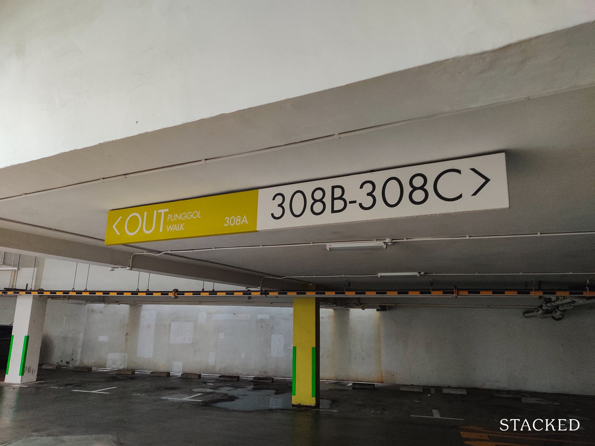
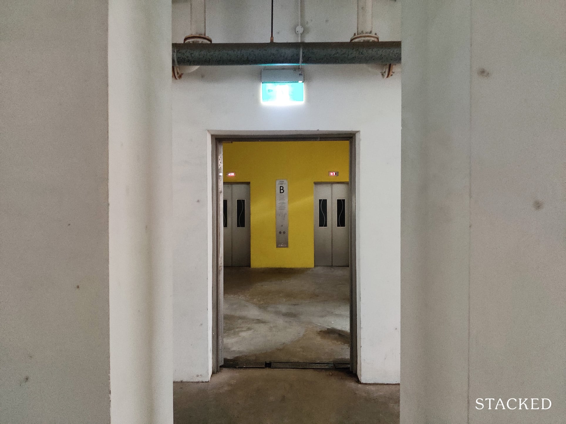
More importantly, the carpark covers quite a bit of the development underground and houses the lift lobbies too – so residents can enjoy immediate access to the underground carpark.
The basement carpark also contains a lot of greenery in the central area.
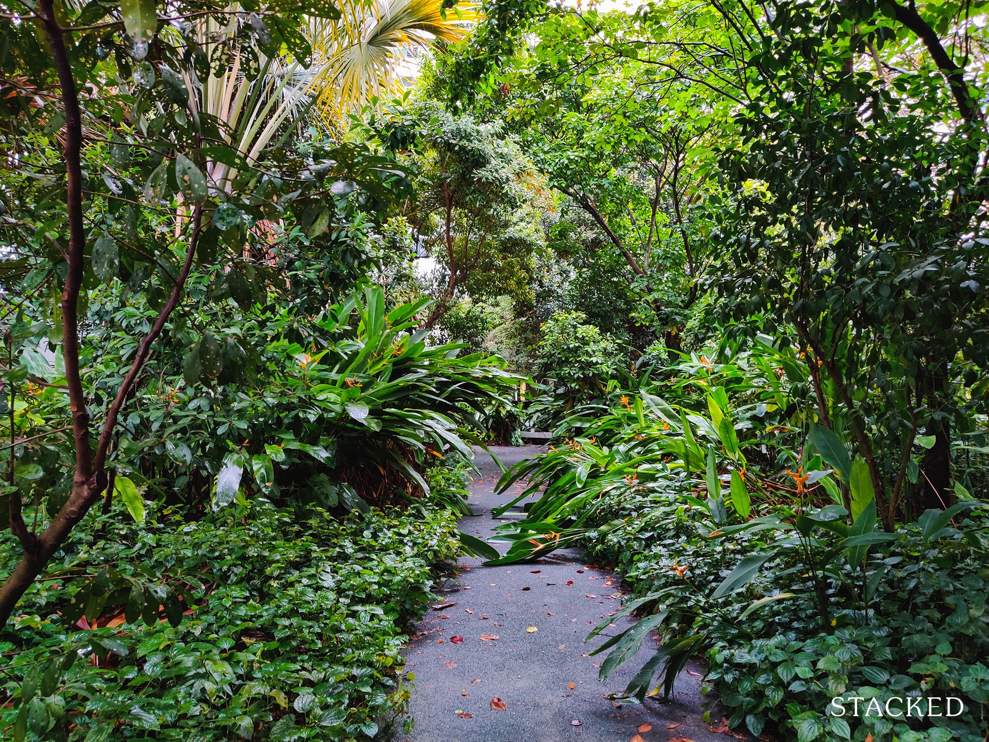
This is the one area in the development that really stood out for me, as the amount of greenery here is thick and luscious.
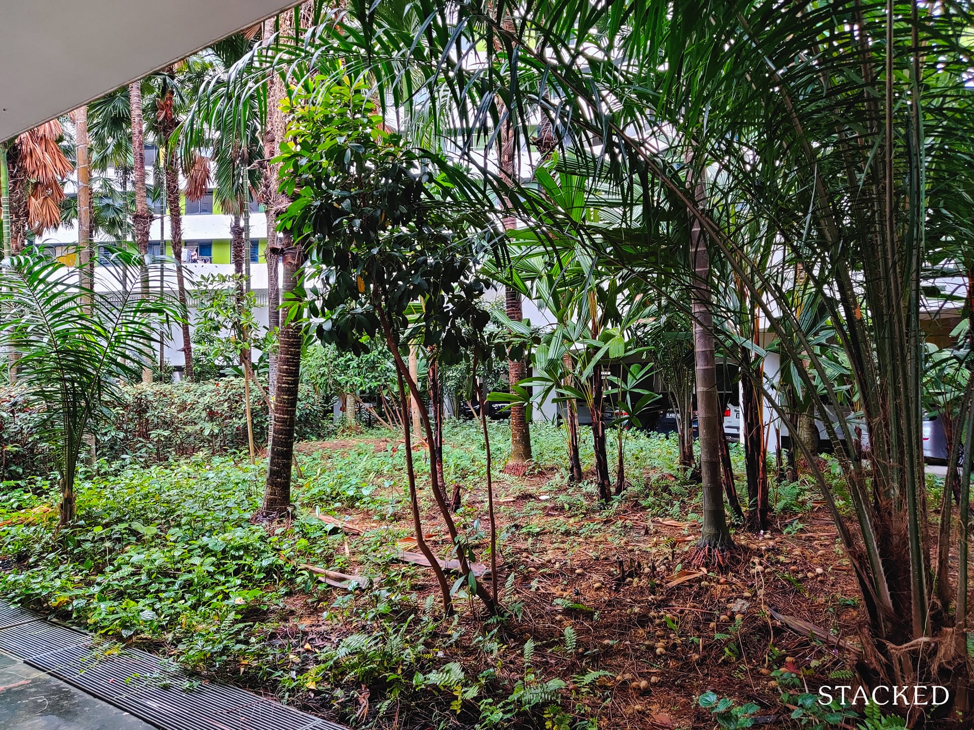
But while the greenery is nice, I can’t imagine residents deliberately coming here often considering it’s on the same level as the carpark – in other words it isn’t visible on the ground level.
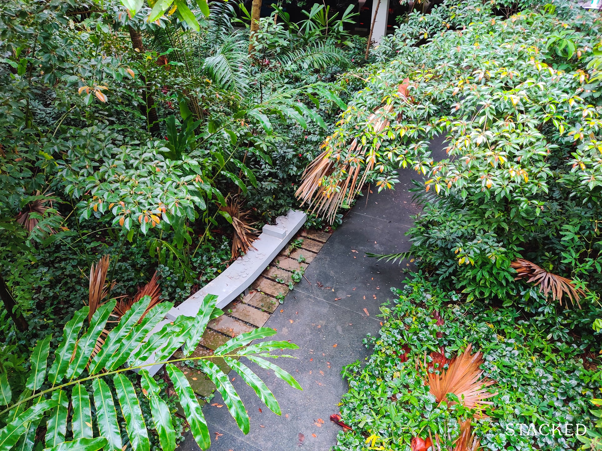
In fact, the path isn’t a loop and more of an unsheltered but green path you can take to cross from one block to another.
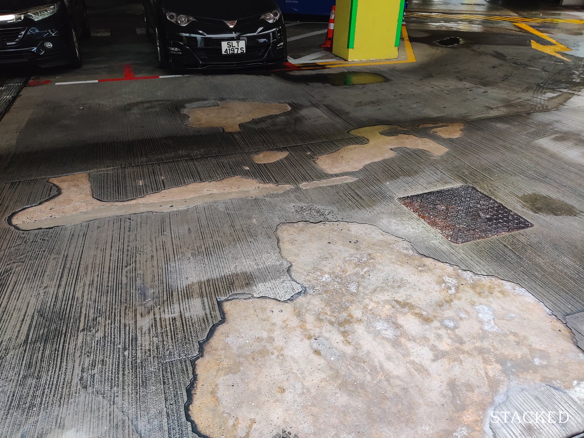
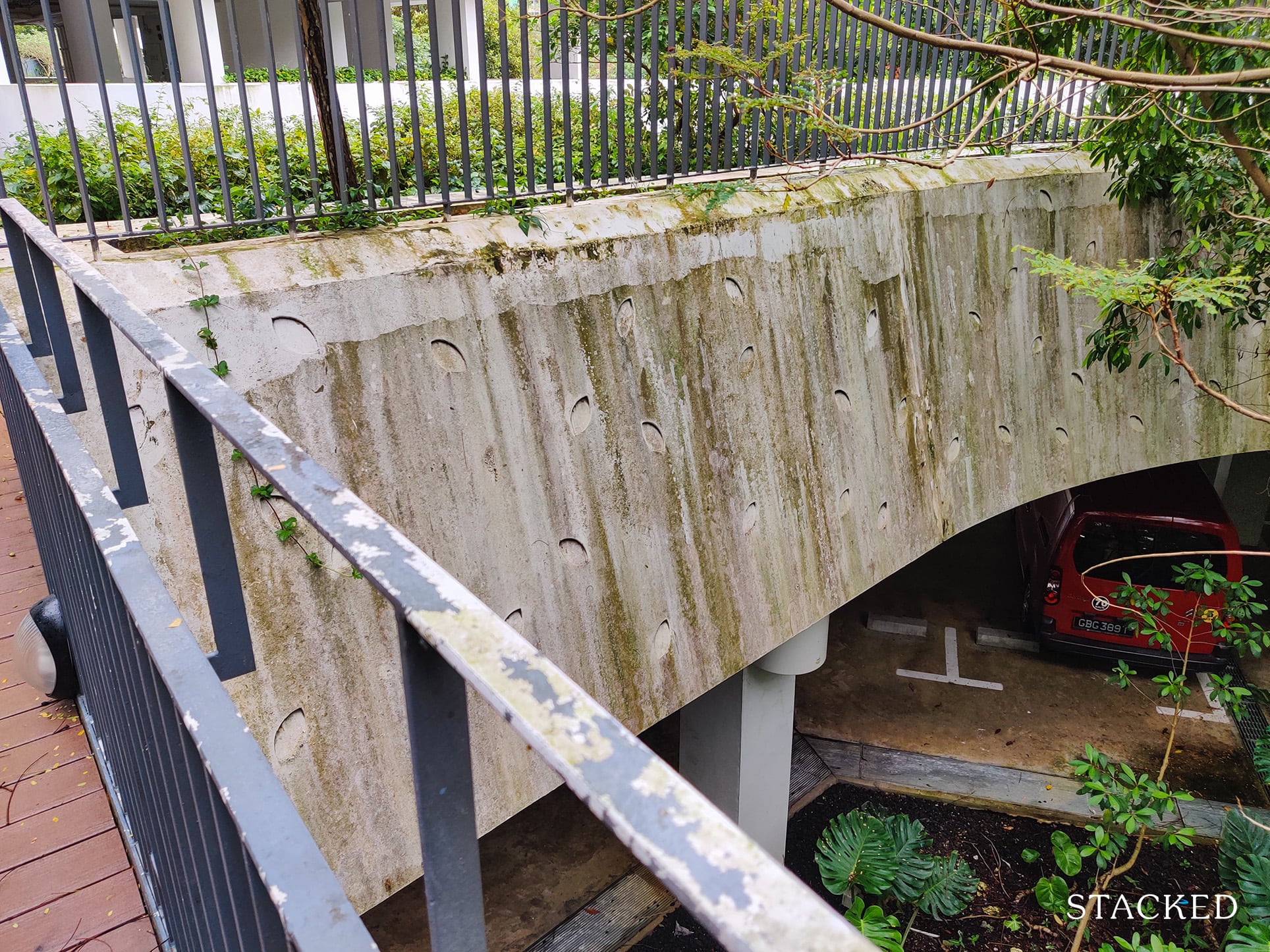
Moving on, one thing here worth pointing out is the lack of maintenance.
Being unsheltered, I can understand that the pavements here are exposed to the weather elements. Still, I do think this is too much damage for a project that is just 5 years old, which is alarming to say the least.
And while I wish I could say that was the extent of the upkeep issues, these were persistent in different parts of the development.
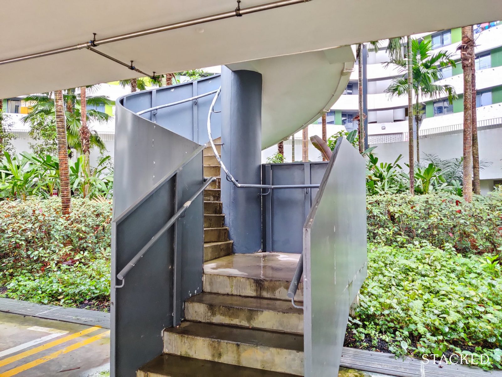
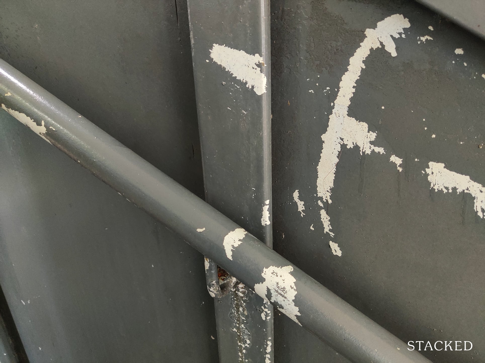
I didn’t have to look too far, as the steps leading to the ground level also had paint that was starting to wear off, and some parts of the steps were turning green.
Here’s a closer look of the wear and tear of the panel.
Going up this flight of stairs will lead you to the driveway just outside block 308A.
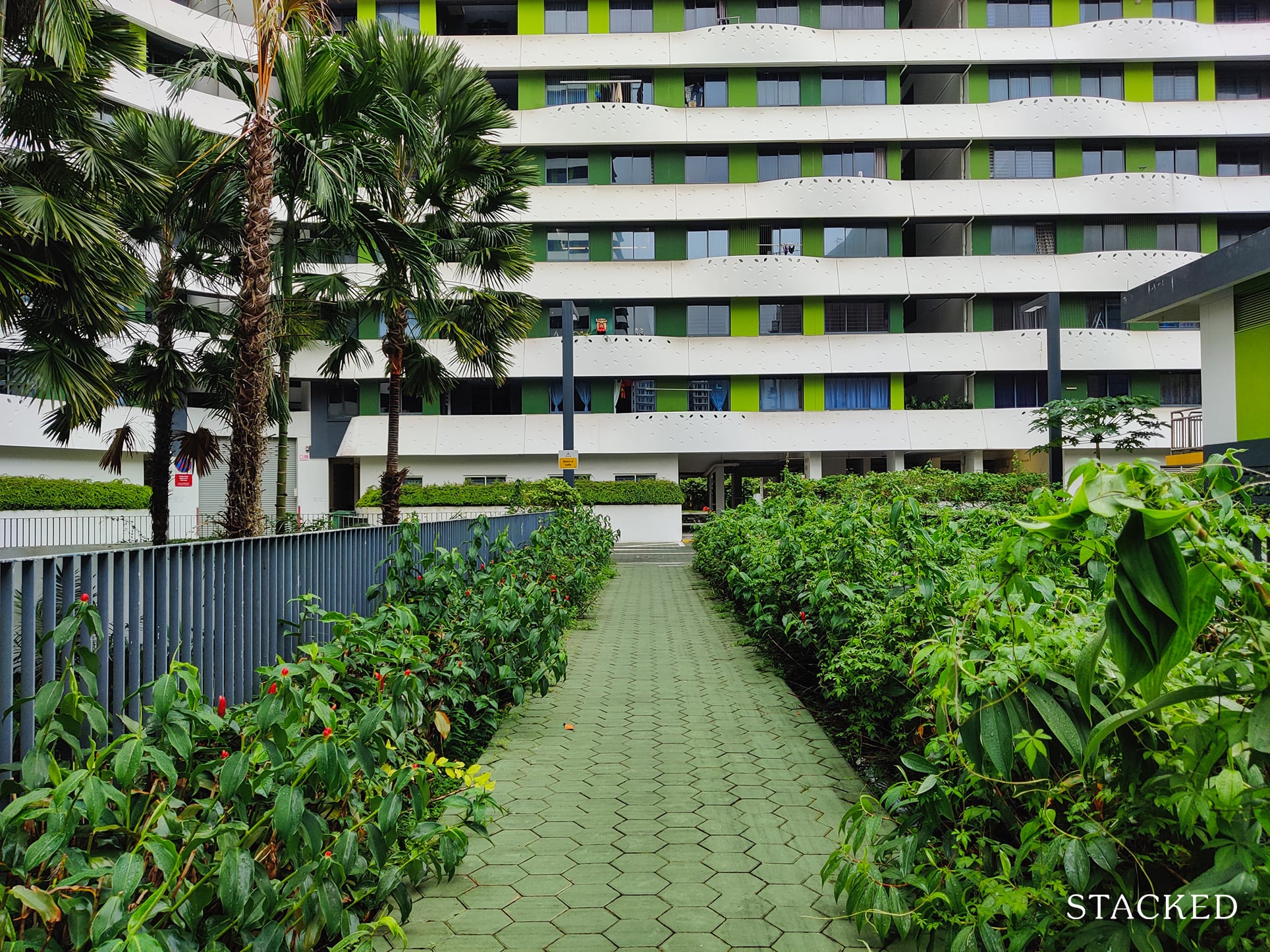
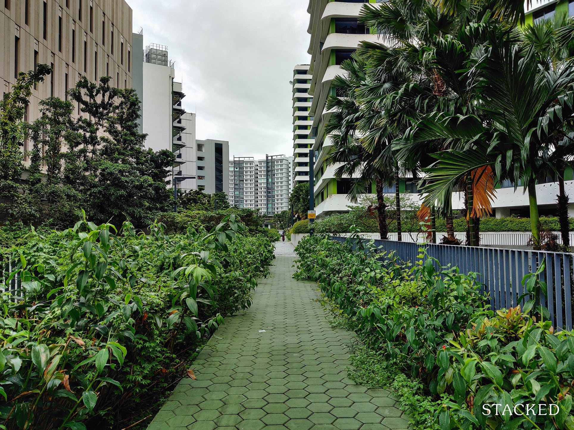
The pathway here is sufficiently wide for a walkway, and it’s nice to see the sides lined with a diverse range of plants with the taller ones coming out from the basement level.
One small detail that I like here is the use of hexagonal tiles. This goes in line with the hexagonal shape of the central green areas here. It could be purely coincidental, but it’s a neat one nonetheless!
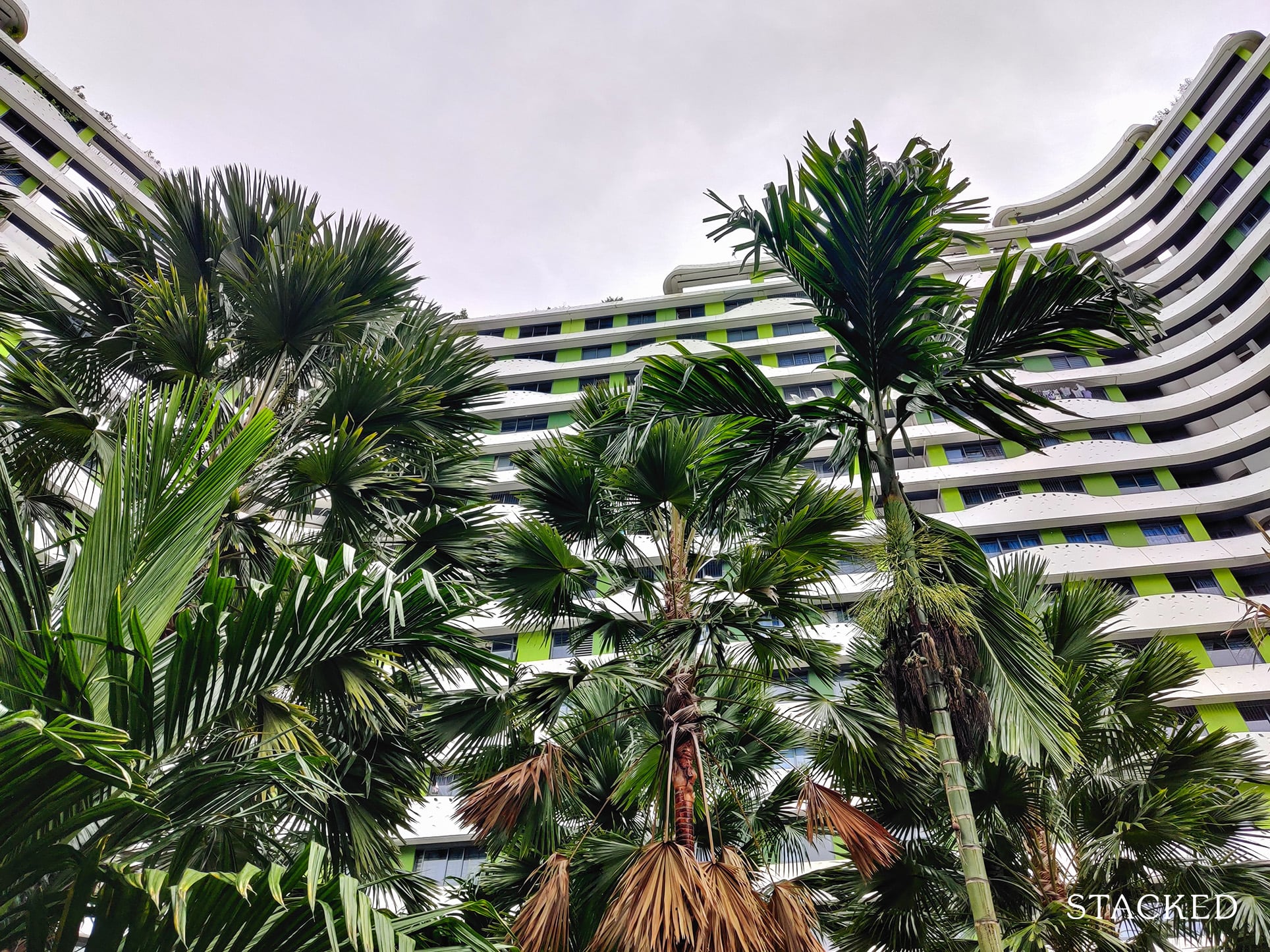
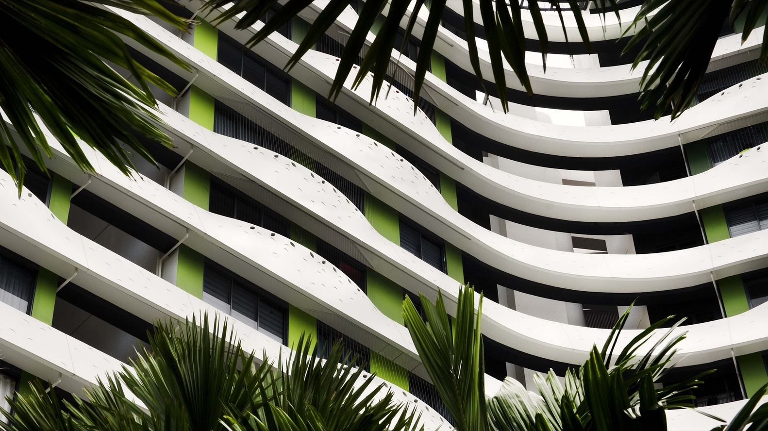
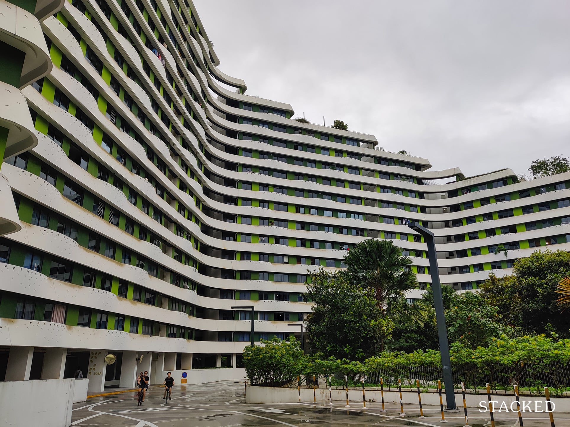
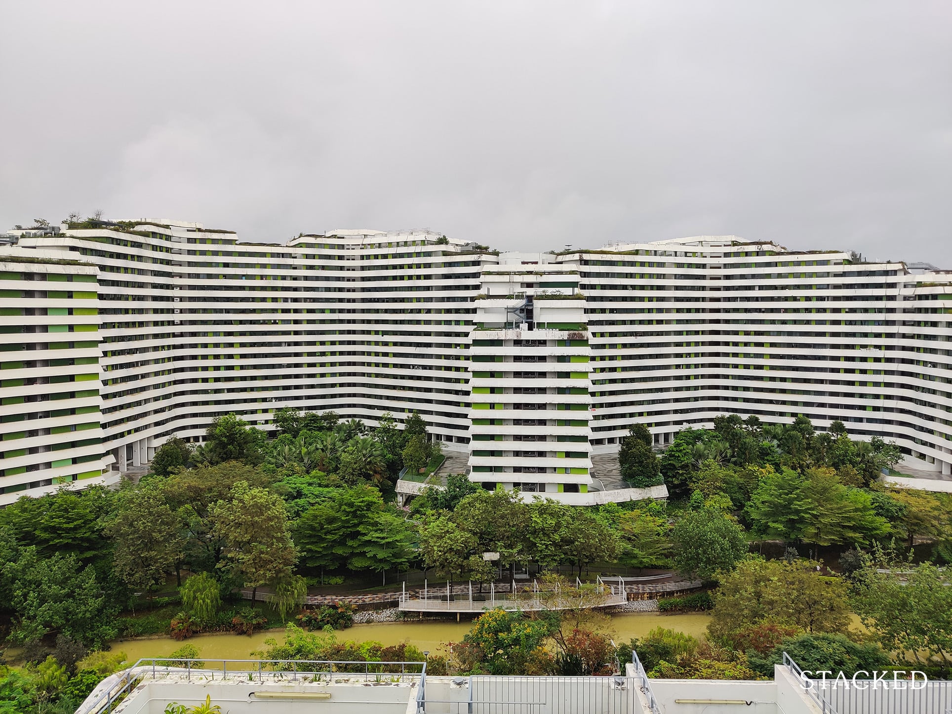
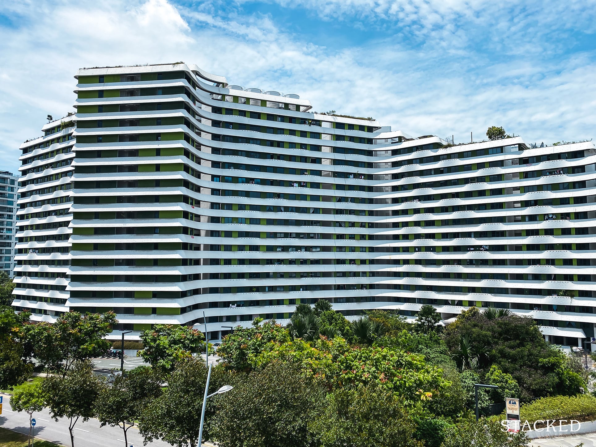
If you look past the trees, however, it becomes clear that the building is quite far from what it looks like in the photos taken immediately after the building’s completion in 2015.
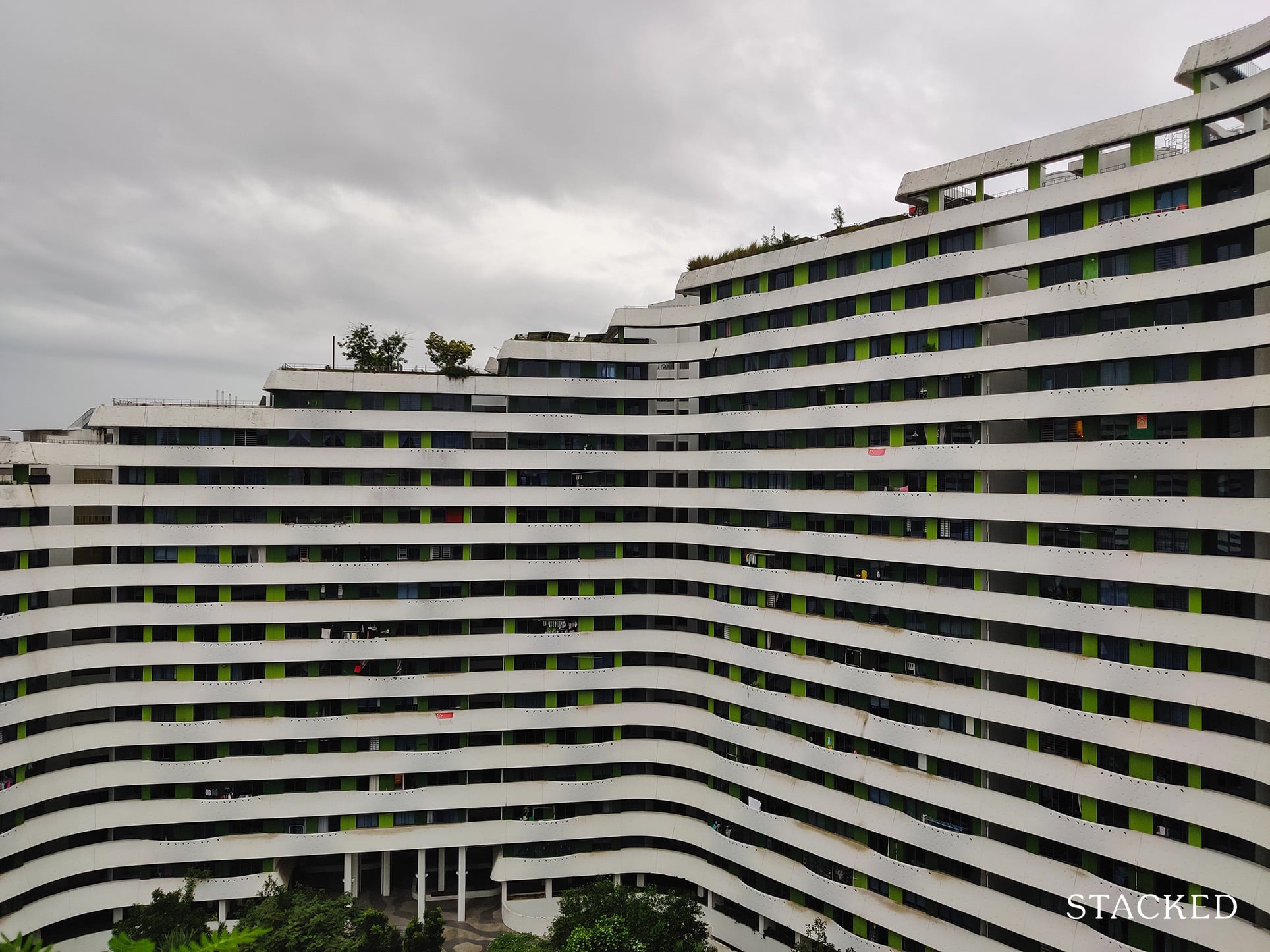
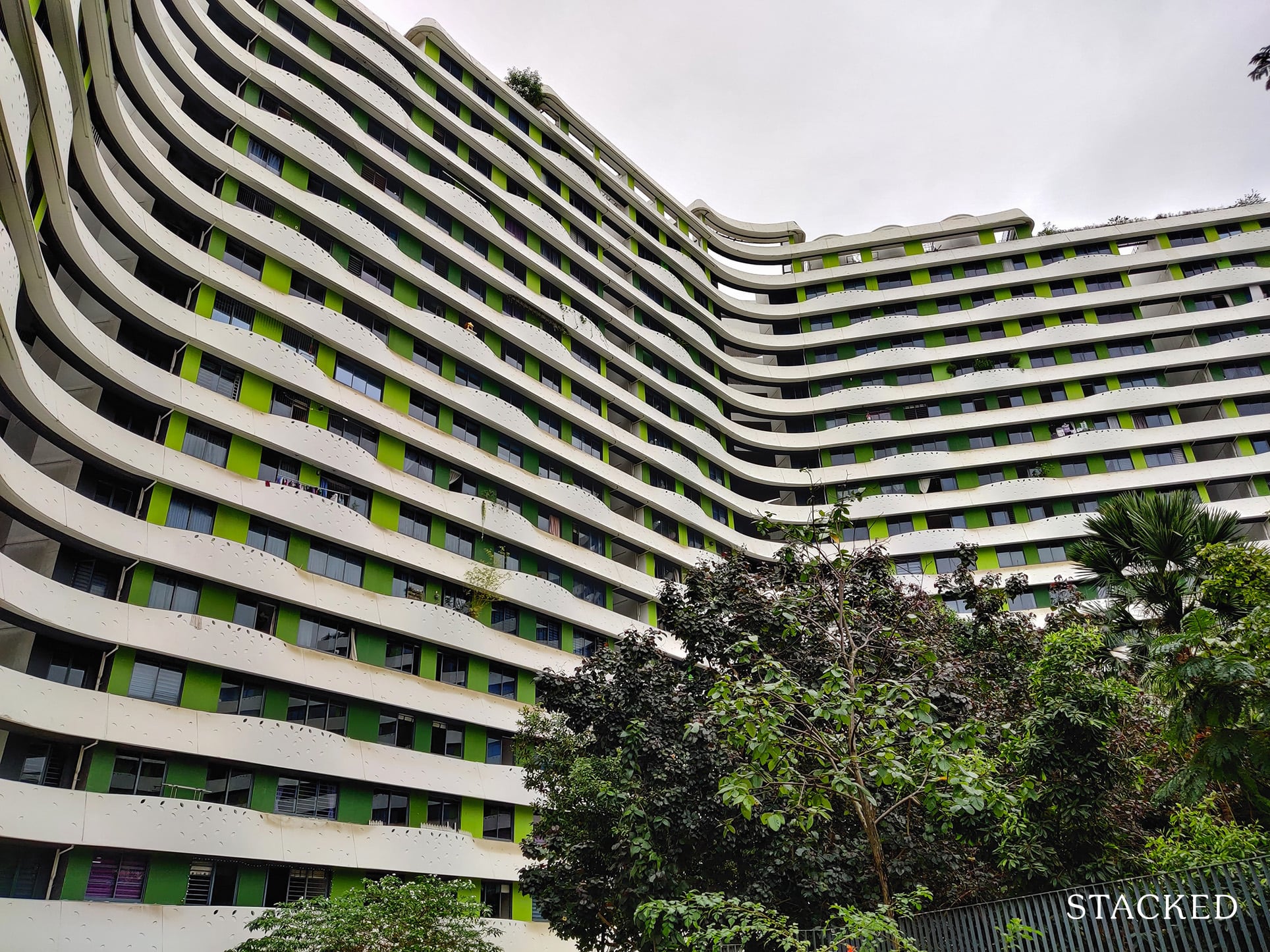
You can clearly see that the building facade has not stood up well to the elements, with the whites of the balconies incorporating a dirty finish.
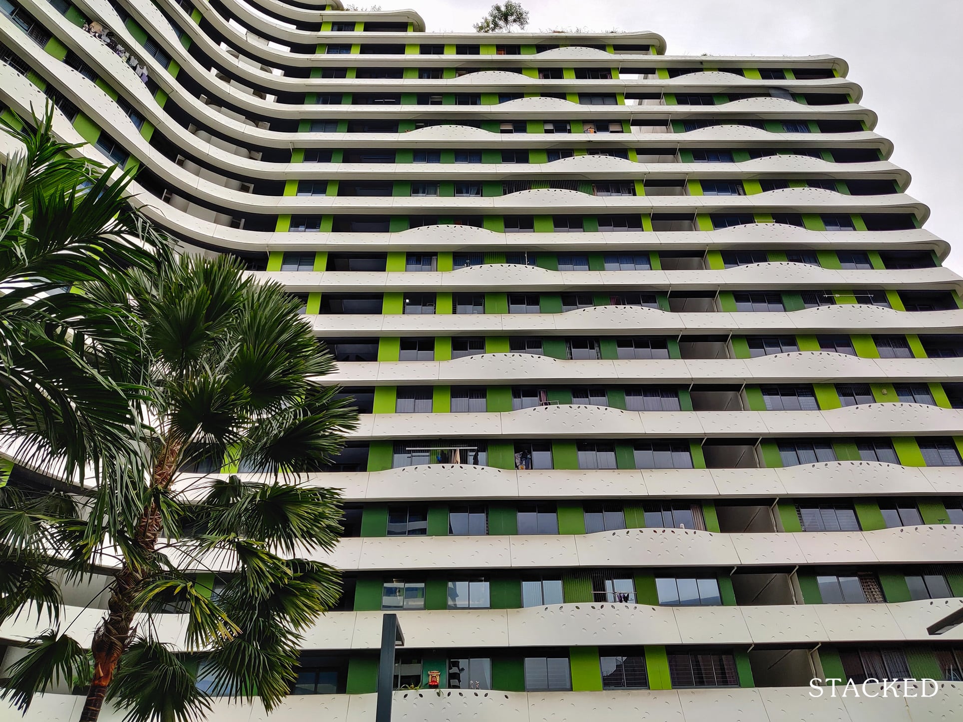
That said, white is definitely not an easy one to maintain, but from my initial impressions, it certainly looks older than it really is.
Here’s a closer look at the white exterior walls.
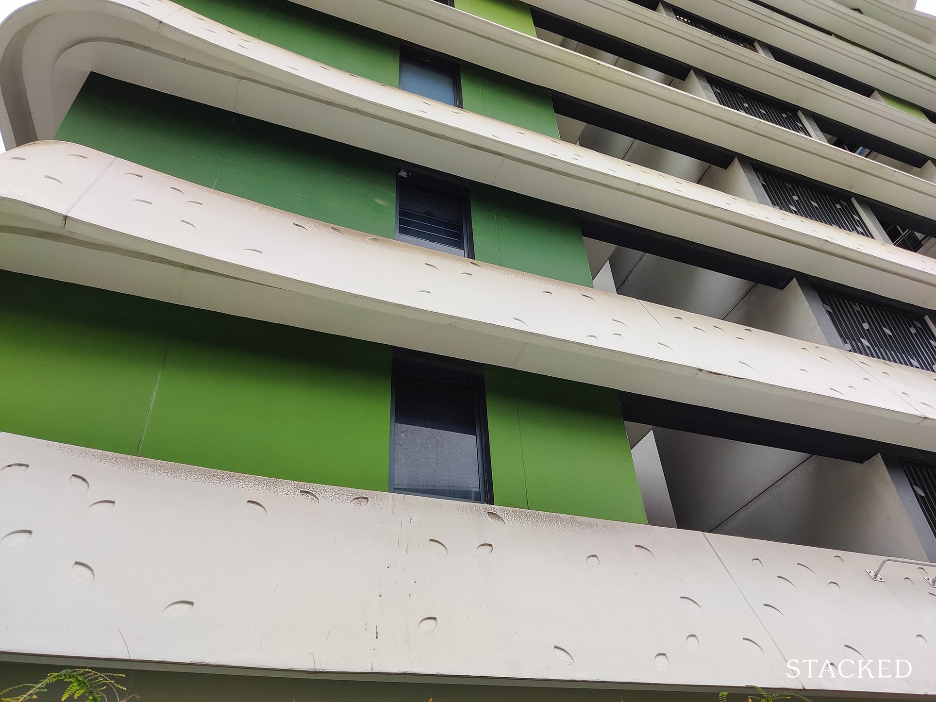
It seems to consistently affect just the top part of the white exterior wall. I think this is due to the way the facade slopes outwards which prevents the rain from washing off the dirt at the top – so gradually the dirt forms at the top part over time.
Again, this is a constant sight throughout the development – not just one part of it. I can imagine the maintenance cost here to be quite high to clean the entire development.
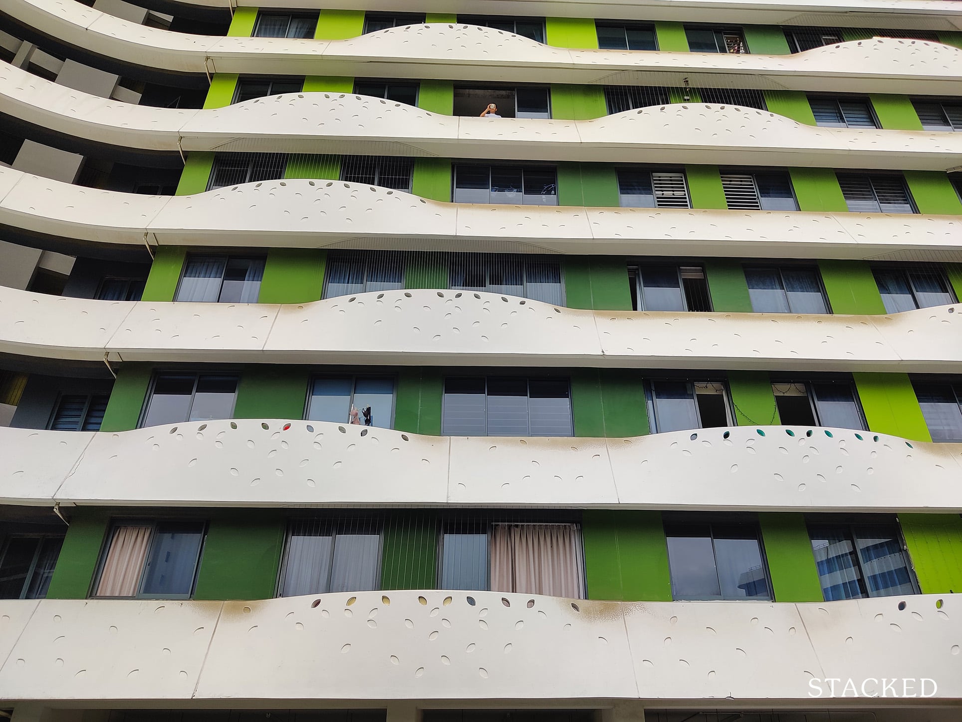
In case you’re wondering what the original condition looked like that got many photographers flocking here to take architectural shots when it first opened, here it is:
One thing I’d like to point out here is the Juliet Balcony.
For the uninitiated, a Juliet Balcony is one consisting of a balustrade connection to the building facade without a deck to walk on.
So why would the architects build a balcony without much space to walk on you ask?
For one, to improve the airflow through the development. By building a Juliet Balcony, residents can open a sliding window to allow more airflow into the home.
You can also see the little leaf-shaped holes on the balcony which is one of the key tenets to the architecture of Waterway Terraces.
But one downside to having these balconies is that the residents don’t get to maximise the views & sunlight from a full floor-to-ceiling window.
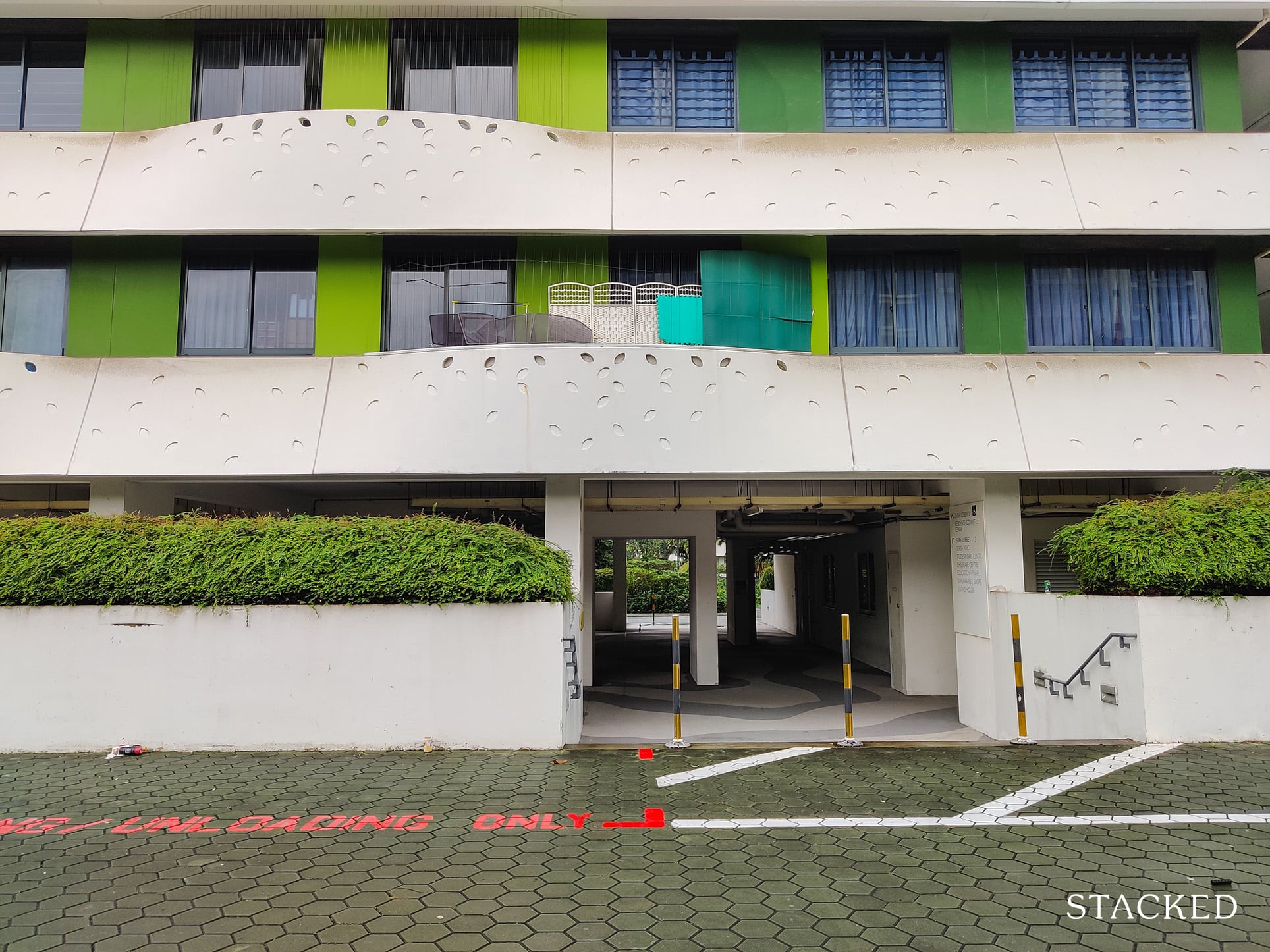
Moving on, the driveway here on the 1st level where cars can traverse across the development to pick-up and drop-off passengers doesn’t pass through the center of the development, but outside of it.
This serves to separate vehicular movement from the central green areas which residents would use frequently.
At the front of the development (from Punggol Walk) is the arrival area/drop-off porch which looks sufficiently big to fit up to 3 cars. It’s also sheltered quite well!
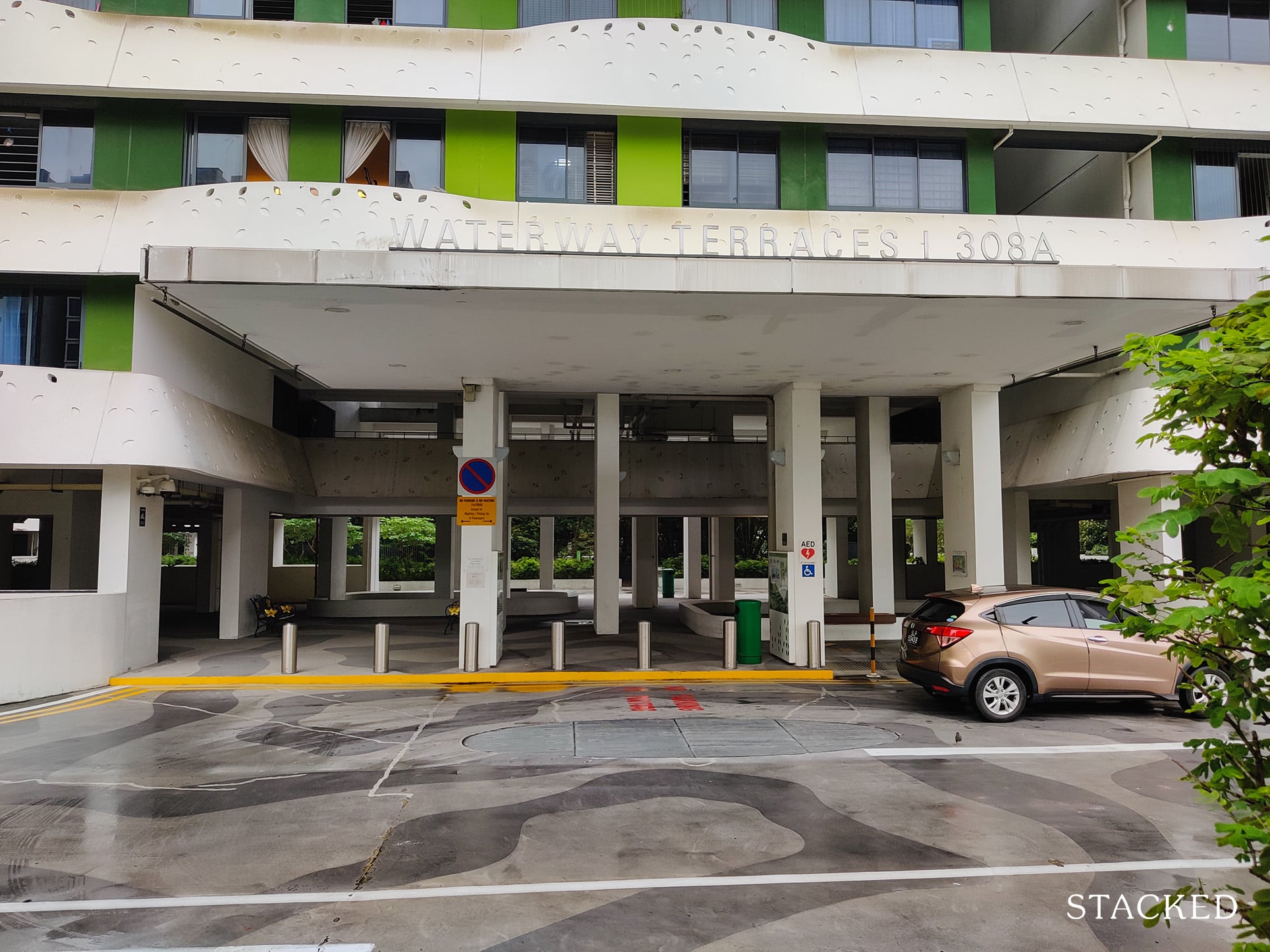
You can also see the stains on the underside of the shelter here which I think could be due to water seepage, while the edges of the shelter looks as if they might be dropping off any moment – it’s not a good look.
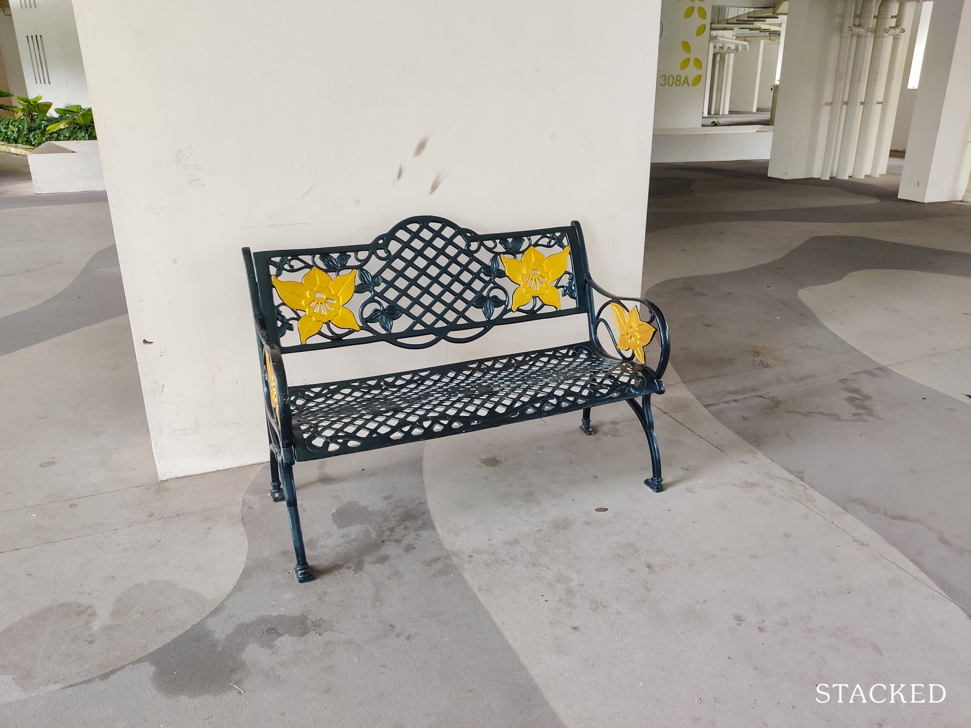
I’m happy to see that there are seating areas here though, which is perfect for the elderly waiting for their pick-up.
The void deck area also has some stone decorations which would have been a nice space to feature more plants to break the cold vibes that the void deck exudes, but that’s just a personal preference. Perhaps the lack of sunlight coming into the area would’ve made it difficult to achieve this.
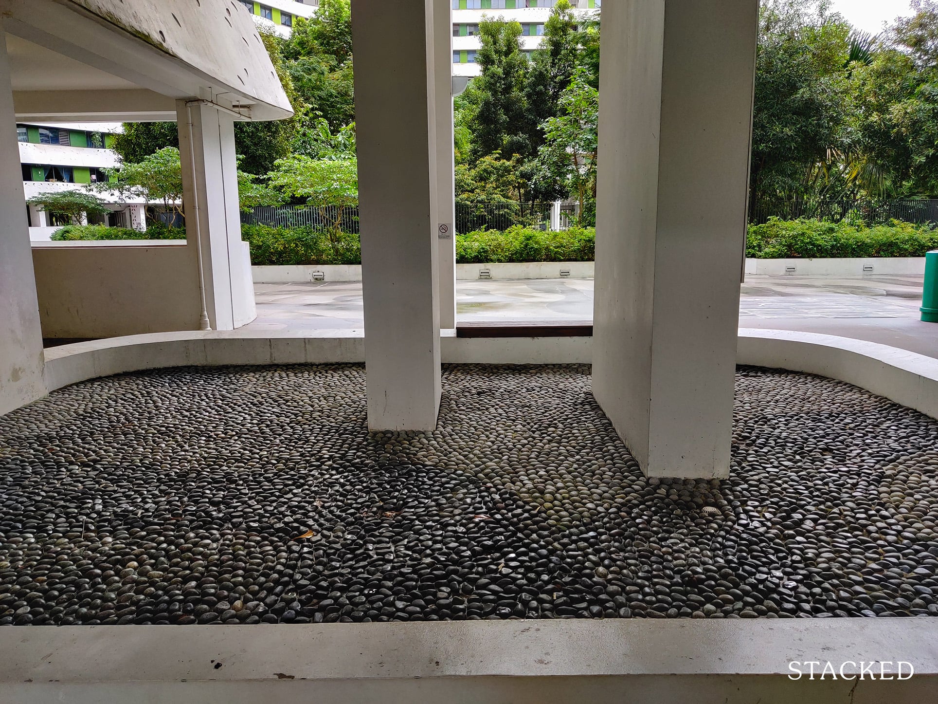
There are other spaces designated for greenery though – they just weren’t filled at the time of visit.
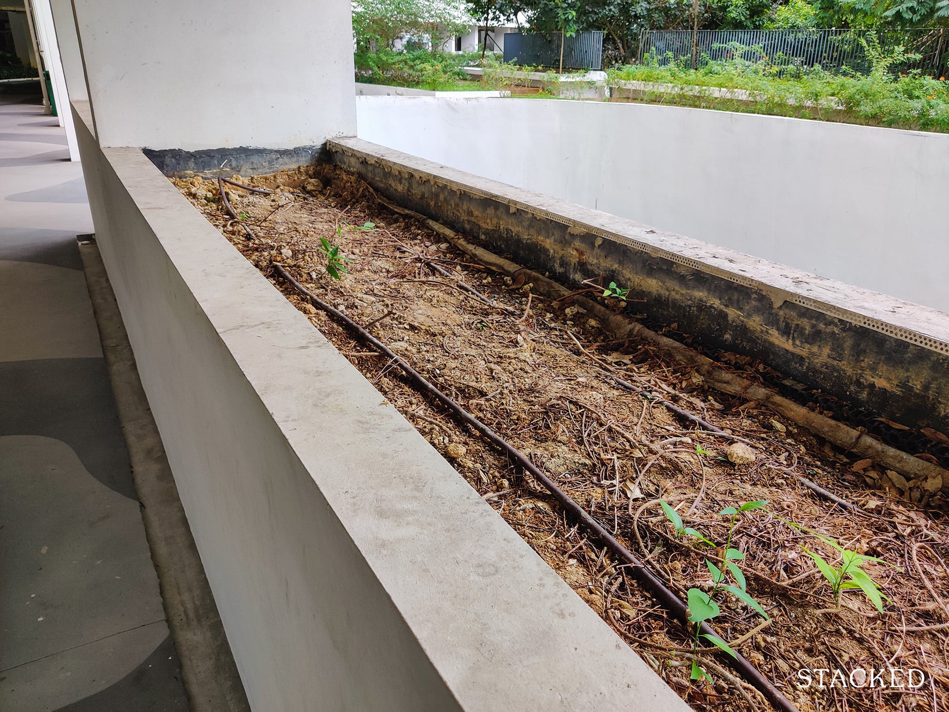
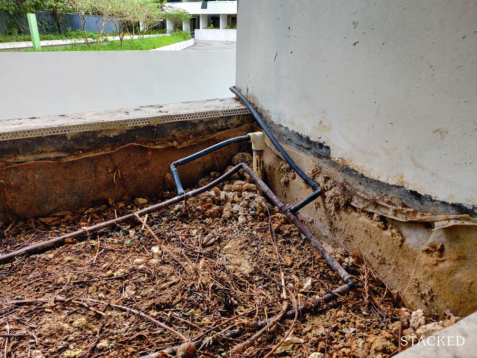
I can’t say how long this has been going on for, but I do hope that works will be done to rectify it.
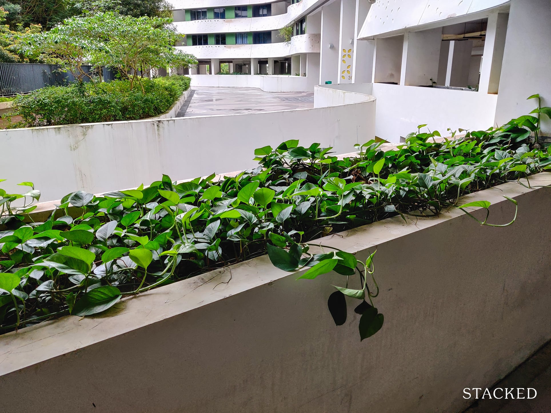
To be fair, some areas did feature plenty of plants which grew out quite nicely, so plus points for that.
There are also signages around the development which I find very handy when getting around, considering how big the development is.
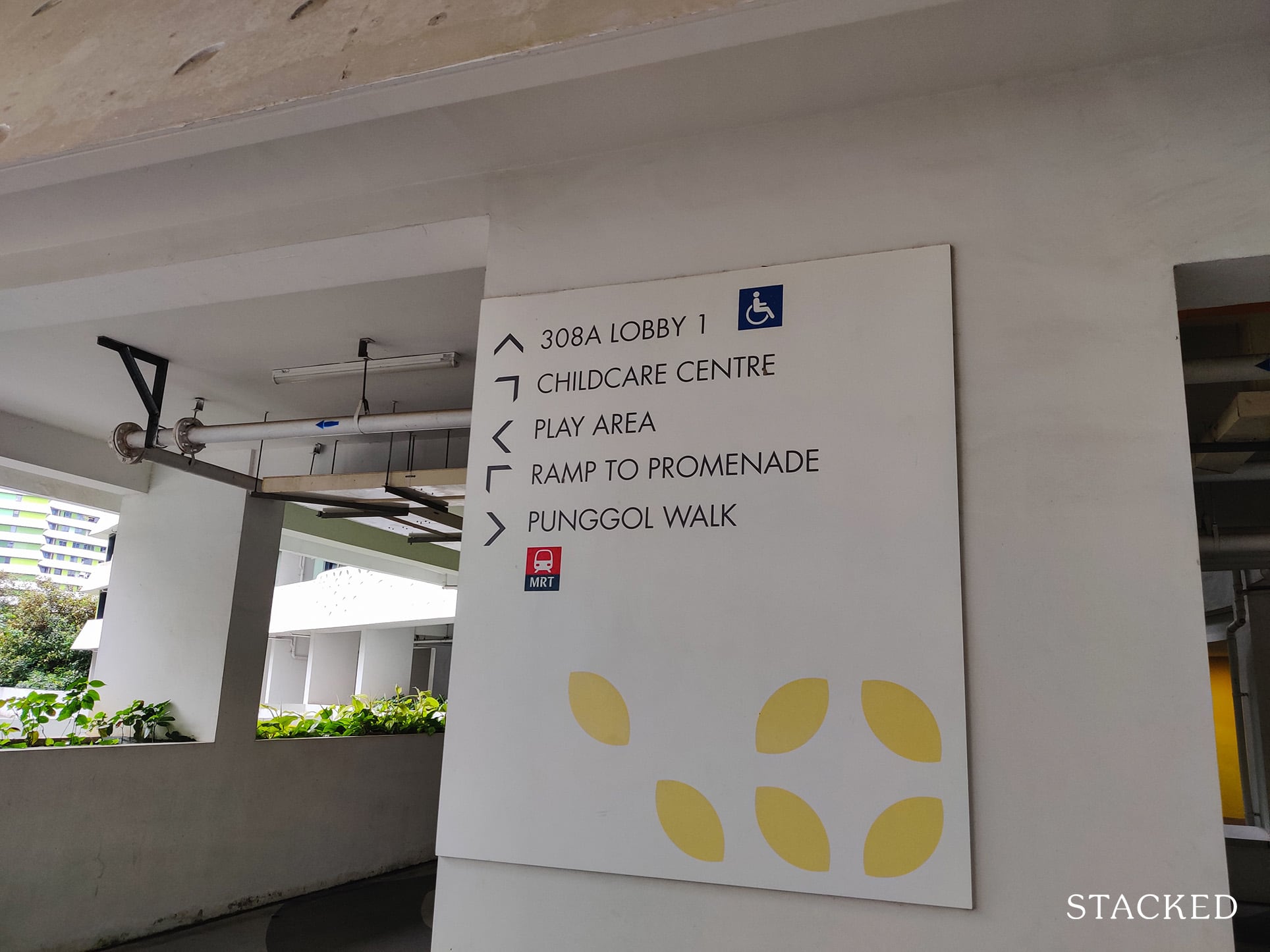
The leaf motif branding is also consistently displayed, even on the pillars.
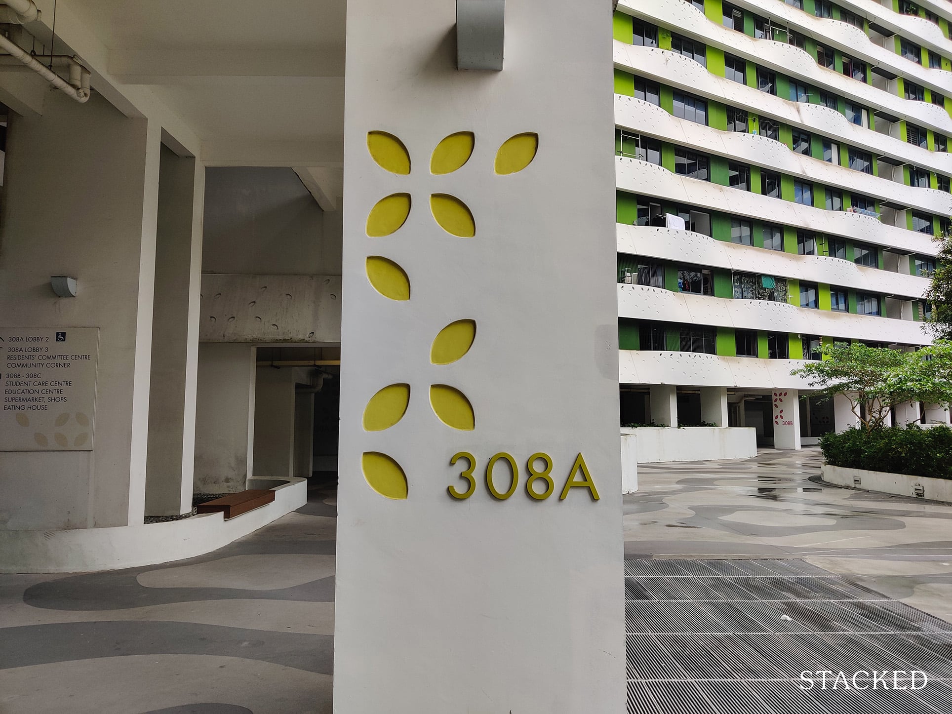
I’ll have you know, the yellow colour here isn’t just for fun. There are 3 blocks in Waterway Terraces I – 308A, B and C which are coloured yellow, pink and orange respectively.
This further helps differentiate the blocks when you have guests coming over. “Take the yellow lift lobby!” is a much better guide than just the block number – even more so given the long corridor (but more on that later).
Now let’s move on to the green center.
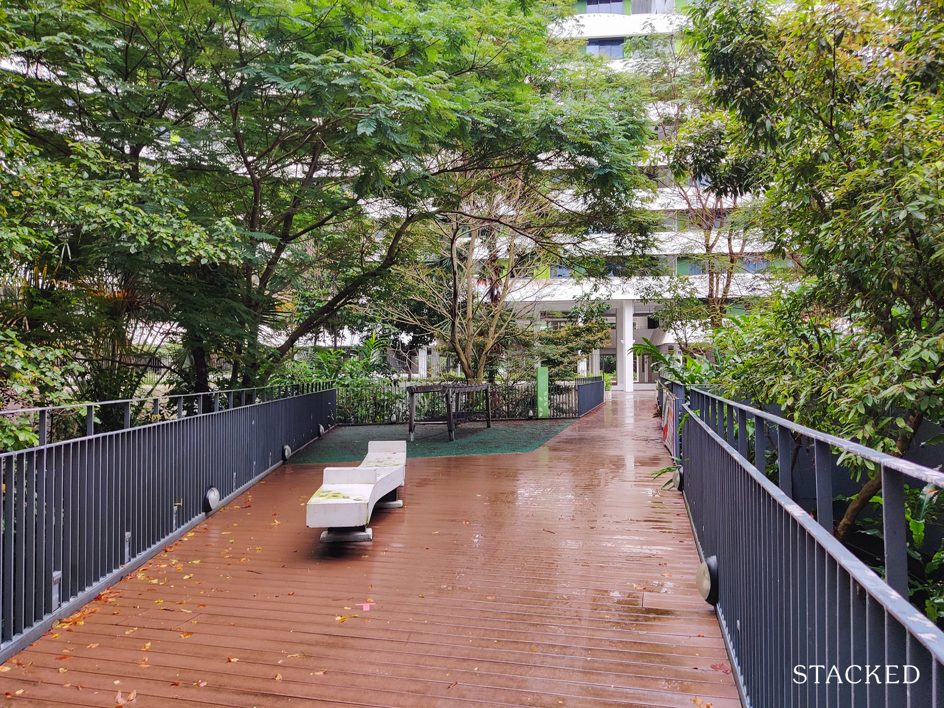
Again, I love that the greenery from the basement level is so apparent here. The tall trees coming out from the sides of the walkway is really refreshing.
But beyond that, the shortcomings of the development are even more apparent here: the lack of maintenance.
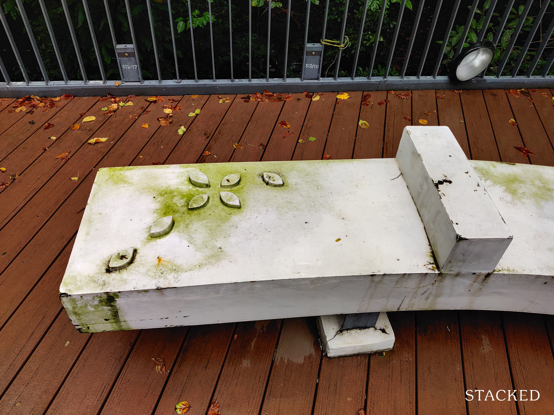
While I’ve seen some maintenance issues in my other HDB reviews, Punggol Waterway Terraces has to take the cake for being the worst so far in terms of maintenance – even as I compare it to the older Pinnacle@Duxton!
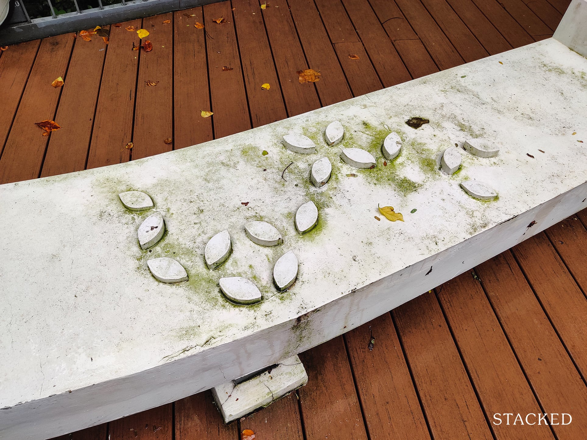
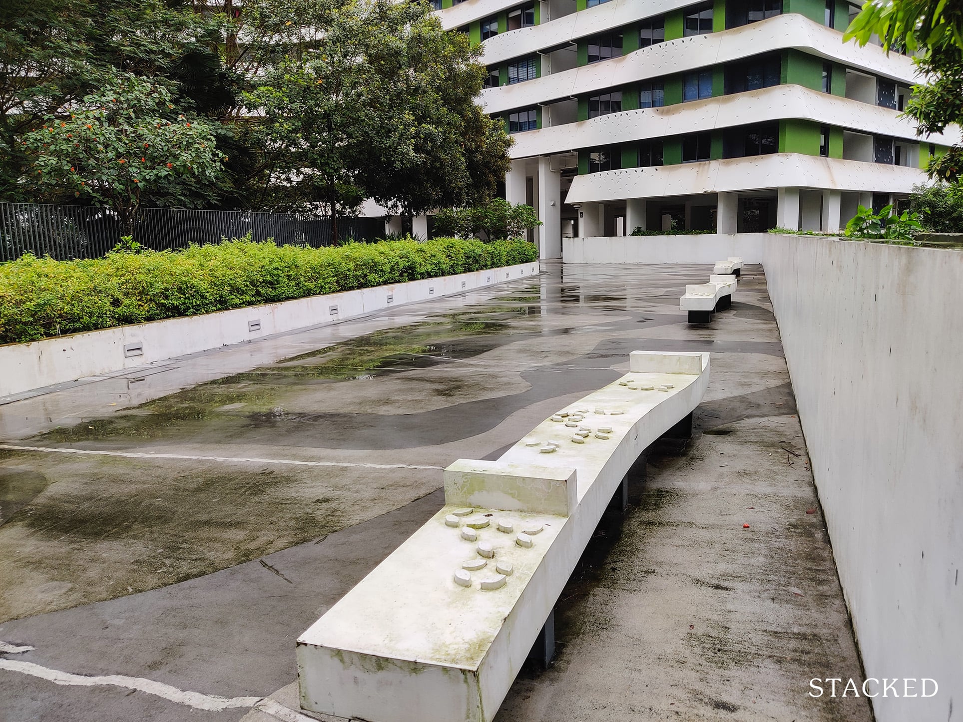
Another thing that is perplexing here are the protruding leaf motifs on the bench. It’s one of those things which may look nice, but is wholly impractical considering it’s not very pleasant to sit on.
Perhaps it’s great as a social distancing measure during times of Covid, but it definitely isn’t something I’d chalk as very practical in my books.
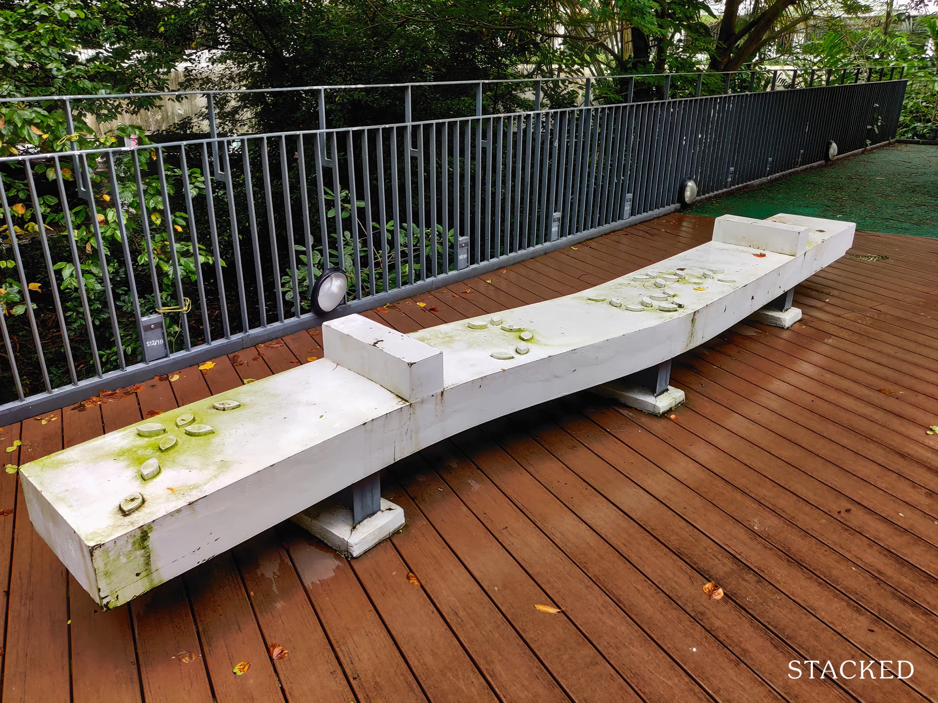
The protrusions also causes water to be retained here, which is why most of the dirt surrounds these motifs. Great design for a country with 4 seasons and less humidity perhaps, but not in a tropical one like Singapore.
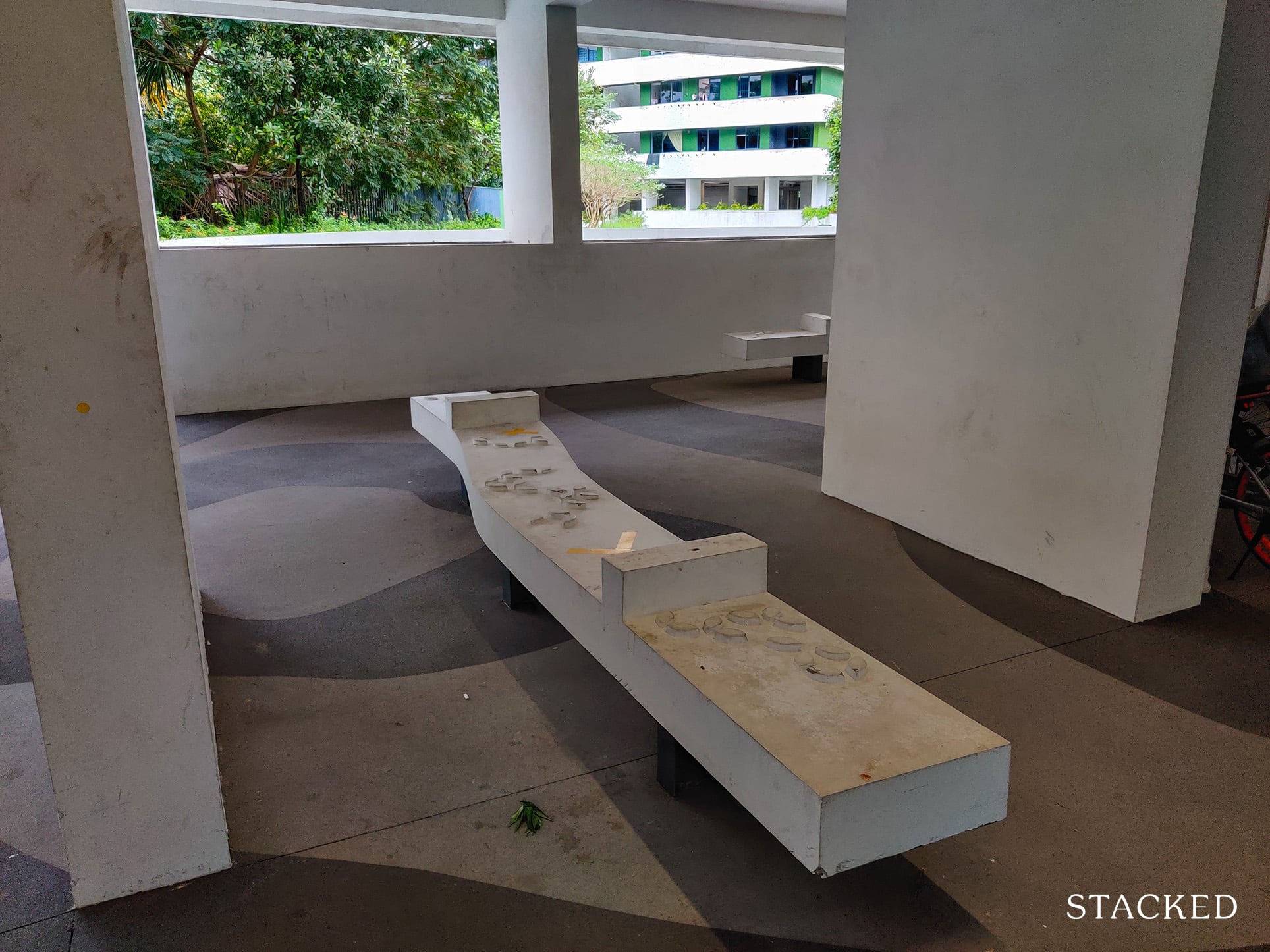
The indoor benches which aren’t as exposed to the weather are also already quite dirty, so while the weather does play a big part, I would say the lack of maintenance here has much bearing on the outcome too.
The walkway is pretty well-maintained though and it does blend in quite nicely with the surrounding greenery!
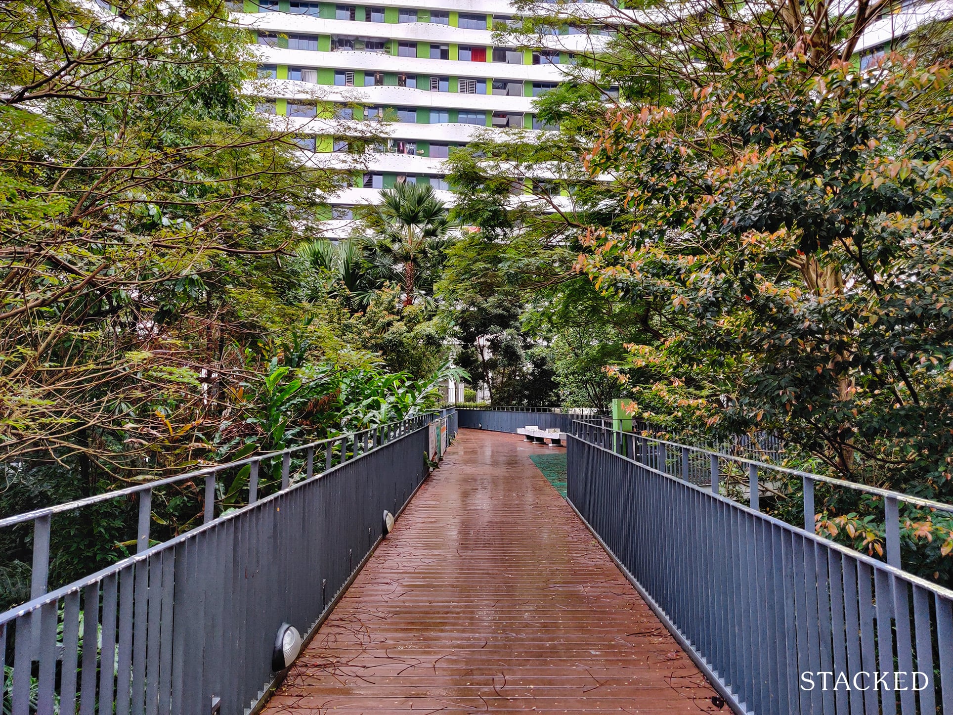
But I’d say that it’s probably the only feature that’s well-maintained. Looking around, it’s not just the standalone benches that are poorly-maintained, but the benches all around too.
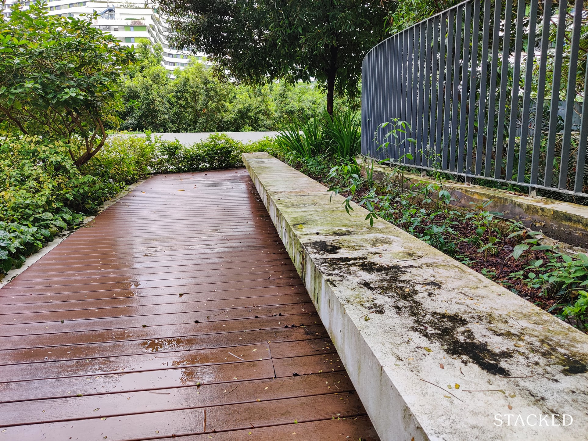
Granted I didn’t tour the development with the best of Singapore’s weather, but even when it is dry and sunny, these stains are very visible.
In fact, just about anything white looks dirty here!
You can see how the area is in need of much re-painting on both the railings and the white areas – it’s really a wonder how far this development has fallen from grace.
I think having a shelter for these walkway areas would’ve helped, but I can understand the cost constraints here.
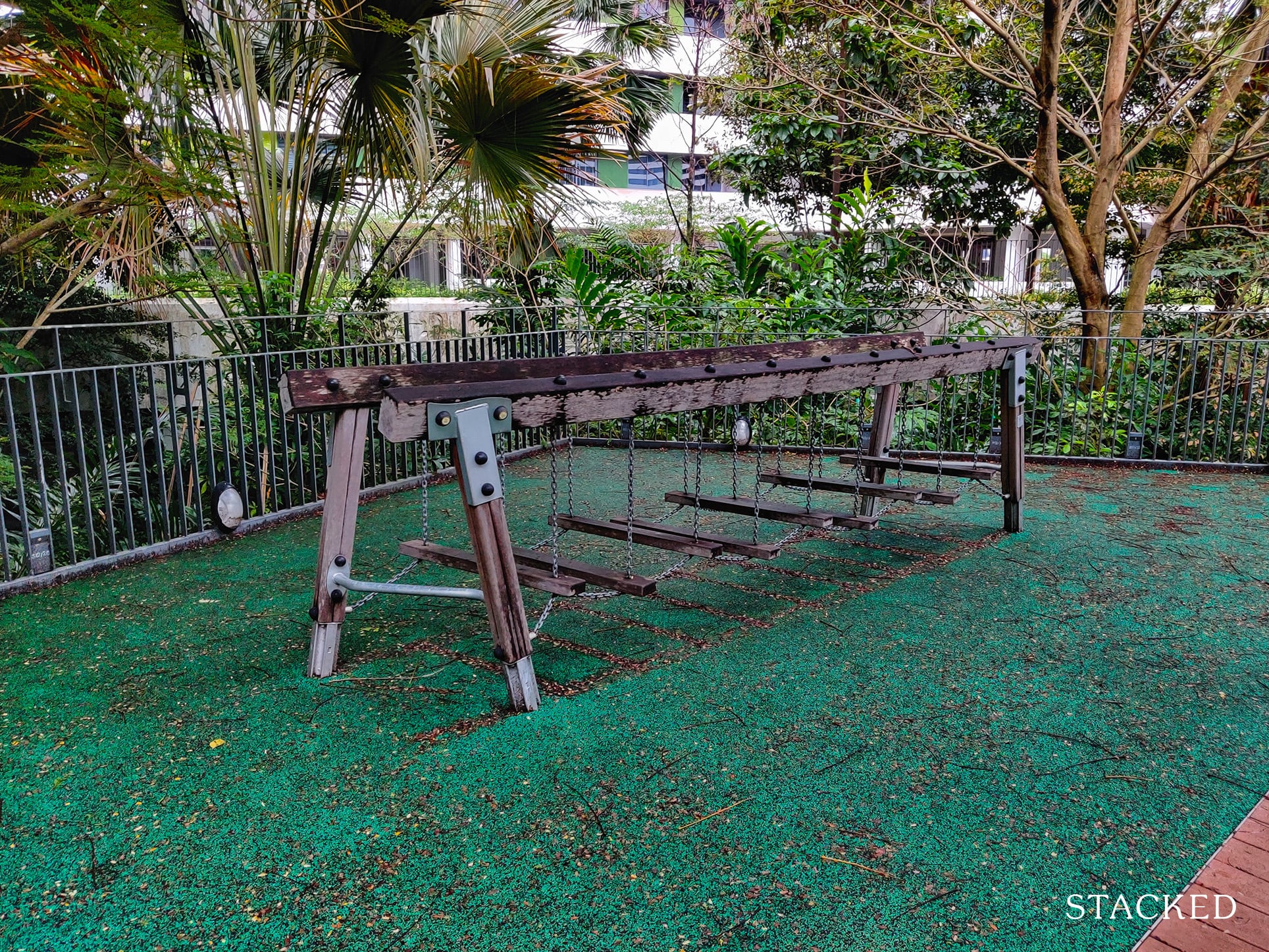
The central green area also features a playground, or at least what is being touted as a playground.
I would say this should be renamed to “Balancing Tree Top Walk” given the surrounding greenery and the nature of the contraption here.
The other central green area’s playground, however, really left me scratching my head.
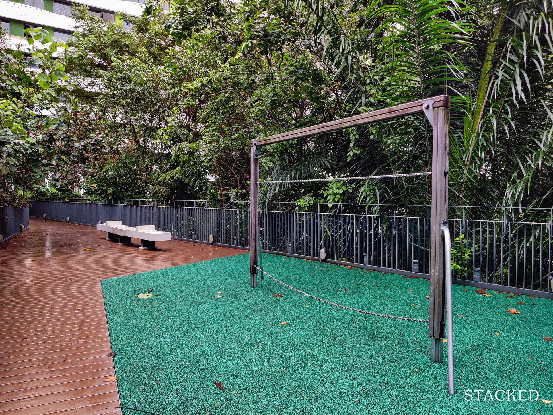
If I had to come up with a theme, it would be “Let your imagination run wild”, because it really takes a lot of imaginative powers to squeeze some fun out of it.
The chains don’t look fun to hold, and it kind of reminds me of a cold store where you hang meats.
Again, perhaps something along the theme of balancing would be great, but it’s certainly far from what a playground should be – even the colour theme doesn’t look inspiring.
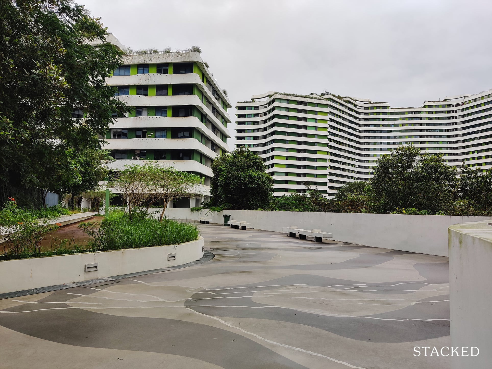
Surrounding the green center is a very wide walkway that residents can use to walk/run/cycle around should they decide not to leave the development.
While it doesn’t look like much, it’s quite a unique offering in some sense since many HDBs don’t even feature such a walkway within their development.
This is really useful for residents who want to take a quick stroll without going to the Park Connector.
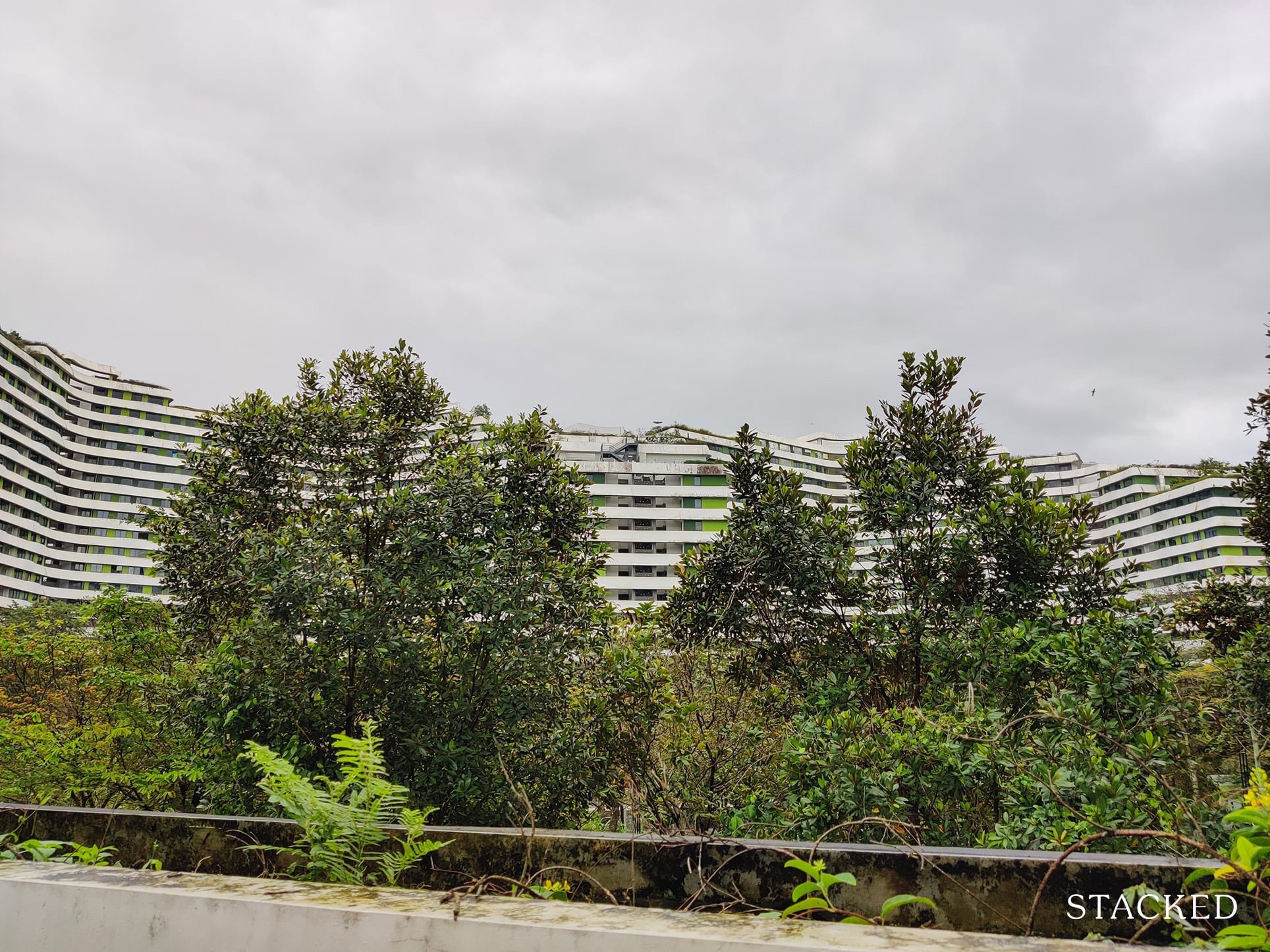
Perhaps it’s just the weather, but it seems as if no one is really taking care of the greenery here and a lot of it was left to its own devices. Much like those documentaries featuring what cities would look like uninhabited for 50 years, except in Waterway Terraces – it’s just 5.
That said, it’s just nitpicking on my end here given the flora here wasn’t really touted as a manicured garden but more of a catchment area.
If you haven’t already noticed, there are many residents who use the Juliet balcony to hang their clothes.
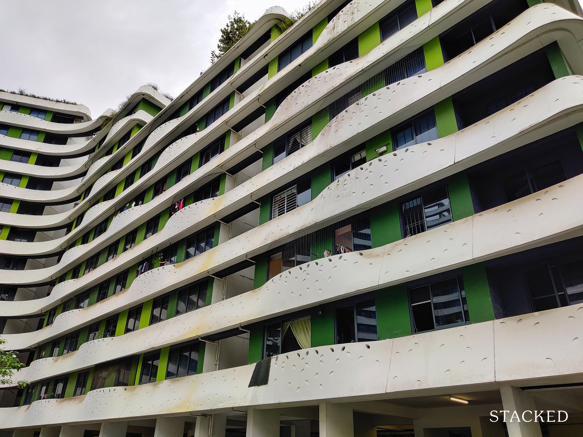
Considering it just rained before, what you see here is already very mild. In the day, many of these balconies can be seen with clothes draped over them, making the overall facade extremely unsightly.
Now before heading up to see the common corridor and community garden, let’s check out some of the amenities at Waterway Terraces I.
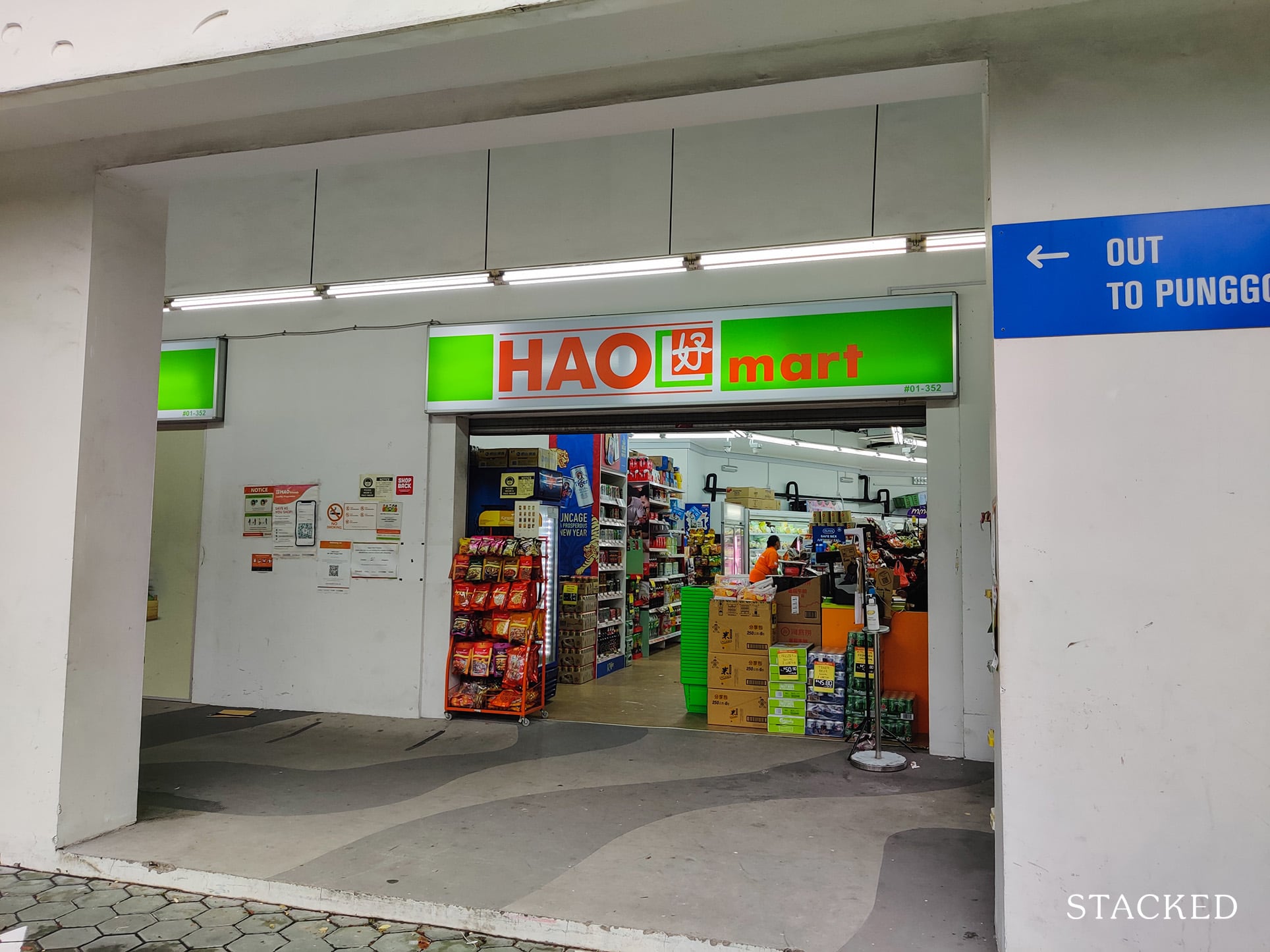
First off is the Hao Mart. It may look rather non-descript from the outside, but this grocer would be more than sufficient to fulfill the residents’ grocery needs here.
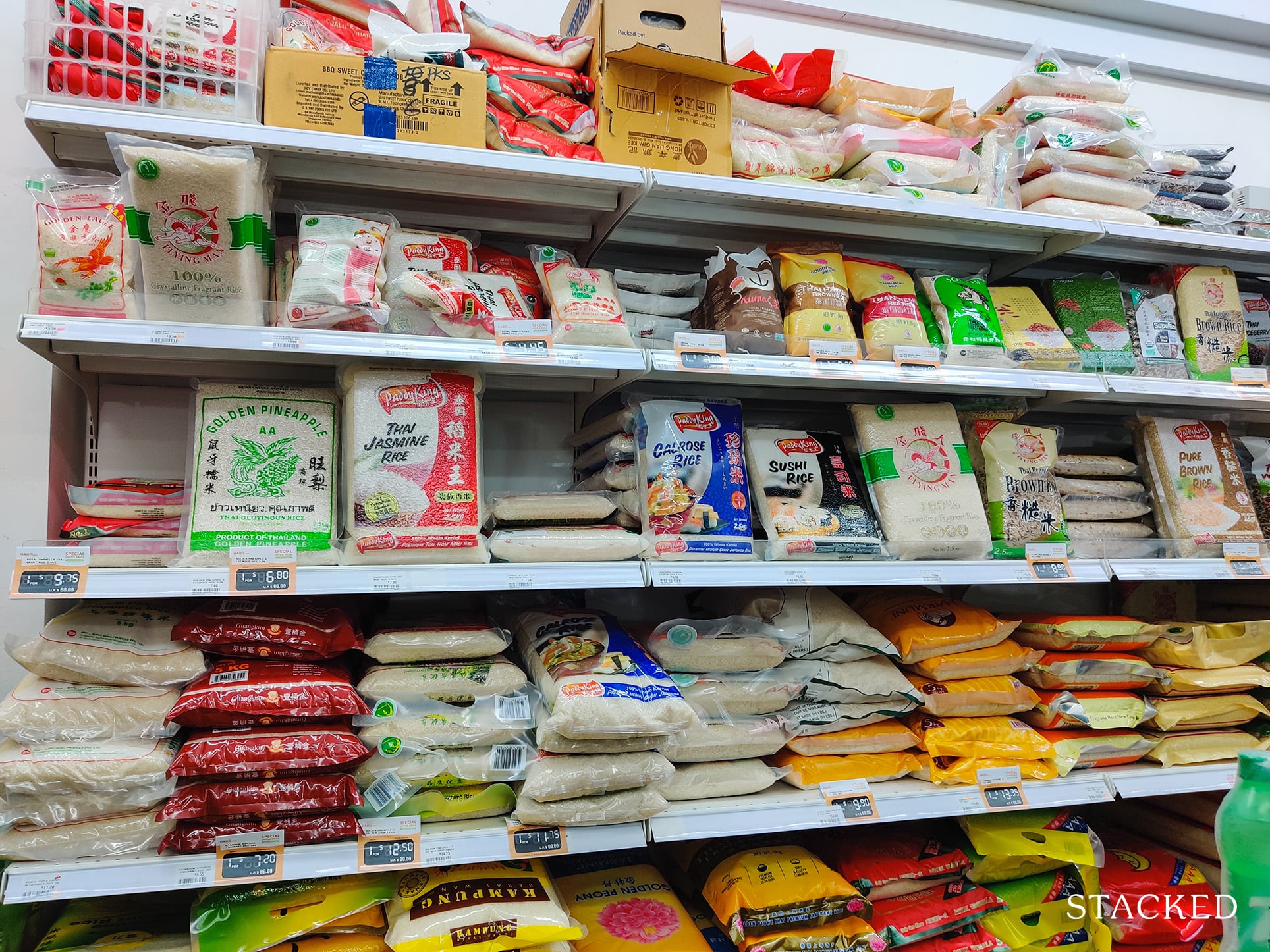
There’s a large selection of basic necessities, fruits and meats here – which will no doubt be very convenient for residents.
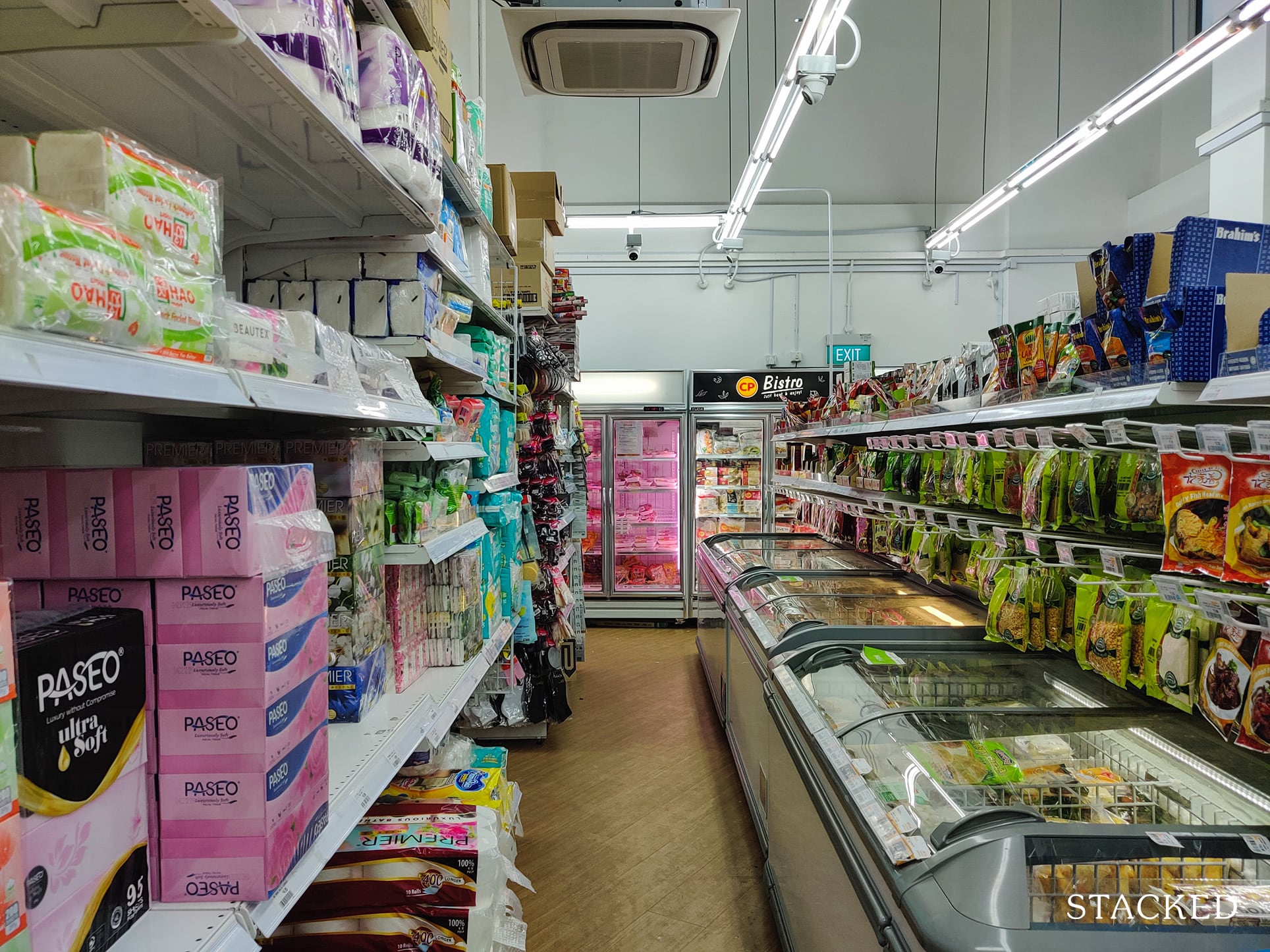
There’s also a refrigerated foods section.
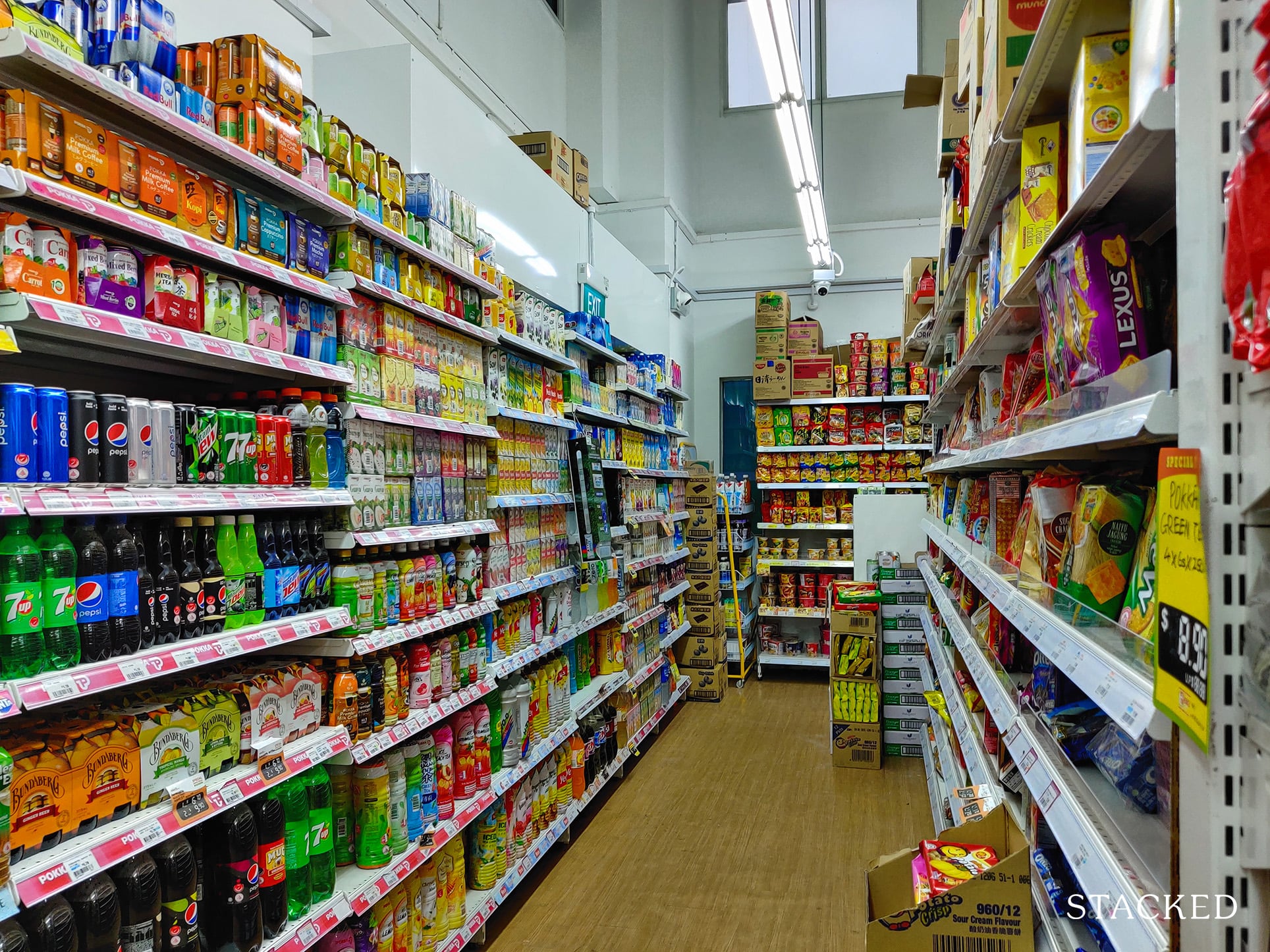
A huge array of snacks and drinks are also available for that last-minute gathering with friends.
Outside the Hao Mart, there’s a clinic which is very convenient for residents.
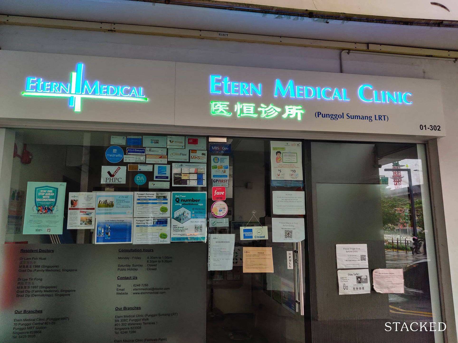
The clinic is situated right across Punggol Sumang LRT, so it’s also quite convenient for residents in the other developments to access too!
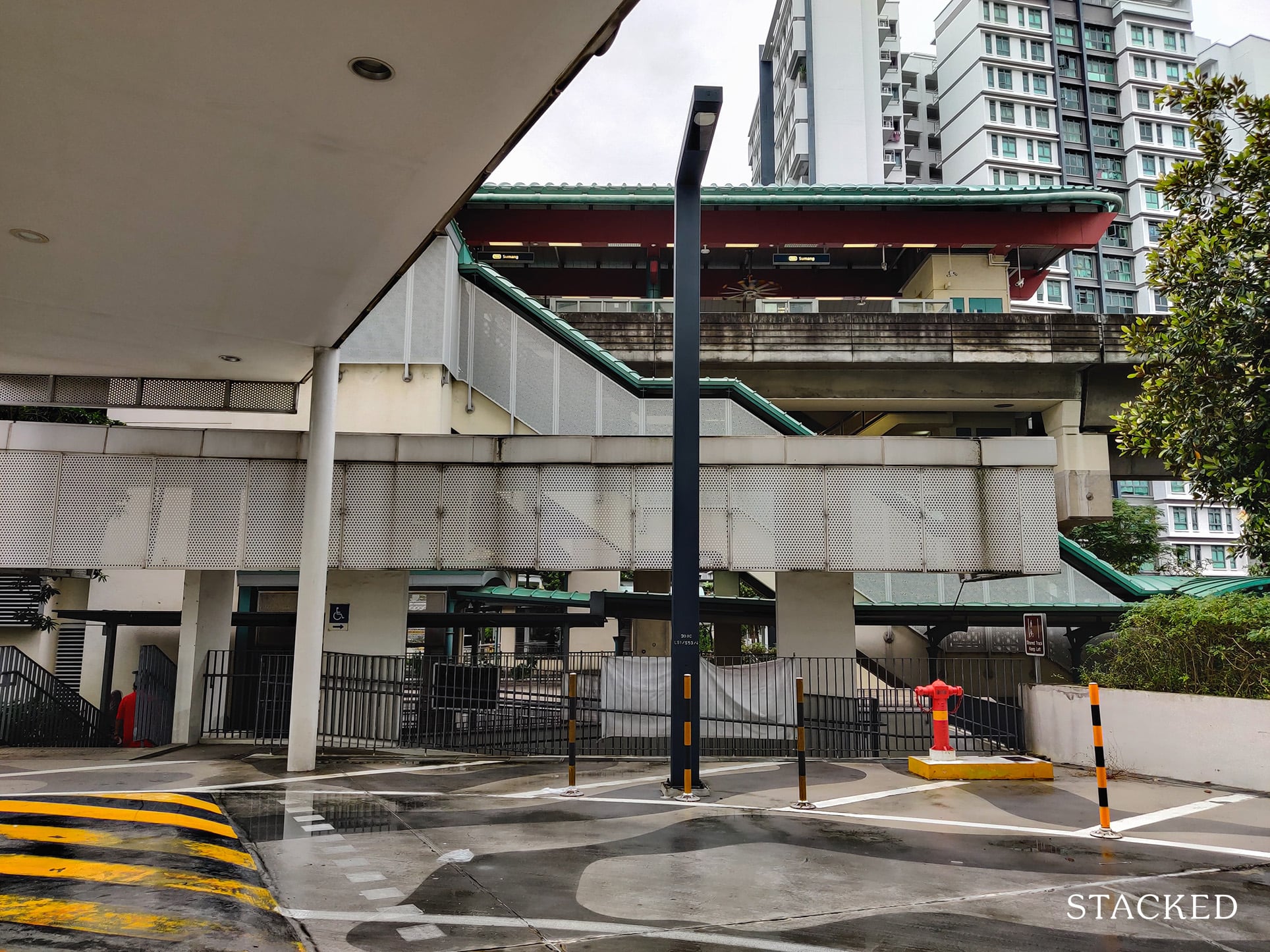
Next up and probably one of the most important amenities here is the food court on the 1st level.
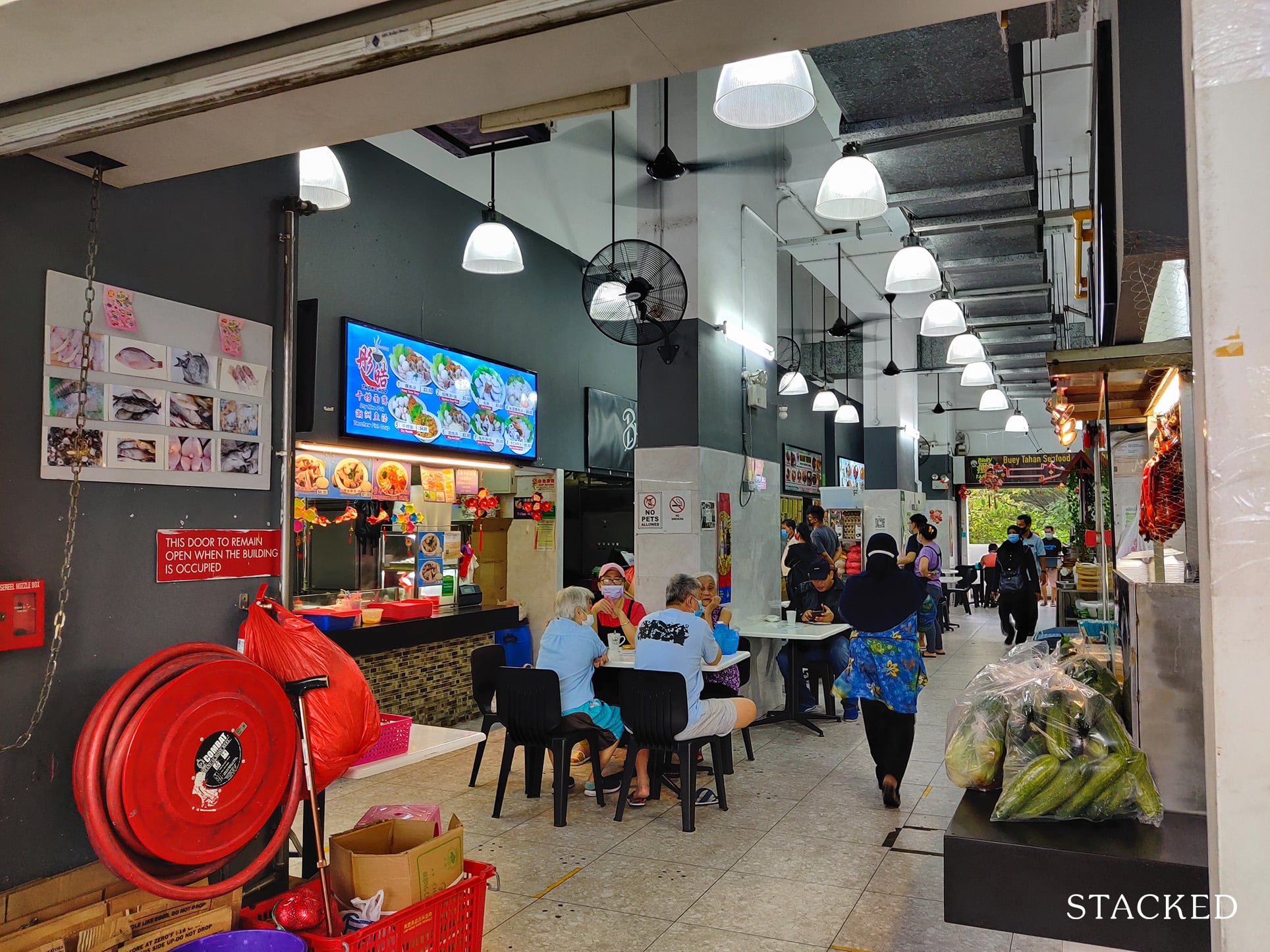
I must say that the food court here is quite impressive with its diverse selection of food.
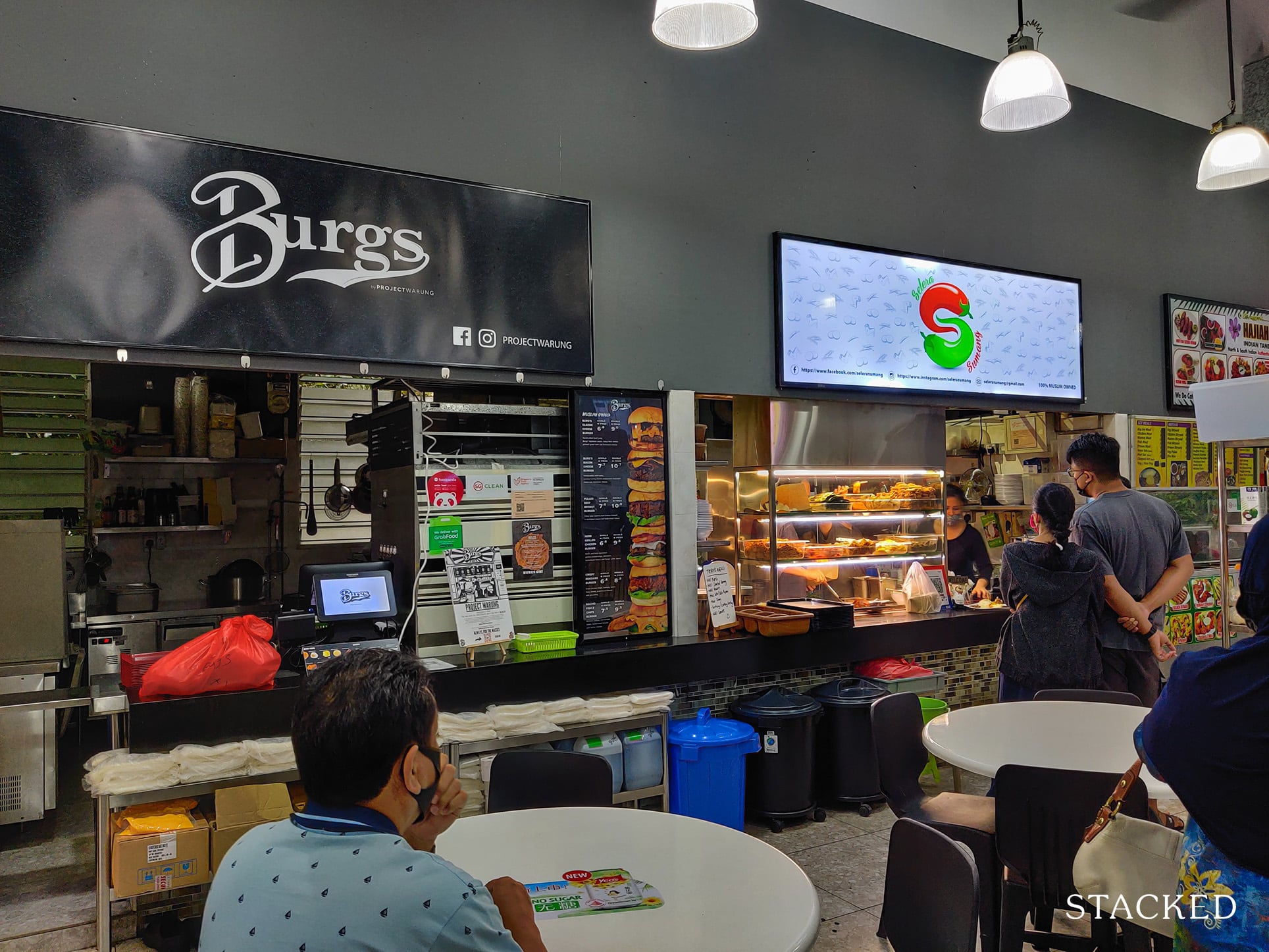
It’s probably one of the best amenities that Punggol Waterway Terraces I has – a food court right at your doorstep can really take your mind off having to hunt for food when you’re too lazy to cook.
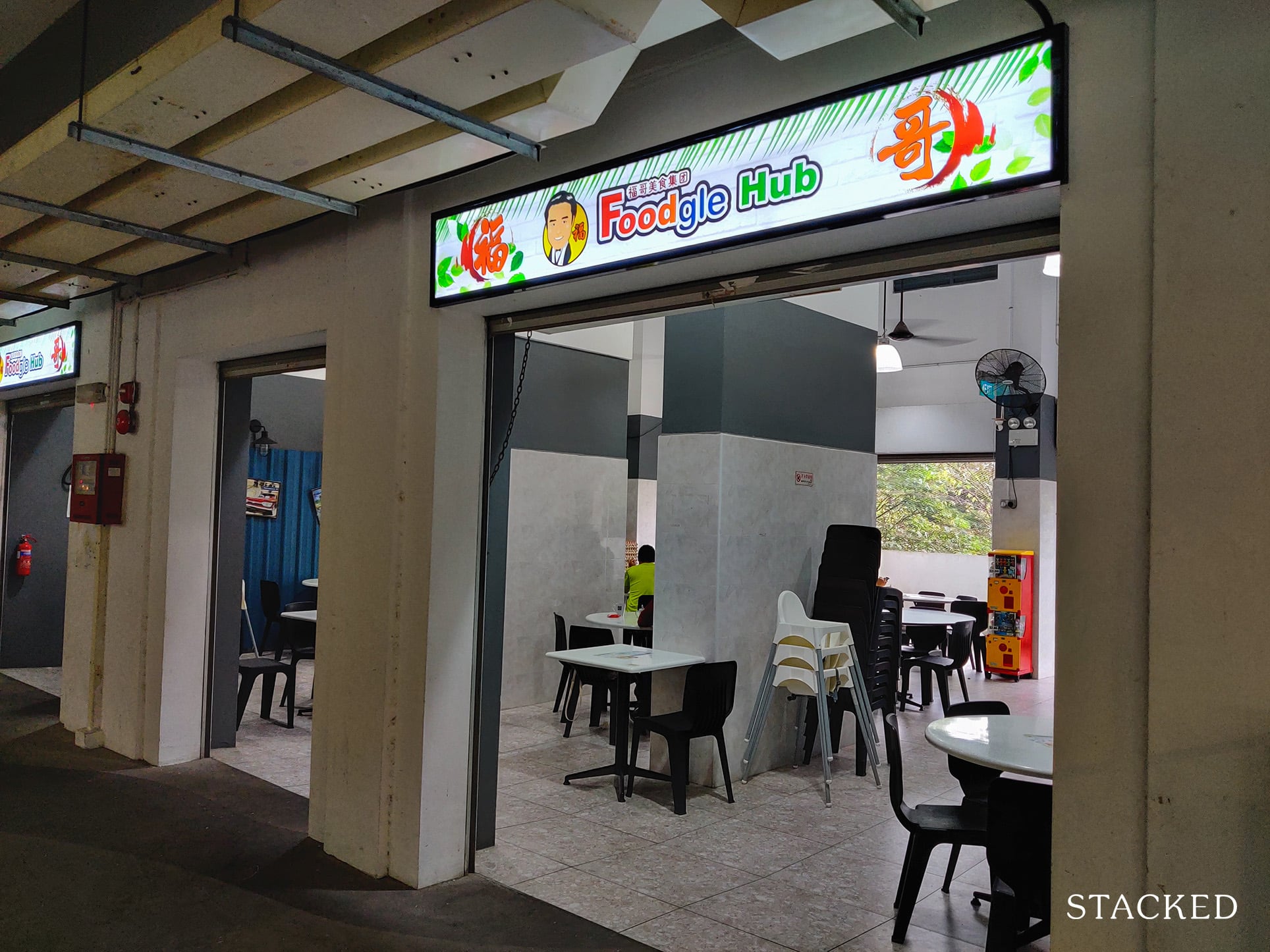
I wouldn’t say there’s a lot of seating areas here though, so during peak hours, it may be best to pack your food.
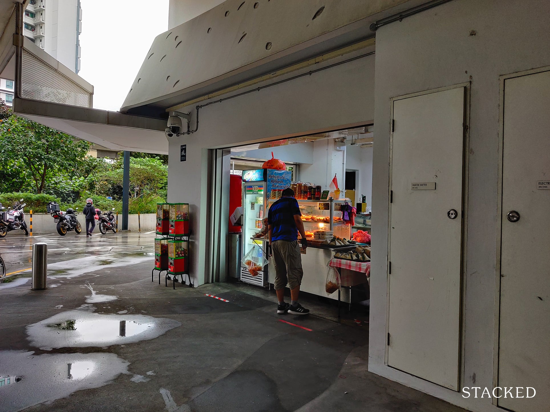
There’s also a standalone stall that sells local snacks like curry puffs!
The other arrival area/dropoff point is also located here.
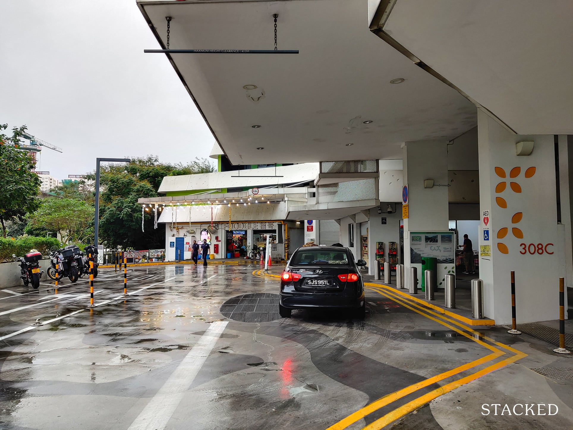
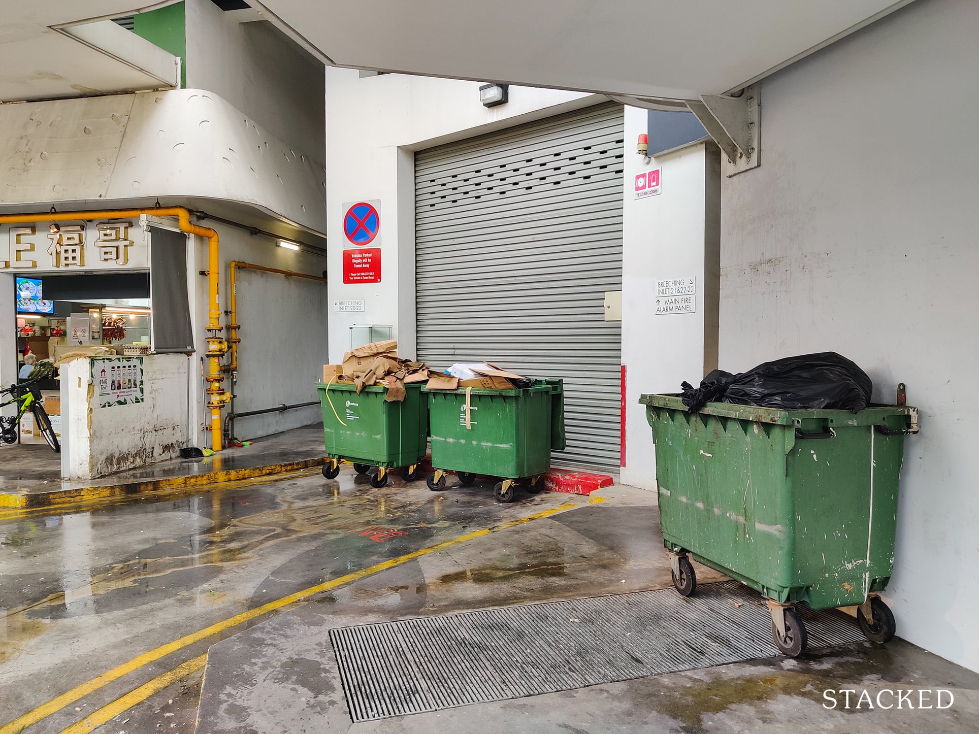
It isn’t the most pleasant of sights however, given how close it is to the refuse area.
Other amenities here include a 24/7 laundromat as well as a barber, which I unfortunately did not manage to take a photo of.
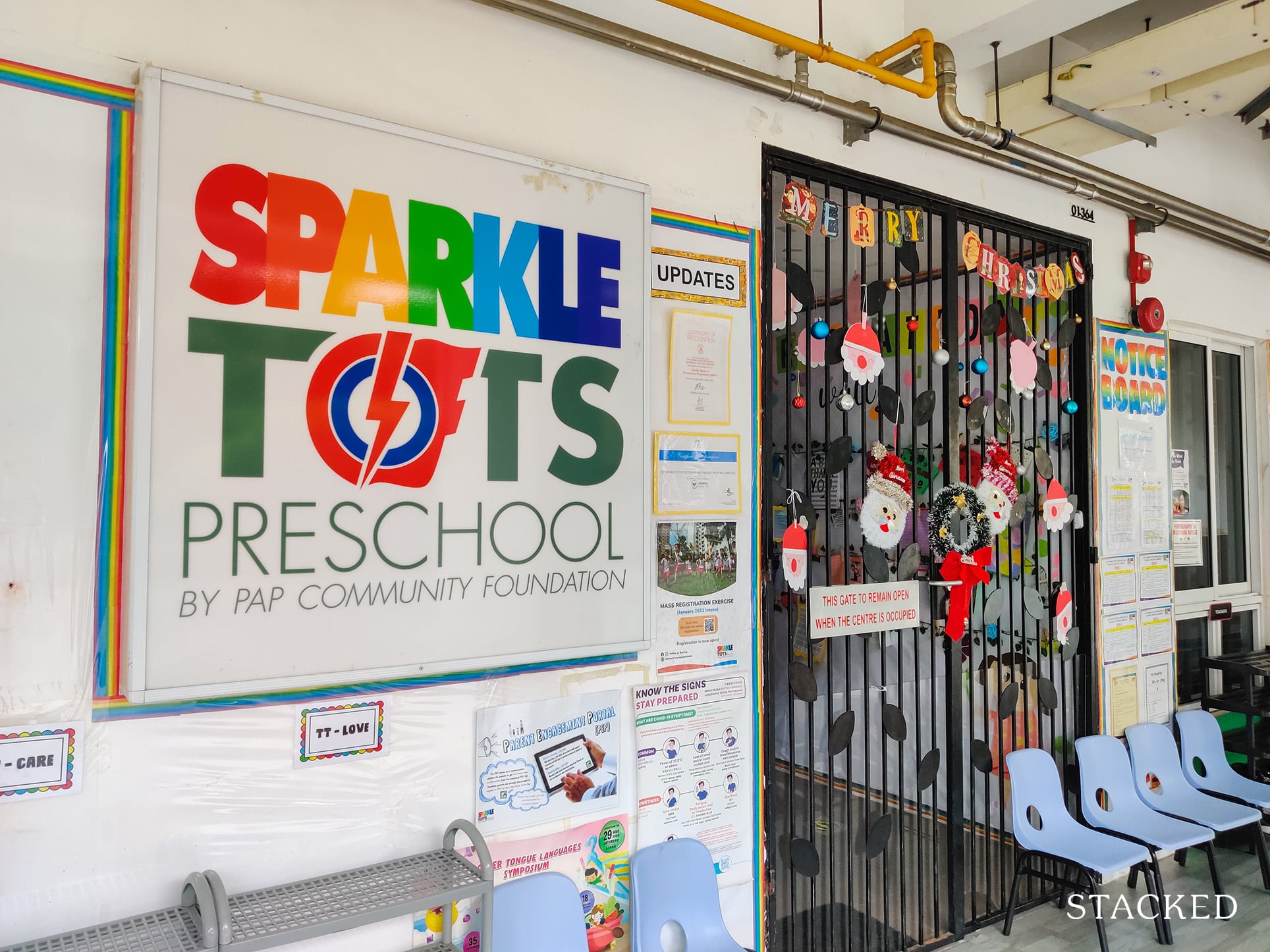
The development also has several childcare centres, including a Sparkletots.
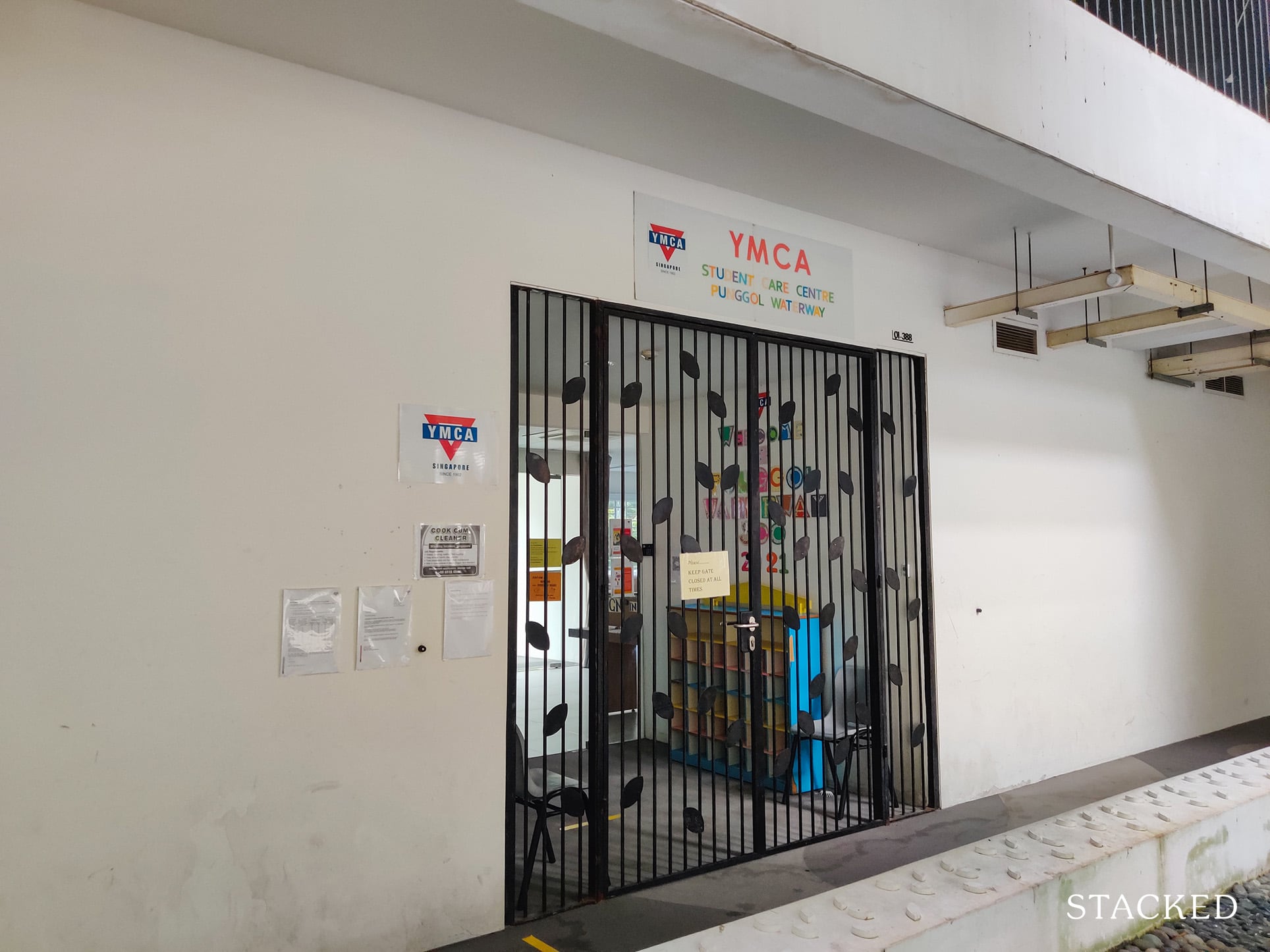
Another one is the YMCA student learning centre.
And the last one is Greenland Childcare Centre located on the ground level of block 308A.
One final nifty amenity I’d like to point out is the Parcel Santa!
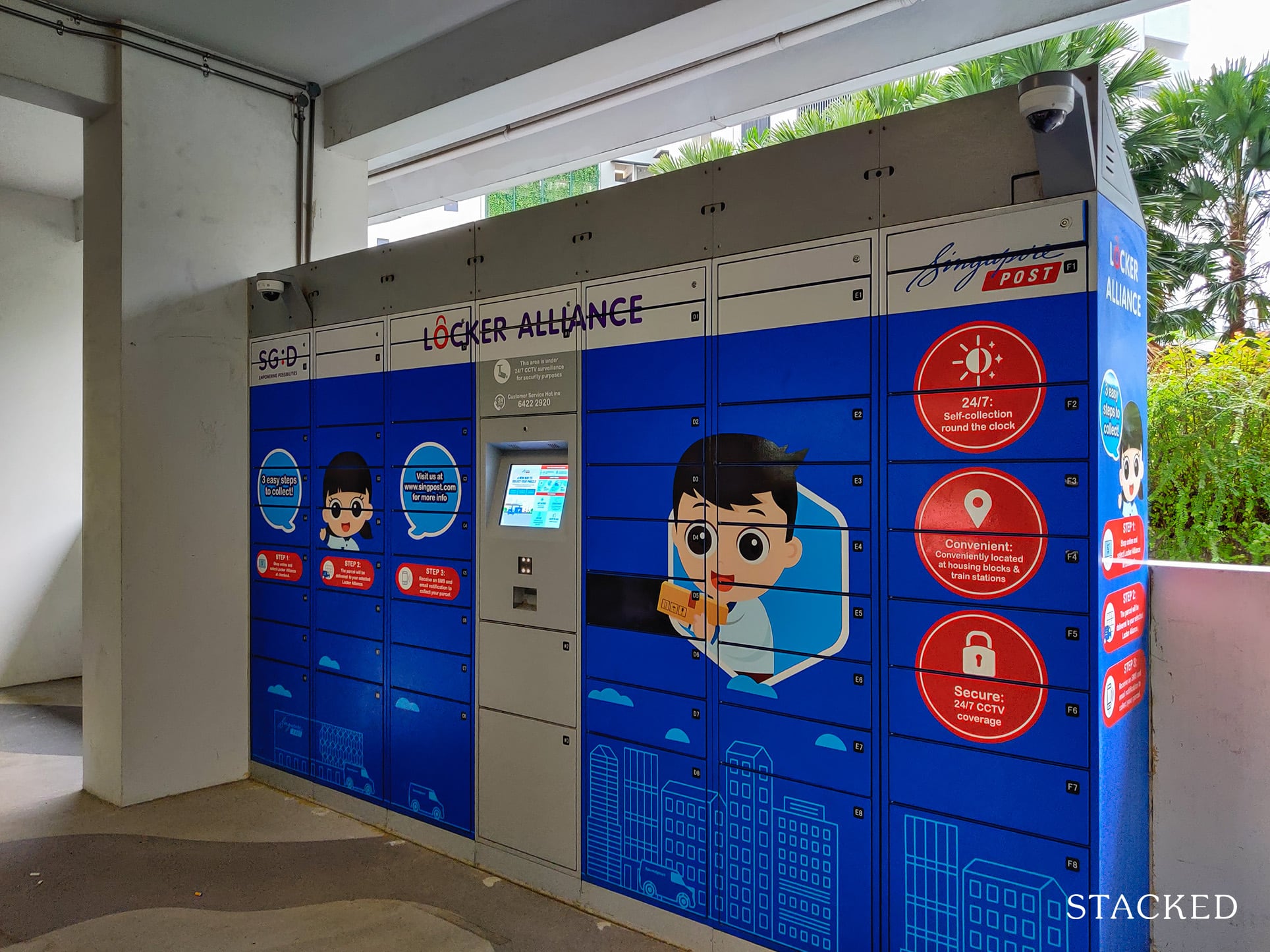
I would think this is a godsend given both the lack of privacy on each floor (which I’ll get to soon) and how big the development is, making it much easier for those delivering the parcels here.
Now let’s check out the lift lobby!
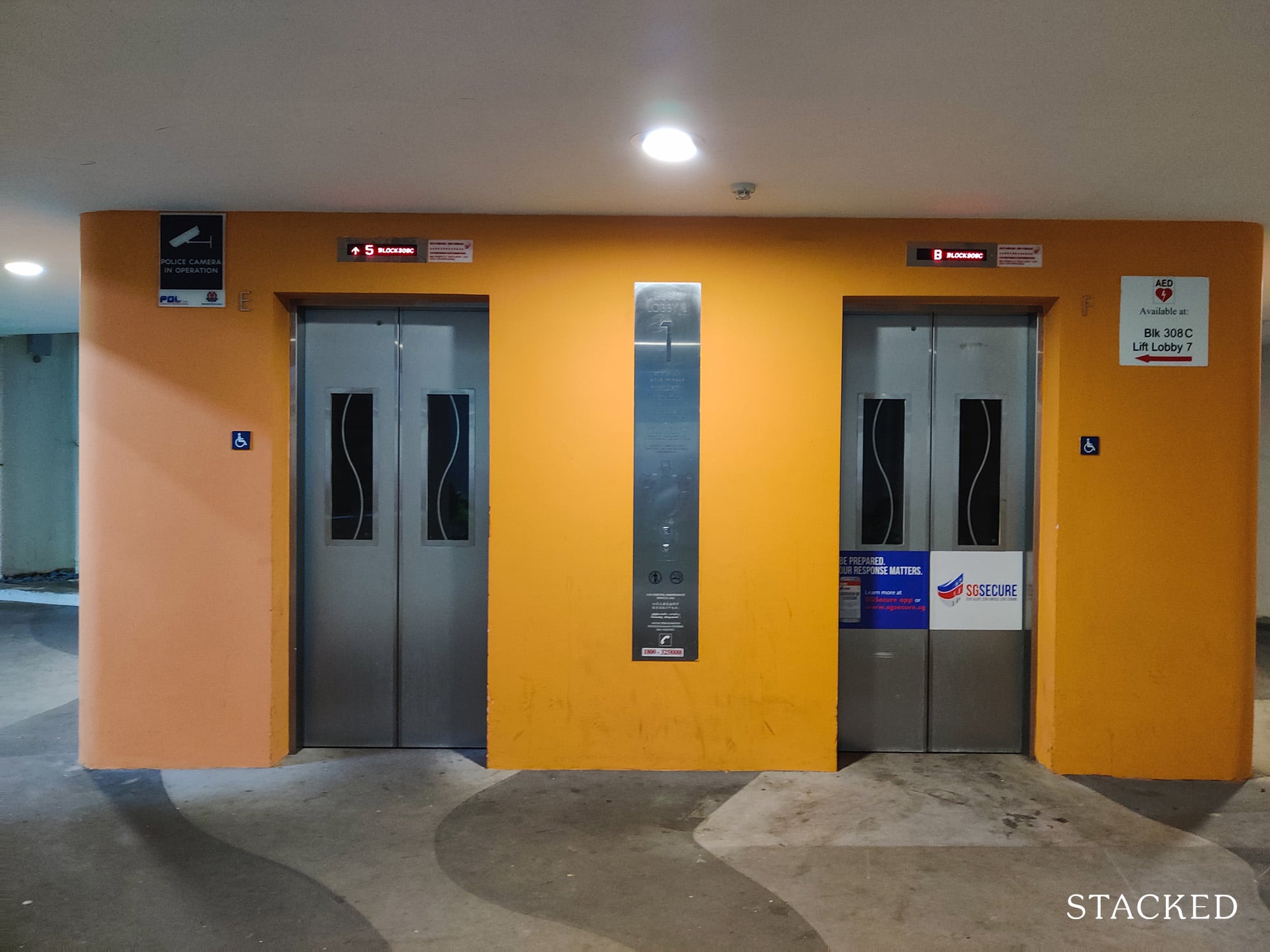
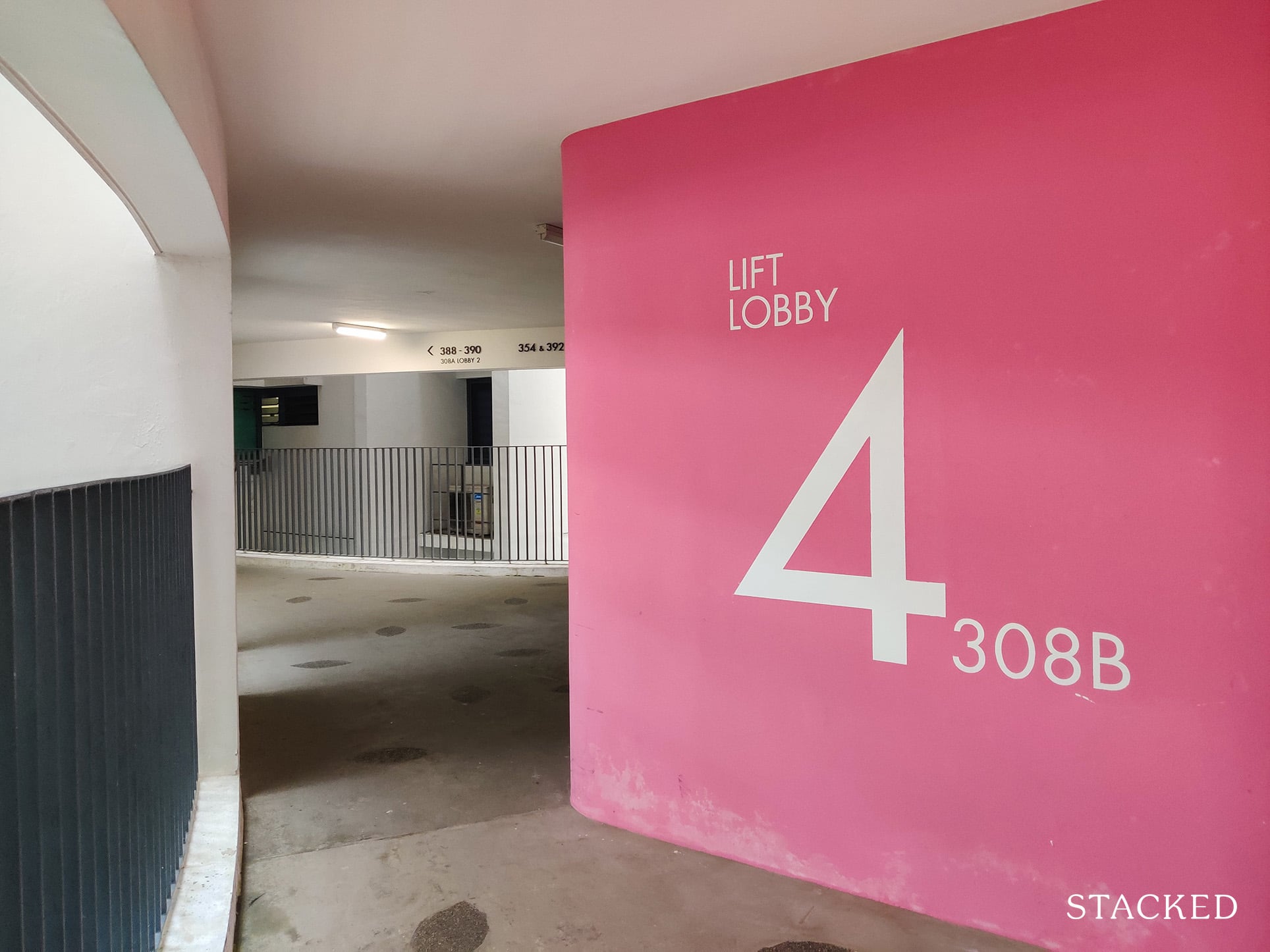
As mentioned earlier, Waterway Terraces features colour-coding for each block, and it’s visible at the lift lobby too.
There are 3 lift lobbies in block 308C and 308A, while block 308B has 2 lift lobbies. Each lift lobby has 2 lifts which is enough considering the numerous lift lobbies per block.
Not all the lift lobbies serve the top few floors though, given there are fewer units on the upper floors.
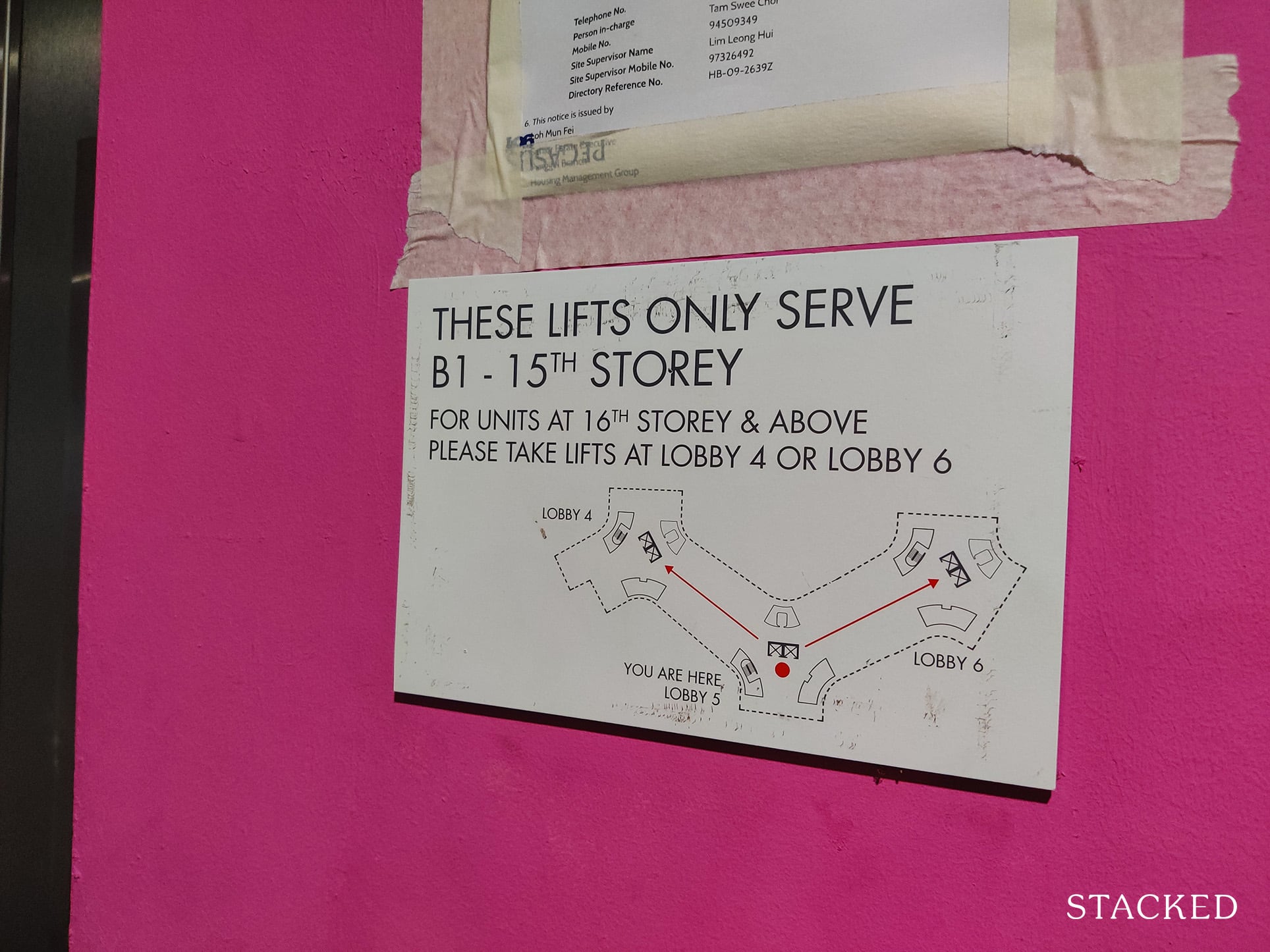
This particular lift lobby that I took opens up straight to the community garden.
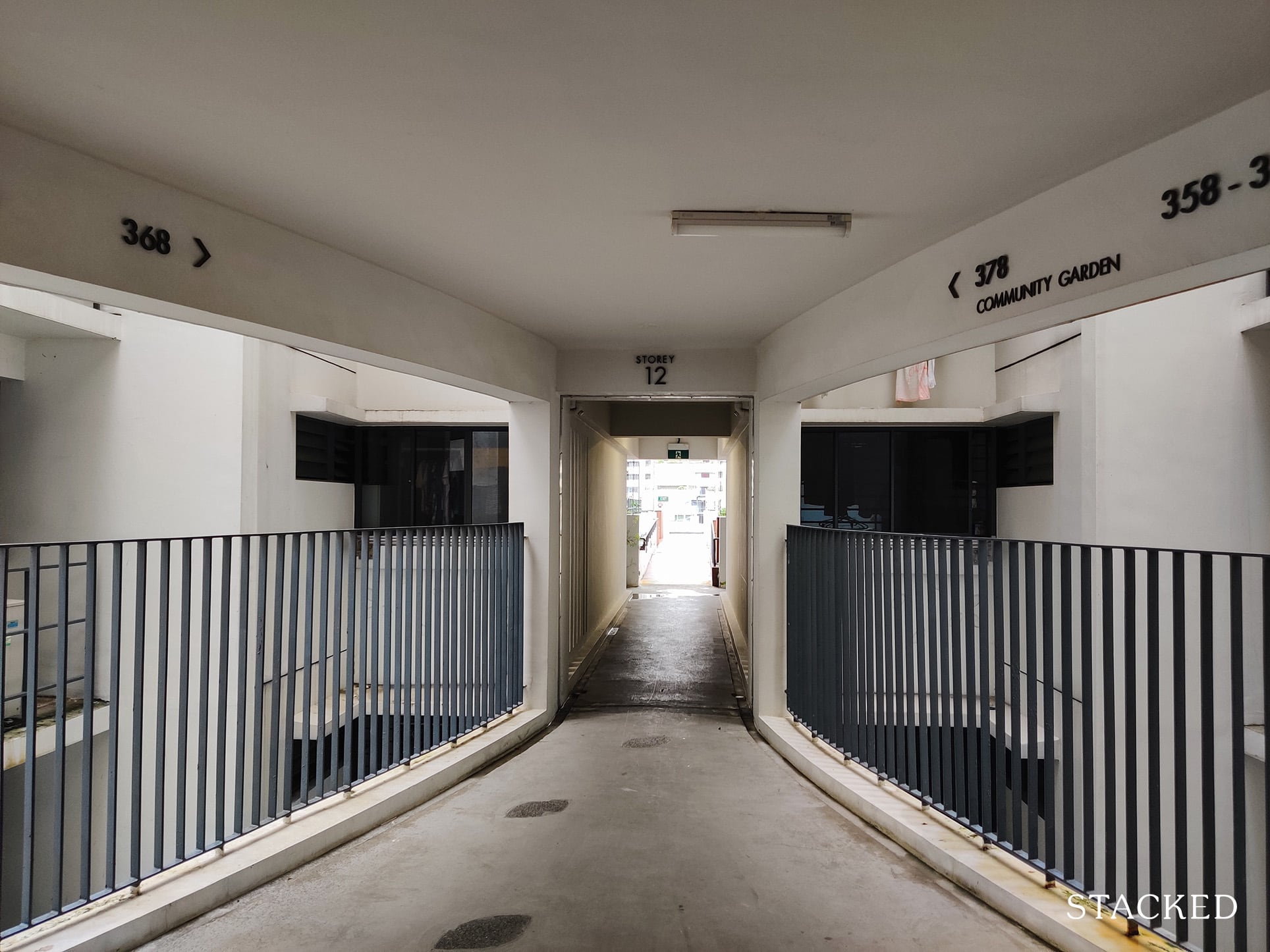
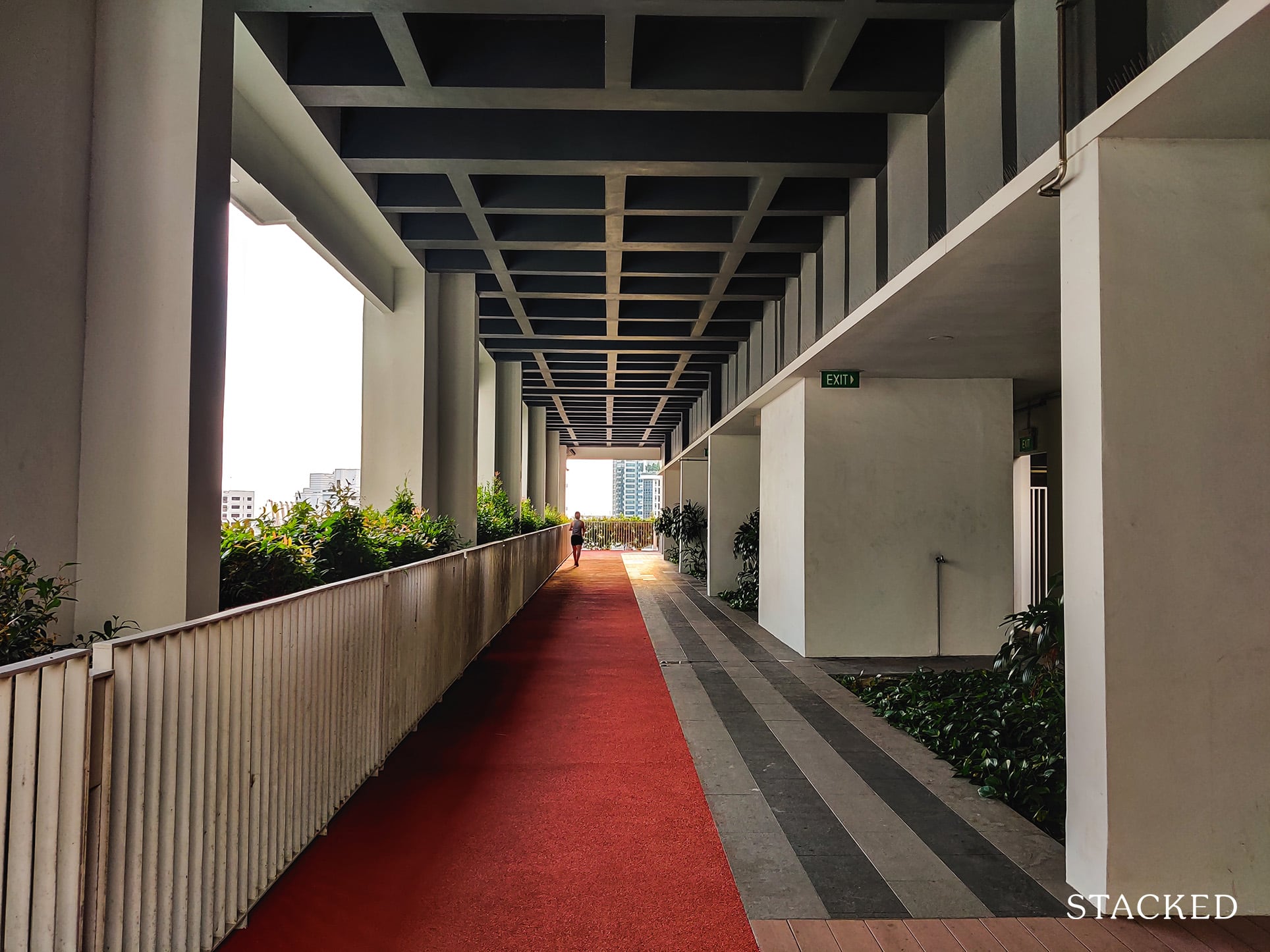
Now what’s interesting here is that the building was deliberately designed so that there would be no dead-ends along each corridor.
So at the end of the corridor above, you’ll find 2 units on the left and right, and going straight would lead to you to the roof terraces.
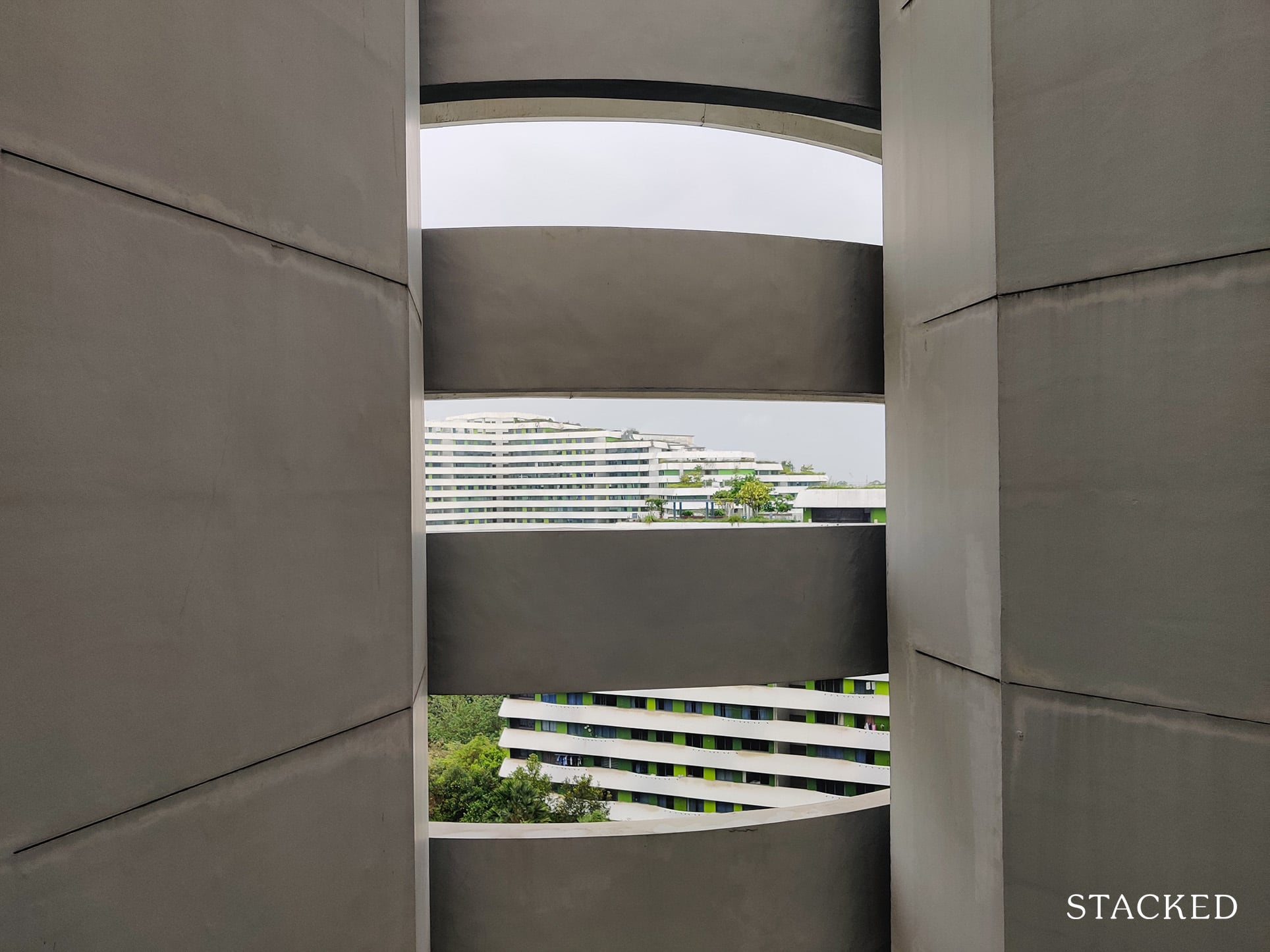
The corridor also has voids seen here to facilitate ventilation. This helps ventilation and reducing heat in the dwelling units, and is one of the many reasons why this development achieved the Green Mark Platinum Award.
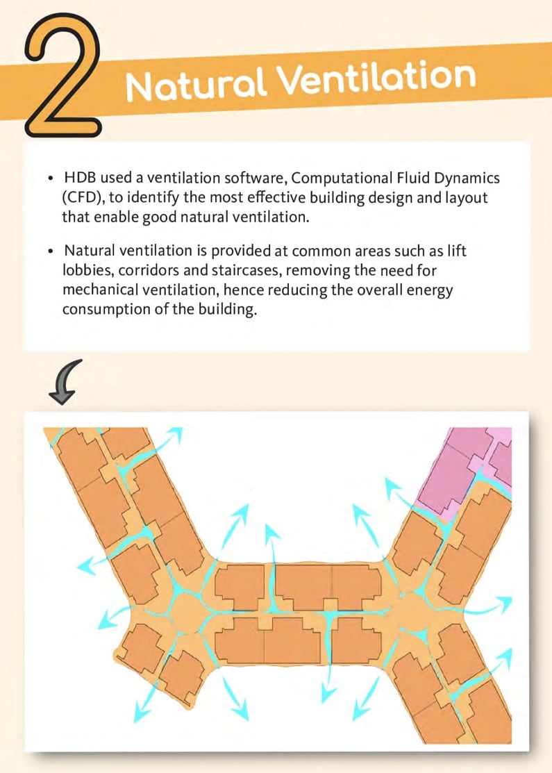
In case you are wondering why the corridors meander in such a way, it’s a deliberate design meant to improve natural ventilation here.
In addition to that, the corridor is also lined with energy-efficient lighting which features motion sensors so as to save energy.
The entire corridor is really, really long and there can be up to 82 units per level as each of the blocks are connected to one another.
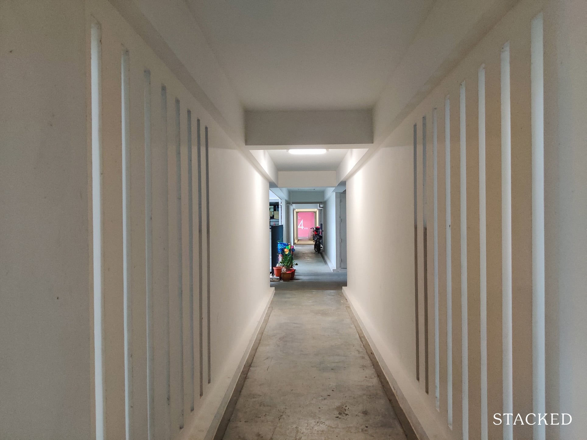
The long corridor style here really encourages you to walk past your neighbour’s home, which is supposed to foster a communal spirit much like the older block design. But this does come at a cost to your privacy which I believe most people would prefer today.
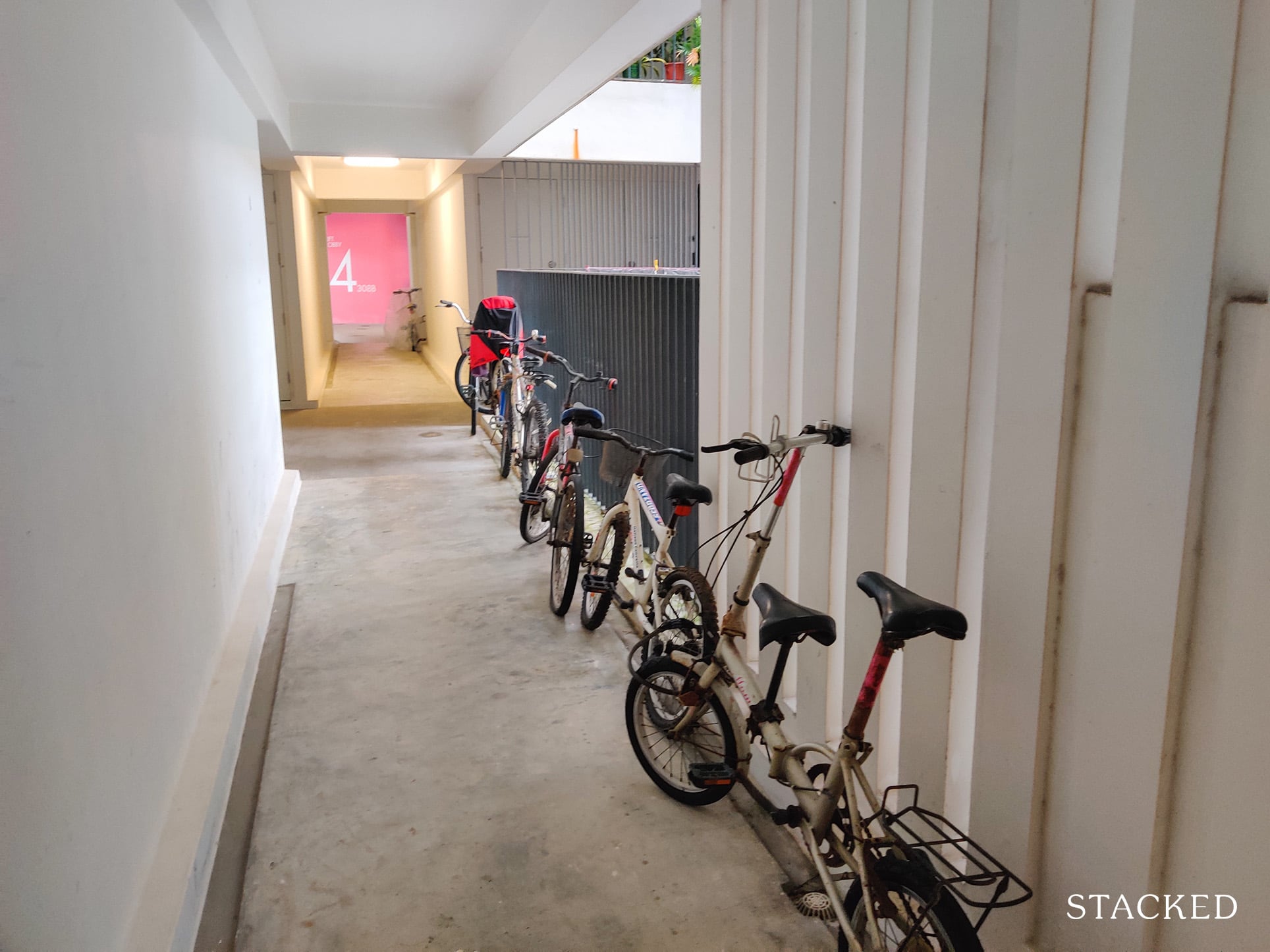
Given the number of units per floor here, the common walkway ends up being used to store things by residents. In this case, bicycles can be seen lined up on the side.
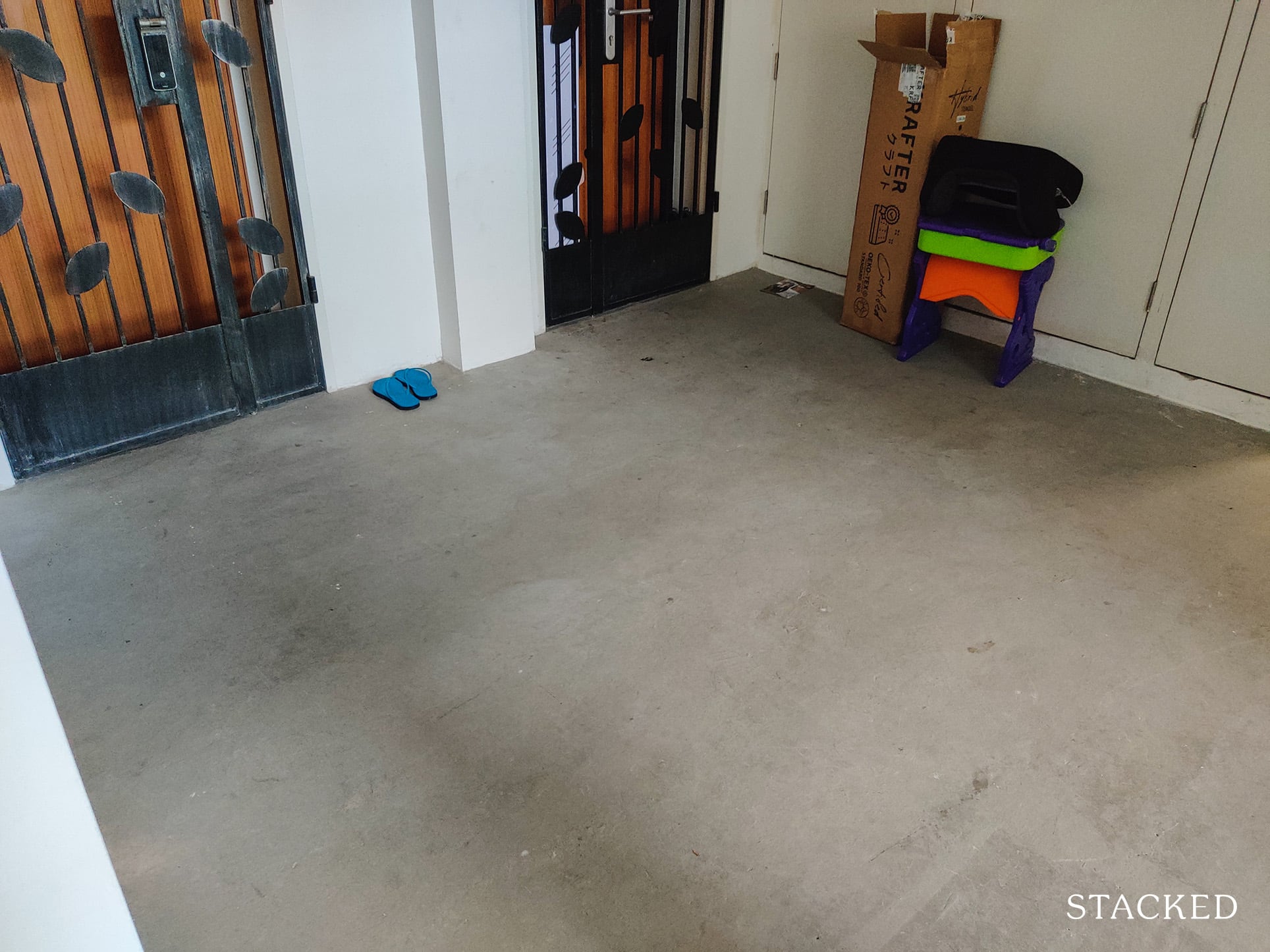
While the space afforded in front of each unit is decent enough to store a shoerack and perhaps a bicycle, I can still see why residents would encroach into the common corridor if they can.
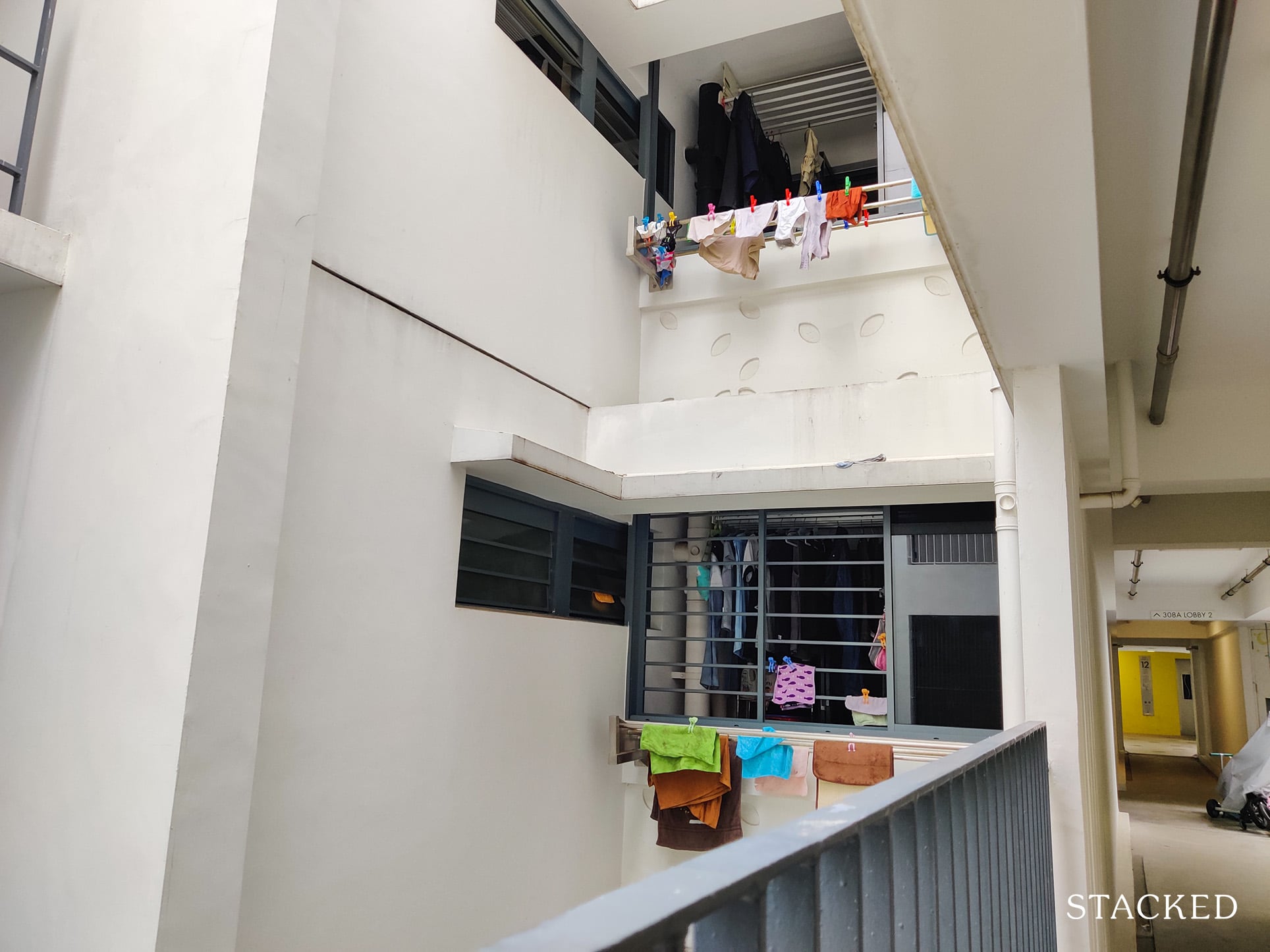
Perhaps one of the more notable issues along here are the service yards.
Firstly, you can look directly into them from the corridor, making privacy an issue.
Secondly, there seems to be a serious lack of sunlight coming into the service yards, which could explain why so many residents chose to hang their laundry on the Juliet Balcony itself.
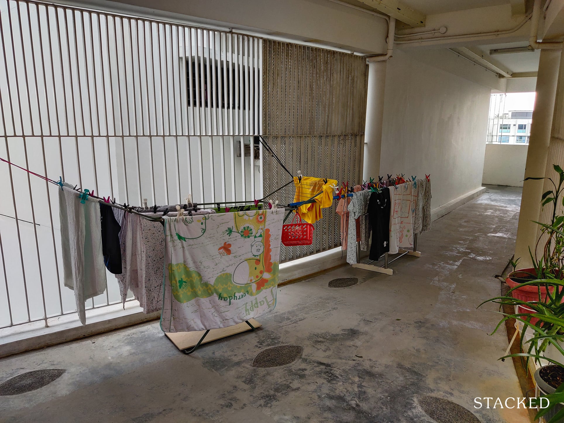
And if it’s not being hung on the Juliet Balcony, it’s even prominently displayed along the common corridor.
I wouldn’t be too harsh on this behaviour though – it’s really a consequence of when form trumps over function. So when presented with an open and long corridor with no one stopping you, this is the expected outcome.
Now let’s head onto one of the roof terrace.
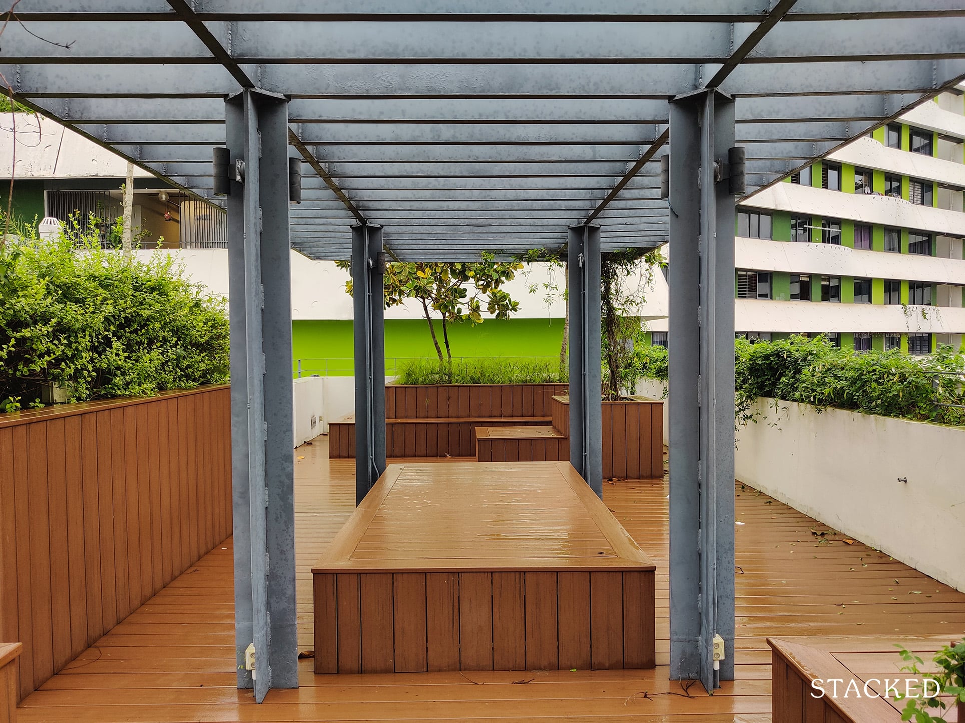
There are multiple roof terraces around the development. They feature seating areas as well as open spaces to do stationary exercises like Yoga and Pilates, an outdoor fitness area or a children’s playground.
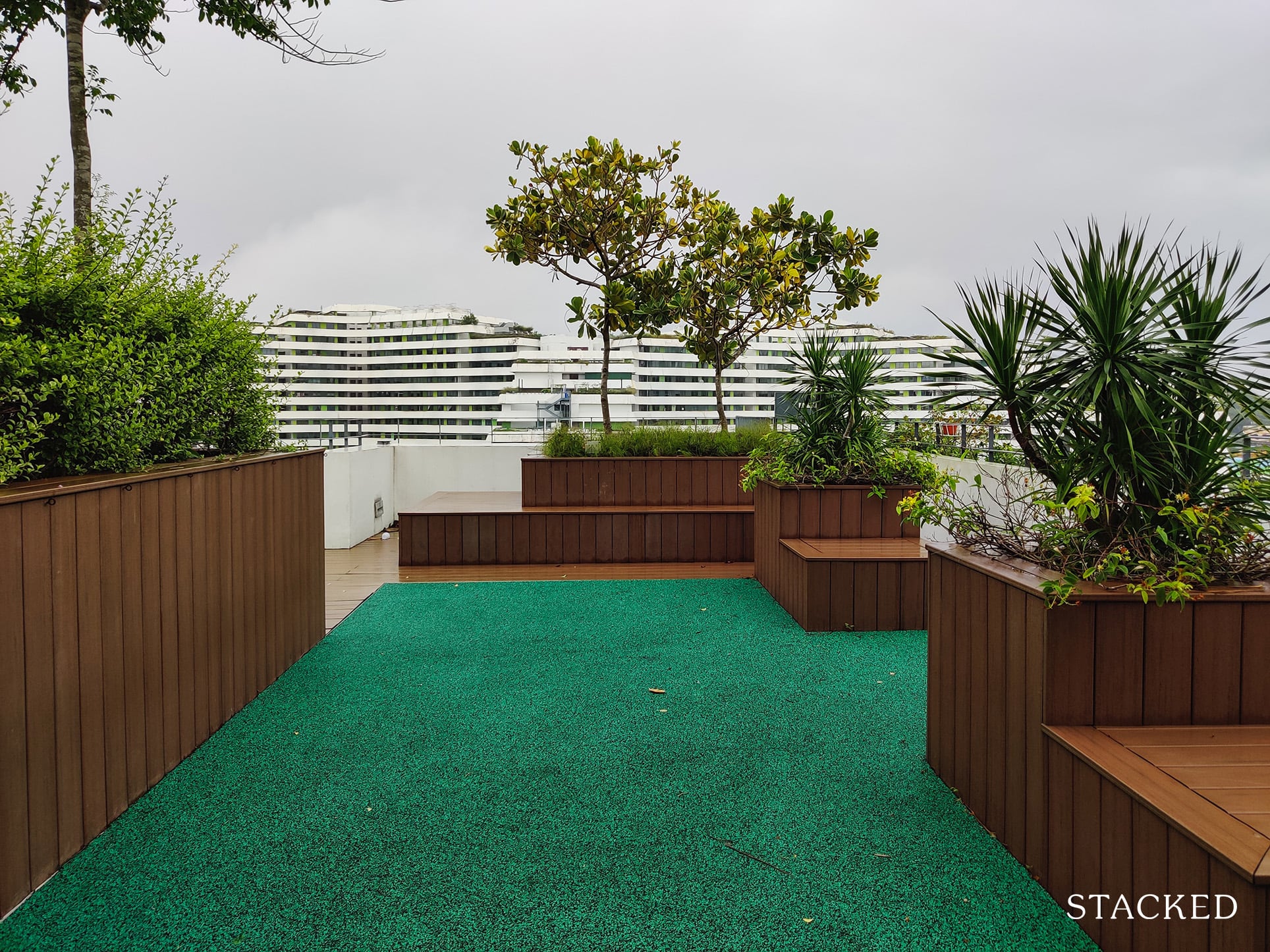
The roof terrace shown here features an open area, and it’s actually quite well-maintained! The wood and plant combination here works really well too.
In fact, I would say that this wood supplier is pretty decent considering how it looks to be the same wood used along the walkways I saw earlier.
Residents who prefer doing their exercises out in the open should find this spot private enough.
The only issue now are the constant sounds of construction going on with new developments in the area, but in the longer run, I do think this spot is great to wind down and relax.
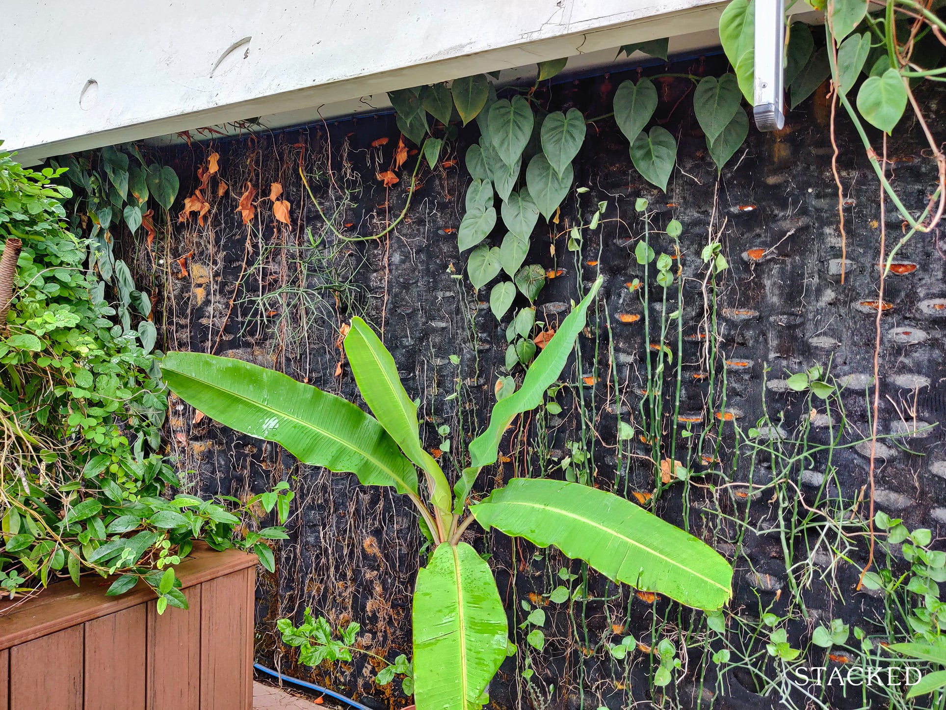
Around the back, there’s also a vertical garden which looks pretty nifty.
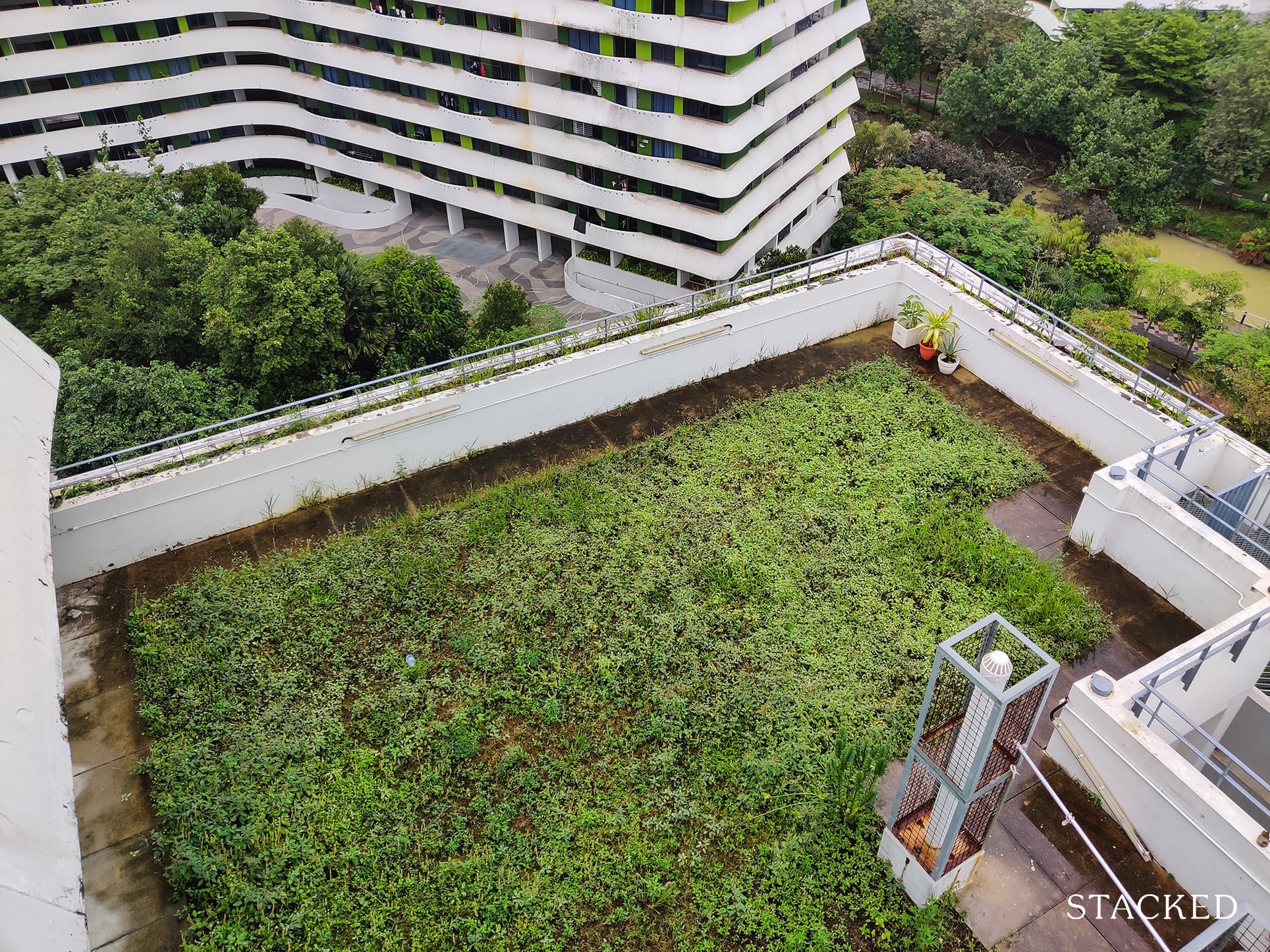
There are some parts of the roof terrace that looks slightly disappointing. I can understand that a patch of grass constitutes as a garden and to begin with, it wasn’t quite touted as one – but given how patchy it looks and how much space it takes up, I felt that more could have been done with it.
More from Stacked
November 2022 BTO Launch Overview: 9,540 Units On Offer At Queenstown, Kallang/Whampoa, Bukit Batok, Tengah, Yishun
HDB has ramped up production as promised, and this upcoming launch is where we’re starting to see it. There are…
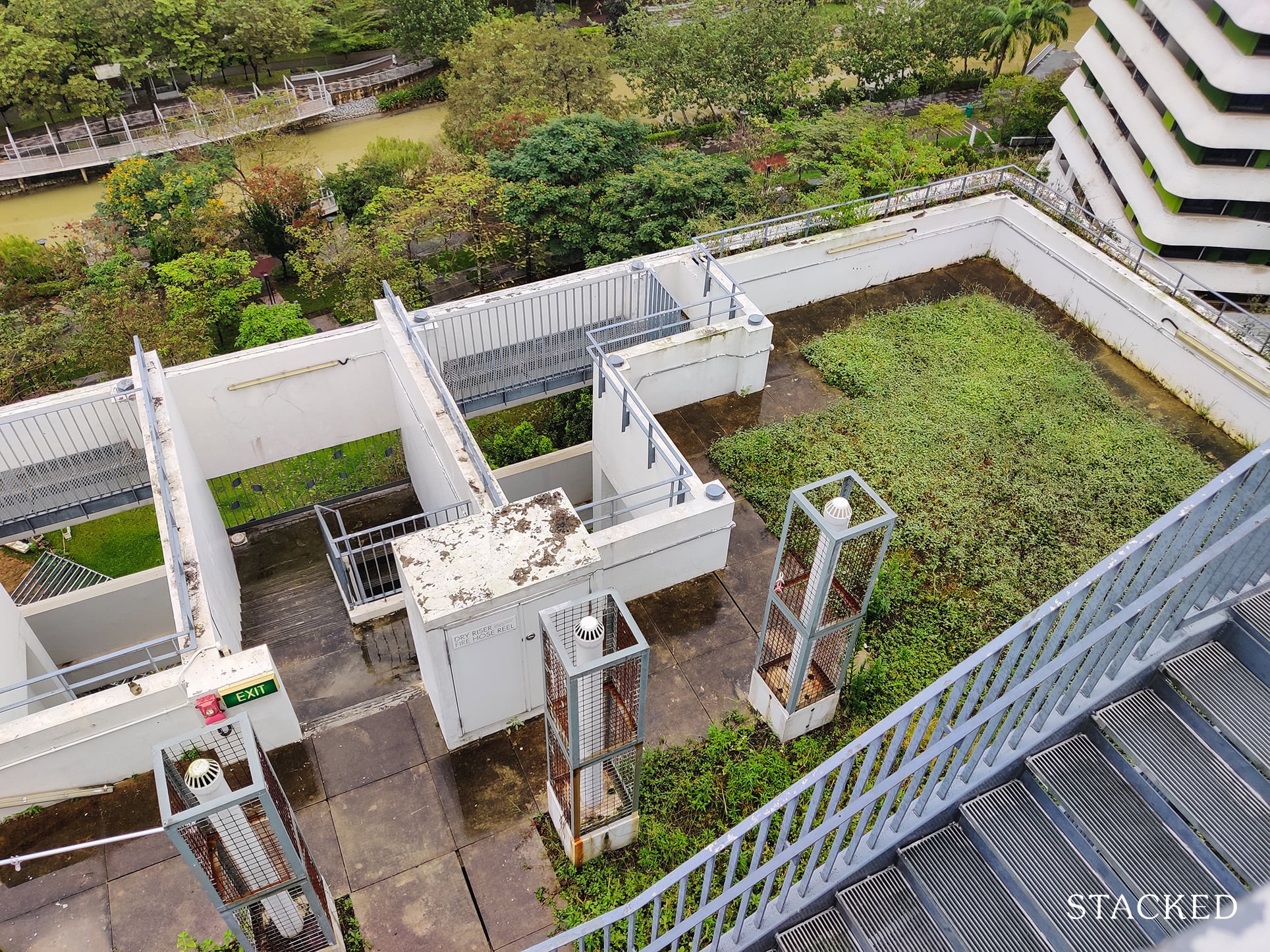
In case you’re wondering why there’re so many different levels here, the stepped nature of the roof gardens were actually inspired by the rice terraces you see in Asia.
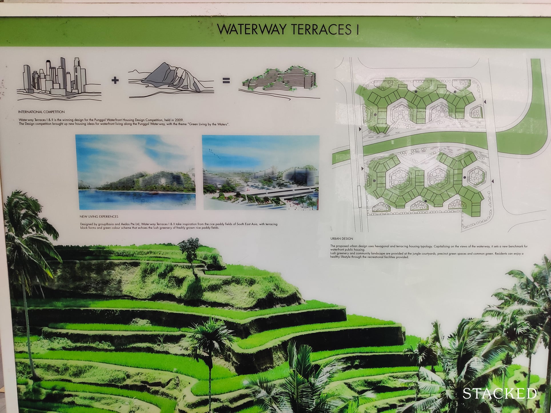
The illustrations painted an even more alluring picture.
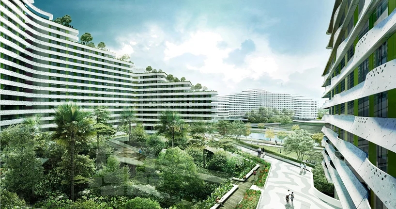
While these look great in marketing brochures, I think that a central common facility such as the one at The Pinnacle@Duxton is much better for 3 reasons.
First – a bigger area allows you to use multiple facilities more conveniently, rather than one having an open area, another having an outdoor fitness area and so on. What if, after doing pilates in the open area, I want to use the outdoor fitness area, all the while keeping an eye on my children who want to use the playground?
Second – with one central area, residents increase the chances of meeting one another which fosters community spirit better. There’s no separation of space there, and no guessing which floor one is on.
Third – having a central area that spans the development allows for a 360 degree panoramic view all around the development.
So while rice terraces work great for crops, it’s not so much a good source of inspiration (in my opinion) for residential living.
During a sunny day, it’s also common to see residents hanging their clothes and sunning their shoes here, which you can see in our Waterway Terraces Insider Tour video.
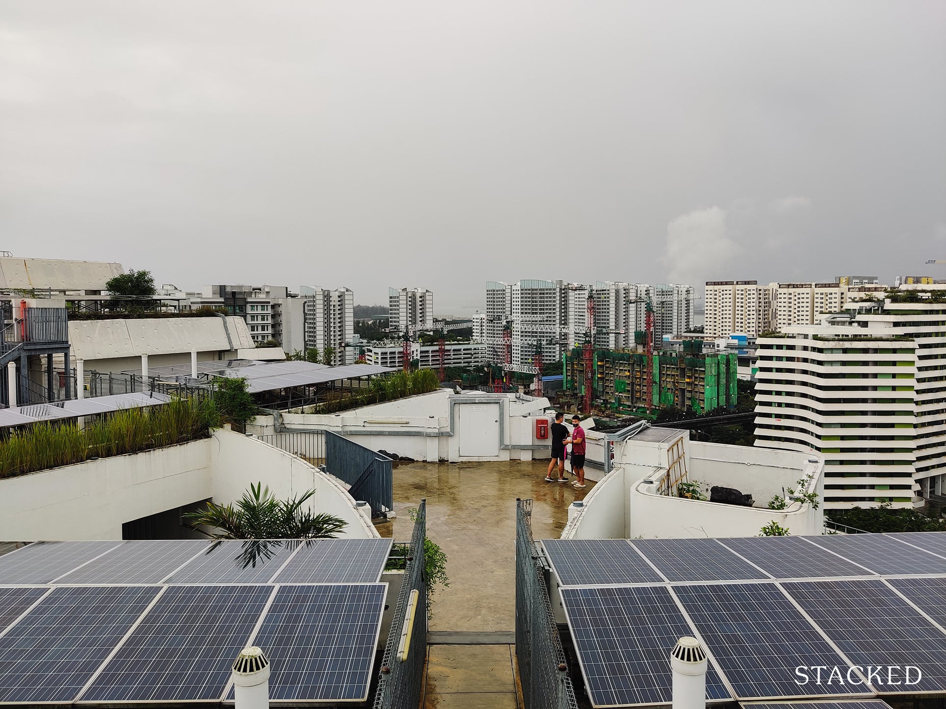
Not all roof terraces feature a garden though. Some/most of them are used used to house solar panels. If there’s any physical place here that’s most telling of its eco-friendliness, it has to be this.
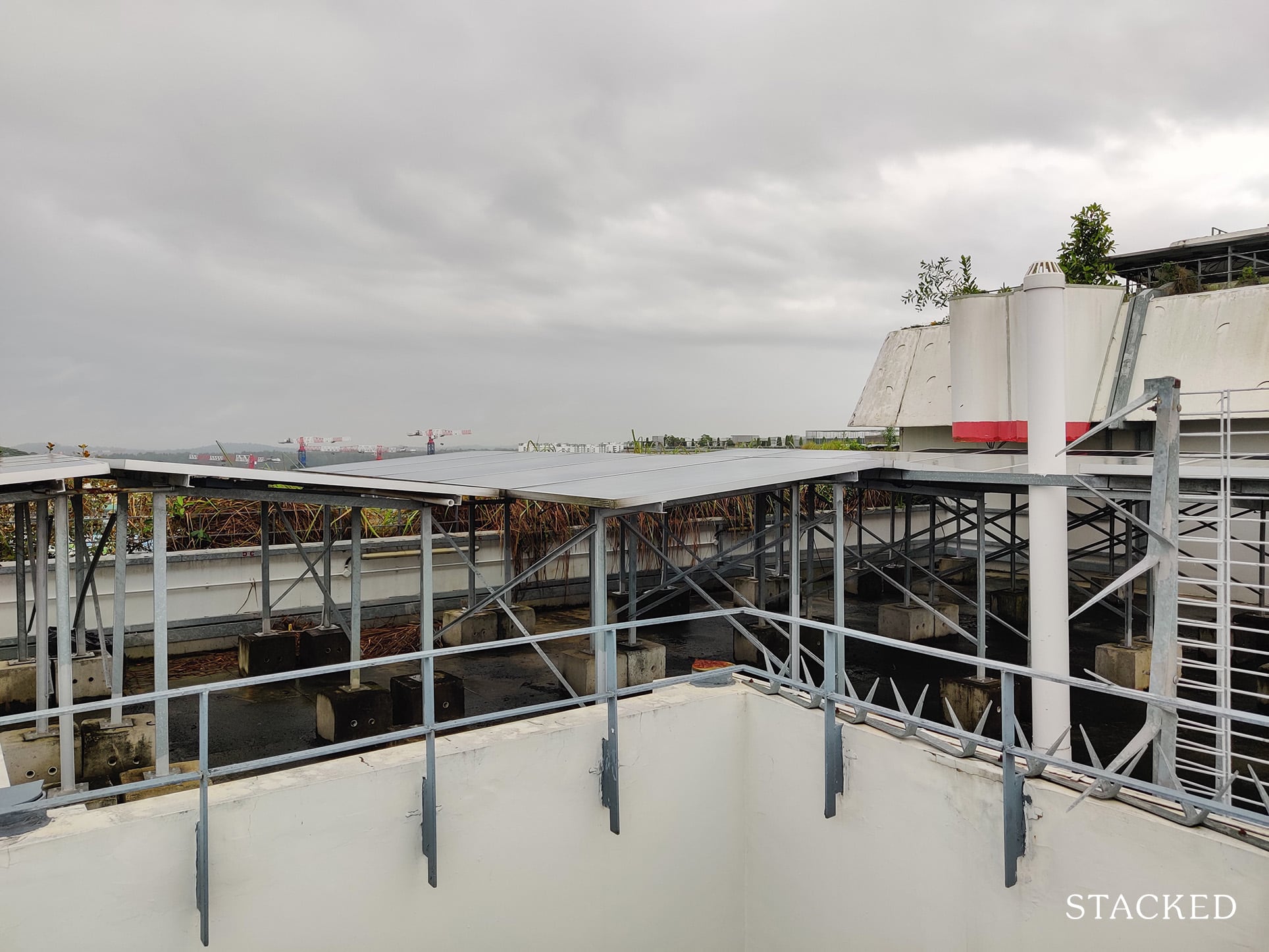
It’s nice to see the adoption of solar panels for this HDB project, and I do hope HDB will consider doing more of this in the future.
It’s pretty cool actually, as a result of the many eco-friendly features in this development, Waterway Terraces I has achieved the Green Mark Platinum Award, and has an annual saving of 1,578,200 kWh per year.
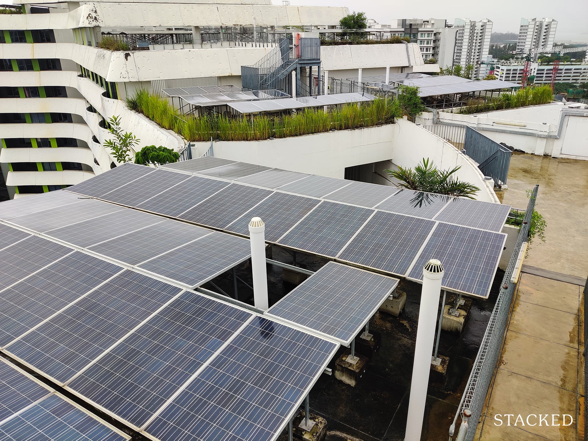
To put it into perspective, according to the Energy Market Authority of Singapore, a typical 4-room HDB household consumes approximately 4,309 kWh per year in 2019. So this equates to powering about 366 4-room flats annually!
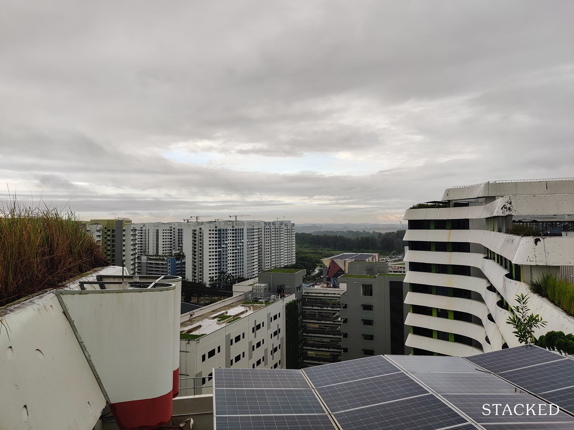
It’s also from here that you are afforded some views – this one here is towards Yishun.
Now let’s head back down to check out the Common Green where the main facilities on the ground level are located, right next to the Promenade.
The Common Green features pretty standard facilities that are located right next to the Park Connector, so it can be quite popular with the public too.
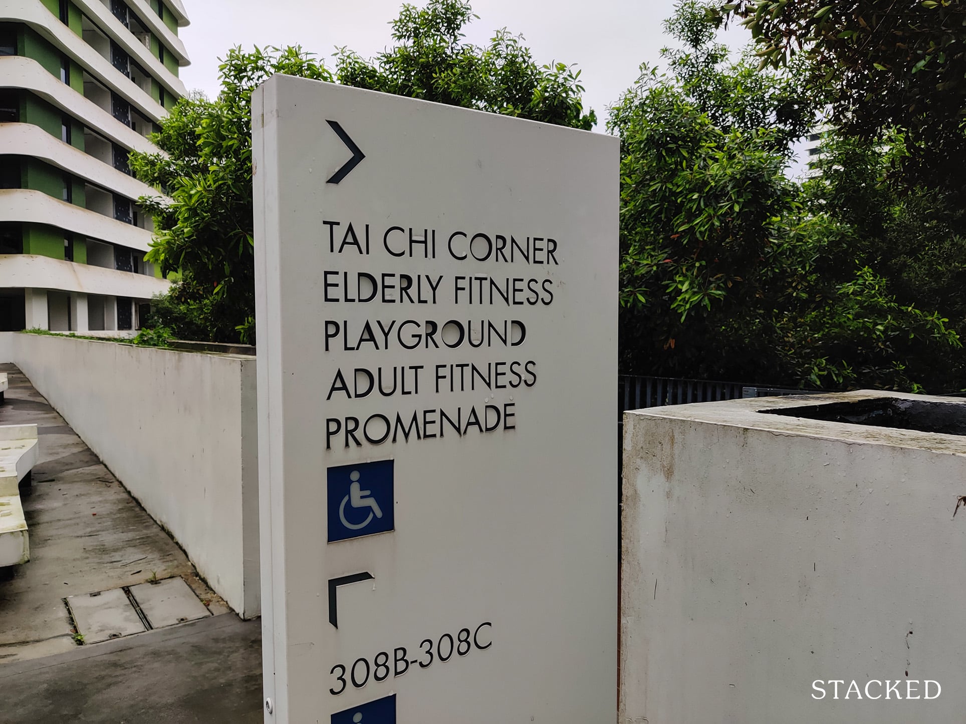
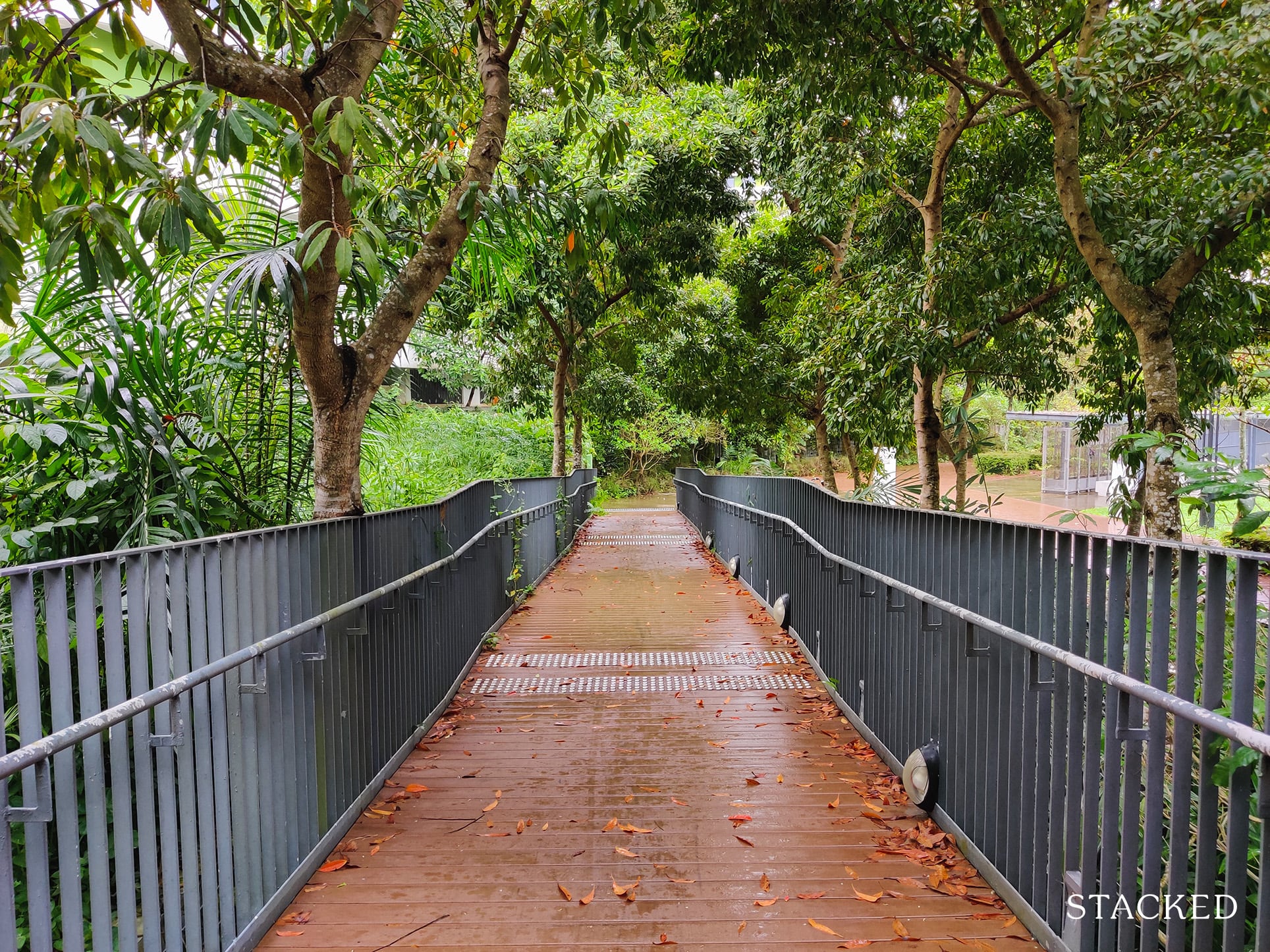
I’m happy to see a wheelchair-friendly path down here, which is quite a pleasant trail given the flora all around.
It’s also over here that you’ll see a display about the Rain Garden.
The Rain Garden is actually quite a special feature. To the lay person, the surrounding nature is just greenery, but the landscaping here is quite a deliberate one.
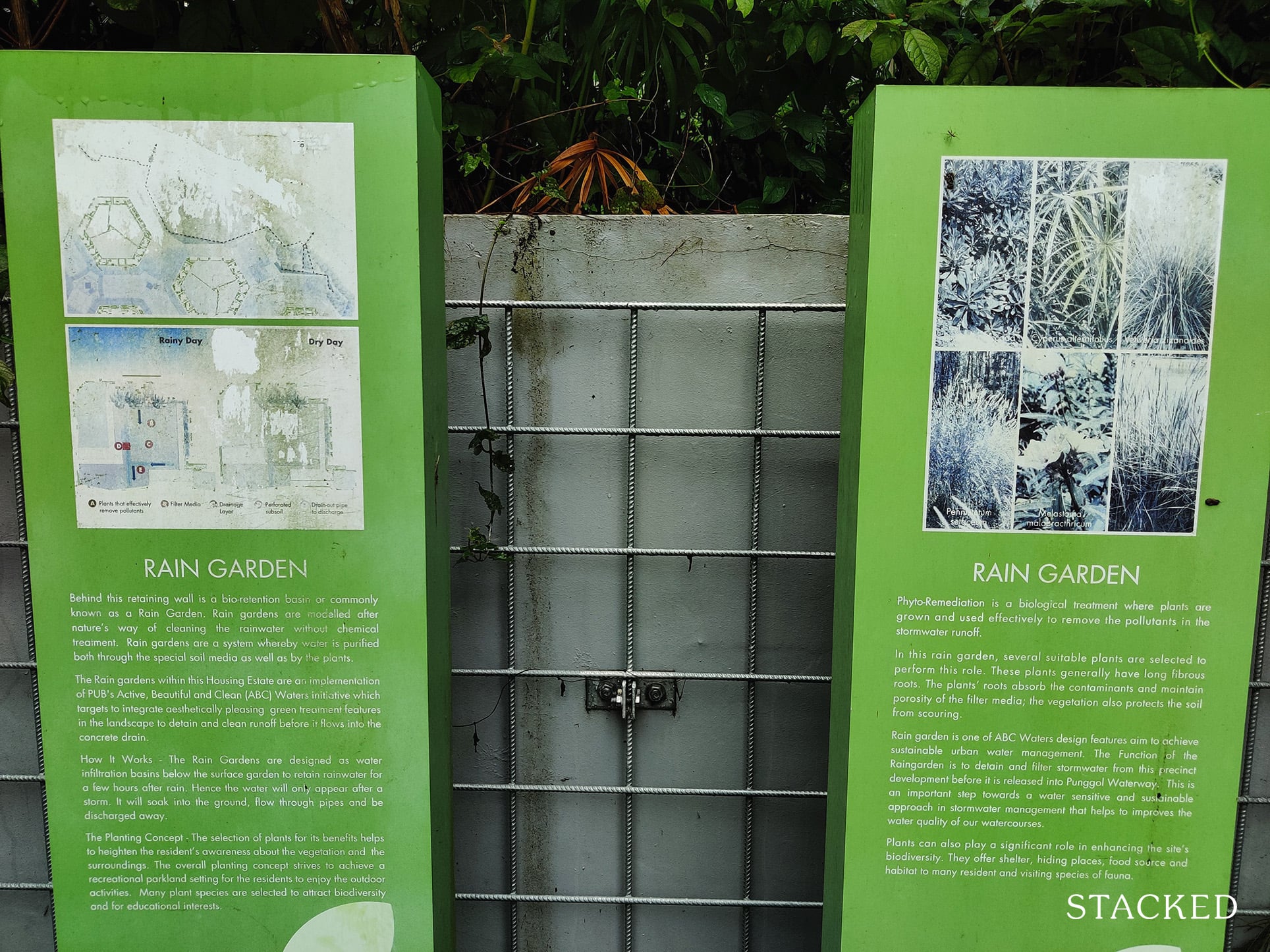
As a curious bit of trivia, The Rain Garden is meant to detain and treat more than 35% of run-off from the catchment area, and less compacted soil is used to encourage infiltration – mimicking the way nature cleans water and serves to be a more effective way to manage water.
The landscaping here also blends in very well with the Park Connector right next to it.
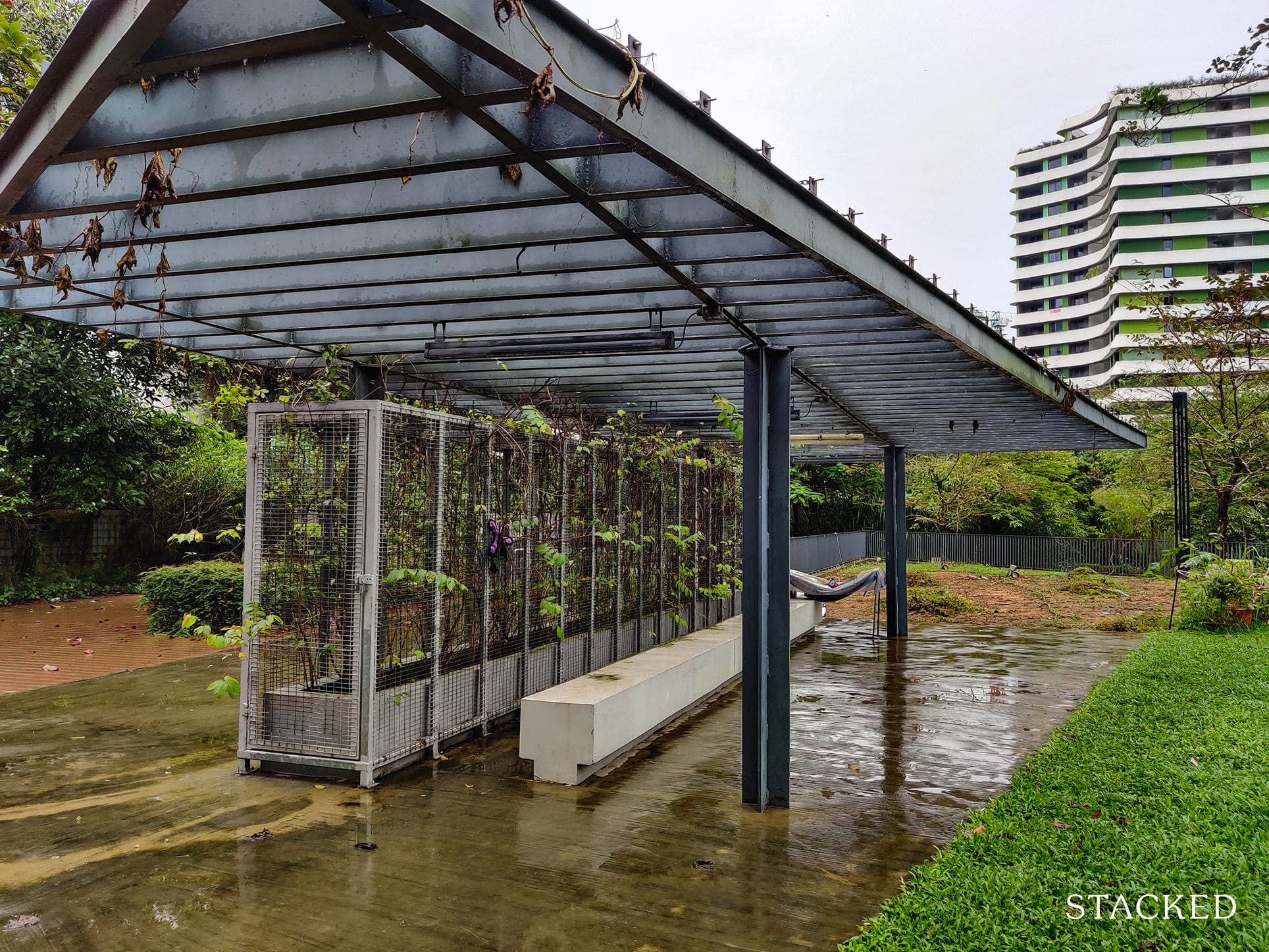
On the extreme west side of the Common Green area is a pergola.
What’s a pergola you ask?
Well, according to Wikipedia, a pergola is “an outdoor garden feature forming a shaded walkway, passageway, or sitting area of vertical posts or pillars that usually support cross-beams and a sturdy open lattice, often upon which woody vines are trained.”.
I think it’s quite a nice idea to have a pergola here for educational purposes, though I must say that on a day like this, the area certainly looks quite unsightly – especially with the dead leaves hanging on the shelter and the patch of dirty round the back.
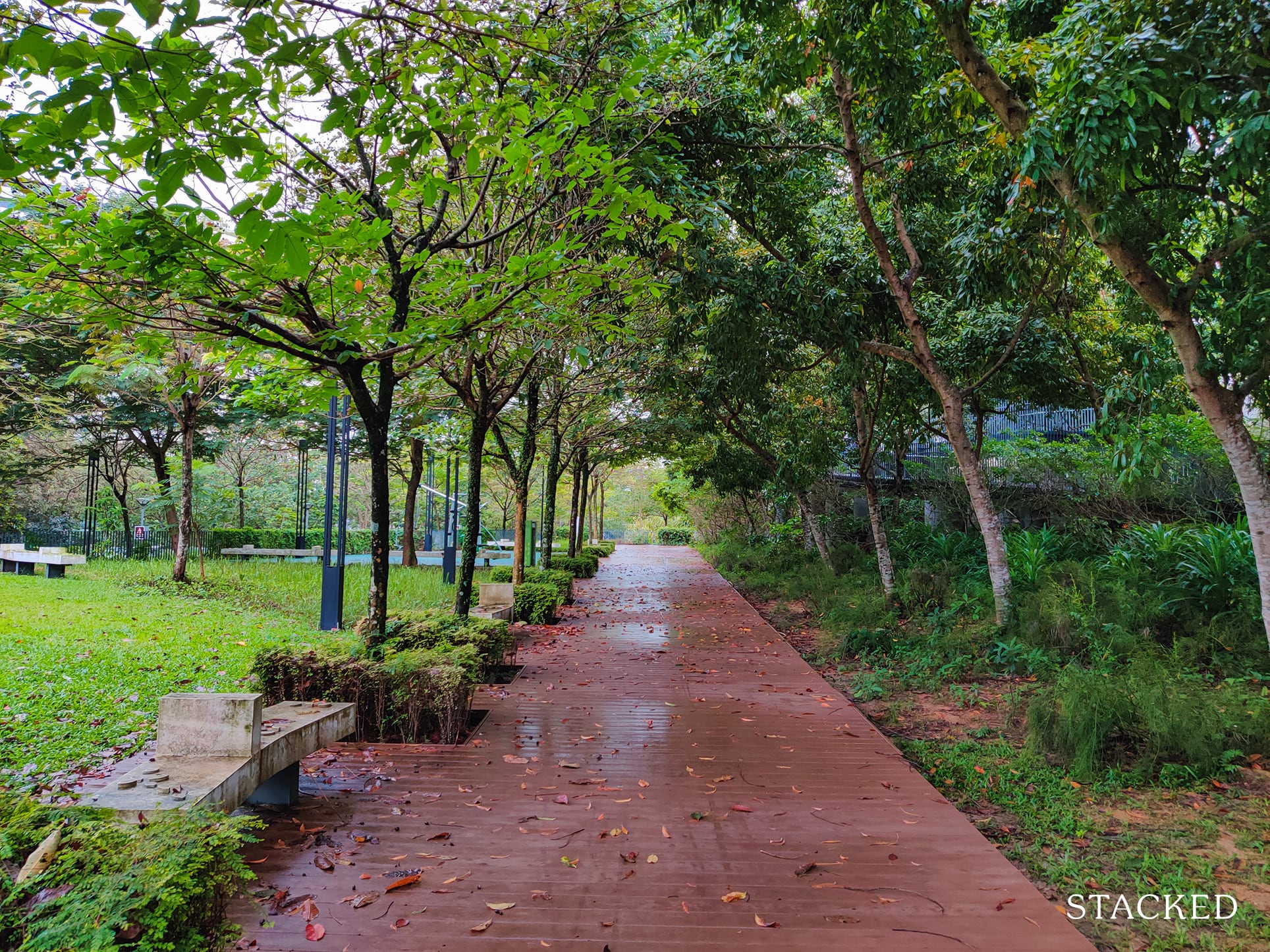
The Common Green area also features a beautiful walking path surrounded by lush greenery on both sides.
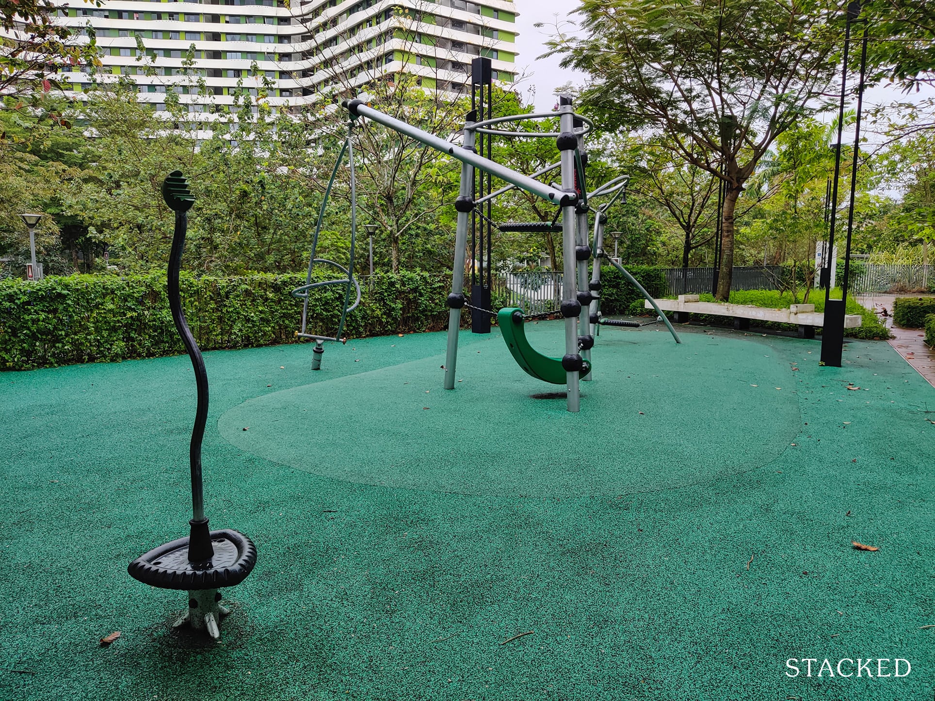
Which then leads you to the playground.
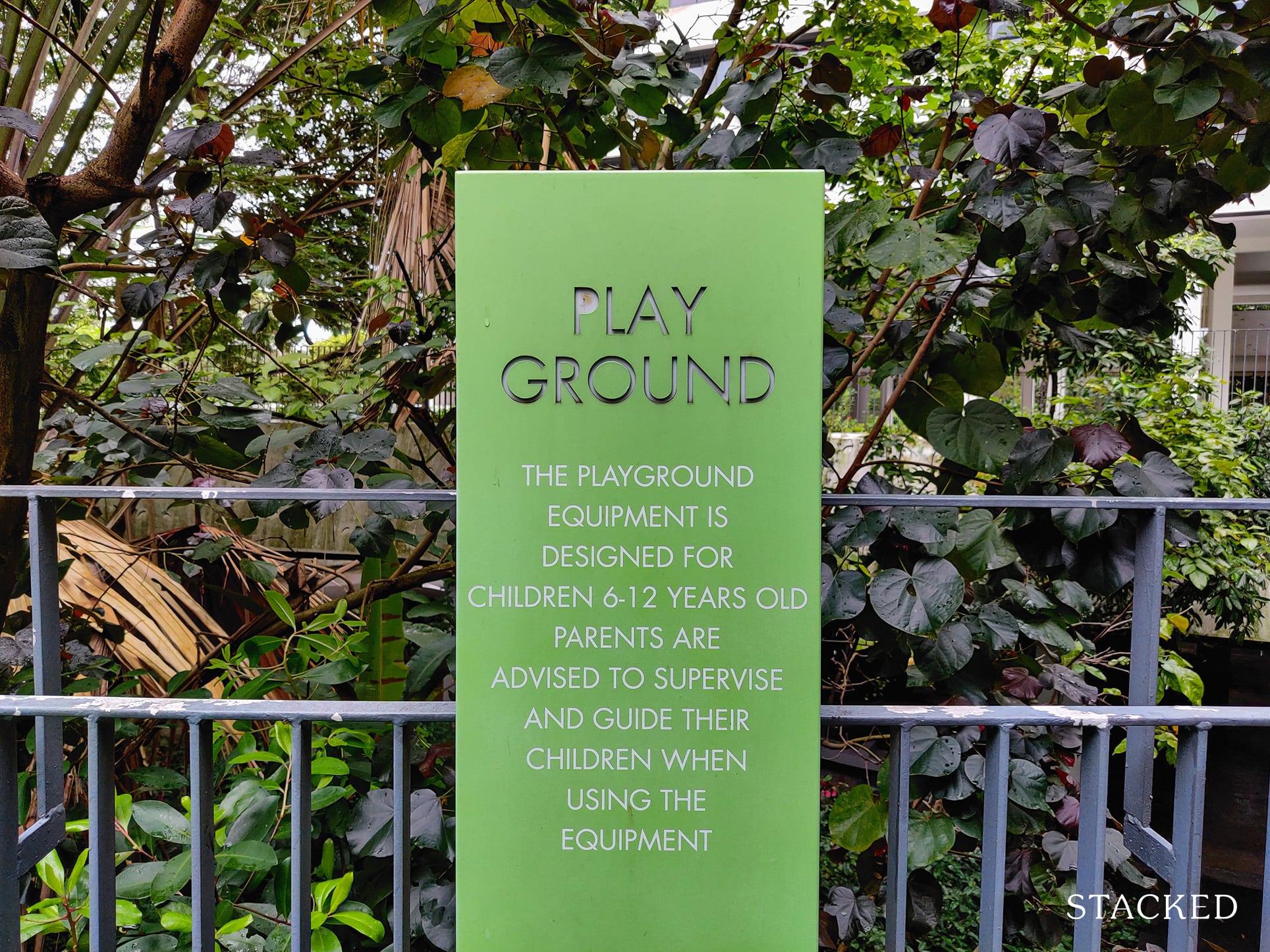
Now I’m not sure about you, but this certainly does not look much like a playground to me. Instead, it really looks like something out of a cross-fit gym.
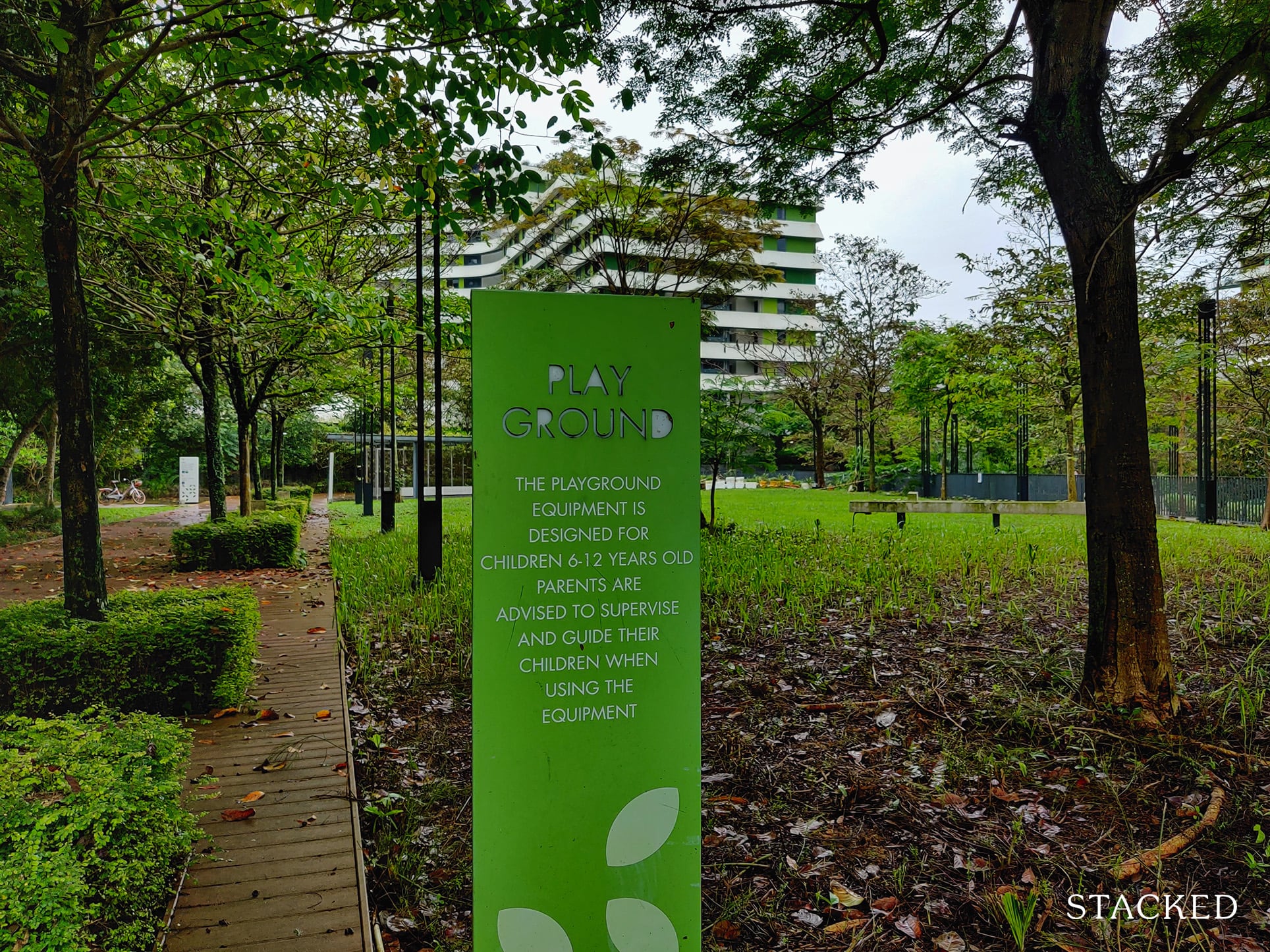
Unsure of what this was, I looked around for some guidance and can confirm that this is indeed for 6-12 year olds.
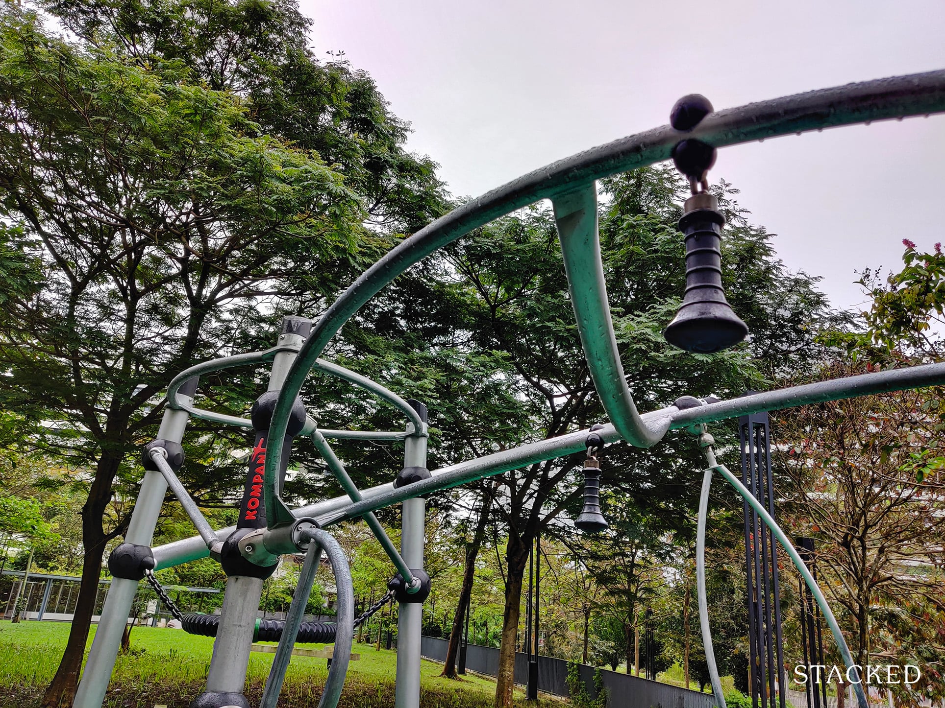
This is some pretty extreme monkey bars I must say.
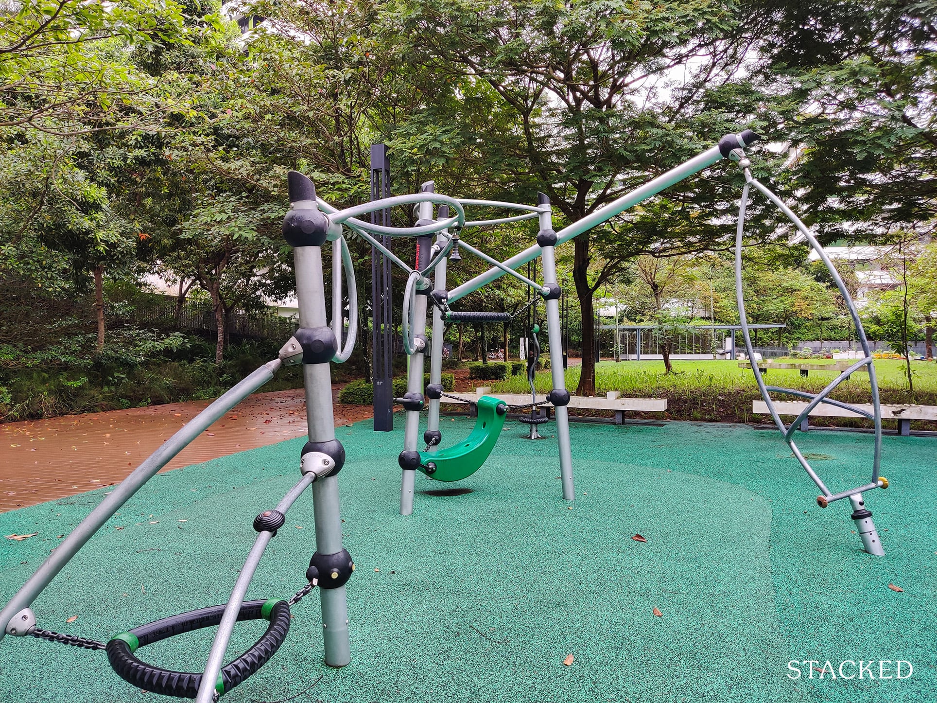
If you must know, the manufacturer of this playground is called Kompan.
It turns out that this playground is part of a series called “Galaxy’ which is built to accommodate the play needs across a diverse range of ages which explains why it doesn’t look so kiddish.
Indeed, a playground that’s out of this world (get it?).
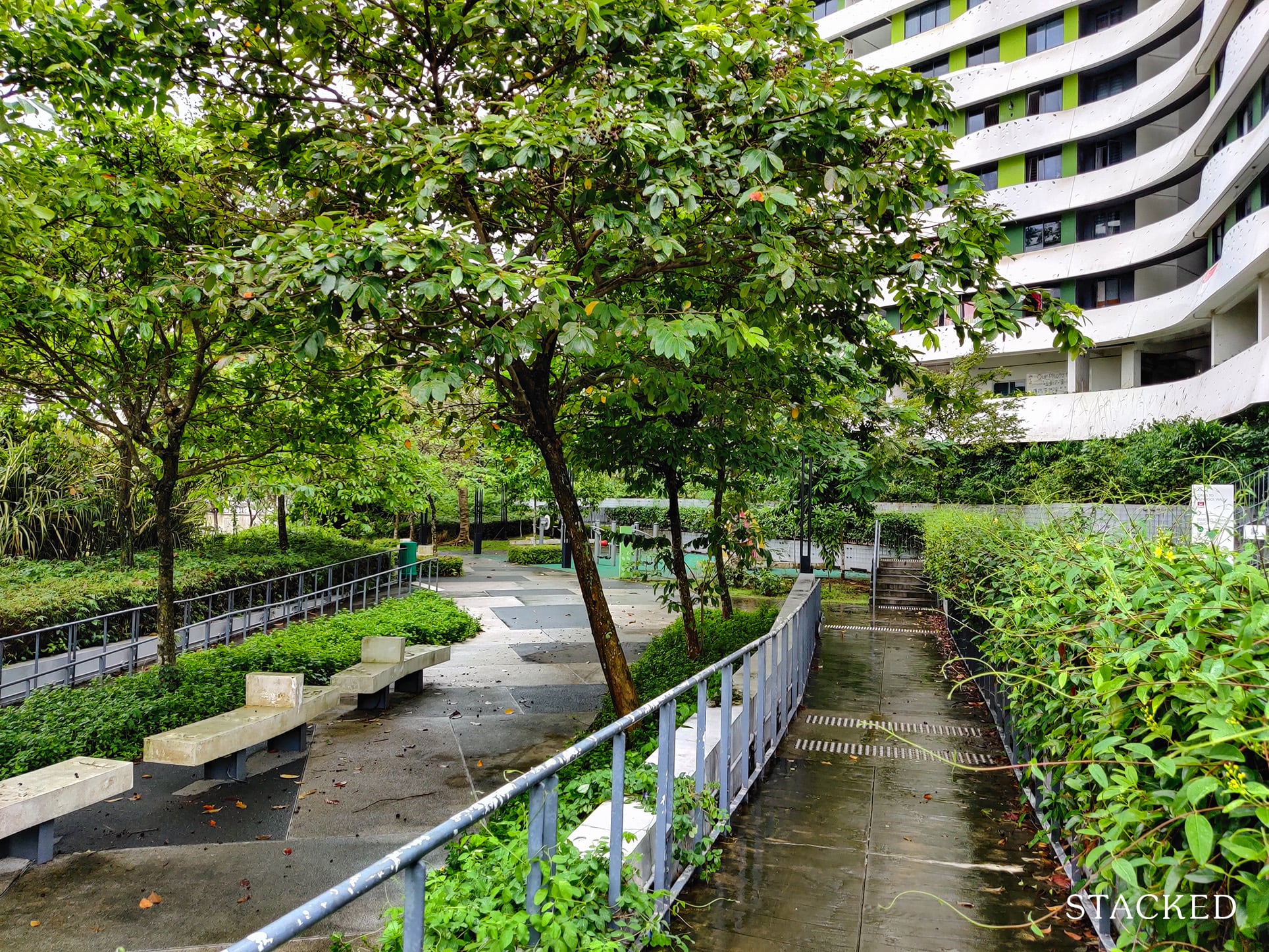
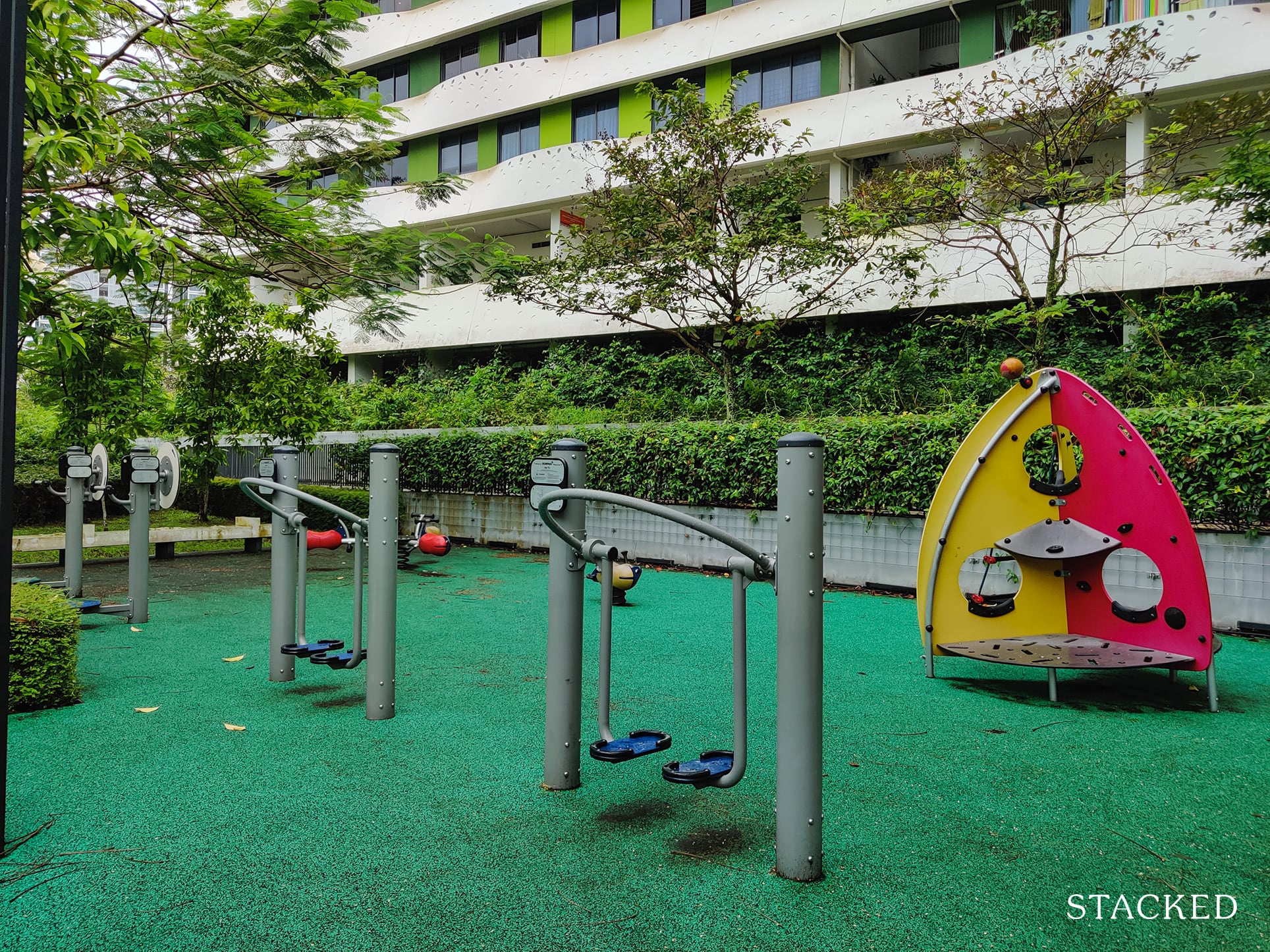
Moving on, there’s the usual outdoor fitness area. The ones below do not look too impressive in terms of variation, but there are more machines on the other side of the Common Green too. It’s a good thing that there are also more on the roof terraces, which I suppose are more private given this one is located right next to the Park Connector.
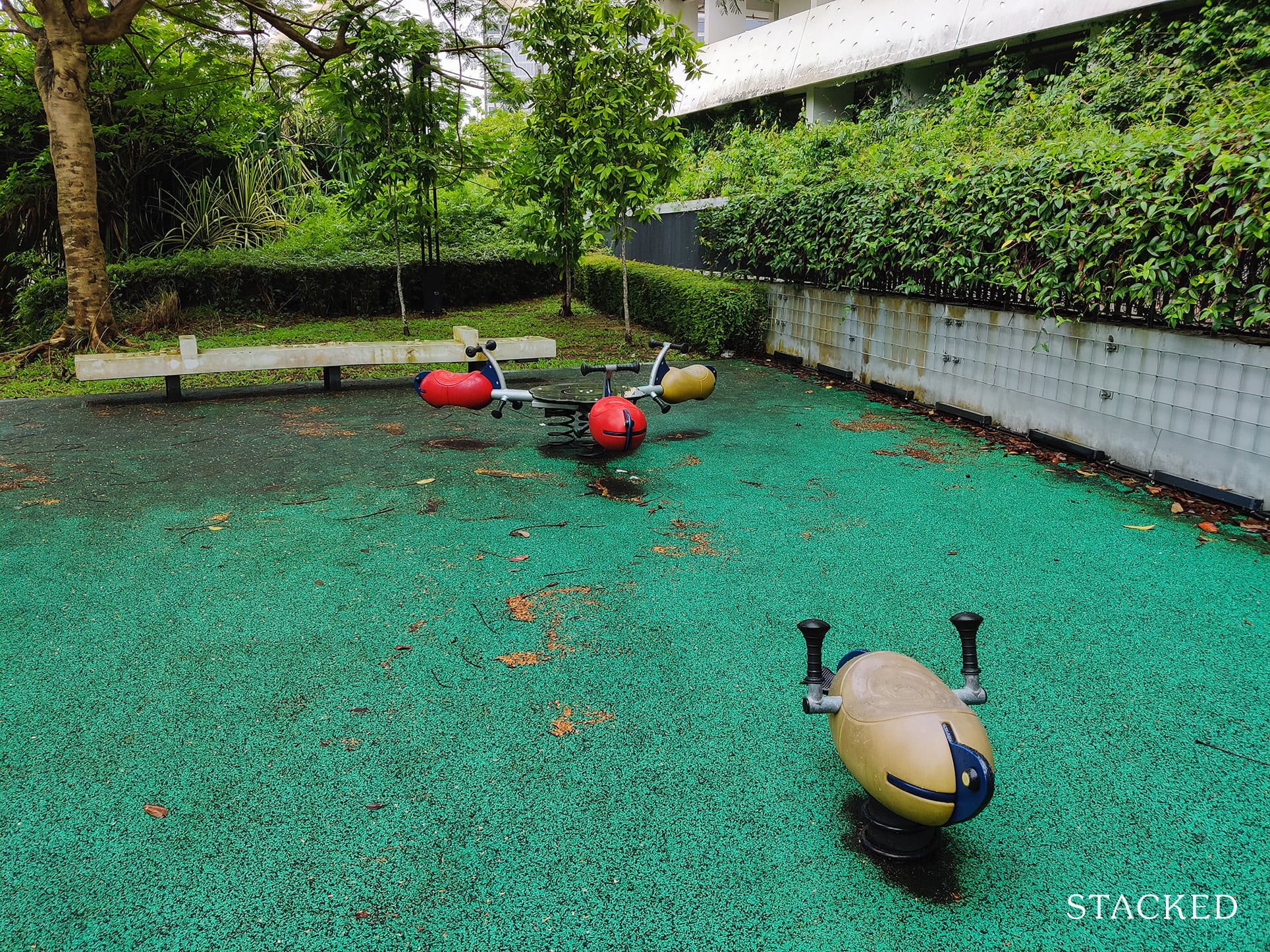
A playground for toddlers can also be found here.
What’s also great about the Common Green is its seamless connection to the Park Connector – a deliberate design meant to integrate nature with living. When I was here, it was common to see residents entering and exiting the development via this pathway.
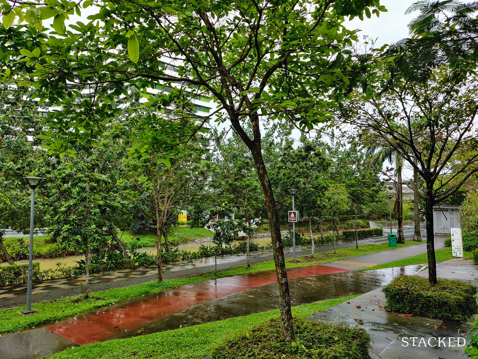
Waterway Terraces I Location Review
One of Waterway Terraces’ main advantage compared to other HDBs in Punggol is its location and it’s probably the most common reason why anyone would buy a unit here.
First of all, it has the advantage of having a seamless connection to the Park Connector Network – a huge plus in my books.
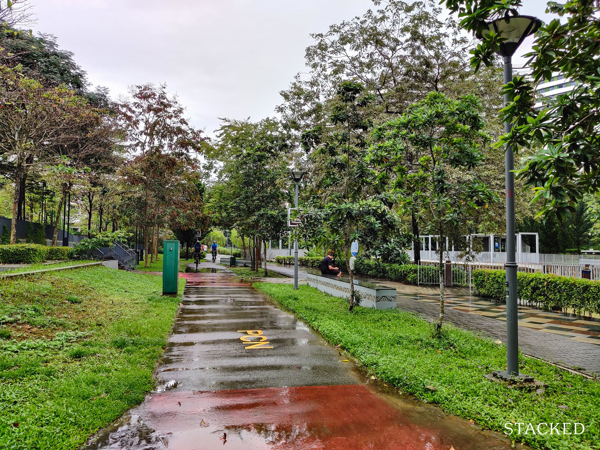
Considering that HDBs lack a diverse range of facilities unlike condos, having the network at your doorstep opens up the possibility of not just activities along the connector, but added convenience when it comes to reaching certain hotspots such as the SAFRA Punggol.
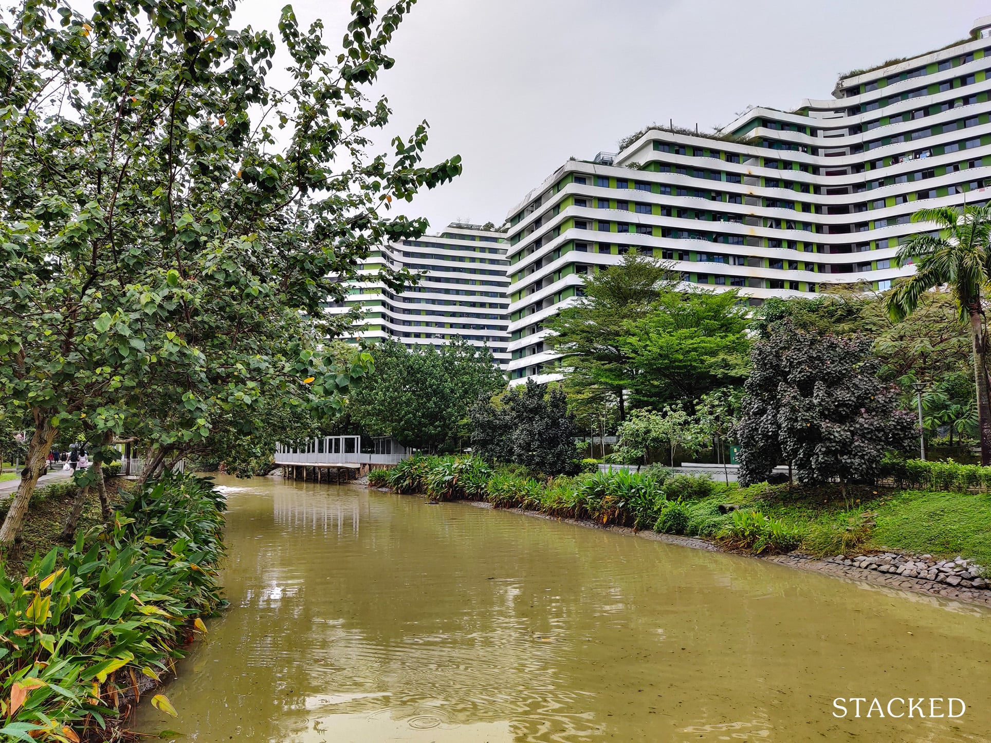
Regardless of the time, residents are able to enjoy a scenic and tranquil walk along the park connector. In fact, I would go so far as to say that the walkways provided in Waterway Terraces are no longer relevant given how easy it is to reach the Park Connector!
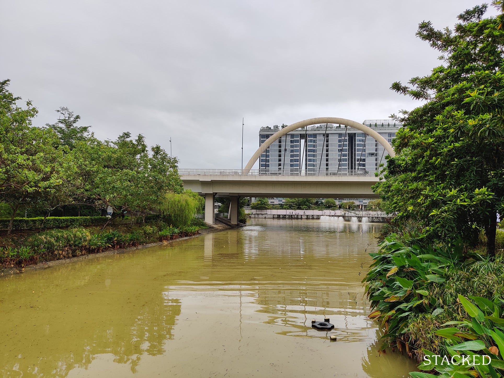
The Park Connector here also quickly connects residents to the “North-Eastern Riverine Loop”, a 16km network around the scenic Punggol and Serangoon rivers.
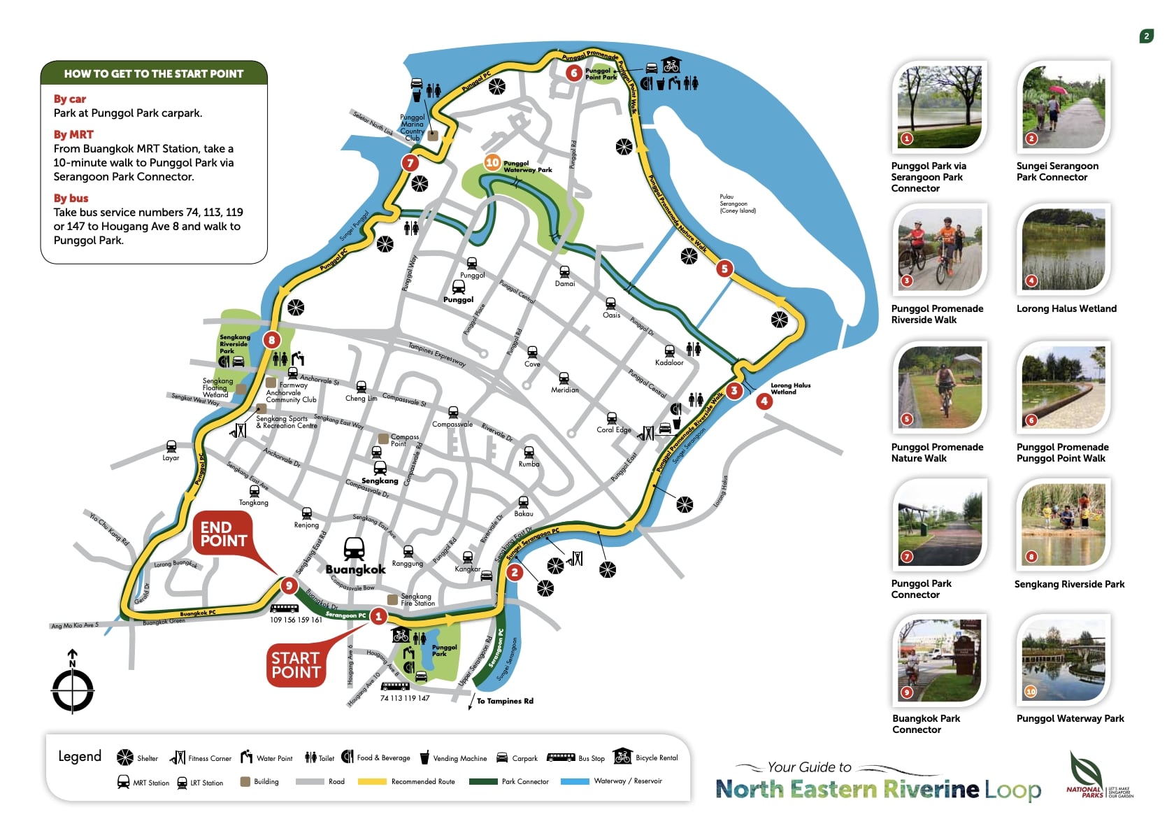
Along the way, there’re many detours one can take like heading to Punggol Waterway Park or Coney Island.
Having cycled along this loop myself, I can happily say that it’s really one of the best cycling routes you can take in Singapore given the smooth and wide riding paths, the scenic views and the accessibility of the place.
In fact, when friends or family drop by Singapore and ask what I’d recommend as an off-beat thing to do, I always mention the cycling network around here.
The little detour to Coney Island also offers an off-road type of experience!
Now, right in front of Waterway Terraces is the main Punggol shopping centre: Waterway Point.
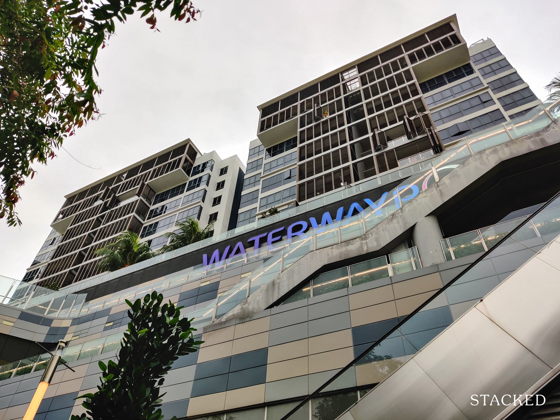
The 4-storey shopping centre is located right beside Punggol MRT and boasts over 200 shops, including a cinema that houses an IMAX facility.
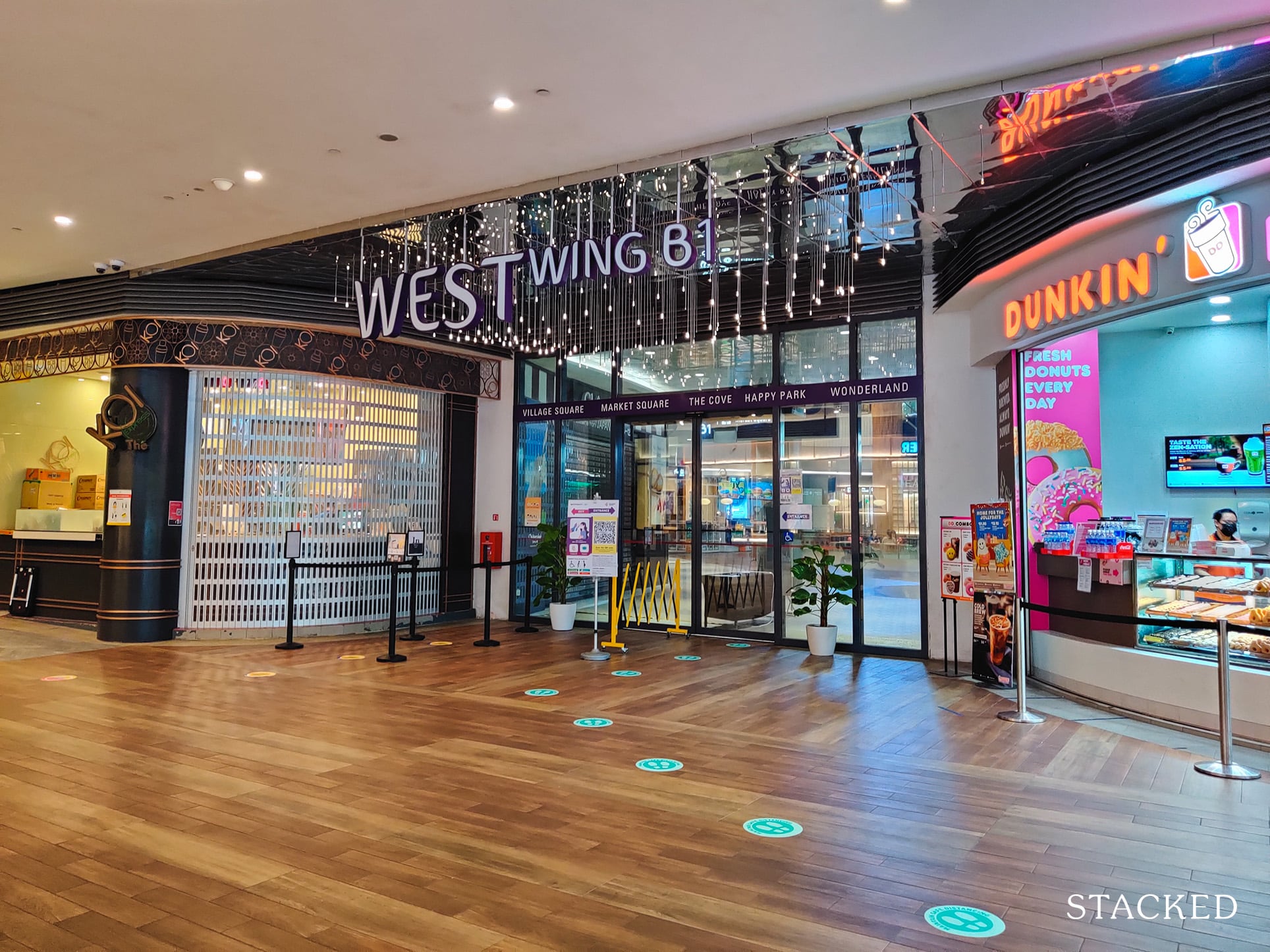
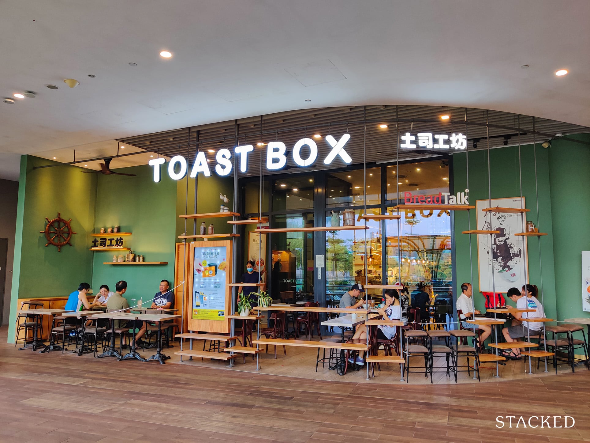
If the food court below Waterway Terraces isn’t enough, there’re also plenty of eateries here!
Residents can also enjoy the view of the river. It’s from here that I can really see how Waterway Terraces truly provides the riverfront living lifestyle.
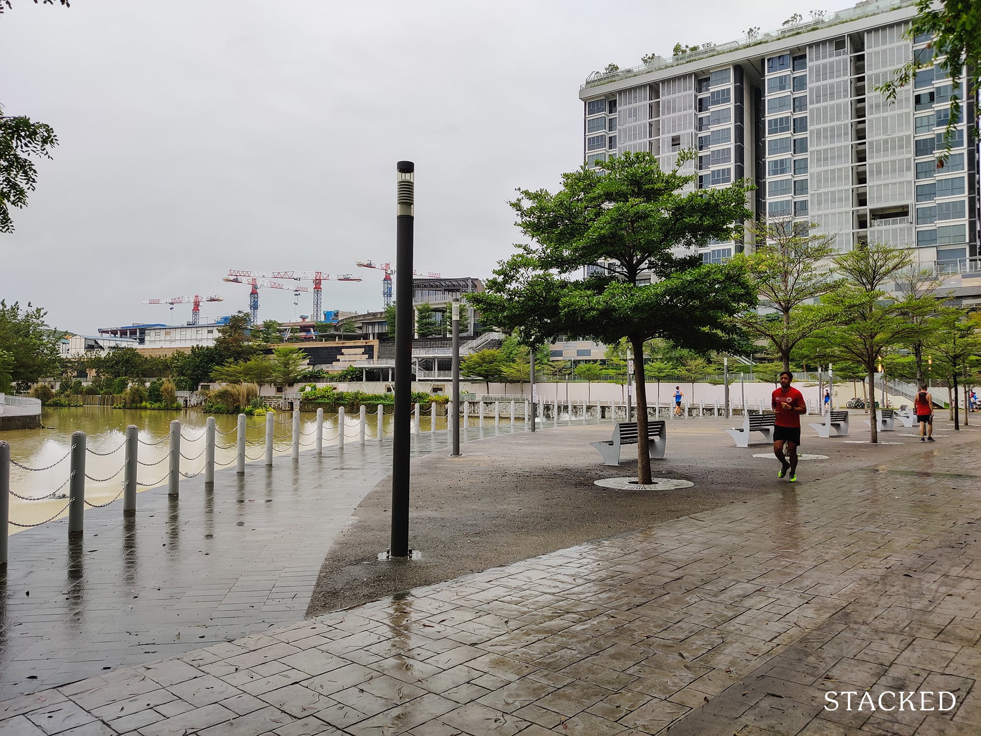
Across the bridge is Waterway Terraces II, which is very similar to Waterway Terraces I. For residents living there, it would be slightly more inconvenient in reaching both the MRT and Waterway Point.
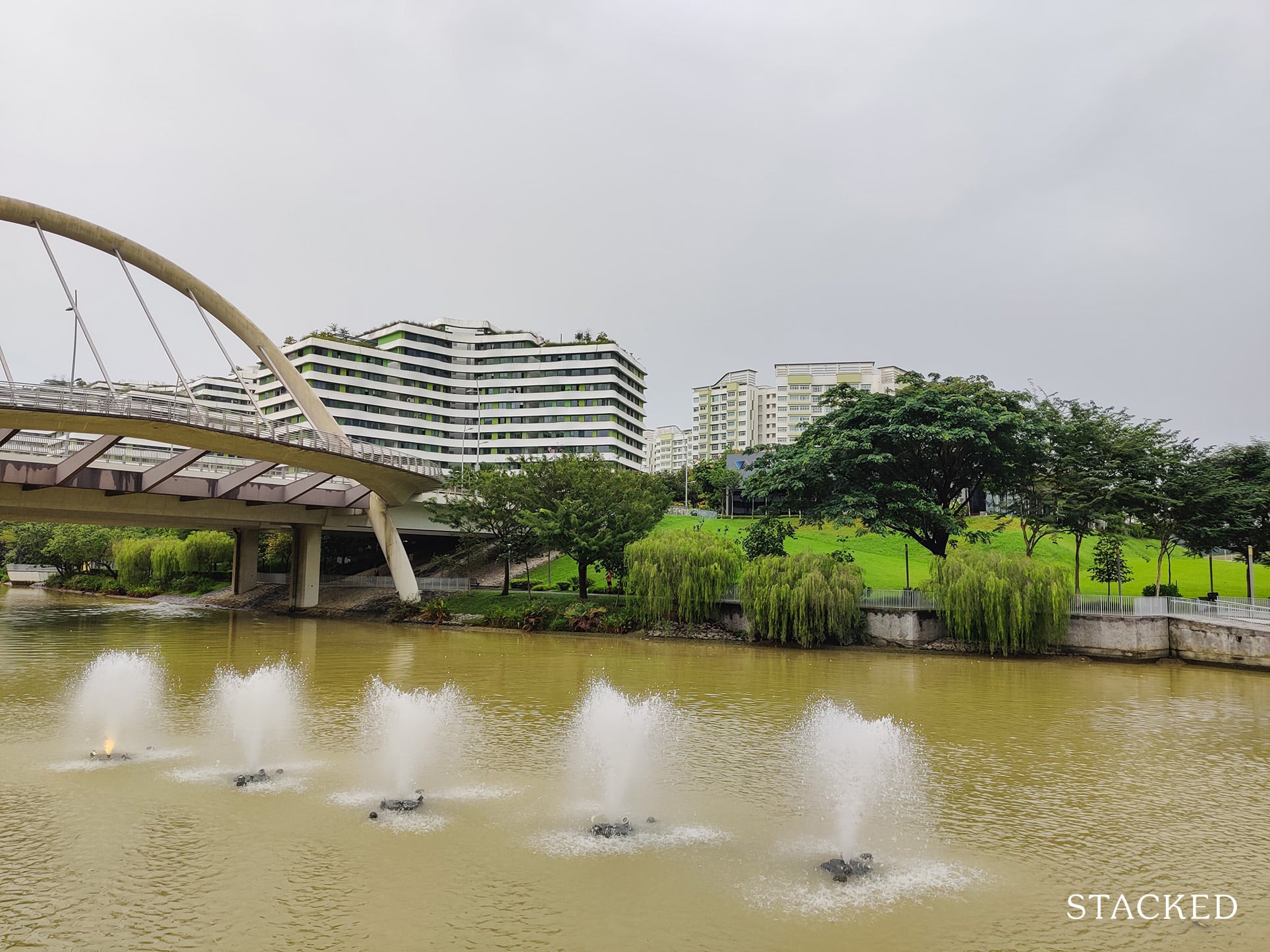
Overall, I would say that the location is probably Waterway Terraces’ strongest point – both due to the seamless Park Connector access, as well as its proximity to Waterway Point and Punggol MRT.
Public Transport
| Bus station | Buses Serviced | Distance From HDB (& Est. Walking Time) |
| ‘Opp Blk 264a’ | 43, 43M, 43e, 117, 118, 381 | 350m (4 min walk) |
| ‘Bef Blk 264’ | 43, 43M, 43e, 117, 118, 381 | 400m (5 min walk) |
Closest MRT: Punggol MRT station; 5-min walk. The walk along Punggol Central is unsheltered and leads straight to the MRT.
By train, the journey to Orchard MRT takes around 40 – 45 minutes and requires a transfer at Dhoby Ghaut interchange onto the North-South Line.
Those working in the CBD would take around 40 – 45 minutes by train as well to reach Raffles Place MRT.
While Punggol is a dense neighbourhood, it’s actually a better neighbourhood to live in if you’re looking to take a seat for your MRT ride to the CBD given that Punggol is the first stop.
In fact, some residents at Sengkang even take the train up to Punggol just to have a chance of getting a seat on the train.
Still, there’s no denying the wait for the trains during peak hour and it should be something you experience before deciding on the neighbourhood.
Private Transport
| Key Destinations | Distance From HDB (& Est. Peak Hour Drive Time) |
| Raffles Place | 21 km (26 min drive) |
| Orchard Road | 19.1 km (24 mins drive) |
| Suntec City | 17.5 km (20 mins drive) |
| Changi Airport | 13.2 km (14 mins drive) |
| Tuas Port | 50.7 km (45 mins drive) |
| Paya Lebar Quarters | 13.2 km (20 mins drive) |
| Mediapolis | 26.9 km (30 mins) |
| Mapletree Business City | 28.2 km (30 mins) |
| Tuas Checkpoint | 40.5 km (45 mins) |
| Woodlands Checkpoint | 20.5 km (20 mins) |
| Harbourfront Cluster | 25.7 km (28 mins) |
| Punggol Cluster | 0.45 km (3 mins) |
Immediate road exit:
From Punggol Central, Punggol Walk and Punggol Way.
Summary:
Given its North-East location, Waterway Terraces is quite a distance from the central area (at least a 20 minutes drive under good conditions) and the south. For those who want quick access to the CBD, you might be better off looking at other HDB estates like Queenstown or Bukit Merah, though it does come at a price.
Groceries
| Name of Grocery Shop | Distance from HDB (& Est Time) |
| Minimart | Within the development |
| 24-Hour NTUC FairPrice Finest | 450m, 7-min walk |
| Sheng Shiong | 700m, 8-min walk |
Schools
| Educational Tier | Number of Institutes |
| Preschool | 5 |
| Primary School (within 1km) | 4 |
| Secondary School | 5 |
| Junior College | 1 |
| Polytechnics | 0 |
Preschool
PCF Sparkletots Preschool @ Punggol West Blk 308B (DS) – Within the development
Greenland Childcare @ Punggol – Within the development
MOE Kindergarten @ Valour – 270m (3 min walk)
School4kidz Centre – 450m (6 min walk)
My First Skool – 550m (7 min walk)
Primary School
Valour Primary School – 260m (3 min walk)
Punggol Cove Primary School – 750m (9 min walk)
Punggol View Primary School – 800m (10 min walk)
Punggol Green Primary School – 800m (10 min walk)
Secondary School
CHIJ St. Joseph’s Convent – 2.5 km (32 min walk) or 3.0 km (7 min drive) or 31 min by MRT.
Edgefield Secondary School – 1.1 km (14 min walk) or 1.1 km (4 min drive) or 15 min by bus.
Compassvale Secondary School – 2.3 km (30 min walk) or 2.4 km (7 min drive) or 31 min by MRT.
Greendale Secondary School – 2 km (24 min walk) or 2.4 km (6 min drive) or 24 min by LRT.
Punggol Secondary School – 1.6 km (20 min walk) or 1.5 km (5 min drive) or 23 min by LRT.
Junior College
Tampines Meridian Junior College – 32 min by bus (requires 1 transfer)
Additional Pointers
Punggol Digital District (PDD)
This is without doubt the most exciting transformation to look forward to in Punggol.
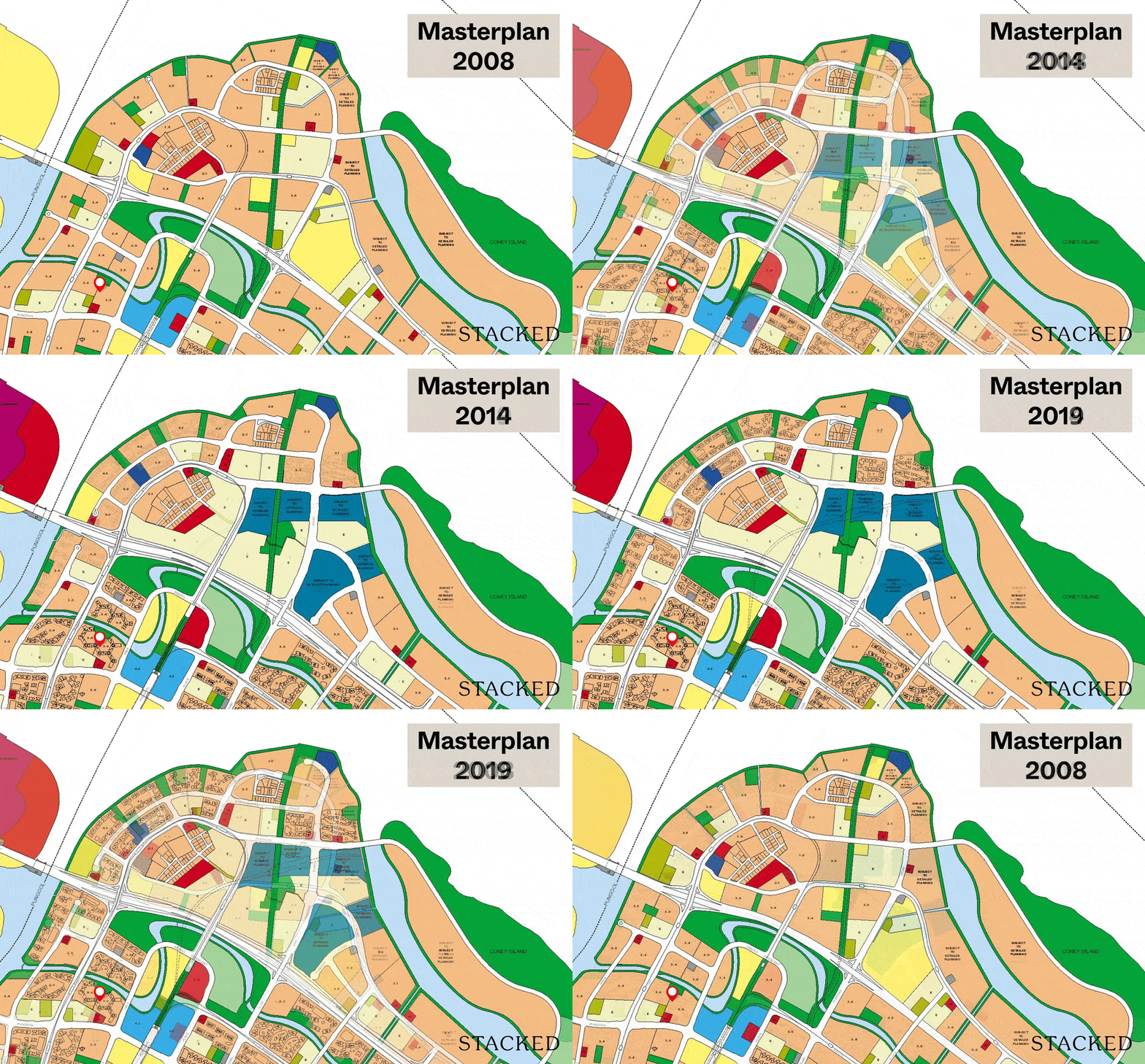
Over the past 12 years, you can see a lot of exciting changes happening to the Punggol area, so it’s very safe to say that this district has a lot more potential going forward – namely the Punggol Digital District.
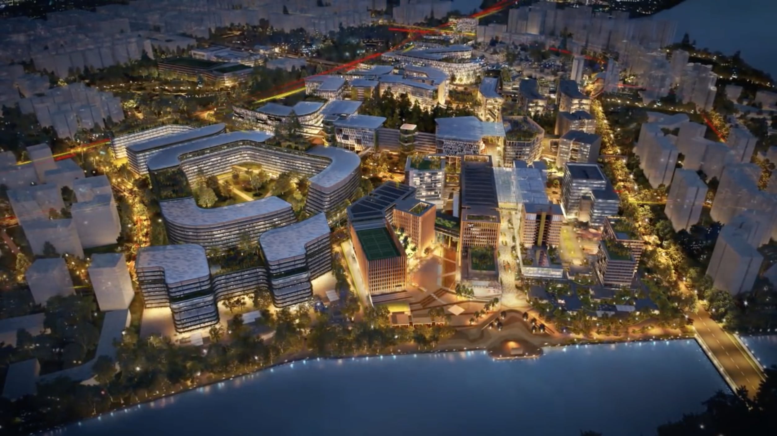
The Punggol Digital District will provide major support for Singapore’s drive towards being a “Smart Nation”. The district is set to bring about over 28,000 jobs in the area via the integration of Singapore Institute of Technology (SIT) and JTC’s Business Park, serving mainly the Cybersecurity and digital technology industry.
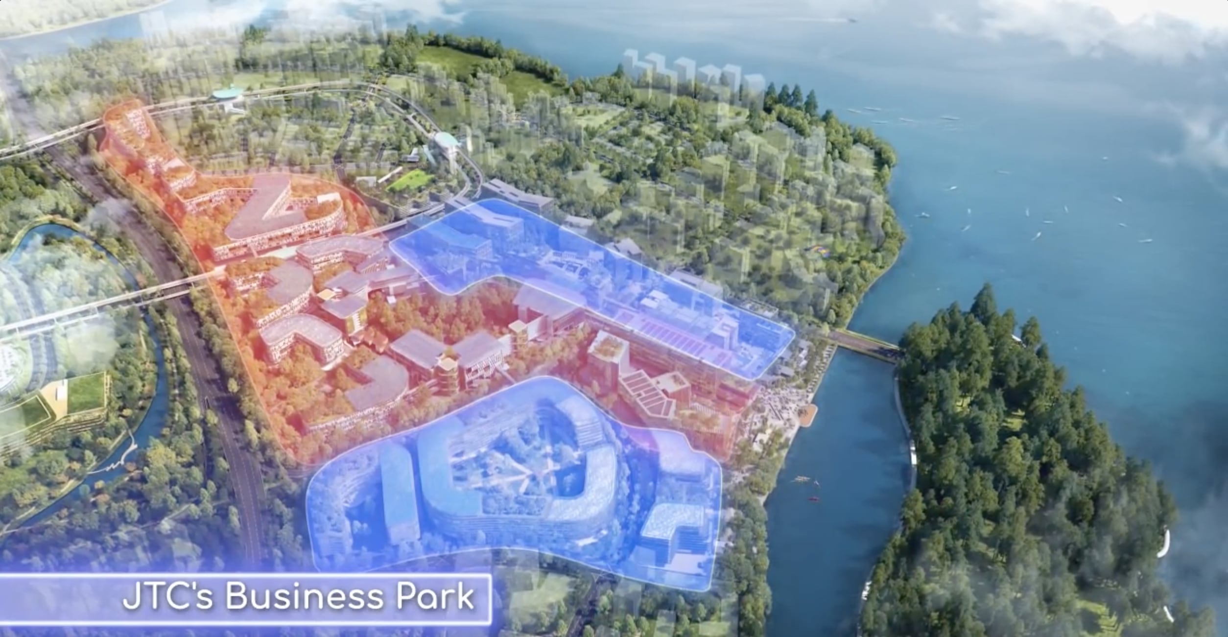
But it’s not just jobs and an increase in rental demand that residents can look forward to. More retail and dining amenities can also be expected, especially along the eastern end of the “Campus Boulevard” which overlooks the waterfront.
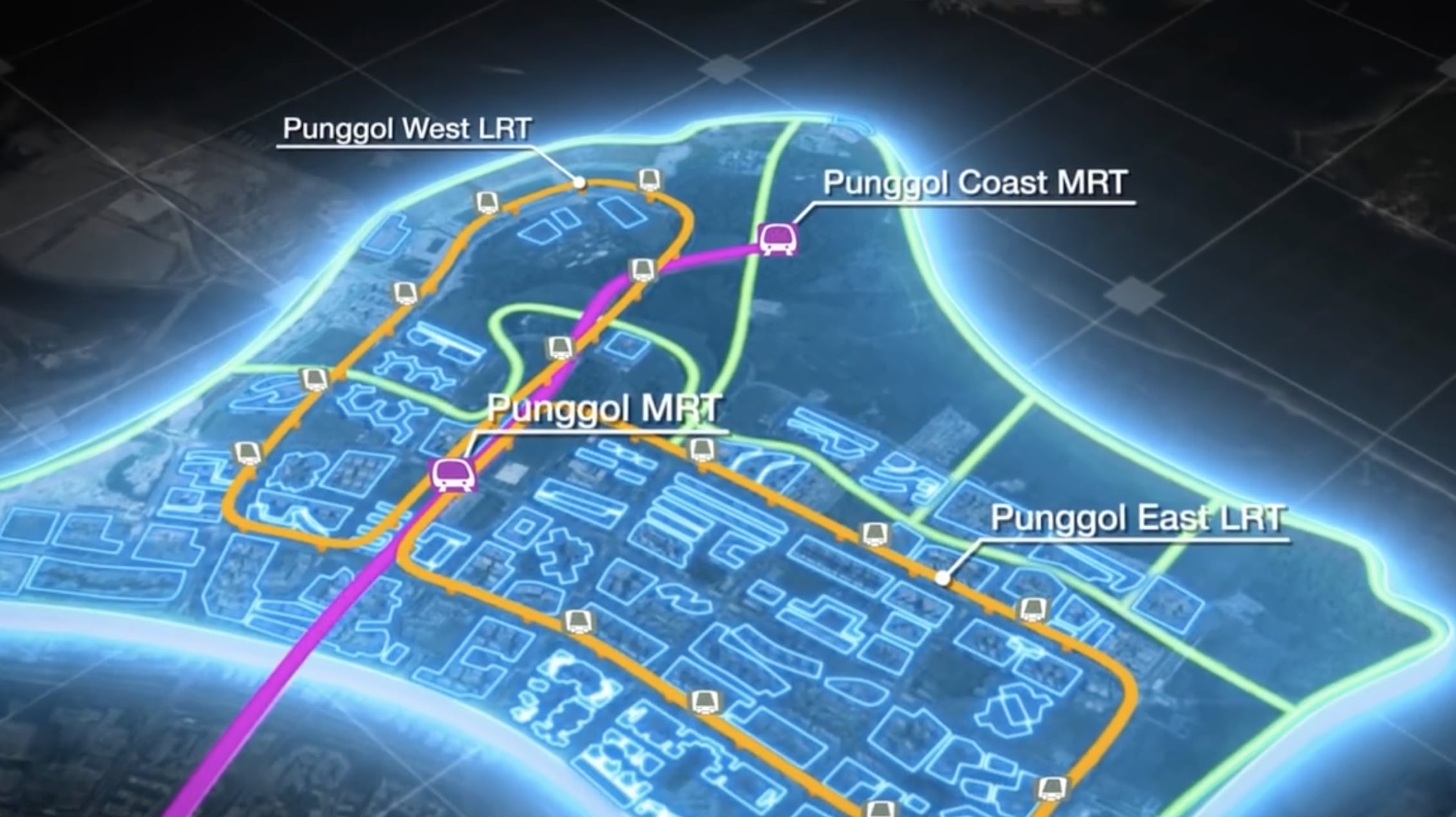
The largely undeveloped space would seamlessly integrate with the existing Park Connector Network that is also PMD-friendly. A new MRT station (Punggol Coast MRT U/C 2024) would also be opened there.
Still faces teething issues
For many years, residents at Punggol have been complaining of having to wait up to an hour to access the expressways (namely the KPE and the TPE). The situation was so bad that the LTA even brought forward the extension of Punggol Central Road by almost 1 year.
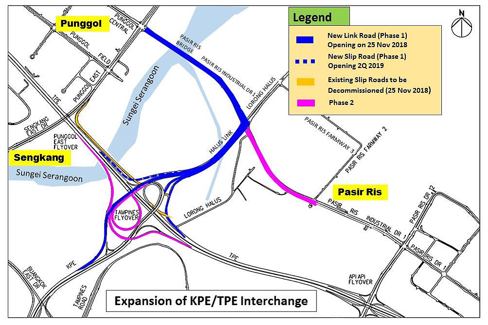
In fact, just 2 months ago as of this writing, the final links of the interchange between both expressways were completed.
As the estate continues to grow in size (it has an estimated 187,800 residents as of September 2019, I would think that Punggol still has some way to go in terms of improvement in connectivity and amenities, which brings me to my next point.
More amenities & connectivity coming up
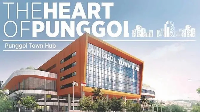
Punggol will soon see some exciting new amenities including the Punggol Town Hub and the Regional Sports Centre.
The town hub will feature a public library as well as a hawker centre and a childcare centre. It will also offer large viewing decks for visitors to admire the surrounding areas.
Yes, this is the feature that got many residents here to say “finally, we have a hawker centre!”.
The Regional Sports Centre will boast 5 pools and an over 5,000-seater football stadium.
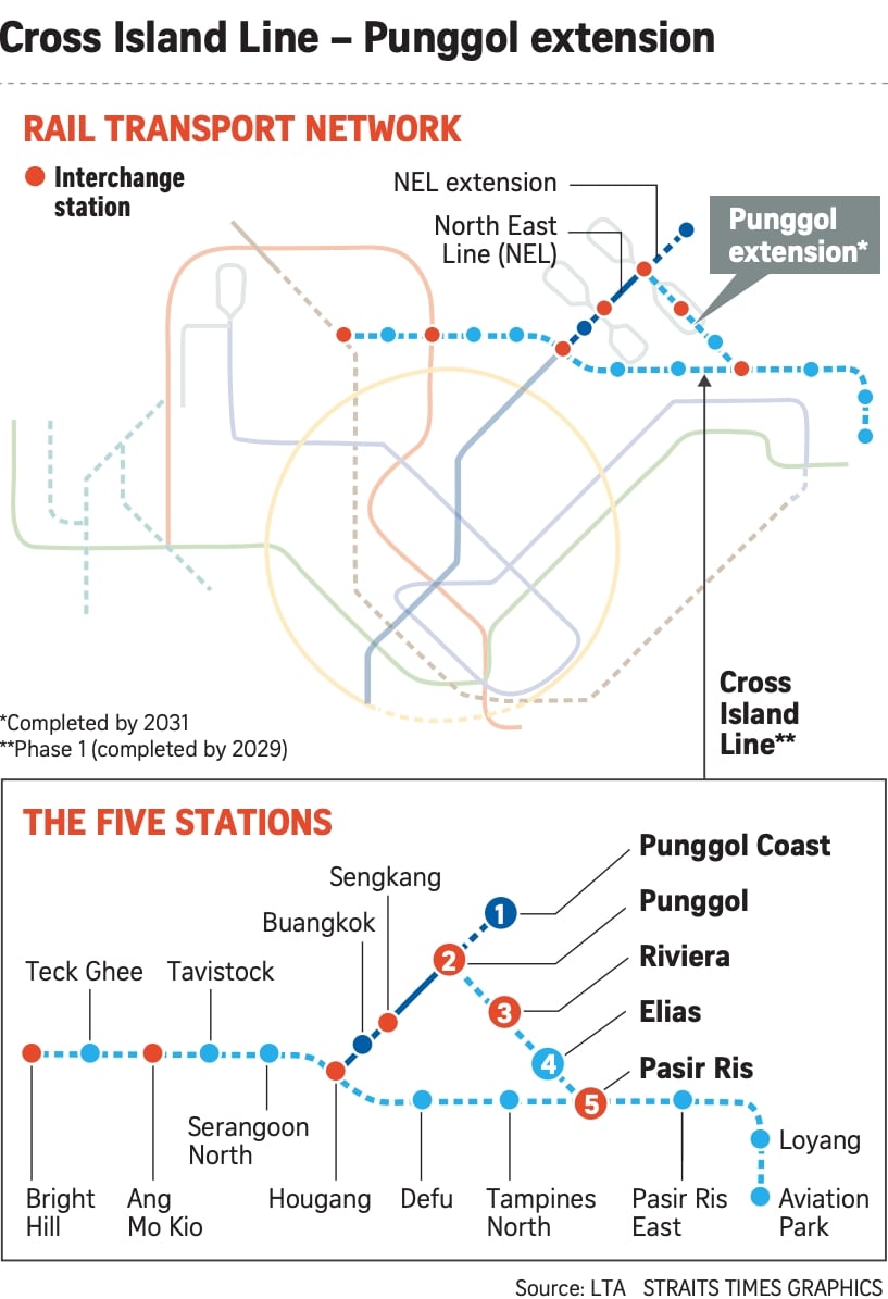
In addition, the upcoming Cross Island Line will connect with Punggol MRT, making it an interchange on its own. This will give even greater access to residents here who want to visit the east as it reduces the existing travel time from 40-45 minutes down to just 15-20, and it will be ready by 2031.
Waterway Terraces I Development Site Review
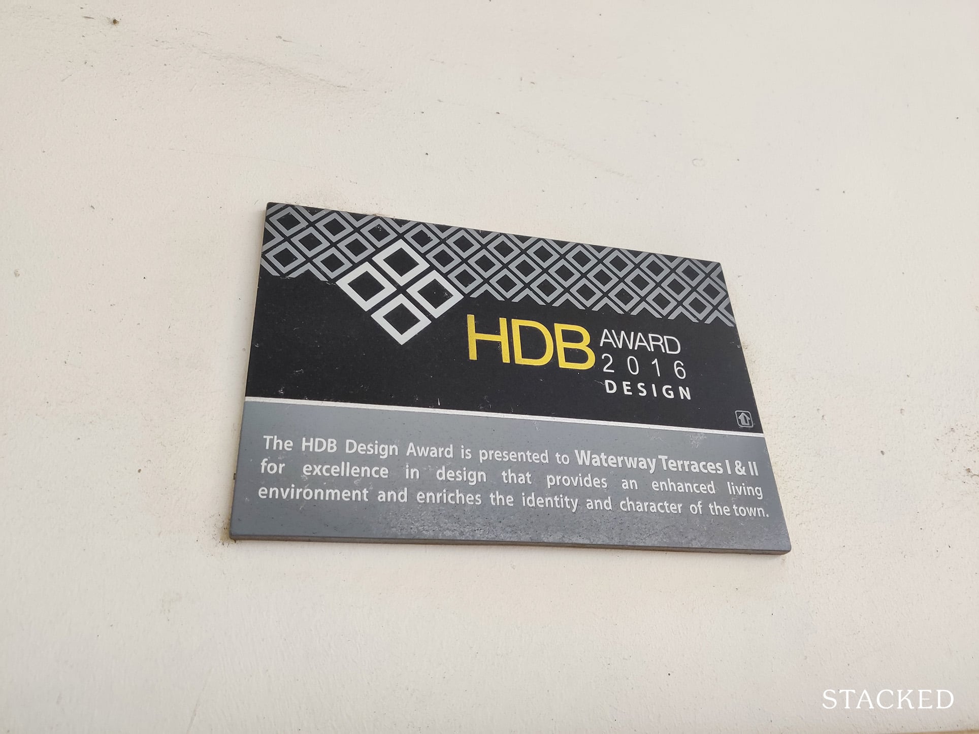
In 2016, Waterway Terraces I won the HDB Design Award (it’s not the only recipient in that year though!).
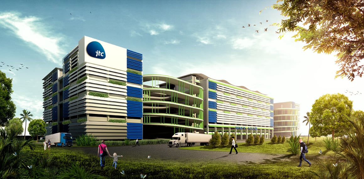
To be frank, Waterway Terraces’s design may be new/novel, but it’s not something that inspires me personally. If it’s any inspiration, I would say it looks like a well-designed industrial building by JTC.
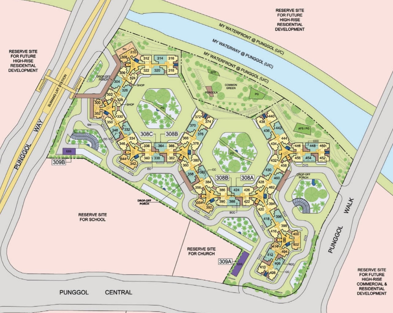
The development houses 1,072 units with a mixture of 3-, 4- & 5-room flats spread across 3 interlinked blocks with up to 82 units per floor.
The biggest attraction to Waterway Terraces I for me would be the seamless access to the Park Connector.
While the roof terraces are a lot more private, the Park Connector offers river views, a long network to stroll/run/cycle, as well as exercise machines and other amenities along the path.
When I was there, the central green areas with the interlinking bridges were not utilised much, and I do believe that the Park Connector Network which is just next to the development offers way more than the common spaces here.
Unit Mix
| Block Number | No. of Storeys | 3-Room | 4-Room | 5-Room | Total |
| 308A | 18 | 68 | 248 | 140 | 456 |
| 308B | 18 | 34 | 166 | 82 | 282 |
| 308C | 18 | 76 | 174 | 84 | 334 |
| Total | 178 | 588 | 306 | 1072 | |
Stack Analysis
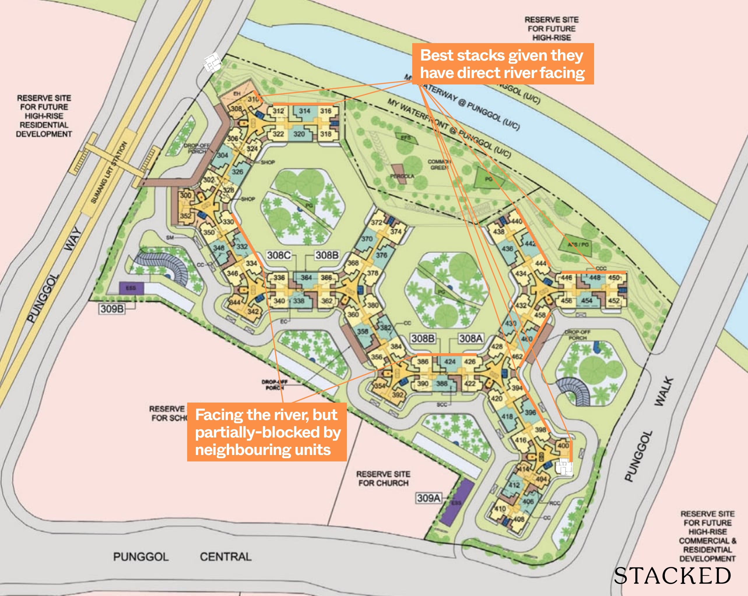
I think it goes without saying that the river-facing view carries the premium here.
For those looking to get the 3-room flat, do take note that only stacks 310, 400 and 402 offer this. However, only stack 310 offers this view from the living room balcony. 400 and 402 only offer this via the window near the main entrance.
Stacks closest to the Park Connector get to enjoy the river view from all the living spaces.
Some inner stacks, namely stacks 330, 332, 334, 386, 424 and 426 also offer a view of the river, but are partially blocked by neighbouring units. These also have a much further setback from the river.
Given the structure of the development, most inner blocks actually face the HDB units across. However, it is a respectable distance of around 72m.
Waterway Terraces I Price Review
| Project | Lease Start Date | 3-Room | 4-Room | 5-Room |
| Waterway Terraces I | 2016 | $398,888 ($553 psf) | $530,000 ($535 psf) | $688,000 ($571 psf) |
| Waterway Terraces II | 2016 | $387,500 ($537 psf) | $528,000 ($533 psf) | $670,000 ($556 psf) |
| Punggol Arcadia | 2013 | $360,000 ($478 psf) | $538,000 ($511 psf) | $650,000 ($525 psf) |
| Punggol Crest | 2014 | $357,500 ($496 psf) | $435,000 ($439 psf) | – |
| Punggol Emerald | 2015 | $365,000 ($506 psf) | $480,000 ($485 psf) | $630,000 ($524 psf) |
| Punggol Opal | 2016 | $360,000 ($492 psf) | $485,000 ($484 psf) | – |
| Punggol Parcvista | 2015 | $367,000 ($501 psf) | $478,000 ($483 psf) | $650,000 ($539 psf) |
| Punggol Regalia | 2013 | – | $522,500 ($514 psf) | $690,000 ($565 psf) |
| Punggol Residences | 2014 | – | $533,500 ($532 psf) | $660,000 ($529 psf) |
| Punggol Ripples | 2014 | $350,000 ($485 psf) | $450,000 ($454 psf) | – |
| Punggol Sails | 2014 | $350,000 ($485 psf) | $460,000 ($465 psf) | $542,888 ($450 psf) |
| Punggol Sapphire | 2013 | – | $520,000 ($503 psf) | $643,000 ($524 psf) |
| Punggol Topaz | 2016 | $360,000 ($492 psf) | $476,000 ($476 psf) | $604,000 ($497 psf) |
| Punggol Waves | 2015 | $355,000 ($492 psf) | $433,500 ($433 psf) | $548,888 ($451 psf) |
| Treelodge @ Punggol | 2012 | – | $510,000 ($504 psf) | $865,500 ($547 psf) |
Given the number of developments in the vicinity with the relatively same age, buyers looking to stay in Punggol would be spoilt for choice.
Naturally, being the closest development to Waterway Point, having seamless access to the Park Connector and of course being one of the newest developments, Waterway Terraces I & II command the highest $PSF in the area.
As Waterway I is closer to both the MRT and Waterway Point, it’s also slightly more expensive than its lookalike peer – Waterway Terraces II.
Of interest are the significantly cheaper Punggol Waves and Punggol Crest. Their 4-room flats are about 20% cheaper and this is mainly due to their further distance from Punggol MRT (about a 10-11 minute walk) as well as their proximity to the TPE.
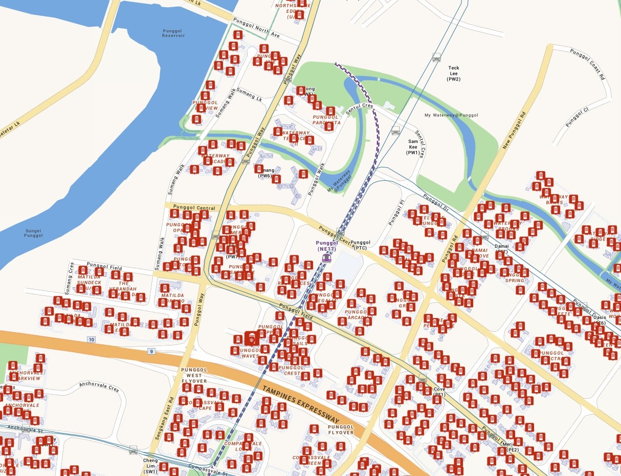
Still, if one is on a budget, there are plenty of options to choose from such as the aforementioned developments – but it’s clear that buyers are willing to pay a premium to stay in the better located Waterway Terraces I & II.
Punggol Residences rivals Waterway Terraces in terms of $PSF for its 4-room flat despite being 2 years older, but the former has the advantage of being literally right next to the MRT.
So based on the prices, is Waterway Terraces worth the premium?
I would argue that if you truly value being right next to the Park Connector, as well as the convenience of Waterway Point at your doorstep, then yes – especially if you can get a unit with a river-facing view.
Property Market CommentaryPunggol HDB: BTO and resale prices you need to know from 2008
by Sean GohOur Take
Overall, Waterway Terraces left much to be desired for several reasons.
While the original intention of designing a project with a modern take on the old public housing was a great idea, I felt that it was not appropriate in today’s context.
The long corridors that connected all the blocks with its carefully calibrated angles and no dead-ends did a good job in providing ventilation, but this also exaggerated one of the least favourite attributes of public housing: the lack of privacy – something that buyers today value.
The artist illustrations and initial building shots also looked amazing when it was new, but in just a short span of 5 years, the building already looks like it’s in need of much maintenance – I shudder to think what it would be like another 5 years from now.
Moreover, residents here are pushed to hang their clothing along the long corridor, along the Juliet Balcony (and in some cases, on the roof terrace) given the lack of sunlight coming into the service yard, which makes it a very unsightly development to live in.
Of course, the eco-friendliness of the development is amazing – and HDB did a fantastic job at that.
But the reality is that these are not the primary considerations of most home buyers – especially given the diverse range of flats potential buyers here can choose from.
That being said, if you really value being right next to the Park Connector and Waterway Point, then I would give this some consideration.
But personally for me, the shortcomings are just too apparent to compromise on.
At Stacked, we like to look beyond the headlines and surface-level numbers, and focus on how things play out in the real world.
If you’d like to discuss how this applies to your own circumstances, you can reach out for a one-to-one consultation here.
And if you simply have a question or want to share a thought, feel free to write to us at stories@stackedhomes.com — we read every message.
Frequently asked questions
What are the main maintenance issues at Waterway Terraces?
How is the waterway terrace's carpark designed?
What are the architectural features of Waterway Terraces?
Are there any amenities available within Waterway Terraces?
What are the visual and maintenance conditions of the building facade?
What is the overall impression of Waterway Terraces' environment and facilities?
Reuben Dhanaraj
Reuben is a digital nomad gone rogue. An avid traveler, photographer and public speaker, he now resides in Singapore where he has since found a new passion in generating creative and enriching content for Stacked. Outside of work, you’ll find him either relaxing in nature or retreated to his cozy man-cave in quiet contemplation.Need help with a property decision?
Speak to our team →Read next from HDB Reviews
Editor's Pick Clementi Towers Review: A Rare Integrated HDB That’s Incredibly Convenient (With Unblocked Views)
Editor's Pick Centrale 8 DBSS Review: Relatively Convenient HDB Living Close To MRT & Amenities
HDB Reviews Park Central @ AMK DBSS Review: Close To Mall, MRT And Amenities But Needs Better Maintenance
HDB Reviews Adora Green DBSS Review: Great Views, Amenities And Affordable Albeit Far From MRT
Latest Posts
Singapore Property News A Chance to Redevelop This Bukit Timah Mixed-Use Site Just Came Up — It Costs $118M
On The Market Here Are Cheaper 5-Room HDB Flats In The Central Area Still Priced Below $900K
Property Market Commentary Singapore Mortgage Rates Dropped 61% In A Year. Is There Still Room To Fall?







6 Comments
The leaf protrusions on the benches are what is known as hostile architecture. It’s meant to prevent people from sleeping on them.
Why is it a problem that residents choose to hang their laundry along the common corridors? I wouldn’t do it personally for fear of perverts swiping my CK underpants, but having lived in HDBs my entire life it isn’t something which strikes me as a big deal.
Did you request special access to the upper rooftop gardens or are they publicly accessible?