Analysing 3 Condo Floor Plans In District 21: Which Is The Best Family Friendly Unit?
September 16, 2020
Unlike buying a home if you’re single, buying a home for your family is a whole different proposition.
Why?
Put simply, you no longer have to contend with just what you want – you now have to account for the needs of everyone else in your family.
Whether you have young kids, teenagers, or elderly parents, the decision making process now becomes a lot more complicated.
As an example, when you have young kids, you’d definitely want an open space that allows you to keep a line of sight on your kids while you’re cooking/doing chores.
If you have older kids? Well, you’d want more privacy for sure.
So while that may sound straightforward enough, what happens when your kids are in between ages? Which do you now prioritise more?
Unless you plan to be moving pretty often, the eventual condo unit chosen needs to be flexible. For everyone to live comfortably in their home, it needs to be able to withstand the different seasons of changing needs.
Just a while back, I analysed and ranked 5 different shoebox units for singles.
Now, I’ll be doing the same for a range of 3-bedroom condominium units for families with children.
Today we’ll look at three developments in District 21, two different new launch condos and one resale to compare.
I picked between these as new launch versus resale is an often asked topic (and let’s be real, who doesn’t like new and shiny things).
On the other hand, a resale comparison is always brought up because people feel they can get a bigger space for the same amount (plus, you can move in right away).
So in this case, I’ll be making a comparison between Mayfair Modern, Mayfair Gardens (the only new launches in the area), and a similar quantum resale unit at the Cascadia.
Read on to find out!
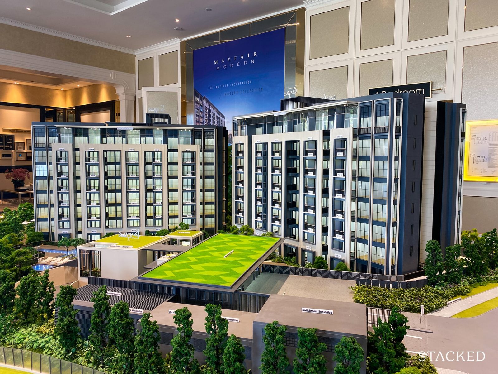
#3 Mayfair Modern, 1044 sqft, ~$2.2M
| Project: | Mayfair Modern |
|---|---|
| District: | 21 |
| Address: | Rifle Range Road |
| Tenure: | 99 years |
| No. of Units: | 171 |
| Site Area: | 92,346 sqft |
| Developer: | Citrine Holdings Pte Ltd |
| TOP: | 2024 |
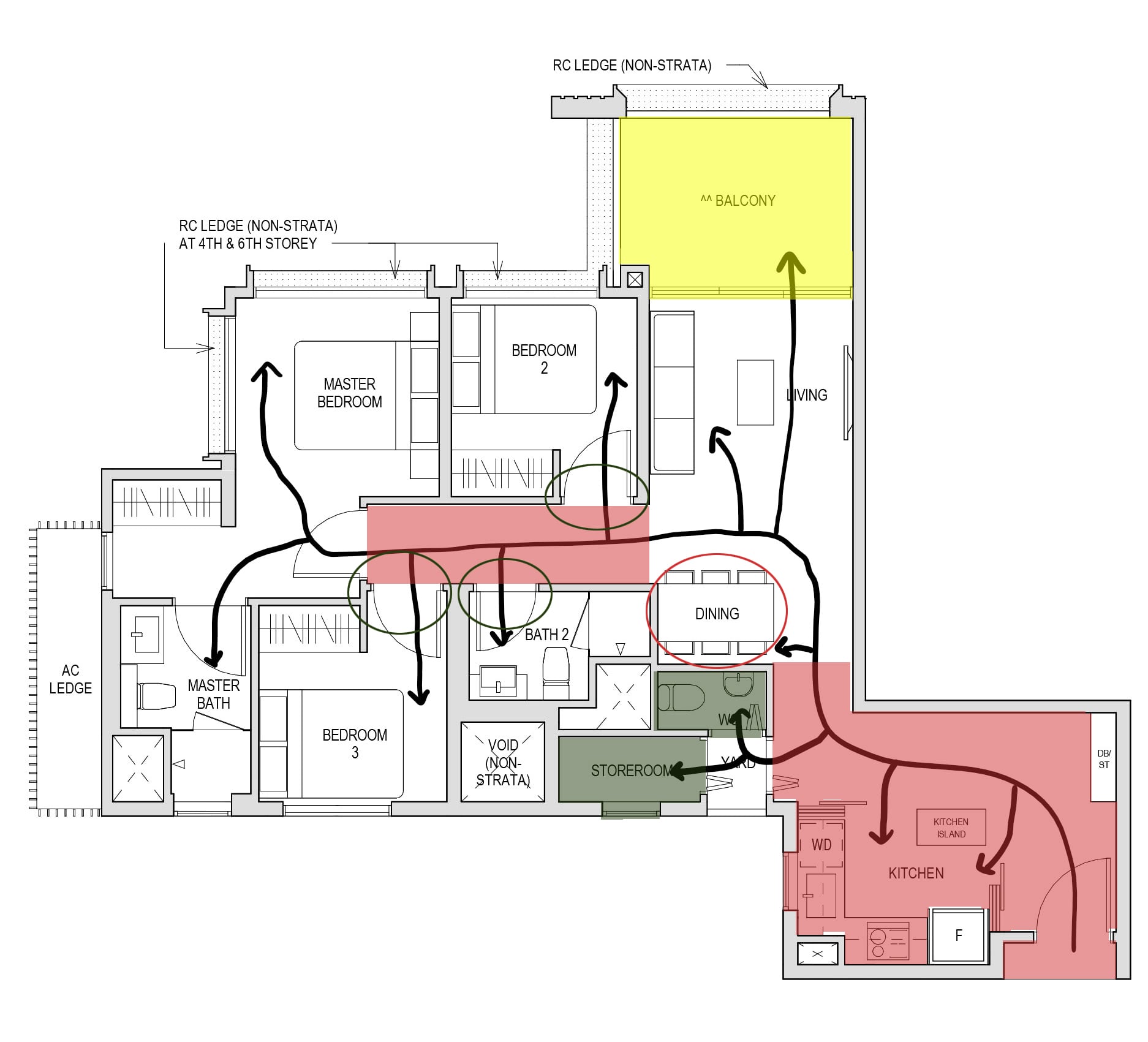
Out of the three units, this Mayfair Modern unit is the smallest with a size of 1,044 square feet.
For the older generation reading this, you might be shocked at the size on paper – after all, there was a point in time when 1,000 square feet of space would get you a 2 bedroom at the very least.
So given it’s relatively smaller size, it is crucial for the planning of spaces to be more efficient.
And is it?
Well, let’s just say that efficiency is not always present in this unit. Specifically, more than 15% of the space (~158 sqft) is purely dedicated to circulation, instead of being integrated with the other spaces.
Unfortunately, this has a knock on effect on other spaces in the unit. If you take a closer look at the floor plan, the inefficiency is highlighted especially when you see some spaces being undersized.
This includes the kitchen (~63.5 sqft) and the dining area (~33.5 sqft), both of which is borderline criminal to overlook especially when you are targeting families.
While the kitchen is simply smaller, the dining area is actually problematic. Given the intended orientation of the dining table, users are likely to find the area a tight squeeze. With the wall behind the chairs on one side of the table, and the start of the corridor on the other, you will not be able to push out your chair and sit comfortably, as you will either be blocked by the existing wall or block others from passing through.
As I consider flexibility to be an important criteria, the dining area does indeed set off multiple red flags. With the existing layout of spaces, it does seem like the occupants will have to deal with this dining arrangement as there is simply no space for any adjustment to be done without affecting the overall internal circulation.
That said, every unit will definitely still have its merits.
For one, the layout of the bedrooms is its stronger suit, as there is a low possibility for a bottleneck situation along the corridor. The entrance of the common bathroom is also situated in a way where occupants of both rooms can have easy access without walking past each other’s rooms.
What’s good here is also that there is sufficient room to house a helper – something most families would no doubt be considering. Seeing that the storeroom has a small window, it can be easily converted into a small bedroom for a helper. The additional WC also ensures that your helper need not share a bathroom with everyone else.
The balcony may be a hit or miss, depending on your lifestyle requirements. In this case, as it is quite a big space, you could use it as an alternative or even primary dining space – thereby having a bigger living area.
However, while I enjoy its potential in being an outdoor leisure area or even an informal dining area, seeing a balcony bigger than the actual kitchen (~82 sq ft) ultimately still reminds me of how the distribution of spaces within this unit can still be worked on.
To conclude, it is not its relatively small size, but the general inefficiency in spatial planning that placed it at the bottom of this list.
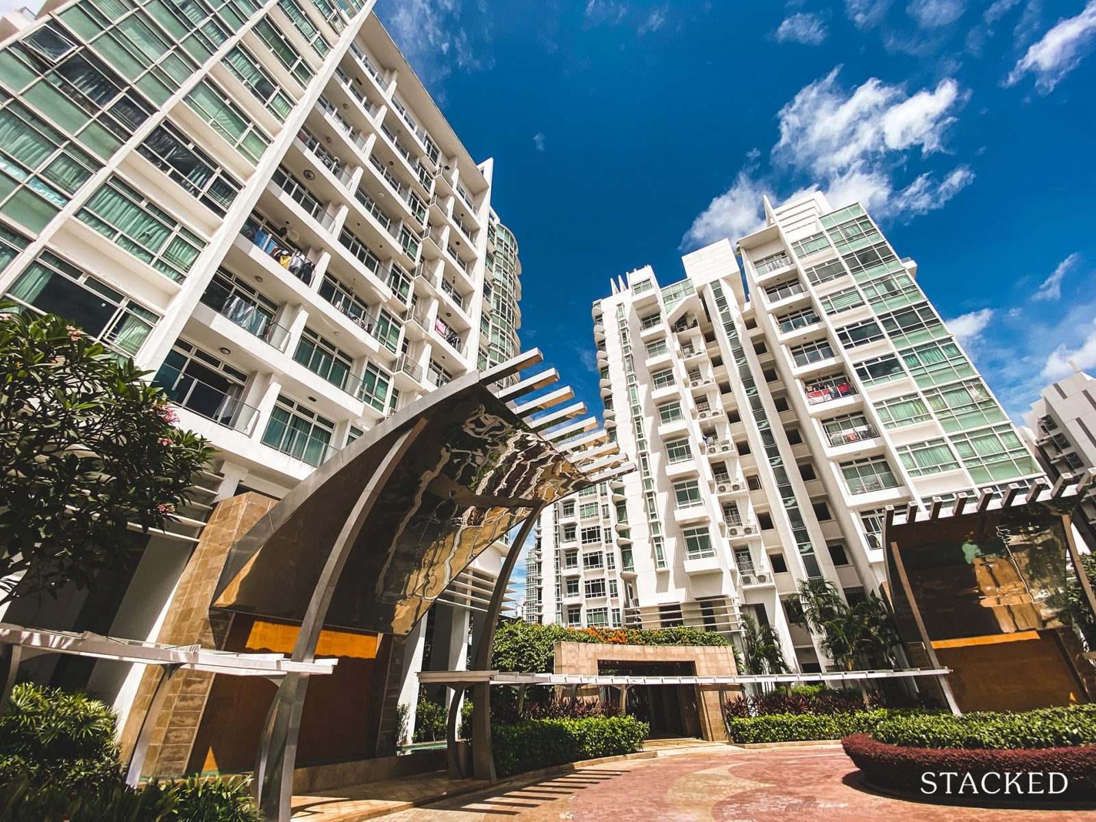
#2 The Cascadia, 1,302 sqft, ~$2.2M
| Project: | The Cascadia |
|---|---|
| District: | 21 |
| Address: | Bukit Timah Road |
| Tenure: | Freehold |
| No. of Units: | 536 |
| Site Area: | 293,650 sqft |
| Developer: | Boonridge Pte Ltd |
| TOP: | 2011 |
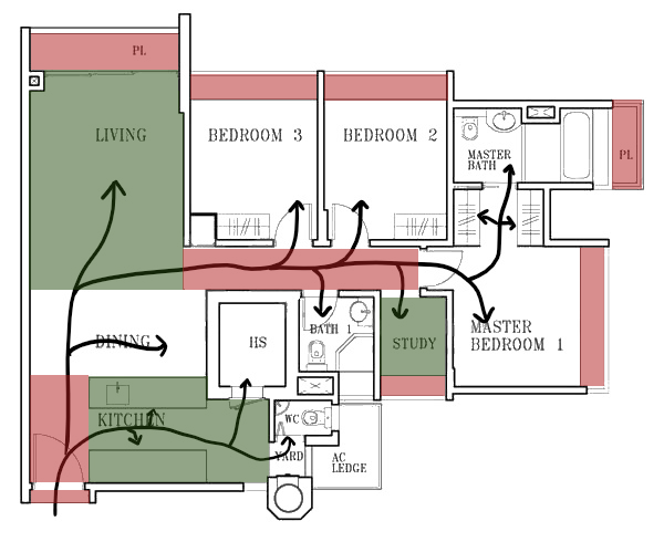
Just like the Mayfair Modern unit before, this Cascadia unit also suffers from some inefficiency.
So while the amount of space dedicated to circulation is drastically lesser here (~94 sqft), I would still consider it inefficient as this additional space can be used to improve other existing spaces in the unit.
More from Stacked
So many readers write in because they're unsure what to do next, and don't know who to trust.
If this sounds familiar, we offer structured 1-to-1 consultations where we walk through your finances, goals, and market options objectively.
No obligation. Just clarity.
Learn more here.
A Rare 1930s Art Deco Home In Alexandra With 33,000 Sq Ft of Land Is Up For Rent
Stamped into the façade of 1 Canterbury Road is the year of its completion: 1933. While most of Alexandra Park…
But here’s the biggest problem with this unit.
Despite it being the largest unit size on paper (1,302 sqft), it has the dreaded large bay windows and planters.
But between the two, planters are more pointless as additional renovation needs to be carried out for the area to be accessible and usable.
And in all the bedrooms and study, large bay windows can be found too. While these bay windows can double up as resting spots or decorative surfaces, they ultimately still take up a lot of precious space (~68 sqft) within the unit.
Although I personally think that bay windows add a sense of coziness to the rooms, it simply isn’t worth the amount you are paying for it. If you do the math (~$115k), it isn’t a sum to be sniffed at.
Rounding up the downsides, there is a distinct lack of balcony in this unit – but given the amount of bay window and planter space already, this is probably for the best. Also, the yard is tiny, which isn’t the most conducive for most families.
Nevertheless, this unit is comparatively better given that spatially, all the spaces are functional, and some even exceed my expectations.
For instance, both the living room and kitchen are large compared to their counterparts, standing at ~177 sqft and ~95 sqft respectively. This makes the highlights of this unit centred on the common areas, which makes it a good fit for families who enjoy spending quality time together on a day-to-day basis.
Plus, I like that there is also a study that can be used by any member of the household that needs a quiet space to work. Although this room can only comfortably hold one user at a time, the inclusion of the study here is especially appropriate in a time like this where working from home is becoming a norm.
Finally, one small feature worth highlighting is the “walk-in” wardrobe in the master bedroom. While it isn’t a proper one, it does offer more storage than most other competing new launch spaces. Given that lack of storage is an issue that many people tend to overlook, I think this is a good plus point.
On the whole, while it isn’t the most efficient use of space, I would say this unit would tick the boxes for most small young families out there.
#1 Mayfair Gardens,1130 sqft, $2M
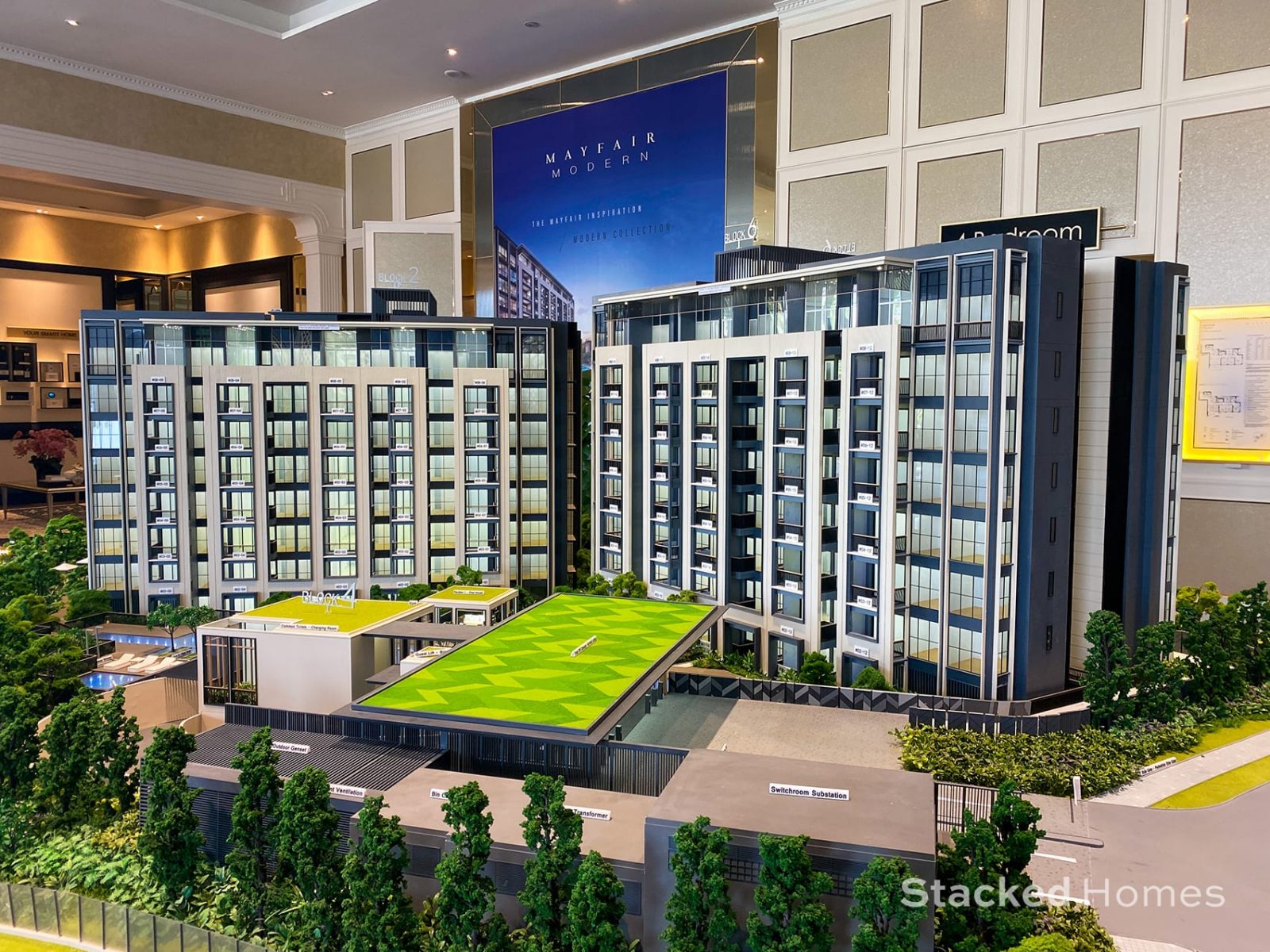
| Project: | Mayfair Gardens |
|---|---|
| District: | 21 |
| Address: | Rifle Range Road |
| Tenure: | 99 years |
| No. of Units: | 215 |
| Site Area: | 116,129 sqft |
| Developer: | Citrine Property Pte Ltd |
| TOP: | 2024 |
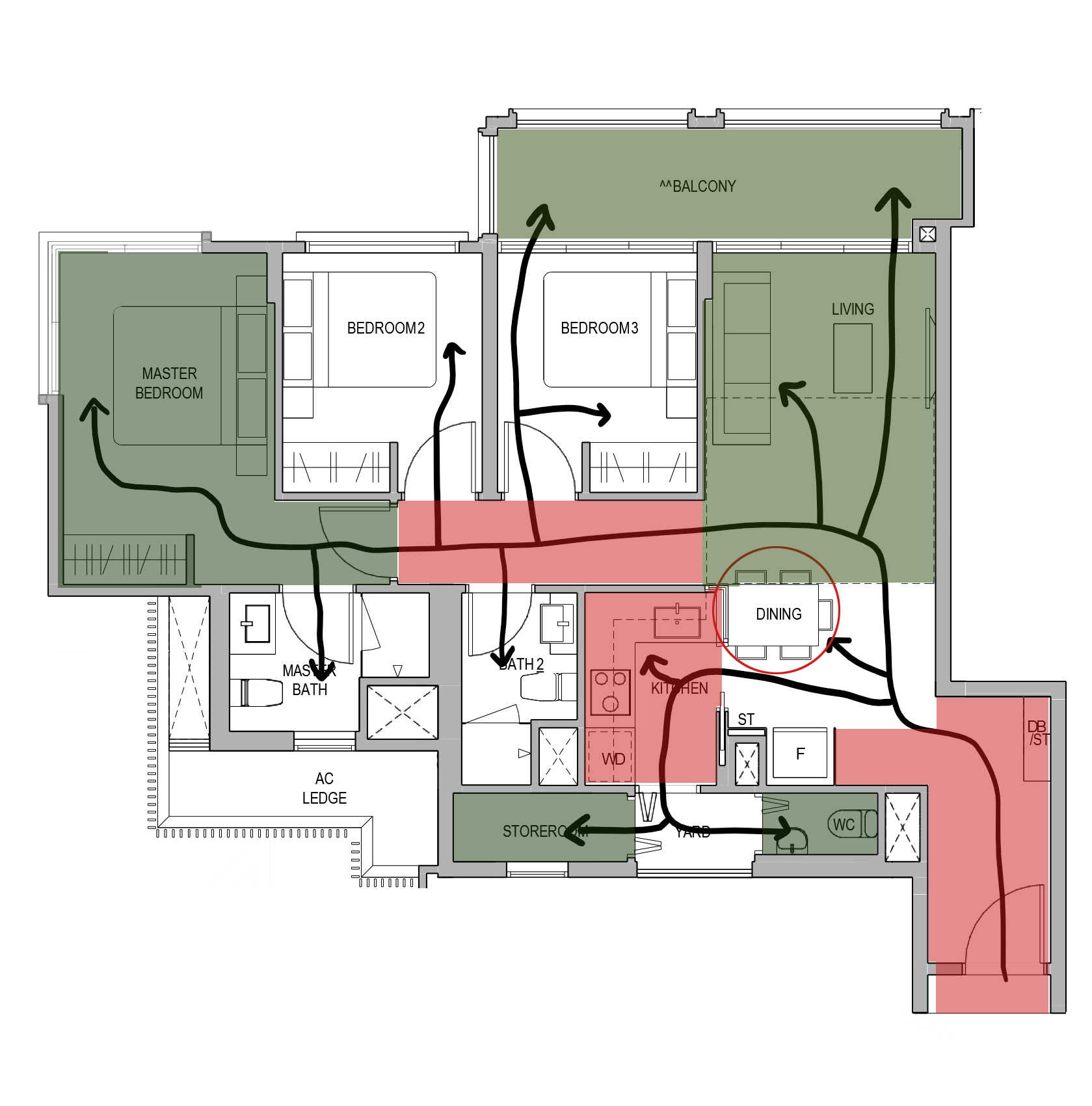
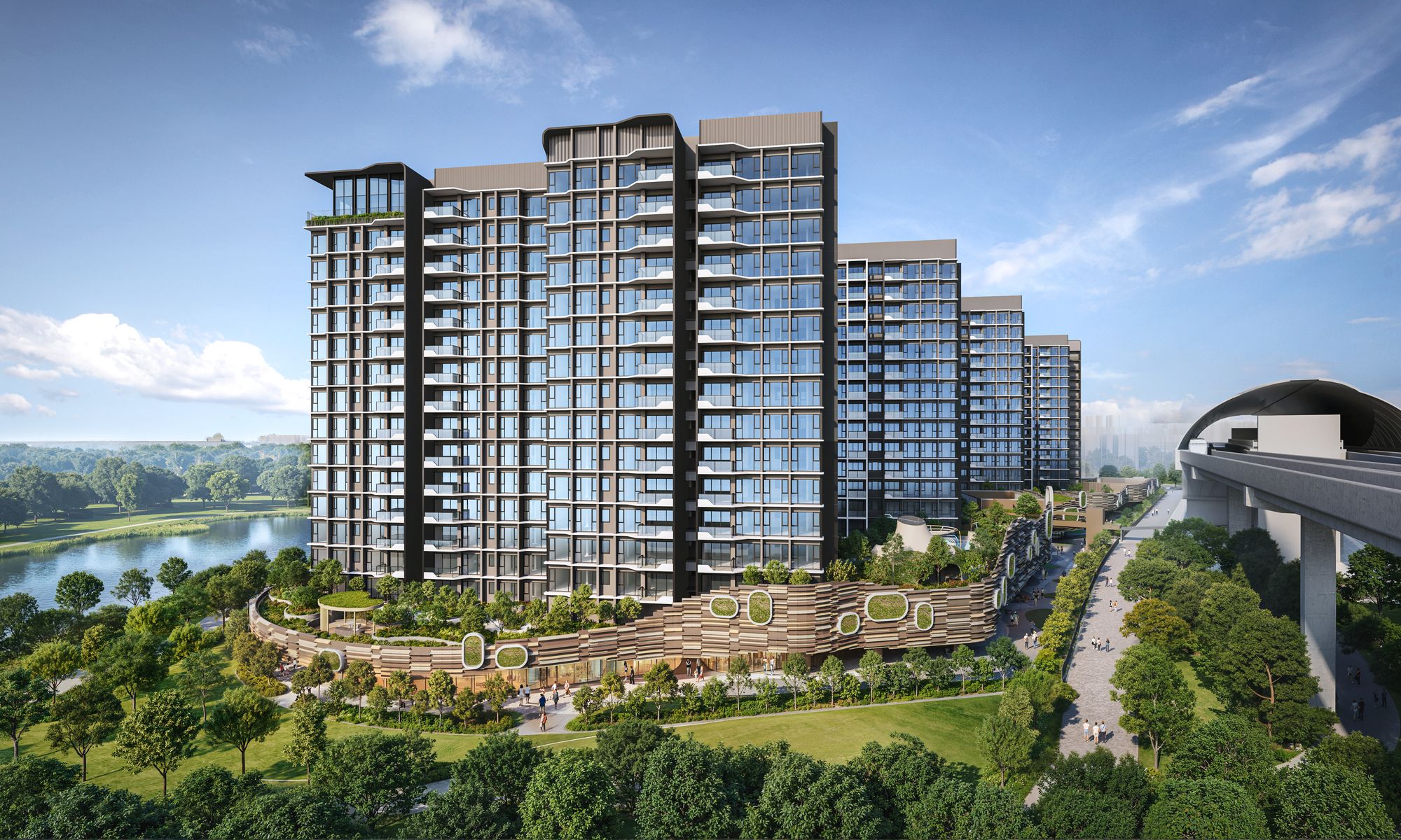
Last but not least, this 3 bedroom unit at the Mayfair Gardens is my choice on this list as it does strike a fine balance between the first two units.
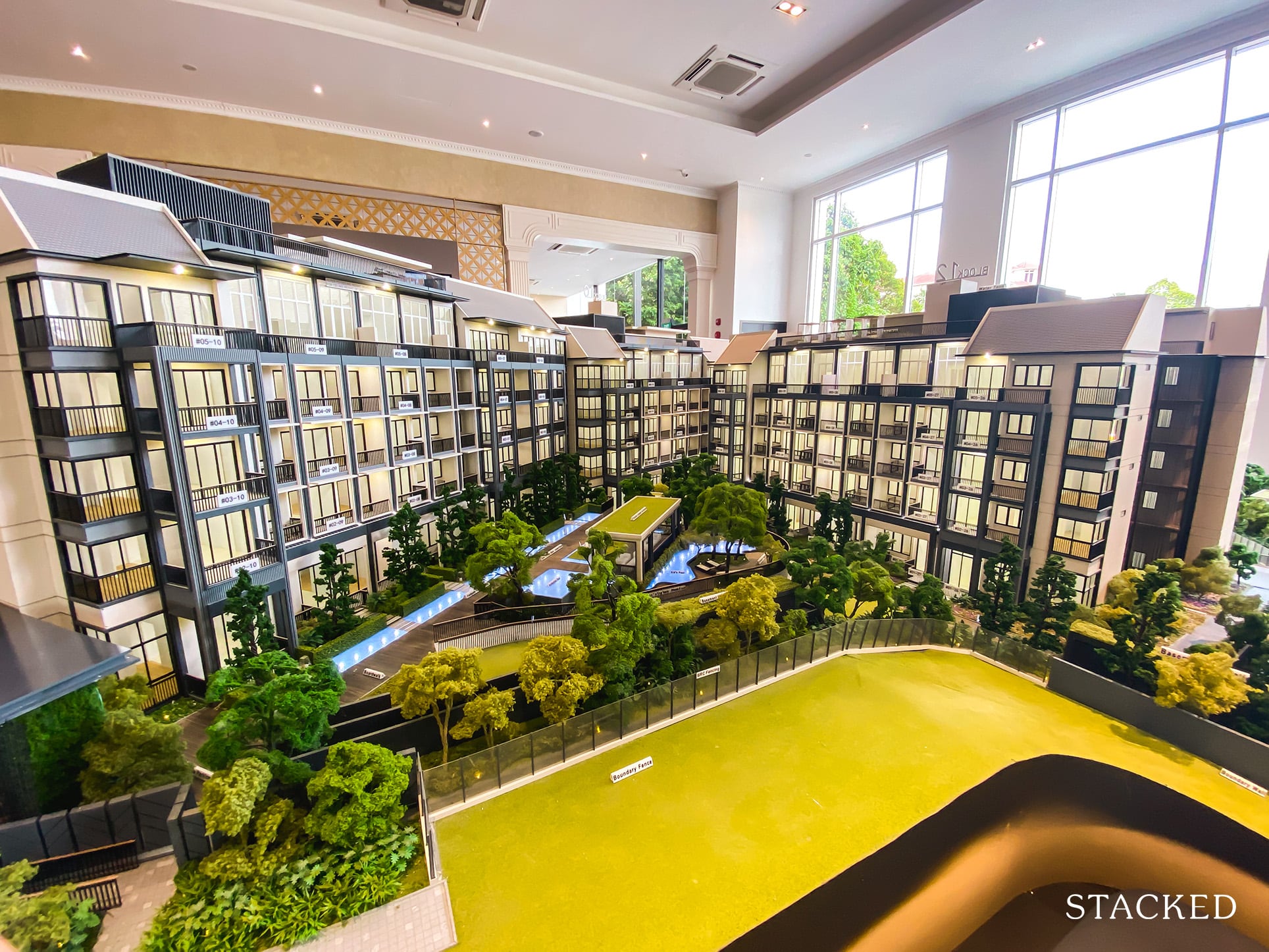
New Launch Condo ReviewsMayfair Gardens Review: British Inspired Condo in Bukit Timah
by Reuben DhanarajWhile this unit does not escape from inefficiency considering that it too has ~127 sqft of space set aside purely for circulation, its merits are truly worth mentioning.
But before we go there, let’s first take a look at some of its shortcomings.
The first, and probably the biggest issue is the inordinate amount of space the entranceway takes up. While privacy is important when you have a young family, the space taken up here is definitely excessive.
Like the Mayfair Modern unit, the dining area here is definitely cramped. While there are no walls here to restrict the placement, you would still be very limited by the size of the dining table as anything too big will end up blocking the circulation to the bedrooms and the kitchen. Moreover, its kitchen is also considerably small for a 3-bedder, standing only at ~56 sq ft.
However, unlike the Mayfair Modern unit, you do have the flexibility to make some changes here. Given that the living room is of a good size (~145 sqft) and long, there is some room for the dining table to be rearranged to a more suitable location or orientation.
As mentioned earlier, given that a balcony allows for some outdoor living, I see it as a value-add here. For me, its value has increased multifold seeing that the balcony is not only accessible through the living room but from Bedroom 3 too.
So if your child is more inclined towards the outdoors, this room would be a good fit for him or her. And even if that is not the case, by having only glass sliding doors on one side of the room will definitely help to bring in more indirect daylight.
While the bedrooms in all three units have been more or less the same, the master bedroom in this unit is slightly different. Despite being relatively big (~152 sq ft), this bedroom is also very wide. As far as master bedrooms go, this is definitely a very good size.
Lastly, this unit is also capable of housing a helper easily, given that it has a ventilated storeroom and a water closet. More importantly, these spaces are also separated from the rest of the house by the kitchen and the yard in this unit, unlike in Mayfair Modern.
Final Words

Through this set of analysis, it is apparent that almost all homes have merits and shortcomings. Even if you were to design and build your home from scratch, it is likely that the home will still have some shortcomings as you cannot predict your every want and need.
As such, the best you can do is to consider your family’s most pertinent and foreseeable needs and wants, and make your decision from there. Ultimately, the best house layout for your family is one that aligns with your lifestyle.
Have a question about floor plans? Or need some help over a floor plan comparison? Feel free to reach out at stories@stackedhomes.com
At Stacked, we like to look beyond the headlines and surface-level numbers, and focus on how things play out in the real world.
If you’d like to discuss how this applies to your own circumstances, you can reach out for a one-to-one consultation here.
And if you simply have a question or want to share a thought, feel free to write to us at stories@stackedhomes.com — we read every message.
Frequently asked questions
What should I consider when choosing a condo unit for my family?
Which condo unit in District 21 is best for families with children?
What are the drawbacks of the Mayfair Modern condo unit?
How does the Cascadia unit compare for family living?
Is a resale condo better than a new launch for families?
Celine H
Celine is an architecture student who doesn’t want to be an architect. Passionate about spaces, the arts and cultural heritage, she now spends her days writing, seeing, feeling and exploring.Need help with a property decision?
Speak to our team →Read next from Property Picks
Property Picks Where to Find Singapore’s Oldest HDB Flats (And What They Cost In 2025)
Property Picks Where To Find The Cheapest 2 Bedroom Resale Units In Central Singapore (From $1.2m)
Property Picks 19 Cheaper New Launch Condos Priced At $1.5m Or Less. Here’s Where To Look
Property Picks Here’s Where You Can Find The Biggest Two-Bedder Condos Under $1.8 Million In 2025
Latest Posts
Property Market Commentary 18 Upcoming New Launch Condos In 2026 — Where They Are And The Ones To Watch
Property Advice Should We Sell Our Freehold Condo For A $2.2M Leasehold Landed Instead?

Singapore Property News Kallang Close GLS Site Sold For $610.8 Million: New Waterfront Condo Could Launch From $2,900 PSF








0 Comments