Congratulations. You’ve bought your 5-room HDB flat in a housing market where prices only seem to go in one direction (which is up).
Now comes the fun (or hard part, depending on which side of the fence you sit on) part – renovating the space.
Depending on the layout of the flat, you will be surprised at just how much you can actually configure a space. All this will come at a greater cost, as hacking walls and floors will certainly be a more costly affair.
We’ve done a few of these already (4-room HDB layout ideas for DINK couples, Executive Apartment layout ideas, and 5-room HDB layout ideas), but given how the older 5-room HDB flats can vary a lot, we’ve decided to do another due to popular demand!
So let us help you narrow down your options with these 9 layout ideas for a 5-room HDB. While the base floor plan we’ll use may not be the same as yours, the choices here should help jumpstart your creativity.
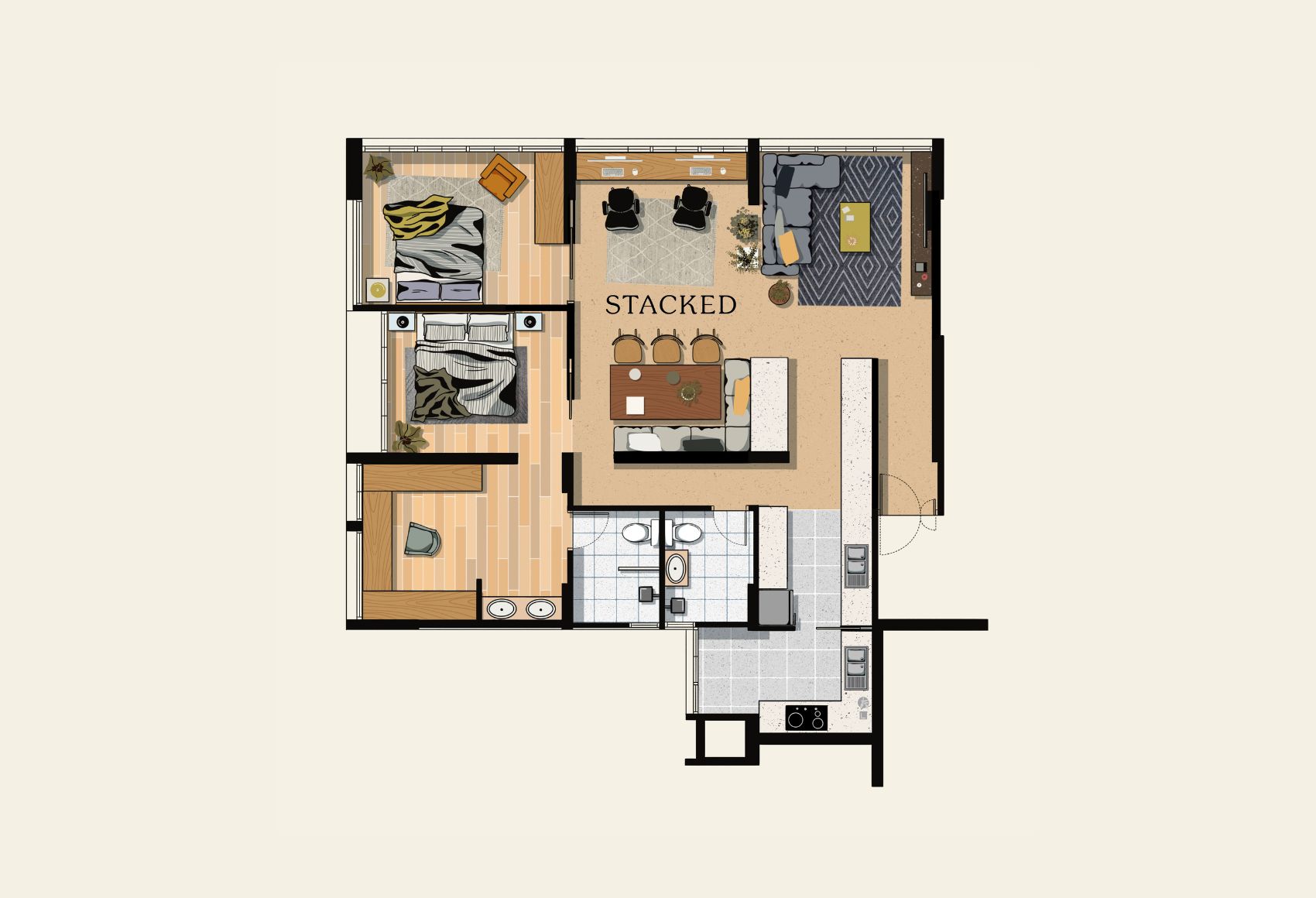
Below is a 5-room point block HDB layout that you might find in older HDB’s:
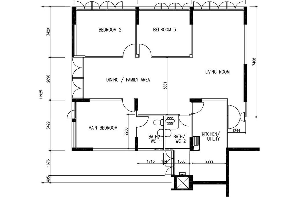
In each of our variations, you’ll notice that we haven’t touched the two bathrooms and the kitchen. The layout changes will take place in the 3 bedrooms, living room, and dining area only because you can’t simply relocate the kitchen and bathrooms due to the pipe installations.
Here’s how the layout looks when we dress it up:
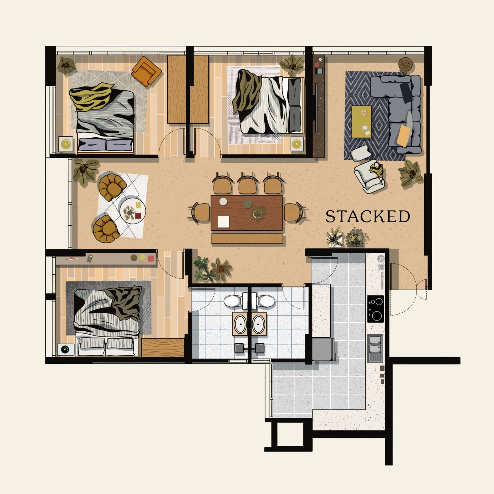
Overall, this layout is one that really prioritises space for the communal areas. As you can see, even without any adjustments you have a good amount of space for your living and dining areas – you can even afford an additional seating area beside the dining.
There’s a good amount of light too as this is a point block unit. So you have light streaming in from the living, as well as the dining area.
What’s not so great is the position of the bathrooms. They are located next to each other, and the position of the common bath means that occupants of both common bedrooms will need to walk across the dining – it’s not ideal for privacy.
The kitchen while a decent size too can be quite dark, as the yard is only at the end and at a right angle.
Table Of Contents
So many readers write in because they're unsure what to do next, and don't know who to trust.
If this sounds familiar, we offer structured 1-to-1 consultations where we walk through your finances, goals, and market options objectively.
No obligation. Just clarity.
Learn more here.
1. Maximised Master Bedroom
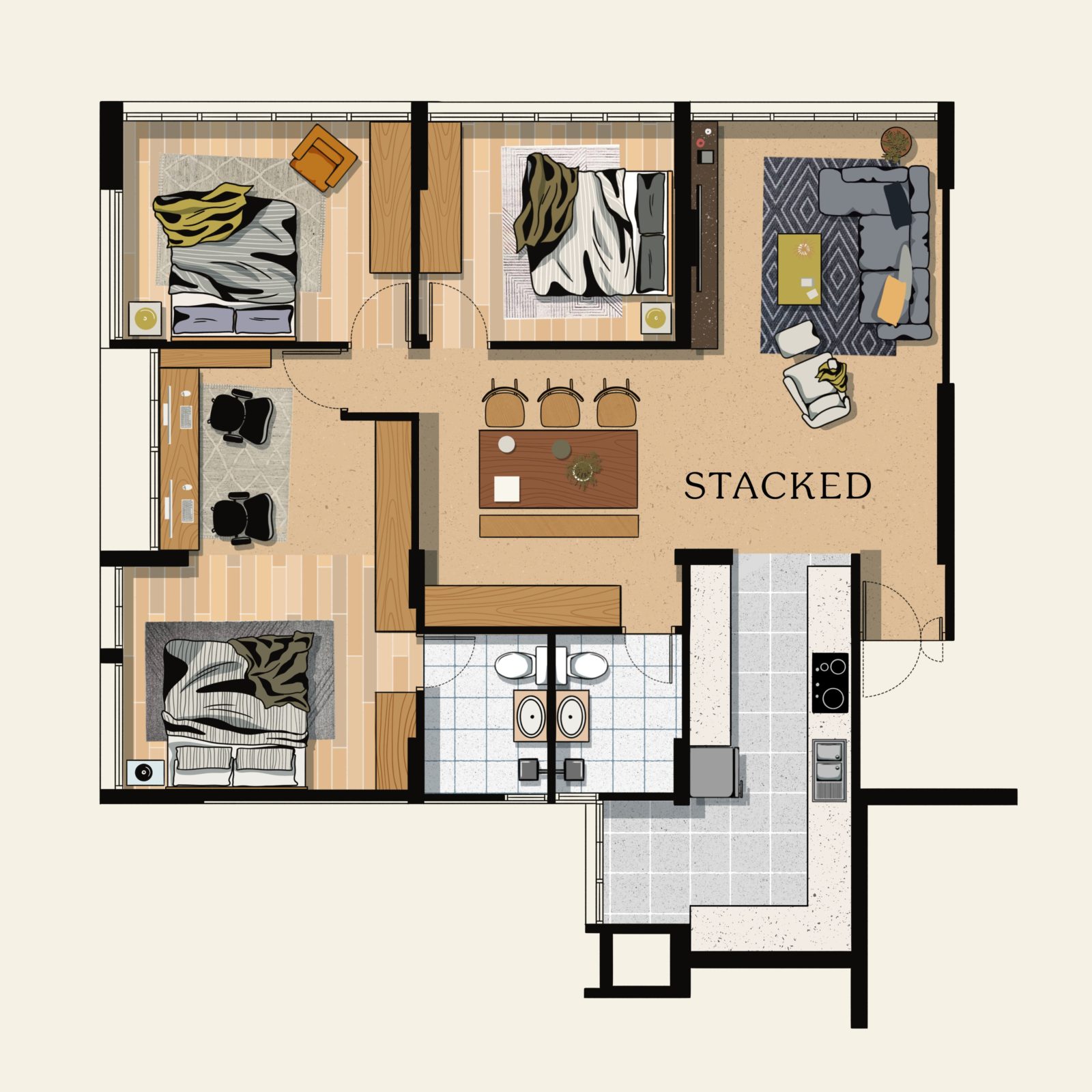
One of the best ways to make use of the lounge/coffee nook space in the dining area is to extend the master bedroom to have a larger, more functional space.
The additional area, as illustrated above, can now be converted into a home office space, perfect for those who need to work from home every now and then. It also helps separate this productivity area, which adds a great degree of privacy, especially if there are visitors.
However, this approach will mean that the dining area will lose the natural light from the windows. As such, it becomes necessary for the dining area to have a good lighting setup, such as some pendant lighting or running lights.
You could also do away with the additional storage, and push in the wall to make the study area smaller and give more space to the dining.
2. For Those Who Love to Cook and Entertain
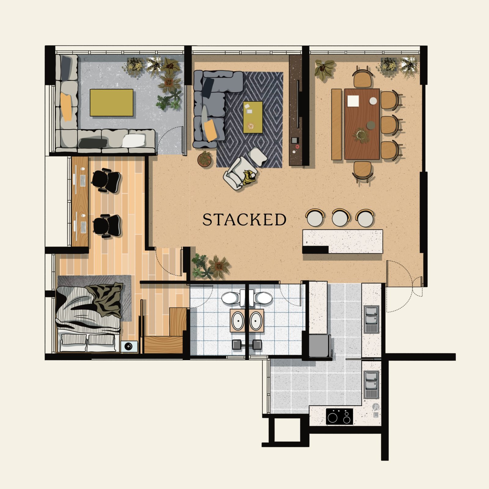
This layout is one for those who just need the one bedroom, and would like to dedicate the rest of the space towards a generous living/dining and entertainment area.
Instead of immediately being greeted by the living room as soon as you enter the home, you now have the kitchen island, which sits between the dining room and the kitchen. Aside from providing additional space to prepare meals while having a conversation with guests, it also makes for a good gathering centrepiece.
To make this possible, part of the kitchen was removed. But given that part of it is a non-removable pillar, this would form an interesting pillar of the kitchen island (you can use it to hang artwork or a clock).
The dining area now occupies the space where the living room was previously located to create continuity from the kitchen to the dining area.
The other bedroom has been converted to a dedicated lounge area, but you can always transform this into something that’s more appropriate for your hobbies.
On the other hand, the master bedroom retained the previous setup, except the walls behind the home office have been pushed forward to allow for more room in the common area. While this will make the home office smaller, you can compensate for it with a compact walk-in closet leading to the master bathroom.
3. A More Open-Concept Implementation
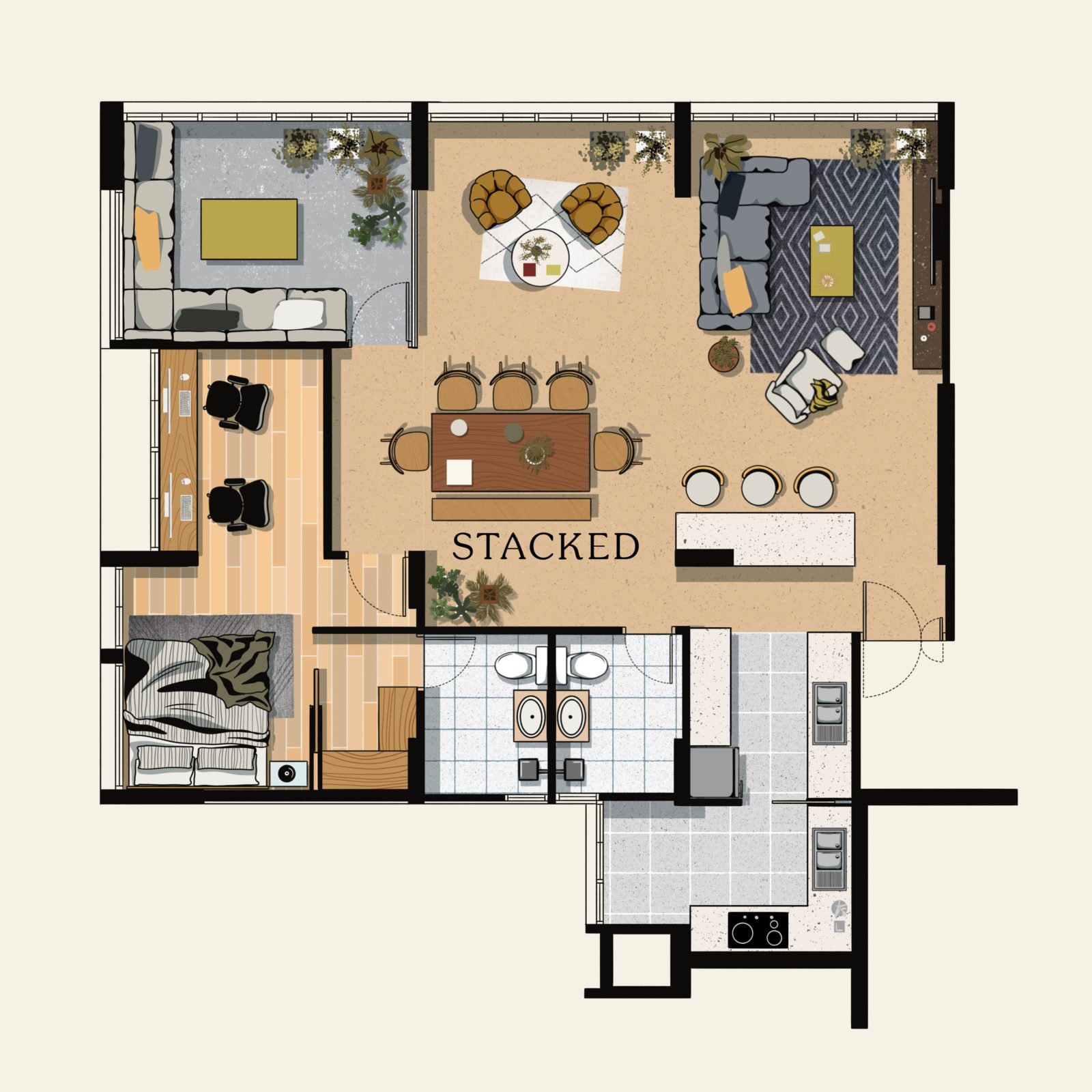
This option is almost the same as the previous one, but it is more suited for someone who prefers a more open-concept floor plan. Here, we decided to completely hack away the wall that separates the dining and the living room.
While we retained the kitchen island in its position, we tweaked the furniture arrangement and moved the living room back to its original location. The dining room, on the other hand, now shares the space with a small coffee nook that immediately faces the window. You could also remove the nook to place a 10-12 seater dining table that runs parallel to the sofa. Along with a suitable pendant light, this could make it an eye-catching centrepiece of the home.
Not only does this arrangement makes the space brighter, but it also allows for more seats, ensuring no guests are left out in the house.
4. Dedicated Work-From-Home Setup
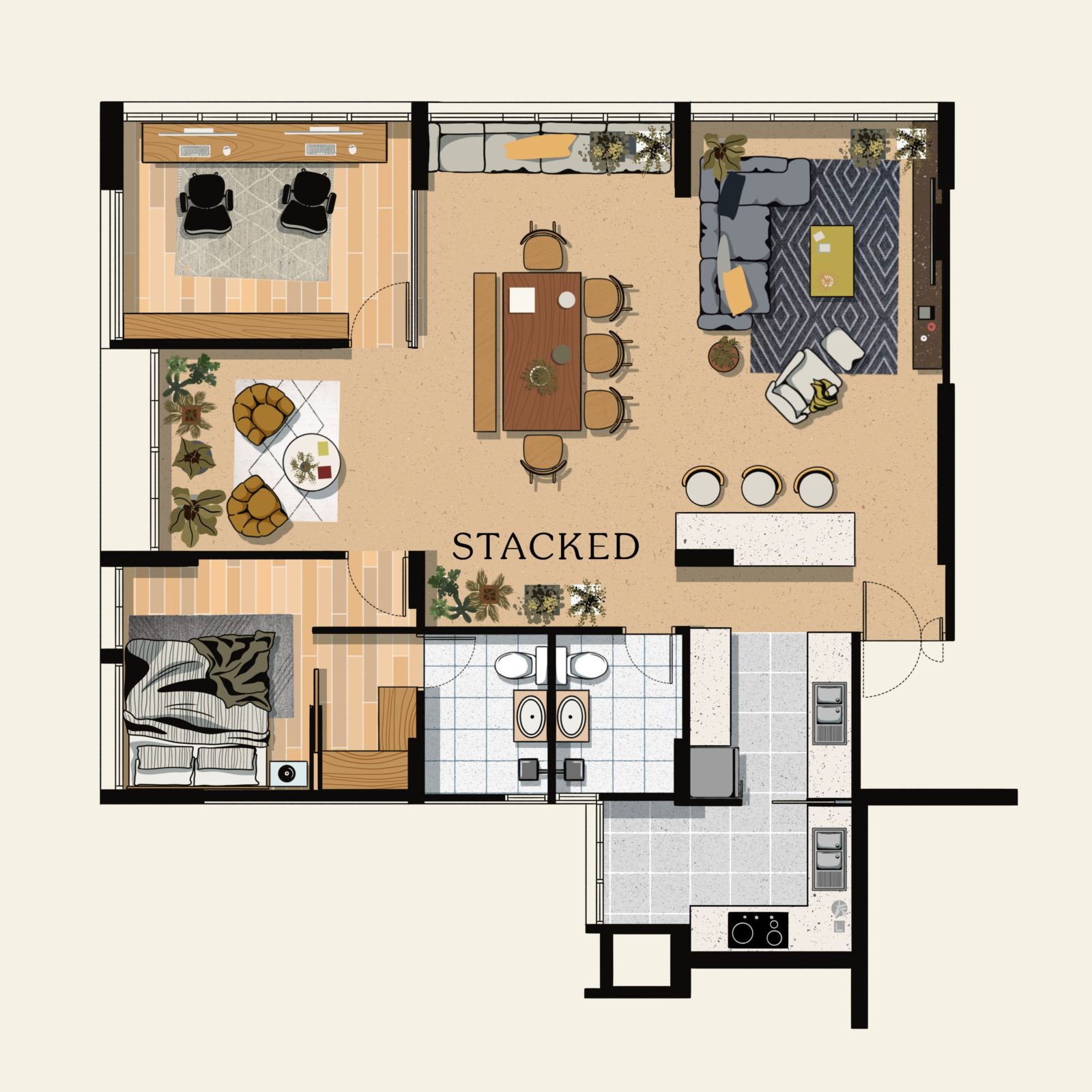
For those who are fortunate enough to still be able to Work From Home and just need the one bedroom, here’s a layout that might be suitable.
You could opt to use one of the bedrooms as a “bay window”, which would make sense here as most of the older HDB units do not sport floor-to-ceiling windows anyway.
5. A Master Bedroom Suite
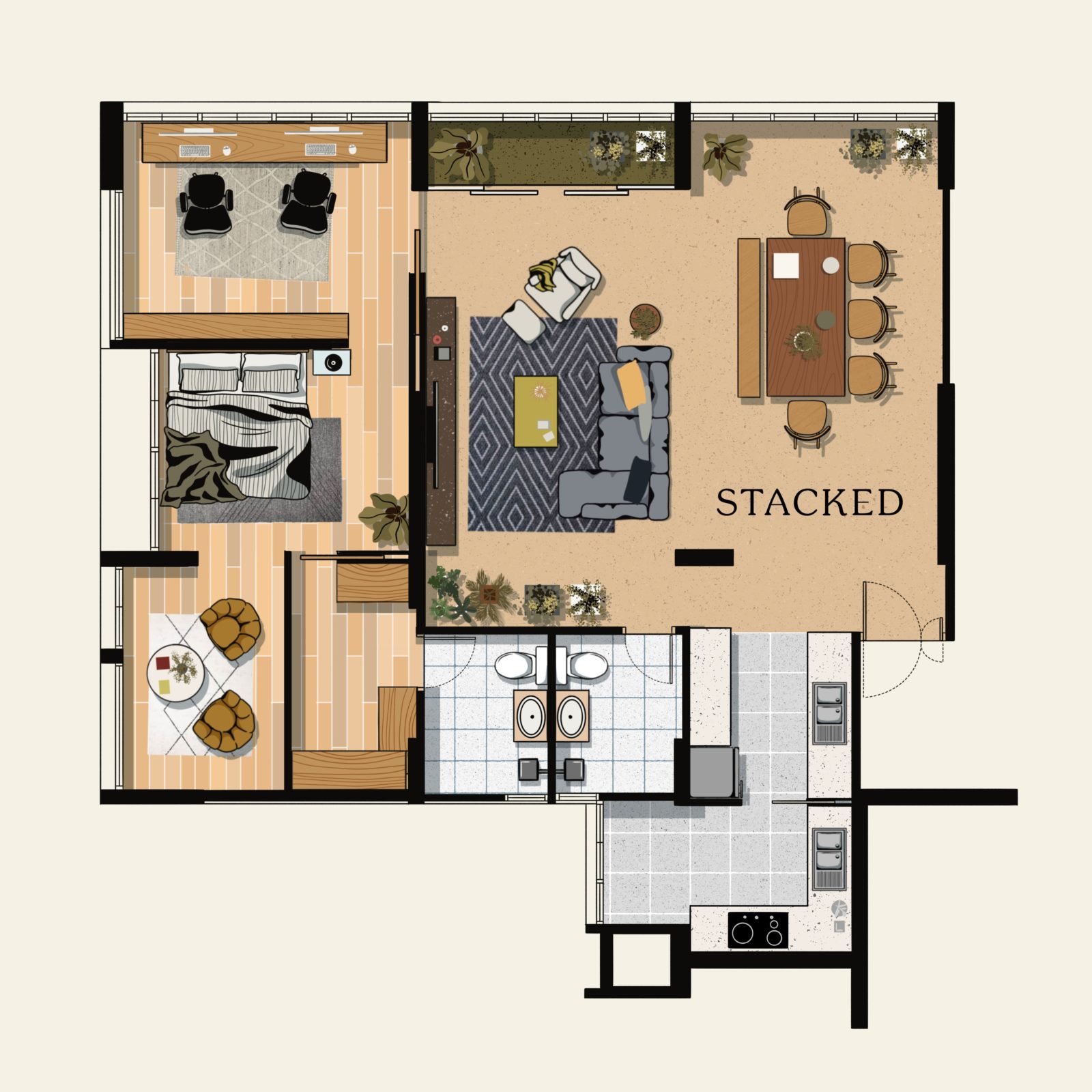
Are you one of those folks whose favourite spot in the house is the bedroom? Or do you want to have a clear and solid separation between your home’s private spaces and those areas available to guests? If you’re in that camp, this might just be a very interesting option to consider.
We call this layout the “master bedroom suite” because it makes your bedroom feel like the ones you experience in hotels – complete with a lounge area and office space. Plus, it also maintains the open-concept design of the living and dining area, especially since the space has been literally squared-off.
While the home office shares the same area as the master bedroom, we kept it well separated by retaining a wall separating the space for productivity and sleep. Additionally, you can now have a full-blown walk-in closet right next to a small lounge area.
If you love the idea of a balcony, you could create a closed-off area for your plants too.
The downside of this space is the pillar that remains at the entrance, which can be a little awkward.
6. A Little Bit of Everything
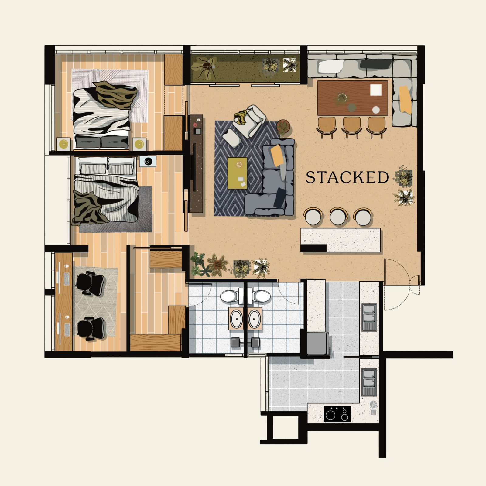
If you’ve been reading through each of the layout ideas before this one, you may have noticed that the best design elements have been spread out depending on priorities. In this option, we decided to pick out the best from each of these ideas and combine them.
While some of these elements may not be what you consider the best in your case, our goal in this particular layout is to give you an idea of how to combine those parts that matter to you.
In this floor plan, we retained the squarish, open-concept layout for the dining and living area by hacking away bedroom 1. We also placed back the kitchen island to the front of the kitchen to serve as a binding centrepiece for all these three areas. The dining table was moved next to the windows for a brighter ambiance and to take advantage of the view outside.
There was no major change for bedroom 2 except that the door was shifted to the wall facing the living area. The door was also changed to a sliding one, which is a better choice than a swivel when it comes to maximising the space.
7. Privacy-Oriented and Larger Kitchen
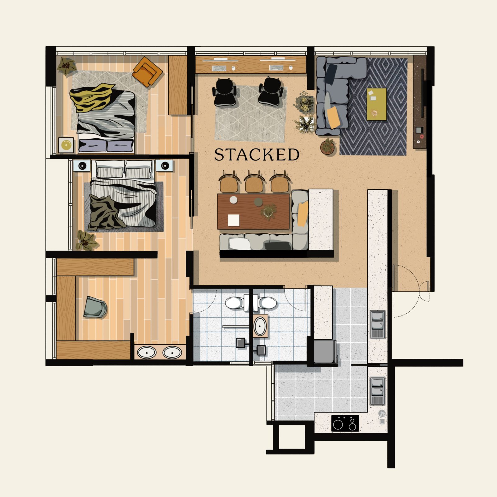
Not everyone wants to have almost all their living or dining area visible as soon as someone enters the front door. That’s why in this last layout idea, we decided to create a short hallway at the entrance, effectively offering privacy to the house.
In able to achieve this, the kitchen had to be considerably extended outward. As such, this change provided privacy and extended the kitchen so you can continue to entertain guests while you prep the food.
To combat the awkward pillar, it was turned into a feature wall instead, that can also form the backdrop of a bench seating for the dining.
The master bedroom is larger, with a space for a dresser, walk-in closet, and even wash basin counters immediately outside the master bathroom. As a result, there’s now more space in the master bathroom.
Do you have any more 5-room HDB layout ideas? Feel free to let us know at stories@stackedhomes.com or send us your floor plans and we can see what we can do!
At Stacked, we like to look beyond the headlines and surface-level numbers, and focus on how things play out in the real world.
If you’d like to discuss how this applies to your own circumstances, you can reach out for a one-to-one consultation here.
And if you simply have a question or want to share a thought, feel free to write to us at stories@stackedhomes.com — we read every message.
Need help with a property decision?
Speak to our team →Read next from Property Advice
Property Advice Should We Sell Our Freehold Condo For A $2.2M Leasehold Landed Instead?

Property Advice Should I Buy A Freehold Condo In A Landed Enclave — Or Look Elsewhere For Better Growth?

Property Advice We Own A 2-Bedder Condo In Our Early 30s: Should We Upgrade To A New Launch Or Resale With $2.2M?

Property Advice What A Family Of 5 Can Really Buy With $2 Million In Newton And Redhill
Latest Posts
Property Market Commentary 18 Upcoming New Launch Condos In 2026 — Where They Are And The Ones To Watch
Singapore Property News Kallang Close GLS Site Sold For $610.8 Million: New Waterfront Condo Could Launch From $2,900 PSF

PRO Pro Bishan Loft EC Price Review: Why This Older Executive Condominium Saw Strong Gains








0 Comments