5 One-of-a-Kind Condo Layouts In Singapore You Probably Haven’t Seen Before
Get The Property Insights Serious Buyers Read First: Join 50,000+ readers who rely on our weekly breakdowns of Singapore’s property market.
A seasoned content strategist with over 17 years in the real estate and financial journalism sectors, Ryan has built a reputation for transforming complex industry jargon into accessible knowledge. With a track record of writing and editing for leading financial platforms and publications, Ryan's expertise has been recognised across various media outlets. His role as a former content editor for 99.co and a co-host for CNA 938's Open House programme underscores his commitment to providing valuable insights into the property market.
Maybe it’s the ABSD, or maybe it’s just high land costs, but most developers play it safe today. This means a lot of condo projects end up being quite cookie-cutter, as no one wants to risk big deviations from the norm. For homebuyers who are tired of the usual aesthetic though, or who like a creative bent to their home, here are some of the more unusual options to look out for:
1. The Draycott
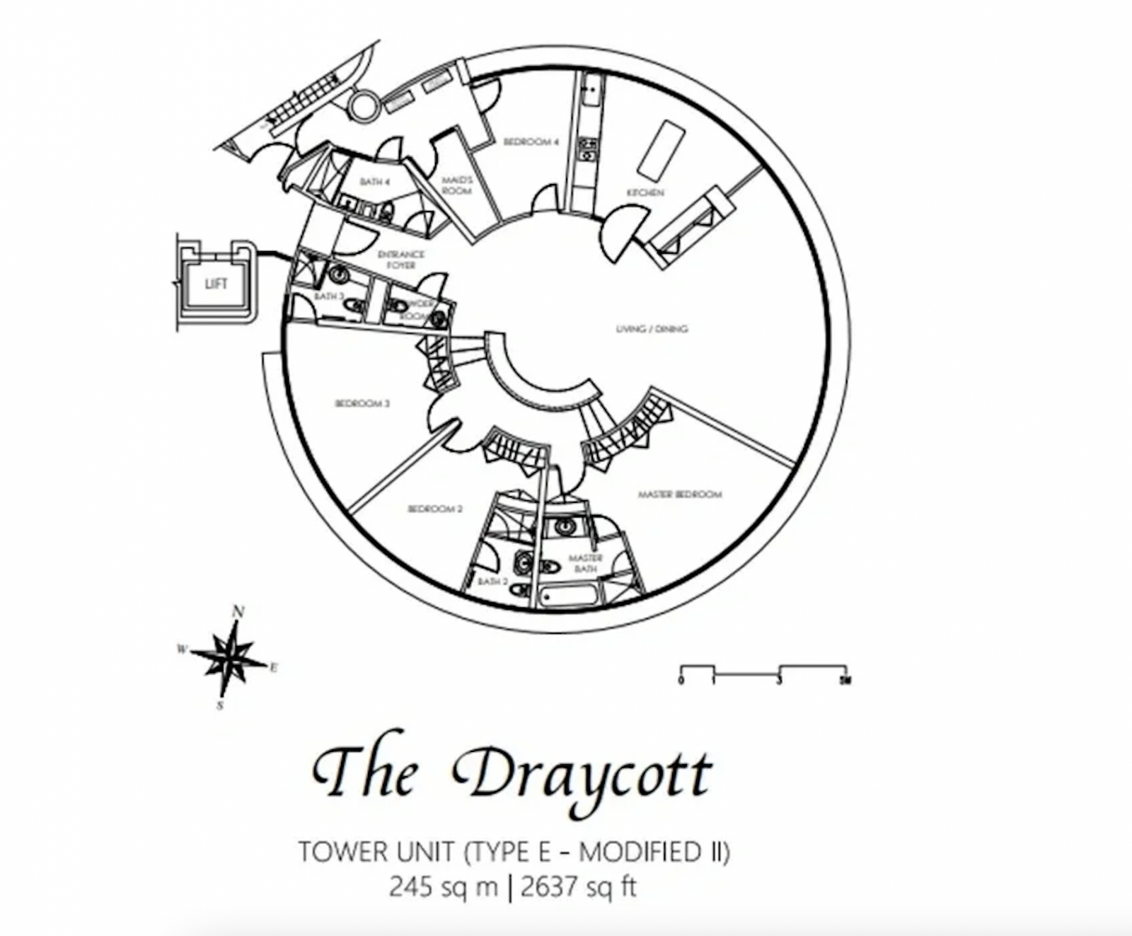
The Draycott was built in 1980, at a time when developers were more experimental. This 132-unit freehold project is within the Orchard area, and so close to the shopping belt that you can walk to Far East Plaza from here.
This is a circular high-rise building, which was a popular experimental concept in the 1980s. While it is challenging from an interior design perspective (you’ll need a lot more in the way of custom work, as most furnishings are designed to accommodate square rooms), it offers some unique advantages. One of these is the unit having better panoramic views of the Singapore cityscape.
The other advantage is that these units, which are quite large at over 2,600+ sq. ft., are also more space efficient: the circular layout removes the need for connecting corridors, and there’s better natural ventilation. With a circular layout, there’s simply more exterior surface area to capture the light.
Also note that the private lift opens up into a foyer rather than directly into the living room, which does give a better sense of privacy.
Circular layouts are very rare in the current era, and are rarely found among new launches (the newest condo like this is One Pearl Bank, which was designed to look like the old circular Pearl Bank apartments).
2. Reserve Residences
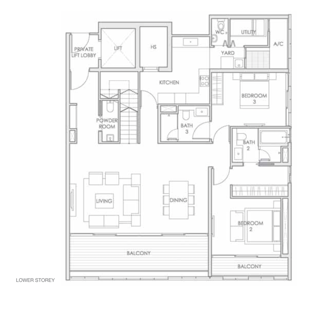
Reserve Residences is a new launch 99-year condo that will be completed by 2028. This is one of the bigger projects in Beauty World, with 732 units. Despite the unit count, it’s 95 per cent sold out and was a fast mover from the start; probably because you are right next to Beauty World Plaza and MRT (DTL).
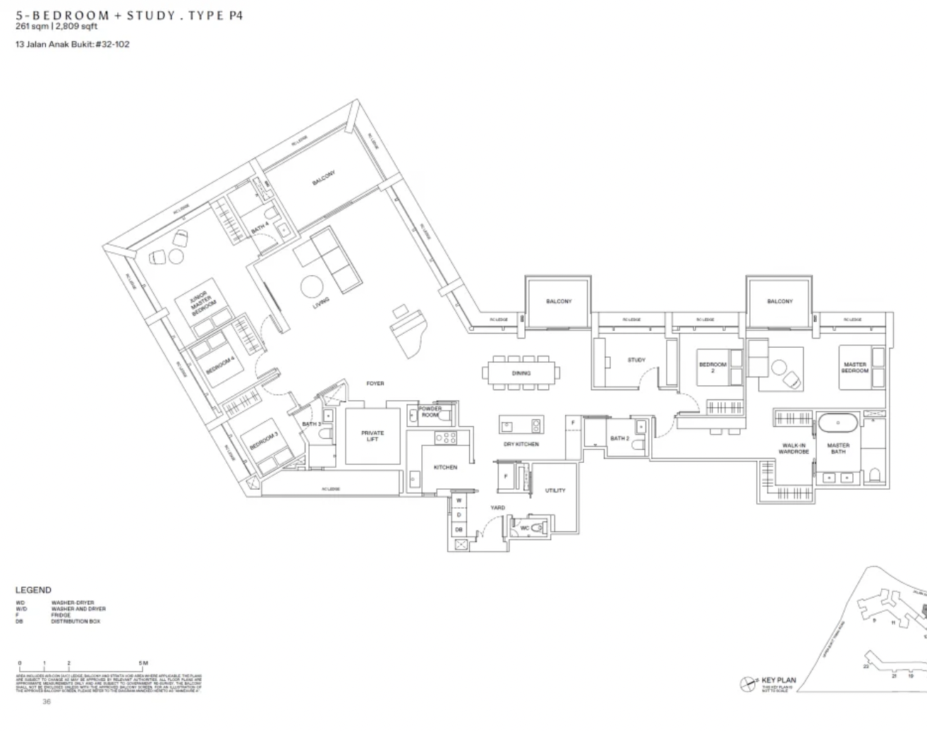
The angled portion of the unit is used to subtly divide the living and dining areas; while there’s no partition (although it’s easy enough to install one), this works well for families who like a more traditional approach: most condo units today simply merge living and dining rooms into a single space.
From the get-go, we heard repeatedly that the layout will be good for extended families, or those who want to maintain privacy while having guests. The concept does seem to work out: there’s a good amount of separation between the master bedroom on one end, and the junior master bedroom (and its accompanying bedrooms) on the other. It’s almost as if the angled portion of the unit is a sub-unit of its own.
The study room adds some versatility, and can be easily repurposed into a home office or another bedroom if you need.
It’s quite a clever layout as the odd angle could be awkward, but it’s turned into a unique feature instead. That said, not every homebuyer may appreciate having three separate balcony spaces.
3. Lloyd 65 (also spelled as Lloyd SixtyFive)
This small (76 unit) freehold condo in Orchard was built in 2016, and is one of the closest units to the Somerset stretch. You can walk to Somerset MRT (NSL) from here, but it’s just far enough from the main road that you’re shielded from the noise and crowds. Lloyd 65 was also designed by W Architects, which gives it quite the pedigree – this was the same firm behind the refurbishment of the National Museum of Singapore, and luxury icons like The Nassim.
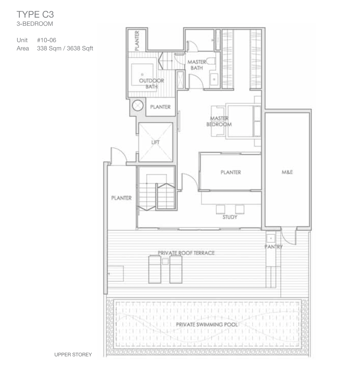
While it is not unusual for large luxurious units in the CCR to have a private swimming pool, this layout is quite unique if you want a unit with the ultimate privacy for the master bedroom: so besides being located on the floor above the rest of the unit, it has an attached private pool, along with pool deck/roof terrace. There’s also a study space on the top floor, which can be used to extend the master bedroom, or used as a home office.
More from Stacked
5 Cheapest Newly MOP-ed 5-Room Flats Near An MRT Station (From $740k)
As we all know, the supply of BTO flats is expected to increase in the upcoming future (I know many…
Also unique is the outdoor bath, attached to the master bathroom. This is secure from public view, but provides the user with a view of the private terrace space – a feature more commonly found in upscale landed homes.
While planter boxes are often considered inefficient space wasters, this layout is very big (3,638 sq. ft.), so there’s ample space for this sort of greenery. It probably wouldn’t work in a more compact unit, where space is at a premium.
Because the other bedrooms are all on the lower floors, this is very good for retaining your privacy whilst having guests or extended family. The lift also accesses both floors, so it’s not an issue for less mobile residents.
4. Jardin
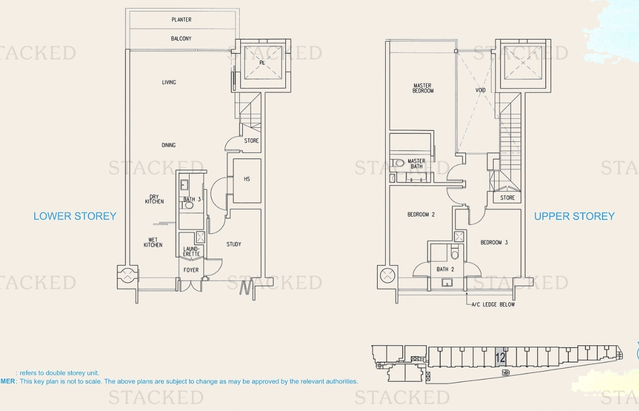
Jardin is a compact (140-unit) freehold condo, within walking distance of King Albert Park MRT (DTL, TEL). Besides its own facilities, it has benefitted quite a bit from the redevelopment of King Albert Park (KAP), with the mixed-use KAP Residences adding retail, food, and a cinema to the vicinity. Jardin is also favoured by those who want easy access to Beauty World, without the usual crowds and traffic problems that occur nearer to Beauty World Plaza.
The double-storey units here have an unusual entrance, where the main door is accessed along a common corridor (although you do have private lift access too). This may have privacy concerns for some people, but for others, the view out towards the green corridor may be quite a nice change. The bottom floor has no bedrooms, although the study space could be converted into one. The high ceiling over the living and dining areas is used to open up the space, and the unit has both a wet and dry kitchen. The stairs are tucked into a corner, rather than being directly visible from the entrance; a positioning that will please Feng Shui believers.
The bedrooms are all on the upper level, and this will be appreciated by families who want to separate private areas of the home, from the parts frequented by guests. The bottom floor is deliberately left as open and flexible as possible, so this is a very versatile space for designers to work on.
5. The Balmoral
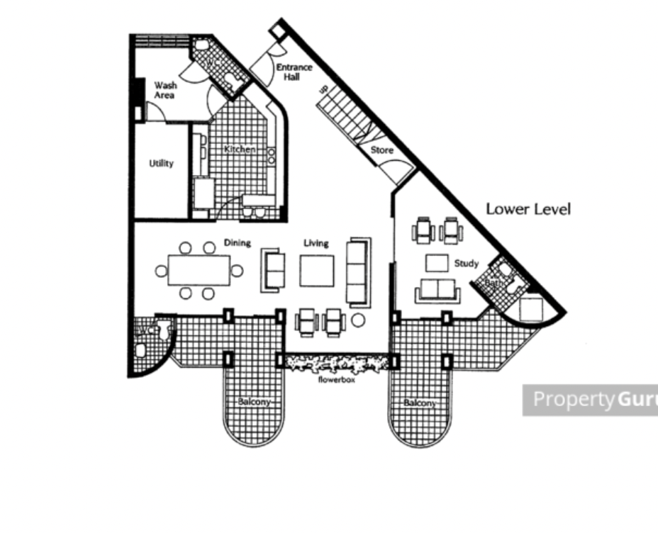
The Balmoral is a freehold project that dates back to 1986. This 81-unit project is cosy and highly private, and only around a seven-minute drive to the heart of the Orchard shopping belt. The project is also known for being within the enrolment range of Singapore Chinese Girls’ School and ACS Barker Road, which makes for a good family condo in the heart of the city.
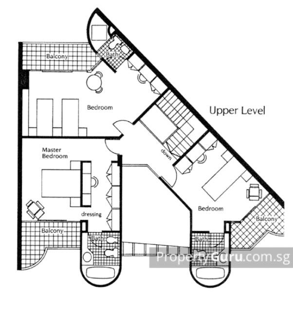
Wedge-shaped layouts are considered tougher to work with, as you get more odd nooks and crannies. But layouts in the ‘80s were much more unusual and unique, so that’s what you’re seeing here: note the multiple large balconies, which were also considered desirable at the time (although today, some owners consider them to be space-wasters). But if you love large balconies for alfresco parties, this layout gives you ample room for it.
While the wedge layout is odd, the use of space (barring the subjective balcony issue) is efficient; the rooms connect directly without needing corridor space. The upper floor holds all the bedrooms, creating a neat separation between the family’s personal spaces and potential guest spaces. For those who don’t want to use the stairs, the study room is sizeable and has its own attached bathroom – that’s good for conversion to a bedroom, even if the shape is unusual.
Feng Shui believers might not like how the stairs are the first thing you see upon entering though.
For more unusual layouts and reviews of new and resale condos alike, follow us on Stacked. If you’d like to get in touch for a more in-depth consultation, you can do so here.
Ryan J
A seasoned content strategist with over 17 years in the real estate and financial journalism sectors, Ryan has built a reputation for transforming complex industry jargon into accessible knowledge. With a track record of writing and editing for leading financial platforms and publications, Ryan's expertise has been recognised across various media outlets. His role as a former content editor for 99.co and a co-host for CNA 938's Open House programme underscores his commitment to providing valuable insights into the property market.Read next from Property Picks
Property Picks Where To Find The Cheapest 2 Bedroom Resale Units In Central Singapore (From $1.2m)
Property Picks 19 Cheaper New Launch Condos Priced At $1.5m Or Less. Here’s Where To Look
Property Picks Here’s Where You Can Find The Biggest Two-Bedder Condos Under $1.8 Million In 2025
Property Picks The Cheapest 2 And 3-Bedder Condos Within 1km Of Top Primary Schools—From Just $1 Million (Part 2)
Latest Posts
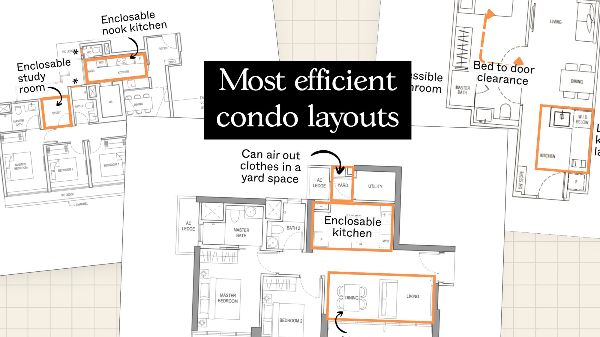
Property Advice The New Condos In Singapore With The Most Efficient Layouts In 2025 Revealed – And What To Look Out For
On The Market The Cheapest 4-Bedroom Condos Under $1.7M You Can Buy Today
Homeowner Stories We Could’ve Sold Our Home for More, But We Didn’t — Here’s Why We Let It Go in Just 24 Hours
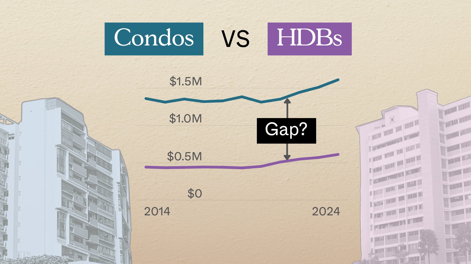
Pro Condo vs HDB: The Estates With the Smallest (and Widest) Price Gaps

Property Advice The Hidden Costs of Hiring a “Cheaper” Agent In Singapore

Property Market Commentary I Tested ChatGPT Against Claude on Singapore Condo Floor Plans — And There Was a Clear Winner
Editor's Pick Treasure at Tampines Pricing Review: How Its Prices Compare to D18, OCR, and the Wider Market
Property Investment Insights Which Resale Two-Bedroom Condos Quietly Made Buyers Six-Figure Profits In Singapore?
Property Market Commentary Why Developers Are Now Building for Families in Singapore’s Most Expensive Districts
Editor's Pick We Toured A Freehold Landed Estate Next To Mount Faber – With Semi-Detached Units From $5.2million

Singapore Property News Why More Singaporeans May Soon Trade Condos For Resale HDBs

Editor's Pick Singaporeans Are Buying More Overseas Homes — But Few Have Prepared For These Things
Singapore Property News This 5-Room HDB in Clementi Just Sold For $1.458M: Here’s What The Seller Could Have Made
On The Market We Found The Cheapest And Biggest 5-room Flats Over 1,400 Sq ft You Can Buy Right Now
Pro Low Floor vs. High Floor: What Transaction Data Reveals About the Premium


