What makes a good condo layout? Well, the answer is, truthfully, quite subjective – but there are some common features that most people appreciate. So to prevent you from being fooled by a nice show flat – or roundabout reasoning by sales teams – here’s a list of things that most homeowners will appreciate about the layout. And remember, even if you’re not particular about it, your tenant or future buyer may be:
So many readers write in because they're unsure what to do next, and don't know who to trust.
If this sounds familiar, we offer structured 1-to-1 consultations where we walk through your finances, goals, and market options objectively.
No obligation. Just clarity.
Learn more here.
1. In general, fewer corridors are better
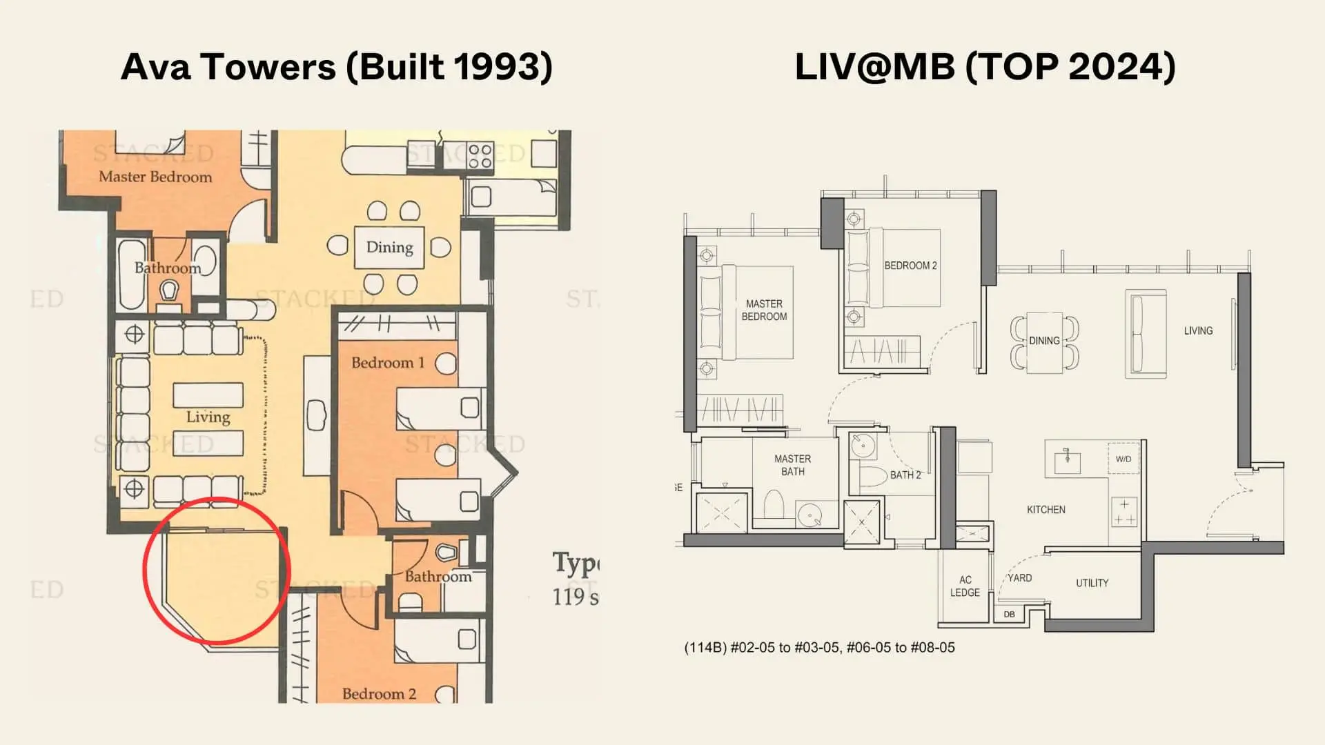
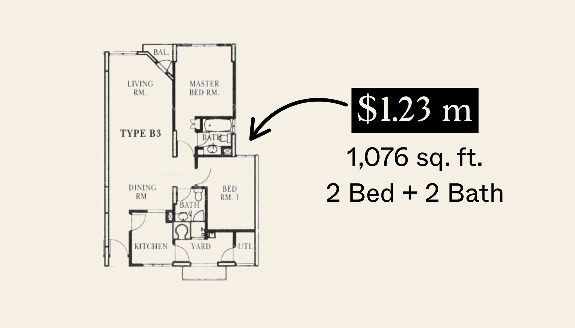
Corridors are undesirable for several reasons: they aren’t versatile or usable spaces (there’s not much you can do except walk down a corridor), and depending on how they’re positioned, they can obstruct airflow and the path of natural light. There’s a reason horror movies love to use corridors, as they tend to be darker areas which can also feel claustrophobic.
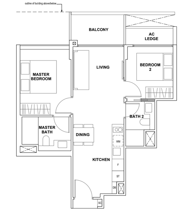
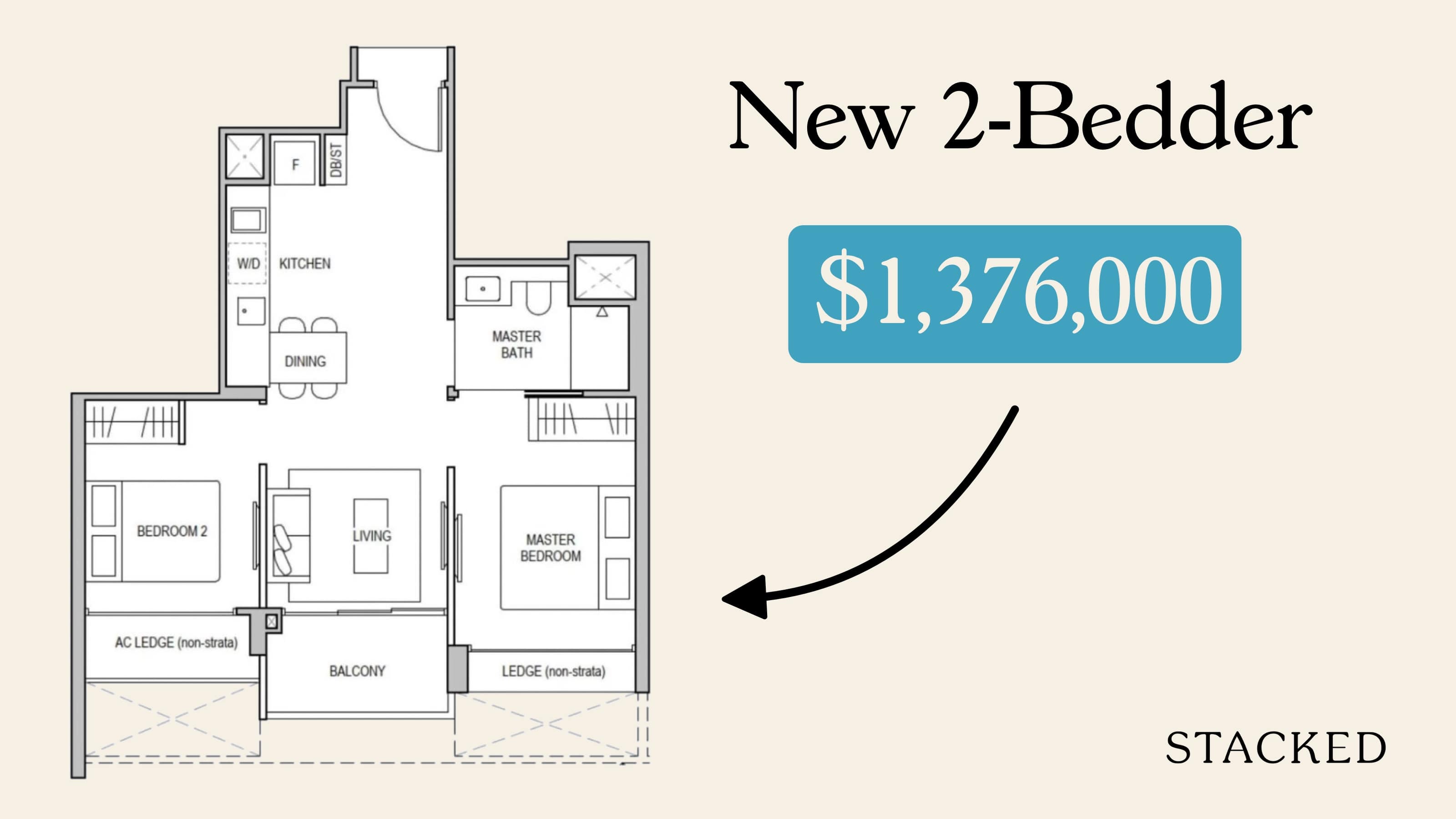
Newer condos tend to minimise corridor spaces with a dumbbell layout, in which the living/dining area acts as the connecting point between bedrooms on either side. This is also more space-efficient, as all the available square footage contributes to room sizes rather than corridors.
2. Rectangular or squarish rooms are more versatile and easier to furnish
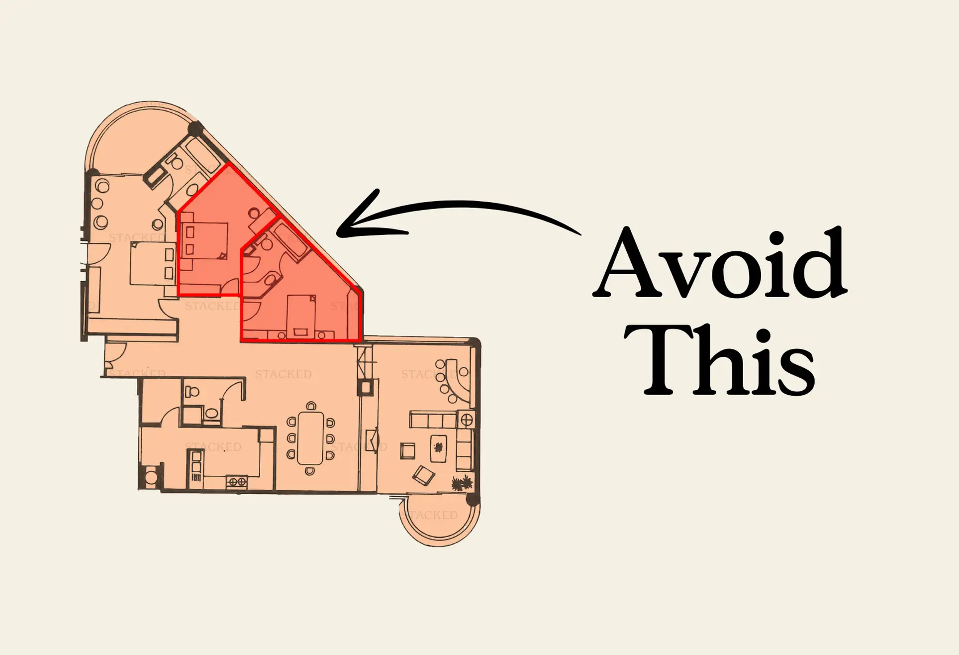
Older condos tended to be more experimental – and while that’s not always bad, it does mean some of them have rounded or wedge-shaped rooms. These odd shapes tend to make the layout less versatile because it’s not as easy to partition them to create new rooms, or fit them into more traditional design themes.
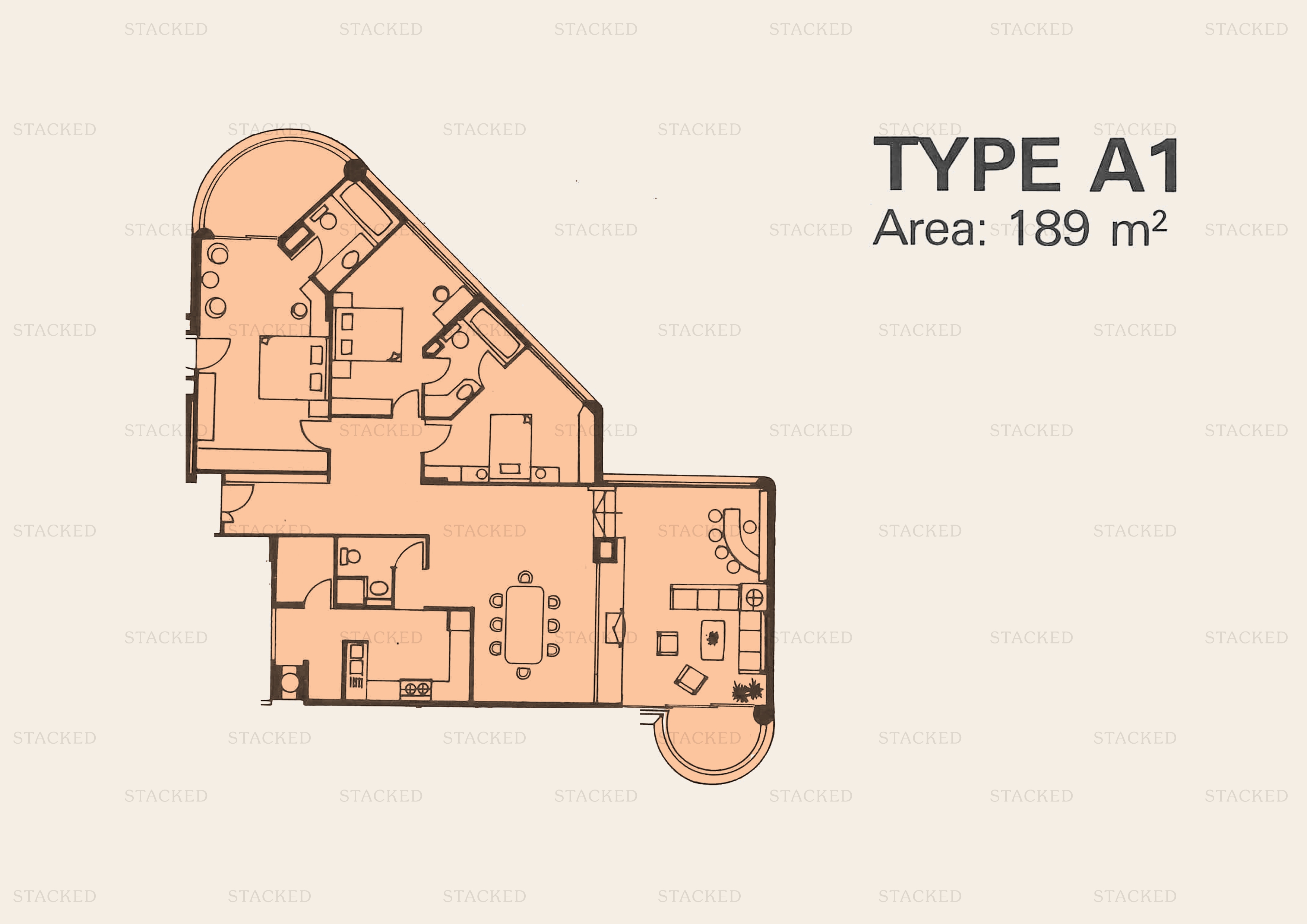
There’s also a tendency for costs to increase because odd-shaped rooms tend to require more in the way of custom work. When it comes to furnishings, remember that most items – from sofas to desks and beds – are generally designed to accommodate squarish rooms and not rounded walls.
That said, if you are willing to bear higher costs for things like custom carpentry and furniture, odd-shaped rooms can be quite exotic and interesting.
3. Check if the “plus one” is truly viable
Some layouts will be designated with a “plus one”, such as a 3+1 bedder. The plus one suggests there’s enough space to add one more room, which can mean anything from a small study to a reasonably sized bedroom.
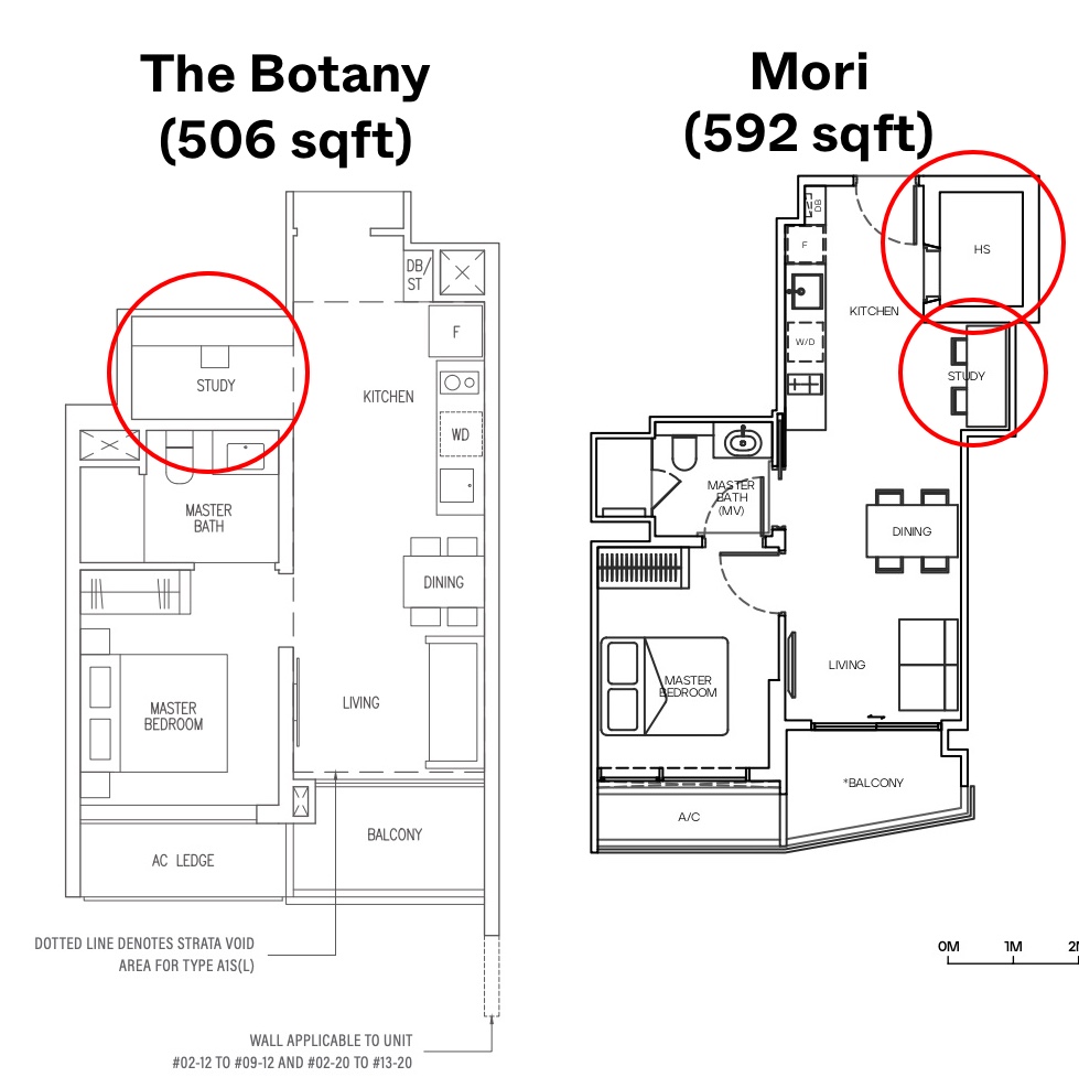
The problem is that the term is used far too liberally these days. Some developers describe even a small amount of extra space as “plus one,” and if you try to follow through with this, you end up with something awkward: a bedroom that’s too small to fit a wardrobe, a study that’s in an odd corner with no sunlight, and so forth.
Note that quite often, showflats will not exhibit the “plus one” optional room, to make them appear as spacious as possible. Once you do add the extra bedroom/study, it may look far more cramped than what you’re seeing.
4. Check for bedrooms on the lower floor, for duplex units
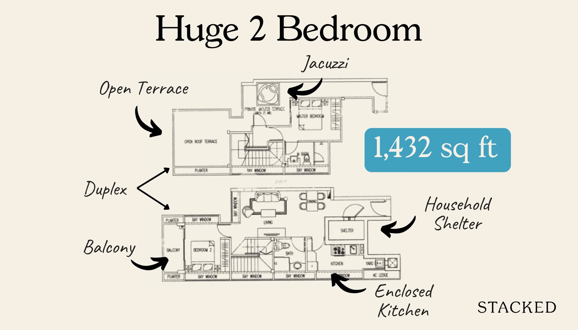
Some duplex units have only the living room and kitchen on the ground floor, while the bedrooms are on the second floor.
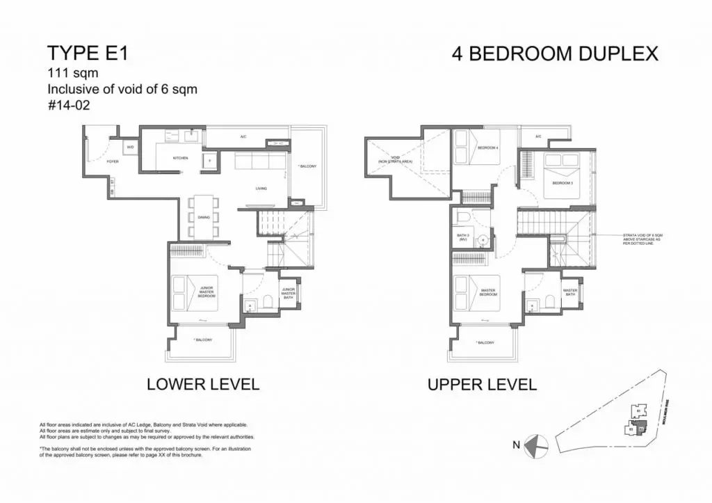
This arrangement is less ideal for families with older members, as it forces them to use the stairs. This is one of the main reasons we hear for people selling their HDB maisonettes or their landed properties: once they’re older, the stairs become a safety hazard. So ideally, there’s a bedroom on the lower floor that they can use.
There’s also the benefit of some extra privacy, if there’s a bedroom on another floor. If you ever have a tenant, for example, it can be more comfortable if they’re living downstairs, while you reside in the upper floor bedrooms.
5. Look for ventilation in the kitchen and bathrooms
Bathrooms without ventilation are quite unpleasant. No one wants to go in after someone’s done their business, and we’ve seen older condos where you need to open the door and blow a fan to “air it out” afterwards.
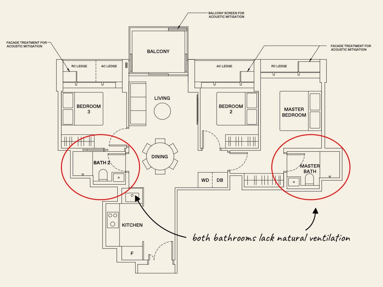
For enclosed kitchens, ventilation is important for any kind of serious home cooking. Unless your meals are strictly microwave/air-fryer affairs, you need to have some way for the smoke and smells to escape. One serious danger of enclosed, poorly ventilated kitchens is the film of grease that can coat the floor, especially if you’re frying with a wok. Besides the fall risk, you’ll need to mop almost immediately after cooking, every time.
6. Look for natural light and wind flow
This is a very underrated point, that most people don’t think about. But finding a home that has cross-wind is very ideal (check the unit facing). This allows the area to be naturally cool, sometimes even without air-conditioning or a fan on the higher floors.
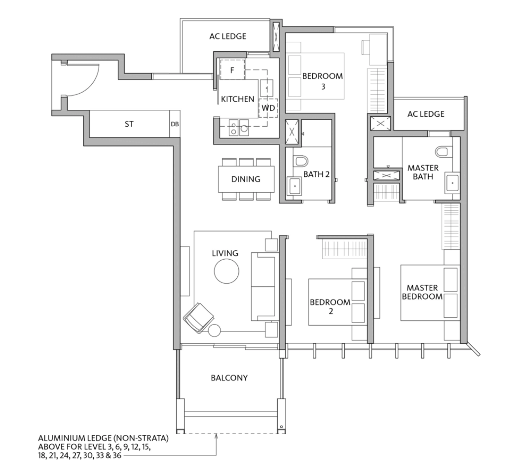
You also want to be careful when it comes to the layout of the living/dining. A long one means that you don’t have much natural light that can reach in. Other than natural light helping an area to look more spacious, it can also be a great saver in terms of electricity. Those who are looking to incorporate more plants will want to be wary too, as you will be limited to the types of plants that you can have in your home.
Just be careful where you position a TV or computer though: you don’t want the natural light to be directly behind you when you’re looking at the screen. This will create a lot of glare and reflection.
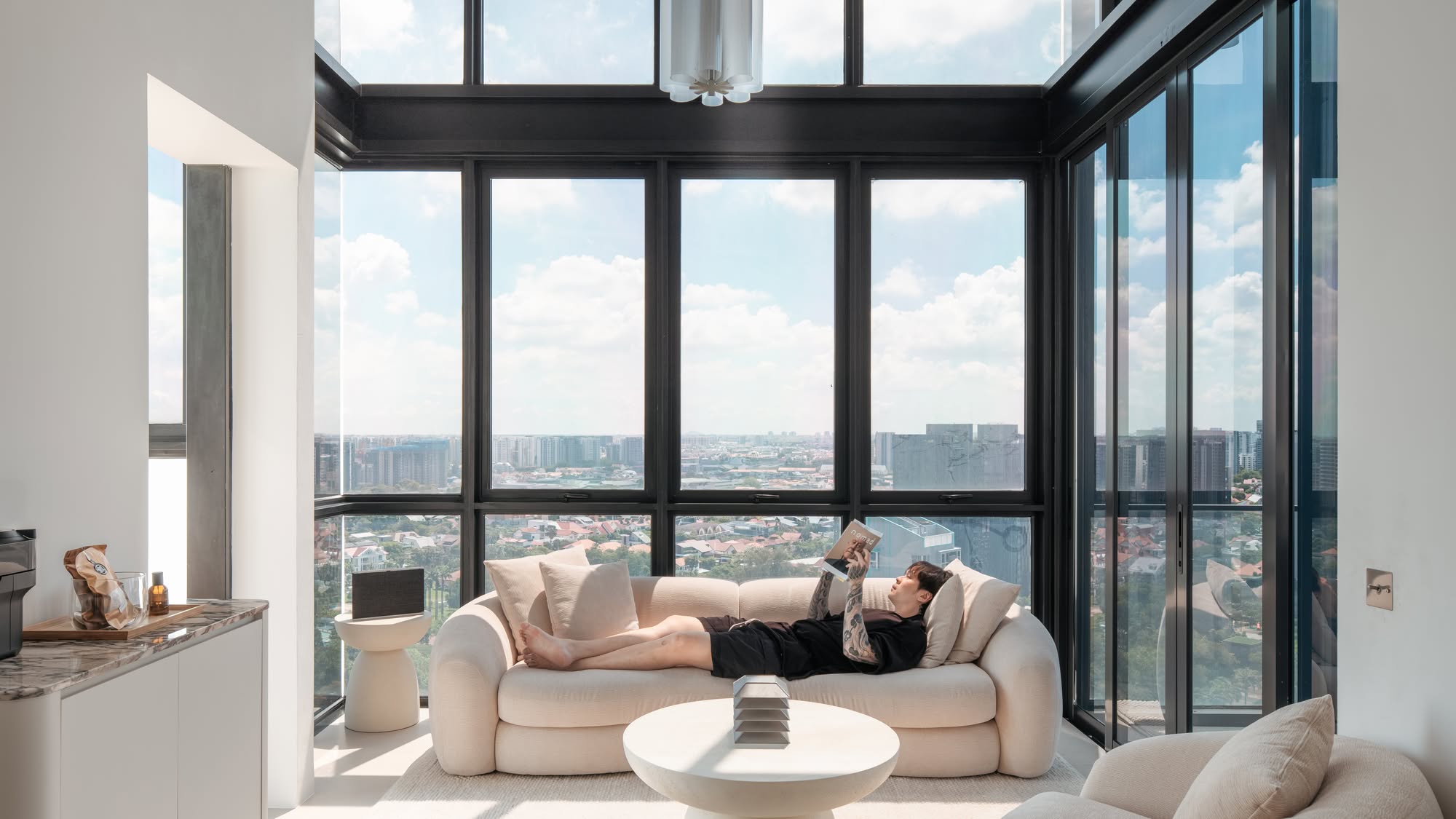
7. For high-ceiling units, remember there are additional challenges
If you want a high-ceiling unit, it may be best to settle for simpler lighting fixtures. A chandelier is already hard to clean, and it’ll be twice as bad hanging off a three-metre ceiling.
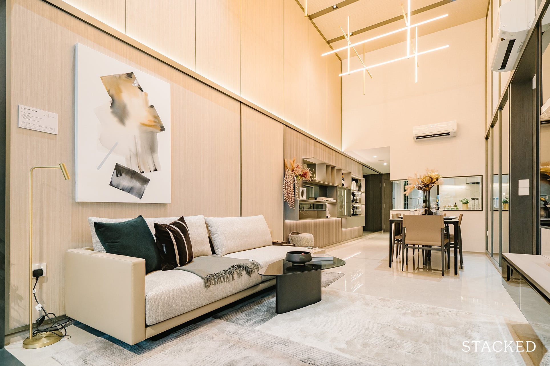
For some condos, the ceiling is so high, that a conventional ladder may not even be enough; and something as simple as changing a light bulb, or clearing the cobwebs on the ceiling, could become a monumental effort.
As an aside, high ceilings can affect the room’s acoustics; if you have a powerful home theater system, you may be dealing with a lot of echoes, or extra loud screams and explosions, when watching a movie.
8. Check that the kitchen space allows you to use both walls
Some kitchen spaces don’t have the traditional “U” shape – there may only be one wall available for cabinetry, while the other opens up to a service yard or is just windows. If you don’t do too much cooking, this may be acceptable – but serious home cooks dislike it, as it means fewer storage options in the kitchen. It could also mean having to walk over to a distant storage area for tools or spices, which interrupts the floor of food preparation.
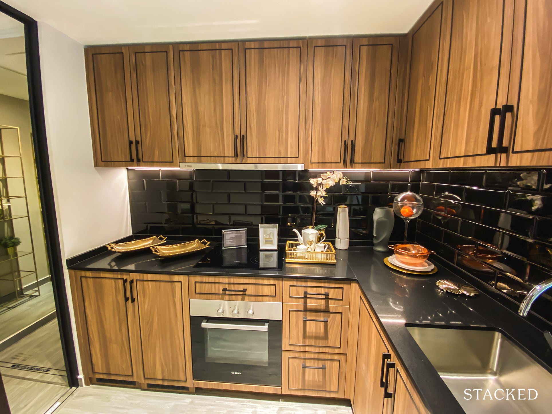
Conversely, those who don’t cook much may prefer a kitchen where one side is a balcony, service yard, or floor-to-ceiling windows; it may even strike them as appearing more spacious and better-lit.
9. The service yard should be big enough to be useful
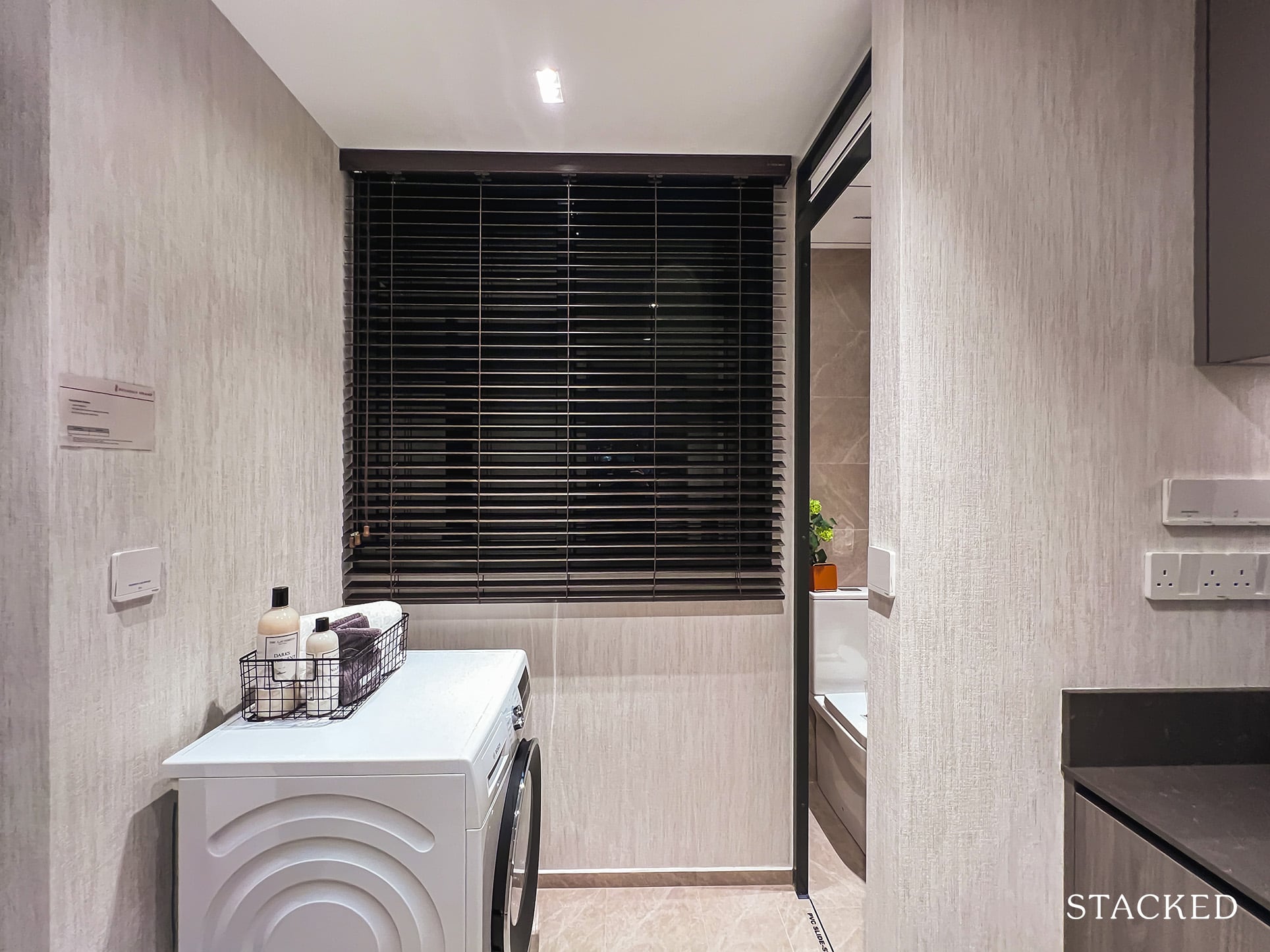
Some service yards are half-hearted and tiny, added just so the developer can say there is one. These types of service yards are almost useless, being too small to fit proper washer/dryer machines or hang any significant amount of laundry. They would have been better off just added to the space of the kitchen.
10. Outdoor areas should be correctly sized and maintainable
In the 2010s, there was a trend of building huge balconies and patio spaces, to max out the space developers could charge for (but that they themselves didn’t have to pay charges for). You may want to consider how much you love outdoor spaces, as quite often these big balconies/patios are chewing into the total square footage. A more reasonably sized outdoor area might give you a more spacious living room, for the same price.
Maintenance is also an issue here. Landed homes with rooftop access, for example, often end up abandoning rooftop patios/BBQ areas. This is because it’s a large area exposed to the elements, and just tough to clean.
On a related note, rounded balconies tend to have the same issues as rooms with rounded walls; it might be harder to fit appropriate furnishings. Future buyers may also consider the look to be dated, as it’s a very ‘80s trend to have these.
For more on condo interiors and layouts, follow us on Stacked. You can also check out our reviews of new and resale project layouts.
At Stacked, we like to look beyond the headlines and surface-level numbers, and focus on how things play out in the real world.
If you’d like to discuss how this applies to your own circumstances, you can reach out for a one-to-one consultation here.
And if you simply have a question or want to share a thought, feel free to write to us at stories@stackedhomes.com — we read every message.
Ryan J. Ong
A seasoned content strategist with over 17 years in the real estate and financial journalism sectors, Ryan has built a reputation for transforming complex industry jargon into accessible knowledge. With a track record of writing and editing for leading financial platforms and publications, Ryan's expertise has been recognised across various media outlets. His role as a former content editor for 99.co and a co-host for CNA 938's Open House programme underscores his commitment to providing valuable insights into the property market.Need help with a property decision?
Speak to our team →Read next from Property Advice
Property Advice Should We Sell Our Freehold Condo For A $2.2M Leasehold Landed Instead?
Property Advice Should I Buy A Freehold Condo In A Landed Enclave — Or Look Elsewhere For Better Growth?
Property Advice We Own A 2-Bedder Condo In Our Early 30s: Should We Upgrade To A New Launch Or Resale With $2.2M?

Property Advice What A Family Of 5 Can Really Buy With $2 Million In Newton And Redhill
Latest Posts
Singapore Property News HDB Resale Prices Fell — But A Third Of Buyers Still Paid $800K+ Last Quarter. Here’s Why

Singapore Property News Three Strata Office Floors In Suntec Priced From $135M

Singapore Property News This Freehold Desker Road Shophouse Is Going For $10.5M













0 Comments