


The very first time I had popiah, ice cream, and coriander together, I was quite blown away.
On the menu, it read like a chef’s drunken misadventure in the kitchen to come up with such a creation. It sounds very strange, but once you taste it together, the flavours just blended so well.
(If this is your first time hearing of it, it’s well worth a try!)
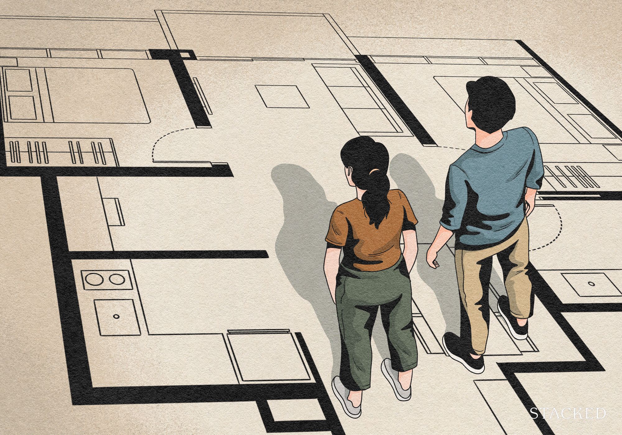
Much like in the interior design world, it’s all about combining different elements to create a cohesive and visually appealing end result. Interior design is not just about selecting furniture and decor that you like, it’s also about considering the overall feel and atmosphere you want to create in a space. One of the most important aspects of interior design is the use of colour, style, and texture.
We all know about the usual combinations like white, marble, and walnut wood colours. These are timeless combinations that won’t go wrong. But if you’re looking for something a little more unconventional (and with a little pop of colour), here are some more unique colour and material combinations that you can consider:
Table Of Contents
- Pink and Green – A Dynamic and Playful Duo
- Light Blue and Wood – A Calming and Natural Combination
- Cobalt Blue and Chrome – For That Bold and Sleek Look
- Terracotta and Cream – For a Warm and Cosy Ambience
- Light Jade and Gold – Sophisticated and Glamorous
- Light Pink, Cream, and Dark Wood – A Soft and Cosy Combination
The challenge for many buyers today isn't access to information.
It's interpreting that information in a way that makes sense for their finances, goals, and stage of life.
Over time, that's also why we decided to work with agents who shared the same data-driven and advisory-led approach behind our editorial, consultants who could help readers think through decisions more objectively, rather than simply push transactions.
Today, the team has worked with more than 2,000 clients across over $5B in property transactions.
Pink and Green – A Dynamic and Playful Duo


Like popiah and ice cream, pink and green are two colours that might seem like an unusual pairing at first glance. But when used together, they create a fresh and energetic atmosphere in any space. Pink is a colour that is often associated with love, warmth, and femininity, while green is associated with nature, growth, and tranquillity. When used together in home decor, pink and green can create a playful atmosphere that is perfect for brightening up any room.
The interaction between these two colours stems from pink’s ability to lift up the grounded and earthy effects of green. However, I would refrain from using too much pink as it can easily make the space too cloying, so it’s best to keep them well-balanced.
Personally, I like to keep the pink tones more towards a blush colour rather than a strong pink. I find that it pairs really well with greenish tones of marble or even velvet/corduroy textures of green for the sofa.
Another way to incorporate these colours is by using pink and green patterned textiles, such as throw pillows or curtains, to add a pop of colour to a neutral room. Alternatively, you could paint an accent wall pink and pair it with green furniture or decor for a bold, eye-catching look.
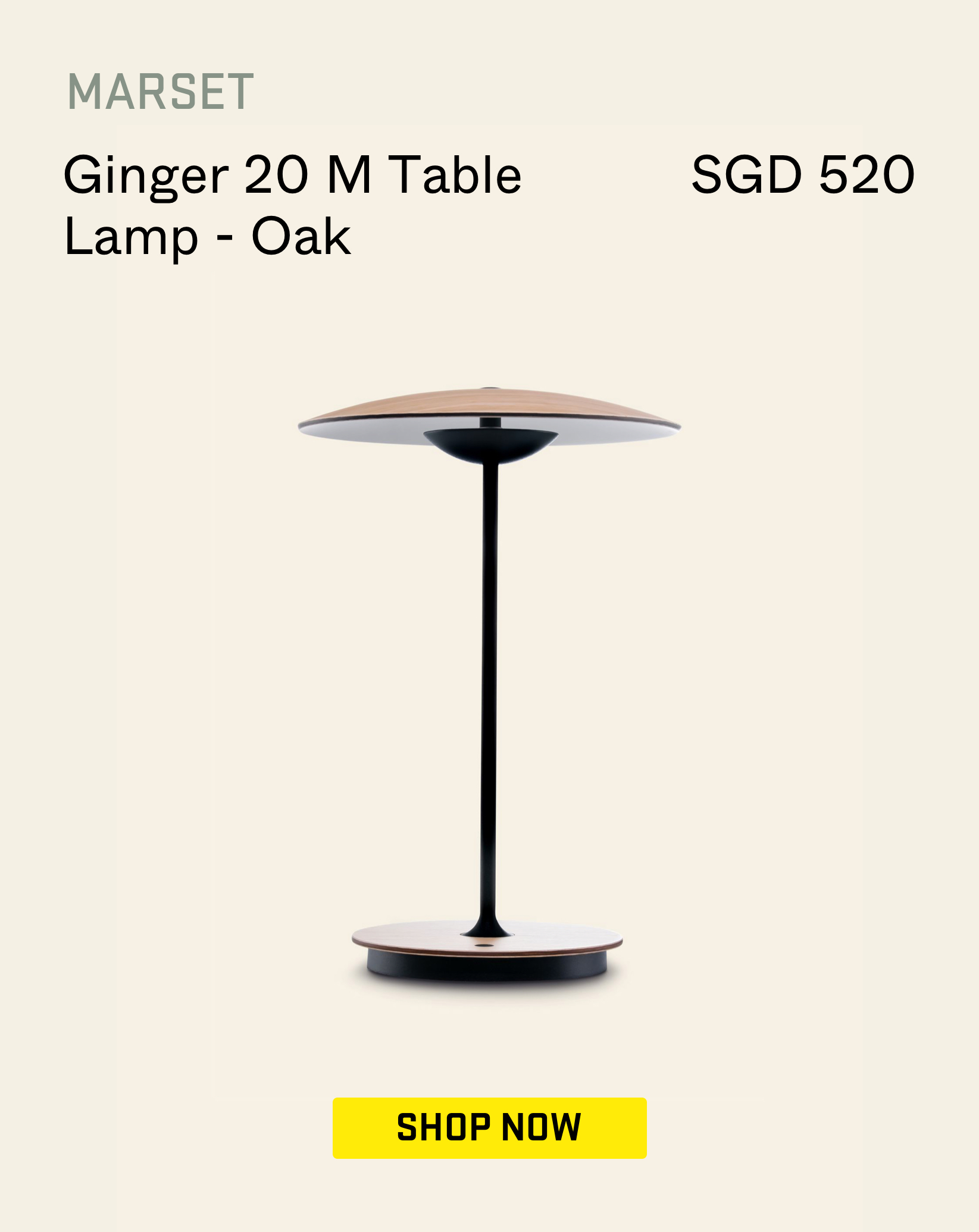
What goes with pink and green?
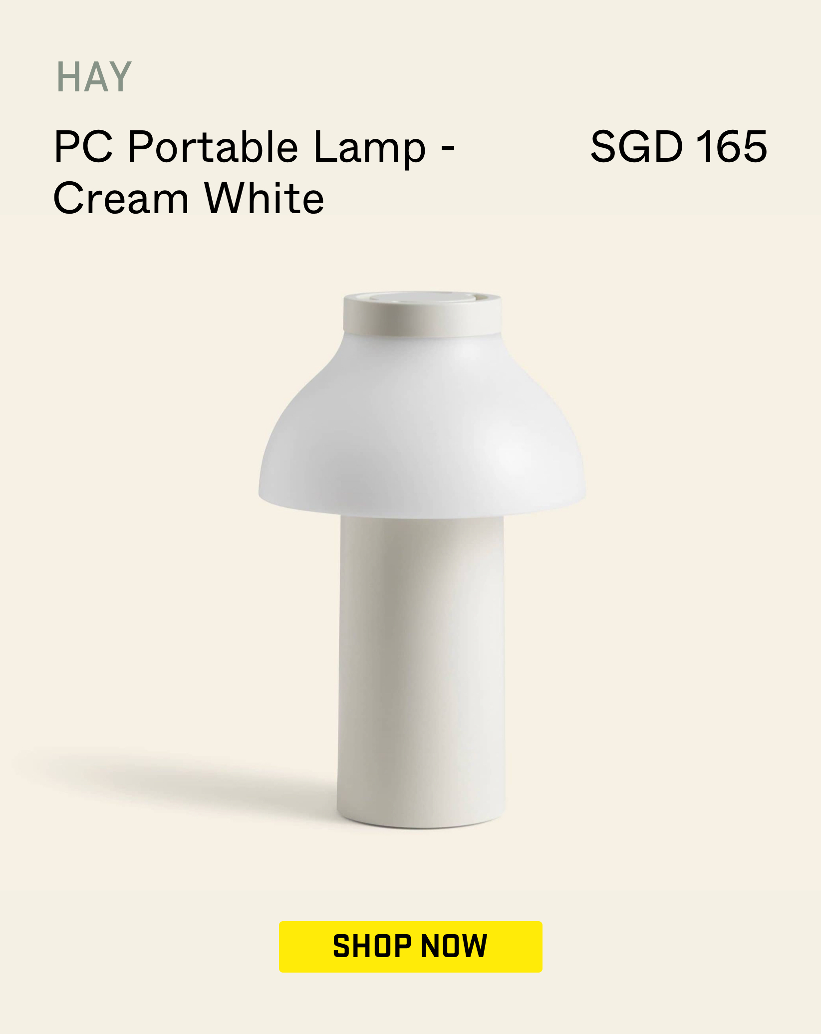
Light Blue and Wood – A Calming and Natural Combination


Light blue or baby blue isn’t a colour that you see very often in Singapore but used sparingly it can pair very nicely with wood. Lighter tones of blue can be a cool and calming colour that is often associated with serenity, while wood brings warmth and texture to a room. When used in home decor, light blue and wood can create a soothing and relaxing atmosphere that is perfect for unwinding after a long day.
However, it can also be tricky to get this combination right – too much wood can make a room feel dark and heavy, while too much light blue can make a room feel cold and sterile. This is where the complementary effect of the two materials comes in handy. By using light blue as an accent colour, such as through pieces like a table or shelving, you can create a calming and natural look that is balanced and inviting.
If you want to make the space bright and airy, which is especially good for rooms receiving a good amount of natural light, you could choose to go with a lighter colour of wood, like light oak or plywood.
You can also implement this combination by using light blue walls and pairing them with wood furniture, such as a wooden bed frame or dresser. Alternatively, you could use wood flooring and pair it with light blue area rugs for a cosy yet slightly playful look.
What goes with light blue and wood?
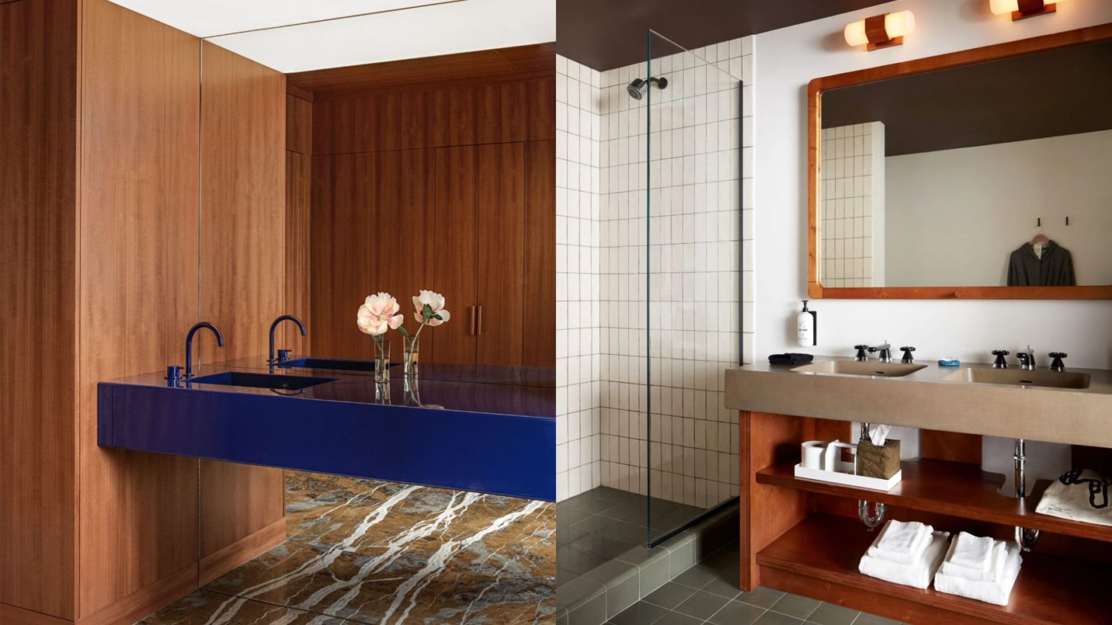
Cobalt Blue and Chrome – For That Bold and Sleek Look


Cobalt blue and chrome isn’t for everyone, it’s a bold combination that takes a bit of finesse to pull off, but when done right it can be a very striking look.
As you know, cobalt blue is a bright and striking colour that commands attention, while chrome adds a touch of glamour and sophistication. When used in home decor, cobalt blue and chrome can create a look that is perfect for those who love a bit of drama in their interior design.
Of course, this may come across as a less homey space. So if you still like this combination, I would try to minimise the use of too much cobalt blue as well.
One example of using this combination is with a cobalt blue sofa paired with chrome accents, such as a chrome coffee table or chrome lamp. Alternatively, you could pair chrome furniture with cobalt blue accessories, such as cobalt blue throw pillows or a cobalt blue rug.
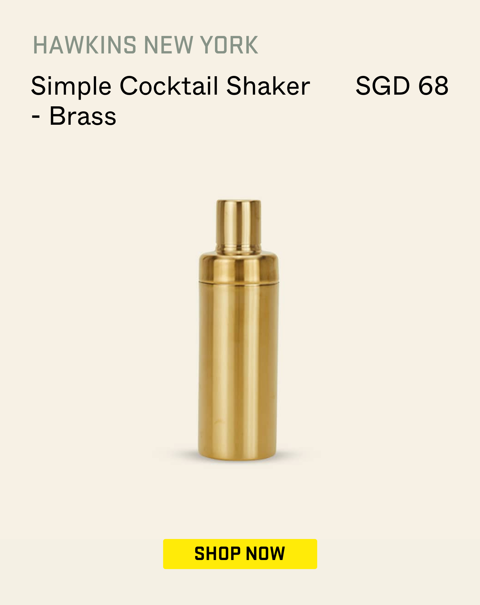
What goes with cobalt blue and chrome?

Terracotta and Cream – For a Warm and Cosy Ambience


If you’ve been to places like Marrakesh, you’d probably be in love with that earthy desert tones. It creates a very warm and relaxing atmosphere, and together with organically shaped furniture, it is a look that is very much in trend right now.
The best combination for that is terracotta and cream.
Terracotta is a colour that is reminiscent of clay pottery and adds a touch of rustic charm to a room, while cream is a classic and timeless colour that is more elegant. Bringing these two together can be challenging at first. Too much terracotta and you end up with a room that feels heavy and overwhelming, and like most of the combinations here, you’d want to be careful with the balance of it all.
If you do want to use terracotta colours as the base, and cream as the accent colour (either through rugs or the furniture), then the lighting of the space becomes very important. I’d invest in more varied forms of lighting through wall sconces, pendant lamps, as well as floor lamps.
Another way to implement this combination is by using terracotta tiles on the floor and pairing them with cream-coloured walls or furniture. Alternatively, you could use cream-coloured tiles on the walls and pair them with terracotta accessories, such as terracotta pots or a terracotta vase.
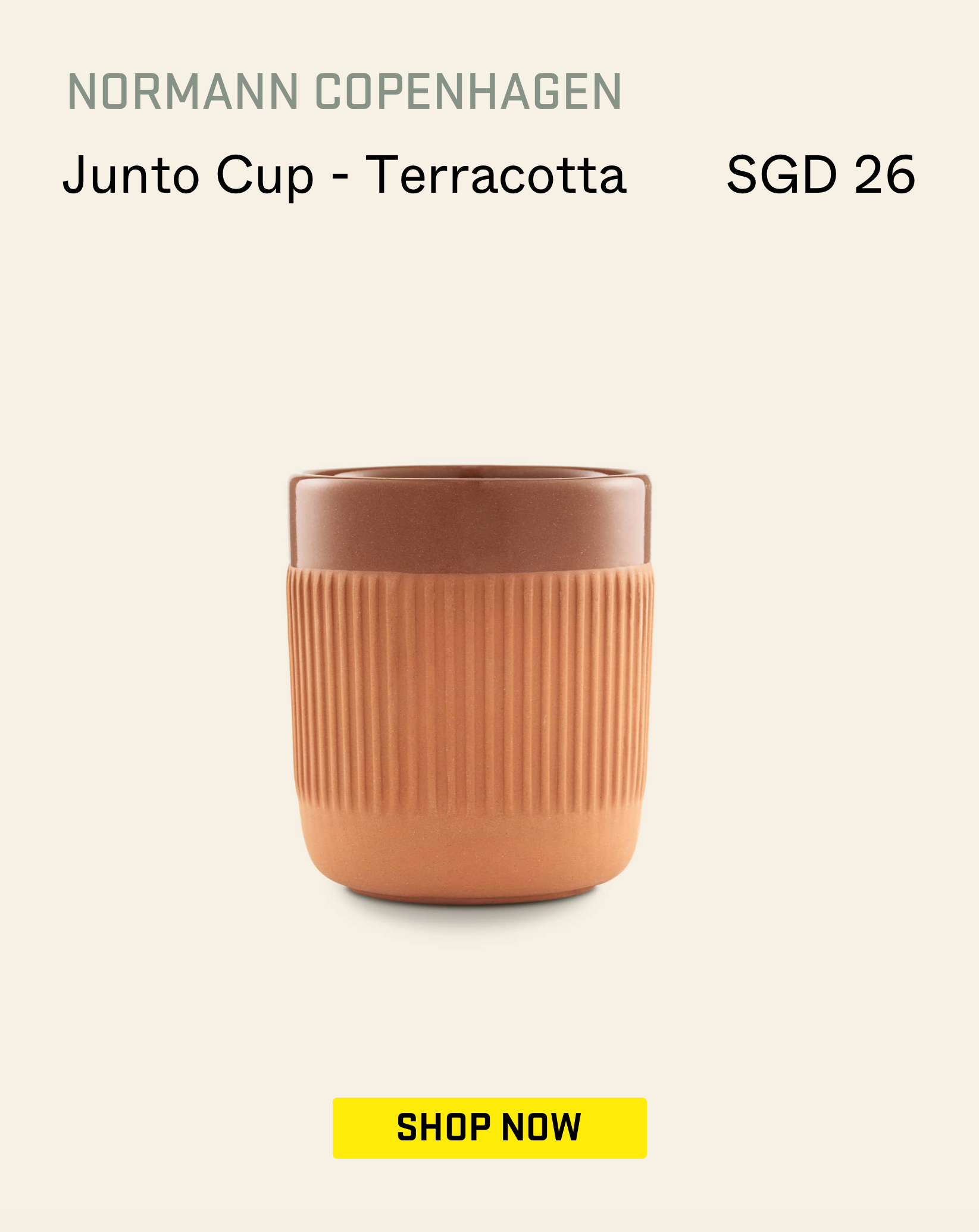
What goes with terracotta and cream?
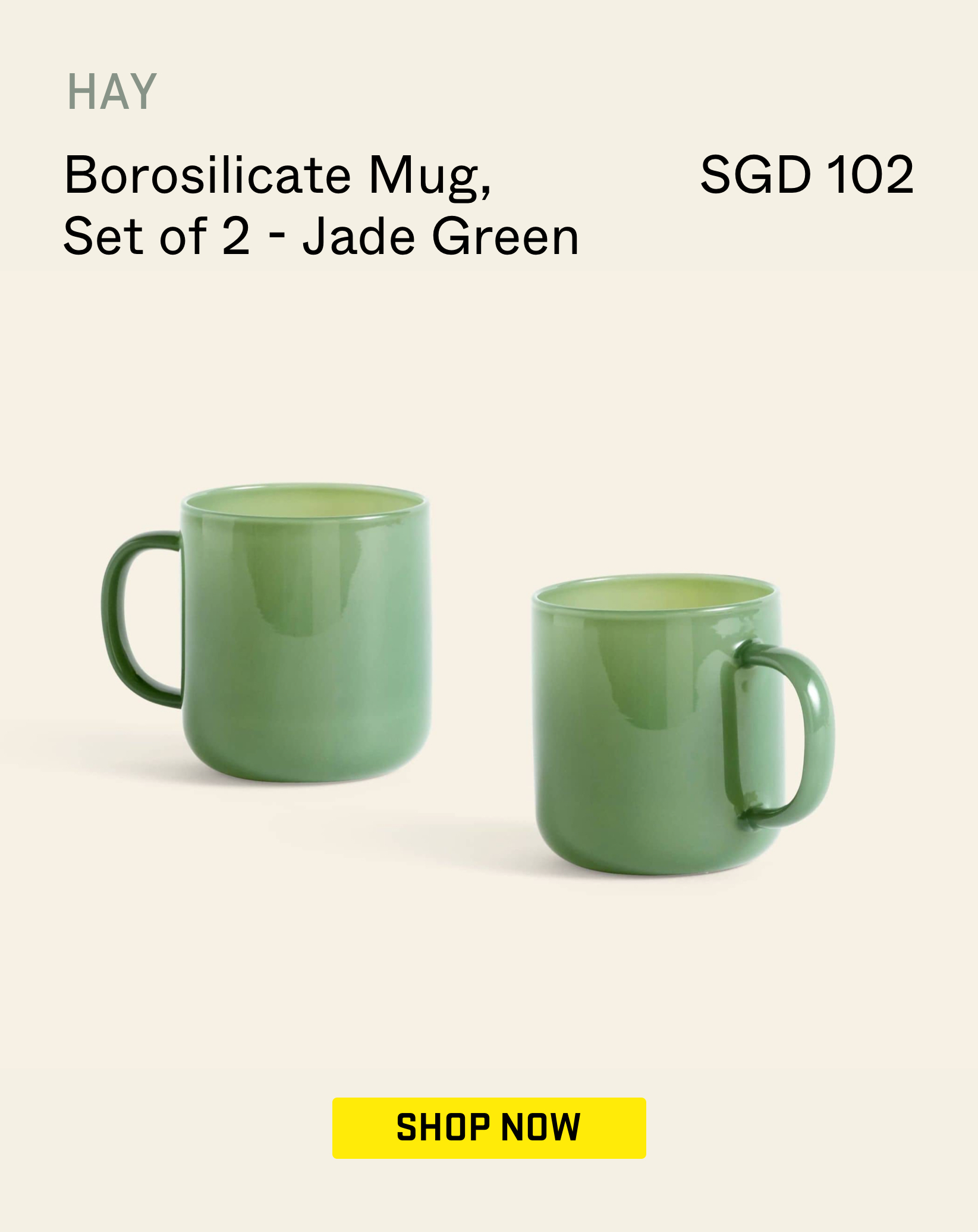
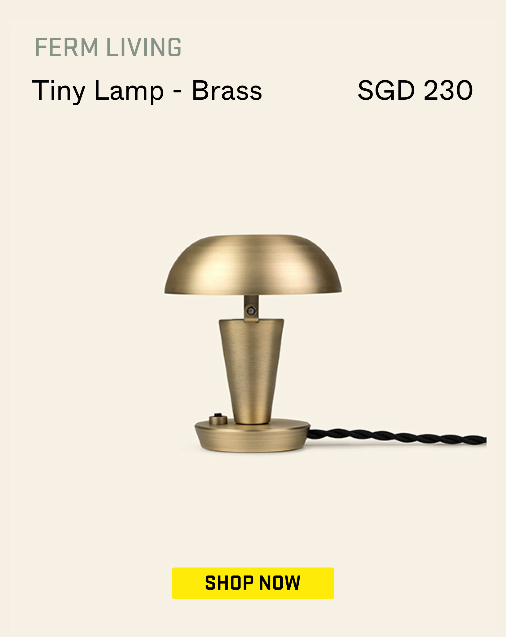
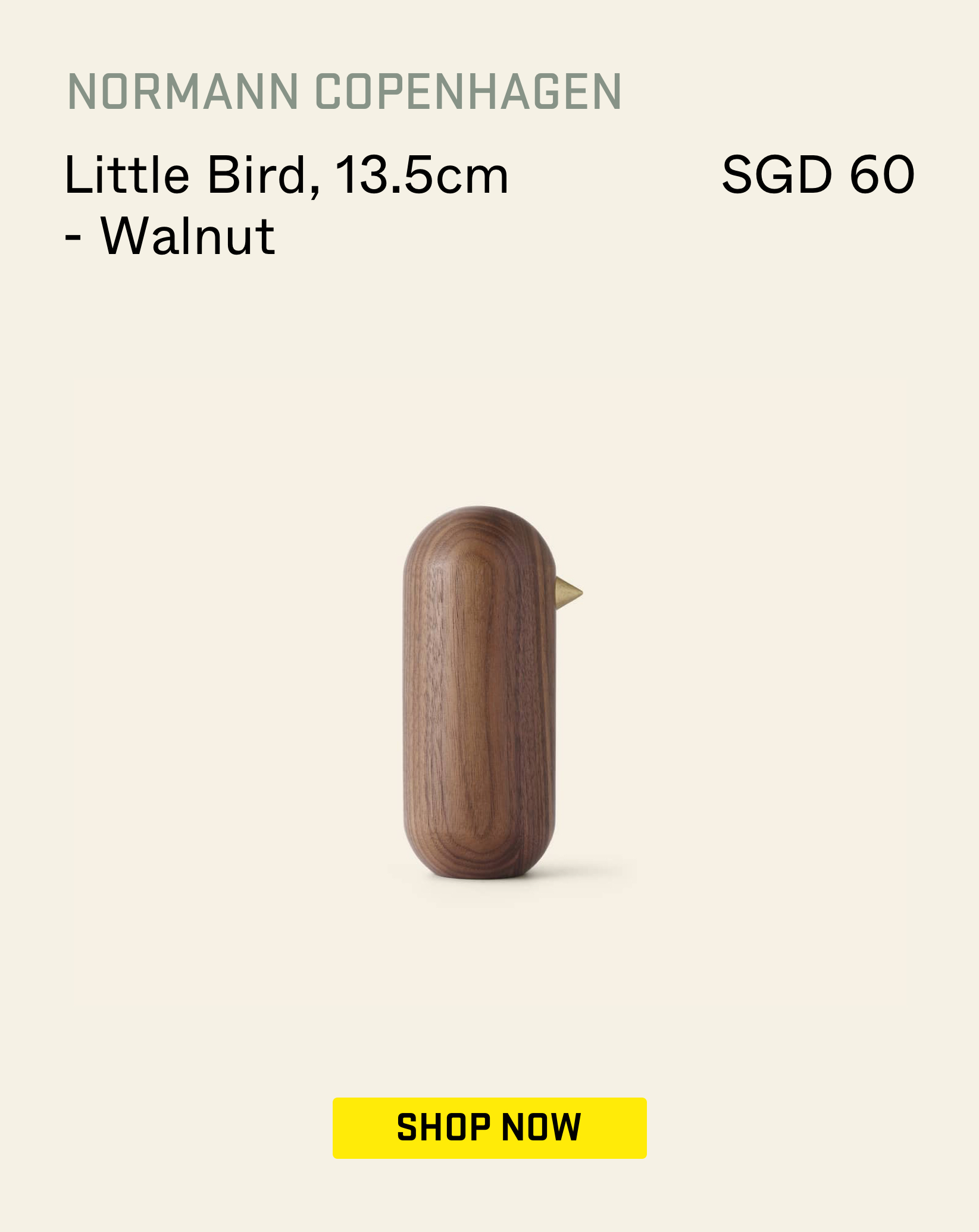
Light Jade and Gold – Sophisticated and Glamorous


Here’s one that I’ve been seeing more as green has been quite a popular colour over the last few years – light jade and gold. It’s one of those combinations that can look really good when pulled off well, but it’s a fine line between classy and gaudy that’s for sure.
Light jade is a soft and calming colour that adds a touch of tranquillity to a room. On the other hand, gold is a luxurious and opulent colour that adds a touch of glamour and elegance. When used in home decor, light jade can create a perfect atmosphere for those who love a chic and modern style.
The simplest way to implement this is by using light jade as a base colour and gold as an accent colour, such as in gold picture frames or gold lamps. A light jade wallpaper paired with gold accessories, such as gold candleholders or a gold coffee table, also works great. I prefer to use matt gold, rather than too overly shiny accents, but don’t be afraid to experiment with different shades of gold (or brass/bronze) here.
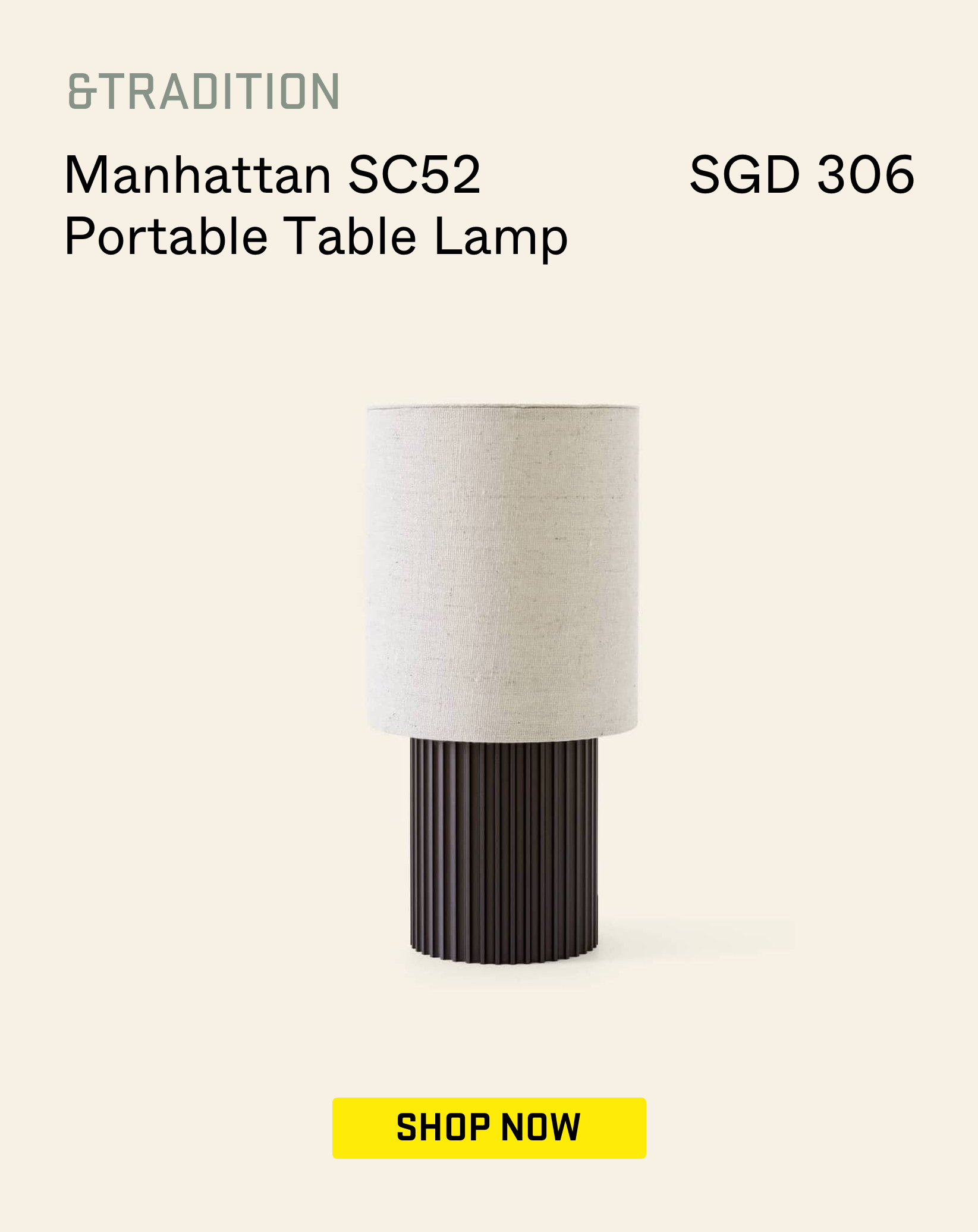
What goes with light jade and gold?
Light Pink, Cream, and Dark Wood – A Soft and Cosy Combination


If pink is your thing, but you don’t quite like green, here’s another variation that works. Light pink, cream, and dark wood are three materials that can create a soft and cosy atmosphere in any space. Light pink is a gentle and soothing colour that adds a touch of playfulness to a room. Cream, on the other hand, is a classic and timeless colour that adds elegance and sophistication. Dark wood, with its rich and earthy tones, adds depth and warmth to any space.
Creating a balancing effect for this trio is no easy feat, but the result is well worth it. The trick is to choose a base or statement colour and add the other two to complement it.
For instance, you can use light pink as a statement colour, such as in light pink curtains or a light pink accent wall. Then, you can complement it with cream and dark wood as complementary colours, such as in a dark wood coffee table or cream throw pillows.
Other ways to execute this is by pairing cream-coloured walls with light pink accessories, like light pink picture frames or a light pink rug, and dark wood furniture, such as a dark wood dining table or dark wood bookshelf.
What goes with pink, cream, and dark wood?
At Stacked, we like to look beyond the headlines and surface-level numbers, and focus on how things play out in the real world.
If you’d like to discuss how this applies to your own circumstances, you can reach out for a one-to-one consultation here.
And if you simply have a question or want to share a thought, feel free to write to us at stories@stackedhomes.com — we read every message.


0 Comments