I Reviewed HDB’s Showroom For 4 And 5-Room Flats. Here’s What Future Homeowners Should Know
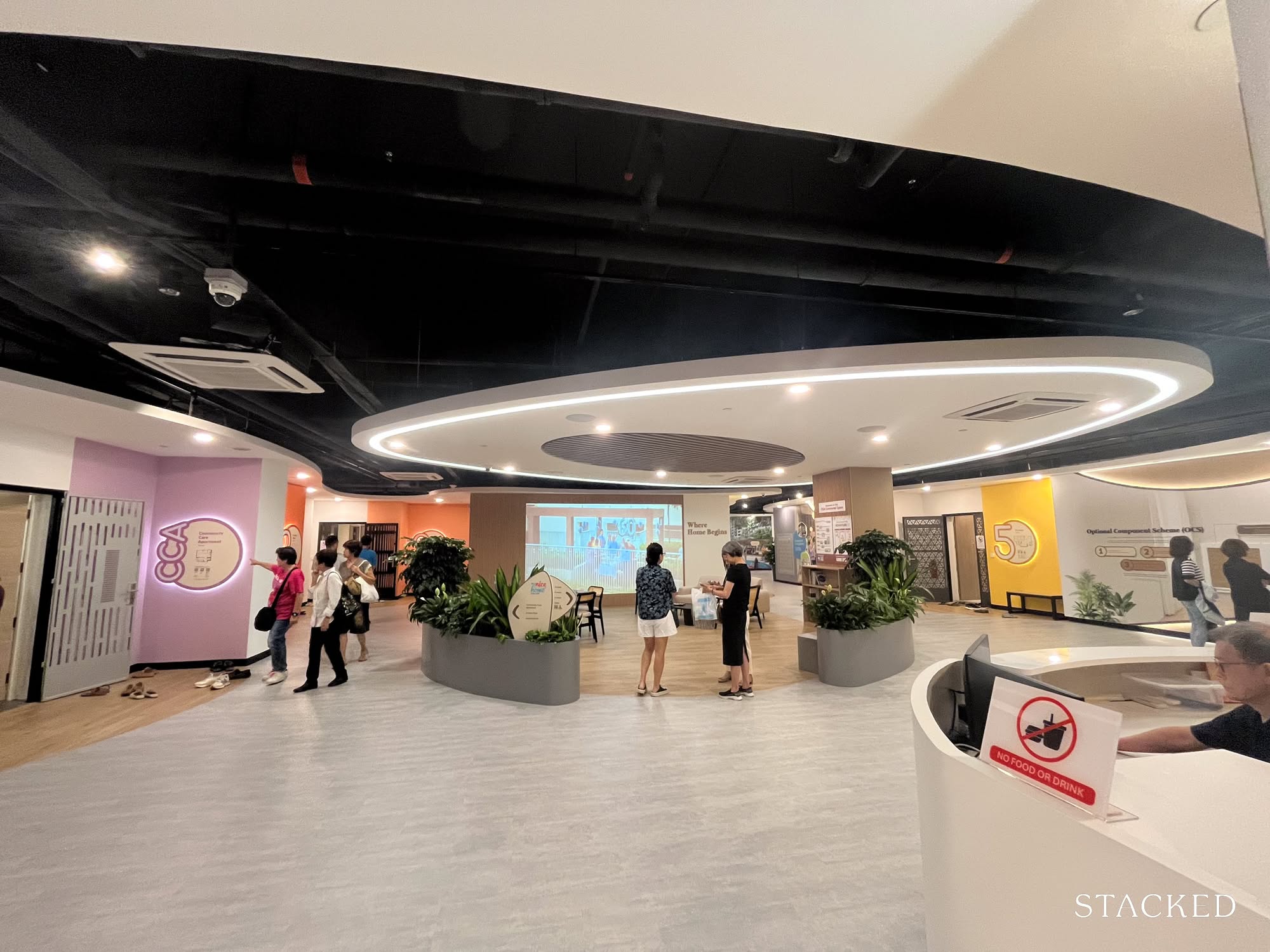
Singaporeans are full of overused jokes about HDB flats and how small they are. “Hamster cages,” we call them, or “flats so small and so close, you argue one time, four neighbours will know your whole story.” But there’s quite a bit you can do with your HDB flat; and I knew just the place to start creating ideas. Apart from that obligatory “and our story begins” photoshoot at HDB Hub, a visit to the MyNiceHome show gallery should be the next rite of passage in every BTO starter pack.
For the uninitiated (yes, I do have friends who applied for their flats without realising this place exists), it’s a public showflat at HDB Hub, featuring full-sized mock-ups of 2-, 3-, 4-, and 5-room layouts. Think of it as IKEA for future homeowners, minus the meatballs.
We are, after all, visual creatures. A 2D floor plan might show you the bones of a space, but walking through a fully furnished mock-up – with mood lighting, fake succulents, and suspiciously tidy countertops – lets you imagine a more organised version of your life.
As someone who spends a good chunk of her life viewing, reviewing, and forming opinions about other people’s homes, I was more than ready to finally have an opinion about my own. (I applied for a 4-room BTO not too long ago, but that’s a story for another time.)
And if you’re thinking, “Aiya, I’ve been there already,” HDB’s recently given the gallery a quiet refresh. New layouts. New styling choices (but same bomb shelter, meh). There’s always something new to see or rethink. So in this column, we take a closer look at the bigger units: the 4- and 5-room layouts. If you’re curious about the smaller ones (2- and 3-room flats), you’ll want to stick around for the next instalment.
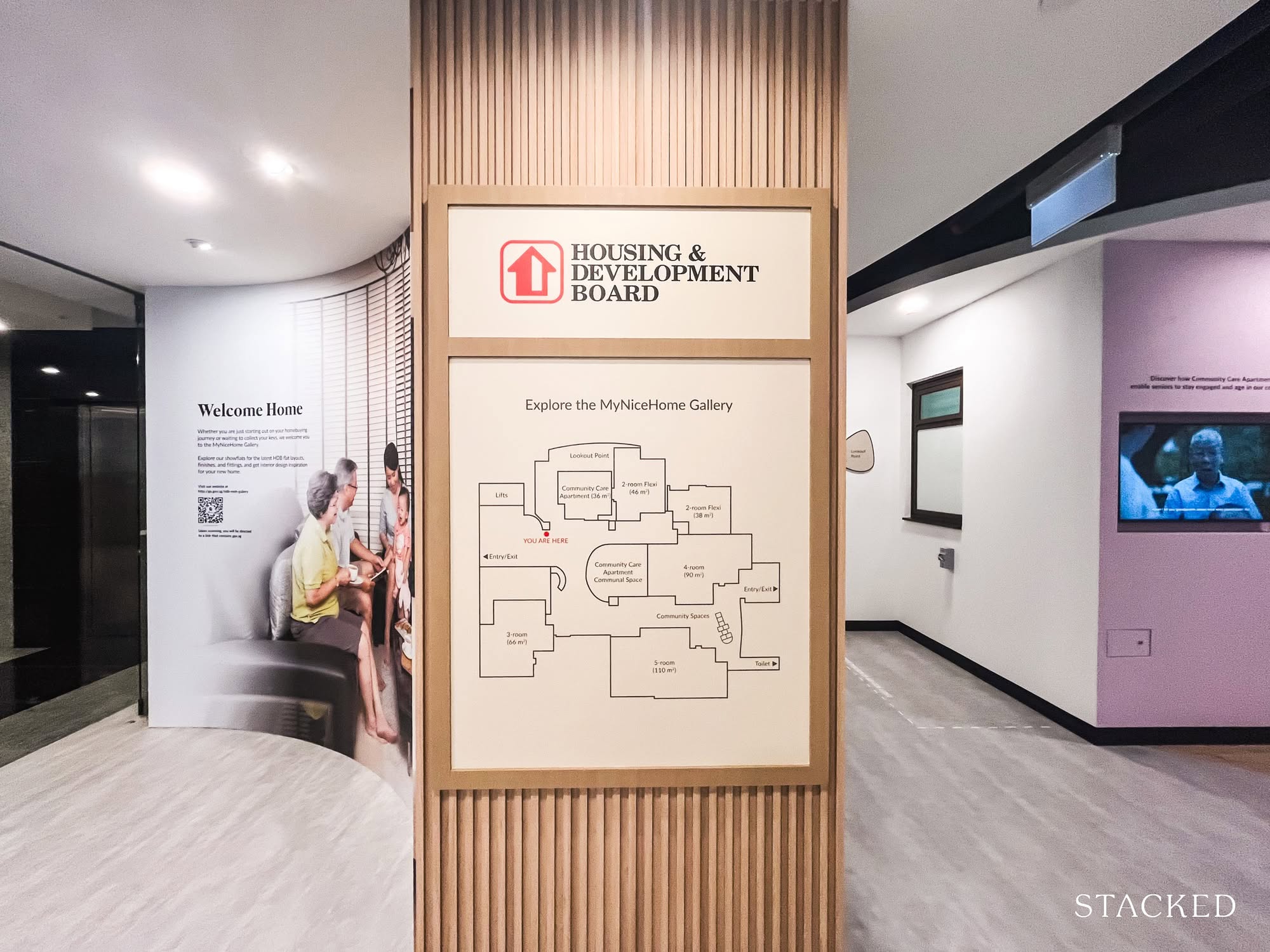
I expected it to be quiet (weekday afternoon and all), but it was packed. Every kitchen mock-up, every display wardrobe, had its own little audience. A little tip though: wear slippers. It’s a no-shoes zone. Let’s start with the largest of the lot: the most recent 5-room layout.
For those who need more space: 5-Room Flats – The 1,184 sq. ft. home
This one’s clean and squarish, with minimal space wasted on corridors or awkward angles; very much what we’ve come to expect from today’s launches. It’s practical, compact, and efficient.
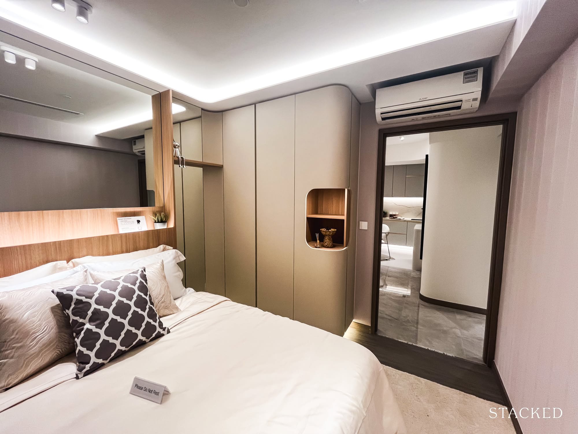
You get three decently sized bedrooms. The common rooms can fit a queen-sized bed, and the master can handle a king; though let’s be honest, once the mattress is in, you might be squeezing a bit in some corners. There are two bathrooms, a clearly defined living and dining area, and a square kitchen that opens out into a proper service yard.
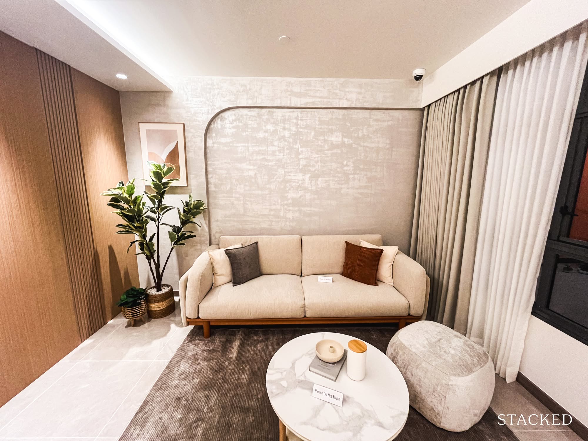
A pleasant surprise: the living room gets two windows. A small detail, but it makes the space feel brighter, airier, and slightly more generous.
Now, on to the bits that bug me.
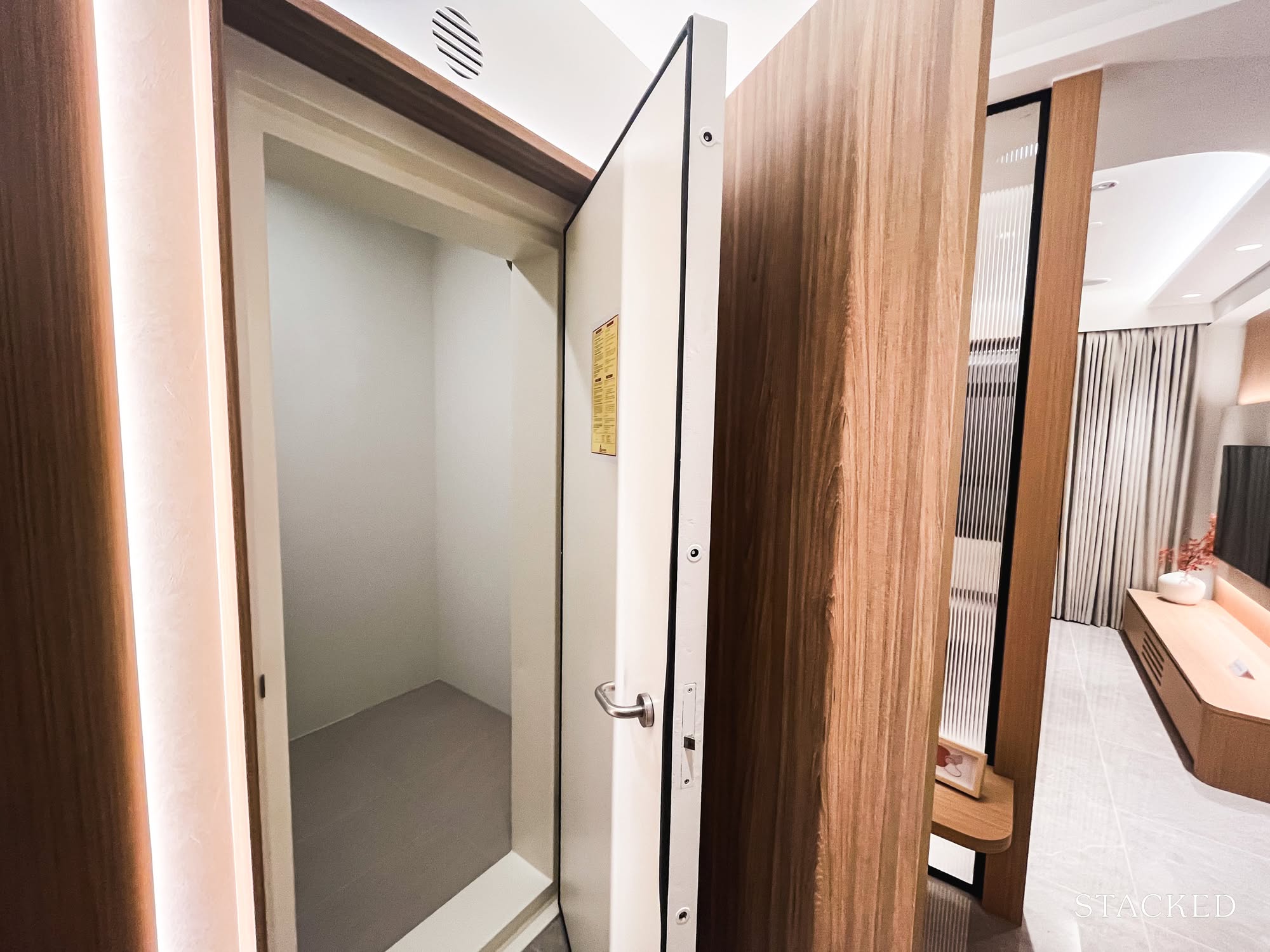
The household shelter is plonked right by the entrance.
I know this is standard, but I still haven’t made peace with how it disrupts the layout. That chunk of wall it creates in the living room always feels like a design compromise, and the heavy metal door? Let’s just say it’s not doing anyone any aesthetic favours. Personally, I much prefer it hidden away in the kitchen, doubling as a discreet pantry or storage nook.
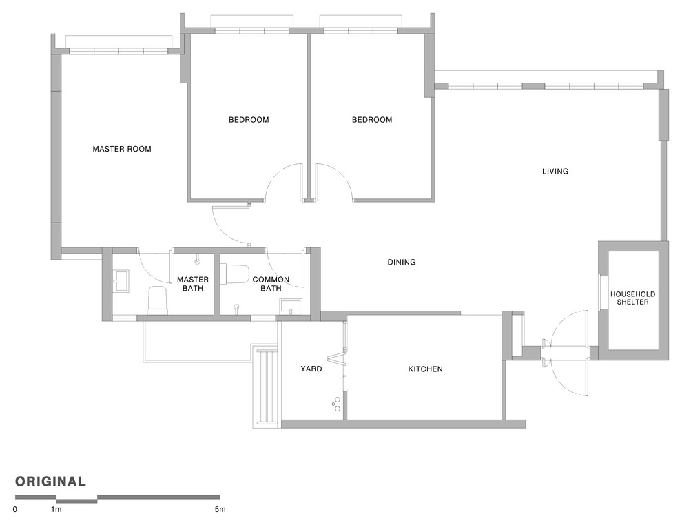
Then there’s the absence of a foyer.
Step through the front door, and you’re immediately looking into the heart of the home. For someone who values privacy, and would rather not have the entire living room on display the moment the door opens, this feels a little too exposed. I understand it’s also considered a Feng Shui demerit, for those who believe in it.
(Ps. Remember that even if you don’t believe in Feng Shui, your future buyers might.
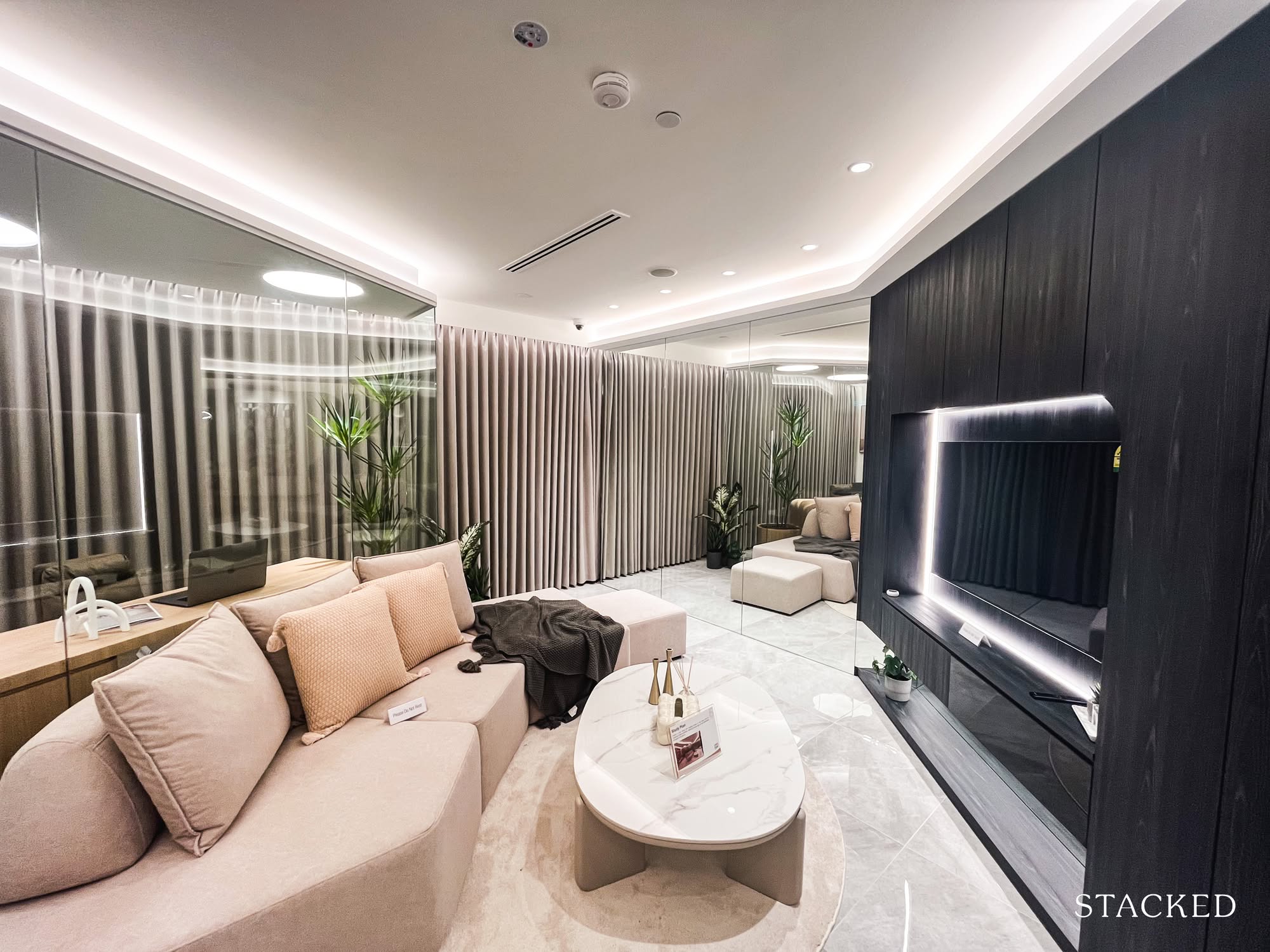
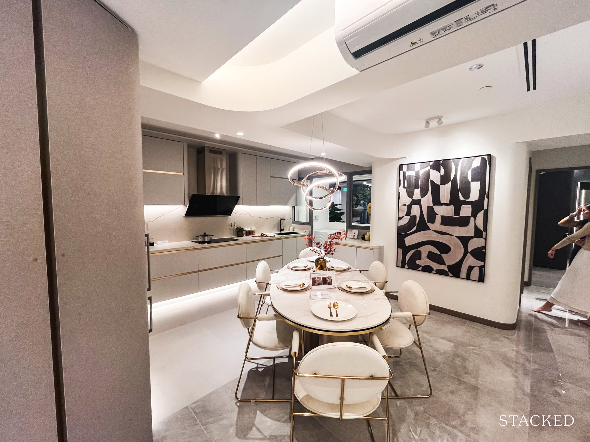
So imagine my surprise when I saw how HDB had chosen to style this layout.
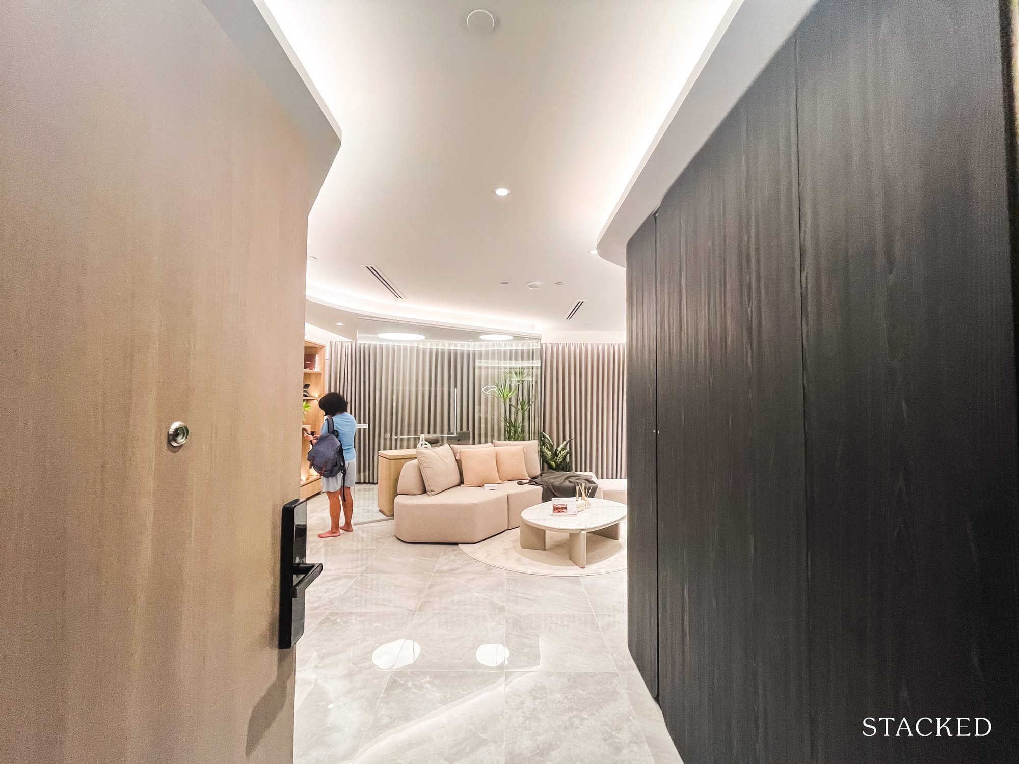
The interior theme? Curves. According to the display, it’s meant to showcase “graceful, flowing lines” and evoke “a sense of warmth and effortless elegance.”
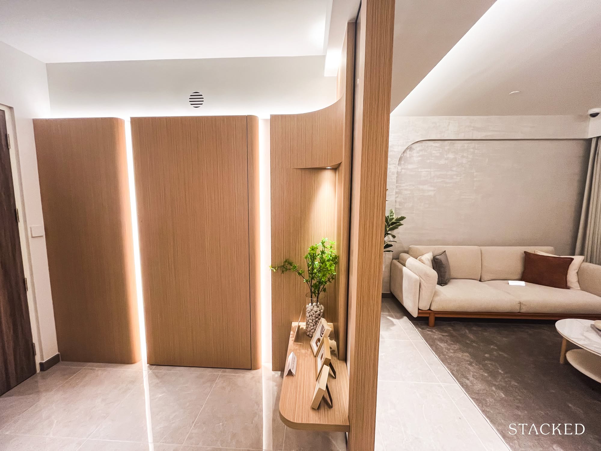
Upon entering, my eyes immediately landed on the bomb shelter, now cleverly concealed behind a feature wall. It’s a common solution for those who, like me, have never quite made peace with the industrial look of that metal door.
Visually, it’s a smart fix. But the way it’s angled gives the room a slight parallelogram effect. For a moment, I actually paused to wonder if this was still a square layout.
It works here, thanks to the generous proportions of the 5-room flat. But in a smaller living room? Probably less forgiving. It’s a good reminder that what feels creative in a spacious layout might come across as awkward when space is tighter.
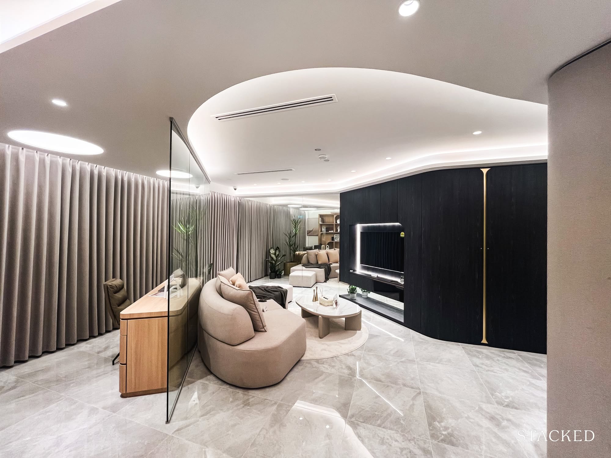
The second thing that caught my eye was the slanted glass enclosure framing an open-concept study.
Personally? Not a fan. It disrupts the otherwise squarish layout and introduces an angle that feels slightly at odds with the rest of the space.
And if you ever decide to reconfigure your living room setup, that fixed glass panel quickly shifts from “statement feature” to “spatial obstacle.” Not to mention the upkeep—fingerprints, dust, and the smudgy reality of everyday life.
That said, I can see why some people might love it. It keeps the flat feeling open and visually connected. If you’re the sort who wants to see everything, all at once, from anywhere, you’ll appreciate the transparency (in more ways than one).
- Privacy-wise? A two out of five.
- Efficiency? I’d say a four.
- Practicality? Somewhere around a 2.5.
It did get me thinking: for homeowners set on carving out a study nook, is this the best approach? Maybe not for everyone, but it’s undeniably creative.
And at the very least, it gives the layout a little personality, which, let’s be honest, most BTOs could use more of.
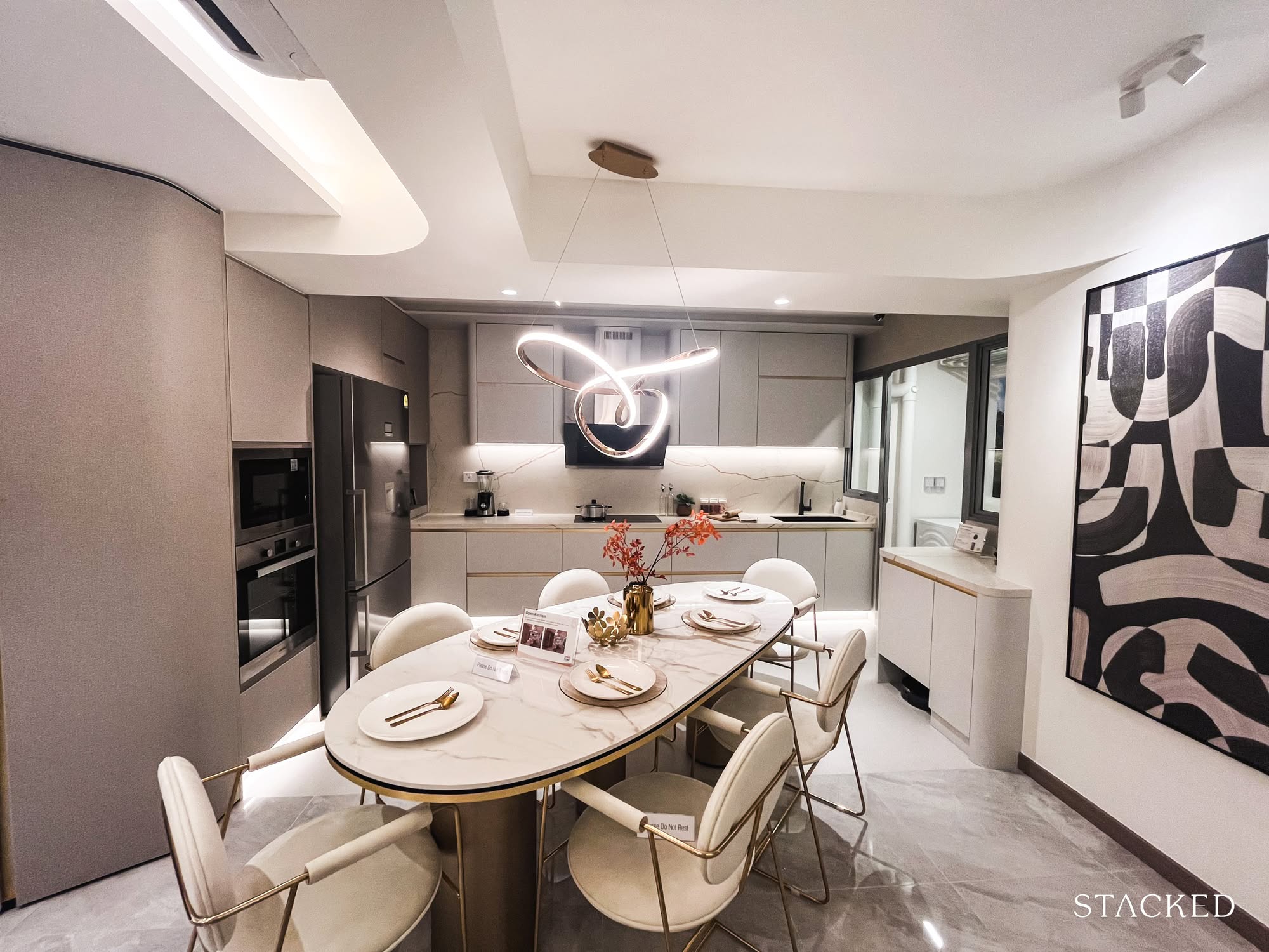
The living area sits right next to the dining space and kitchen, which is pretty standard. But in this version, the designers have knocked down the kitchen wall to create an open-concept layout. I guess it’s to show off just how customisable an HDB flat can be.
Next, open-concept kitchens:
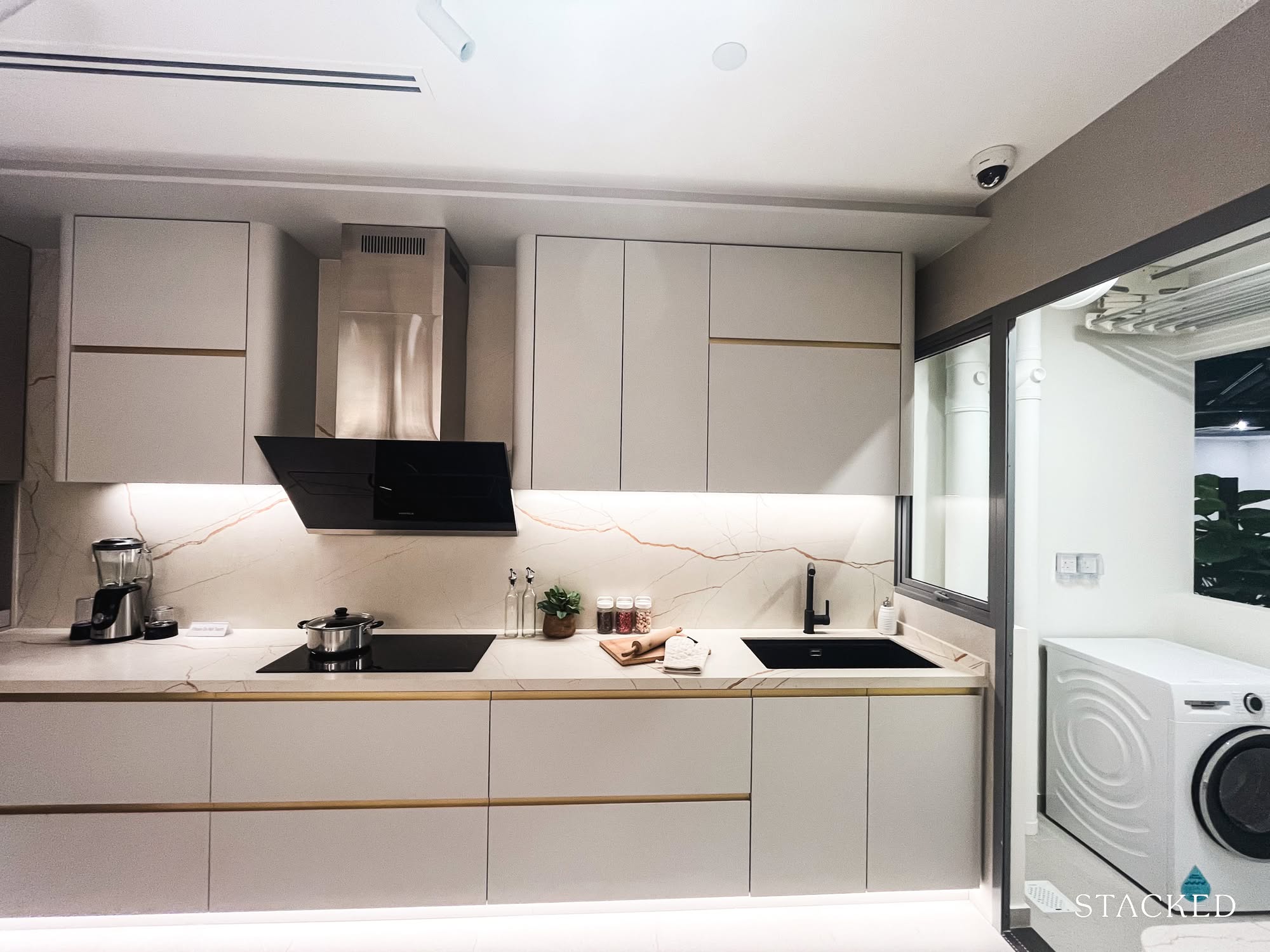
People either love them or absolutely do not. I’m firmly in the pro-open kitchen camp. Sure, sometimes smells escape, but for the openness? The social flow? The illusion of more space? Worth it.
That said, keeping the kitchen enclosed has its perks: more walls, more storage, and arguably a more practical setup for serious home cooks. The trade-off is a tighter dining zone and less of that airy, everything-connects-to-everything feeling.
If you’re the kind who prefers something more practical, the original layout might suit you better. But if you’re like me and romanticise slow breakfasts, dinner parties, and weekend pancakes, you’ll want the openness.
As for resale, yes, some buyers might prefer the unit in its “original” form. But designing for someone you’ve never met is a little bit like ordering food you don’t like, just because it photographs well.
One thing I wasn’t totally convinced by: the diagonal placement of the dining set. I get that it’s supposed to feel dynamic, but it also felt slightly disjointed.
Still, the kitchen layout itself? I like it.
I could already picture myself at the stove on a Sunday morning, flipping pancakes and pretending I have my life together. And to me, that’s the bar.
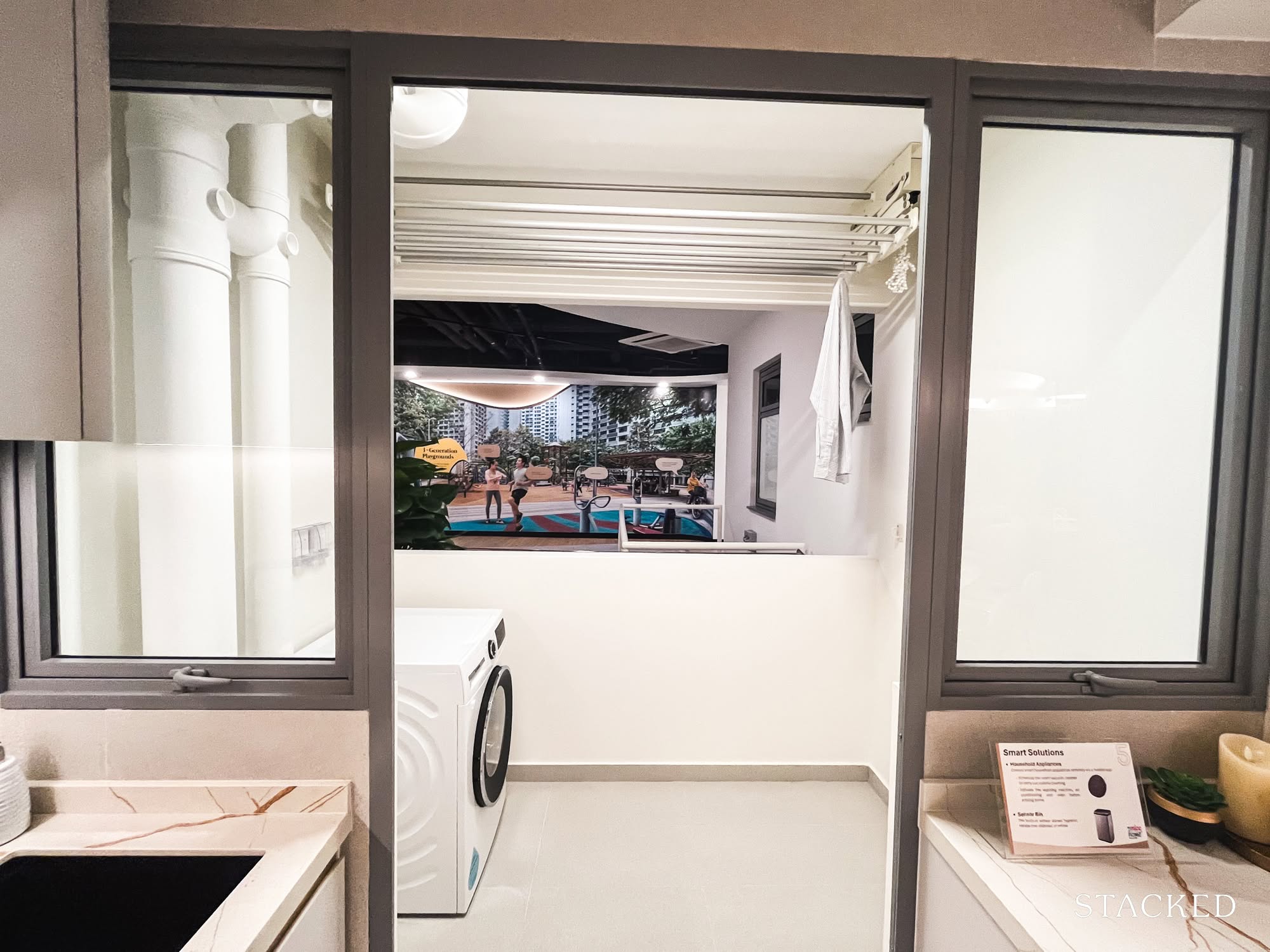
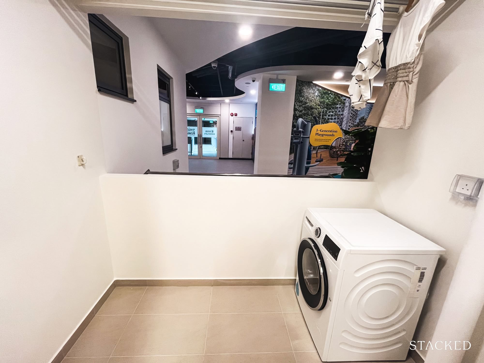
For me, the mark of a good unit is simple: it has a separate yard. This one does, like most newer BTOs. I used to live in a place without one, and if you’ve never had your clothes smell faintly (or not-so-faintly) of garlic post-dinner, you might not understand the full value of the service yard.
There’s also enough space here for both a washer and dryer, though most people still air-dry everything, which is great until it rains for six days straight. But if you do have a dryer, let me offer a life-altering or at least mildly game-changing suggestion: don’t stack them on each other.
Put the dryer next to the washer instead. No more weird squats, no more yoga poses to transfer damp clothes from one drum to another. Just a smooth, side-by-side operation that almost makes laundry feel enjoyable.
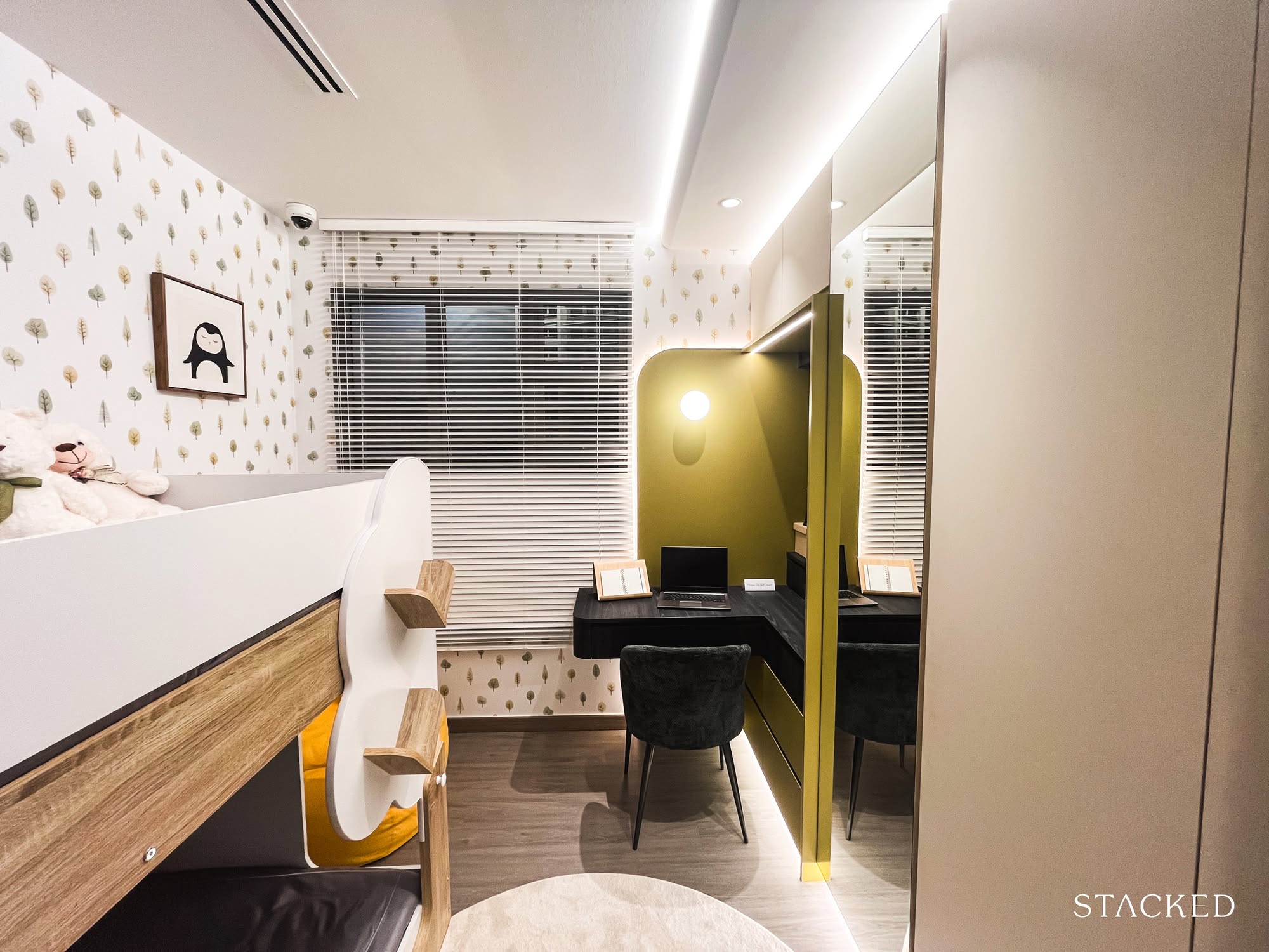
Here are the two common bedrooms, styled to show how they might work for children or elderly parents: classic multi-gen living scenarios.
Both rooms are the same size, but the designers went with different setups to illustrate the flexibility. One features a queen-sized bed with side cabinetry, showing that you can still move around comfortably.
The other squeezes in a bunk bed, study nook, and built-in wardrobe, clearly aimed at the younger demographic (or perhaps the chaotic energy of two kids in one room).
There’s nothing particularly groundbreaking here, but I’m relieved that newer BTO launches can at least accommodate a queen bed without feeling like you’re playing furniture Tetris. There was a period when bedrooms were so tight you could barely fit anything beyond the mattress. We’ve thankfully moved past that.
As for the windows, they’re half-height in the common rooms, which is par for the course with HDB flats.
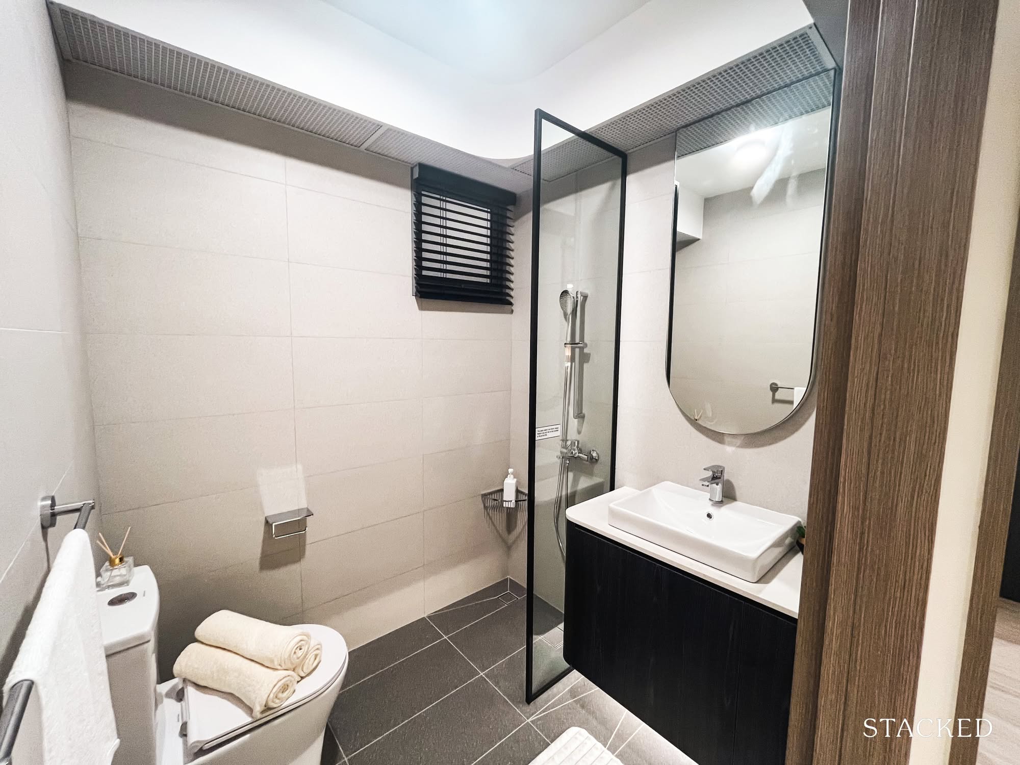
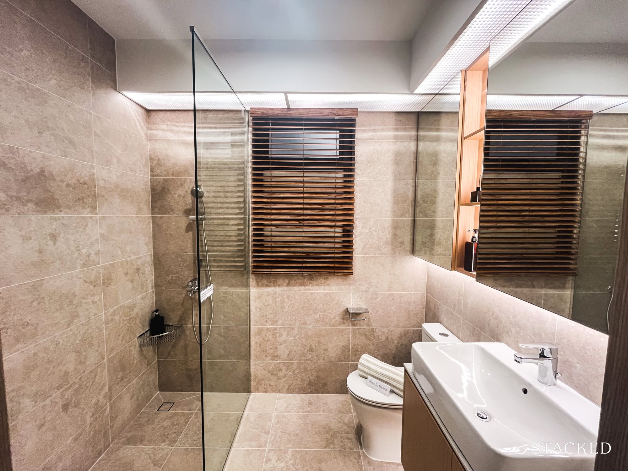
Here’s the common bathroom.
Nothing groundbreaking, but also nothing offensive. I’ve yet to see an HDB bathroom that’s blown me away (though to be fair, I’m a pretty tough critic). This one’s simple, functional, and well-ventilated; bonus points for the window, which makes a real difference in a space that usually battles humidity and trapped moisture.
There’s a glass panel separating the shower, which I always appreciate. It keeps water from ending up everywhere, though yes, it’s another surface to wipe down. And if you, like me, keep a mental tally of where limescale shows up first, you’ve already spotted it too.
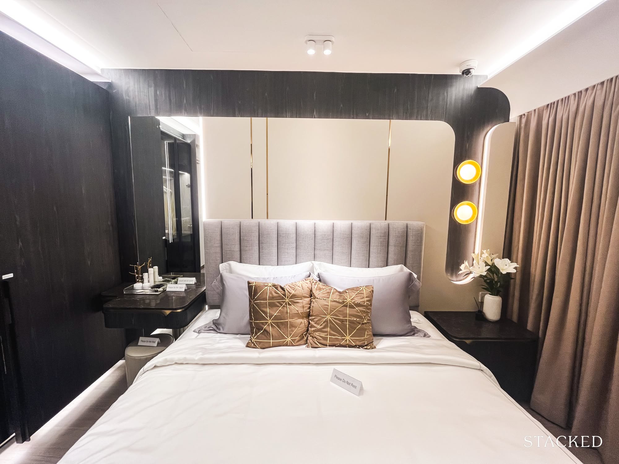
And finally, the master bedroom.
I have to say I was pleasantly surprised. The size is generous, and the design is pretty polished. I even overheard a couple of aunties whisper that it “looked like a condo,” which isn’t far off.
There’s room for a queen-sized bed, two slim side tables and a wardrobe, albeit one that may not be sizeable enough for everyone’s taste. It’s on par with what you might find in a junior master, or a tighter master bedroom in a compact condo.
And finally, the master bathroom.
Maybe it’s the larger window panel, but the space does have a slightly more luxe feel compared to the common bathroom.
Note the option to install a glass divider to keep the shower splash contained (which I’d personally recommend), and I appreciate that there’s a decent amount of walkway space. You don’t feel like you’re squeezing past anything or bumping into the sink every time you turn around.
All in all, it’s surprisingly spacious and fully liveable, which are the main metrics for a good home.
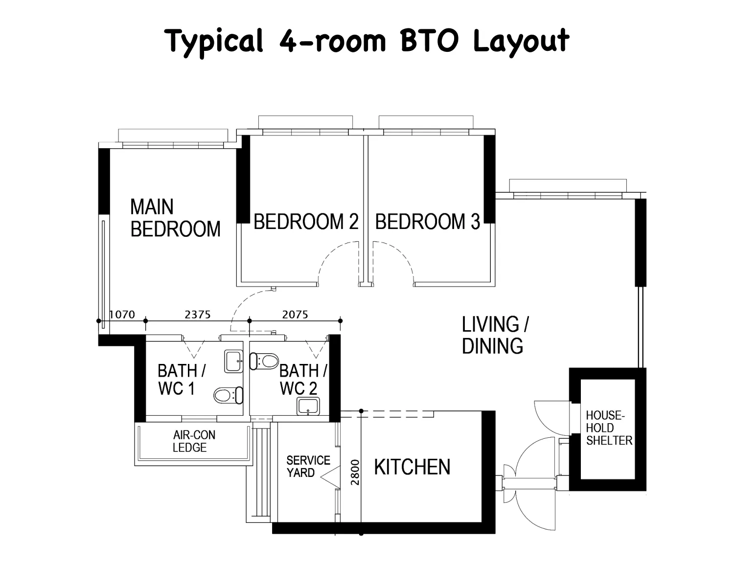
A Sweet Spot (For Most): The 4-room flat: 969 sq ft.
I’ll admit I’m biased, but this was the unit I was most excited to talk about. It’s the exact layout I chose for my future BTO.
My project had two layout options: one with a balcony, and one without. It would’ve been a nice touch if the gallery showed both versions, but the one featured in the showflat is the layout I ended up picking, so I’m not complaining.
It comes with three bedrooms (all able to fit a queen-sized bed), two bathrooms, an enclosable kitchen, a separate service yard, and yes, the household shelter right by the entrance.
At first glance, you can immediately feel the size difference between this and the 5-room unit. It’s noticeably more compact, which means ideas like the diagonal glass study probably wouldn’t fit quite as comfortably here. Still, the layout feels functional and well-proportioned for everyday living.
For this unit, the styling follows a Japandi theme – a crowd favourite among new homeowners these days.
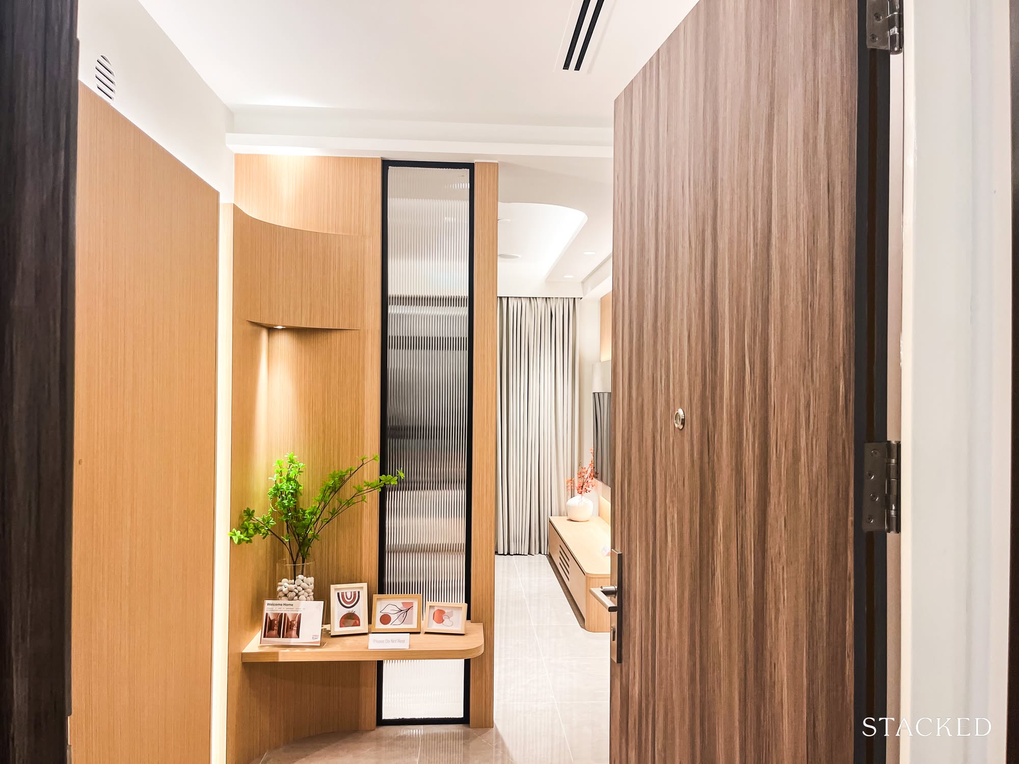
Upon entering the unit, I fully expected to have an immediate view of the entire living area. But to my surprise, the interior designers had added a fluted panel, cleverly placed to offer a bit of privacy while still allowing natural light to filter through.
It solves two problems at once: it softens the entry view and discreetly hides the household shelter (yes, it’s tucked neatly behind the wood panels). And it does so without compromising on walkability or usable space.
If I were adapting it for myself, I’d probably swap out the mini shelf and go for a full-height shoe cabinet instead, because my sneakers deserve a proper home too.
I do think the lighting choice here really helped. With poor lighting, this space wouldn’t look half as inviting. It’s a reminder of how much atmosphere can hinge on something as simple (and often overlooked) as a warm-toned bulb.
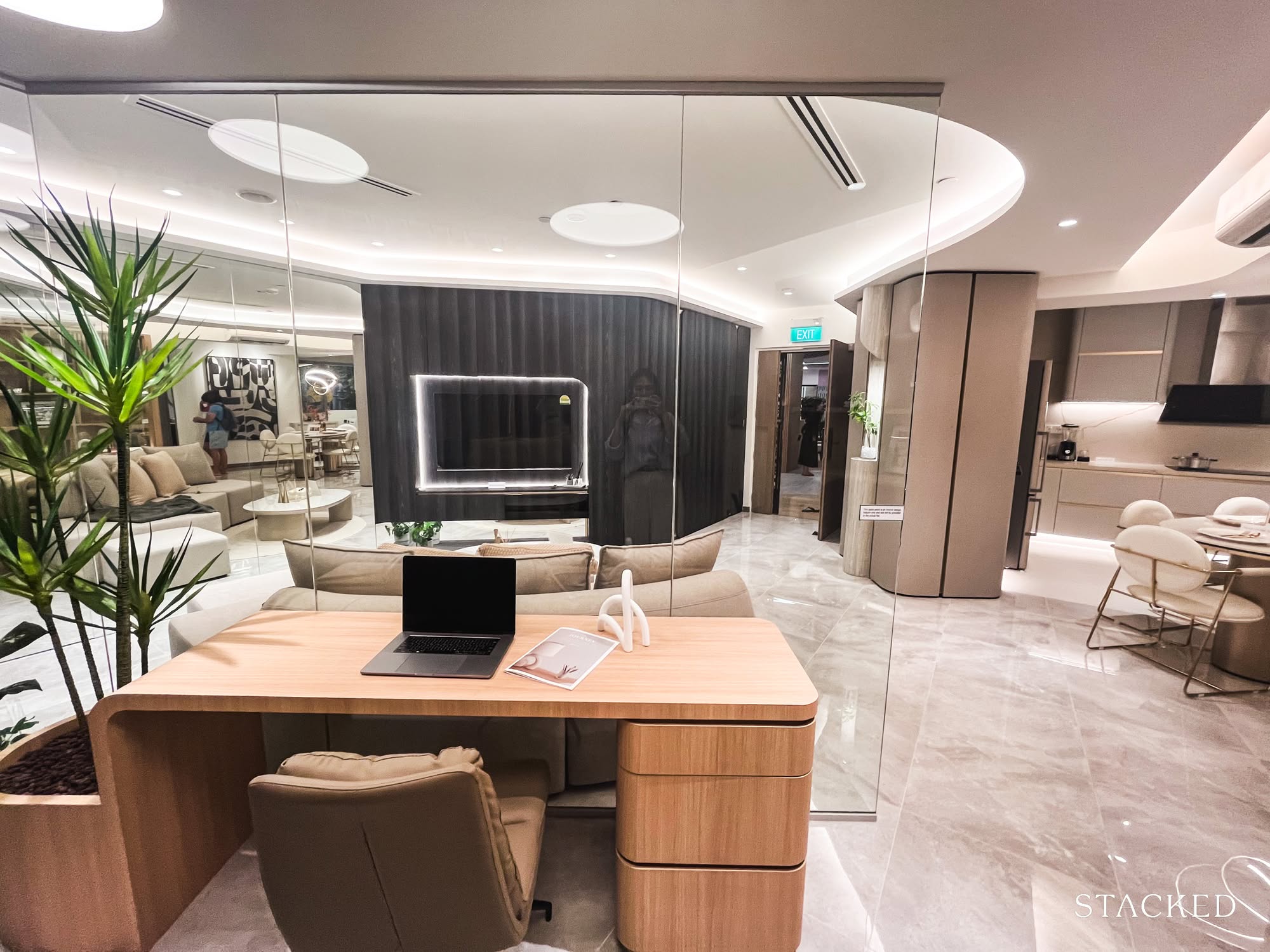
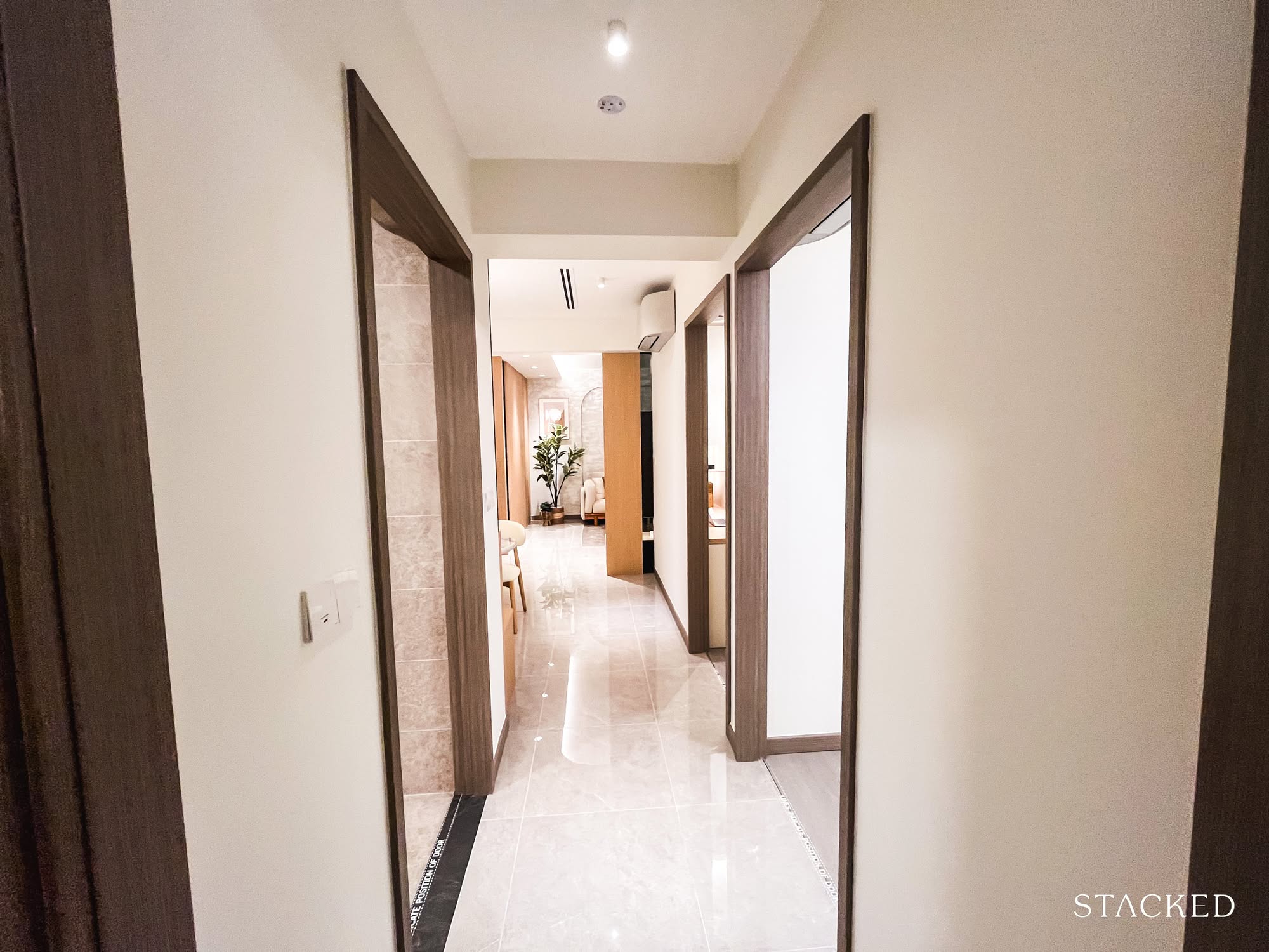
Now, onto the main living area.
Compared to the 5-room layout, it’s definitely more pared back. But there’s still plenty of potential to make it feel cosy. I was especially pleased to see the almost full-height windows: my unit faces the river, so having that kind of openness to enjoy the view feels like a small luxury in itself (one of the things I’m most excited about!)
For most small families, this space will be a comfortable fit. I also appreciated how squarish the layout is. It makes furniture placement a lot easier, and the interior designers here took the practical route, fully maximising the available space.
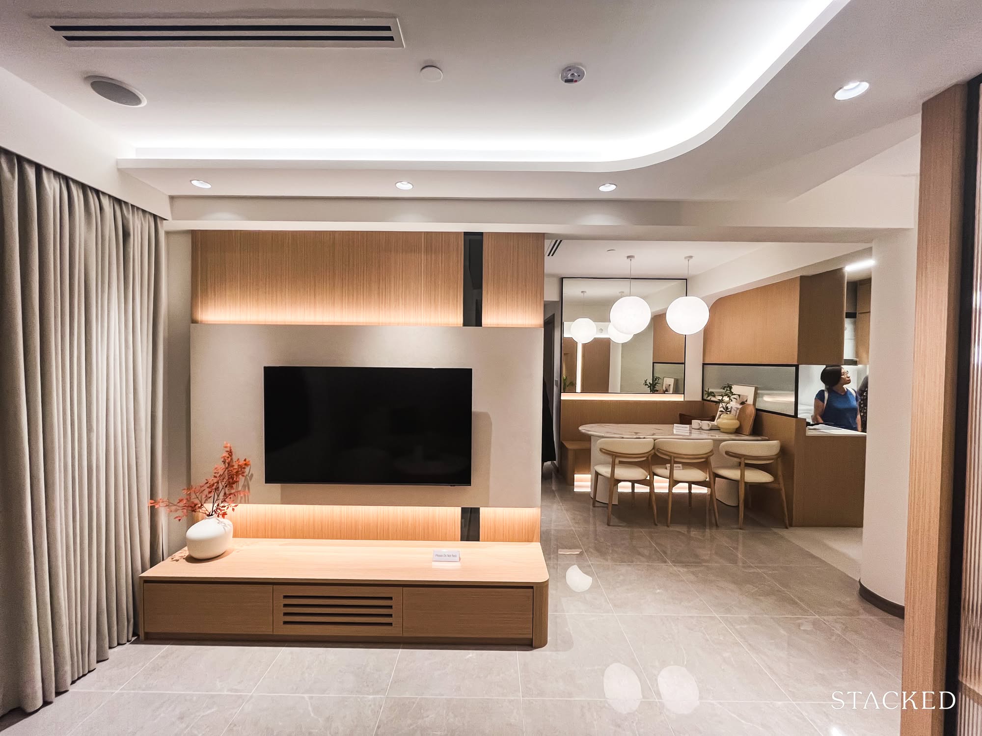
Just beyond the TV console is the dining area and kitchen, so let’s take a closer look.
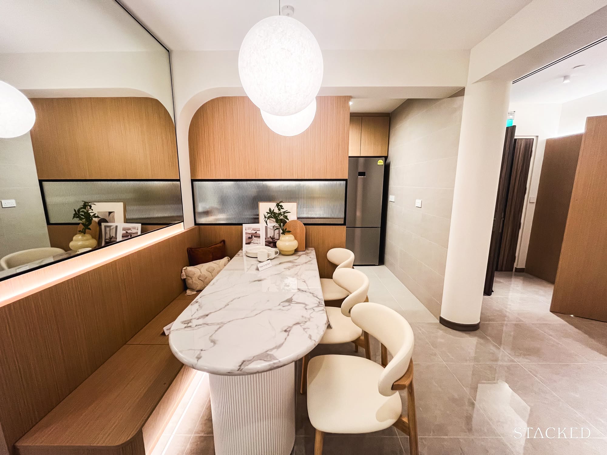
Here’s the booth seating setup, something we’ve seen in countless condo showflats. I like that there’s enough room here for a compact six-seater, which is generous by BTO standards. It’s positioned just beside the kitchen, which brings us to the next space.
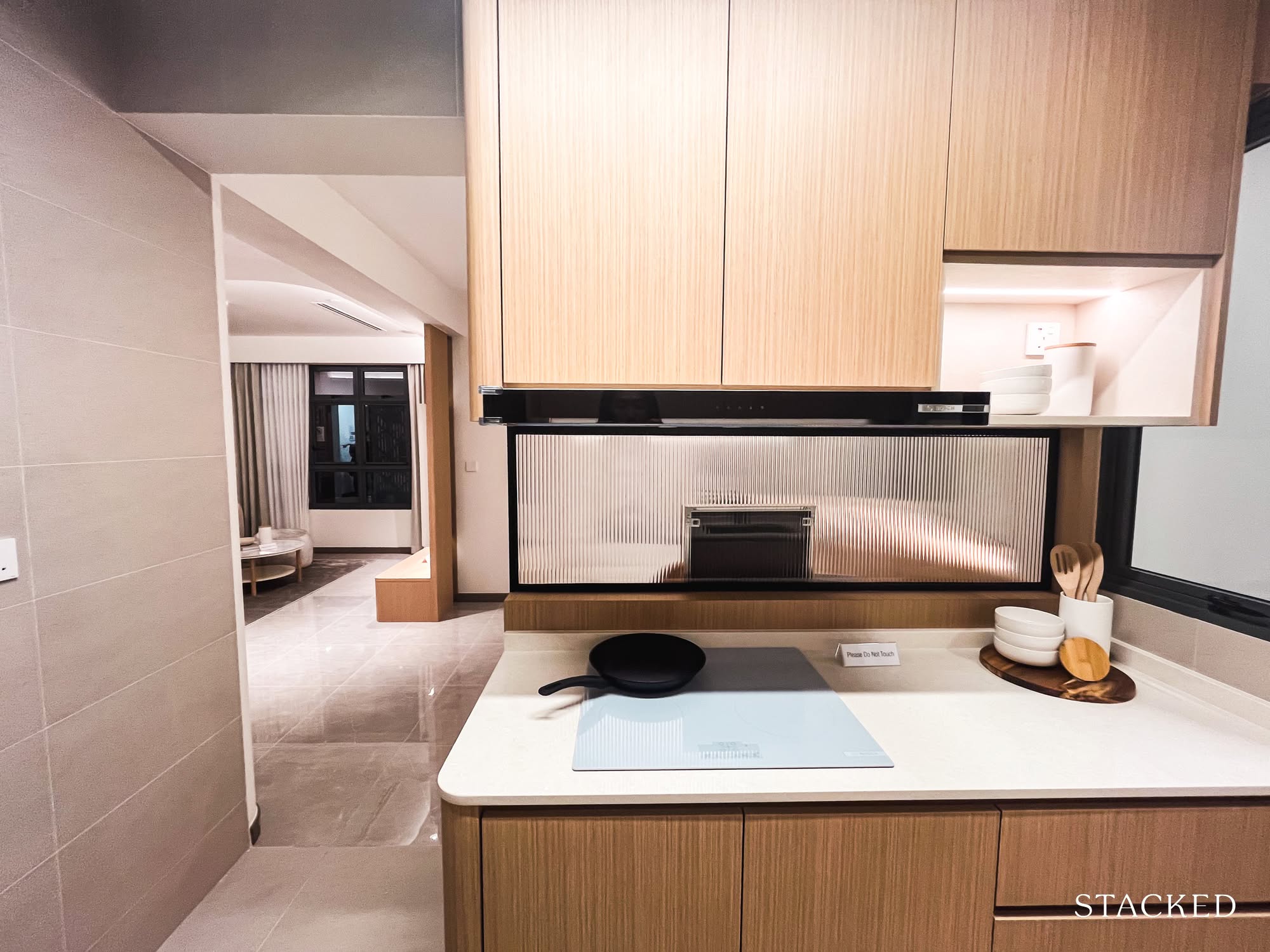
On paper, this kitchen is supposed to be open-concept.
But the IDs have added a fluted panel here too, which, given the tightness of the layout, actually makes a lot of sense. It creates more cabinetry and extra countertop space, both of which are very welcome in a compact kitchen. If you prefer a closed-off setup, there’s even room to install a sliding door.
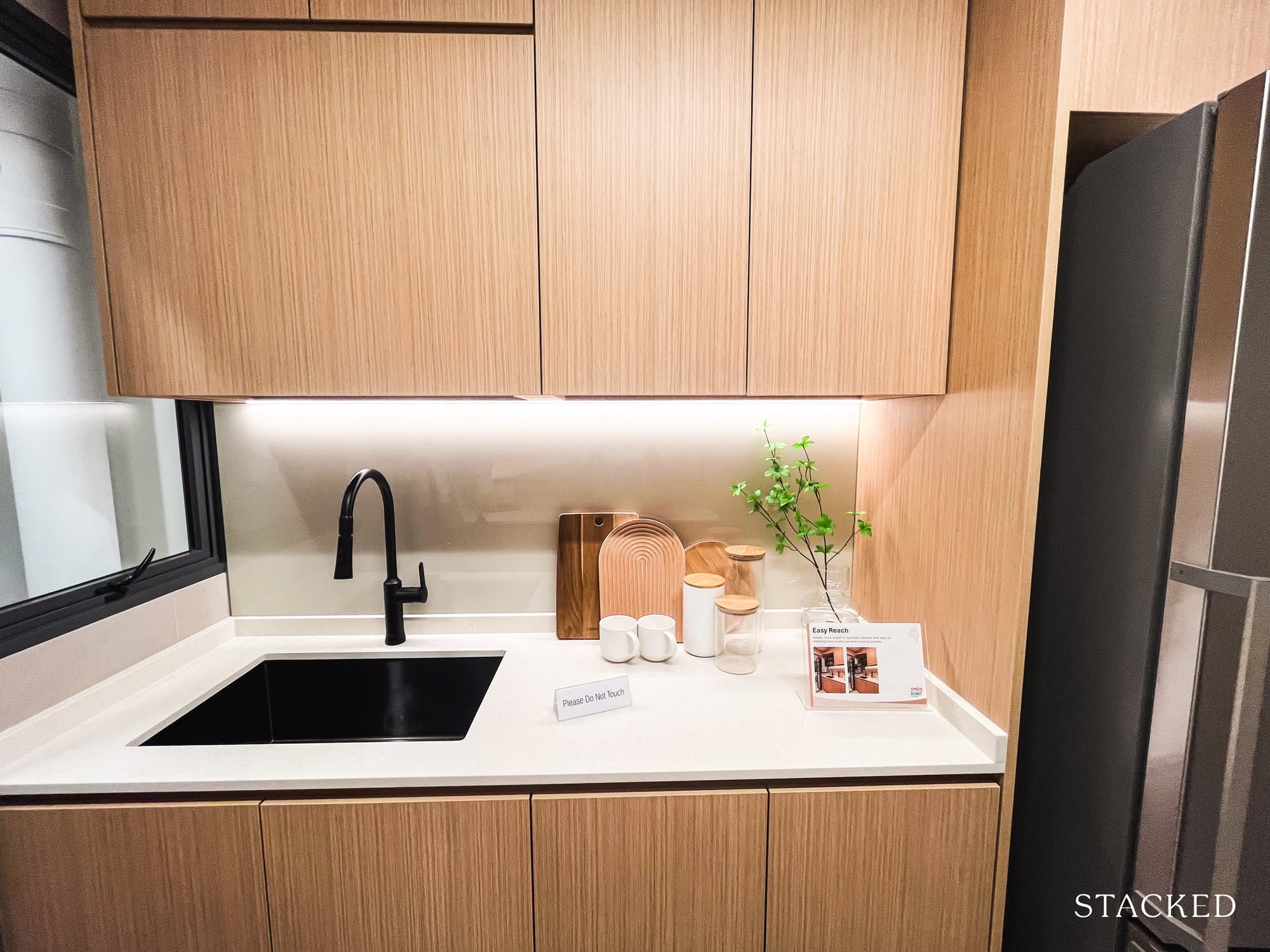
The kitchen itself is nicely done. It’s streamlined, spacious enough for two people to cook side-by-side without bumping elbows. Though, full credit to the reno budget here. Good bones help, but a lot of this comes down to finishes and styling.
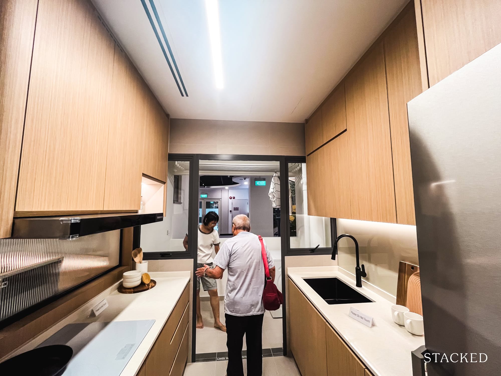
And at the far end, we have the yard.
It’s simple, functional, and does exactly what it needs to do. You can choose to enclose the yard (which I’m planning to do for my own flat) or leave it open for better airflow. There’s enough space for a basic laundry setup.
Now, let’s head over to the living area.
First up: the common bathroom.
It has a window for ventilation, and enough space for the basics. Everything you need is here. But if I had to be picky (and I usually am), I really dislike that the shower faces the WC. It’s one of those things that sounds minor until you’re stepping into a damp bathroom every time someone’s had a shower. Even with a glass panel, the splash situation isn’t great.
I’ve been brainstorming solutions for my own future home, and… nothing yet. Sadly, HDB hasn’t cracked it either. We live in hope. Or just in wet slippers.
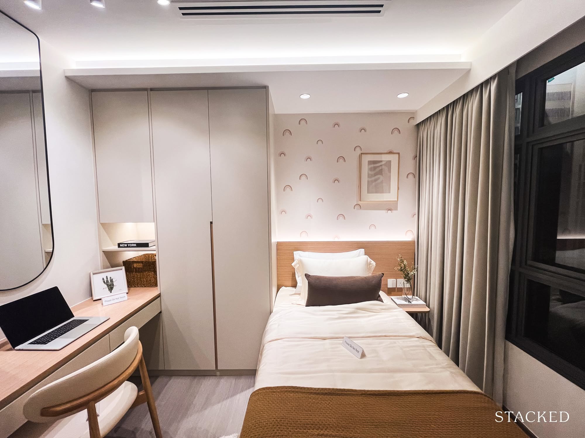
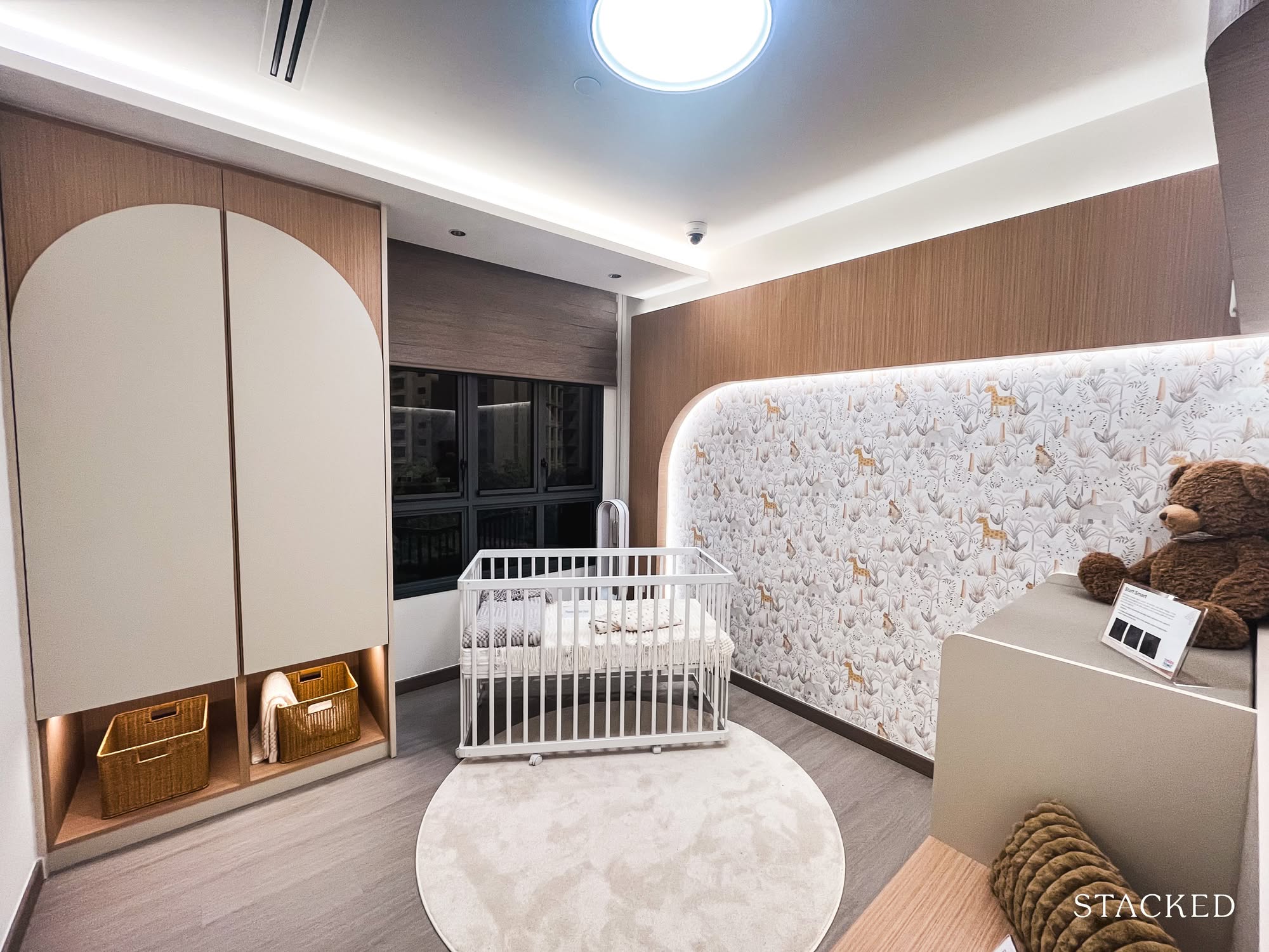
As for the common bedrooms, there are two layout variations to consider: one styled with a single bed, likely for a teenager, and the other as a nursery. It’s clear this home was designed with a growing family in mind.
Both rooms are identical in size, but the differing interior treatments offer a helpful look at how the space can be adapted for different needs. It’s the kind of visual cue most homeowners will appreciate, especially if you’re planning ahead for life stages.
What I liked most was how the space still manages to fit a proper writing desk, a small cabinet, a single bed, and a bedside table; all without feeling overly cramped.
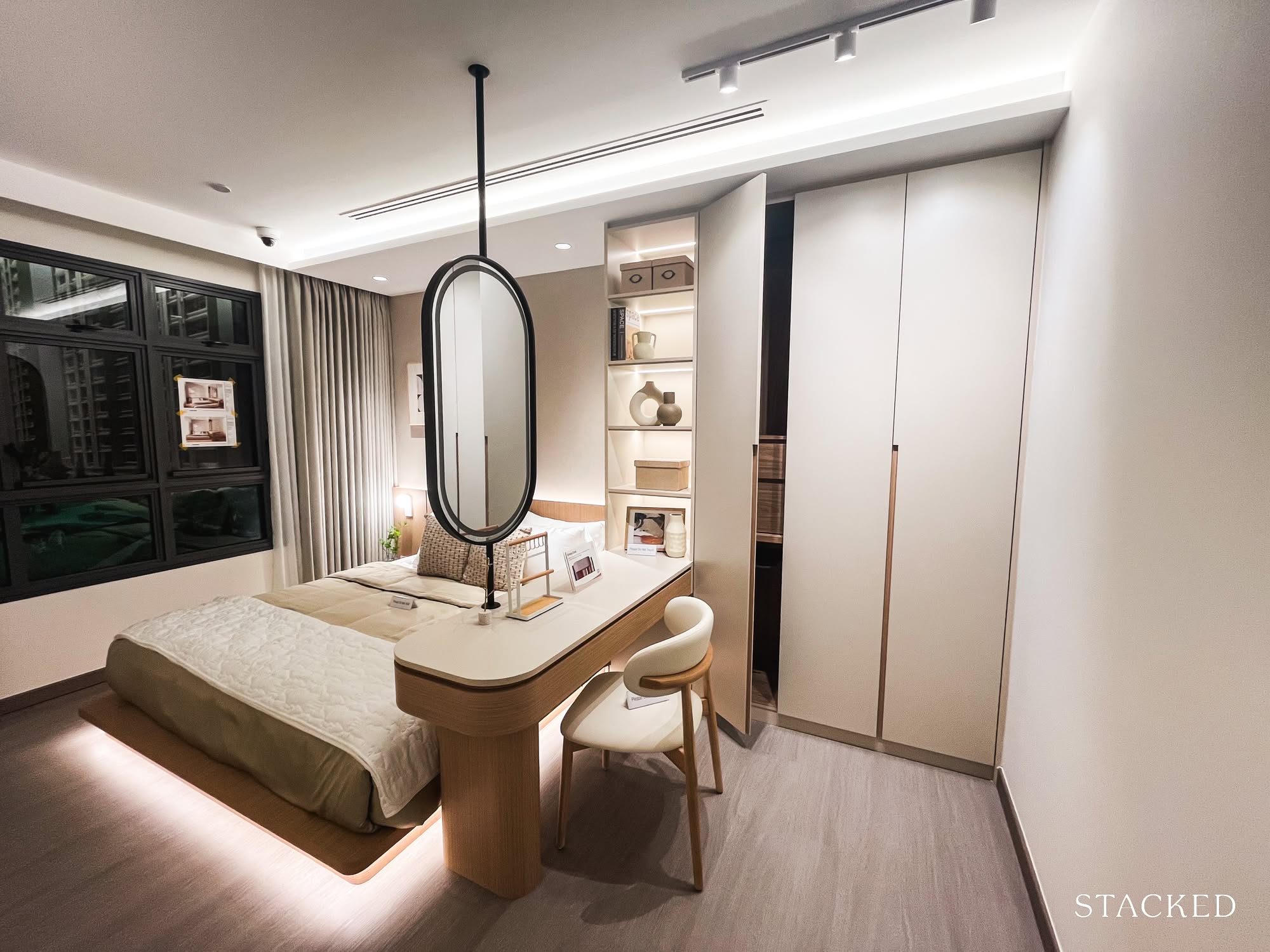
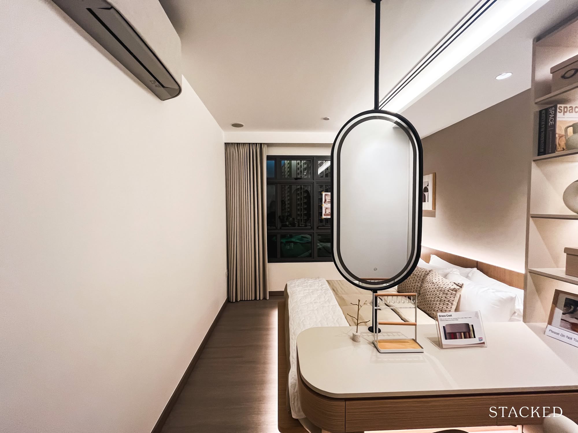
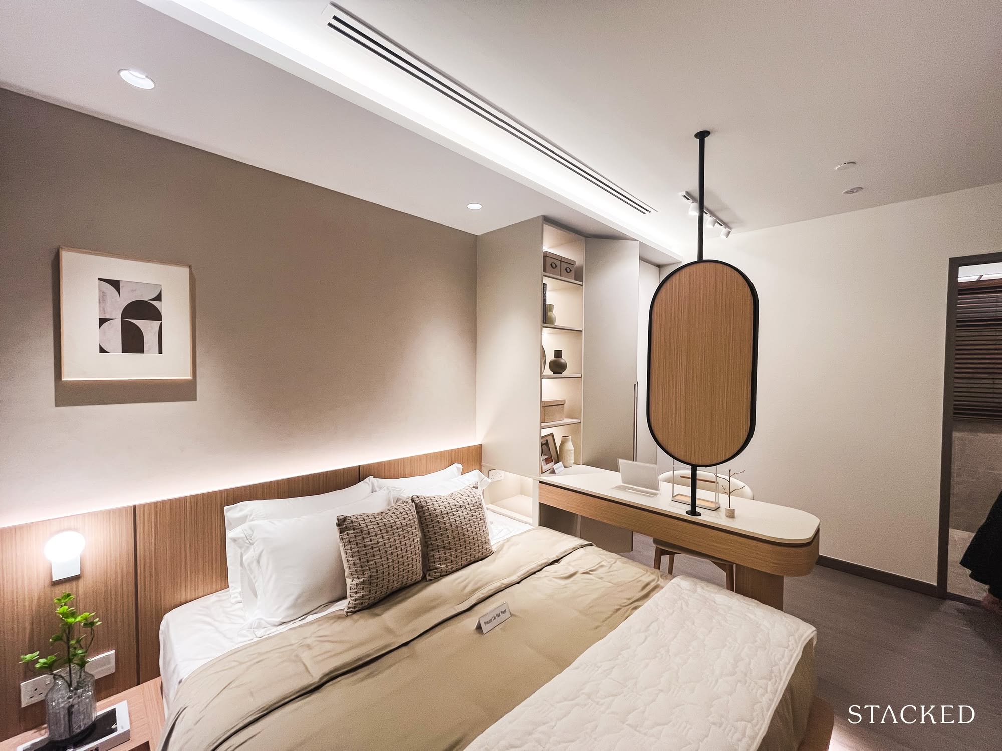
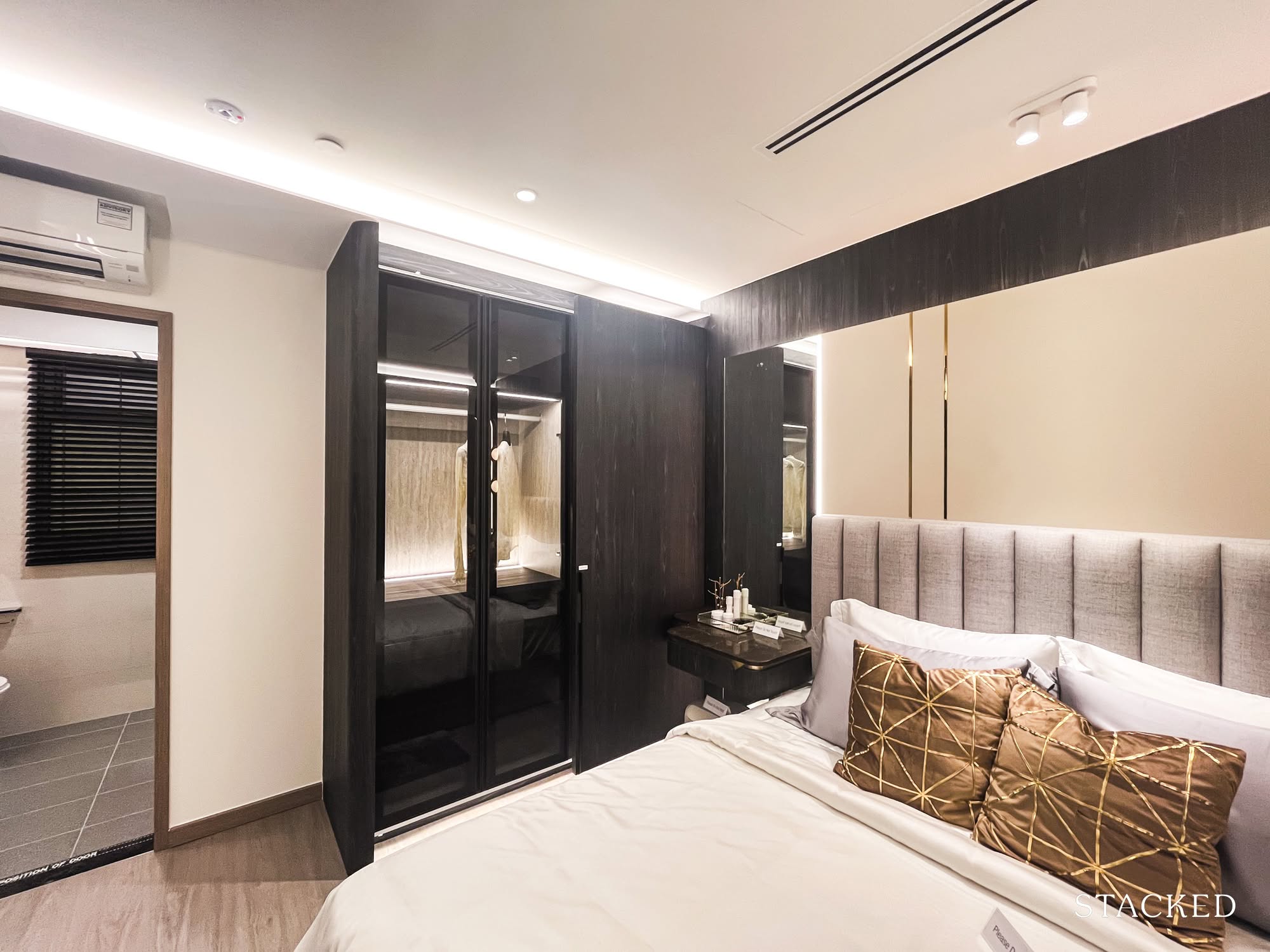
And finally, the master bedroom. This is arguably the part of the tour I was most excited about.
Before this, I wasn’t sure if the space could accommodate a small walk-in wardrobe (a dream, a fantasy, a storage necessity). But seeing how the IDs carved one out here, by tucking a vanity into a recessed corner, gave me a flicker of hope.
Even with that setup, the room still fits a queen-sized bed and a small bedside table. That said, my partner and I currently use a king, and if we stick with it… let’s just say things might start feeling a little tight. But I suppose that’s a decision for future me, along with the 40 other renovation debates I’ll eventually need to have.
Still, it’s hard not to be impressed. I sent a photo to my mum, and she was genuinely shockedthat this was a HDB flat. Proof, perhaps, that good design and reno really can work wonders.
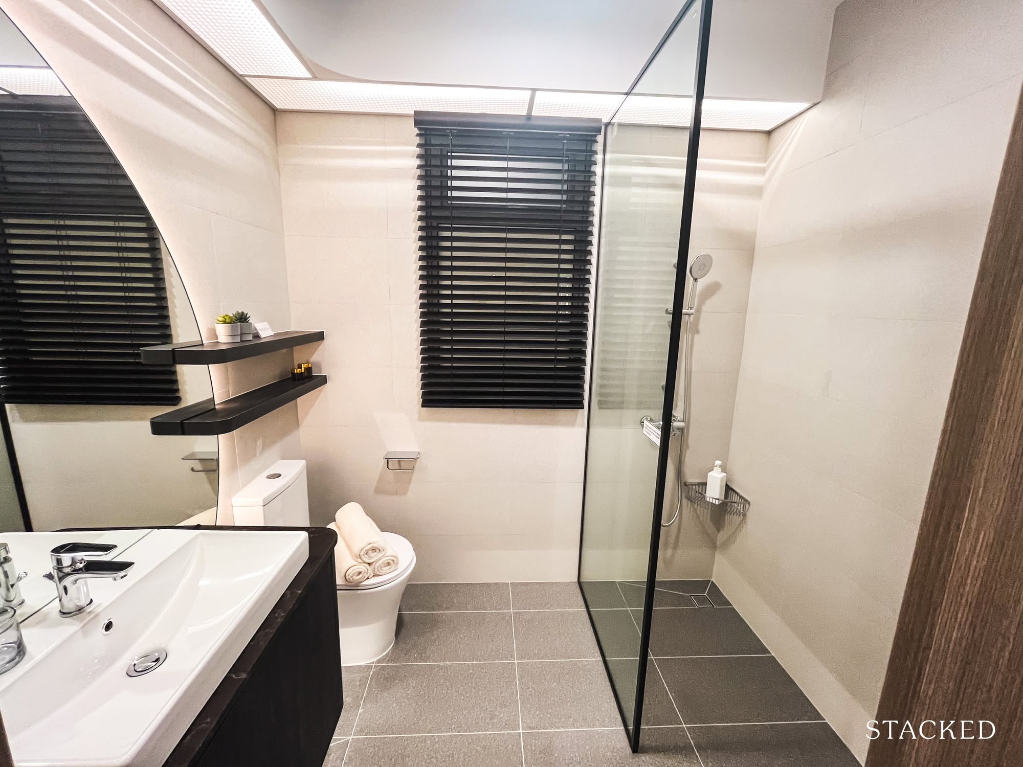
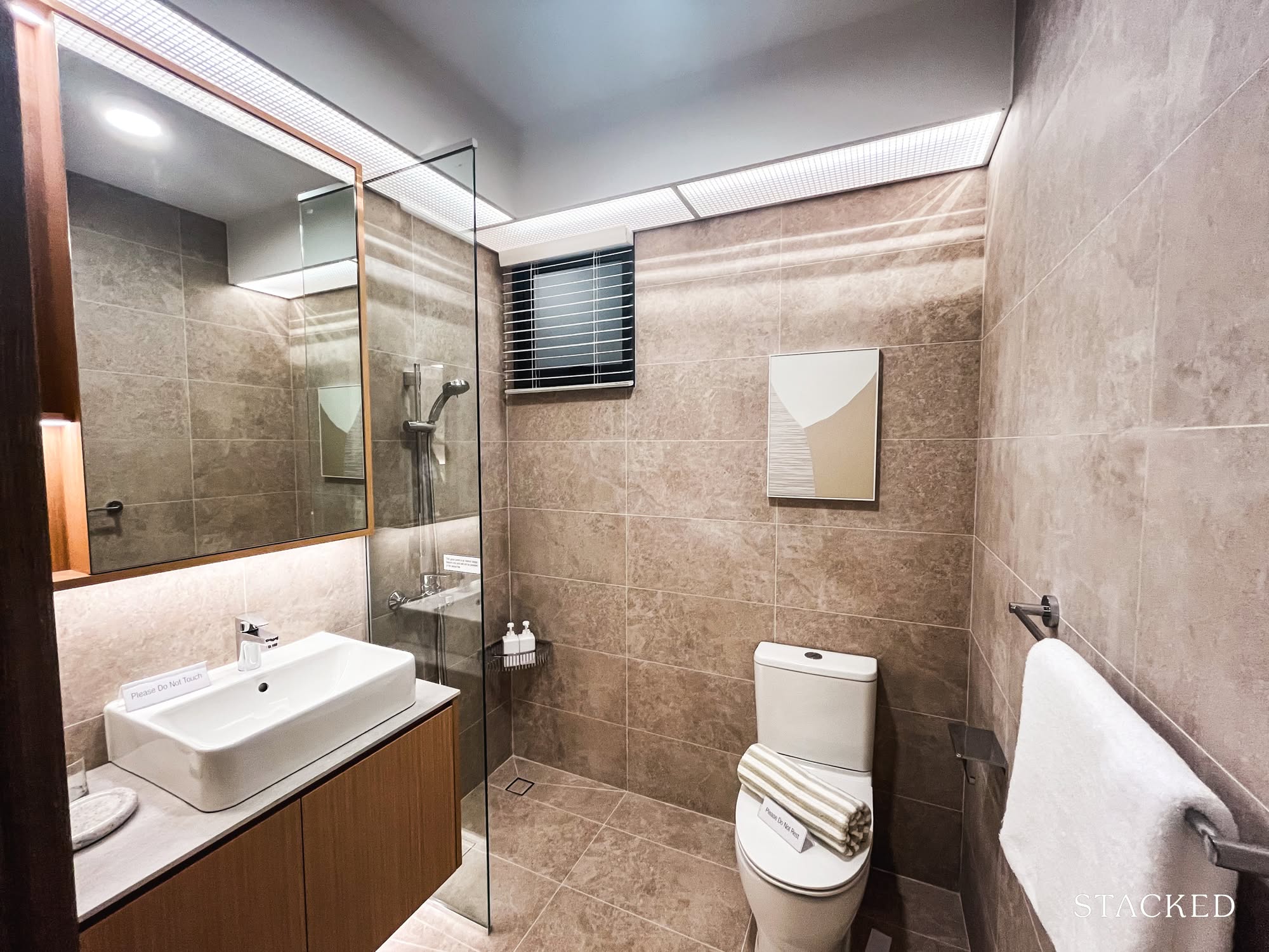
Last but not least, the master bathroom. It ticks most of my boxes for what makes a good bathroom. The shower area is separated enough to keep the rest of the space dry (a small but important win), there’s a window for natural ventilation, and even with all the essentials in place, it doesn’t feel overly tight.
All things considered, I’m feeling pretty good about this layout.
Final thoughts: On BTOs, layout tweaks, and quietly spiralling over cabinetry
I left the gallery with 123 photos, 17 new renovation ideas, and a quietly burning hope that (somehow) that walk-in wardrobe dream might still survive.
The flats are still under construction, but the Pinterest boards? Very much in progress.
If you’re in the early days of your BTO journey like me, a visit to the MyNiceHome gallery might be just the jolt of inspiration (or realism) you need. You’ll walk away with a clearer sense of space, a handful of styling ideas, and probably one or two strong opinions about bomb shelter doors.
If this piece resonates, I just might return with a review of the smaller layouts next; 2- and 3-roomers deserve their moment too. But for now, I’ll be over here, sketching out storage solutions and pretending I know how to use SketchUp.
If you’d like to get in touch for a more in-depth consultation, you can do so here.