


A Black & White Lover’s Guide To Choosing Colours For Your Home
Picture this: I’m reclining on my sofa in my recently-renovated living room. I’m reading Joyful by designer Ingrid Fetell Lee.
I read, “Few people would name their favourite color as gray or beige, yet our homes are often cloaked in bland neutral tones.”
I stop reading and glance around.
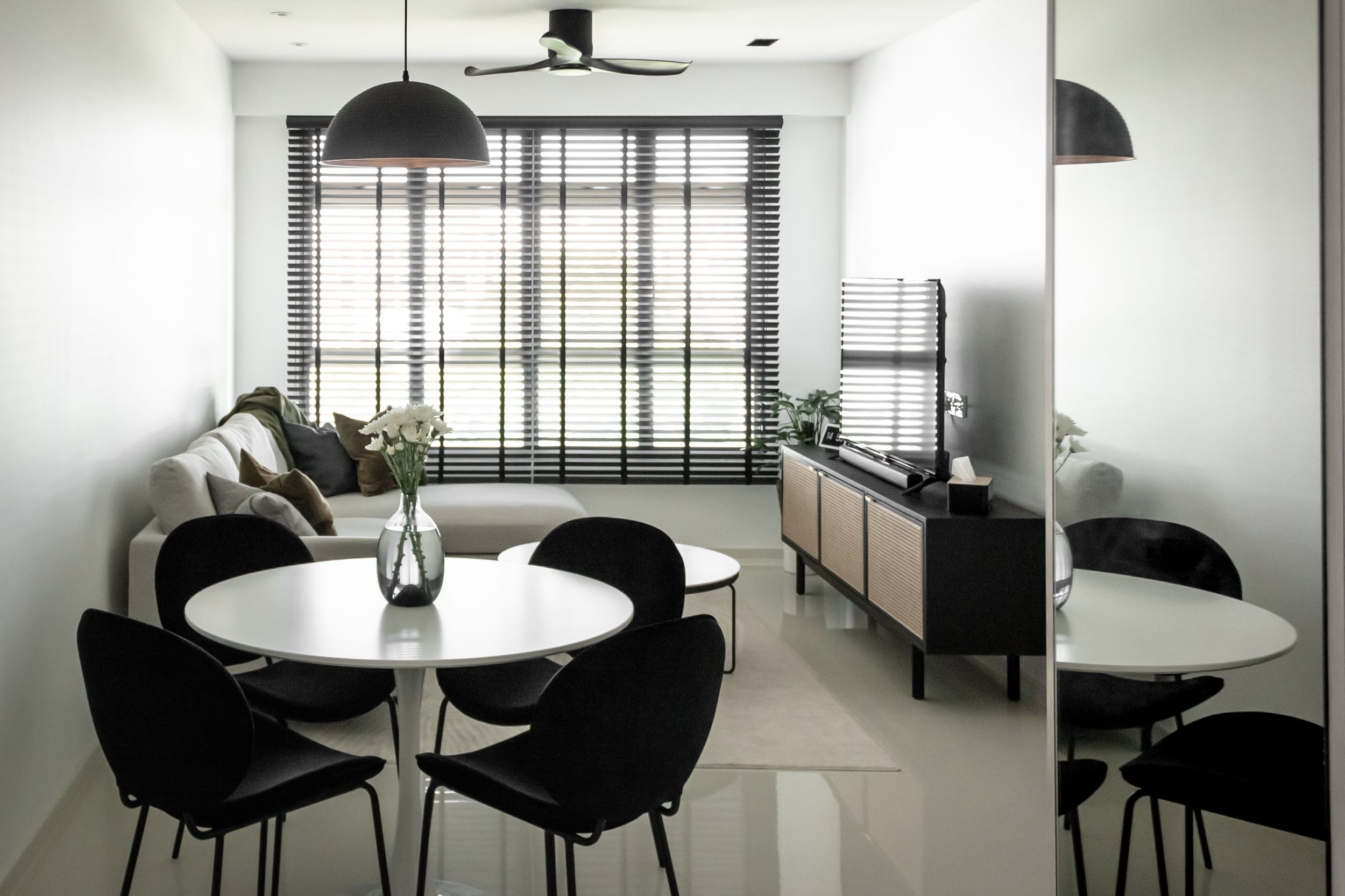
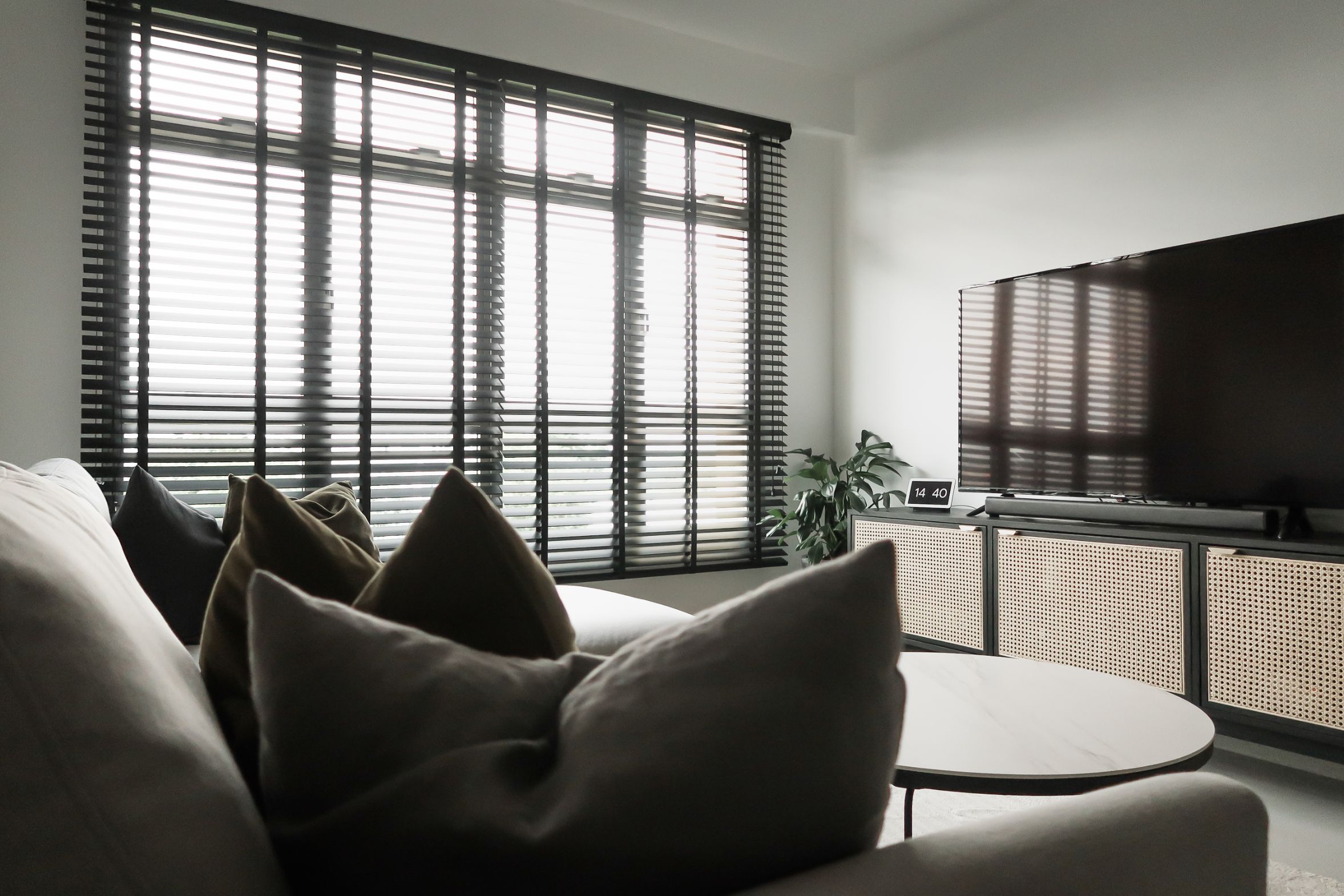
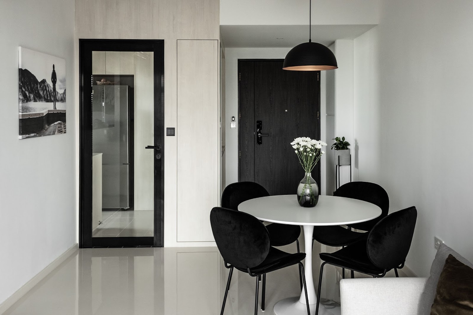
My walls are white. My sofa is grey. My Venetian blinds are black. My entire living room is a temple to neutral colours.
I feel called out. I reluctantly continue reading.
“Why is there such a gap between the colors that enliven us and the colors that surround us?”
“Chrom0phobia,” the book tells me emphatically.
Diagnosing Chromophobia
Chromophobia, simply put, is a fear of colour. The term chromophobia was coined by Peter Stamberk and Paul Aferiat, the architects behind the vividly-hued Saguaro Hotel in Palm Springs, California. To them, chromophobes are people who live in fear of picking the wrong colour for their spaces. Chromophobes are afraid of colour.

Am I a chromophobe? For my flat, I’d picked whites, blacks and beiges with wood accents and natural textures for warmth. I’m quite fastidious about maintaining a neutral colour palette in my home, and I shudder at the thought of painting a room in a stronger colour. In fact, I decorated for this year’s Chinese New Year without using one bit of red!
Ladies and gentlemen, I think that makes me a certifiable chromophobe. And if you resonate with what I’ve just described, or even live in a home that’s a gorgeous fifty shades of grey, you could be a chromophobe too.
Wait, you protest. Aren’t white and black colours?
The answer isn’t terribly straightforward, but according to Adobe, white and black aren’t colours in a technical sense because they’re shades. They add to and affect other colours, but aren’t colours in themselves. What we think of as “pure” white and black are very rare – more often than not, they’re a combination of several colours to give us extreme light and dark tones.
And you’re not getting away with desaturated colours too. Lee informs that desaturating colours is about dulling them out by adding varying amounts of grey. So think of slate, khaki, olive, and, of course, beige.
“Beige is a desaturated yellow – a yellow with all the joy sucked out of it!” Lee writes. (Rude.)
Is there anything wrong with being a chromophobe?
I certainly hope not! Neutral spaces are calm havens for me. And in our decision-laden lives, decorating in blacks and whites makes interior design arguably a lot easier. But Lee cautions that we could be denying ourselves the joy-infusing power of colours.
“Colour is energy made visible,” states Lee.
Hence, brighter colours can energise us and bring us joy. And really, who wouldn’t want more joy?
The antidote to chromophobia is to inject colour into our calm (or drab, depending on who you speak to) spaces. But what to do when painting a wall in fluorescent yellow makes you break out in a cold sweat?
Baby steps, my fellow chromophobes. We pick one colour to introduce into our chromo-deprived spaces. That was my strategy when I decided that my flat needed a bit of colour.
But there are millions of shades within the colour spectrum. How do we choose just one?
I’m no interior designer, but I am quite obsessed with interior design, especially what’s trending at the moment. And what could be easier for the chromophobe than picking a colour that everyone else already likes? Here are a few recent trendy colours to help ease the transition from colourless to colourful.

Blue
Blue was a very popular colour just a few years ago.
At the end of 2019, Pantone named “Classic Blue”, a deep blueberry hue, its Color of the Year. At the time, the world was about to cross into a brand new decade, and everyone was hopeful, but also eager to leave the tumult and division of the 2010s behind.
Pantone described Classic Blue as “highlight[ing] our desire for a dependable and stable foundation on which to build as we cross the threshold into a new era.” (Who could’ve predicted the disarray that a global pandemic would throw the world into just a few short months later?)
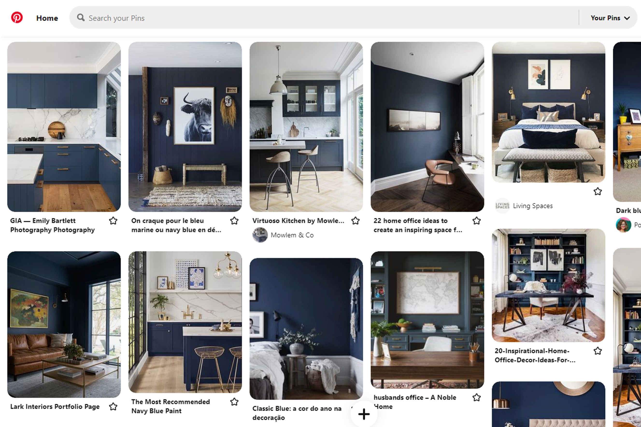
2020 was the year I purchased my flat and was planning for its renovations. At the time, blue in interior spaces was making waves across interior design blogs and social media. My Pinterest board, in particular, was full of images of navy cabinetry with gold hardware in kitchens, home offices shrouded in cobalt, and indigo feature walls in bedrooms. If blue represents stability, I think a lot of us were desiring it and happy to swathe our walls in the colour.
So what changed for me? Honestly, after I saw the umpteenth blue kitchen on my Instagram Story, a part of me grew tired of the colour. After nearly a year of Covid-19 and spending more time indoors than ever before, I wanted a space that I could hunker down in for long periods of time without becoming weary of its design. Blue, to me, was more passing passion than a long-term lover, so we parted ways even before I got the keys to my flat.
But that’s just my feelings for the colour. There’s a reason why this particular shade is called a classic – it’s perennial and, more importantly, relatable. Time magazine described Classic Blue as “both genderless and seasonless, making it both accessible and desirable, for people in all walks of life.”
For a great example of using blue in a home, check out this episode of Stacked’s “Living In” video series featuring Rachel and Kheng’s lovely blue kitchen in their five-room Bukit Batok flat.
Blue is an easy colour to get on board with, so it’s a good choice for the chromophobe who’s tiptoeing into the world of colour.
Pink
Okay, relax. I’m not about to suggest you create a life-size Barbie playhouse. (Although power to you if that’s what you love!) I can also sense those of us who identify on the male side of the ol’ gender binary are tiptoeing towards the exit.
But hear me out – there is a shade of pink that is fairly genderless and was trendy in the mid-2010s. It’s called Millennial Pink, a pastel shade of pink that was so ubiquitous, it could be found everywhere, from fashion to food packaging. In 2016, Véronique Hyland, who claims credit for naming the shade, was scathing in her description of Millennial Pink in an article for The Cut: “…it’s ironic pink, pink without the sugary prettiness. It’s a non-color that doesn’t commit, whose semi-ugliness is proof of its sophistication.”
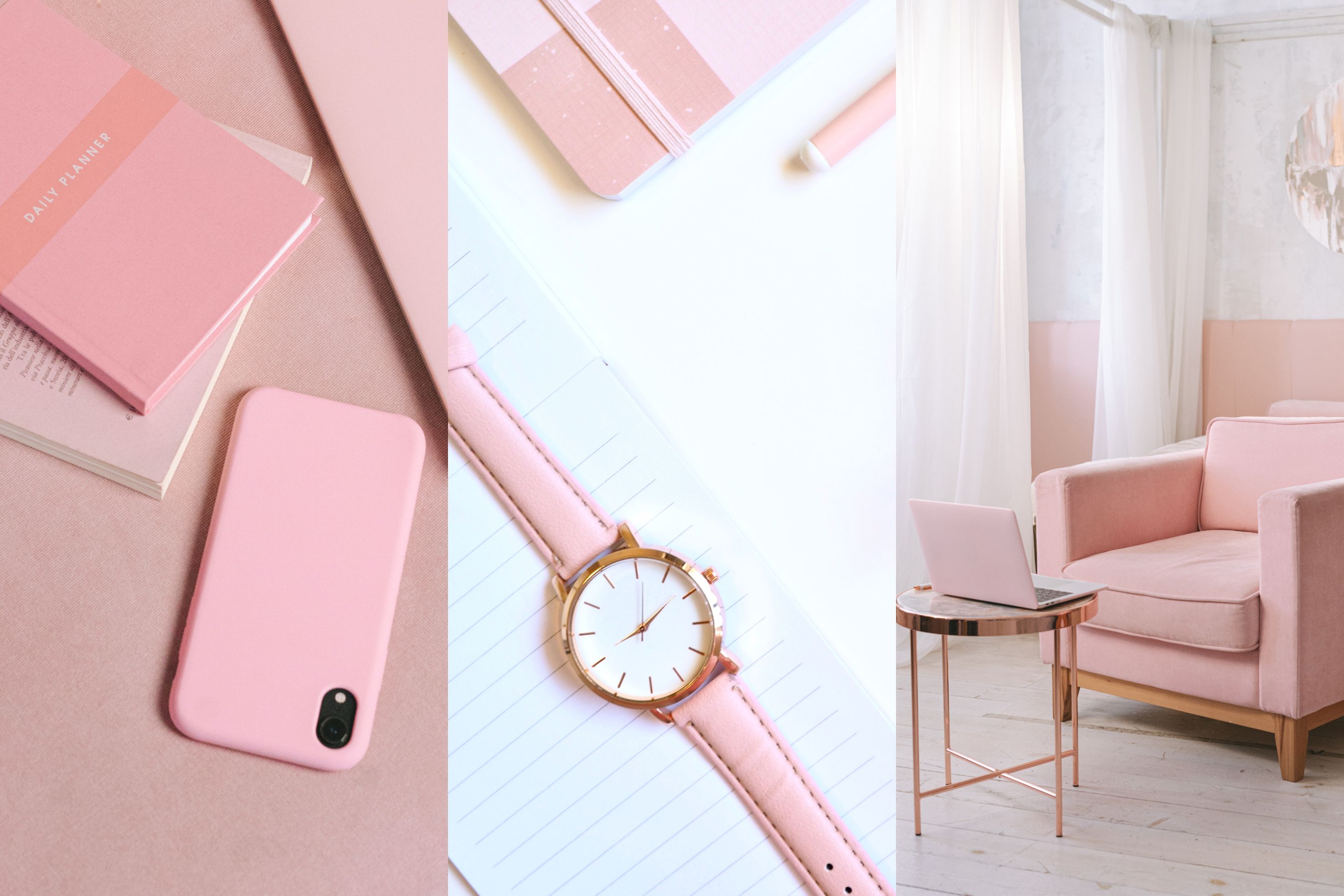
A pink that’s gender neutral and noncommittal? That sounds perfect for chromophobes! And the results can be beautiful. Case-in-point, the cheery pastel pink walls of this 5-room HDB flat which Stacked featured. Believe it or not, the pink was chosen by advertising professional Janan, not his wife Sherry!
While Millennial Pink has made the colour more acceptable across the gender spectrum, it’s important to note that pink wasn’t always a feminine colour. In 18th-century European culture, pink was the colour of choice for boys, not girls, because it was thought of as a lighter shade of red, the colour of vitality and strength. The feminisation of pink occurred around the 19th century in the West, and by the mid-20th century, we had the axioms pink-for-girls and blue-for-boys.
Nowadays, the conversation has evolved towards creating a future without the gender binary, even in our descriptions of colours and interior design. Bobby Berk of Netflix’s Queer Eye fame made an impassioned plea to de-genderise our interior design vocabulary. He writes, “…when we generalize interior design in these terms, we not only enforce gender stereotypes, we also limit design and how we think of materials, patterns, colours, and styles.
“By allowing all design components to exist outside the realm of gender classification, we can see interiors for simply what they are – beautiful spaces.”
I was curious why Janan would choose pink, so I tracked him down on the Instagram profile he shares with his wife. Janan says, “We see ourselves as happy-go-lucky people who don’t take ourselves too seriously. Pink and pastel colours symbolise our personality in our home environment. Those colours make our home feel cosy, joyful and happy.”
So why is there nary a Millennial Pink wall in my flat? Don’t get me wrong – I like pink. I’d happily wear a pink shirt any day of the week. But having a pink wall may be taking a step too far for my own chromophobia. But if pink is within your tolerances, it’s a colour that will create a happy home environment for its inhabitants.
Green
The last colour in our anti-chromophobia prescription is green. And you’ll be glad to know if you’ve picked green for your homes, you’re bang on trend.
Interior designer Nick Lewis conducted a comprehensive roundup of this year’s Colours of the Year from several paint manufacturers. And there was a clear winner across four major paint brands – green! And if your cultural zeitgeist is Vogue, you’ll be very glad to know that the fashion magazine has named green the new Millennial Pink.
“Green is THE colour of 2022!” screams The Spruce’s headline.
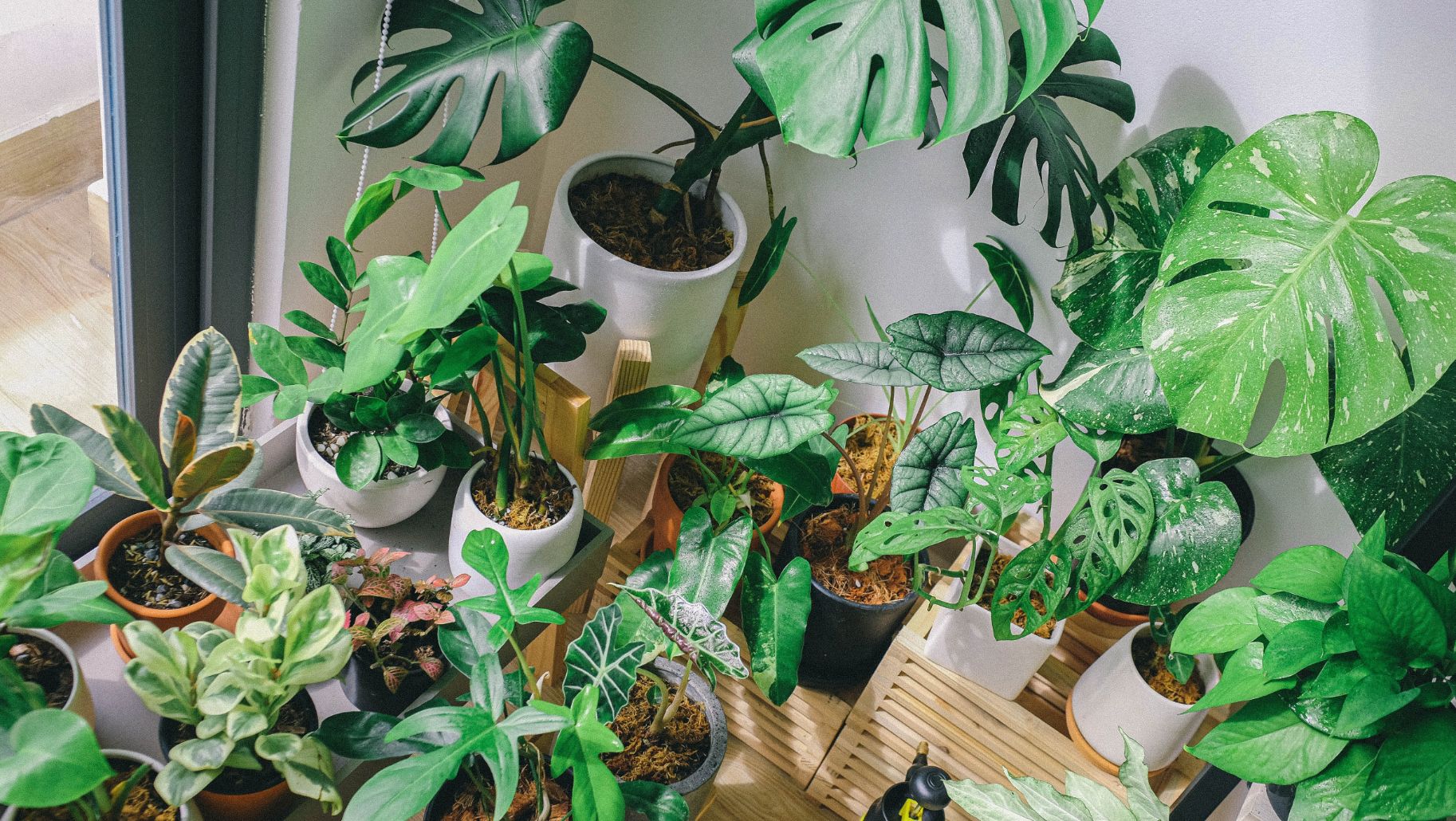
Green is an easy colour to get behind. It’s the dominant colour of Nature, and with most of us spending so much time at home in the last couple of years, we’ve made the most of our parks and green spaces whenever possible. And I know many of us homeowners have become plant mummies and daddies during the pandemic. So, painting out walls green is simply part of the natural progression of bringing the outdoors in.
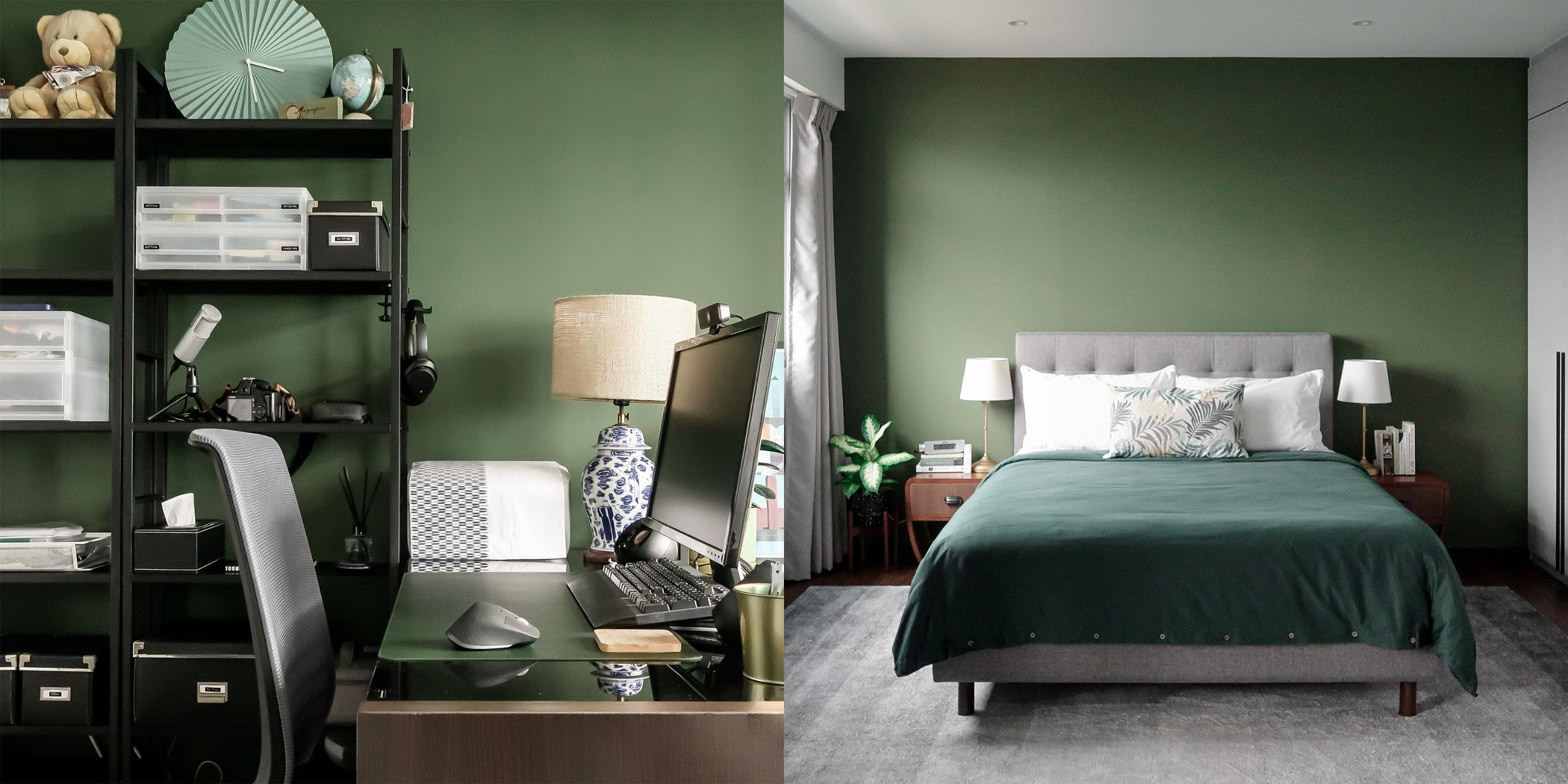
There’s another reason why green is the easy choice – in some circles, green is considered a neutral! Obviously, we’re not talking about radioactive sludge green here. Apartment Therapy, for instance, points to dark olive and sage as fantastic green neutrals because they’re derived from the colours of the forest.
This makes green the great loophole in our chromophobia treatment. It’s a colour, and it’s also neutral! It’s the super diet food that burns more calories than it contains. It’s the vaccine that doesn’t make you sick to impart its protection. It’s the mysterious phone call that actually puts money into your bank account instead of taking it. More importantly, green has the capacity to induce both joy and calm.
While the majority of my flat is painted in white, I have dedicated two whole walls to green, a dark mossy green, to be exact. (It’s Nippon Paint Easy Wash in Esparina, paint code 1750.)
But let’s not get carried away – I’m still a chromophobe. I’ll always find comfort in whites, blacks and greys. And on some days, I can be persuaded to adopt desaturated colours.
In some ways, it feels like I cheated by choosing green. But I’ve successfully introduced a proper colour into my home. And, who knows, this could be a stepping stone to being more daring with other parts of the rainbow in future.
If you’re a chromophobe, there’s hope for you yet! Just pick a colour that won’t make you run for the hills, maybe even a little brighter than you’re used to, and go from there. Whatever you choose, your prognosis can only be more joy in your life.


Thanks, Dan, for sharing that amazing beautiful home pic with the combination of white and black color. I was thinking can I place black wall decals(https://www.vwaq.com/). Will it sync with my home or not? Please suggest.