
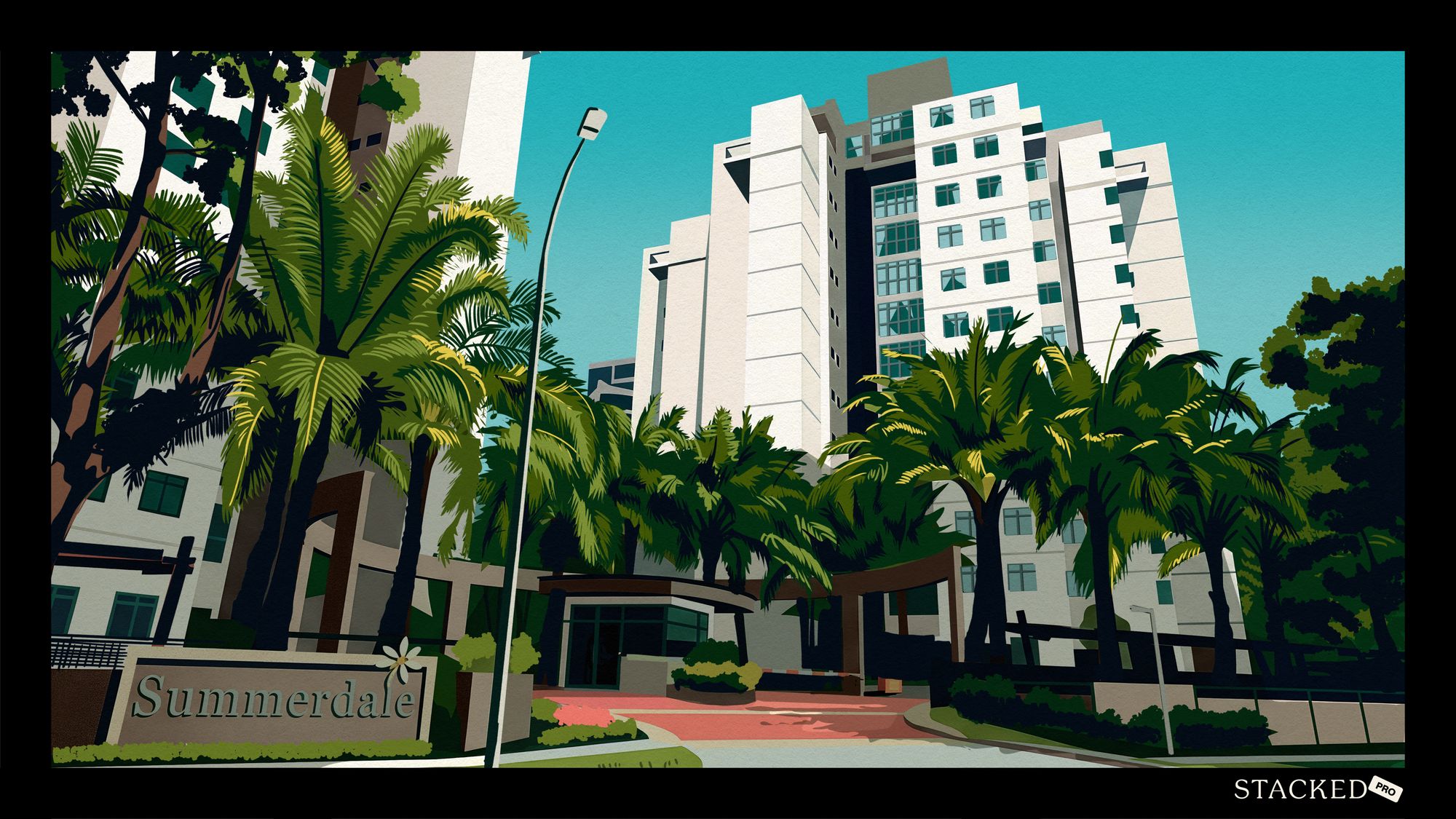


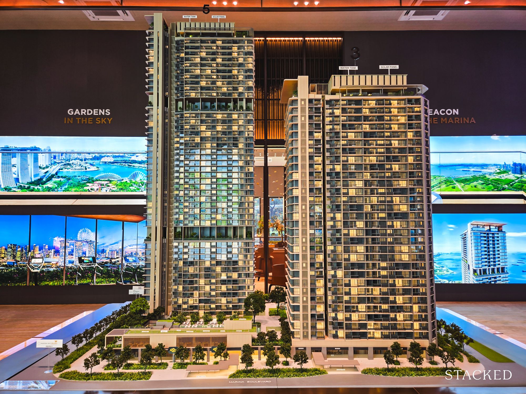
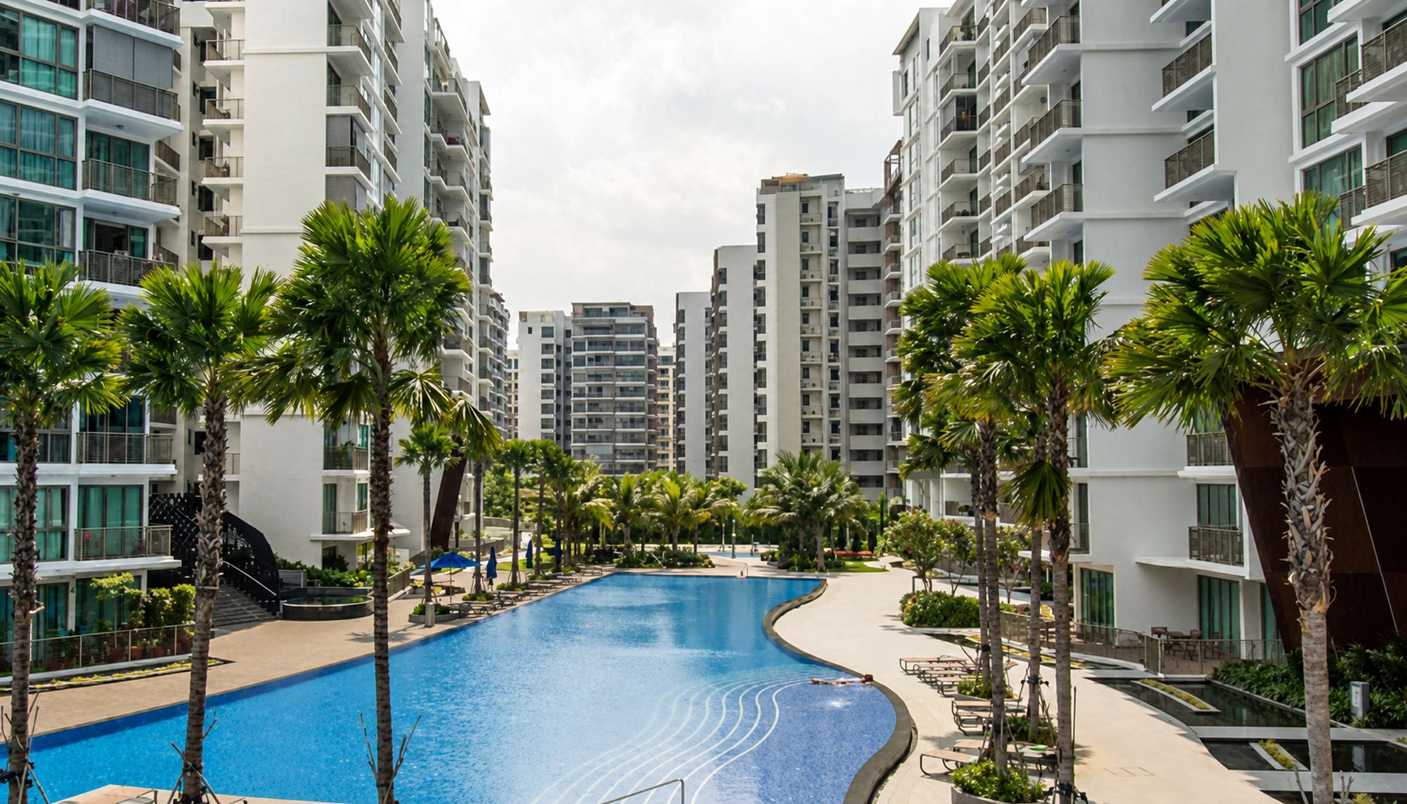


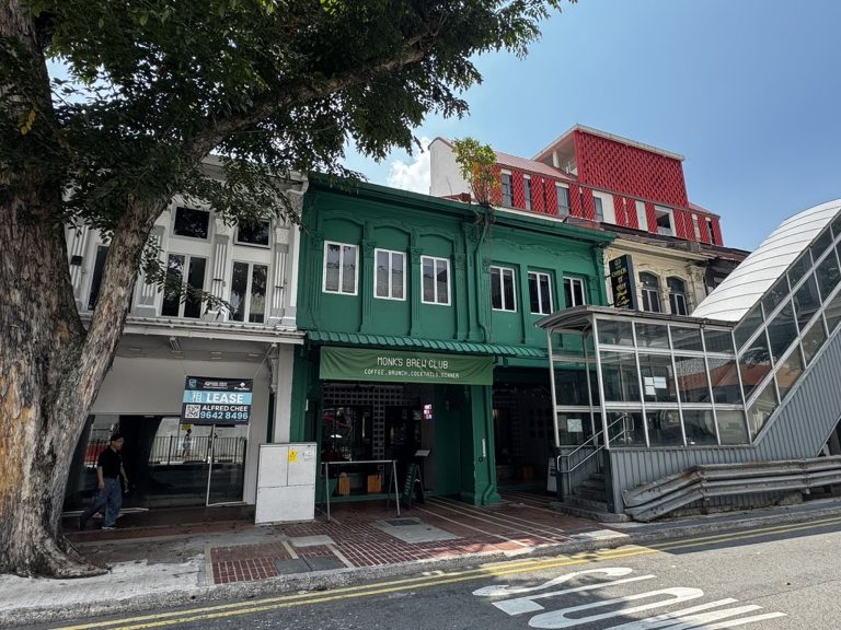
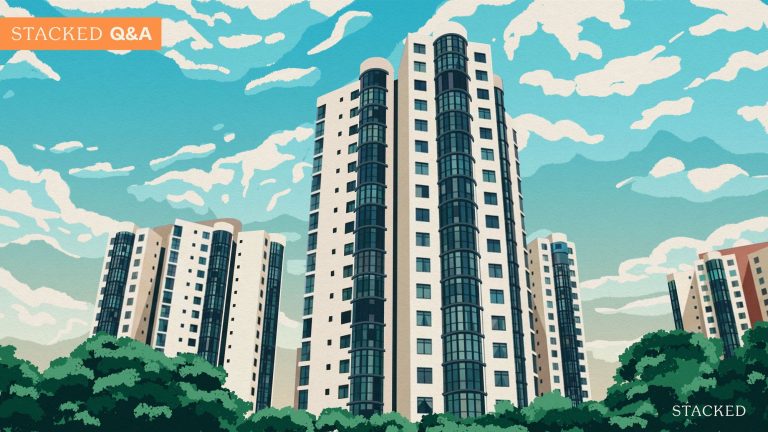


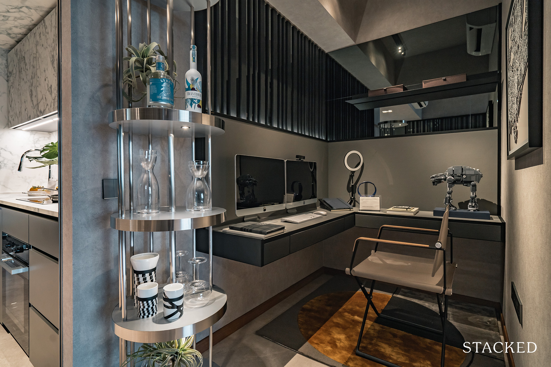
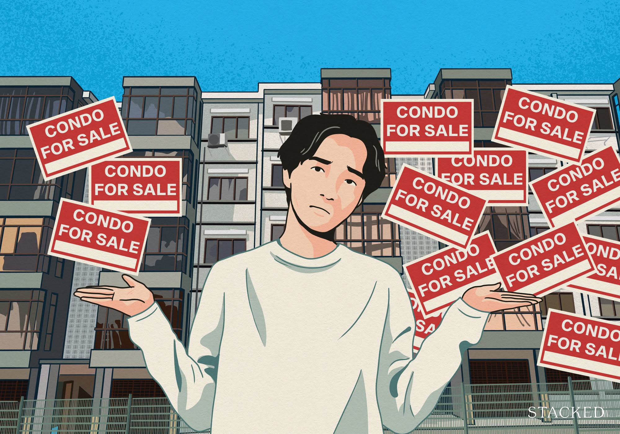
When it comes to condo design features, novelty can sometimes get in the way of practicality. There are features that have appeal just on the basis of being new or unusual. Give it a few years, however, and you might rue the day you fell for them. From the impractical to the downright ugly, here are some of the not so great design features we should put a pause to – possibly for good:
Table Of Contents
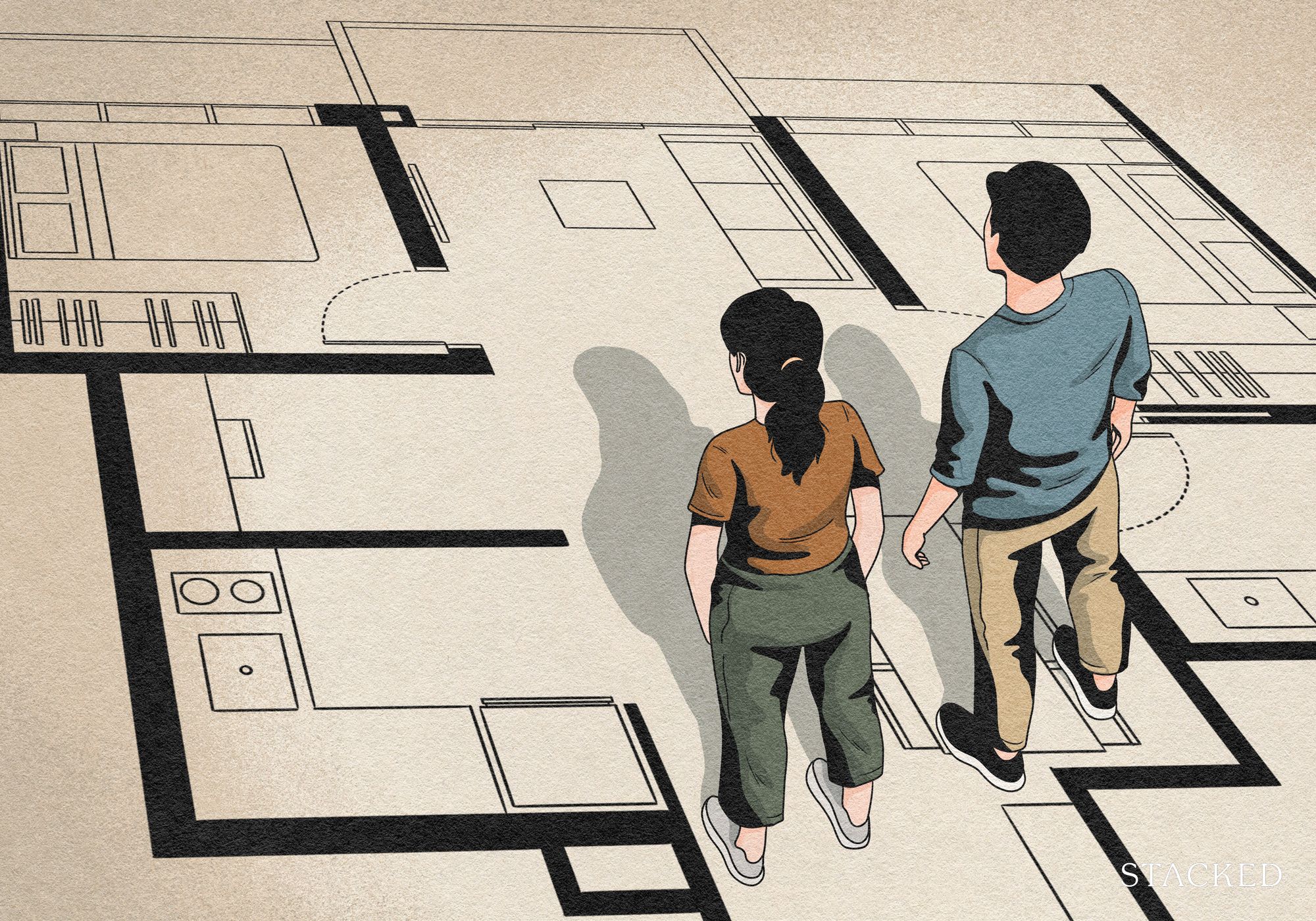
The challenge for many buyers today isn't access to information.
It's interpreting that information in a way that makes sense for their finances, goals, and stage of life.
Over time, that's also why we decided to work with agents who shared the same data-driven and advisory-led approach behind our editorial, consultants who could help readers think through decisions more objectively, rather than simply push transactions.
Today, the team has worked with more than 2,000 clients across over $5B in property transactions.
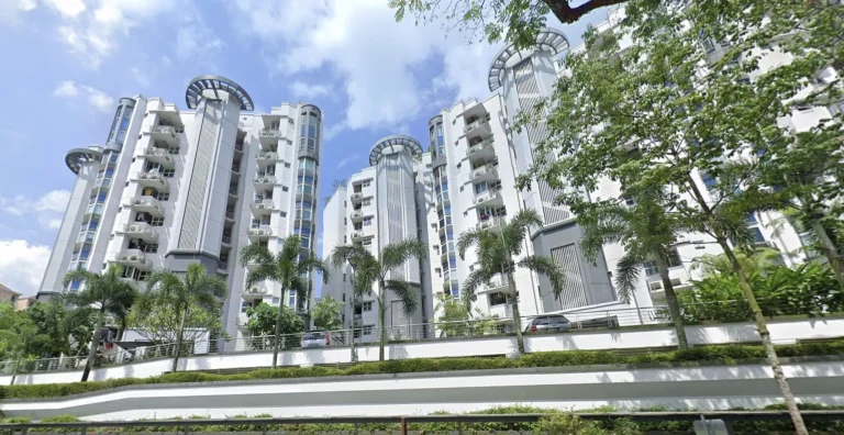
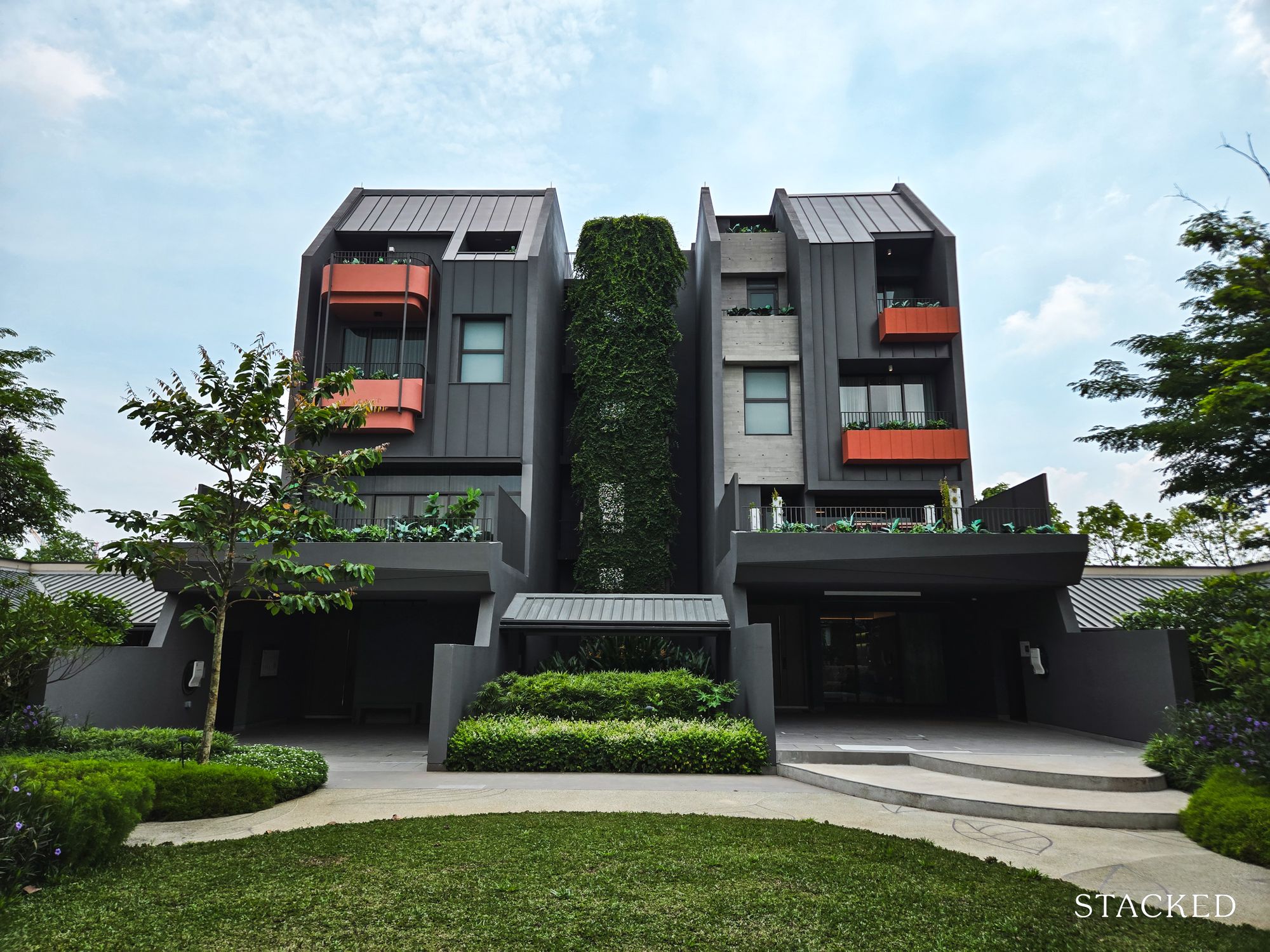
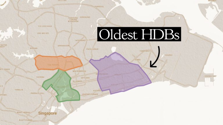
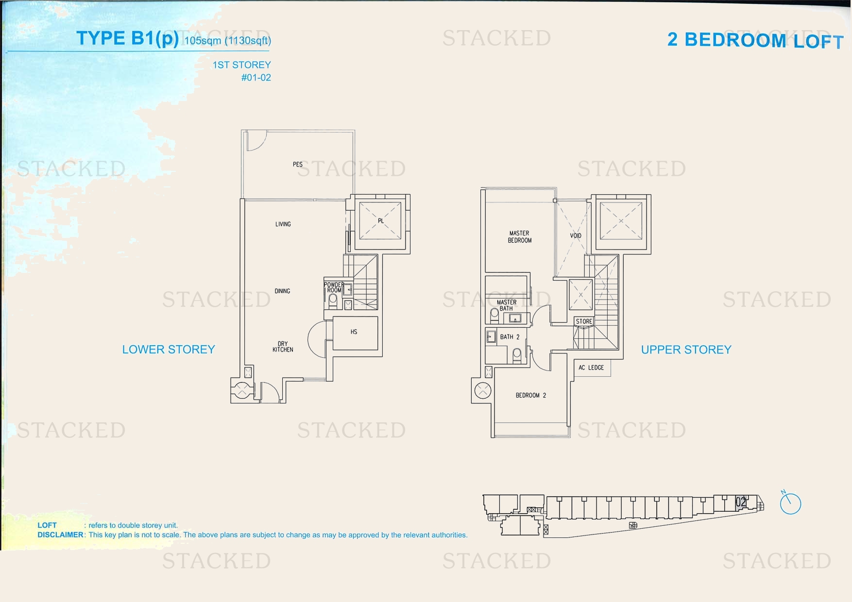
1. Round/curved walls in the layout
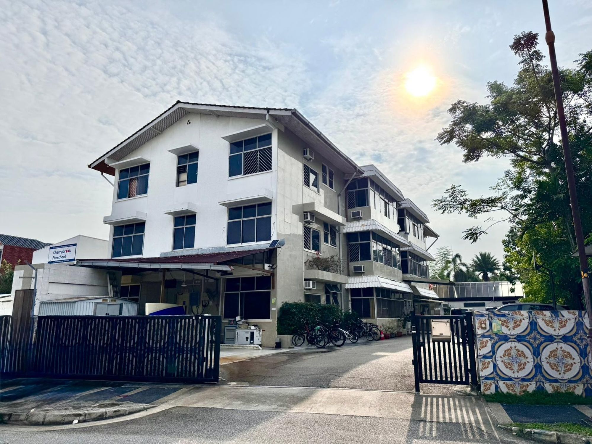
Interestingly, one of the culprits here is an HDB project (The Clover @ Kebun Baru). For the most part though, it’s older generation condos – particularly those from the ‘80s – that may feature rooms or balconies that are curved/circular.
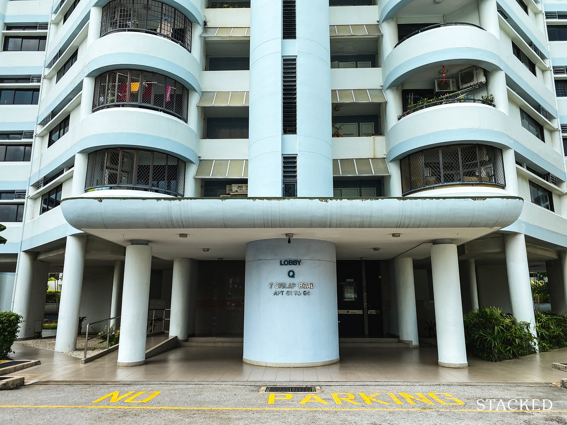
It’s an interesting aesthetic, but there are practical issues. For starters, few pieces of furniture work well with curved walls – unless you’re ready to pay for pricey, custom-made pieces, that is. In some cases, such as a rectangular desk pushed up against a curved wall – it leaves space in the back that’s wasteful, and also hard to clean.
It does work if the units are large in size (like Park Nova, or the Eden), where you have the luxury of space to play around with. But for smaller units, the drawbacks are much more apparent.
As far as interior design goes, unusual, rounded corners can be a challenge. You may end up having to fork out more, for custom design elements to use or disguise the space.
Finally, because this look is so closely associated with older projects, rounded balconies or layouts can create a dated façade.
2. Excessive bay windows
We have nothing against the concept of bay windows – within reasonable limits. However, projects from around 2000 to 2008 tend to feature unusually large bay windows (i.e., windows with large protruding ledges). Some of them have ledges big enough to convert into a study area, or a sofa nook.
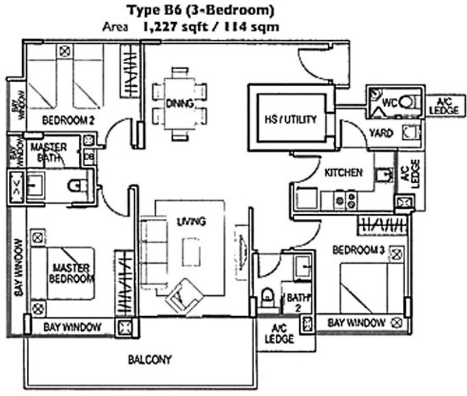
This owes a lot to a now-closed loophole (see below), which incentivised developers to create big bay windows. In theory, these can allow for fancy options such as reading nooks, or a ledge high enough to function as a desk.
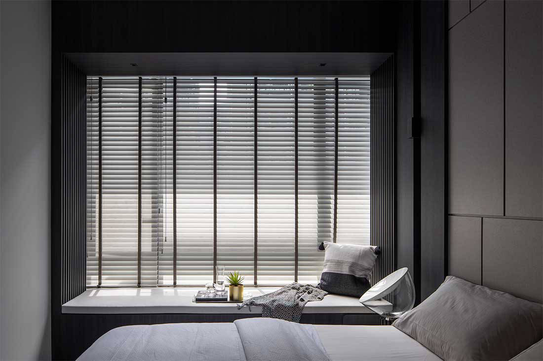
In reality, bay windows mostly just take up floor space. There are layouts where more than 10 per cent of a bedroom or living room is just bay window ledges; and many homeowners have found they’re less comfortable than they seem. The ledges are often barely big enough to serve as spaces like sofa nooks – and the end result is often cramped discomfort, rather than cosiness.
Oh, and if you think you’re going to just hack it away, think again: you need to get official approval to do that, if the ledge space was originally exempt from the Gross Floor Area (GFA). That can come with some hefty fees, as you’re expanding the GFA.
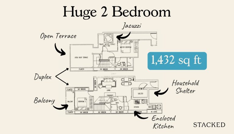
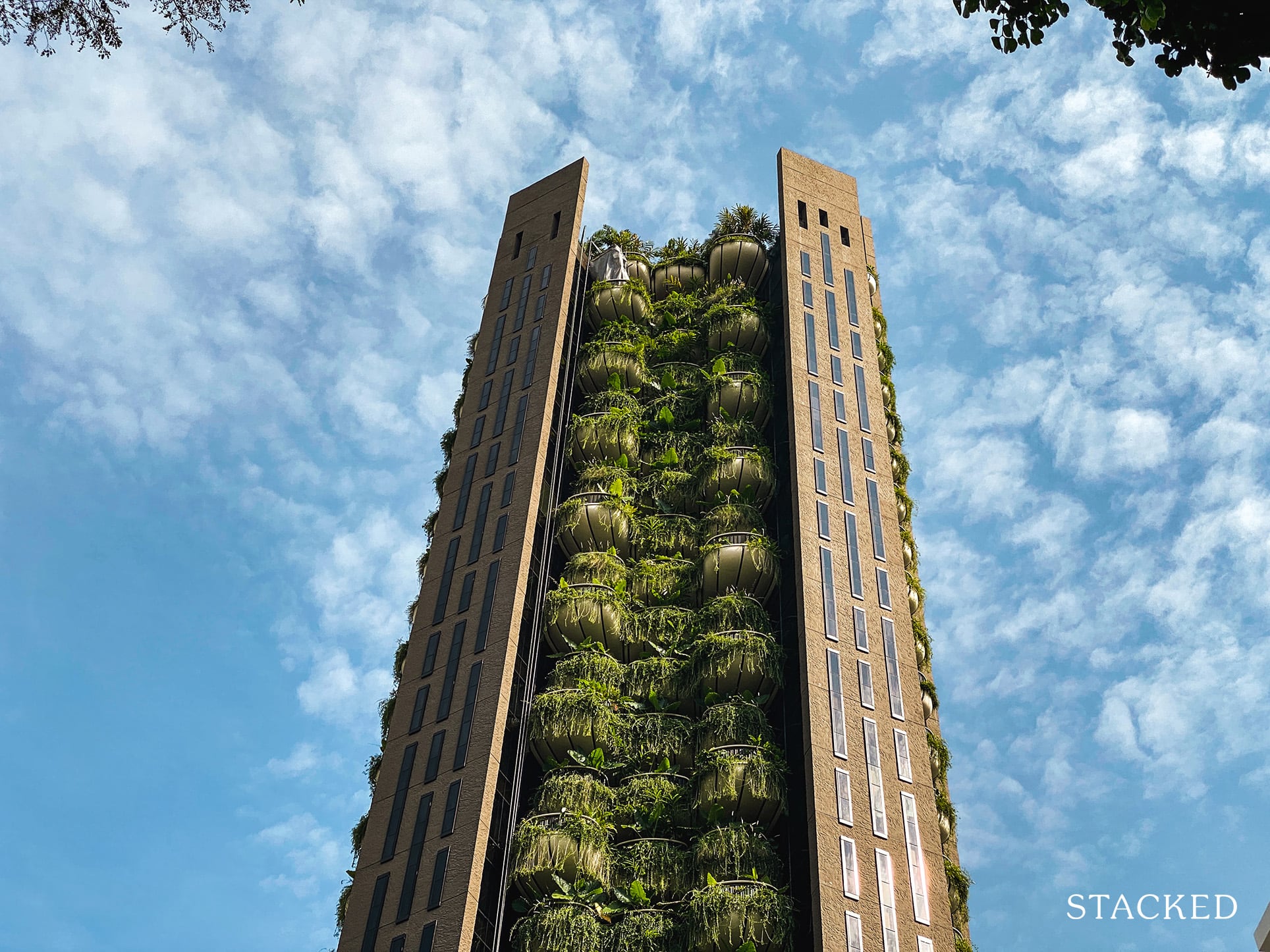
3. Huge planter boxes
This came about at the same time as bay windows. The reason was that, before 2009, these didn’t add to the GFA of a unit – so developers weren’t taxed for the space. They could, however, charge buyers for that space.
In theory, planter boxes give condo owners a chance to have their own garden; something you might otherwise need a landed property to pull off. In practice, planter boxes – like bay windows – mainly just take up space.
It takes quite a bit of effort to maintain a lush planter box – and if you have no interest in doing so, well… too bad. You’re paying thousands of dollars for it anyway.
To add to the problem, poorly maintained planter boxes turn facades into eyesores. When a condo looks like a swamp monster covered in dropping, dead plants – thanks to excessive planter boxes visible at every angle – the entire project starts to look dilapidated.
4. Bathrooms opening directly into awkward areas
These bathrooms aren’t just awkward, they can also limit the uses of the space they open into. For example: imagine a toilet that opens right into a living room. It would probably be uncomfortable to set up your dining table and chairs in that same space, where someone is going to be seen – and possibly hear – the toilet while it’s in use.
Landlords, take note: if you’re renting your unit to a collection of unrelated tenants, most of them loathe having the bathroom open out into the living room.
No one wants to see other tenants staring at them the moment they exit they step out of the toilet; especially not if they have to rush to their room with a towel wrapped around them.
The other concern is Feng Shui; and as we always stress, even if you don’t believe in it, your future buyers might. Bathrooms in the centre of the home, or which open facing the front door, are taboo for many believers.
The worst part is that this issue sometimes can’t be fixed. You can’t “renovate away” the placement of a bad bathroom – once it’s there you just have to live with it.
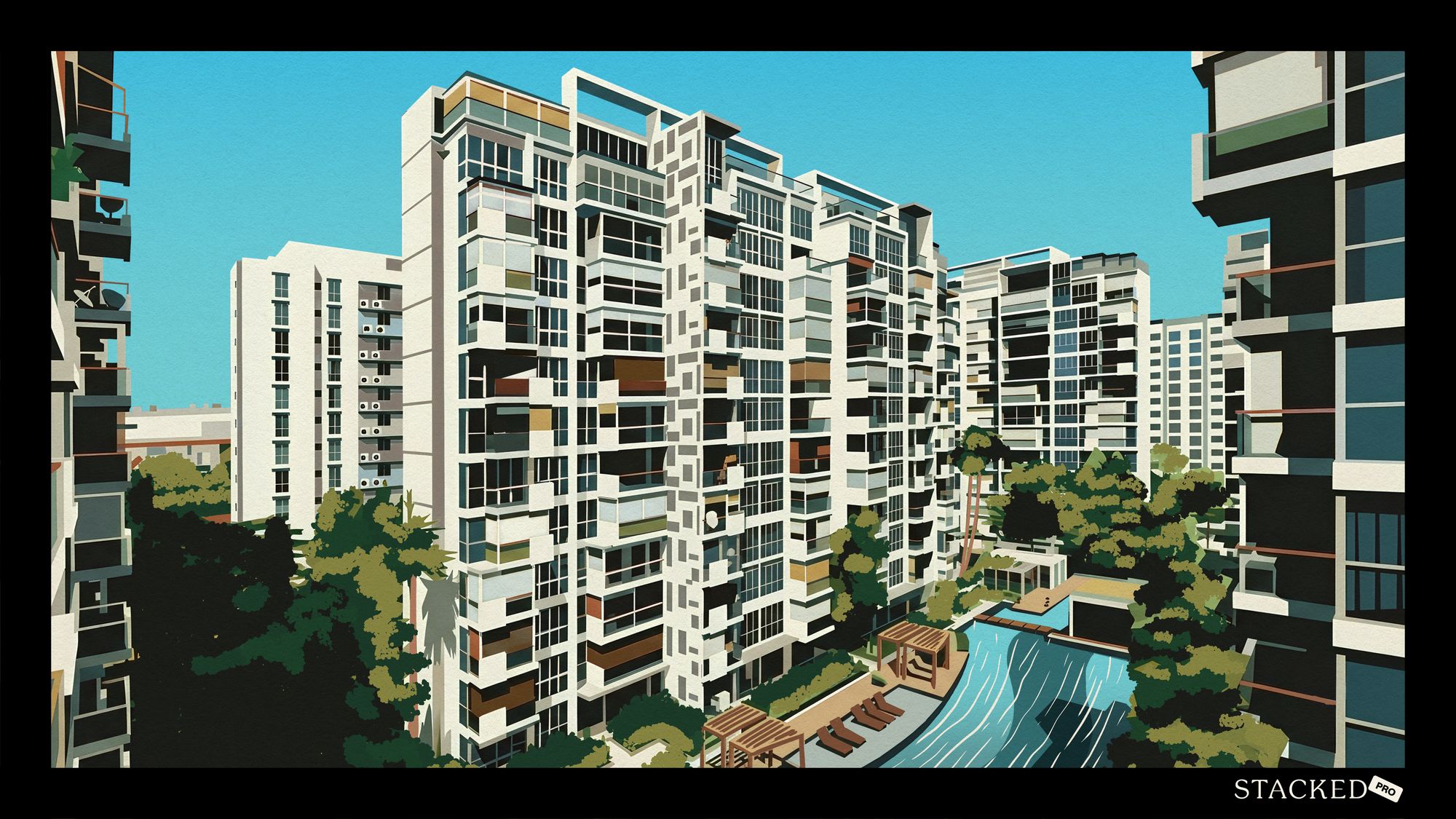
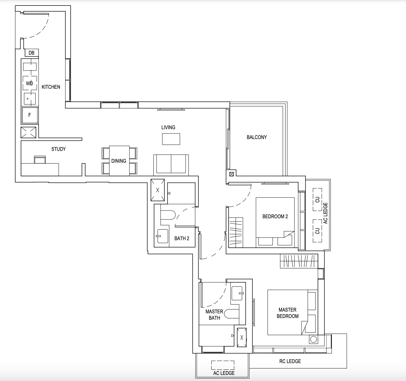
5. L-shaped layouts, or layouts with long corridor spaces
It’s a rare condo that manages to pull off these spaces well. As is, they tend to be quite inefficient: space taken up for corridors is just wasted (there’s no other use for them that won’t block up other areas).
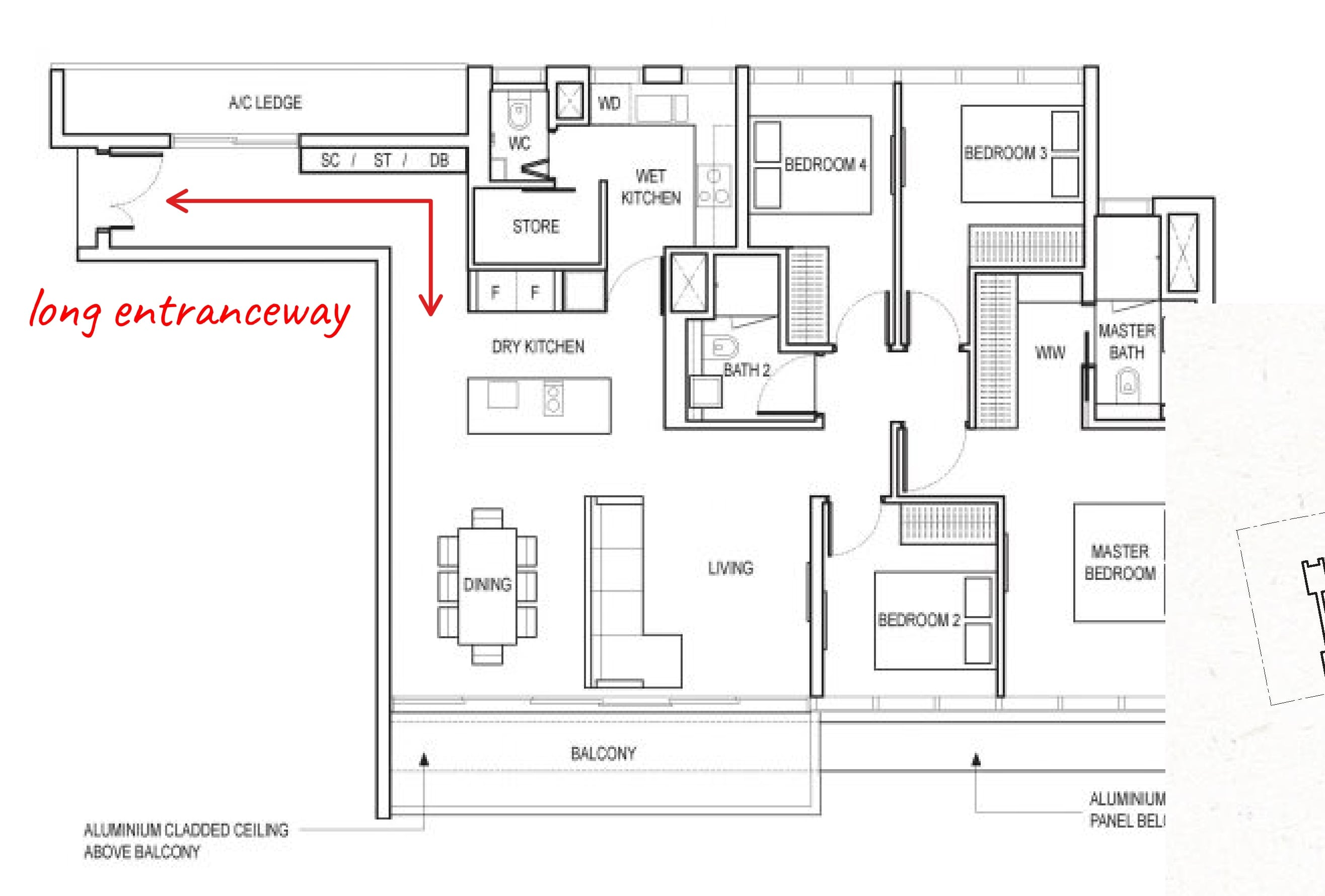
The main issue though is the lack of ventilation and sunlight. Unless there’s more than one balcony or a clever use of mirrors, these units tend to end up having more dark corners. That can mean more costs for lighting and air-conditioning, and the place can look dreary besides.
As a loose rule of thumb, the more rooms are in line of sight of each other, the more spacious the unit will feel. With a long or L-shaped layout, at least one part of the unit gets hidden away: this can create the sense of a smaller or more claustrophobic space.
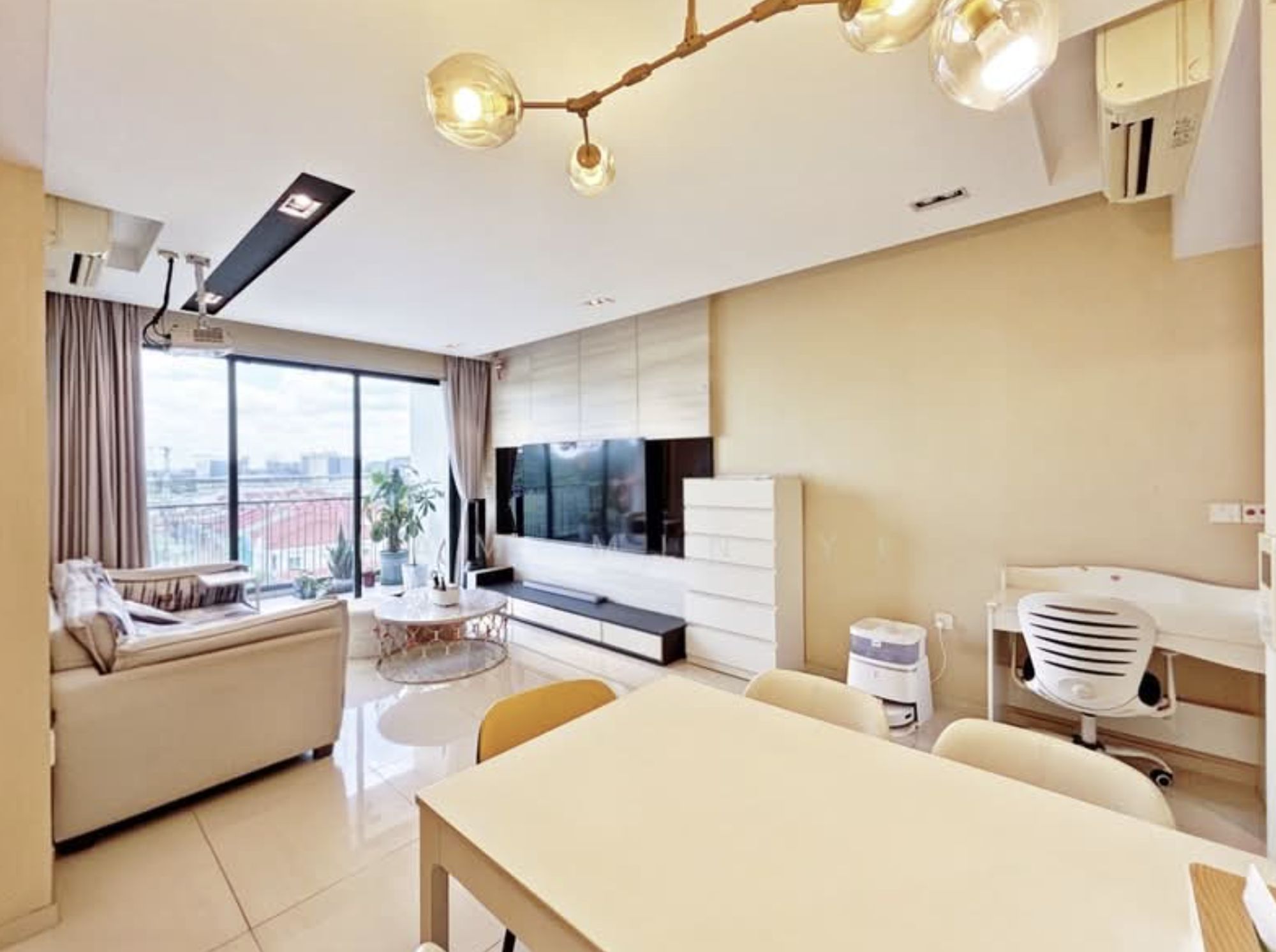
6. Tiny service yards
Developers know that for bigger units, most buyers consider it a drawback if the kitchen area has no service yard. However, with space at a premium, there isn’t always an option to create a spacious one. So, sometimes condos get a tiny and barely functional service yard, just so the sales team can say it exists.
Tiny service yards, where you can barely fit one washing machine, are very uncomfortable to use. There are some units where, if you just open the washing machine doors outward, it practically touches the opposite wall. This gets in the way of serious laundry loads, and there isn’t much you can use the space for.
Some condos could take a cue from HDB here, where – at least with newer flats – the service yards are more seamlessly integrated with the kitchen.
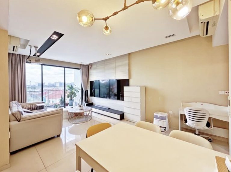
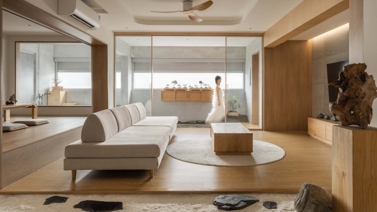
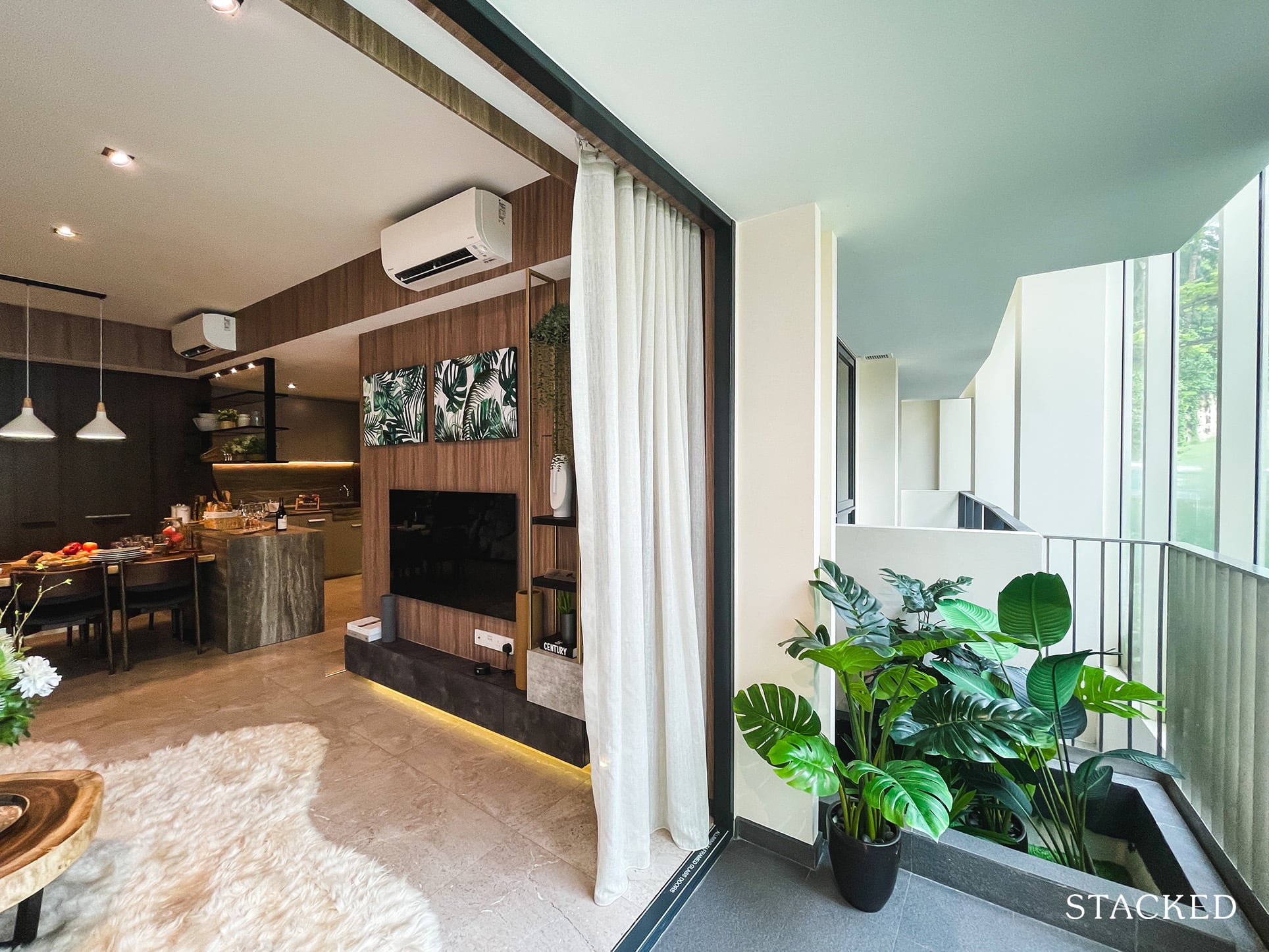
7. Excessive use of open space plans
The use of fewer partitions has, in general, been a good thing: from open kitchens to seamlessly connected living and dining areas, open spaces have been the trend of the decade (perhaps also due to shrinking sizes).
But during Covid-19, however, some homeowners probably discovered that this can be taken too far. At some point, awareness dawned that – just maybe – having a more private place to work could be a good idea. Such as, say, an enclosed area, where all the distractions of the household aren’t constantly rushing past you during your Zoom meeting. Advocates of old-school enclosed kitchens had grounds to gloat a bit, since they could close the door and have an office/kitchen.
While old school layouts might be less well-lit, all those partitions could also offer a greater sense of privacy; something tenants may want to consider.
This isn’t to say open plans are bad – just that we may be taking it a bit far. Not every home needs to look like the inside of a Japanese dojo to be chic.
To get a sense of where you might find and avoid these features, check out our in-depth condo reviews on Stacked. We review new and resale condos alike, and we even look at specific unit layouts where available.
At Stacked, we like to look beyond the headlines and surface-level numbers, and focus on how things play out in the real world.
If you’d like to discuss how this applies to your own circumstances, you can reach out for a one-to-one consultation here.
And if you simply have a question or want to share a thought, feel free to write to us at stories@stackedhomes.com — we read every message.


2 Comments
This is a great educational article as I feel Singapore property buyers need to be much more discerning and demanding when it comes to selecting residential units. My pet peeve is one of the layout flaws you’ve highlighted. That multi million dollar apartments often don’t have functional utility areas. As you go around Singapore you notice laundry hanging out windows or strung along main livingroom balconies in very unsightly manners …in these so called high end luxury apartments. If buyers were more demanding about practical floor plans, maybe this wouldn’t have got so bad. I agree that some older apartment designs were more functional. Thanks for all the insights on practical versus impractical condo design features.