Tour This Minimalist Korean Aesthetic Home In Telok Blangah Towers Built At A Cost Of $70k
July 9, 2022
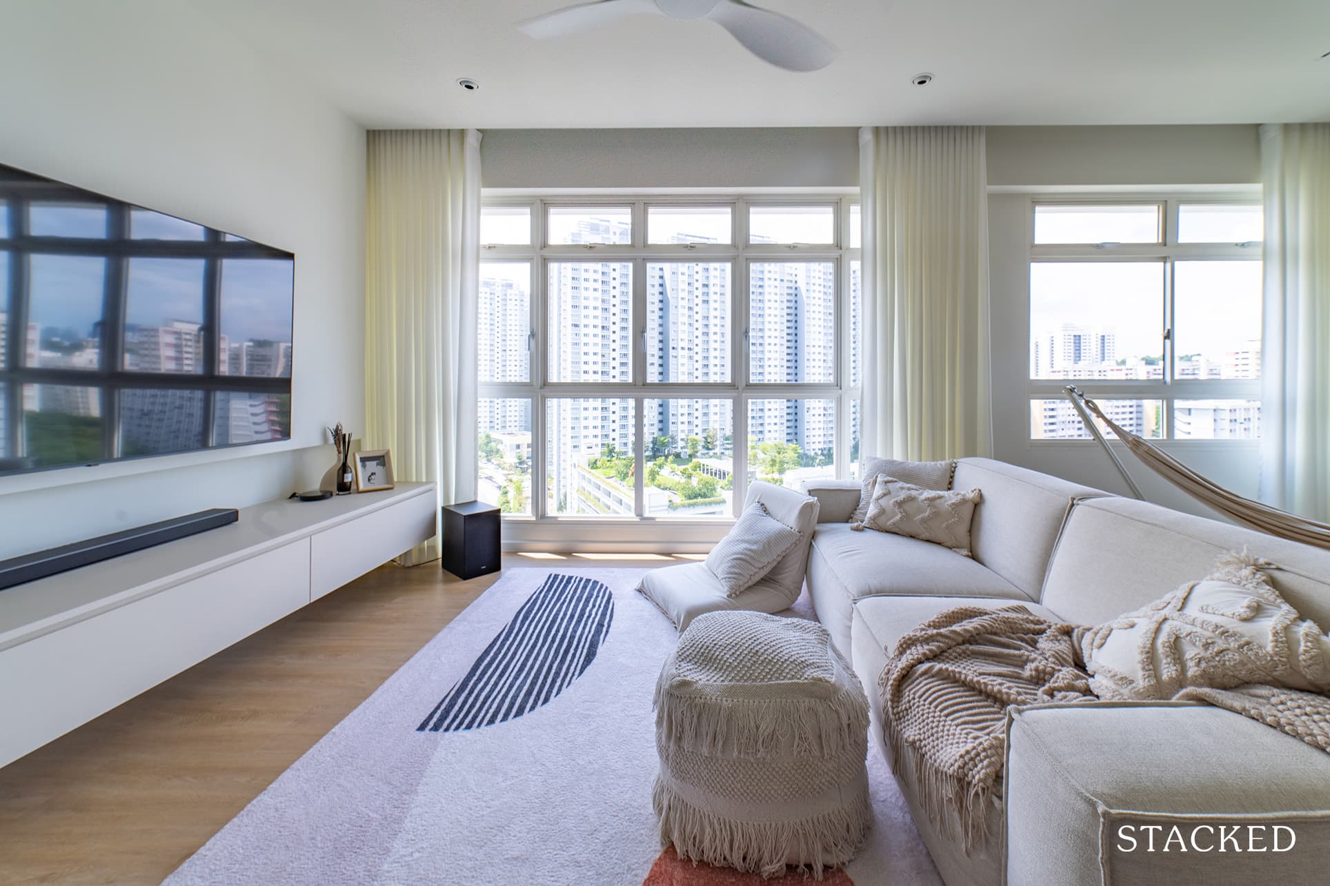
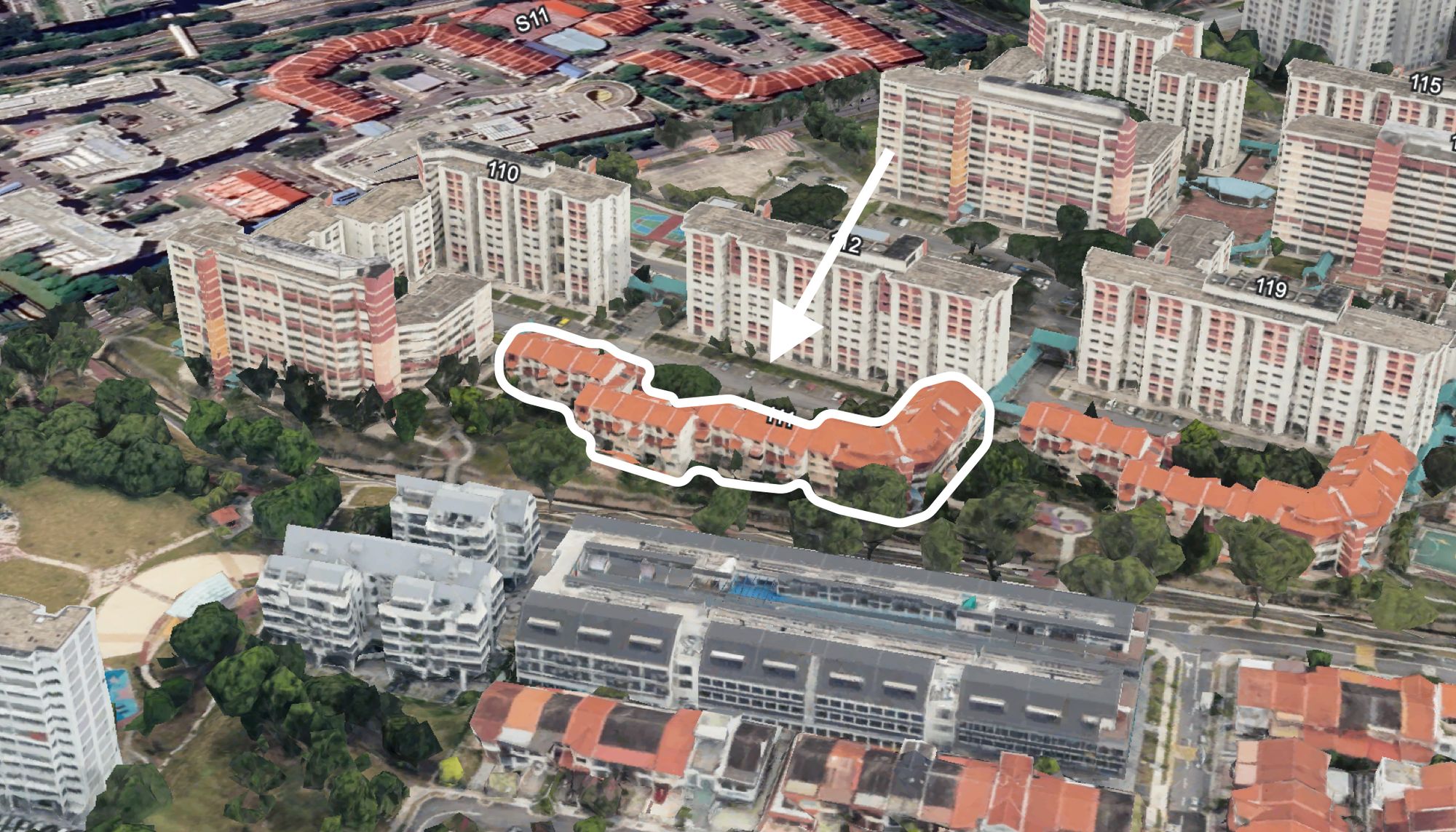
Telok Blangah is an ideal place for those who want to reside in a peaceful area that’s not too far from Singapore’s urban landscape. Not only does it have amazing views of both lush greenery and the sea, but it’s also a place steeped in history.
This is exactly why Terry and Rachel (@cookingpotbay*not their real name for privacy reasons) chose Telok Blangah Towers. With just 3 blocks, it offers a good amount of privacy despite its central location.
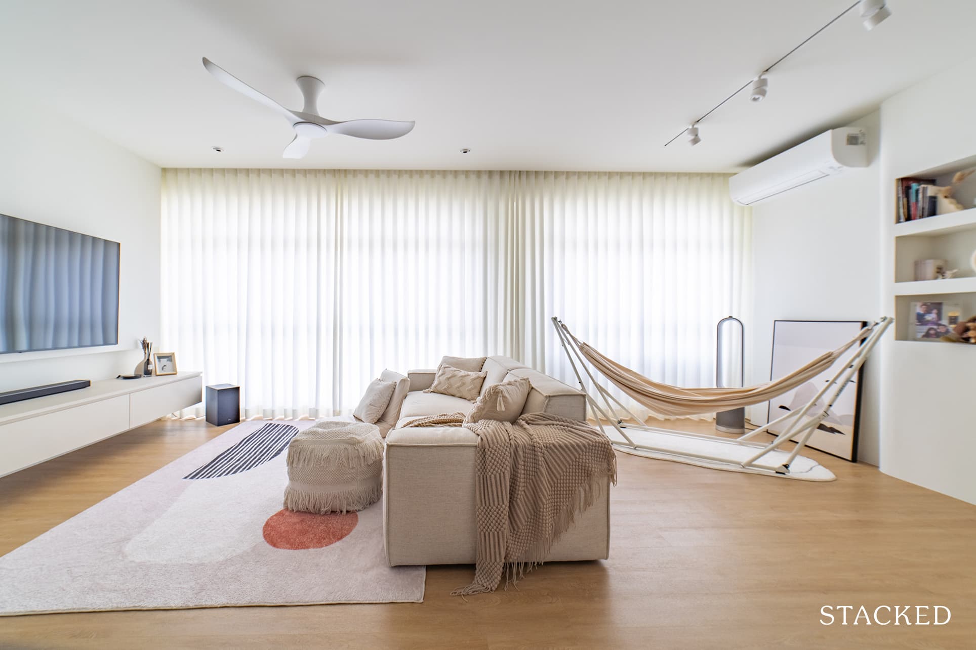
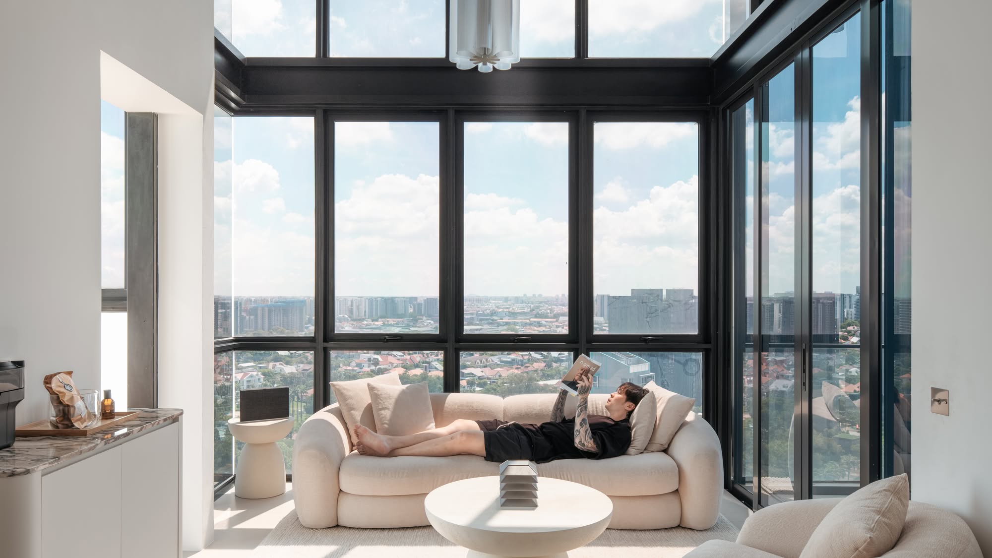
That and the fact that the unit has the luxury of nearly full-length windows, which is something rare to find in HDBs today.
And so to complement that, they looked to keep their home simple and in a minimalist fashion.
If you’re leaning toward the minimalist type of design, look no further as Terry and Rachel share how they achieved this in their home in Telok Blangah Towers.
So many readers write in because they're unsure what to do next, and don't know who to trust.
If this sounds familiar, we offer structured 1-to-1 consultations where we walk through your finances, goals, and market options objectively.
No obligation. Just clarity.
Learn more here.
Achieving A Timeless and Minimalist Home Design
Terry said that their budget for the renovation was $60k. But they didn’t consider this to be a tight budget. They knew that there was always a possibility that they would exceed the allocation in case there were certain higher-quality materials they’d end up choosing in the course of the renovation.
“Our final renovation cost, excluding furnishings, appliances, et cetera, came up to around $70k,” he revealed.
As they anticipated, some of the reasons the budget increased were due to choosing costlier materials such as tiles, vinyl flooring, and switches. “There were also some top-ups for changes in measurements and other miscellaneous items such as making good certain walls where we stripped the wallpaper off.”
The couple said they didn’t have any concrete theme in mind, “but we did mention to our ID that we simply wanted something timeless and minimalist,” said Terry.
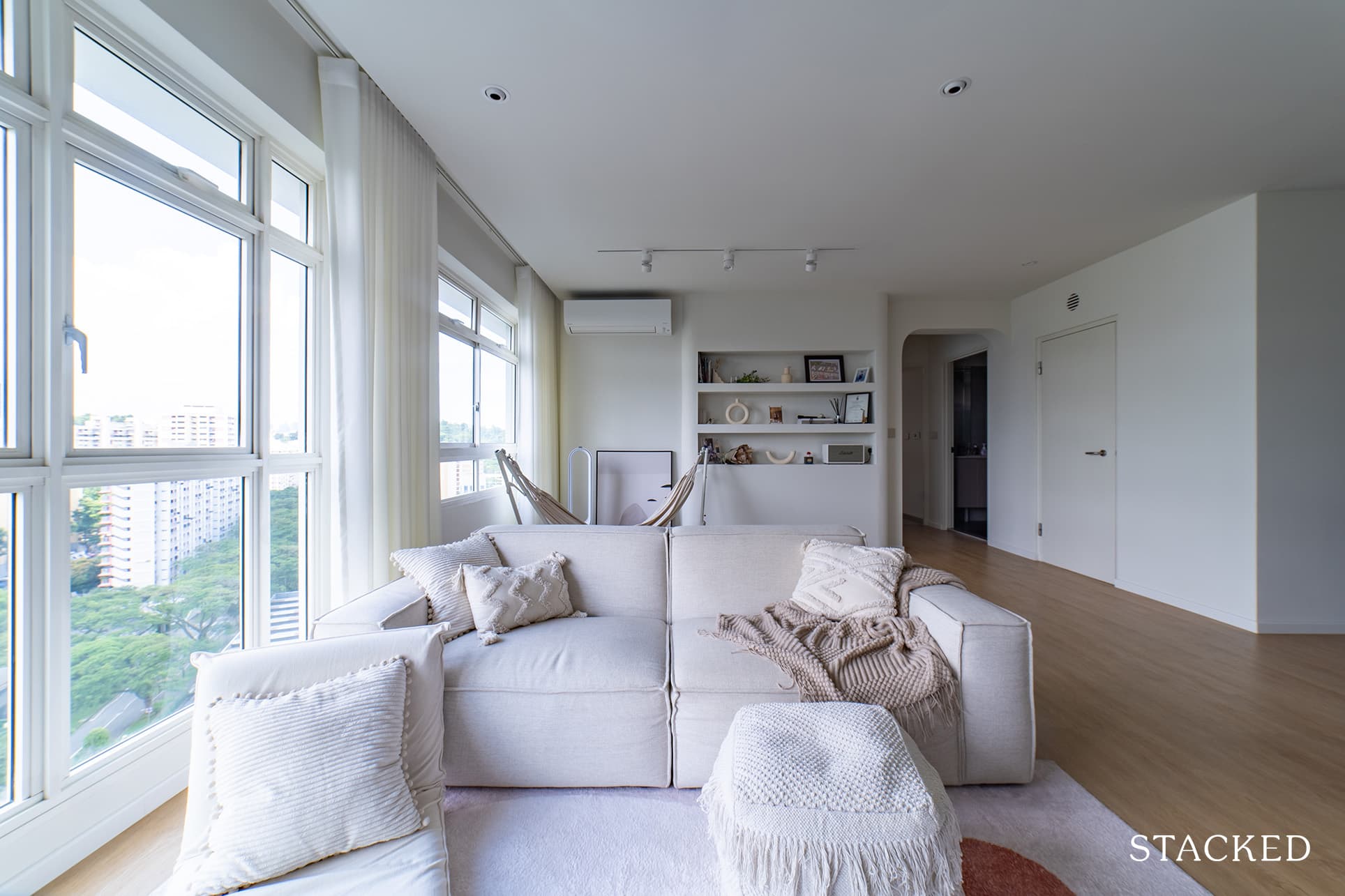
What they wanted was for their home to look simple enough for them not to tire of it soon, without compromising on cosiness. Even before they started the reno, they’ve been surfing a lot of Instagram home accounts, which served as an inspiration for their home design.
“We realised that our home looks a lot like a modern Korean home – clean, with a lot of use of muted block colours,” he said in retrospect.
Getting the house ready for reno means having to knock down the walls of one of the bedrooms. This feat left them with an expanded living room, kitchen, study room, and master bedroom.
Here’s how their home turned out, room per room.
Living Room
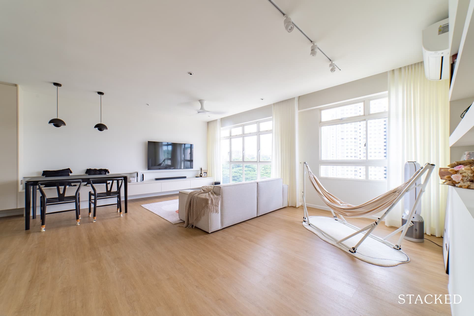
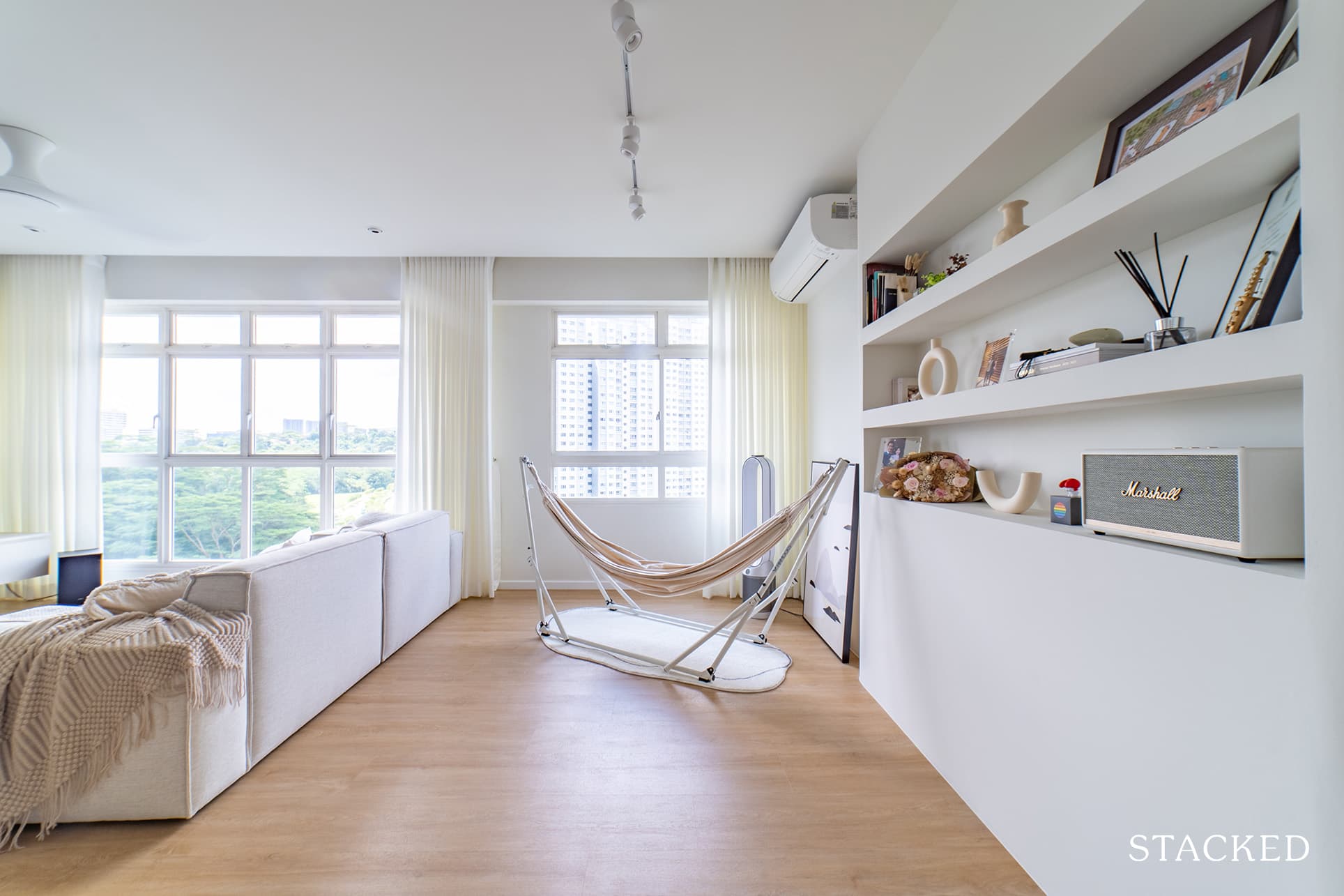
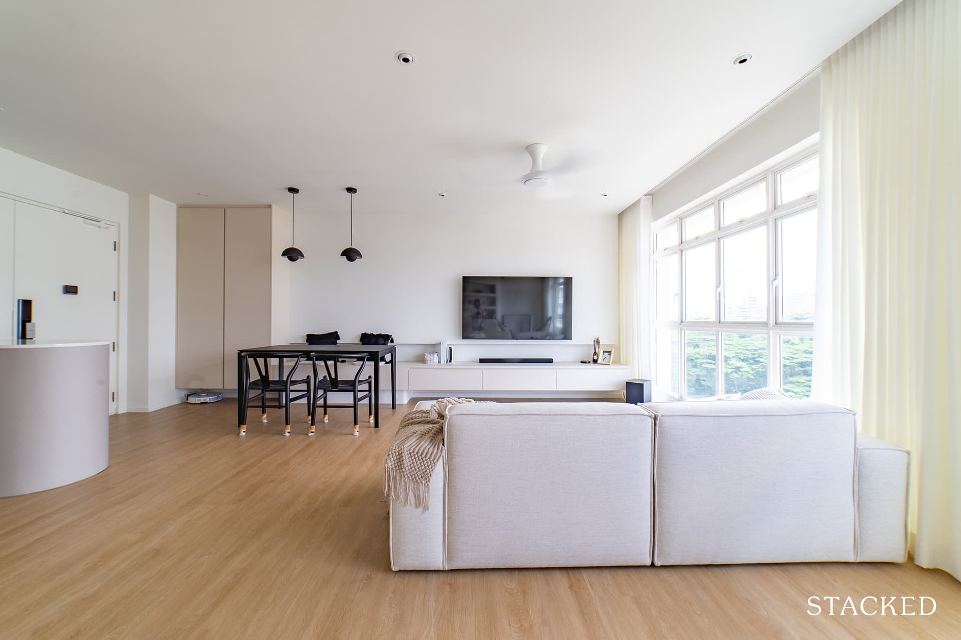
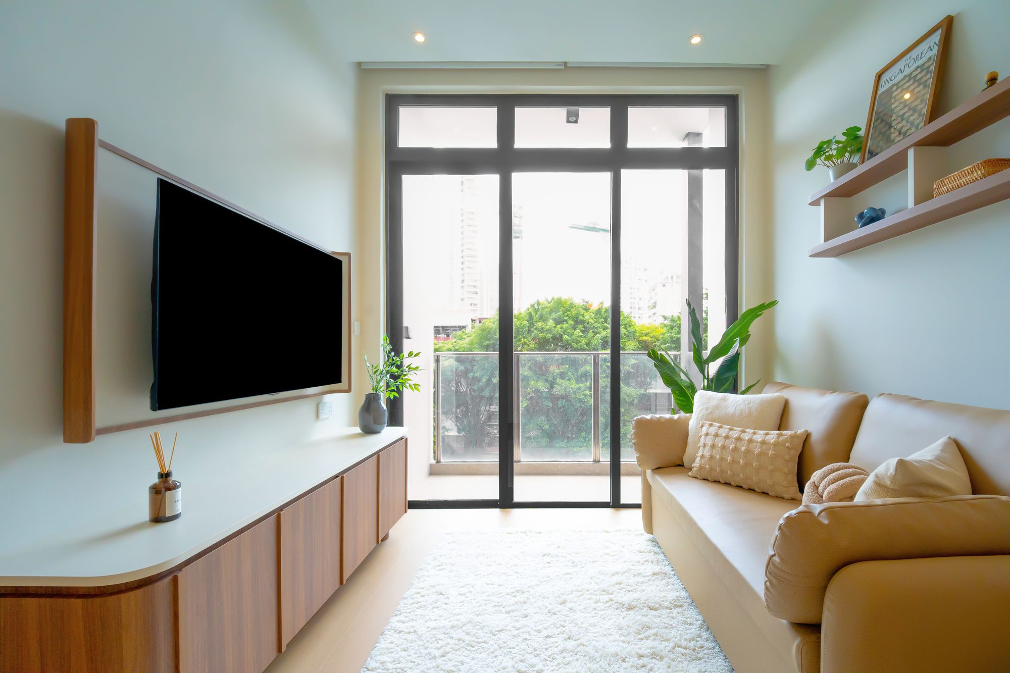
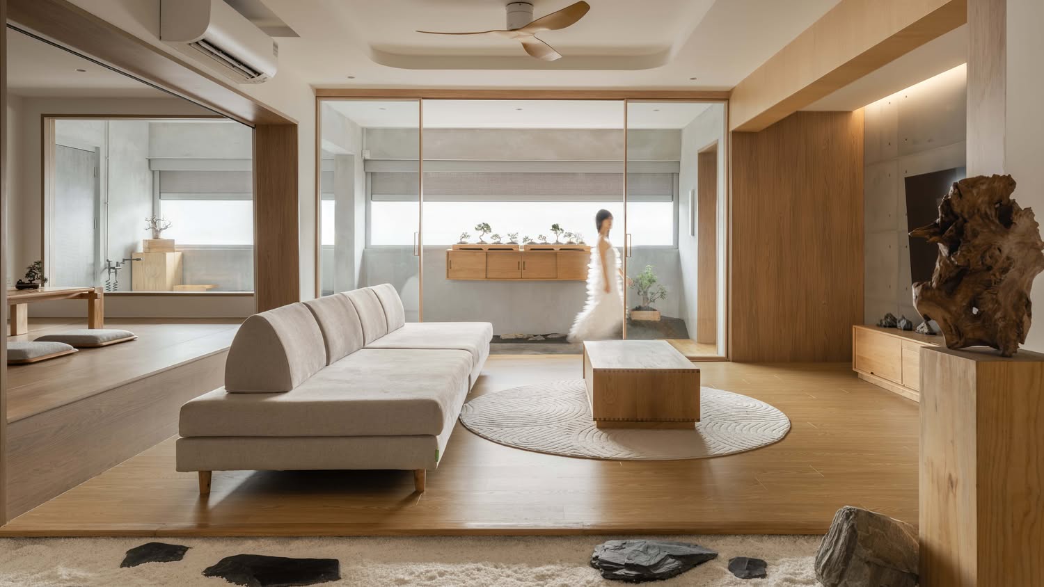
As soon as you enter the living room, the combination of clean white colours and light wood flooring creates a modern but very clean ambience. It is further emphasised by the flooding of natural light from the windows.
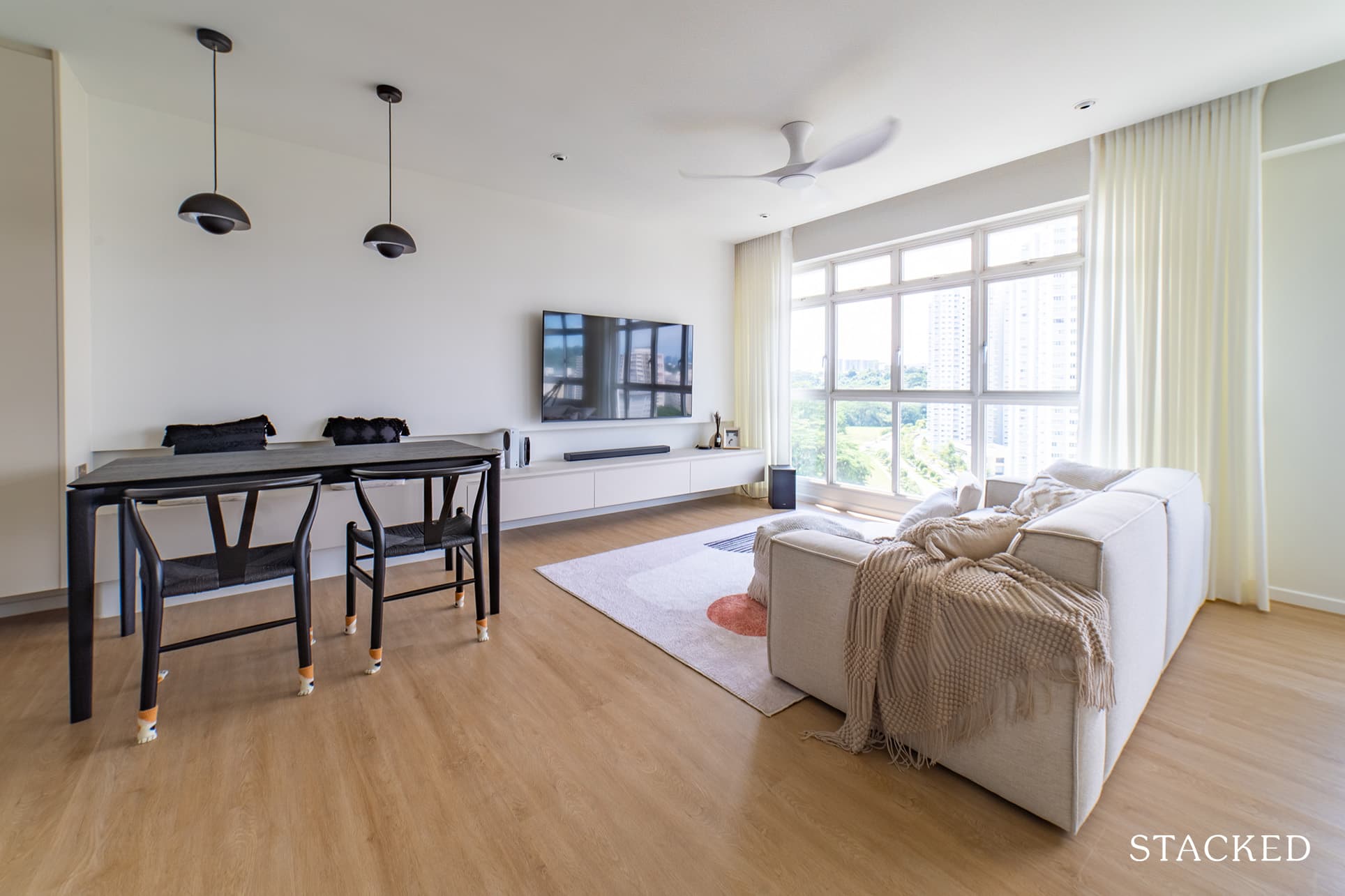

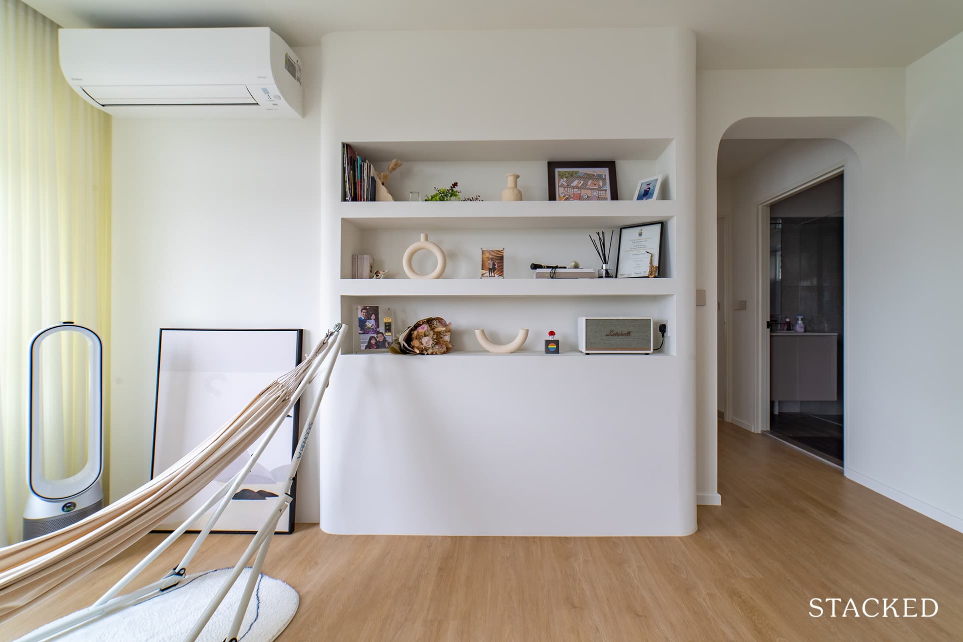
They’ve also added a curved niche display wall in the living room. “This is something we knew we had always wanted even before we began sourcing for interior designers,” said Terry.
Kitchen
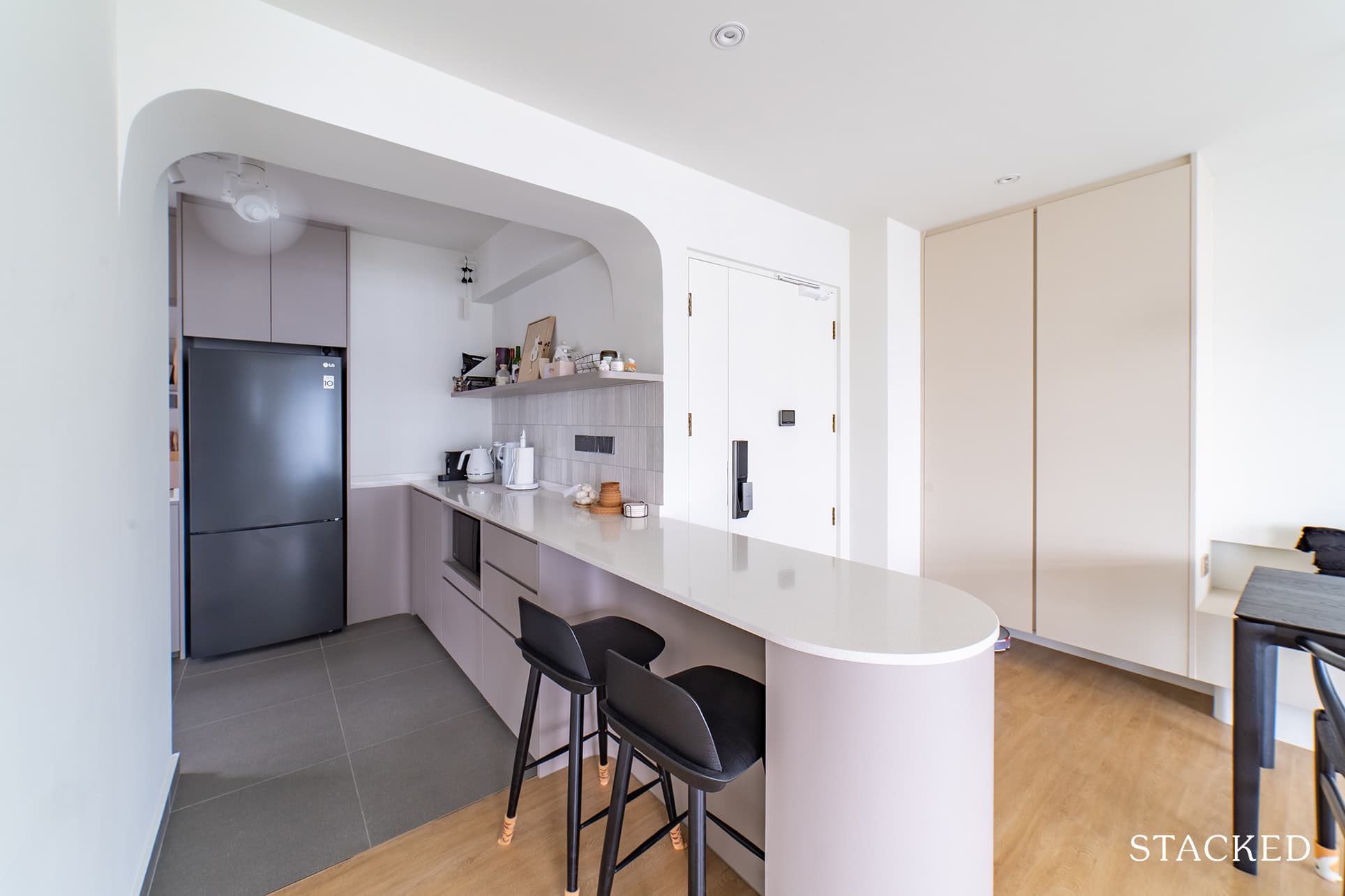
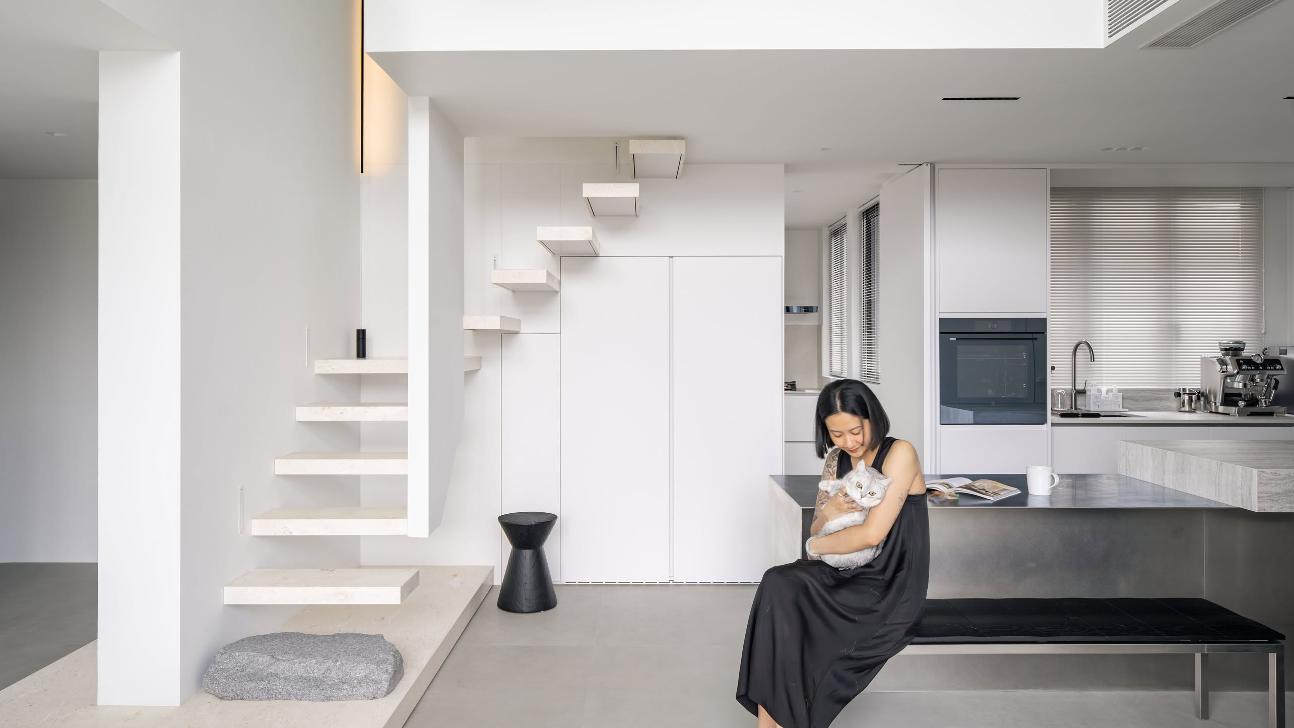
The biggest change they did for the kitchen was knocking down the wall at the entrance. It helped create a space to accommodate an extended countertop which the couple now use as their breakfast counter.
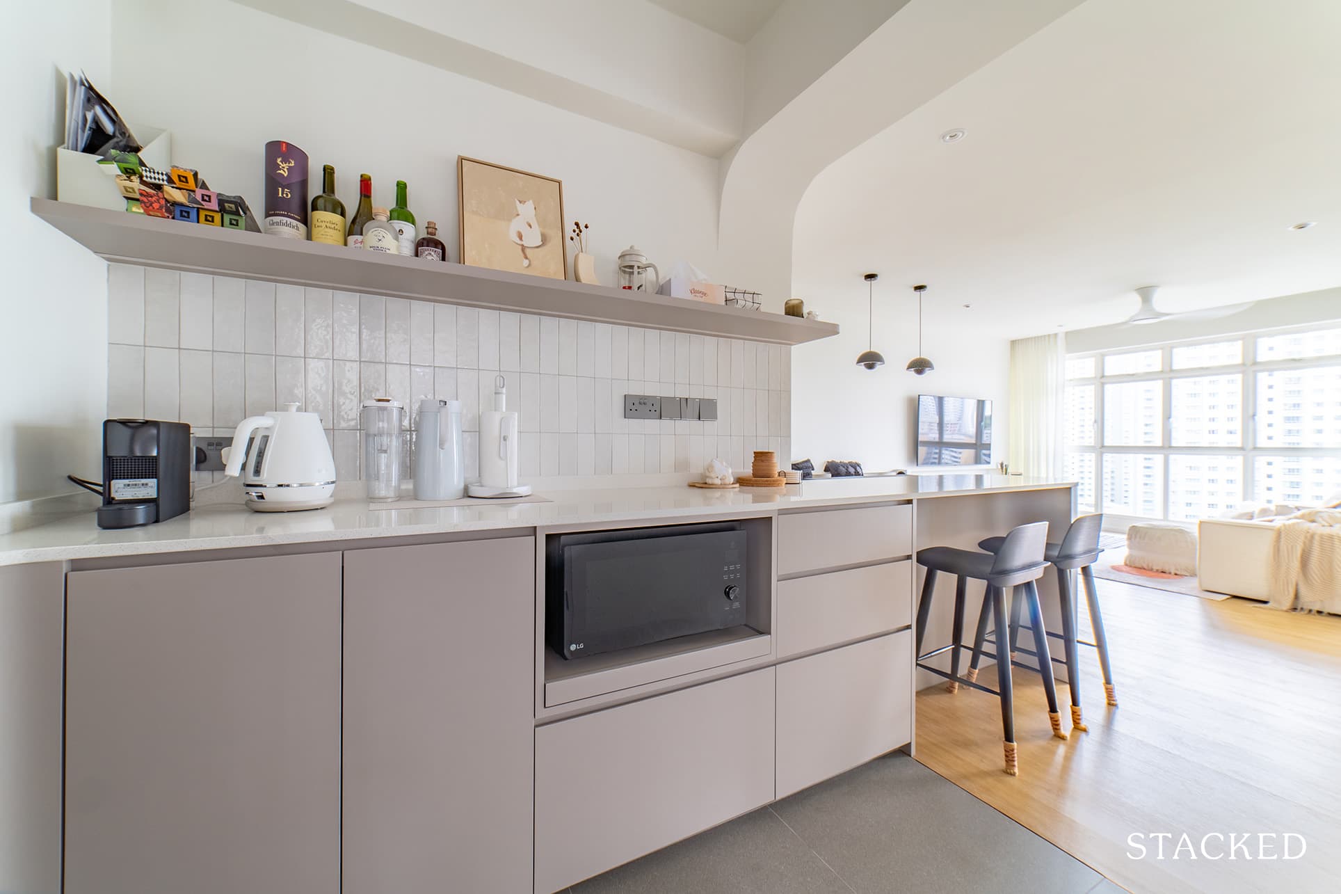
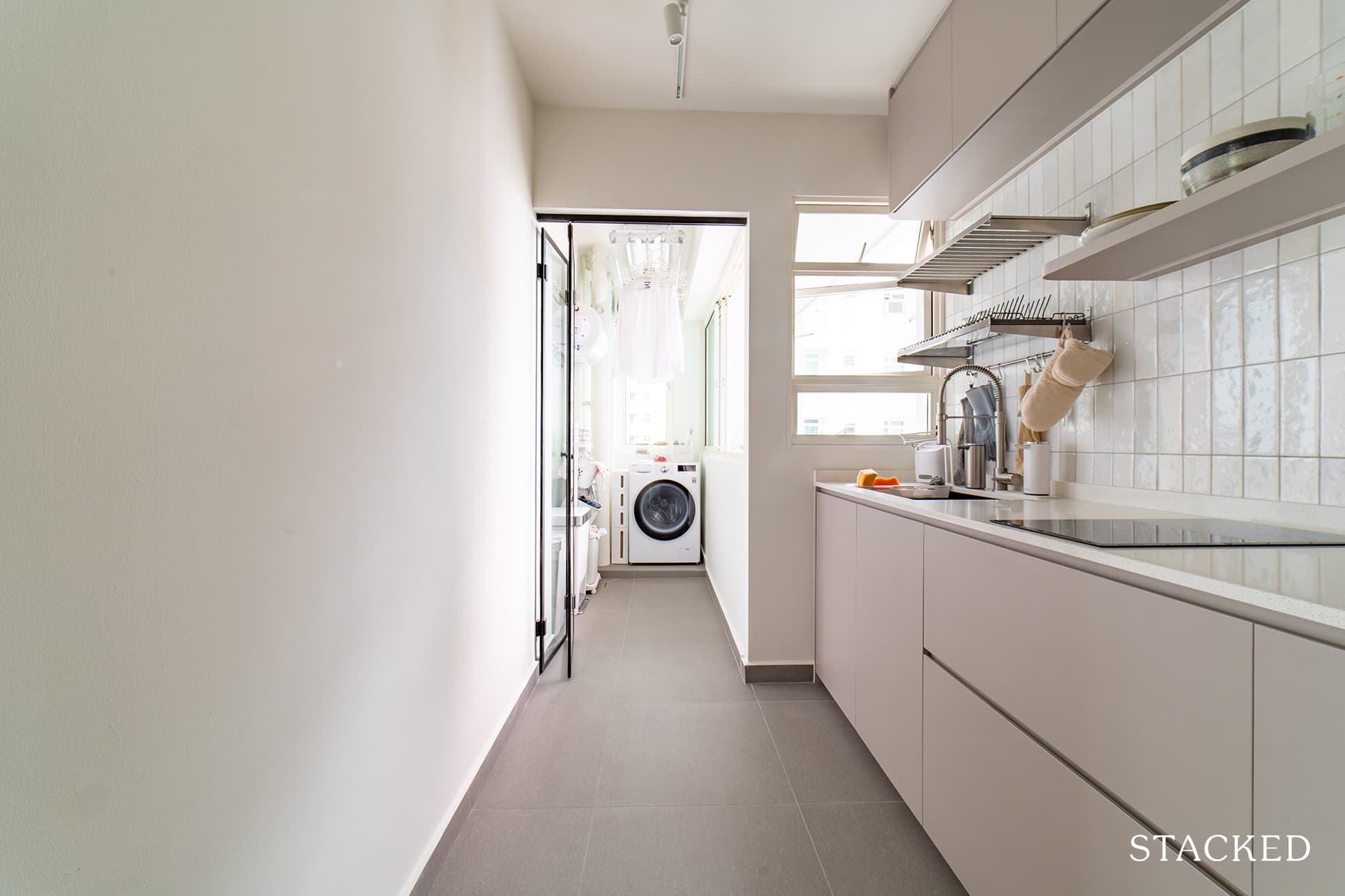
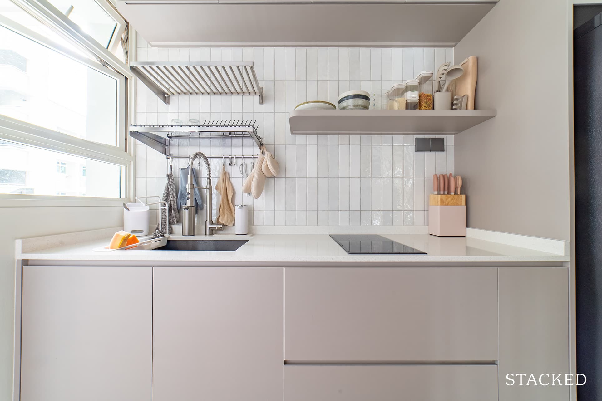
In the kitchen proper, the minimalist and clean lines continue to dominate the design. They opted for open shelving to help open up the space even more and allow the light from the yard and kitchen window to flow inside the room.
Master Bedroom
Terry said that they decided to add a platform for their bed – not so much for the bonus storage but because they just love platform beds for some reason. “Again, this was something we knew we wanted from the very start.” We reckon that platform beds always provide a feeling of snugness, which contributes to that cosy feeling that they were after.
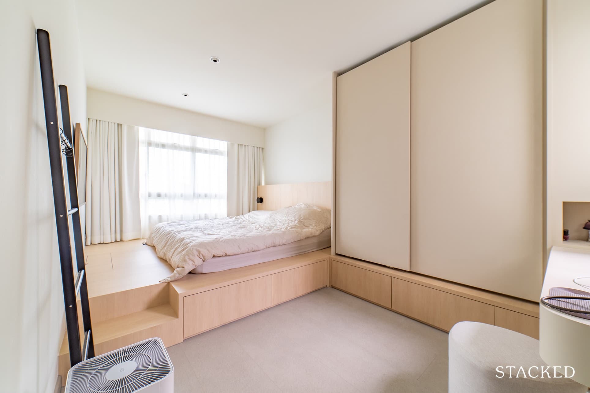
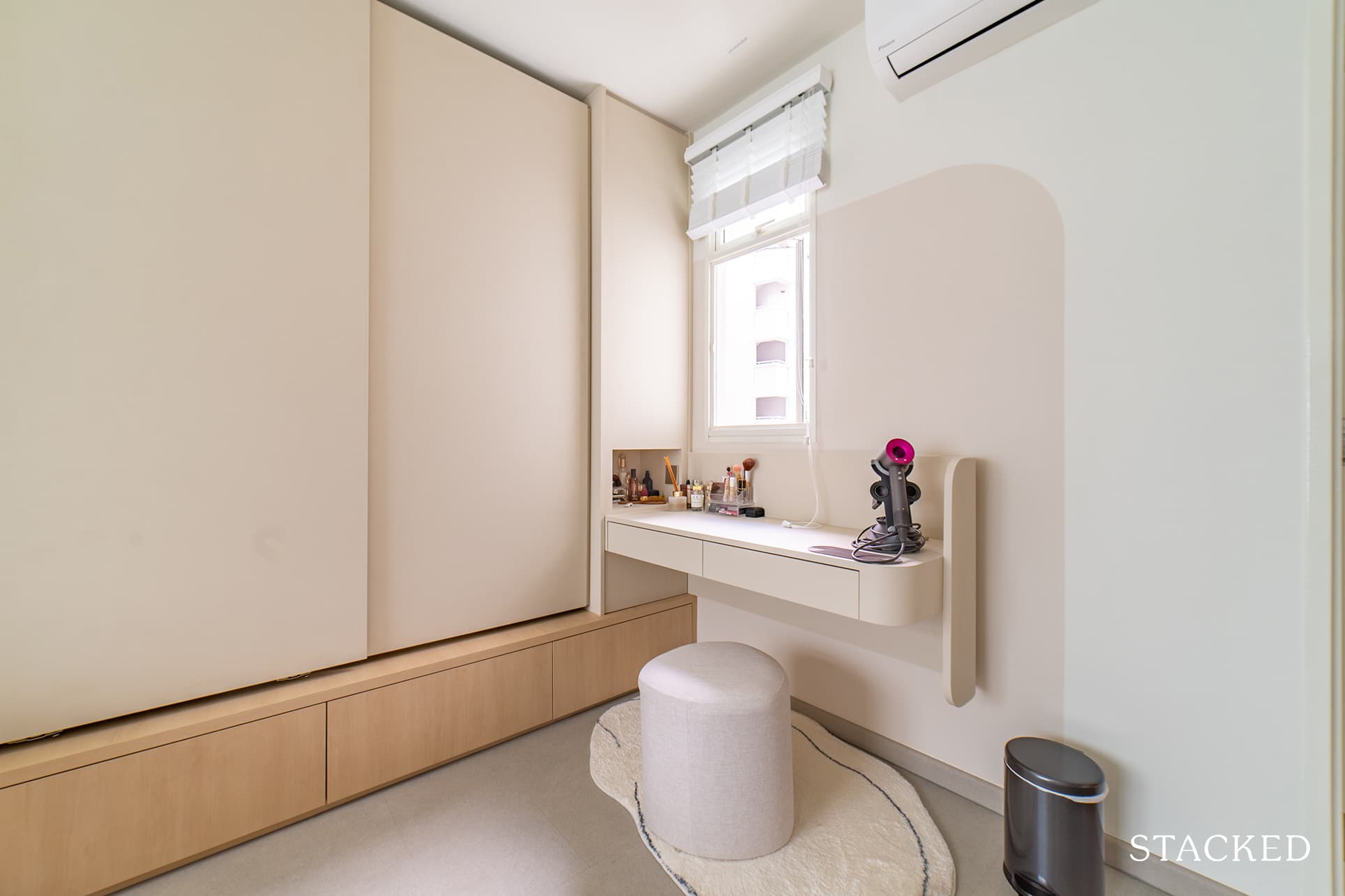
Everything else in the room was designed around their platform bed centrepiece. The couple admitted that it was a pleasant surprise for them that their ID was able to adapt their wardrobe, which sits on an extension of the platform bed. “The resulting effect looks fairly Japanese,” Terry said.
Bathroom
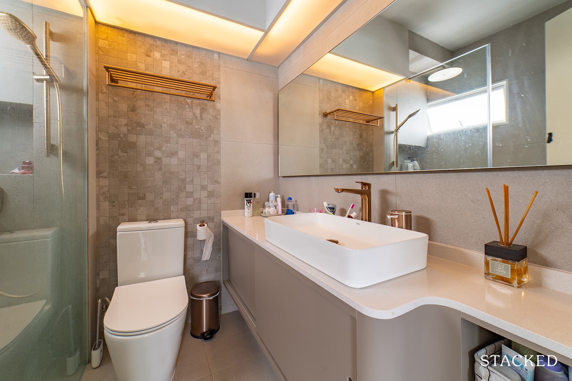
Clean lines and muted colours continue to permeate even up to the design of their bathroom. The frosted lighting creates a warm ambience even in this space.
Study Room
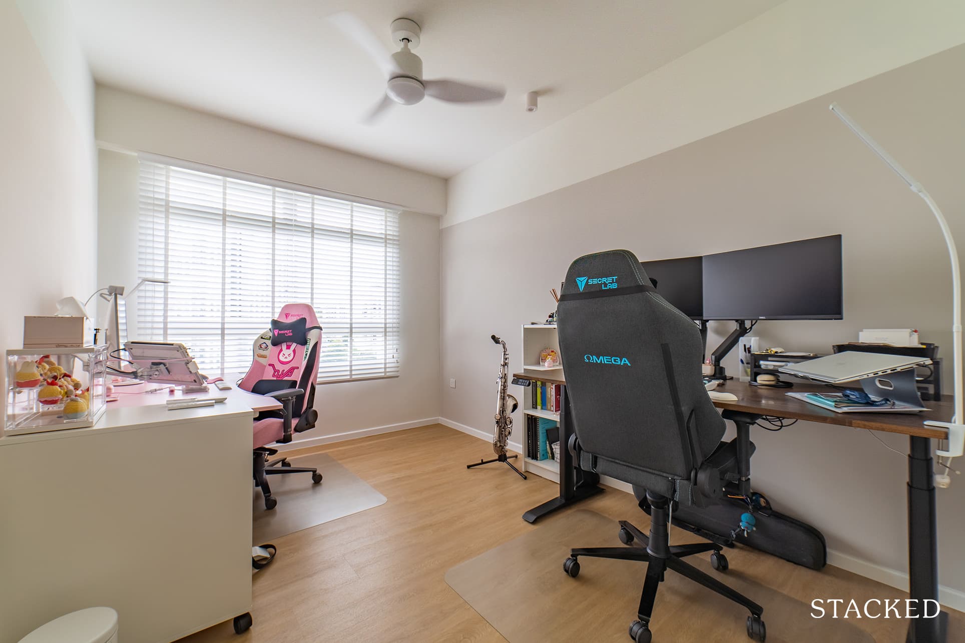
They didn’t make any major changes in the study room’s layout except for making the vinyl flooring and wall colours consistent with the rest of the house. “We wanted to leave this room as a space that we could easily repurpose if necessary, in the future,” Terry noted.
More from Stacked
2025 Year-End Review Of The Singapore Property Market: What The Numbers Reveal
2025 was a unique year for Singapore’s Core Central Region (CCR). Almost a quarter of the year’s new launches were…
Bringing The Vision To Reality
Terry and Rachel are both extremely satisfied with how their home turned out after the reno since the outcome was similar to what they envisioned beforehand.
“We followed our ID’s plan quite closely,” said Terry, “including his 3D rendering.” He added that they even went so far as to sourcing for furniture and fixtures that looked like those in the 3D rendering.
The couple did extensive research when they were searching for an ID. Instead of hiring a contractor directly, they contacted Authors Interior & Styling.
“We approached Authors Interior & Styling directly, purely based on the portfolio they had on their socials.”
They did not have a specific interior designer in mind during that time, though. “Jun from Authors was randomly assigned to us, who proved to be the perfect fit for what we required,” said Terry.
When it comes to sourcing furniture, the couple was very diligent about it. Terry shared that they visited a lot of stores in Singapore in person. They knew from the very start that they would not be making any blind purchases online, especially for the big-ticket items.
“As with most clueless homeowners, our Google searches led us to Tan Boon Liat. It’s something which we still believe is a great first stop for new homeowners as there are so many shops to view,” Terry recalled.
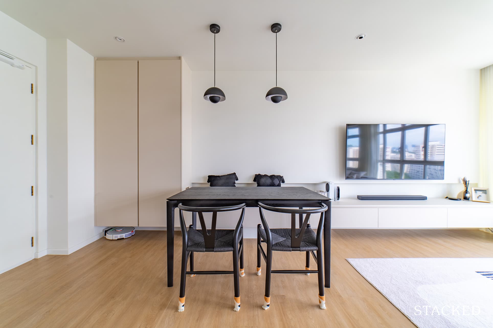
While their sofa required a little bit more research, he said they managed to find their dining table at Tan Boon Liat. For their dining chairs and bar stools, their ID provided them with a list of suggestions from Taobao, where they eventually got these furnishings.
When asked what was the best part of their home after the renovation, both of them answered that it was, and still is, the living room.
“The reason we purchased this unit was due to the white “full-length” windows present in the living room,” Terry said. They believe that this was a rare find for them since most HDB units these days only offer three-quarter windows.
“The knocking down of the 3rd bedroom and kitchen wall was what really opened the space for us,” he added. Indeed, it further enhanced the natural light streaming from the living room windows since the windows (in the area where the 3rd bedroom used to be) provide additional lighting.
Lessons Learned From A Successful Renovation Journey
Just as with most renovation projects these days, COVID-19 was the one that offered the greatest challenge to the homeowners’ determination and patience. Terry and Rachel were not able to escape it either.
“Our tiling schedule was delayed by 2 weeks due to a lack of workers,” Terry said. They also experienced unexpected delays from suppliers of their vinyl flooring, which was very disruptive to the reno. It affected the entire schedule for fittings and appliance deliveries. He admitted that they chose to lay the vinyl flooring last.
This experience taught them to exercise patience and prepare for the worst, including last-minute changes of plans. “There were a number of changes that we made as the renovation went along,” he said, “deviating not only from our planned schedule but also the design of the 3D rendering.”
Still, they were lucky enough to have had most of their renovation go as planned.
The couple from Telok Blangah Towers leaves this guidance to new homeowners who are planning to renovate their homes.
Always be ready to listen to your ID’s advice which comes from a professional standpoint. At the same time, they also recommend being firm if there are any design concepts you would like to try. “Ultimately, it will be you coming home to look at your house every day.”
At Stacked, we like to look beyond the headlines and surface-level numbers, and focus on how things play out in the real world.
If you’d like to discuss how this applies to your own circumstances, you can reach out for a one-to-one consultation here.
And if you simply have a question or want to share a thought, feel free to write to us at stories@stackedhomes.com — we read every message.
Need help with a property decision?
Speak to our team →Read next from Homeowner Stories

Homeowner Stories We Could Walk Away With $460,000 In Cash From Our EC. Here’s Why We Didn’t Upgrade.

Homeowner Stories What I Only Learned After My First Year Of Homeownership In Singapore

Homeowner Stories I Gave My Parents My Condo and Moved Into Their HDB — Here’s Why It Made Sense.

Homeowner Stories “I Thought I Could Wait for a Better New Launch Condo” How One Buyer’s Fear Ended Up Costing Him $358K
Latest Posts

Property Investment Insights Why Some Executive Condominiums Made More Money — And Whether That Still Applies Today
Singapore Property News This New 863-Unit Tengah Condo Will Launch From $980,000 — The First Private Condo in Singapore’s New Forest Town

Singapore Property News HDB Resale Prices Just Fell For The First Time Since 2019 — Is This The Start Of A Bigger Shift?









0 Comments