Tour This Beautifully Chic 1,500 Sq ft Duplex Home Designed For Hosting Friday-Night Dinners
June 4, 2022
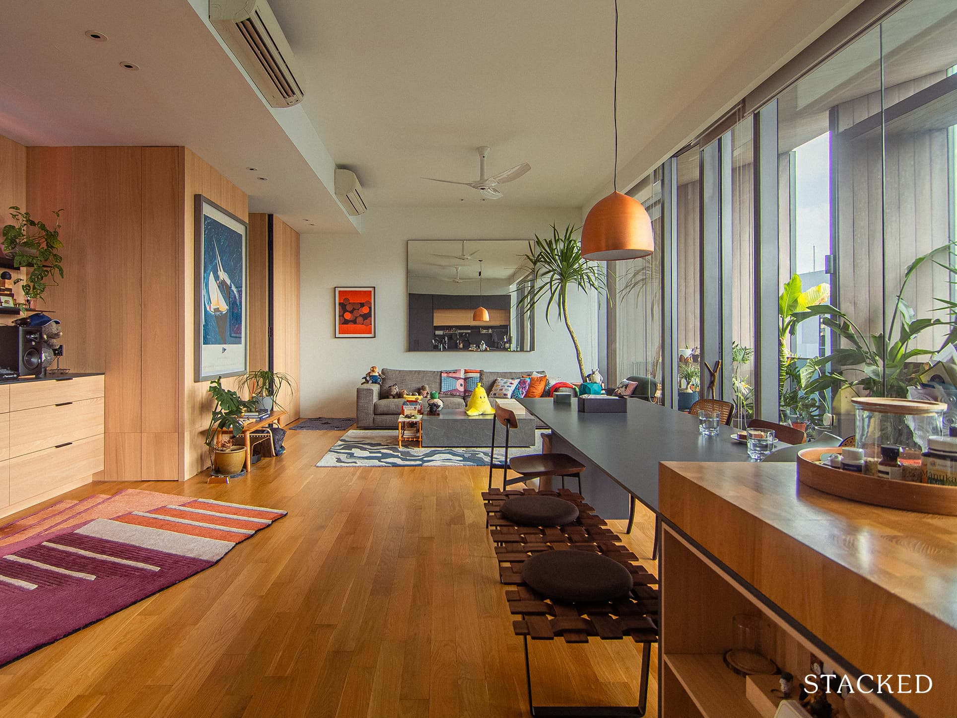
In a world where a fridge can play YouTube videos for easy-to-follow recipes as you cook, or even send you a note to remind you to buy milk as supply is running low – it’s hard to imagine life without technology today.
It is why it is all the more surprising to find this recently built home during the pandemic that has been purposefully shorn of any smart home features or devices. In fact, there isn’t even a TV in sight!
Perhaps it was due to their home’s special location just across a major park, or maybe just the need to disconnect from being plugged in all the time.
But here’s the kicker, Justin and his partner (*not his real name for privacy purposes) both ironically work in the tech industry!
Named the Tikus Haus (you can follow their IG for more), what the couple created in their home was a place of comfort similar to what most boutique hotels have to offer. Their home became a haven not only for them but also for their guests.
It’s a simply resplendent look that has been designed specifically for their lifestyle – and not one born out of a particular style.
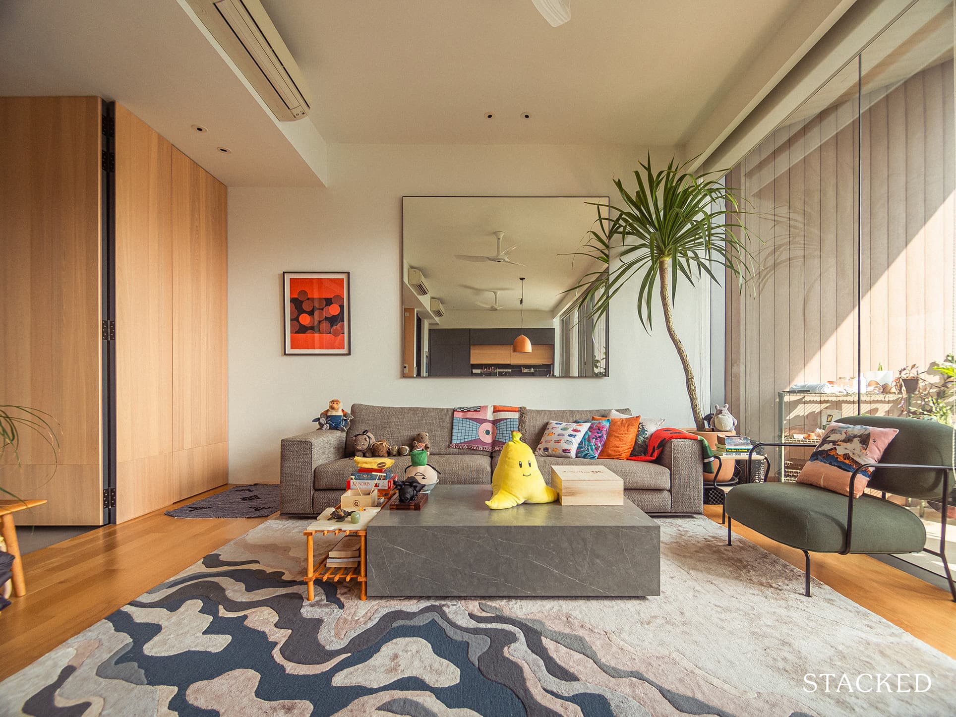
Let’s take an inside look at what transformation took place in their 1,500 square foot duplex condo.
So many readers write in because they're unsure what to do next, and don't know who to trust.
If this sounds familiar, we offer structured 1-to-1 consultations where we walk through your finances, goals, and market options objectively.
No obligation. Just clarity.
Learn more here.
An Indoor Space That Matches Their Inner Wants
The couple took on a different approach with regard to their renovation budget.
Instead of setting an exact numerical value, Justin said they focused on allocating a third of their combined annual income at the time of the renovation. In the final phases of the reno project, though, the allocation even reached almost half of their annual income.
When asked why they chose this approach, Justin replied, “One, we had never renovated a place before and did not have too firm of an idea on what the costs could be.” Their second reason was that they swapped out several materials during the reno process.
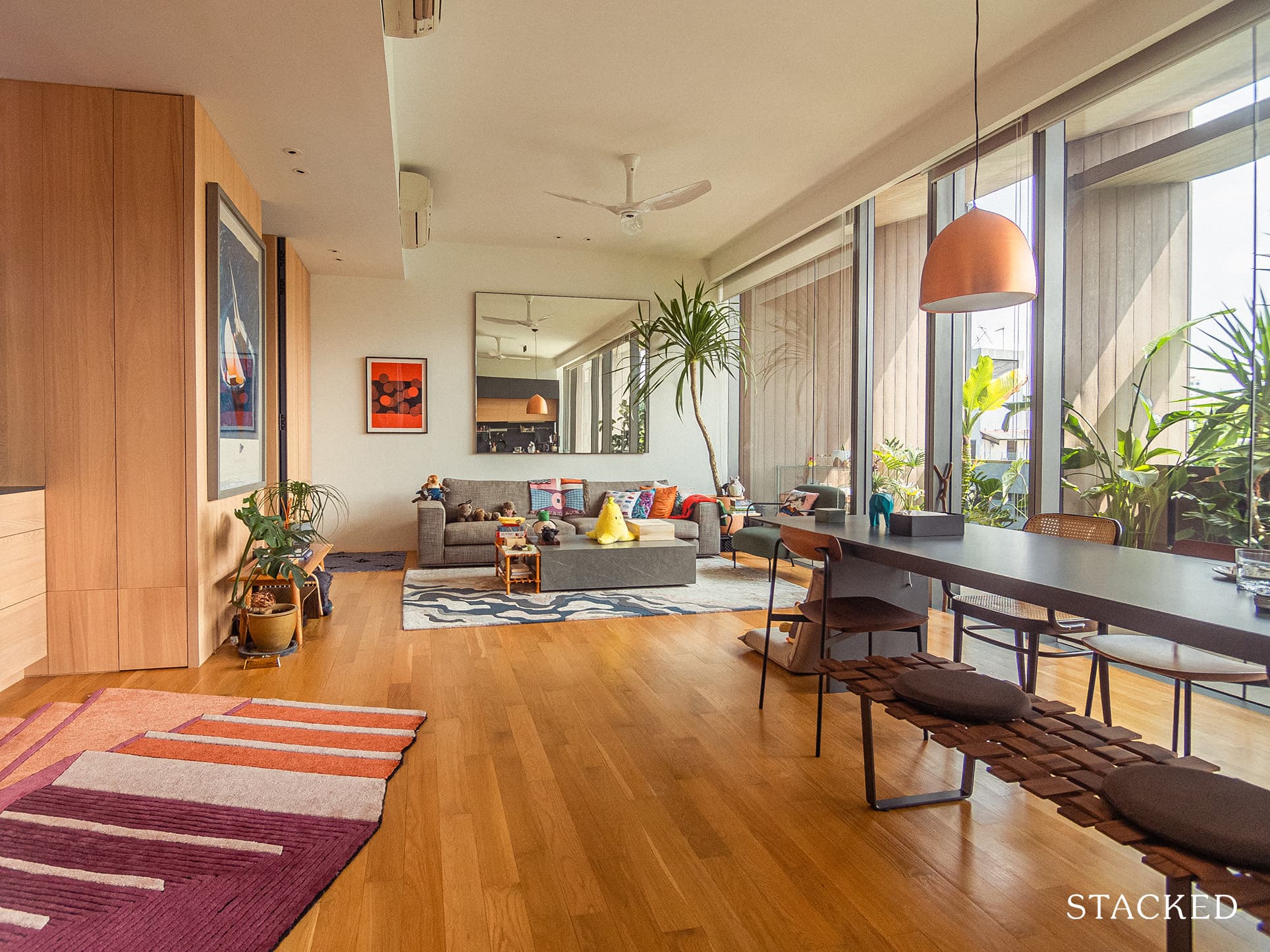
For instance, the couple initially planned for wood-like tiles on the first floor but later changed it. “After stepping on some samples in the shop, I decided I wanted real wood instead because that would be more comfortable on the feet,” Justin said.
Their budget approach is also matched by their unconventional choice when it comes to design and style.
“I am very resistant to placing the home design into broad categories like ‘Scandi’, ‘mid-century modern’, ‘lux’, etc.,” Justin disclosed, “because those come from an external place instead of an internal, personal one.”
For a home to be comfortable to those residing in it, it has to fit their lifestyle. So when it comes to the actual design, it should be something that rings true to them – an expression of their inner wants and desire.
The couple’s liberal and flexible mindset is a great example of this. “What if you wanted a ‘Scandi’ look, but a fluffy velvet armchair called out to you in a shop?” Justin remarked, “It seems silly to dismiss it just because you already classified your home as ‘Scandi’.
Of course, you can’t just follow your wants on a whim all the time. Sudden changes in design can be very costly, especially once the renovation has started. You’ll need careful and extensive planning to push through with it, especially when you’re not following a particular design trend.
And so like many others, Instagram was their go-to source for inspiration. They created folders labelled “Love” and “Avoid” to sort out all the saved images.
This helped the couple narrow down the themes and common elements they truly loved and those that they wanted to avoid. “Just a brief glance at pictures of what we loved told us that wood tones, matte finishing, clean lines, and openness were themes that were central to what spoke to us,” Justin said.
Here’s how their home turned out after going through the renovation journey:
First Floor
Justin and his partner wanted to create a good separation between the living and private space, since they liked to host gatherings and have friends over. In the initial floor plan, the master bedroom was on the first floor, together with the kitchen, dining, and living room. To efficiently use the space and implement an open concept floor plan at the same time, they decided to move their private space to the second floor.
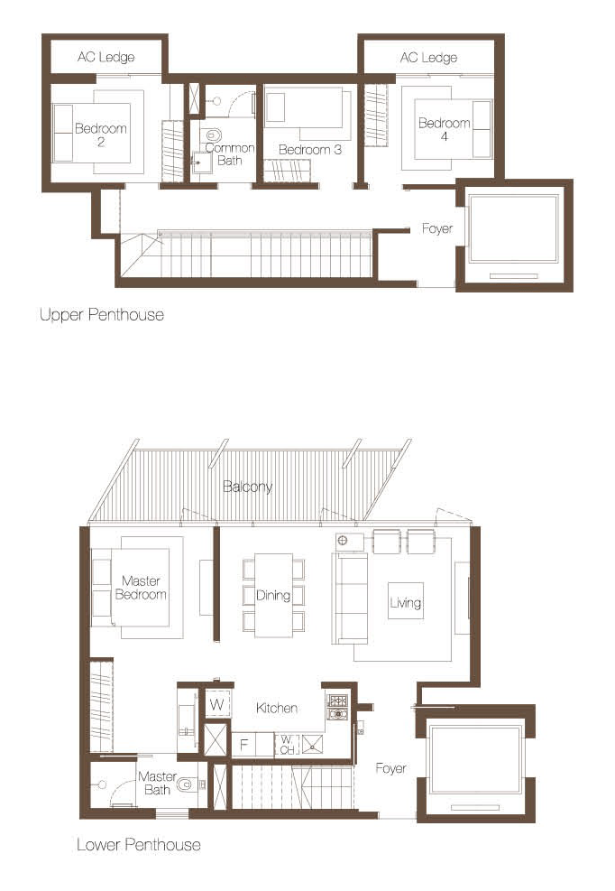
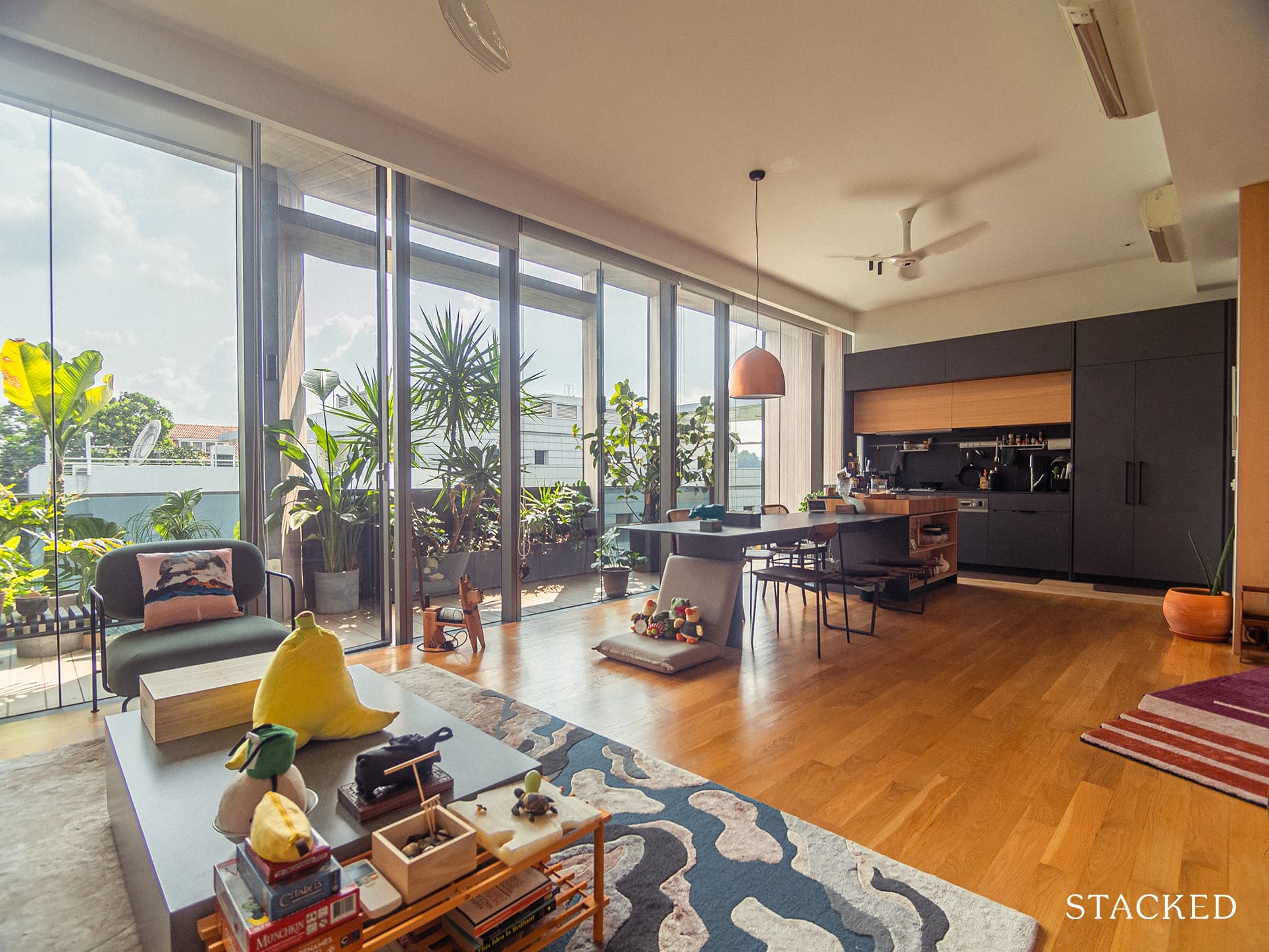
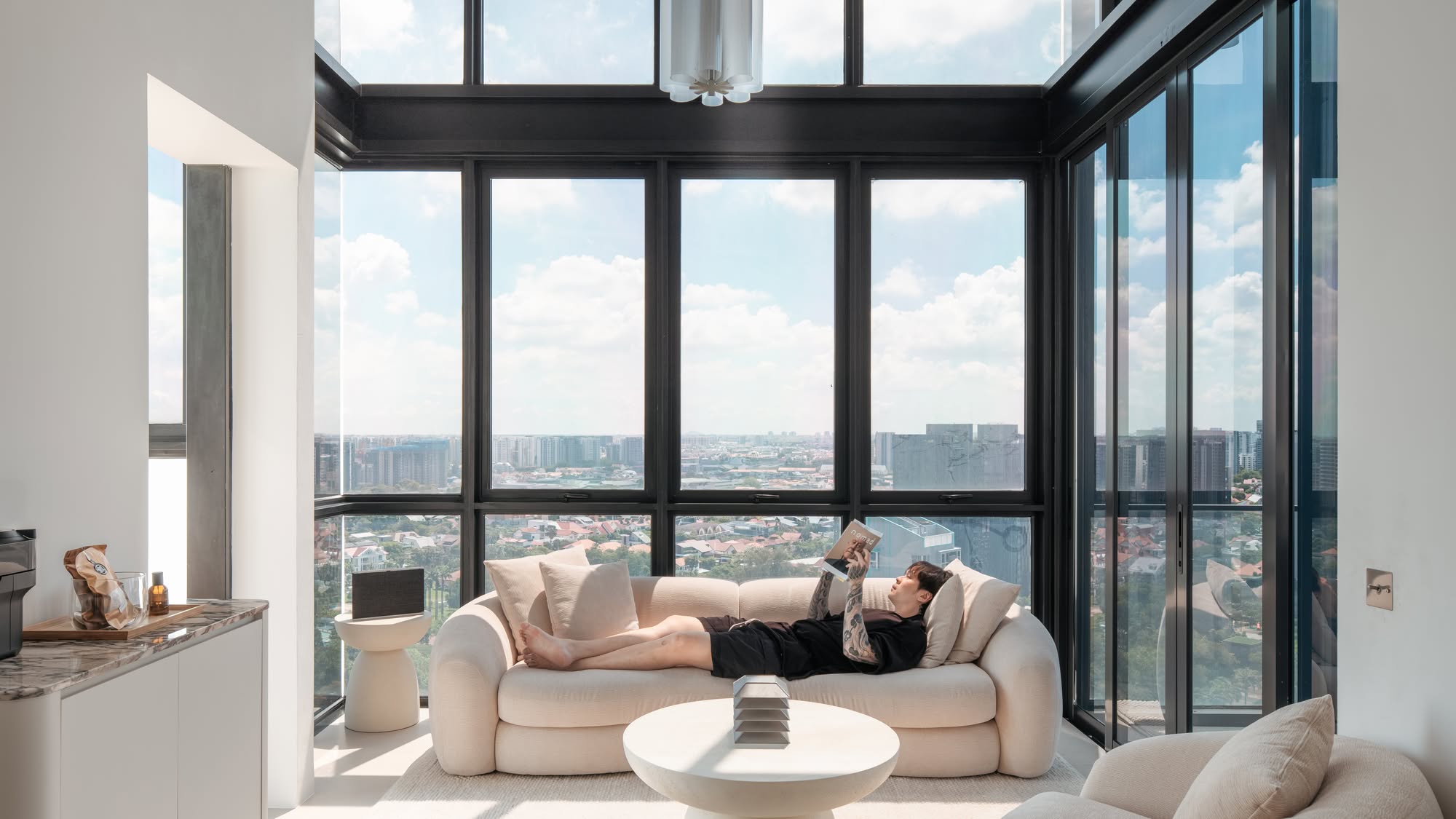
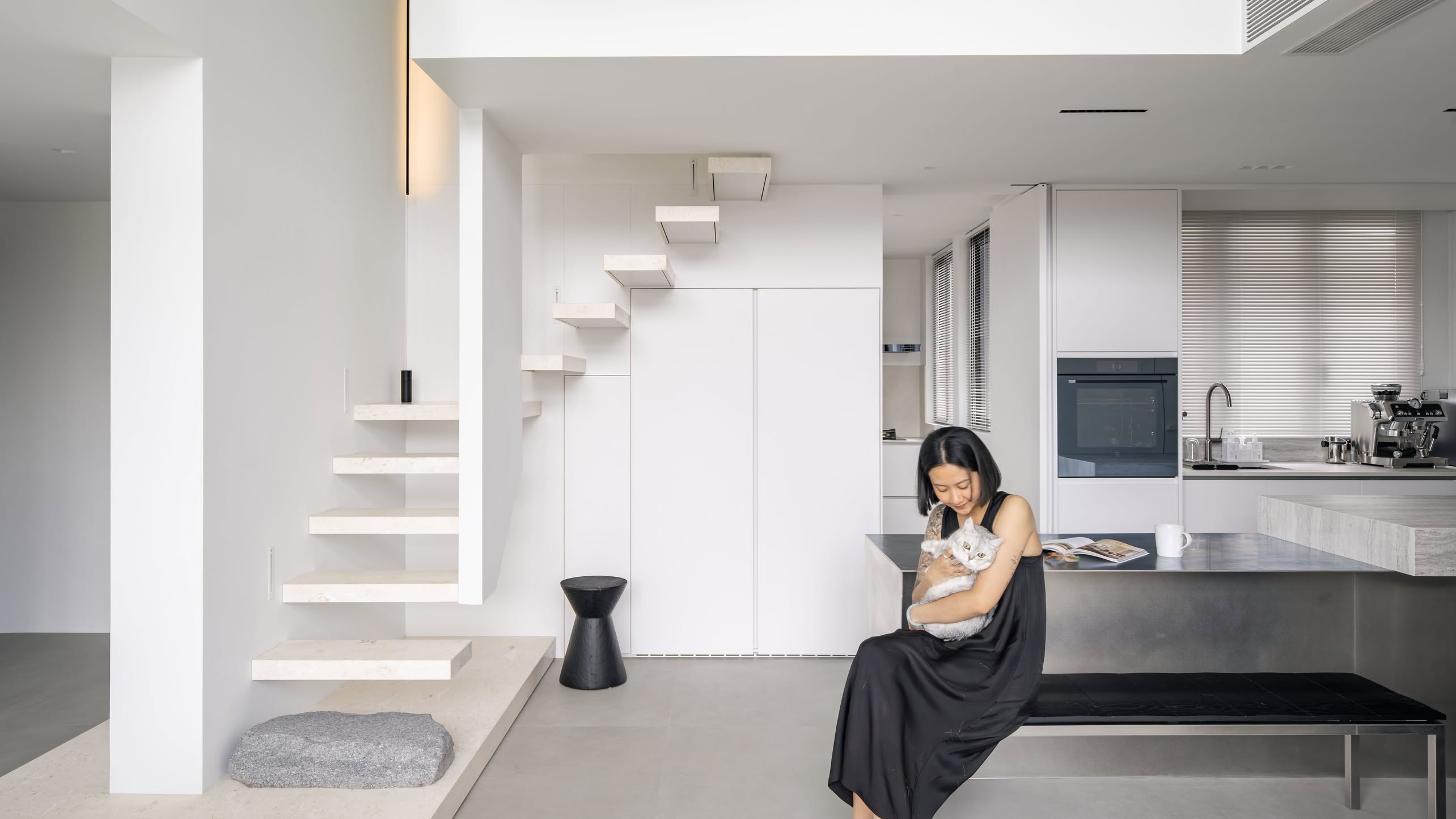
They had their contractor hack down all the walls of the first floor. They also shifted their kitchen to a different location, transforming the entire floor into an open concept communal space. It was a great design decision as it allowed them to make use of their floor-to-ceiling windows effectively.
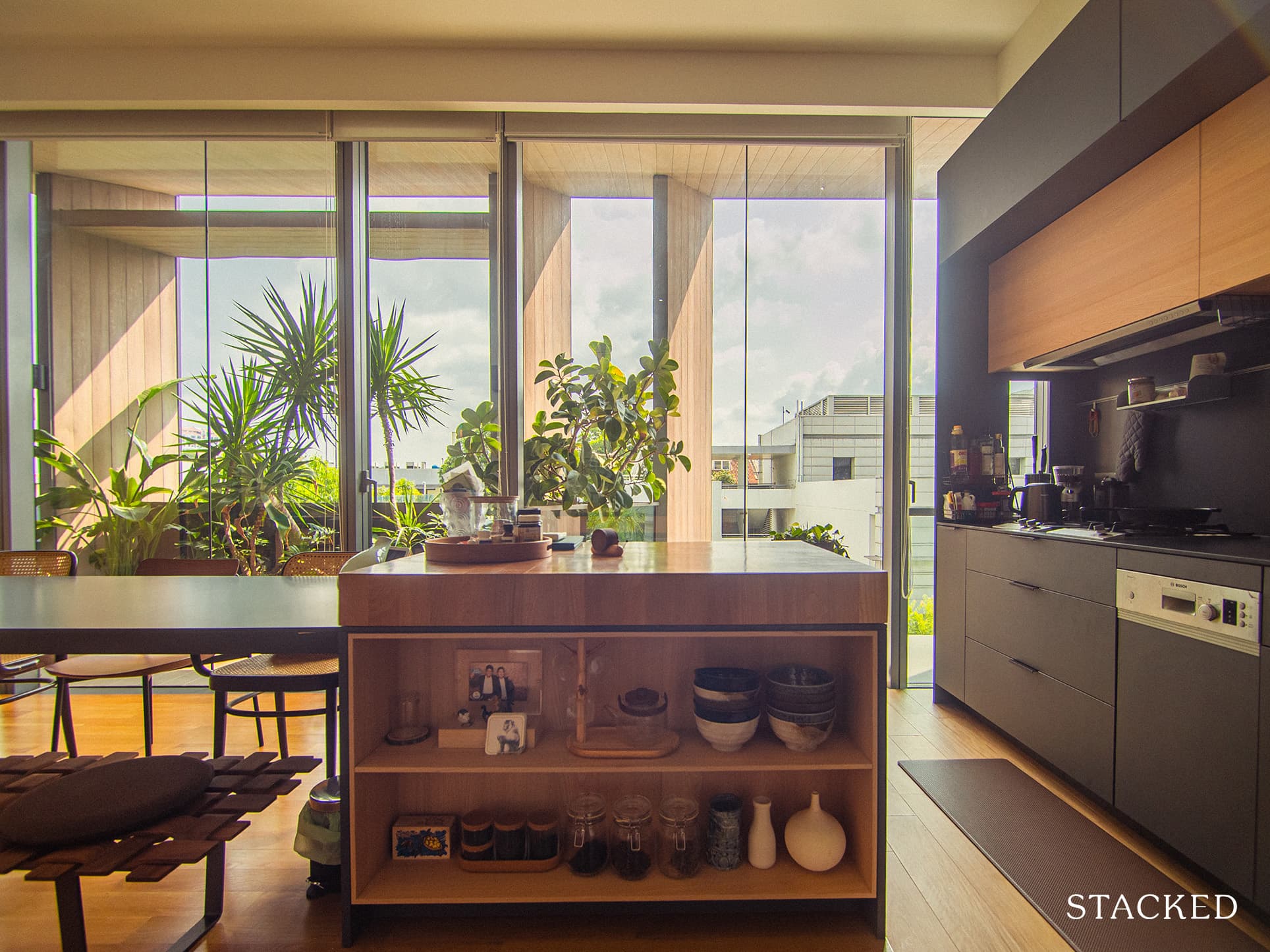
The kitchen, previously located on the left side of the foyer, was hidden from view. Now, with its sleek and contemporary look, the kitchen is the first area that greets everyone after passing through the foyer.
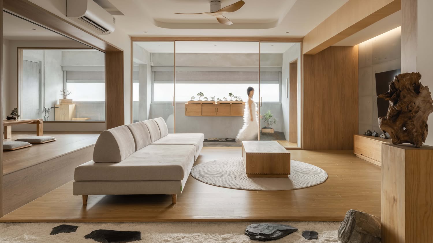
The abundance of natural light and their opulent wood floor, combined with the natural effects of both indoor and outdoor plants, created a warm and cosy atmosphere typically experienced in boutique hotels.
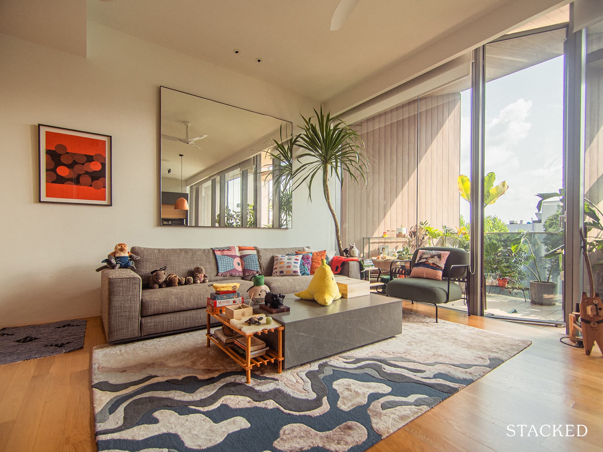
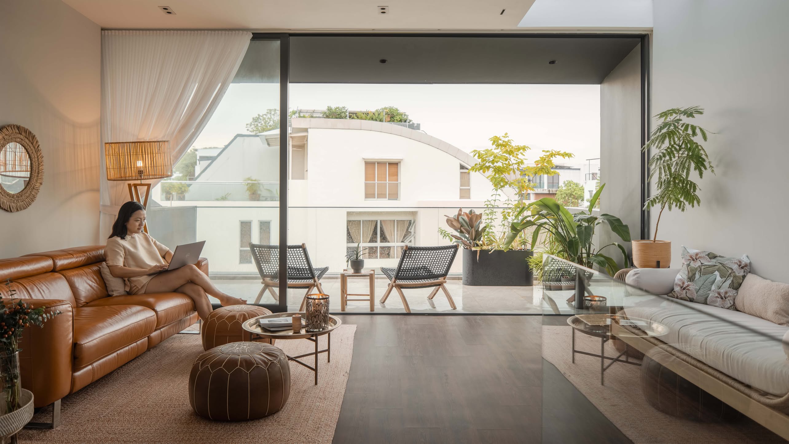
“To be honest, the plants were incidental,” said Justin. It was a shrewd move as since their balcony overlooks some other low-rise buildings in the vicinity, plants were a great option to maintain privacy while making the view more beautiful.
The couple worked with their friend who runs @main_green for the initial plants. “We went a bit crazy after that. Call it a Covid-born obsession,” Justin joked.
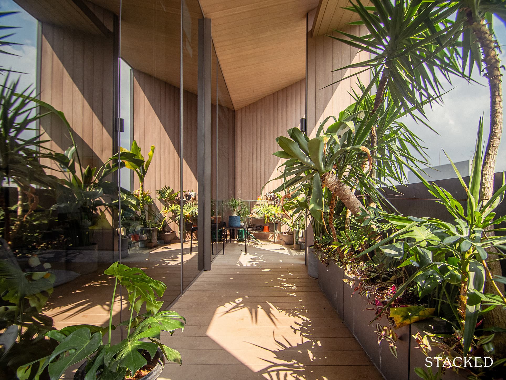
They chose plants with big leaves for the balcony since cleaning the fallen foliage would be easier. When asked about their favourite plant, monsteras stood out to be on the top of the list, occupying their shelves and the living room. But perhaps it was a choice born more out of practicality than anything, as “almost every other plant we tried keeping indoors died”.
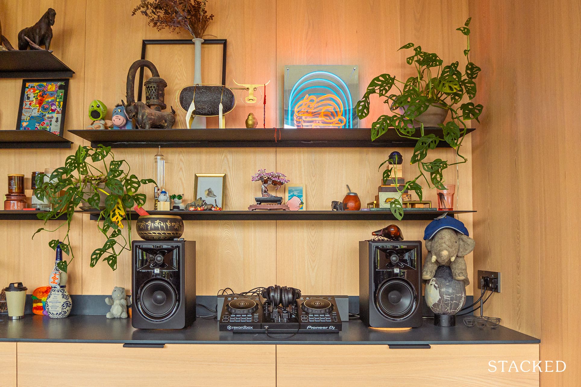
Justin also shared one great tip for those planning to have indoor plants. “Make sure you are always inspecting for pests and other nasties! We recently had a spider mite infestation that killed a few plants. Neem oil, Bti granules, and soapy water helped control infestations and mosquitoes.”
Homeowner StoriesInside An Incredible $15K Renovation Of A Bidadari 3-Room BTO: How This Couple Did It On Their Own
by StackedSecond Floor
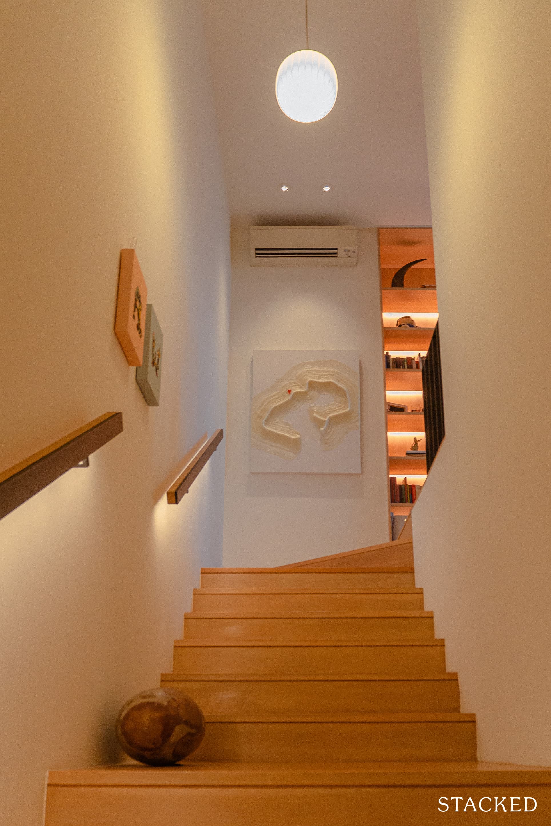
From the downlit wooden railings up to the piece of art that depicts the Circle Line (done by local artist Calvin Tay), the couple went into detail decorating their home. While you may be tempted to take the private lift up (it serves both floors), walking up the stairs rewards you with the little detailing of the home.
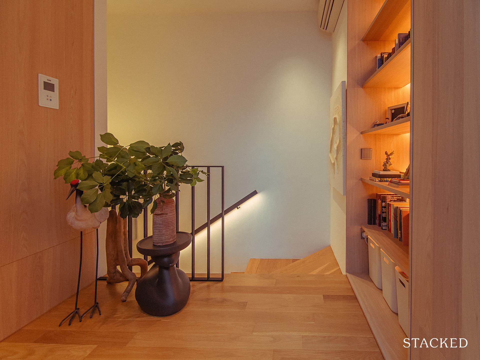
On this floor, only the wall that separates the bathroom from one of the bedrooms was hacked. This helped make the bathroom a little bigger, catching one of the skylights from the bedroom to let in some natural light.
More from Stacked
7 Close To TOP New Launch Condos In 2026/27 For Those Looking To Move In Quick
The projects completing in 2026–2027 were bought at a strange, high-octane moment: that jittery post-Covid rebound in 2021–2022, when the…
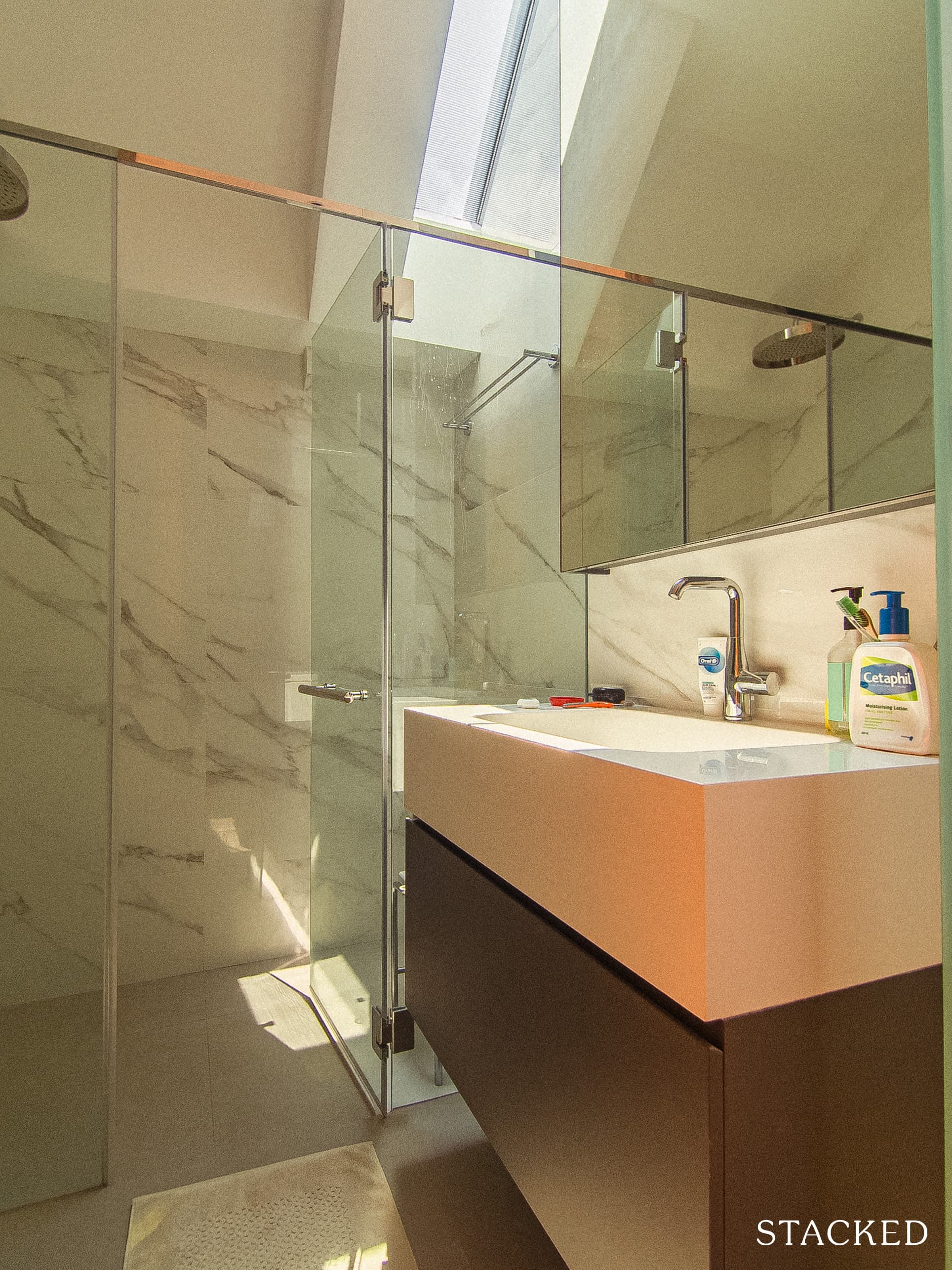
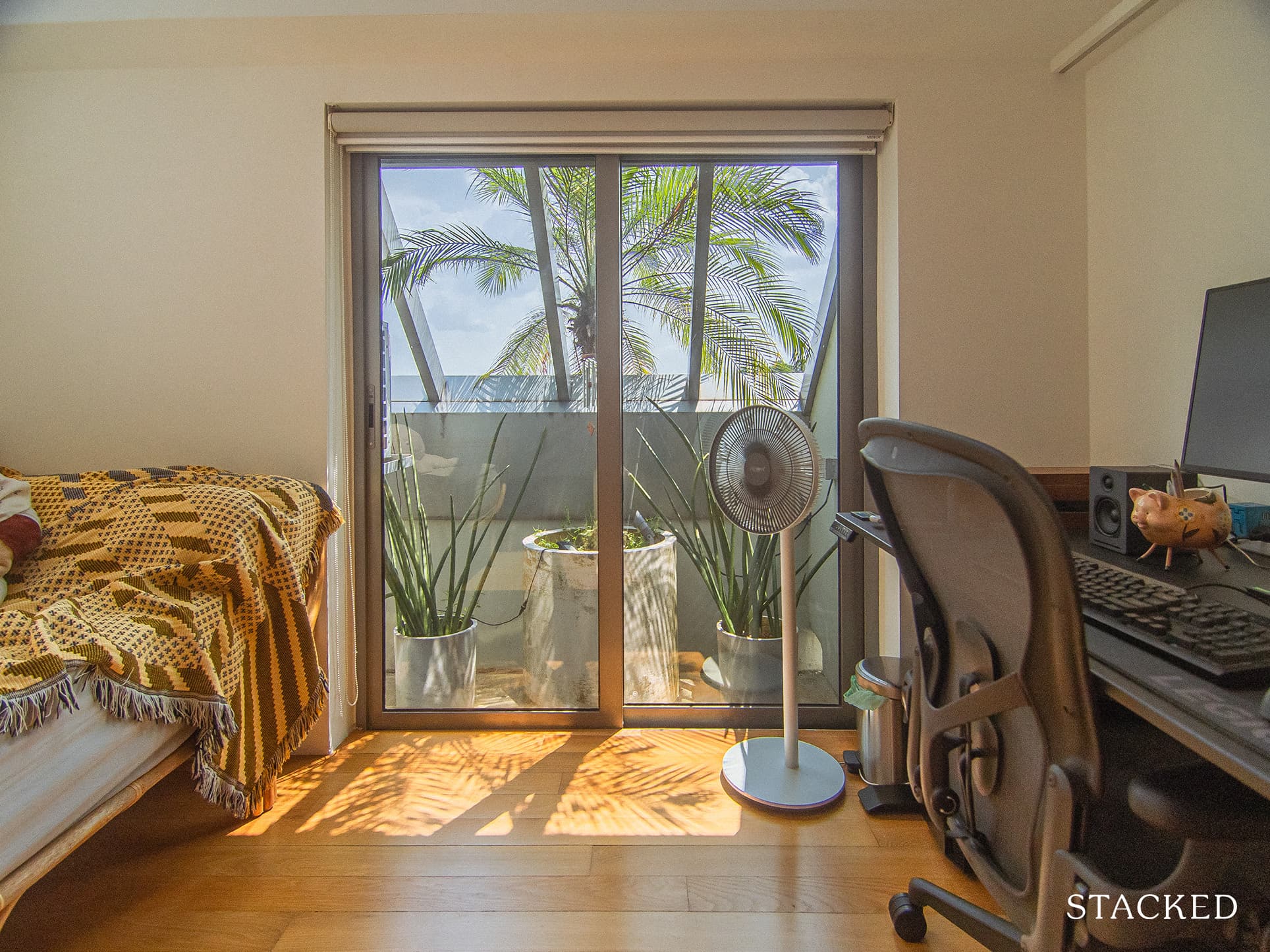
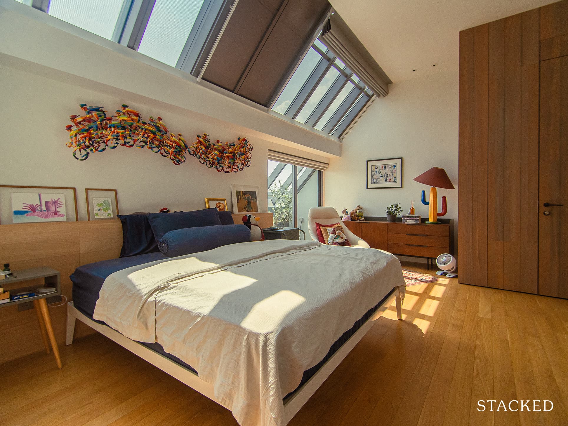
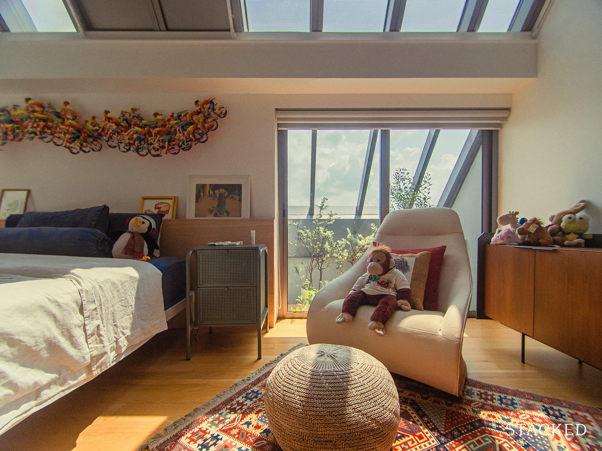
The remaining two bedrooms became the master’s bedroom and a study/gaming room. Both rooms have ample natural lighting streaming from the skylight.
It was one of the first things you’d notice as you enter the bedrooms, that lovely slanted glass roof. Its higher than normal ceiling coupled with the unique slant makes the room feel so much more open and bright – quite unlike any other newer condo that you might find in Singapore.
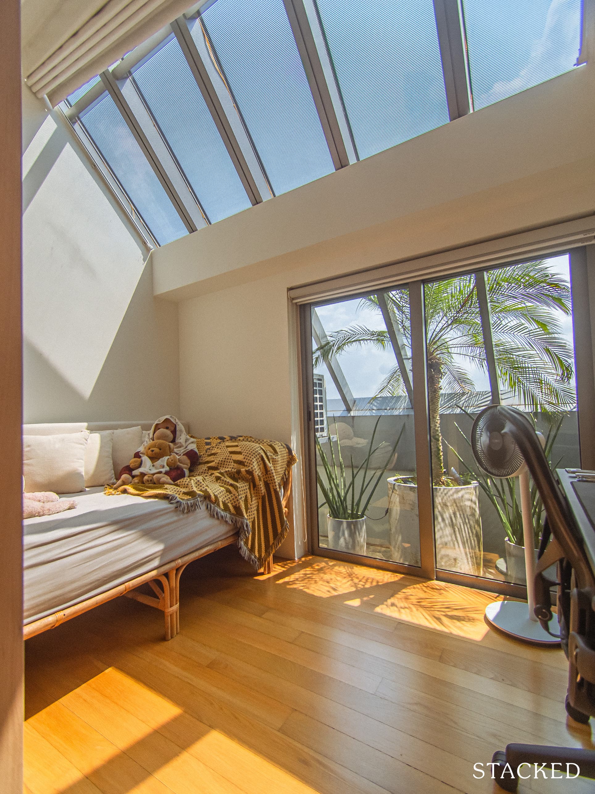
Moving their private spaces upstairs, including their bedroom, was beneficial not only to the couple but also to their guests. “Since we have very different sleep schedules, this allowed us to entertain late at night or engage in an early morning routine without waking/disturbing the other person.” As Justin so aptly advises “Design for a life, not a look”.
Bringing The Vision Into Reality
Justin used a combination of a basic online 3D modelling program and mood boards to help solidify their vision. With the use of the program, he was able to move elements around and remove or adjust the walls. It enabled them to have a general idea of what was possible or not.
The final outcome was close to what they had envisioned before the renovation started.
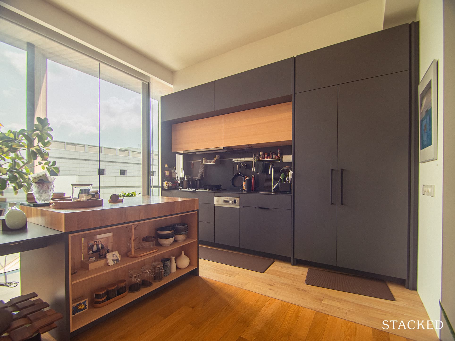
However, the couple also encountered some surprises along the way. “We had wanted a ‘white and wood’ kitchen,” Justin recalled, “but while checking out white slab options at the shop, I saw a darker colour option. I loved it and spontaneously decided to go with that instead.”
Justin was fortunate enough to know a contractor, STEMA, who worked for his parents before. A high level of trust was already established right from the start, and he had a very clear idea of STEMA’s capabilities and quality of work.
“If you have friends or family whose homes you love, ask them about the renovation process and if the process was smooth. It’s a great place to start when sourcing for trustworthy IDs and capable contractors,” Justin advised.
Before the couple even started sourcing furniture, they first classified their furniture pieces based on their function and how they would be used. “For example, the couch had to have armrests that were low enough to rest our heads on when we were lying down,” Justin explained.
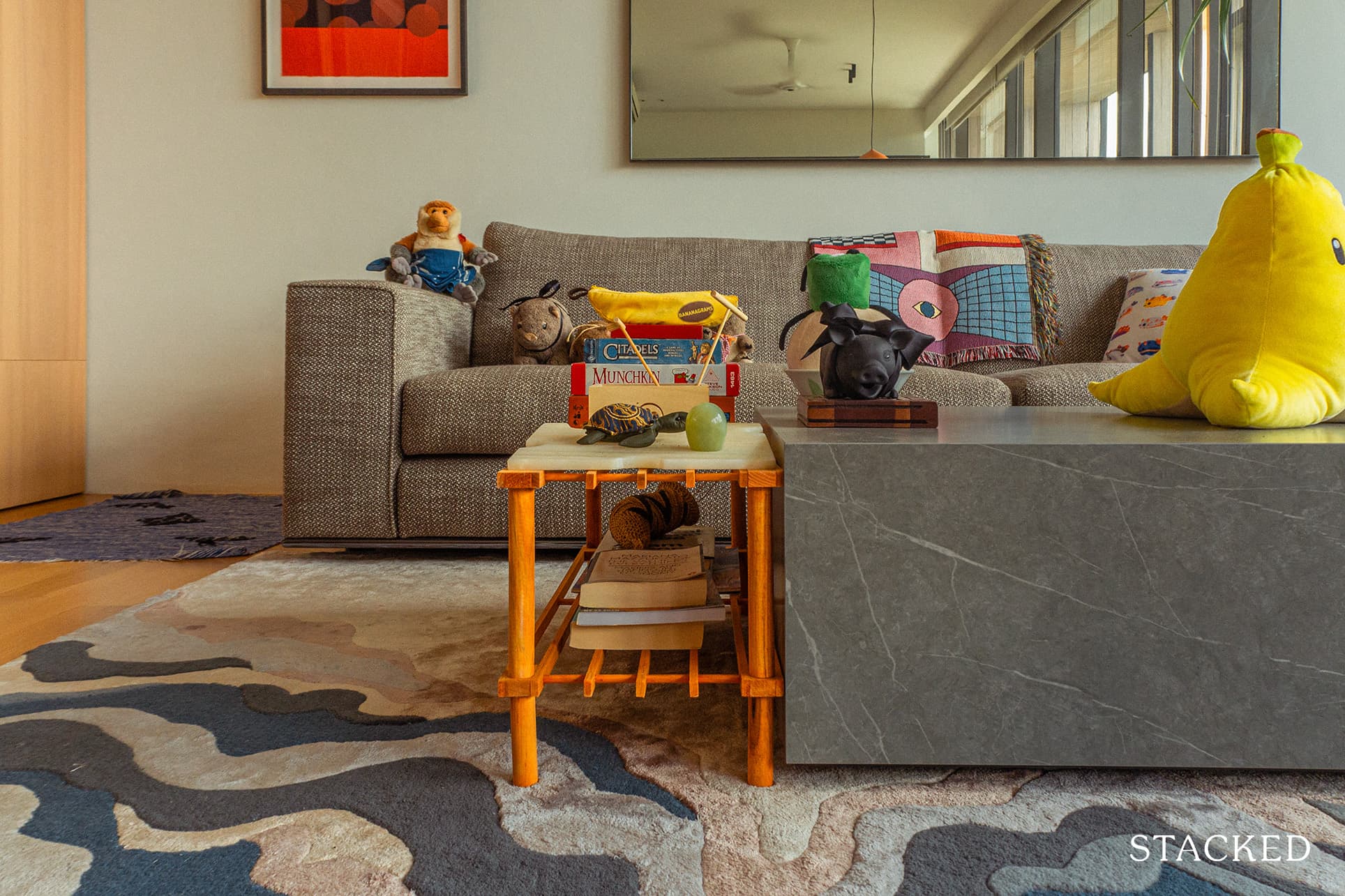
For Justin, the form has to follow an item’s function. When they chose their coffee table, they required that it should have a single low surface instead of multiple heights. The reason behind this preference is that they like sitting on the floor around a coffee table to play games. They also made sure it had no raised ridges on the side so they could rest their arms or feet on it comfortably.
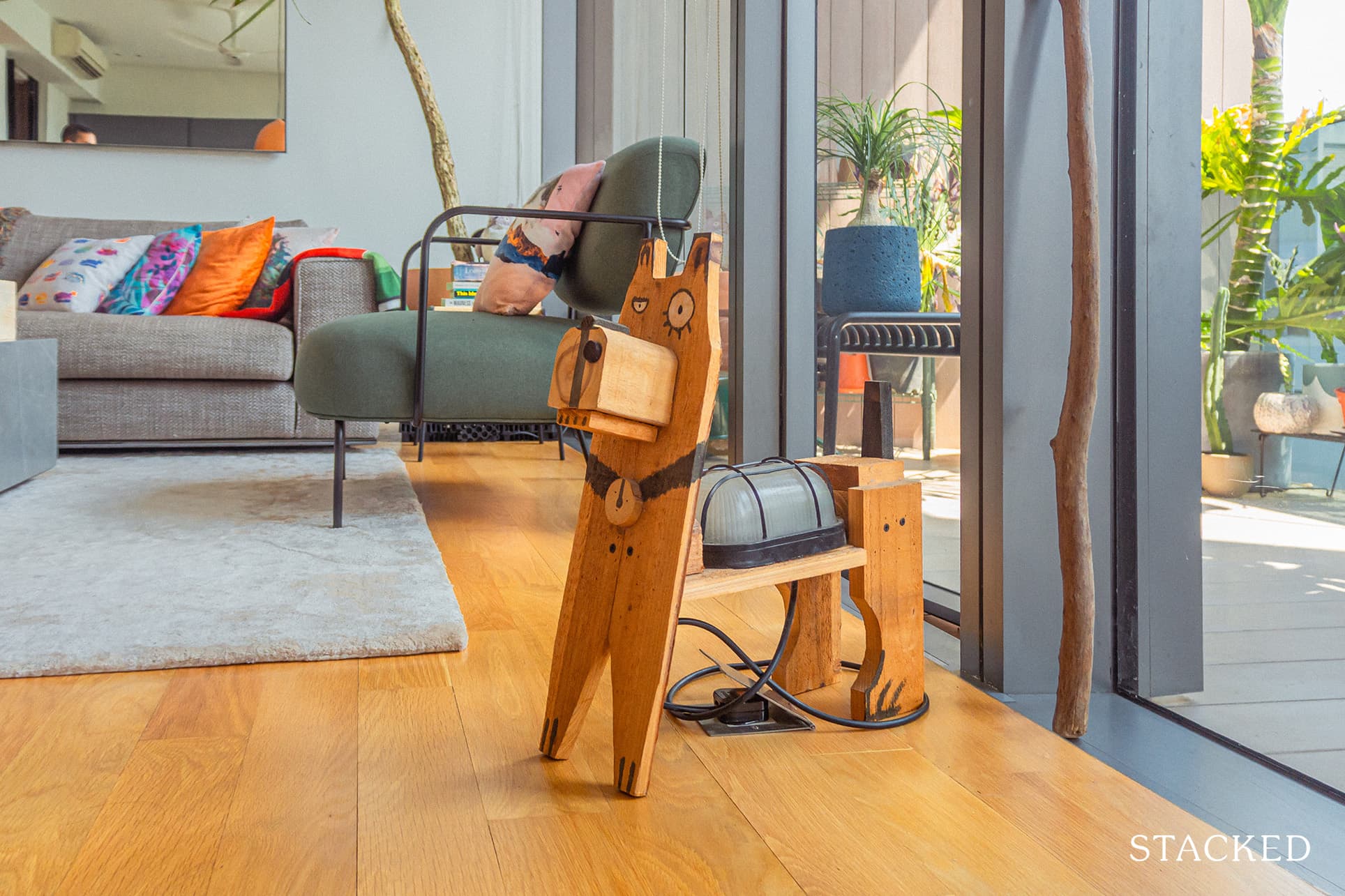
Their furniture sources are varied. A lot of their furniture pieces were either gifted or “thrifted” – bought second-hand or on clearance. “Tan Boon Liat Building and Millenia Walk became very familiar haunts,” recalled Justin. Even their ID helped them with a few options for each major piece of furniture. “Once the big items were purchased, such as the couch, coffee table, or dining chairs, the smaller pieces like stools, lamps, and side tables were sourced from IKEA or Taobao.”
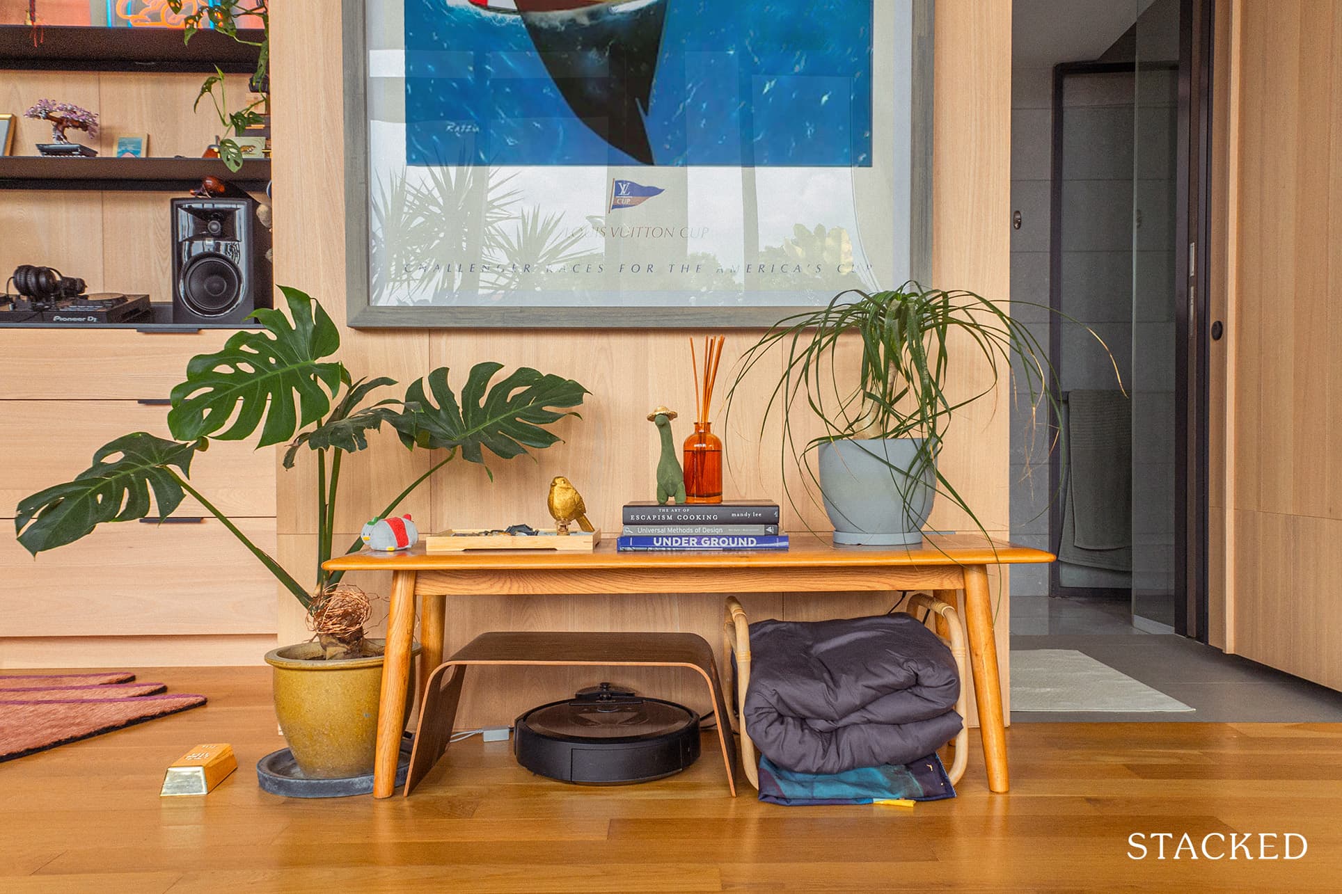
When asked what their favourite part of the renovation journey was, Justin said that seeing how the mood boards and decks came to life was very satisfying for him. The couple especially loved their decision to open up the first floor. “We host people regularly,” he explained. “The first floor created space for friends and family to gather comfortably.”
Meanwhile, the couple also has enough private spaces so they can each do their own thing without disturbing each other. Plus, they also have more than enough communal space where they can do daily activities together.
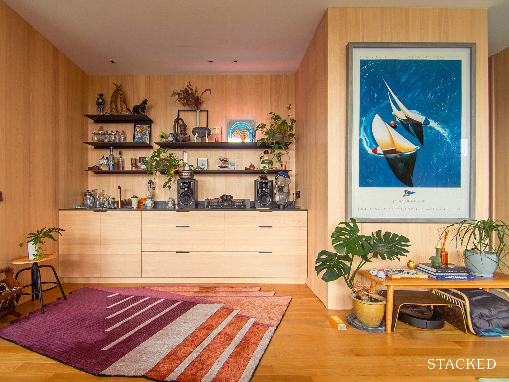
Lessons From A Successful Renovation Journey
All renovation journeys face challenges one way or another. What is important is the mindset the homeowner has during such obstacles. The couple’s mentality helped them stay calm throughout these tough times.
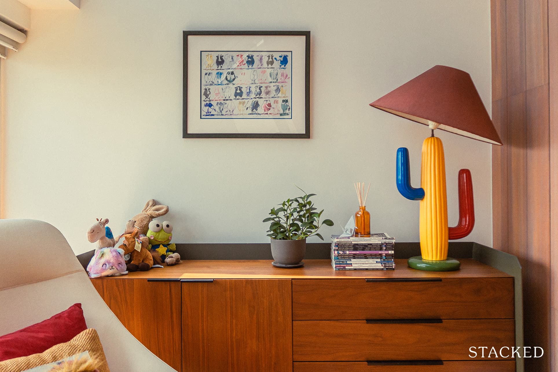
Justin recalled, “Covid greatly lengthened the process for many reasons. It shut down any progress during the circuit breaker period. It also caused the lack of manpower, which significantly slowed down the renovation.”
Due to the pandemic, most people are working from home, which raised a lot of complaints about hacking and other noisy work. How did the couple deal with these issues?
Justin answered, “Working with the condo management to reach a compromise is important, as well as being patient and understanding that the slower-than-usual process was no one’s fault.”
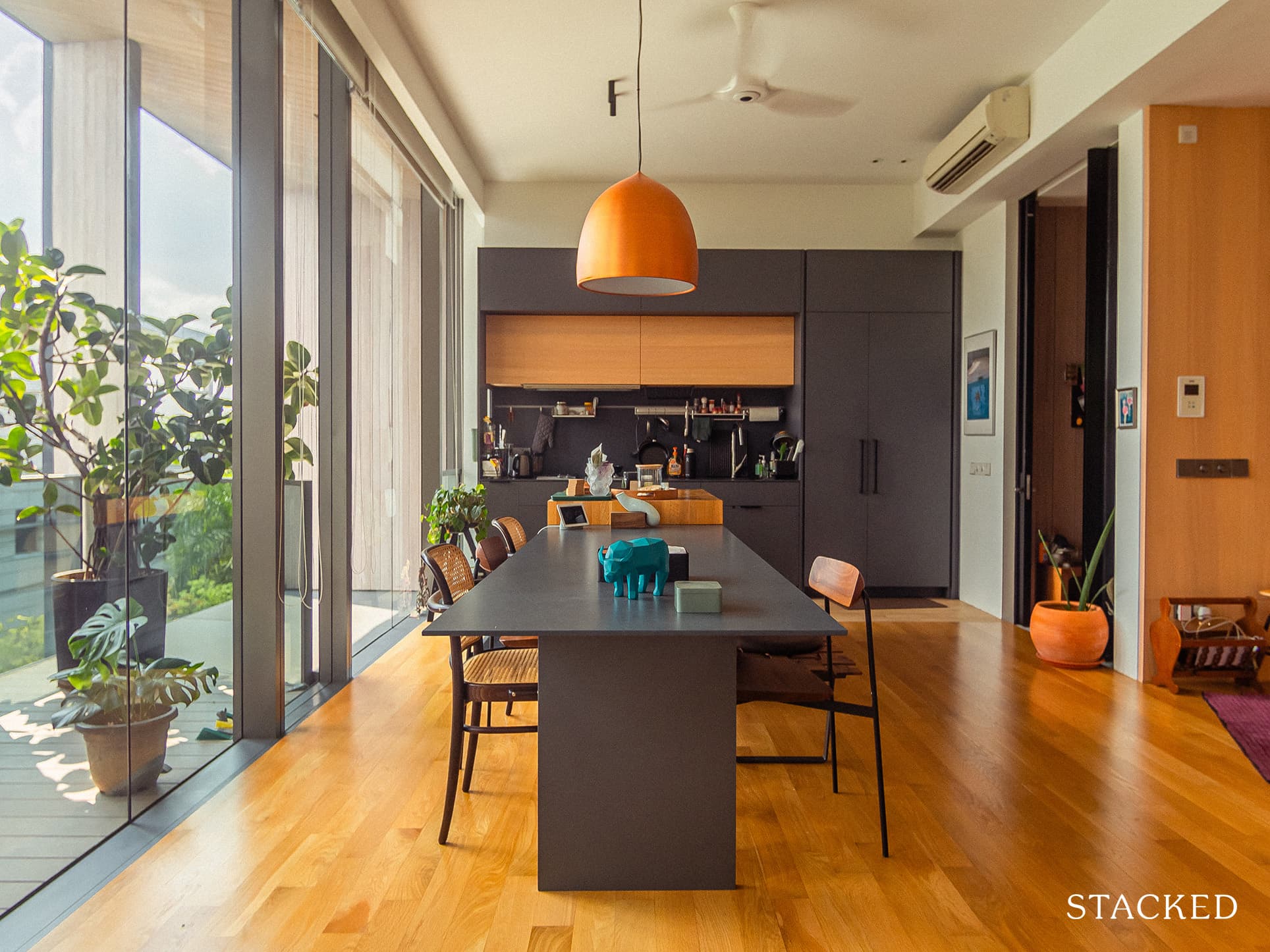
For those still in the planning phase of their renovation, Justin recommends prioritising designs that match your lifestyle. “Be honest with how you want to use each space in everyday life, and use that as a guiding light.” It’s a very sound piece of advice since it will not only help you avoid wasting valuable space in your home but will also cut down on unnecessary expenses. “It’s like having a reading nook no one reads in,” elaborated Justin.
Also, Justin emphasised designing for comfort and not only to impress. “What will make your guests fall in love with your place is how comfortable they feel in it, not how wow-ed they are by it.”
And finally, if you want to considerably minimise the stress throughout the renovation process, trust and clear communication with your ID are crucial.

Justin advised telling your ID everything, including how you intend to use every space. “I had forgotten to tell our ID that I wanted to set up my DJ equipment on the counter in the living room until pretty late in the process. As a result, I had to rely on loose pieces to make the area not look haphazard.”
Whether you prefer to infuse a lot of technological elements into your home or want the decor to be minimal, you and your ID must be on the same level of understanding to ensure your renovation process is a more manageable one. And at the end of the journey, you’ll also feel the same satisfaction Justin experienced – bringing the vision into reality.
At Stacked, we like to look beyond the headlines and surface-level numbers, and focus on how things play out in the real world.
If you’d like to discuss how this applies to your own circumstances, you can reach out for a one-to-one consultation here.
And if you simply have a question or want to share a thought, feel free to write to us at stories@stackedhomes.com — we read every message.
Need help with a property decision?
Speak to our team →Read next from Homeowner Stories

Homeowner Stories We Could Walk Away With $460,000 In Cash From Our EC. Here’s Why We Didn’t Upgrade.

Homeowner Stories What I Only Learned After My First Year Of Homeownership In Singapore

Homeowner Stories I Gave My Parents My Condo and Moved Into Their HDB — Here’s Why It Made Sense.

Homeowner Stories “I Thought I Could Wait for a Better New Launch Condo” How One Buyer’s Fear Ended Up Costing Him $358K
Latest Posts

Singapore Property News Singapore Property Market 1Q2026: Latest Housing Stats, Condo Prices, Supply And Demand

Singapore Property News 4-Room Flat at Bedok South Horizon Sets New Bedok Record at $1.17M

PRO Pro Where To Buy A Condo In Serangoon: Prices, Best Areas And Growth Trends In 2026



















0 Comments