How A ‘Property Oversupply’ in Singapore Could Affect Housing Prices
January 17, 2020

As of Q3 2019, the Singaporean housing price index has hit an incredulous 152.8.
This, up from 118.4 in Q3 2009 just over a decade ago.
(*Base Quarter as of 2009 Q1 = 100)
Perhaps more alarming however, is the quantum growth we’ve witnessed over the past 2 quarters, leaving us on the brink of a new all-time property price index high.
To put it plainly, housing prices are on the uptrend.
In fact, Singapore ranked 2nd last year as the most expensive housing market in the world behind Hong Kong – with a single residential unit here averaging an insane USD 874,370.
… and that was when the property price index ranged 148 to 149.7.
Naturally, these increasing figures have given home-hunters and even weathered investors a massive headache on the purchase front.
‘Should I buy now or should I wait for a bit?’ – is the common sentiment that rings out across all levels.
And so in tandem with these housing prices-related concern and the recent property oversupply news, we’ve decided to piece together an educated prediction of the upcoming housing prices.
Could this oversupply really be leading us to a long-awaited fall in housing prices?
(Note: This is quite a lengthy read with multiple info outlets along the way. While we’ve tried to keep these seemingly ‘off-course’ info outlets to a minimum, rest assured that every sliver of info here is utilised in formulating the final analysis at the end. As such, feel free to consume the article in parts/breaks and re-visit the post anytime!)
So many readers write in because they're unsure what to do next, and don't know who to trust.
If this sounds familiar, we offer structured 1-to-1 consultations where we walk through your finances, goals, and market options objectively.
No obligation. Just clarity.
Learn more here.
What Happened After the Previous Price Index Peak?
Before we get into the correlation between oversupply and housing prices, it’s important to understand that there are other factors that impact housing price trends.
For example, let’s take a look at the major/simultaneous events that occurred during the last property price index record (Q2 2013 – 154.6).
During this period, the government popped in two of Singapore’s biggest cooling measures.
Those measures involved:
- Stricter ABSD & LTV revisions
- A new TDSR implementation – spread across Q1 and Q2 2013.
These regulations had 1 thing in common: preventing housing prices from further peaking.
Naturally, the price index fell in the coming months, making 2014 the first year of a 4-quarter steady price decline since 2008 (and before that, 2001).
To put this into perspective, the last time it happened was during the financial meltdown and just after the dot.com bubble bursting.
Let that sink in.
Now interestingly, the market sentiment continued to wither down over the next few years, signalling the strength of these measures…and that there were in fact more factors contributing to this ‘lowered’ housing prices.
An oversupply of houses that kept increasing in the face of reduced demand perhaps?
Now before we address the oversupply issue, let’s touch on 3 key points that affect our oversupply analysis:
- The 2013 new measure-implementations were not the first of their kind.
- We are focusing solely on non-landed private residential price index and trends here.
- What are the other factors at play in determining price trends, and the role of demand?
1 – The 2013 measures were not the first of their kind.
This point will provide deeper (historical) insights into the 2013 measures.
The reason I am still delving into this factor at this point is because of 1.) the amount of solo impact it had on the 2013-2017 price trends.
More importantly, 2.) the key role it will play in determining the impact of oversupply on price trends later on.
Some of you might know that the 12 January 2013 revisions were actually the 7th straight measure implementation from end Q3 2009.
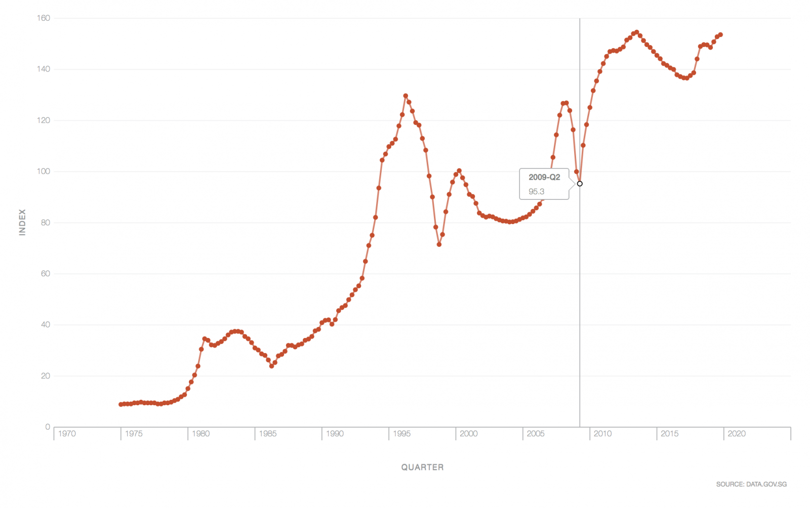
If you were to look at the index chart just before the start of this implementation (between Q2 and Q3 2009), you’d realise that the price index grew by an incredible 15 points in just one quarter (this based off data from 29 January 2020).
Note that this was just after the polar spike and fall of the index over a 3-year period from Q1 2006 to Q2 2009 . To prevent unstable fluctuations/peaks, the government implemented its first measures.
Fast forward to 2020, and we see a repeat historical pattern here. Prices skyrocket. Watchful authorities step in with measures. Prices drop.
There are 2 brief takeaways for us here:
- The government is willing to disrupt the property market to prevent extreme housing price surges.
- It often takes more than one implementation to bring prices down.
(*Also bear in mind that the government gauges housing prices in line with wage/economic growth – GDP etc. so do NOT expect all price hikes to be always met with a cooling hand)
2 – We focus solely on non-landed private residential data
The title of this article revolves around the impact that (the previously discussed) oversupply has on housing prices.
In that piece, we delved into stats based solely on non-landed private residential properties (excluding ECs).
Similarly, the price index chart embedded above is derived through non-landed private residential statistics.
As most of you will know, this means that the price predictions you are going to be reading here will not completely correlate with other residential-types like HDB flats and landed properties.
That being said, here are some links that could help you should you like to tackle those fronts on your own.
(*Note that you can also view the stats in table form)
In fact, to illustrate just how varied predictions can be in the private residential sector alone, have a look at this location-based price index.
Yup, that one residential index just got dissected into 3 location-based price indexes.
Notice how the OCR price-index which started off in 2nd and even bottomed the charts from 2006 – 2008 is now observing the greatest growth?
It further reinforces the fact that there are way more factors than just an ‘oversupply’ that impacts both housing prices and price index trends.
Fortunately for us, some these ‘big-player’ factors are often similar – as you will soon see.
3 – The other key factors that determine price trends and the role of demand
We’ve briefly touched on the factors of location and measures (we’ll also explore supply right after this, promise!).
But do you know what really drives housing prices at the end of the day?
Well.
It’s Demand.
Demand drives these prices.
Not an increase in need/want persay, but a demarcation that signifies interest.
In other words, tangible purchase figures or figures of interest – eg. the number of units sold, or the number of interested parties visiting showflats etc.
When demand increases, developers and landlords know that they can make more cash.
So naturally, they raise their asking prices.
In essence, increased demand = rising housing prices on average.
The same holds true in reverse. Reduced demand also equates to lower housing prices in general.
Now, what drives demand?
Well, some of the bigger factors include economic outlook, increase/decrease in the level of income, property market sentiment (which was very poor between 2013 and 2017), population growth, HDB upgraders and even new launch attractiveness (a random monthly affair).
While I’m not going to go through every single factor, what I want you to understand is the importance of having a rough idea of their existence and their respective impacts.
Only then will you be able to reduce prediction error with well-informed decisions.
In a nutshell, keep up to date with the latest happenings, invest wisely (not necessarily safely) and always receive predictions (yes, even this one) with a pinch and a half of salt.
Now let’s see how this ‘oversupply’ buzz really impacts demand and hence, housing prices.
(PS: If you’d like us to craft a piece on the numerous other factors that could have alarming impacts on future price trends, feel free to drop us an email at stories@stackedhomes.com!)
Oversupply vs Price Trends: What can we learn?
| Quarter/Year | Completed Unit Vacancy | Pipeline units | Unsold Pipeline Units | Sold New Launch Units | Sold Resale Units | Index Price Growth | Rental Price Growth |
| 2013 Q1 | 5.2% | 88,623 | 35,564 | 5,412 | 1,871 | +0.6% | +0.7% |
| 2013 Q2 | 5.6% | 87,789 | 33,255 | 4,538 | 2,075 | +1% | +0.3% |
| 2013 Q3 | 6.1% | 84,917 | 31,004 | 2,430 | 1,340 | +0.4% | +0.2% |
| 2013 Q4 | 6.2% | 83,702 | 30,819 | 2,568 | 1,206 | -0.9% | -0.5% |
| 2014 Q1 | 6.6% | 80,261 | 29,482 | 1,744 | 899 | -1.3% | -0.7% |
| 2014 Q2 | 7.1% | 76,014 | 27,024 | 2,665 | 1,389 | -1% | -0.6% |
| 2014 Q3 | 7.1% | 74,496 | 28,120 | 1,531 | 1,377 | -0.7% | -0.8% |
| 2014 Q4 | 7.8% | 68,960 | 26,742 | 1,376 | 1,151 | -1.1% | -1% |
| 2015 Q1 | 7.2% | 68,201 | 27,061 | 1,311 | 1,250 | -1% | -1.7% |
| 2015 Q2 | 7.9% | 61,237 | 24,435 | 2,116 | 1,827 | -0.9% | -1.1% |
| 2015 Q3 | 7.8% | 58,348 | 22,456 | 2,410 | 1,619 | -1.3% | -0.6% |
| 2015 Q4 | 8.1% | 55,638 | 23,271 | 1,603 | 1,464 | -0.5% | -1.3% |
| 2016 Q1 | 7.5% | 53,512 | 22,370 | 1,419 | 1,340 | -0.7% | -1.3% |
| 2016 Q2 | 8.9% | 47,250 | 21,489 | 2,256 | 2,140 | -0.4% | -0.6% |
| 2016 Q3 | 8.7% | 43,693 | 20,577 | 1,609 | 2,477 | -1.5% | -1.2% |
| 2016 Q4 | 8.4% | 40,913 | 19,071 | 2,944 | 1,944 | -0.5% | -1% |
| 2017 Q1 | 8.1% | 36,942 | 15,930 | 2,962 | 2,170 | -0.4% | -0.9% |
| 2017 Q2 | 8.1% | 35,423 | 15,085 | 3,077 | 3,698 | -0.1% | -0.2% |
| 2017 Q3 | 8.4% | 35,022 | 16,031 | 2,663 | 3,949 | +0.7% | 0% |
| 2017 Q4 | 7.8% | 36,029 | 18,891 | 1,864 | 4,226 | +0.8% | -0.9% |
| 2018 Q1 | 7.4% | 40,330 | 23,514 | 1,581 | 3,666 | +3.9% | +0.3% |
| 2018 Q2 | 7.1% | 45,003 | 26,943 | 2,366 | 4,700 | +3.4% | +1% |
| 2018 Q3 | 6.8% | 50,330 | 30,467 | 1,836 | 2,672 | +0.5% | +0.3% |
| 2018 Q4 | 6.4% | 51,498 | 34,824 | 3,012 | 1,971 | -0.1% | -1% |
| 2019 Q1 | 6.3% | 53,284 | 36,839 | 1,838 | 1,858 | -0.7% | +1% |
| 2019 Q2 | 6.4% | 50,674 | 33,673 | 2,350 | 2,371 | +1.5% | +1.3% |
| 2019 Q3 | 6.1% | 50,964 | 31,948 | 3,281 | 2,378 | +1.3% | +0.1% |
| 2019 Q4 | TBA | TBA | TBA | TBA | TBA | TBA | TBA |
(Data in this table is based off non-landed private residential properties (excluding EC) from URA’s latest statistics as of 15th January 2020)
Don’t worry, this chunk of information is just here to serve as a compilation on key supply statistics over the past years (feel free to use it as you will!)
We’ll also only be referring to the Completed Unit Vacancy Percentage and Pipeline Units trends in tandem with Price Index shifts in our analysis below.
Before we begin, do bear in mind once again that prices are often impacted by an increase/decrease in demand.
- Understanding the Vacancy Rates & Pipeline Unit Trends from 2013-2017
We know that the 2013 measures caused the sudden dip in the (previously) ‘rapidly growing’ price index.
Now these cooling measures impacted the fundamentals on which investors and key players made their money (SSD & ABSD respectively).
They had never witnessed this before and so the majority began treading cautiously as a result. Demand fell as the property market sentiment was poor.
Existing vacant units were left unsold.
To add on to that, this ‘tangible supply’ of vacant units continued to rise as an oversupply of pipeline units from the previous years continued to flood the market.
Unit quantum values and rents fell. The average price index decreased on a 4-year consecutive.
And so at this point, a price-fall should result in increasing demand as investors want to buy low and sell high right?
Yet, why did the property market witness almost 4 years of subdued demand, resulting in gradually lowered housing prices?
This was due (in part) to the unfamiliar situation… as well as the fact that there were fewer immediate indications (as opposed to price decline halts in previous years) to investors/key players (developers) that market sentiment would pick up in the near future.
The fact that prices was also declining very slowly and that developers were focused on selling off their existing land during this time further contributed to lowered market activity.
Naturally, the general public continued waiting (speculating) for lower housing prices (for better gains/reduced losses).
2017: The key turning point
Now the tide-turner (if you will) came when the pipeline supply was getting relatively ‘low’ in 2017.
Add in the ‘lowered prices’ amongst other factors (as addressed earlier) + land-hungry developers and demand began to rise.
Prices rose, vacancies decreased, new 2018 measures came in…. we know what happens next.
More from Stacked
Three Strata Office Floors In Suntec Priced From $135M
A portfolio comprising three full office floors at Suntec Tower 1 and Tower 2 is on the market at the…
- The Link between Index Price Trends and Pipeline Unit Figures/Completed Unit Vacancy Percentage
Now based off this, we observe that the price index (excluding rental price growth) falls as the completed unit vacancy increases & pipeline units are in excess. In linear fashion, the price index begins to rise when unit vacancy decreases and pipeline units are in low supply.
(Note that these trends also surfaced between 2009 and 2013).
To summarize:
‘Lack of demand = Falling Prices/Increased Vacancy (fueled by pipeline supply).
At some point, Low prices + Low pipeline Unit Supply + Other factors = Increase demand = Rising Prices/Reduced Vacancy’.
(End of Table Reference)
Singapore Property NewsWhat next for Singapore housing market after July 6 cooling measures?
by Stanley Goh
Why the Supply Figures might not have such a huge impact on Price Trends
So we’ve observed the impact link of the 2013-2017 supply (Pipeline Units & Vacancy Rates) on the price index.
Now the question that everyone wants to know is –
“Will the upcoming supply from the en bloc craze result in a similar price-fall to what we witnessed between 2013 and 2017?” – especially given the almost ‘similar’ situation with the ‘new’ 2018 ABSD measures.
Here’s the gist:
- The impact of supply on housing prices tend to only get more significant when supply figures reach extreme ranges
(We’ll explore the likelihood of our impending supply reaching this ‘extreme’ right after this.)
Now the impact of supply on demand (and hence prices) begins to get direct/stronger when supply reaches its two ‘extreme points’.
Basically, extremely high supply would directly result in increased competition between developers, naturally leading to a dip in prices.
Now the only way to get to this ‘extremely high supply’ is through:
A.) An outside factor impact resulting in continued low demand (eg. measures in 2013)
OR
B.) An outrageous oversupply number that comes from pipeline units of previous years (eg. en bloc 2017-2018).
And as we know (from the 2013-2017 saga), it is sometimes a combination of both.
Now extremely low supply on the other hand, would naturally result in increased prices.
Yet unlike an oversupply (which we’ve witnessed before), the chances of a drastic undersupply (low vacancy rates and low pipeline units) is not likely in the short to medium term given the number of forward-looking developers in Singapore and the allure of its real estate market (and hence demand) in the global scene.
Given its unlikelihood, let’s go back to determining the possibility of housing oversupply reaching its ‘extreme’ range.
- A.) The public is adapting to New Measures faster, reducing likelihood of ‘drawn-out’ periods of low demand
As mentioned earlier, one way we would see an ‘extreme’ oversupply is if new pipeline units were already met with low demand and hence a gradual build-up of these completed vacant units over a period.
This happened during the 2013-2017 timeframe when low property demand from the 2013 measures led to an ‘extreme’ oversupply of vacant units and hence continued low prices.
Here’s why a repeat of that is unlikely.
As is usually the case, these ‘frequent’ implementations (more specifically to the ABSD genre) are causing investors, developers and even homeowners to better adapt to new governmental measures, resulting in them making bolder moves at a faster pace.
It certainly explains why the price index has risen for the past two consecutive quarters following just two quarters of minimal ‘price-falls’ post 2018 cooling measures.
And why we should not expect new ABSD-related measures to result in drastic/long-standing drops in demand, and hence a peak/extreme range of vacant unit supply – unlike what happened in the previous cycle.
- B.) Supply from the En Bloc craze/GLS sites will not cause it to hit these ‘extremes’
Based on that, the only other ‘sure-fire’ way that we could see a property price drop in the future based solely on supply impact is IF: We know that a massive supply is about to come in (Point B).
According to the table, this current pipeline supply for private residential is 50,964. Out of which, 31,948 units are unsold. (This includes supply from the past En Bloc and GLS sales.)
Let’s look at the estimated completion dates of all these 50,964 private residential units (assuming no sudden pull-backs in supply).
| Year | Units |
| 4th Quarter 2019 | 2,704 |
| 2020 | 5,122 |
| 2021 | 11,958 |
| 2022 | 15,106 |
| 2023 | 16,074 |
Now have a look at the annual uptake over the past years (noting the poor market sentiment of 2013-2017).
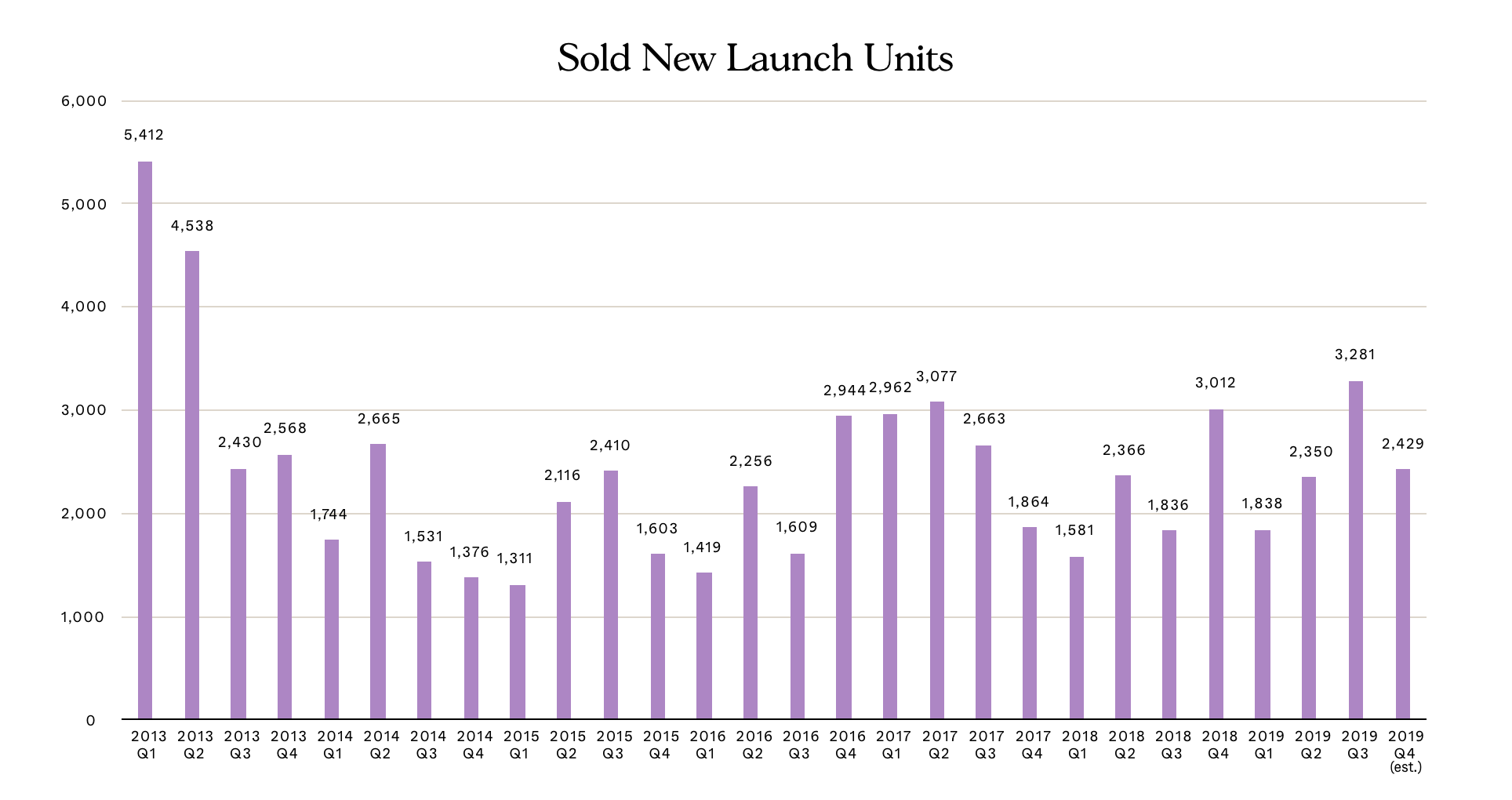
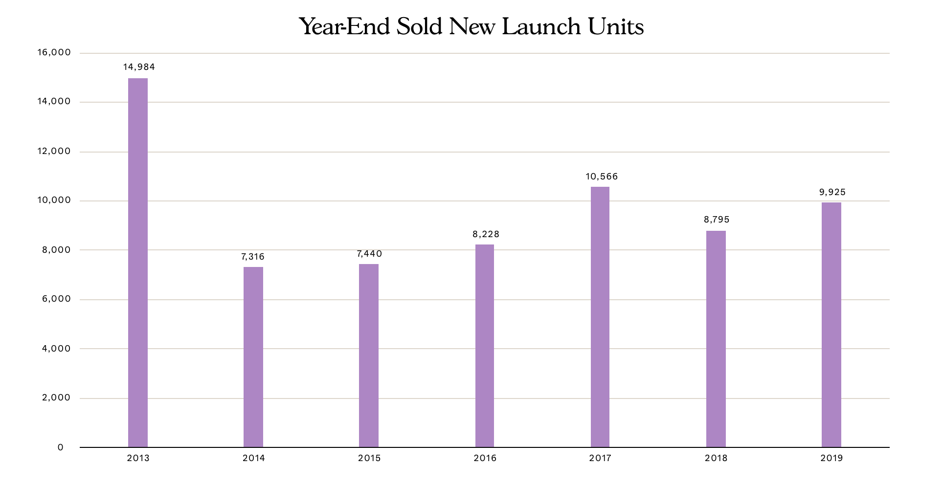
Assuming that there aren’t any crazy dips/rises in demand in the following years, let’s hypothetically average out New Launch Sales at 9,500 units/annum over these next 3 years.
(2023 is also where ABSD taxations from the ‘last en bloc sale’ in July 2018 finally kicks in).
That’s 28,500 units sold.
Assuming all these units from the supply pipeline (and not considering the added supply from the ‘in between’ years) have been built, that’s (48,260 – 28,500) at least 19,760 extra vacant completed units by 2023.
Based on URA’s 3rd Quarter Real Estate Stats Release, there are a current total of 372,085 built private residential units (excluding EC) in Singapore. Add in the pipeline supply and that’s an estimated 423,049 total units by end 2023.
19,760 extra vacant units based off the above total means an approximate 4.67% (0.389% average quarterly growth) increase in vacancy rates over these 3 years.
And thus, we can be certain that an increase in vacancy rates (and most likely a decrease in pipeline unit supply) will follow till approximately 2023.
Conclusively considering the:
- Current 6.1% vacancy percentage low (Q3 2019),
- Expected increase in demand from eased global economic tensions (as a result of stronger foreign investment), as well as the
- HDB Upgraders and Household Growth statistics (more on that in a bit)
– we can therefore ascertain that the possibility of this ‘supply’ growing to an ‘extreme-range’, and hence directly impacting demand (and reducing prices) is highly unlikely.
Even with our relatively tame ‘New Launch Sale/Annum’ estimation.
Other Factors that Cushion the Oversupply
HDB Upgraders
Now there are quite a few factors (as mentioned earlier) that contribute to potential price trends.
More importantly, factors that result in increased demand and therefore further preventing the oversupply from reaching a hypothetical extreme range.
One of the biggest players includes an ever-increasing group of residents who are looking to upgrade from their HDB flats to Private Residential Developments. (If this resonates with you, read this first!!).
Naturally, this ‘phase of upgrade’ comes when a cycle of HDB Flats reaches MOP.
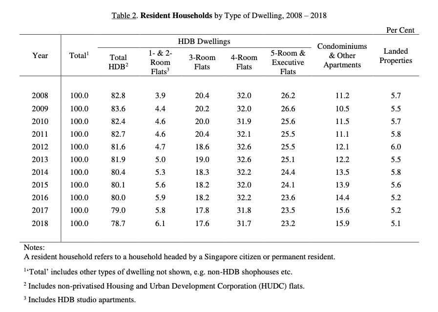
Quite clearly, there has been a decrease in 3,4, and 5-room HDB flats, while the percentage for condominiums has been growing.
| Year | ‘MOP-ed’ Units |
| 2018 | 17,687 |
| 2019 | 30,169 |
| 2020 | 24,163 |
| 2021 | 25,530 |
| 2022 | 31,325 |
(Stats based off data.gov.sg’s HDB/DBSS completion status)
And as of end 2019, there was a record 30,169 HDB units that hit MOP (almost twice that of 2018).
Theoretically, this would result in an increased number of ‘upgraders’.
(Update 29 January 2020: A recent article in the Straits Times has confirmed that 10,149 HDB unit-owners upgraded to Private Residential Developments, 14.9% up from the 8,795 units in the previous year)
Add in the estimated 81,018 flats (and we aren’t even talking about units at this point) hitting MOP in the next 3 years, and we’ve got one hell of an ‘upgrader’ demographic.
Further considering that the average MOP figures for the upcoming three years is 89.5% (or 27,006) of 2019’s 30,169 MOP-ed flats, and that the wage growth of Singaporeans have been steadily rising as a result of ‘benign inflation’, we can expect the relatively same number of upgraders as last year (if not more) making tangible private residential unit purchases.
Of course, the counterbalance is that with MOP status acquisition, units in these flats can now be fully rented out – resulting in an increase in rental options, which would naturally pull down demand on private unit purchases (even if only to a small extent).
Ultimately, this (potentially extended) uptake in the upcoming years would increasingly drive up demand (and hence housing prices) over the 3-year progression assuming no drastic policy/economical changes.
(New to MOP? Learn some interesting facts about it here. Alternatively, if you’d like to see a more detailed analysis of potential HDB Upgraders and their impacts, feel free to make a request at stories@stackedhomes.com!)
Household Growth/Unit Occupation Trend
Another key driver of demand is the household (growth) of Singapore.
This ranges from children moving out from their parents’ place (think couples with babies) to current unit-occupant trends (increase in single-occupant purchases) to an influx of foreign talents (increased rental/sales).
Basically an entire jumble of demographics and numbers which we will avoid going too in-depth into at this point.
To very briefly observe the impact of this, let’s first look at the growth in Singapore’s population over the last year.
- Locals
According to a Straits Times article late last year, local citizens accounted for 3.5million of the 5.7million total (that’s 61%).
The total growth was 1.2% from the year before (5,638,700 to 5,703,600) with:
- An increase in couples getting married (21,900 avg. from 2009-2013 to 24,000 avg. from 2014-2019)
- And increase in ‘citizen babies’ born (31,400 avg. from 2009-2013 to 33,000 avg. from 2014-2019).
Naturally, an increase in couples would mean more home-lookers.
On the other hand, we also know that the increase in babies would mostly have a follow-through effect 2-3 decades from now.
So working backward and looking at the baby-growth in the 1990s, you’ll realise that there wasn’t a massive baby boom then either.
What’s more, with an increasing number of children staying with their parents past their early adulthood as well as the ‘brain drain’ Singapore suffers (aka young people leaving Singapore for better prospects – work, education, travel etc.), marriage/new couples does seem to be the key impactor of local citizen housing demand.
This is where it gets interesting.
Now a bulk of these ‘new couples’ would be looking into BTO flats based on the available governmental subsidies.
Of course, there is the possibility that a section of them will eventually ‘upgrade’ post-MOP (as detailed earlier).
But if you were to siphon the ‘immediate’ new couples buying into the private residential sector, the figures do get substantially smaller.
- Foreigners
Singapore is well known for its engineered foreign population increase.
The 2% non-residential growth, as opposed to 0.8% residential growth in the last year, is a testament to this.
What’s more, with the new employment fairness protocols implemented just a few days back, we might be seeing an increase in foreign employment and potentially foreign growth in the coming years.
This naturally leads to an increase in housing demand – though a bulk of that would logically be suited toward rental deals.
The presence of the ABSD also puts a hold on wealthy foreigners making a quick buck in the Singapore market (and hence lowering potential demand in that regard).
And so while we haven’t looked too deeply into future population trends or even crunching the numbers (and hence the omission of an impact figure), we roughly understand the population nuances that affect demand – even if it does feel tamer than the HDB Upgrader factor mentioned earlier.
En Bloc Beneficiaries and Rising Household Income
Demand from en bloc beneficiaries may well be tapering off as we move into 2020, but there will still be a fair few that will look to upgrade or remain within the same area as their original residence.
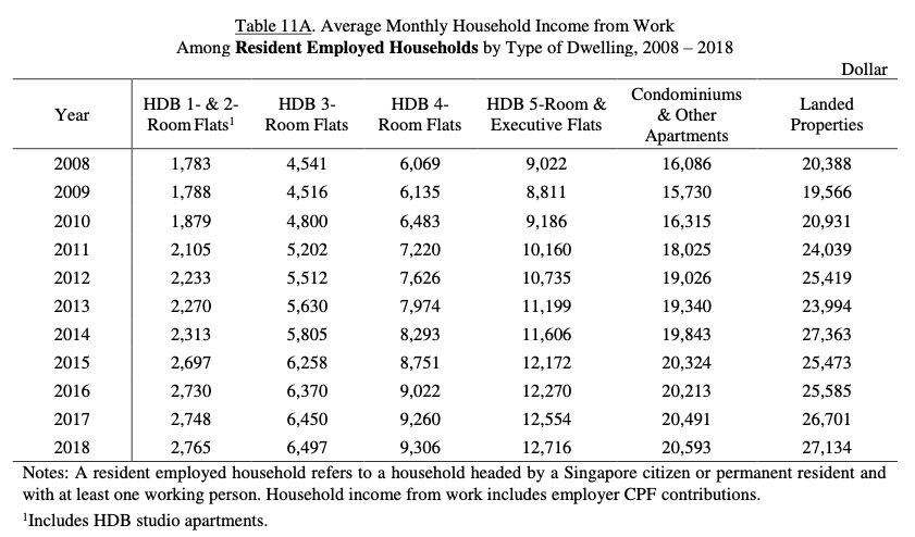
Lastly, let’s not forget the rising household income in Singapore.
Final Word (…And a Prediction)

And so what about the upcoming price trends?
With reduced GLS sales and an almost retired (for now) en bloc phase due to the ABSD hikes, pipeline units will naturally stagnate or decrease in the coming years (assuming no further measure implementations).
Based on this theory (as well as the supply calculation) and without including the other factors (economic plummet/growth etc.) for now, vacancy rates will naturally rise as unsold pipeline units from the en bloc phase are completed.
A minute price dip or a slight, but leveled out price growth caused by average demand from the impending (pricier) new launches, tiny pockets of investors and the ‘unphased-by-index’ homebuyers could naturally be on the cards.
However once pipeline units are nearly diminished (and depending on GLS allocations) nearer to 2H 2022, we could well see higher demand of units and land (from developers who were prioritising stock clearance before), which would naturally result in a cycle of dipping vacancy rates and hence price index hikes.
In fact, a partial (and cautious) en bloc cycle (similar to 2010-2012 phase) could very well happen during that period – and depending on how the trends are interpreted by investors, developers and the government at that time, we could see a few more of these phases and their respective price-related trends.
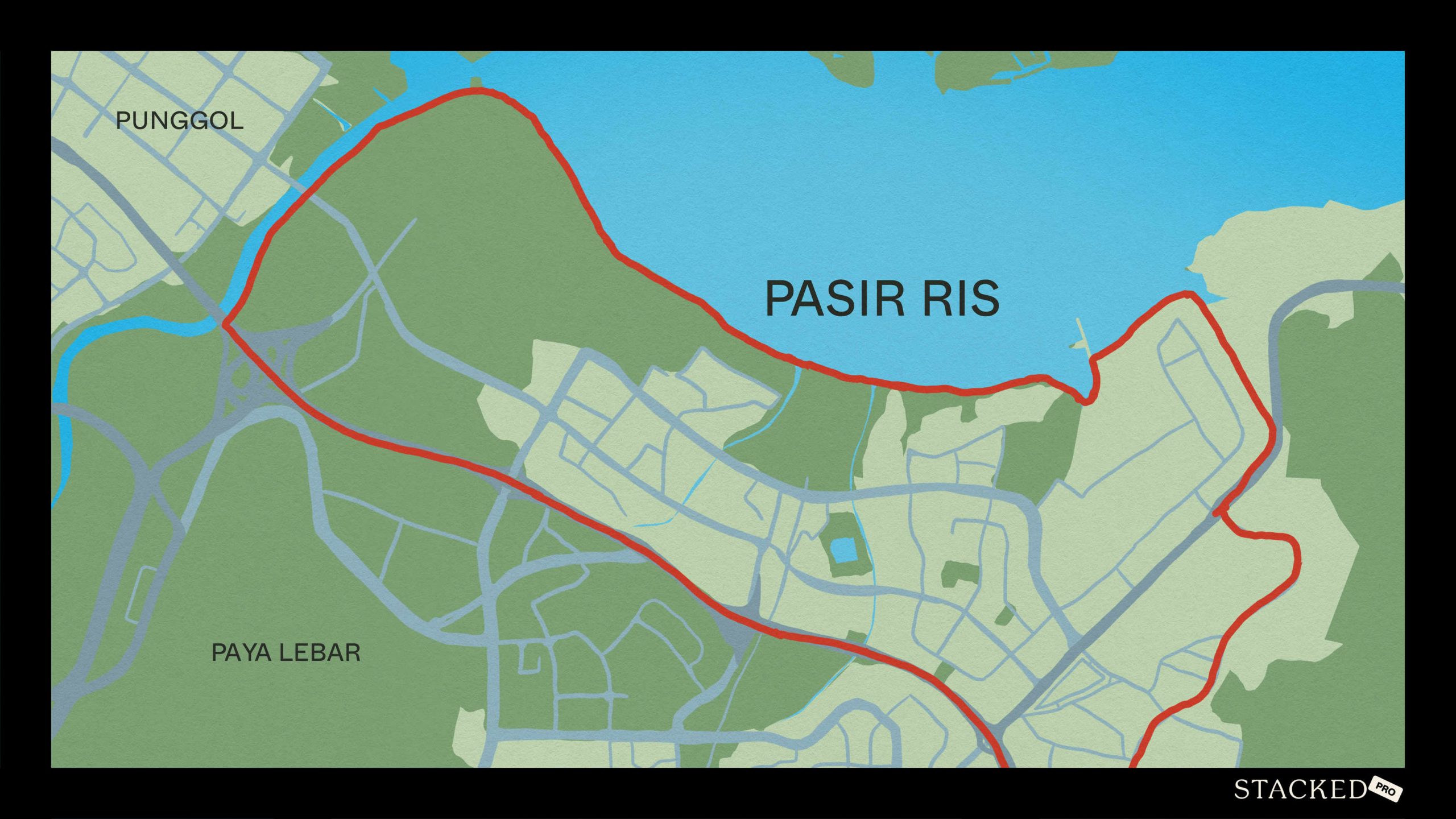
That is till the arrival of pipeline units from the Greater Southern Waterfront and Former Paya Lebar district.
A new era of the real estate industry that is guaranteed to bring with it a whole scope of market changes – and whether a generally expected price fall from an oversupply during that period will really be on the cards… remains to be seen.
One thing that you can count on in the meantime though – we’re definitely not going to be running out of new showflats to visit in 2020 anytime soon.
At Stacked, we like to look beyond the headlines and surface-level numbers, and focus on how things play out in the real world.
If you’d like to discuss how this applies to your own circumstances, you can reach out for a one-to-one consultation here.
And if you simply have a question or want to share a thought, feel free to write to us at stories@stackedhomes.com — we read every message.
Frequently asked questions
How have housing prices in Singapore changed over the past decade?
What impact did the 2013 cooling measures have on Singapore's housing market?
Does an oversupply of housing units always lead to falling prices in Singapore?
How does demand influence housing prices in Singapore?
Why might recent housing supply not cause a sharp decline in prices like in previous years?
Reuben Dhanaraj
Reuben is a digital nomad gone rogue. An avid traveler, photographer and public speaker, he now resides in Singapore where he has since found a new passion in generating creative and enriching content for Stacked. Outside of work, you’ll find him either relaxing in nature or retreated to his cozy man-cave in quiet contemplation.Need help with a property decision?
Speak to our team →Read next from Property Market Commentary
Property Market Commentary Why SingHaiyi Bought Loyang Valley For $880 Million: What The En Bloc Sale Means For Singapore Property Buyers
Property Market Commentary Singapore Retail Rental Market Outlook 2026: Prime Retail Rents May Rise Up To 4%

Property Market Commentary Malaysia Property Market Outlook 2026: What Singapore Buyers Need To Know

Property Market Commentary How the US–Iran War Could Affect Singapore Property Prices and Mortgage Rates
Latest Posts
Singapore Property News 4-Room Flat at Bedok South Horizon Sets New Bedok Record at $1.17M

PRO Pro Where To Buy A Condo In Serangoon: Prices, Best Areas And Growth Trends In 2026

Property Advice Hundred Palms, Riverfront Residences Or Tampines Trilliant — Which Is The Better Buy For A Young Family Today?












8 Comments
Very interesting analysis. Thanks for putting in the effort to write this.
This analysis make me see stars and yet very comprehensive insight into demand and supply. How about increased nterest rate as one of the factors?
Hi reuben, will u be able to identify the breaking point whereby the price index starts to decline or. Increase given the data that u have.
Eg: when the pipeline units reaches certain point, the price index will starts to reduce. Of course all analysis will not be 100 percent but at least it gives us a glimpse of what to expect.
By the way, how did u manage to obtain so much data…. Can I know the data source?
Hi reuben, it sure was a indepth analysis. But do u think u can predict the breaking point whereby the price index will start to decline or rise.
Eg: when the num of units in the pipe line reach a certain level or range, then price index will starts to decline or rise. Well I am not too sure about analysis since the prediction cannot be 100% accurate but will u be able to see the pattern trigger a decline price index.
I feel housing loan interest, rate also have a impact on the demand.