Inside A $65k Ubi BTO Transformation: How This Couple Created Their Raw Yet Playful Home
December 20, 2023
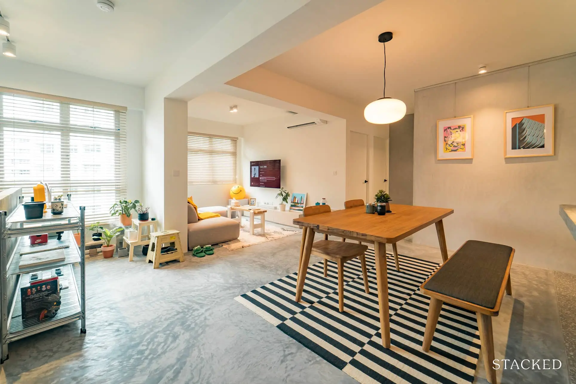
Sometimes it’s not about the sheer square footage of your unit, but how you design around it. Case in point, this flat we found in Ubi, which combined good space planning (with a touch of Feng Shui considerations to boot), to really open up the unit. We spoke to the owners, N and P (@ubigroovy), about their experience and inspiration in the renovation process:
So many readers write in because they're unsure what to do next, and don't know who to trust.
If this sounds familiar, we offer structured 1-to-1 consultations where we walk through your finances, goals, and market options objectively.
No obligation. Just clarity.
Learn more here.
Seventh time lucky, and a good renovation budget
There was a lot of patience and, at first, disillusionment with the balloting for the flat. N says that: “ It was our seventh try for our BTO, so you could say that our hopes and dreams were pretty much dashed and it was just a case of us going through the motions when we applied.”
This time around, however, the couple got lucky and secured the flat thanks to a decent ballot number. The location – at Ubi Grove – also met practical considerations:
“It also fell along the geography of where our ideal location would be. We’ve always preferred the east where it is not too far from town or the airport. Food options are plenty, and it’s just a couple minute’s drive away from Bedok, Katong/Joochiat and Geylang. Having the MRT station right at our doorstep was also a huge bonus.”
Given the long wait, we can understand the degree of care lavished on the home for renovations. The couple set aside $65,000 for renovations. If all other elements, like furnishing, are included, they say it would come to about $100,000 all-in.
They also added that “We’re currently in the process of slowly sprucing the home up so there’s definitely more as we’re just taking it purchase by purchase.”
A balance between Feng Shui and efficient space planning
N shared that: “Juggling the space planning around our feng shui requirements and coming up with in-between solutions was the hardest part. There were items and furniture which we needed to place in certain directions and facings; but we ended up canning some of the advice anyway.”
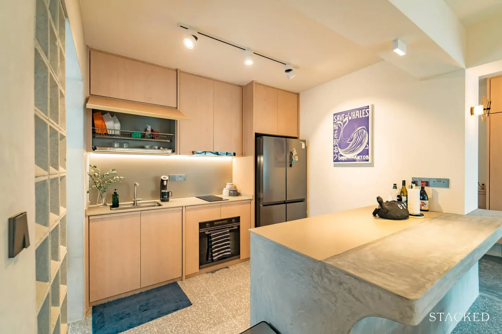
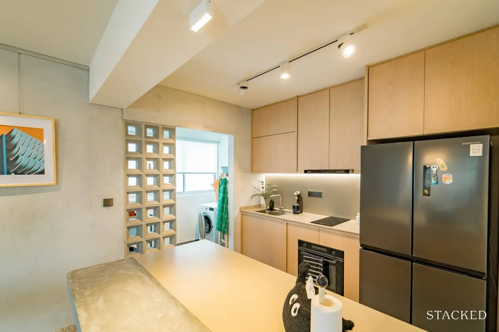
Another challenge was in the kitchen: “Working around having a setup that allowed for sufficient kitchen countertop space was also tricky. We solved it by making full use of our yard and choosing a smaller induction hob.”
Nonetheless, the couple did achieve an interior consistent with their initial vision, thanks to the help of their Interior Designer.
They said that: “We picked Jun from Author’s Interior, who exuded plenty of enthusiasm and genuine interest for our project. He understood our references and provided endless ideas and suggestions in the process, which gave us plenty of confidence to go with them. It also helped that he passed the personality vibe check, and ticked off a lot of our budding concerns on horror reno-stories we’ve heard.”
It also helped that they were not too rigid in their design choices:
“There isn’t really a style we wanted to confine ourselves to,” N says, “So the approach we took was to build a neutral base canvas for the house that would allow us to grow and style it accordingly as we lived into it. Watching a lot of episodes of StackedHomes also definitely played a part!”
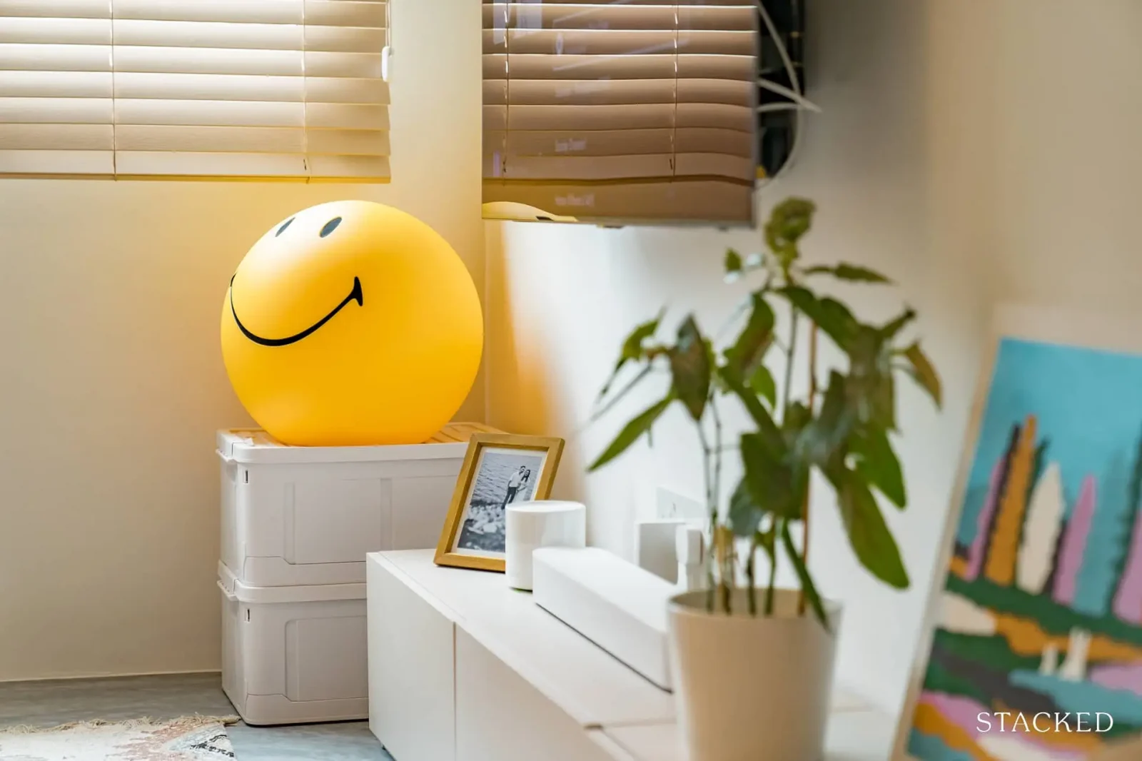
The biggest change, however, was one that helped to maximise the available living space:
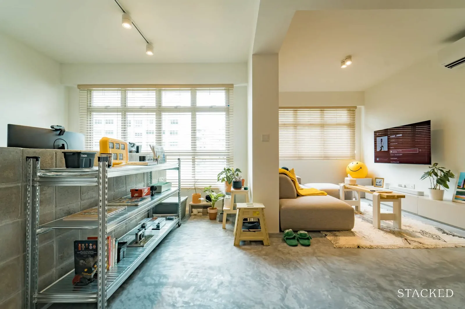
“We broke down the living room,” N says, “As we needed more communal space to host guests and move around more freely.
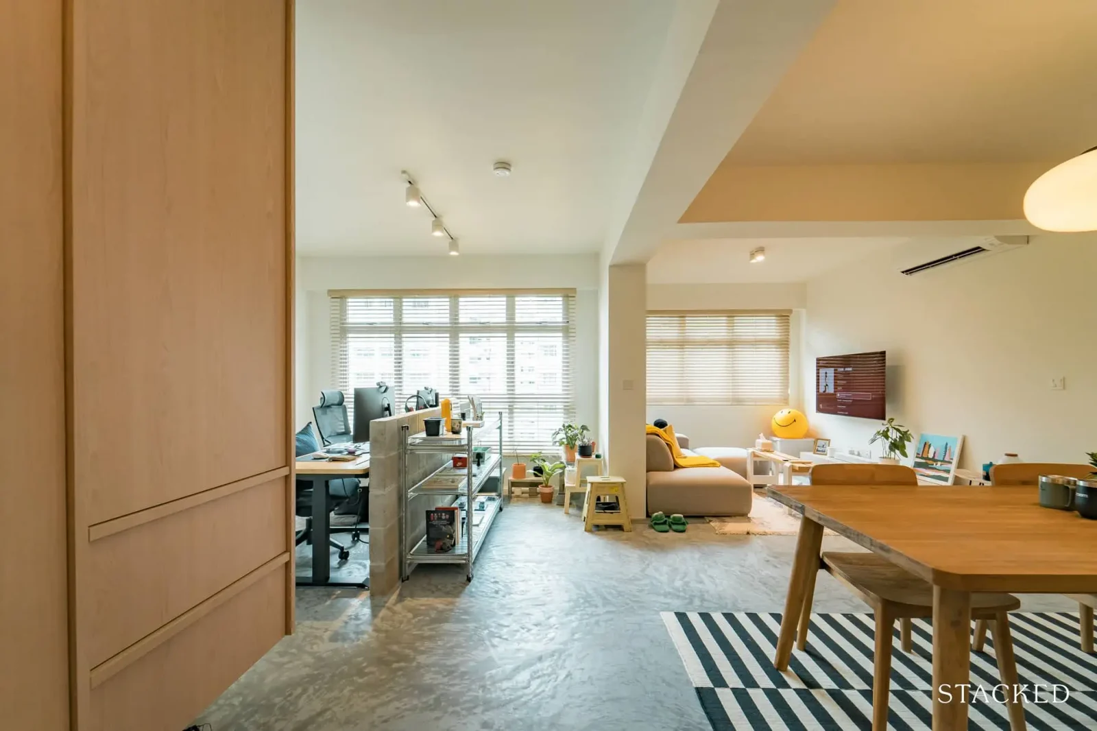
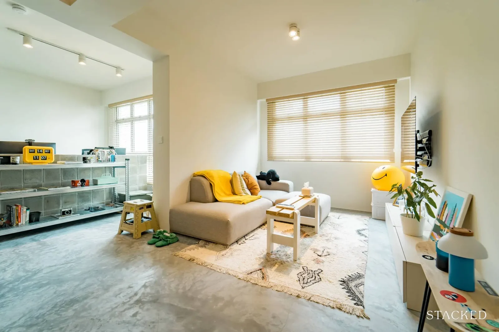
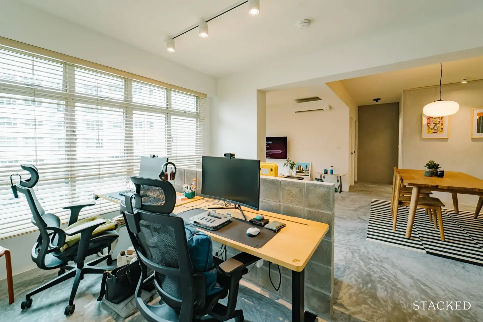
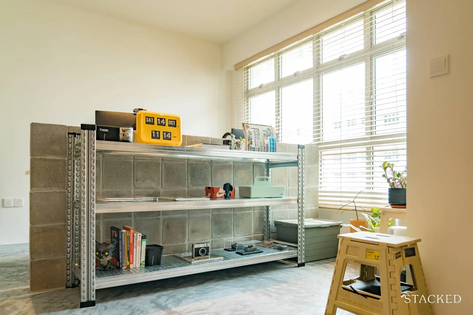
Keeping in mind that we still wanted a spare room, the study was weaved into the living space too; we segregated it with a half-height concrete wall so we could have the living area.
We also liked the idea of a seamless wardrobe for our master, so to cater to that we ate a little into the space of the spare room, to create a little walkway instead.”
Making major changes to some of the rooms
One of the biggest transformations was in the living/dining space. This area, which was hacked into an open space, is right in front of the kitchen. N says: “As we have a habit of eating and watching TV, we added a mount that allows us to bring the TV near a 90° angle, for a better view from the dining area and even the kitchen space.”
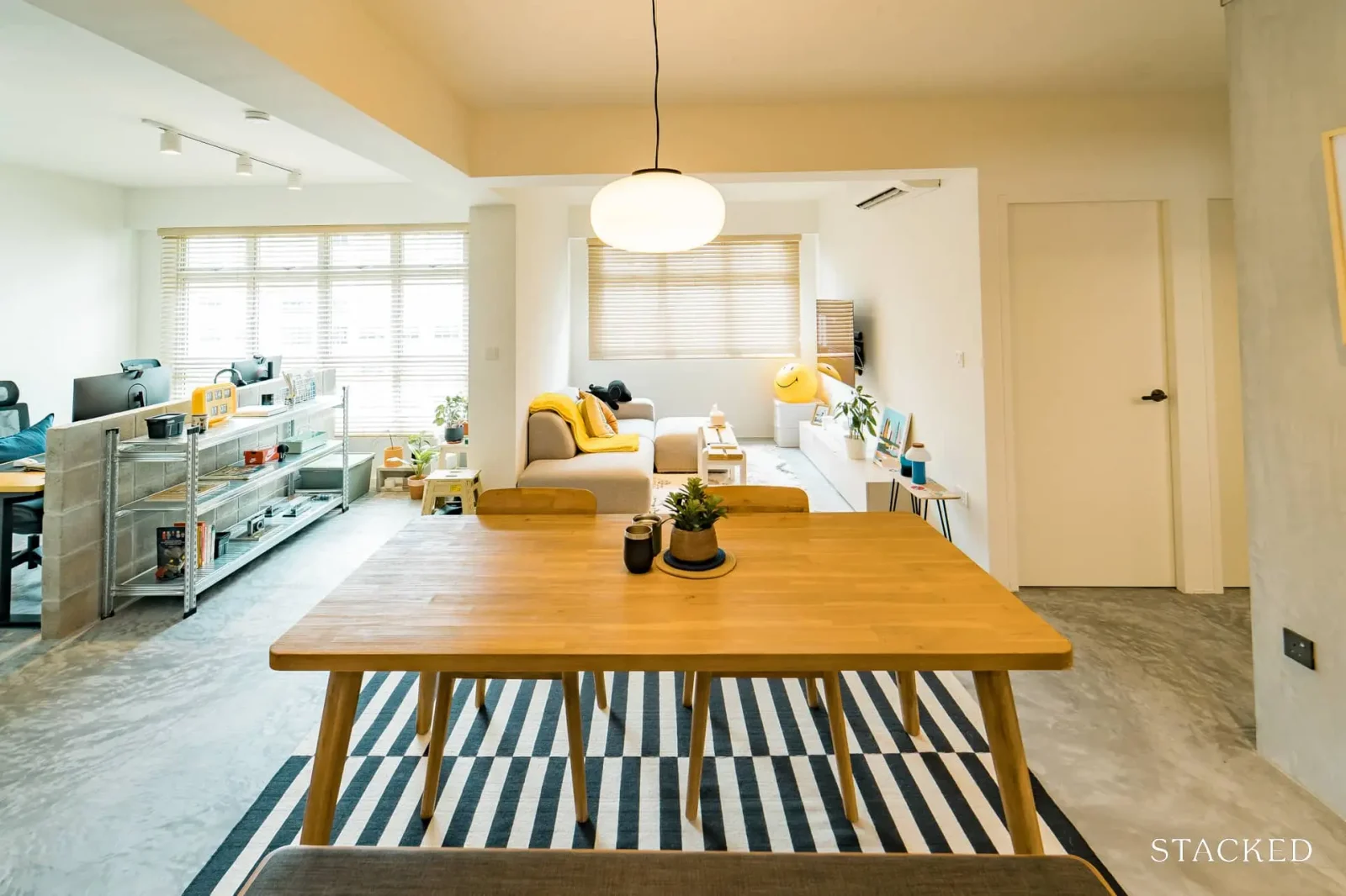
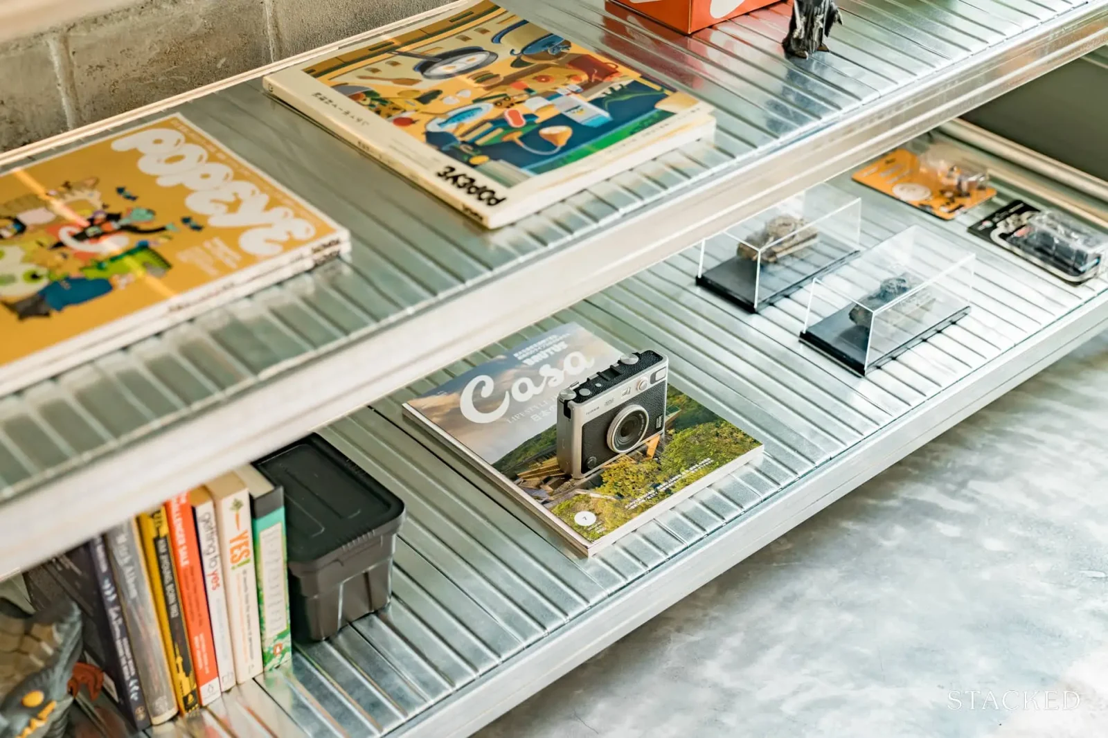
The opened-up space allows for a visual connection with the study. N says that: “We’ve also grown to love our study/work area and how it allows us to peek over our computer screens, to see what’s going on in the living area instead of staring at a wall.”
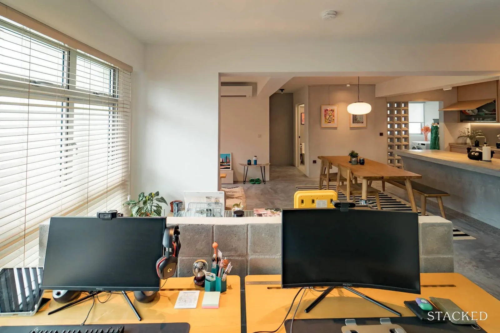
For the kitchen area, the couple “built a peninsular, to segregate the kitchen and living space.
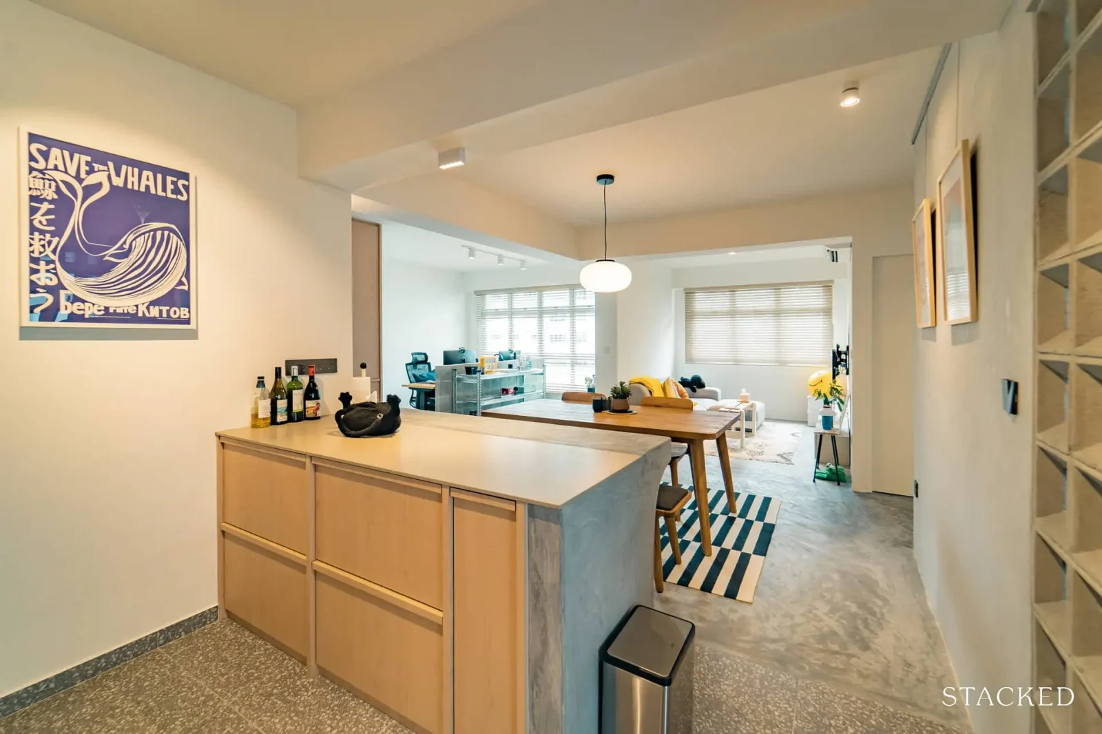
We also did away with the HDB yard door and windows. to create a seamless extension outwards where we place our washer and other kitchenware.
Windblocks were also introduced in hope that there’ll be some play of light during certain times of day; but sadly there hasn’t been much of that.”
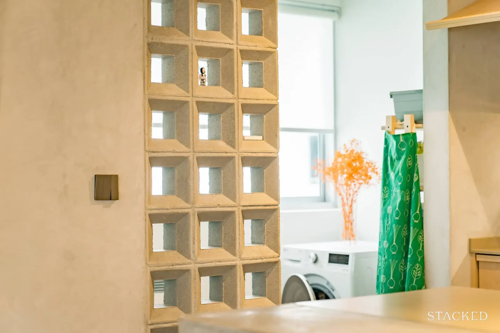
Nonetheless, the kitchen also contains one of the couples’ favourite elements of their home:
“We’ve learnt to discover that we enjoy standing behind our kitchen counter, as it serves as a little outpost that allows us to oversee the entire living space; especially when guests are over and happily mingling/enjoying the environment.”
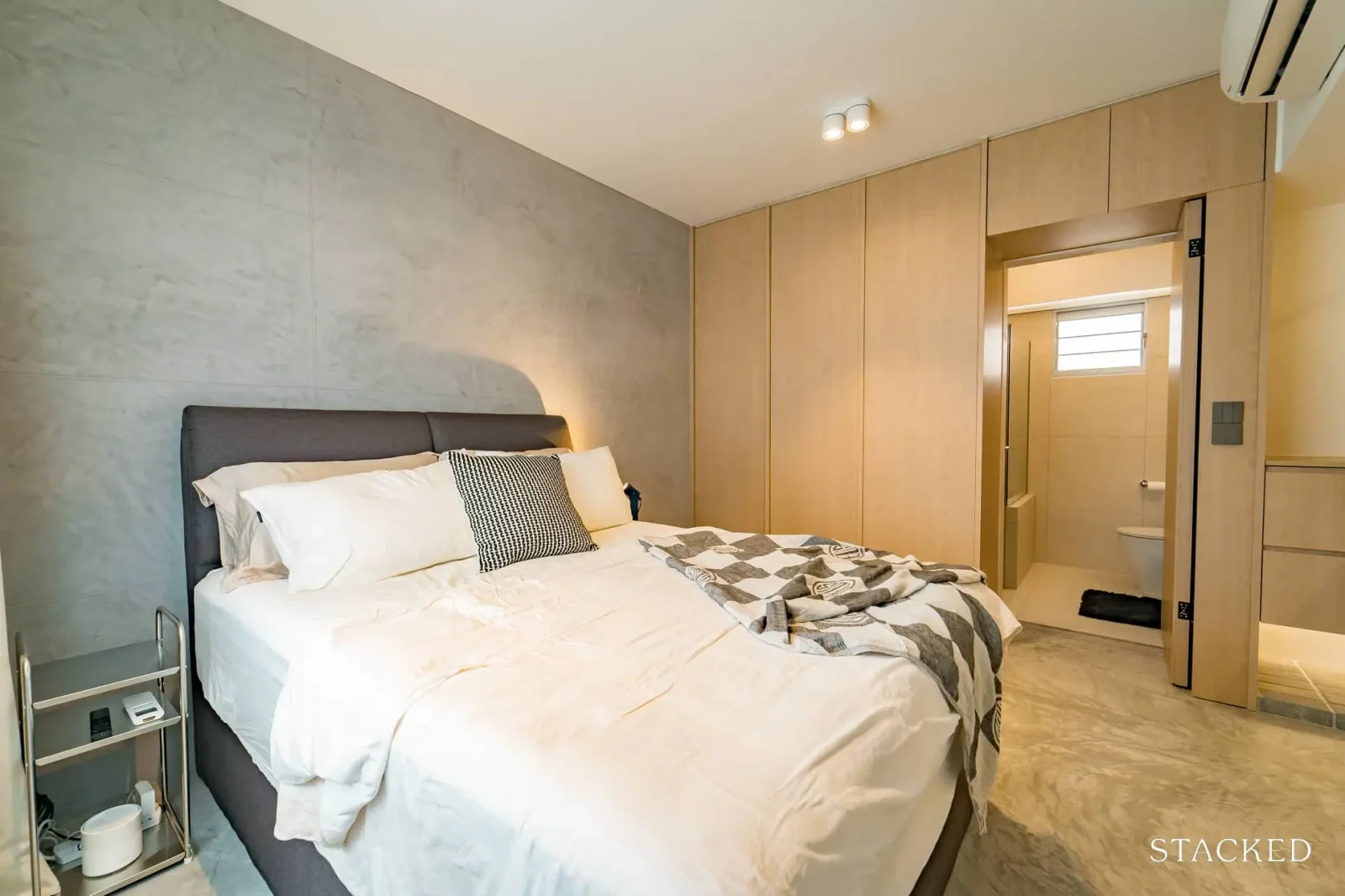
As for the bedrooms, the master bedroom was given some extra space at the expense of the bedroom next door. This was to allow for more storage space in the master bedroom. Also, a hidden bathroom door was created, between the wardrobes.
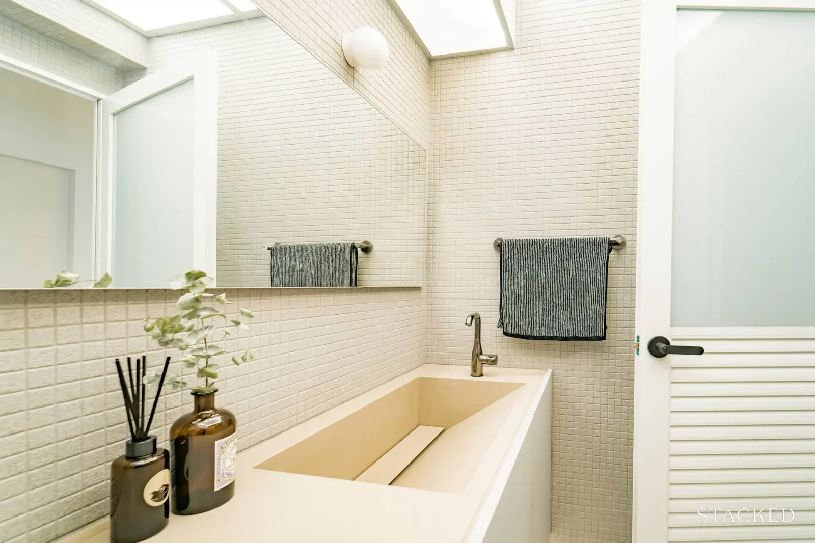
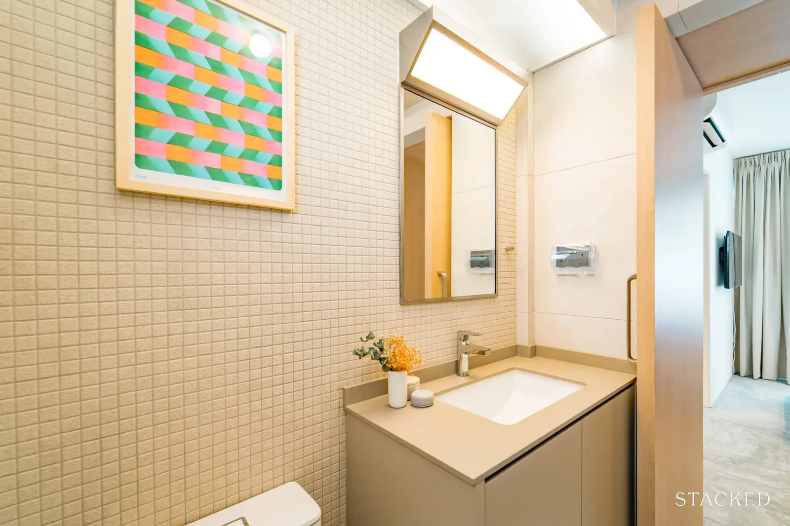
For bathrooms, the couple removed the common bathroom shower altogether. This was to make space for the bathroom vanity. Mosaic tiles were used, integrating the sink, and a lightbox on the ceiling illuminates the space better.
Furnishing the rooms
N says that when it came to furniture, “We started off by building on core pieces like bed frames, sofa, and dining first, looking at popular and recommended stores. We noted the practicalities and aesthetics of each piece, before finally narrowing it down to purchase.
Smaller puzzle pieces like side tables and decorative ones are allowed to fall in place, as we live and figure out how we work things out in our daily routines.”
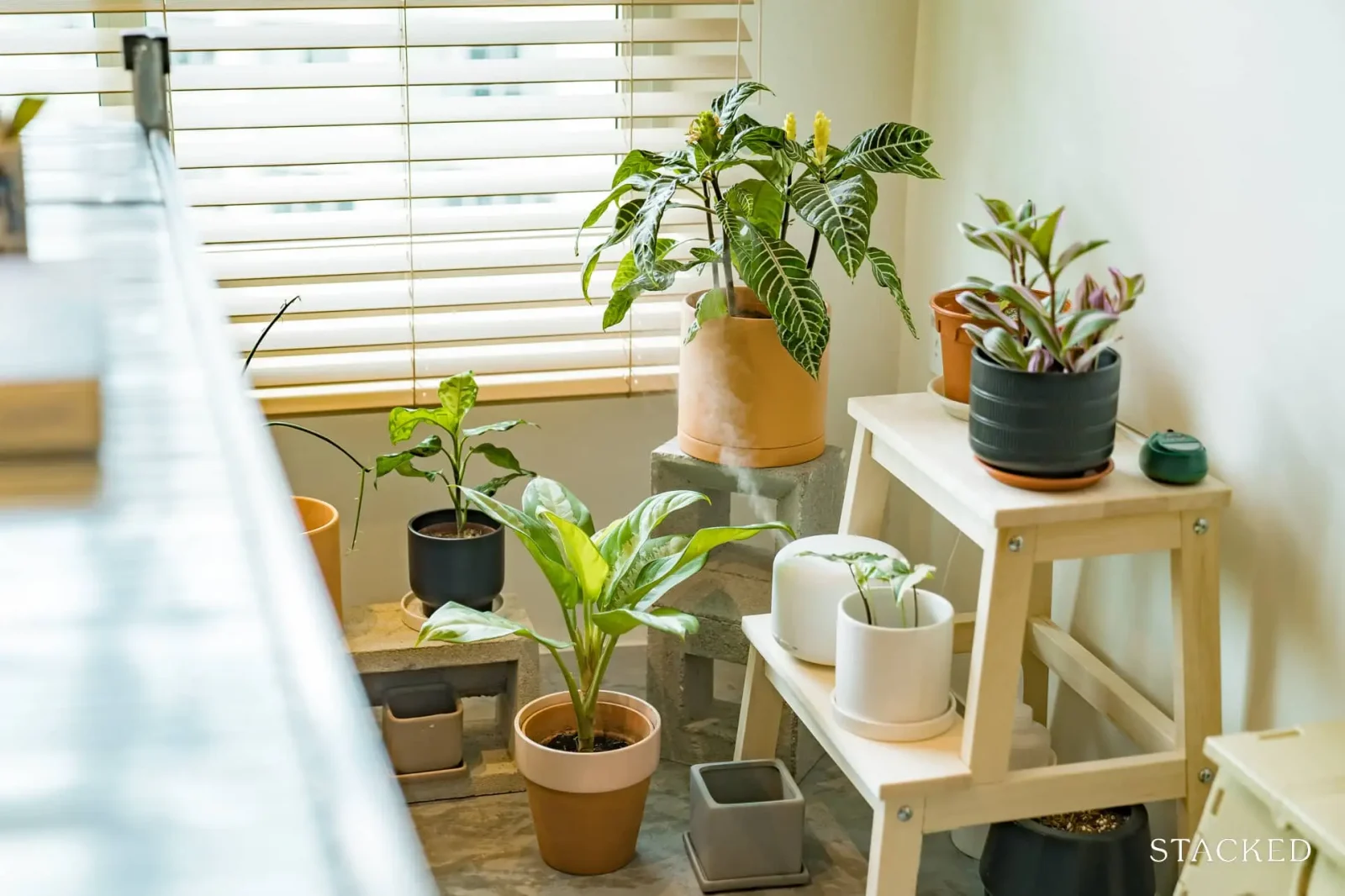
As far as possible, the couple aims to get items that serve multiple purposes. Their bench also serves as a coffee table, and their IKEA step ladder can also serve as a plant stand in future. They consider their decorative process to be only half-complete so far.
Lessons and advice from the renovation process
In the renovation process, the couple learned a lot about “the intricacies of space planning, and how light can make a whole world of difference for a space.” From their experience, they have some advice for new homeowners looking at renovations:
“Although it can be stressful for most, our advice would be that new homeowners don’t forget to have fun and enjoy the process of it all. Breaking down your living habits and what works for you helps a great deal too! And of course, be kind to your ID’s and whoever’s helping with anything at your home.”
For more renovation ideas, as well as homeowner experiences and stories, follow us on Stacked. We’ll also provide you with reviews that show different layouts, to help you pick your next home.
At Stacked, we like to look beyond the headlines and surface-level numbers, and focus on how things play out in the real world.
If you’d like to discuss how this applies to your own circumstances, you can reach out for a one-to-one consultation here.
And if you simply have a question or want to share a thought, feel free to write to us at stories@stackedhomes.com — we read every message.
Ryan J. Ong
A seasoned content strategist with over 17 years in the real estate and financial journalism sectors, Ryan has built a reputation for transforming complex industry jargon into accessible knowledge. With a track record of writing and editing for leading financial platforms and publications, Ryan's expertise has been recognised across various media outlets. His role as a former content editor for 99.co and a co-host for CNA 938's Open House programme underscores his commitment to providing valuable insights into the property market.Need help with a property decision?
Speak to our team →Read next from Home Tours
Home Tours Inside A Minimalist’s Tiny Loft With A Stunning City View
Editor's Pick This Beautiful Japanese-Inspired 5-Room HDB Home Features an Indoor Gravel Garden
Home Tours A Family’s Monochrome Open-Concept Home with Colour Accents
Home Tours A Bright Minimalist Condo Apartment With A Loft
Latest Posts

Singapore Property News HDB Resale Prices Fell — But A Third Of Buyers Still Paid $800K+ Last Quarter. Here’s Why

Singapore Property News Three Strata Office Floors In Suntec Priced From $135M

Singapore Property News This Freehold Desker Road Shophouse Is Going For $10.5M











0 Comments