How To Decide Between A New Launch Or Resale Condo (From A Floor Plan Perspective)
February 29, 2024
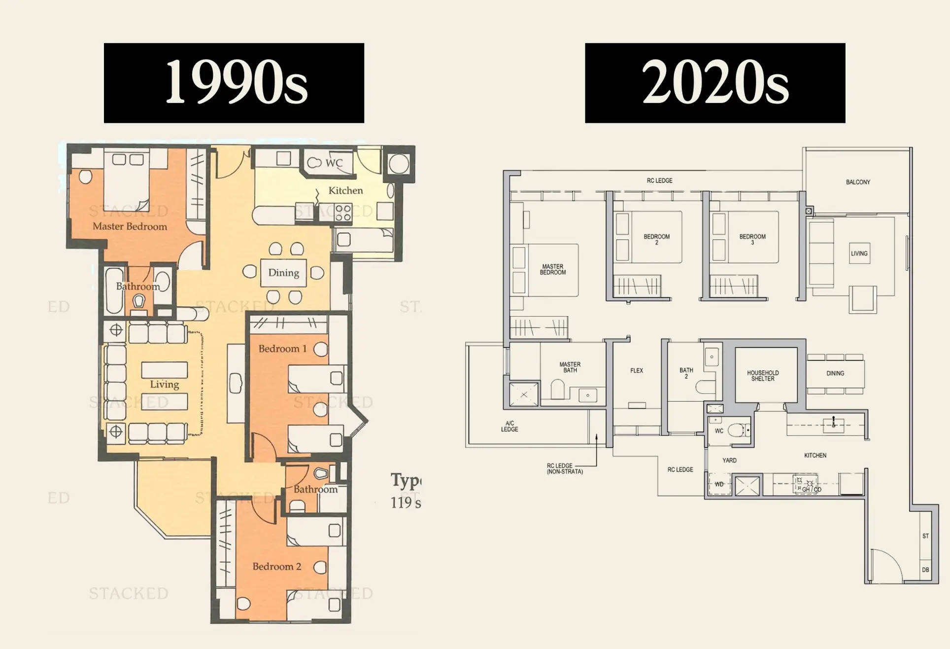
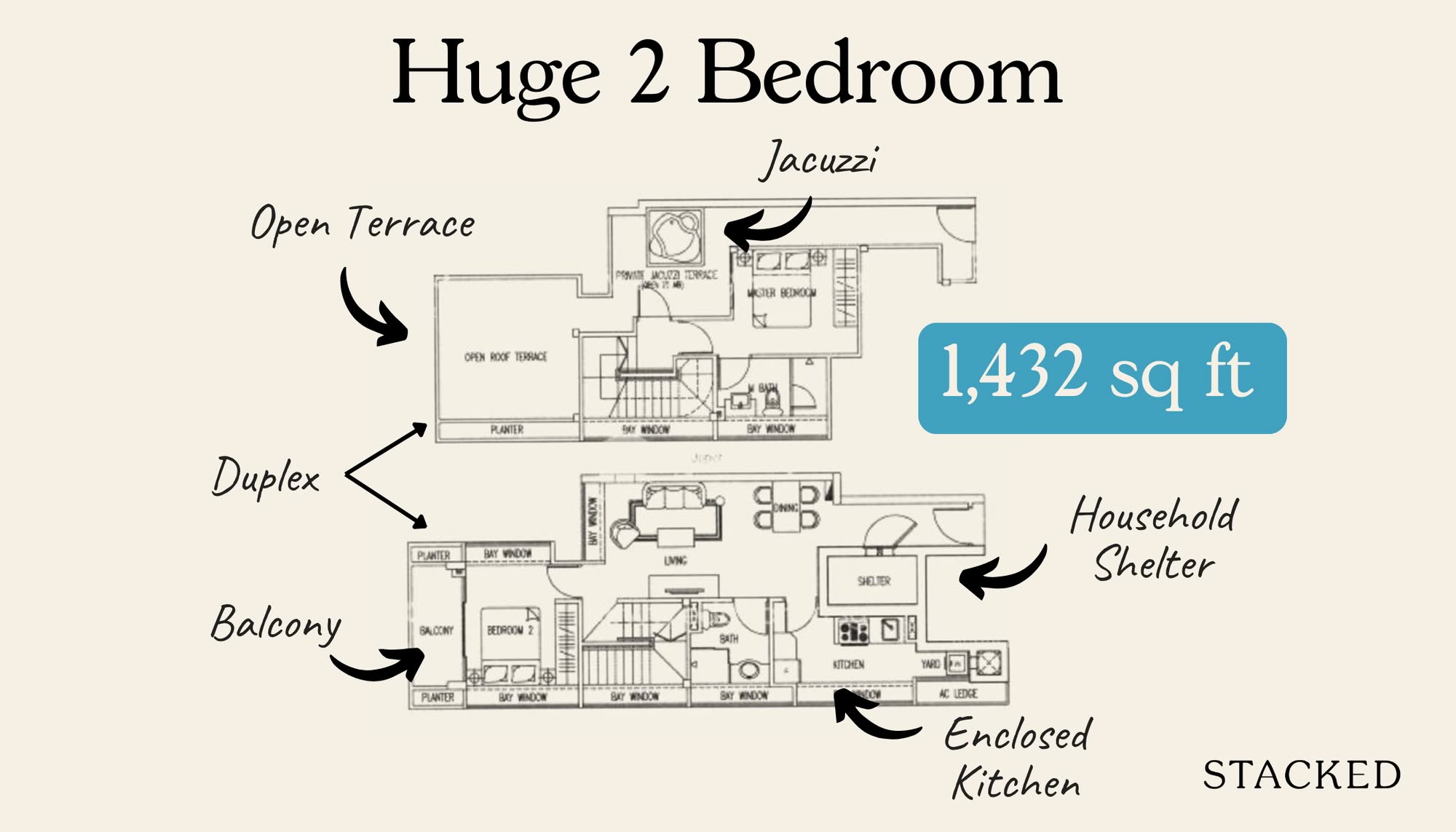
Trends change, and the condo market is nothing if not subject to trends. From squash courts to bay windows, many things have come and gone since the first condo was built in the 1970s. And whilst it’s common knowledge that old condos tend to be bigger, some buyers may also prefer their features and layouts. For example, many older 2-bedroom condos will have a proper yard for washing and drying clothes and an enclosed kitchen – but you’d be hard-pressed to find that in a new development today.
So for those deciding between a newer condo or an older resale one, here are some of the differences you’re going to see:
So many readers write in because they're unsure what to do next, and don't know who to trust.
If this sounds familiar, we offer structured 1-to-1 consultations where we walk through your finances, goals, and market options objectively.
No obligation. Just clarity.
Learn more here.
A quick note on “old” vs “new”
In a loose sense, when we say old, we’re referring to condos from the 1990s or earlier. You may occasionally find condos that are a bit ahead of their time, or which buck the trend; and older condos are also harder to generalise, as those from the ‘70s and ‘80s tend to be more experimental.
1. Opening into an antechamber or a nook, versus opening directly into the living room
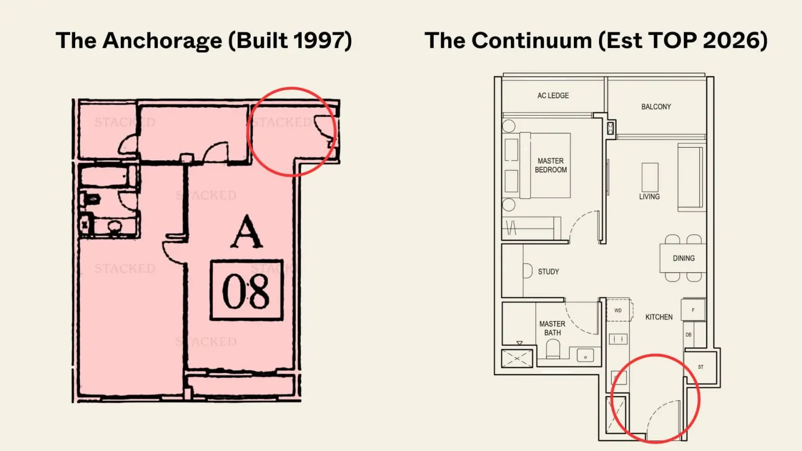
A common example of this is a small room or corner where you have an umbrella stand, shoe rack, or sometimes just an ornamental greeter like a vase/painting. From here, you then head into the main living or dining area.
This can be found in some older layouts, but newer condos tend to eschew this as a waste of space. For newer projects (especially for the smaller 1 and 2-bedroom units), the front door is more likely to just open directly into the joined living/dining area.
While most of us are now used to this, there are still a handful of homeowners who aren’t big fans of it. We’ve also been told that such areas are ideal for Feng Shui greeters if you’re a believer (e.g., a place to put the water feature, chimes, or other appropriate Feng Shui things).
You can always make your own if you need to: get a designer to put in a partition, and create a small nook before guests step into the living room.
2. An abundance of floor-to-ceiling windows is a recent thing
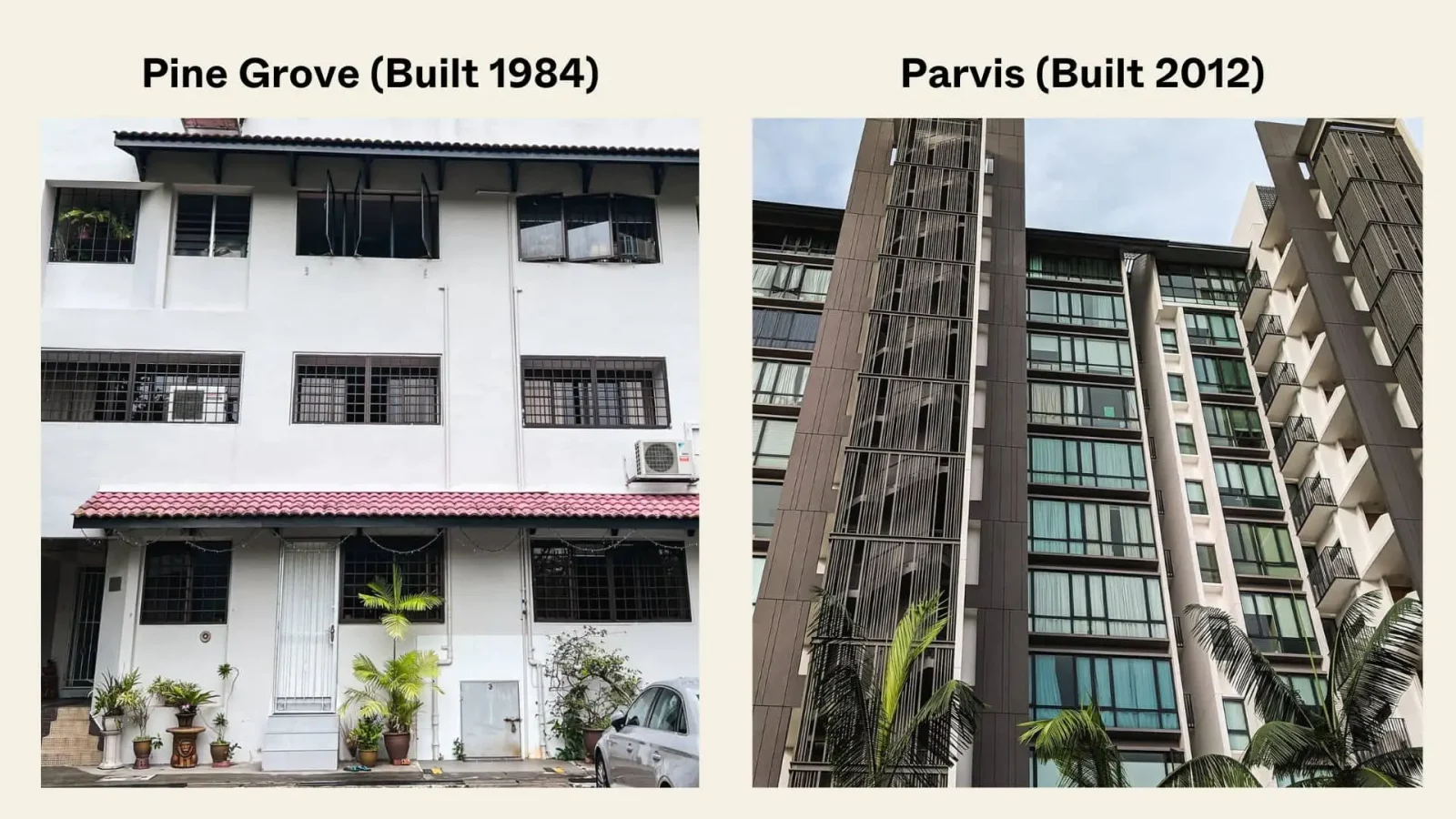
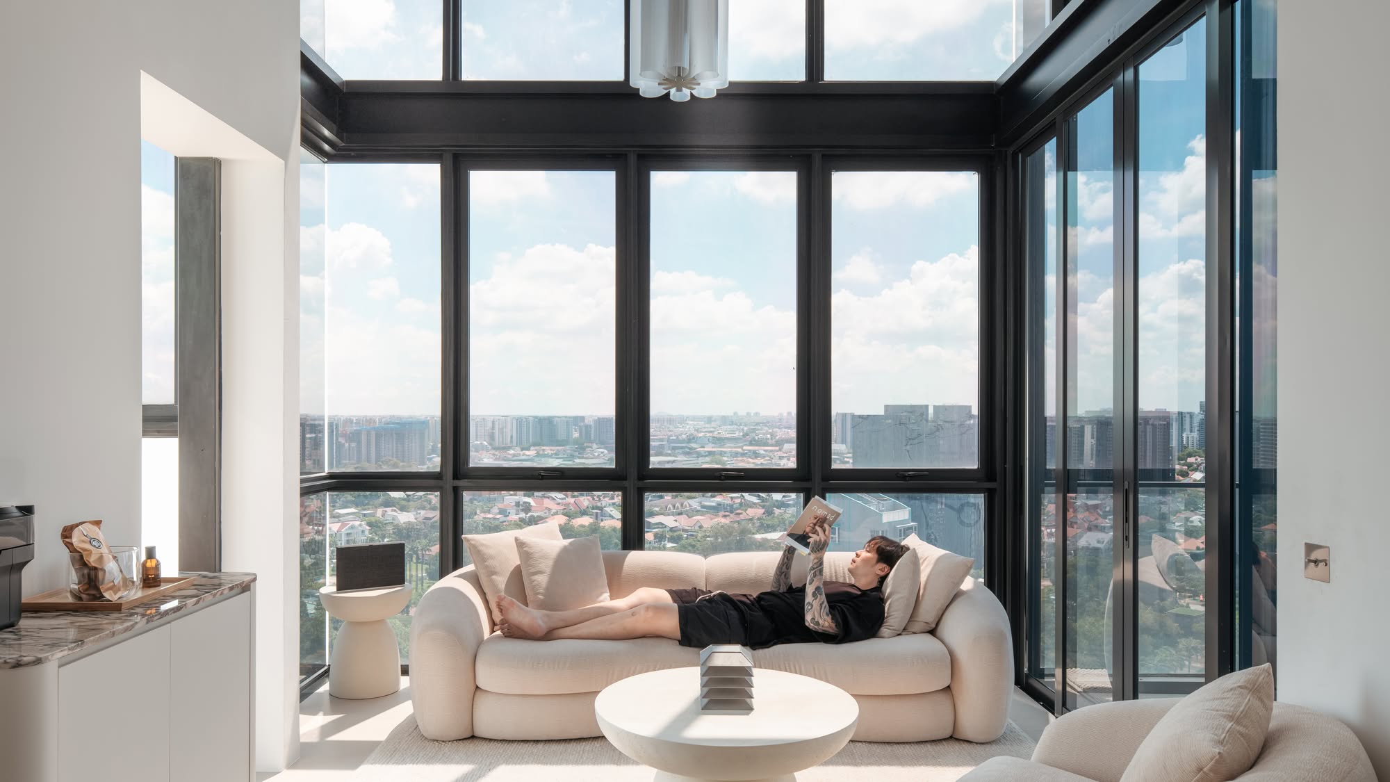
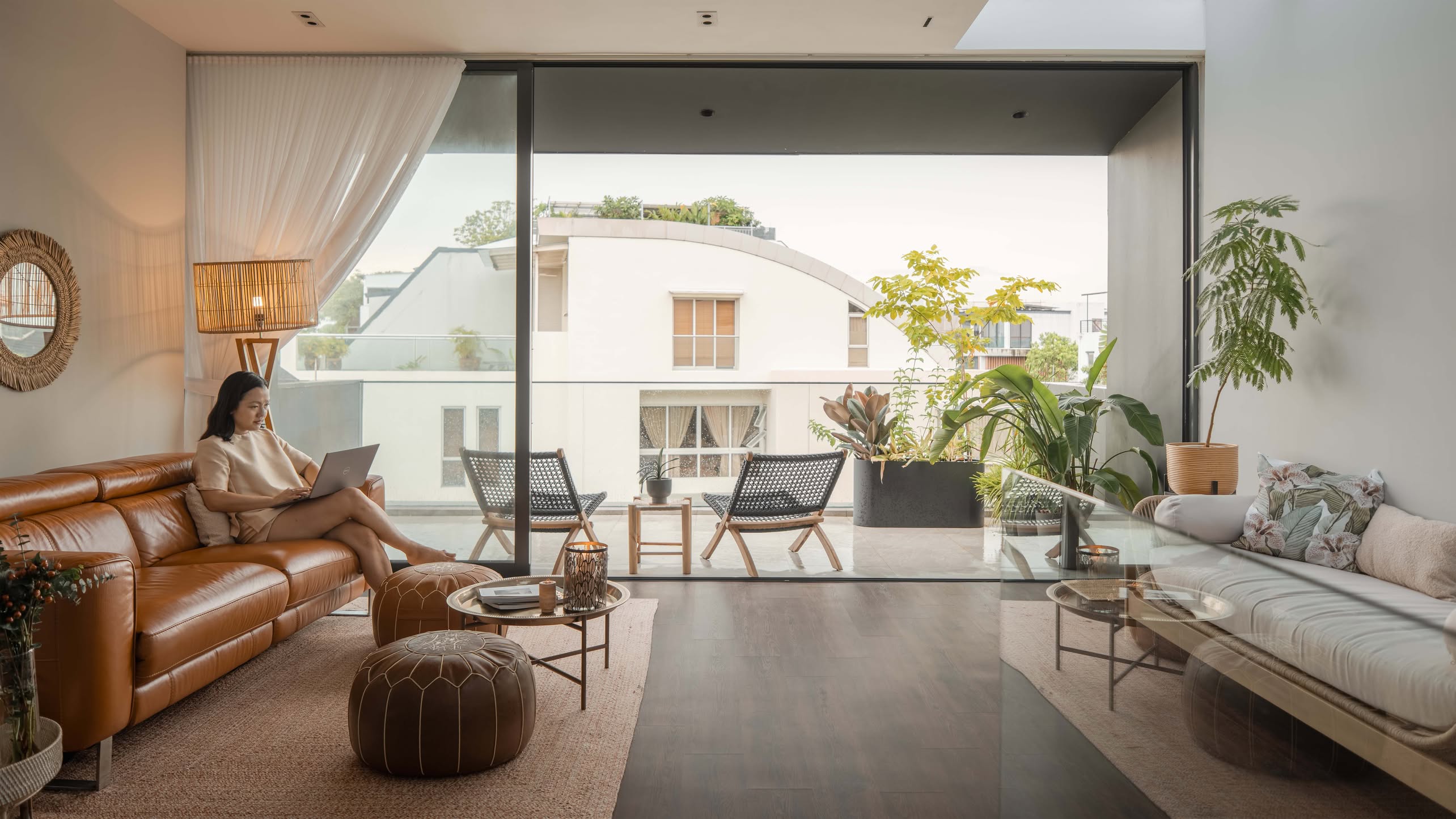
Over the past decade, condos have begun to use more floor-to-ceiling windows. These provide better natural light, and look much more impressive; but call it a testament to more advanced maintenance methods too.
In the past, these types of windows were used much less often, because of the fears of maintenance issues. There has to be regular washing for these large panels, and you’ll more frequently see cleaning crews on a platform outside. And whilst they can provide a great view, they do also result in a loss of privacy unless you keep the curtains drawn (especially for the ground floor units or lower floors).
For older condos, windows tend to be smaller, and are more likely to be casement windows; not all too different from what you may find in HDB flats, minus the grilles. This isn’t always a bad thing though, as damage is easier and cheaper to fix, and you can safely clean the exterior from inside your house (please don’t lean too far out or get your helper to stand on a stool though, we don’t want to be responsible for that).
For the floor-to-ceiling windows, if you’re on a higher floor, you have to bear with any exterior stains and streaks until the condo’s next round of cleaning; as there’s no way for you to clean it yourself.
3. Segregated living and dining rooms
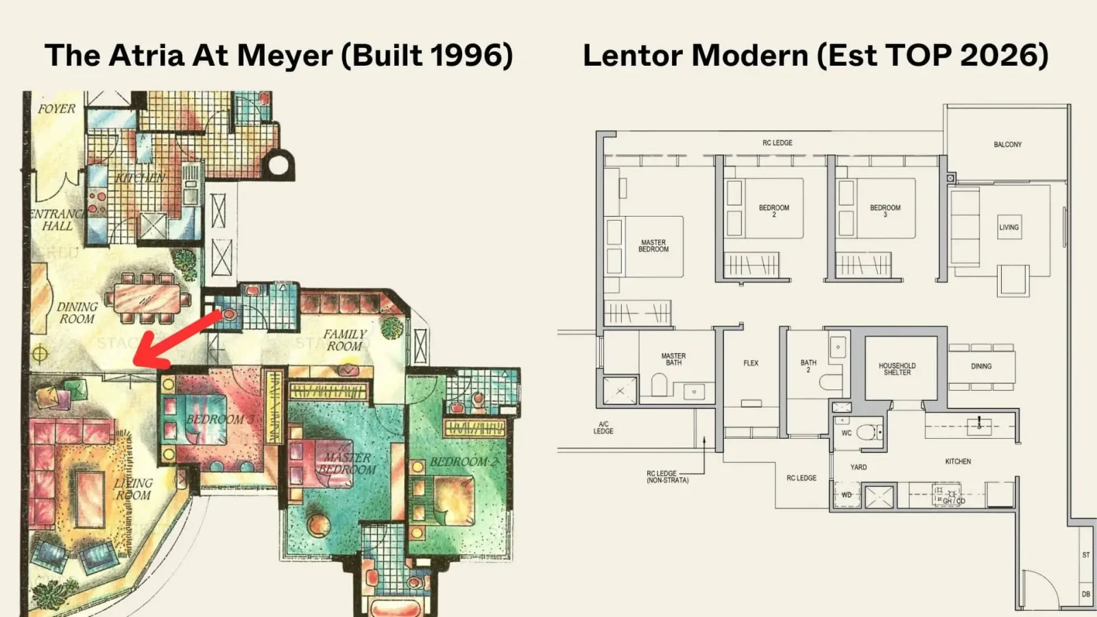
The dining room is in danger of extinction, in Singaporean homes. Perhaps it’s a carry-over from HDB flats, where some people do eat in the kitchen. More likely though, this has resulted from having to optimise space in the newer developments. So when it comes to newer condos, there usually isn’t any physical barrier between living and dining space.
(Also, some kitchen islands are designed to be dining areas, and can include bar taps and stools to double as a dinner area).
In older condos, however, you can still find enclosed dining rooms. Traditionalists may enjoy this, and some families feel it helps with interactions at dinner. There is, for instance, a tendency to stare at the TV while eating, instead of talking to each other. And from the experiences of some homeowners, the “vibe” does get a bit lost, when they transition from an enclosed dining space to a newer, more open home.
On the flip side, some homeowners despise enclosed dining spaces, claiming they trap smells and make it more difficult to cater to large dinner groups. If you’ve had to go in and out carrying food during a reunion dinner, you’ll know what they mean.
4. How simultaneously stylish and lethal the staircases look
If you believe the developers and interior designers, their staircases are all equally regulated and safe.
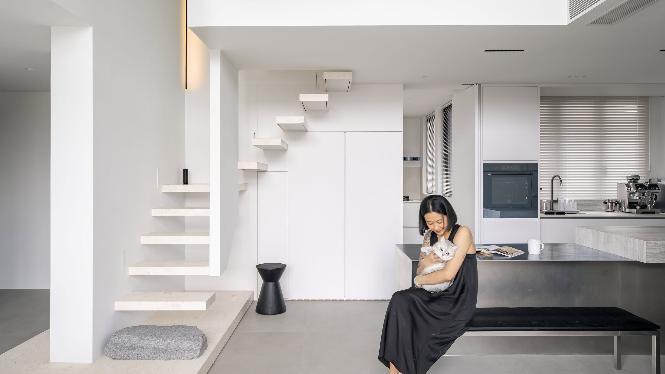
But if you compare a staircase in an older condo, with its traditional solid design, and the fancy “floating” steps and questionable handrails of newer condos, most would agree the former looks safer.
This is a love-it-or-hate-it thing; if you love the fancy look of minimalist, glassy, staircases, you’ll decry traditional stairs as an ugly feature (and they may not go well with more contemporary design themes). On the other hand, some homeowners can’t look at a semi-transparent, glass stairwell and not immediately think of breaking their necks with one slip.
We’d suggest an alternative, like a spiral staircase, which can bring the best of both (but these can be pricey to install and more difficult for the less mobile to traverse up and down).
5. An obsessive dislike of handles has set in
If a newer condo comes with cabinetry and other storage spaces, it’s almost always a “hairline effect.” These are the sleek, flat surfaces which you may stare at and grope at for around 30 seconds before you finally locate the concealed handle.
These seem to be on all the new unit cabinet doors, cupboard doors, kitchen drawers, etc. Post-2010 designers seemingly despise handles and knobs for some reason, and view them the same way supermodels see their zits in a mirror.
For older condos, on the other hand, you’ll see knobs left, right, and centre. In theory, these are bad and can catch on loose clothes, are more likely to break, etc. In reality, there’s a subset of Singaporeans who love those knobs and handles; because how else are you going to hang your packets of mee siam, kopi, and gigantic collection of loose rubber bands? And as many serious home cooks will tell you, having things to hang hooks from matters.
This could be one of the big mismatches between how designers and homeowners think.
6. Balconies and AC ledges
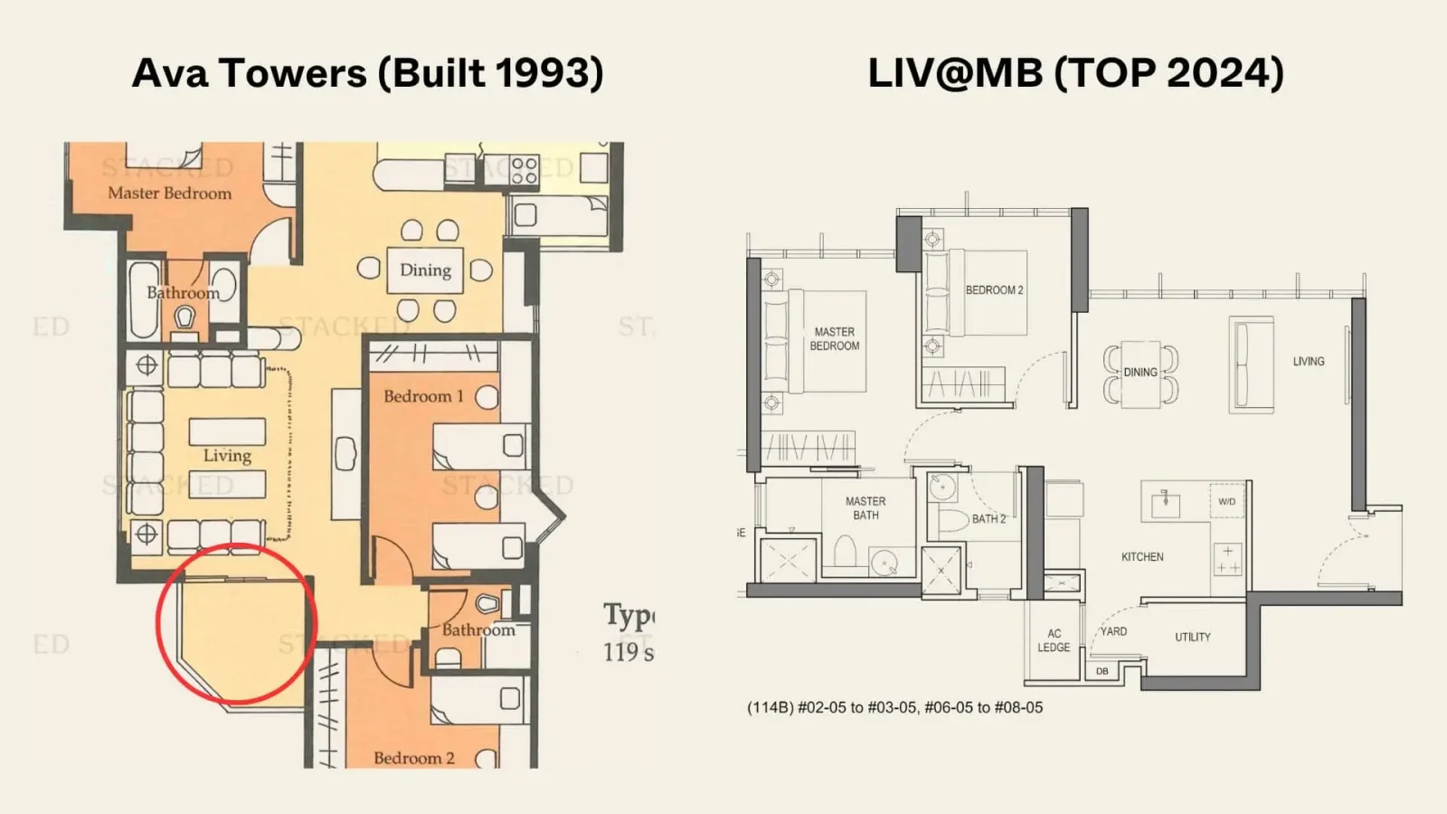
The earliest condos (the ones from the Beverly Mai era in the 1970s) had balconies for pure utility purposes; it was to ventilate the units and dry your clothes, much like how we view service yards today. Many of these older condos didn’t even have a balcony.
But as we reached the 1990s, having a balcony became seen as a luxury.
To some homeowners, a luxury big enough to have a meal on (e.g., you can put a whole dining table for four or more on it) is still considered fancy. If you were growing up in those decades, you might associate it with a degree of affluence. Remember that balconies were one of the great differentiators between private condos and HDB flats, as much fewer flats have balconies.
Today as homes have become smaller, having a balcony is no longer seen as a must-have by some homeowners. Some newer developments like LIV@MB even have the option of some units without a balcony, for those who deem it unnecessary. Interestingly, most compact new 3-bedders today don’t come with a yard as well, so having a balcony becomes important to dry clothes (walk around a newer condo today and you’d see many balconies becoming the default place for the clothes rack and even to store items).
As for AC ledges, these were once viewed as a cash grab by developers. We covered some of the main issues here, but in general, developers could charge you for the space, while not getting billed for it themselves.
But as of April last year though, the changes to Gross Floor Area (GFA) definitions have put an end to such shenanigans. The upcoming Lentor Mansion would thus be one to watch (even if you aren’t interested in the Lentor area), as this is the first project launched with the new GFA harmonisation rules.
At Stacked, we like to look beyond the headlines and surface-level numbers, and focus on how things play out in the real world.
If you’d like to discuss how this applies to your own circumstances, you can reach out for a one-to-one consultation here.
And if you simply have a question or want to share a thought, feel free to write to us at stories@stackedhomes.com — we read every message.
Ryan J. Ong
A seasoned content strategist with over 17 years in the real estate and financial journalism sectors, Ryan has built a reputation for transforming complex industry jargon into accessible knowledge. With a track record of writing and editing for leading financial platforms and publications, Ryan's expertise has been recognised across various media outlets. His role as a former content editor for 99.co and a co-host for CNA 938's Open House programme underscores his commitment to providing valuable insights into the property market.Need help with a property decision?
Speak to our team →Read next from Property Advice
Property Advice Should We Sell Our Freehold Condo For A $2.2M Leasehold Landed Instead?

Property Advice Should I Buy A Freehold Condo In A Landed Enclave — Or Look Elsewhere For Better Growth?

Property Advice We Own A 2-Bedder Condo In Our Early 30s: Should We Upgrade To A New Launch Or Resale With $2.2M?

Property Advice What A Family Of 5 Can Really Buy With $2 Million In Newton And Redhill
Latest Posts
Property Market Commentary 18 Upcoming New Launch Condos In 2026 — Where They Are And The Ones To Watch

Singapore Property News Kallang Close GLS Site Sold For $610.8 Million: New Waterfront Condo Could Launch From $2,900 PSF

PRO Pro Bishan Loft EC Price Review: Why This Older Executive Condominium Saw Strong Gains
















0 Comments