7 Real-Life Reno Regrets As Shown On TikTok
May 12, 2023
Interior design is one of those things where the obvious… just isn’t. It’s seldom a big design feature that ends up being a regret, but rather the small issues like wall socket placements or door frames. Perhaps these become issues precisely because they seem trivial, and we don’t pay them enough attention. We combed through TikTok to find some of these common regrets, so you know what to look for when your next renovation comes around:
So many readers write in because they're unsure what to do next, and don't know who to trust.
If this sounds familiar, we offer structured 1-to-1 consultations where we walk through your finances, goals, and market options objectively.
No obligation. Just clarity.
Learn more here.
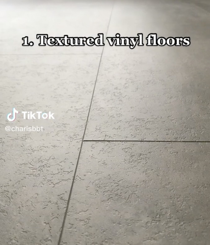
1. Textured Vinyl Floors
We don’t often hear complaints about vinyl floors (if anything, we tend to hear more complaints about parquet flooring). But vinyl these days can come with a variety of textures, from simulated wood to stone, to even gloss marble.
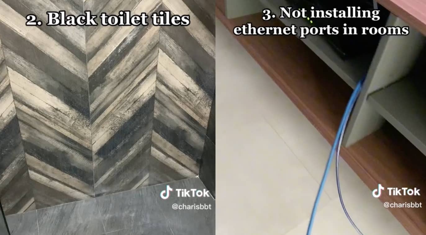
Many homeowners pick their choice of vinyl based on looks, but it’s important to ensure you like the way it feels. What feels great underfoot to some can feel dirty to others, as in this TikTok.
Textures that use a lot of grooves or fine lines (e.g., simulated wood textures with artificial “grain” effects) are also more likely to trap dirt and dust.
But we’d note that, on the flip side, some homeowners have complained about completely smooth vinyl: to some people, it can feel too “rubbery” or “squeaky,” and some have commented it feels like a hospital floor.
The right texture is subjective, but pick one that feels good rather than just looking good.
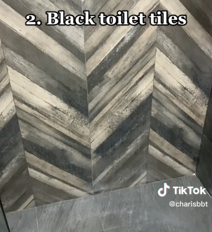
2. Black toilet tiles
As this TikTok shows, it can be hard to see which spots are dirty. It’s all fine when it is brand new and spanking clean, but it can be difficult to upkeep.
Also, if you use glass items in your toilet, such as glass perfume bottles, or glass cups to hold toothbrushes, black tiles can become a safety hazard. If someone knocks over and breaks a glass item, and the tiles are black (especially gloss black), it can be a nightmare trying to pick out the glass fragments on the black surface.
We’ve heard stories of people cleaning up glass from a jet-black surface, only to step on a sharp piece that they didn’t see weeks later.
3. Placement of wall sockets and Ethernet ports
When designing the room, it’s important to communicate with the Interior Designer and explain where you’re likely to sit and hook up various electronics.
One of the most common issues is finding out the power socket or port is blocked by a piece of furniture, and your cables need to snake across the table or chair legs. The height of wall outlets and switches also matters: if you have elderly family members, consider if they can comfortably reach these without bending too low, or having to reach too high.
On a related note, it’s usually uncomfortable to have a window directly behind a television or computer screen, due to the reflective glare. Keep this in mind when you decide where to place the power outlets/ethernet ports.
4. Sizes of wash basins, toilet bowls, and shower cubicles
This is really the Interior Designer’s job, and they should be making sure the sizes are all appropriate for the space. But that being said, it’s important to communicate your sense of adequate space.
Different homeowners have different standards. For example, some loathe small shower cubicles, others feel that big shower cubicles are just a waste of space. Likewise, some homeowners don’t mind a bit of a squeeze, if it means a bigger toilet bowl or washbasin.
On another note, some washbasins look good or sleek, but when used daily become a pain to maintain. One example would be those that are rectangular shaped and nearly flat. When brushing teeth or washing things, food or debris tend to get stuck and you often find yourself having to wash around the rims of it to keep it clean. Water spots are also an issue, and we know homeowners regret such shapes after some time.
5. Height of cabinetry
It’s unusual to have this placed too high, as both the Interior Designer and the subcontractor (in this case the carpenter) will usually warn about this. While pull-down cabinets are one option, you can also use cabinets with adjustable shelving heights.
Too-high cabinets are an important safety issue, as falling – or falling items – become a real risk. Even if you don’t use the storage often, cabinets mounted too high tend to become difficult to clean.
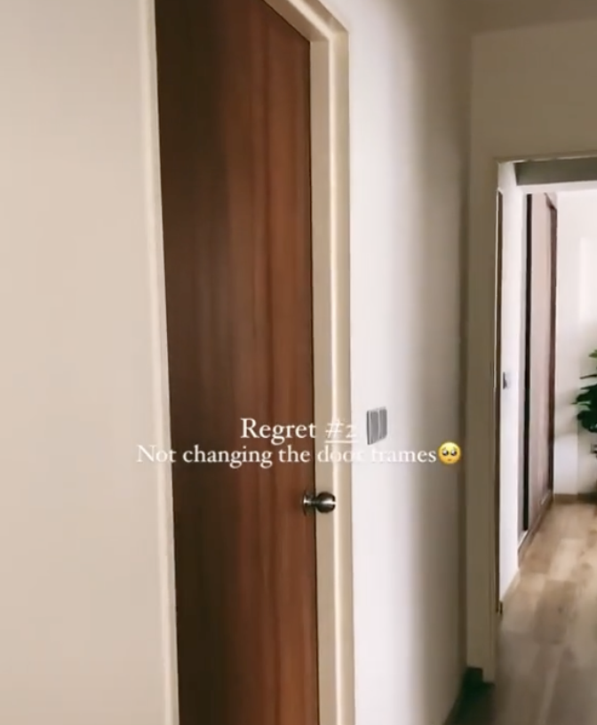
6. Door frames
Wooden door frames aren’t actually good in tropical climates like Singapore; we seem to use them more out of convention or tradition. Nonetheless, our hot and wet climate often results in warping or cracks, so door frames do have to be replaced from time to time.
Note that the door trim (the decorative parts surrounding the door frame and hiding its mechanisms) is aesthetic, and it can be changed or customised as you like. Ask your designer for something that fits your overall home theme.
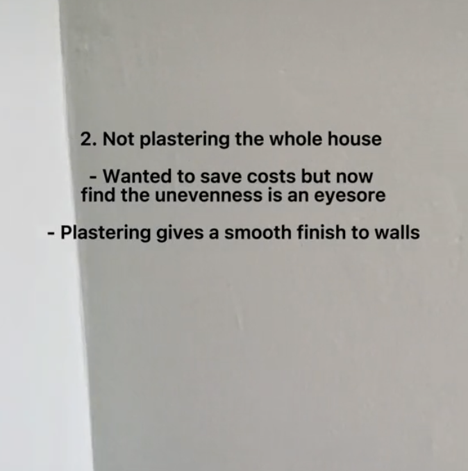
7. Plastering the whole house
It can get pricey to plaster the whole house, and some do cheat by just doing up a few select rooms. But this isn’t entirely wrong, depending on your budget. It may, for instance, be sensible to do up a few rooms now, and then plaster the other rooms later when your cash flow allows.
This might be a bit pricier and more inconvenient than doing it all at once – but some homeowners do have prudent reasons for doing it, such as avoiding the use of renovation loans altogether.
As an added tip: uneven wall surfaces can be the easiest to hide with decorations. Hang some wall art, or use strategic positioning of the back of some furniture; you can probably keep the worst parts out of sight.
Even hanging something noticeable near the spot (e.g., a big painting or mirror) can suffice to draw attention away from it.
At Stacked, we like to look beyond the headlines and surface-level numbers, and focus on how things play out in the real world.
If you’d like to discuss how this applies to your own circumstances, you can reach out for a one-to-one consultation here.
And if you simply have a question or want to share a thought, feel free to write to us at stories@stackedhomes.com — we read every message.
Ryan J. Ong
A seasoned content strategist with over 17 years in the real estate and financial journalism sectors, Ryan has built a reputation for transforming complex industry jargon into accessible knowledge. With a track record of writing and editing for leading financial platforms and publications, Ryan's expertise has been recognised across various media outlets. His role as a former content editor for 99.co and a co-host for CNA 938's Open House programme underscores his commitment to providing valuable insights into the property market.Need help with a property decision?
Speak to our team →Read next from Property Advice
Property Advice Should We Sell Our Freehold Condo For A $2.2M Leasehold Landed Instead?

Property Advice Should I Buy A Freehold Condo In A Landed Enclave — Or Look Elsewhere For Better Growth?

Property Advice We Own A 2-Bedder Condo In Our Early 30s: Should We Upgrade To A New Launch Or Resale With $2.2M?

Property Advice What A Family Of 5 Can Really Buy With $2 Million In Newton And Redhill
Latest Posts
Property Market Commentary 18 Upcoming New Launch Condos In 2026 — Where They Are And The Ones To Watch

Singapore Property News Kallang Close GLS Site Sold For $610.8 Million: New Waterfront Condo Could Launch From $2,900 PSF

PRO Pro Bishan Loft EC Price Review: Why This Older Executive Condominium Saw Strong Gains






















0 Comments