The floor plan is, ironically, both the most boring and important part of picking a unit. We know the show flat is much more attractive – but remember your unit isn’t going to have the staged lighting or pricey decor you see in the gallery. On top of that, it can be soul-crushing to hear your Interior Designer say “I wouldn’t recommend that for this layout,” when you already have a theme you love. So before you pick a unit, study the floor plan:
So many readers write in because they're unsure what to do next, and don't know who to trust.
If this sounds familiar, we offer structured 1-to-1 consultations where we walk through your finances, goals, and market options objectively.
No obligation. Just clarity.
Learn more here.
1. Check the size of non-living areas like ledges, void spaces, or added utility rooms
A common mistake is to look at square footage as being indicative of living space. In reality, it’s possible for a unit to have a higher square footage, but less living space. An example of this is older condos from the ‘80s and ‘90s (check out some of these here).
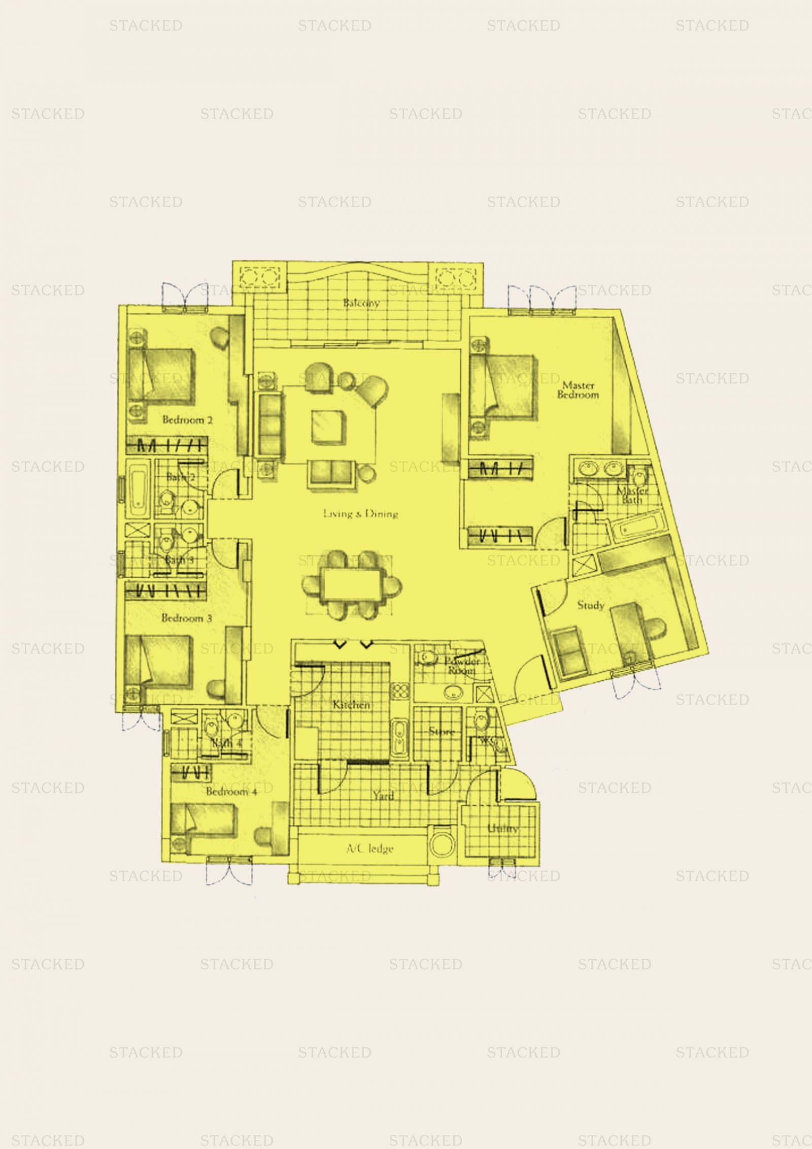
While these older units may reach over 2,000 sq. ft., some may also have very large balconies (even a verandah or patio on the ground floor), which are not really “living spaces”. For condos built in the mid-to-late 2010s, you may also find giant air-con ledges, which are oversized simply so that developers can charge you more. Planter boxes and bay windows were also used to fulfill this purpose.
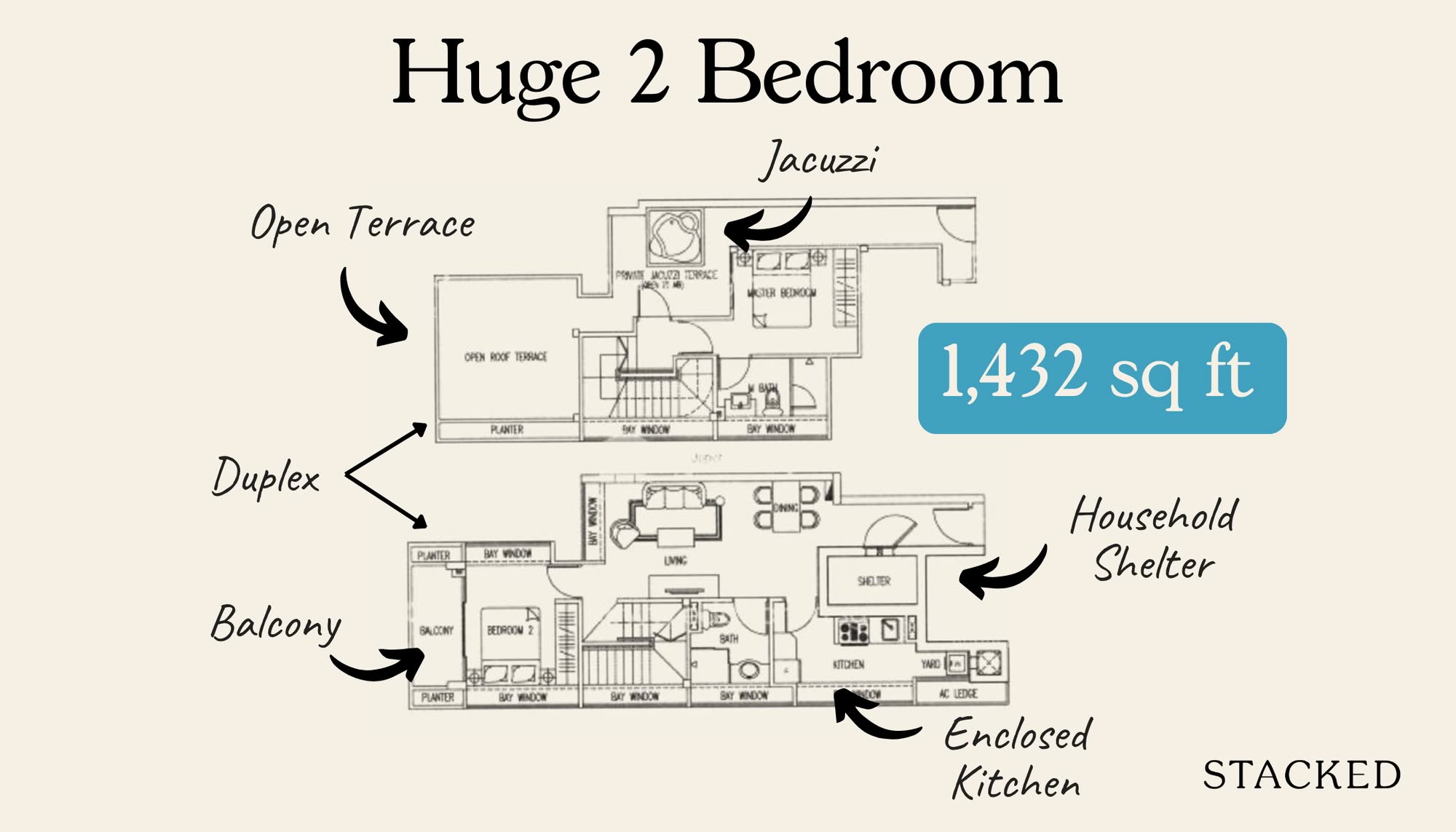
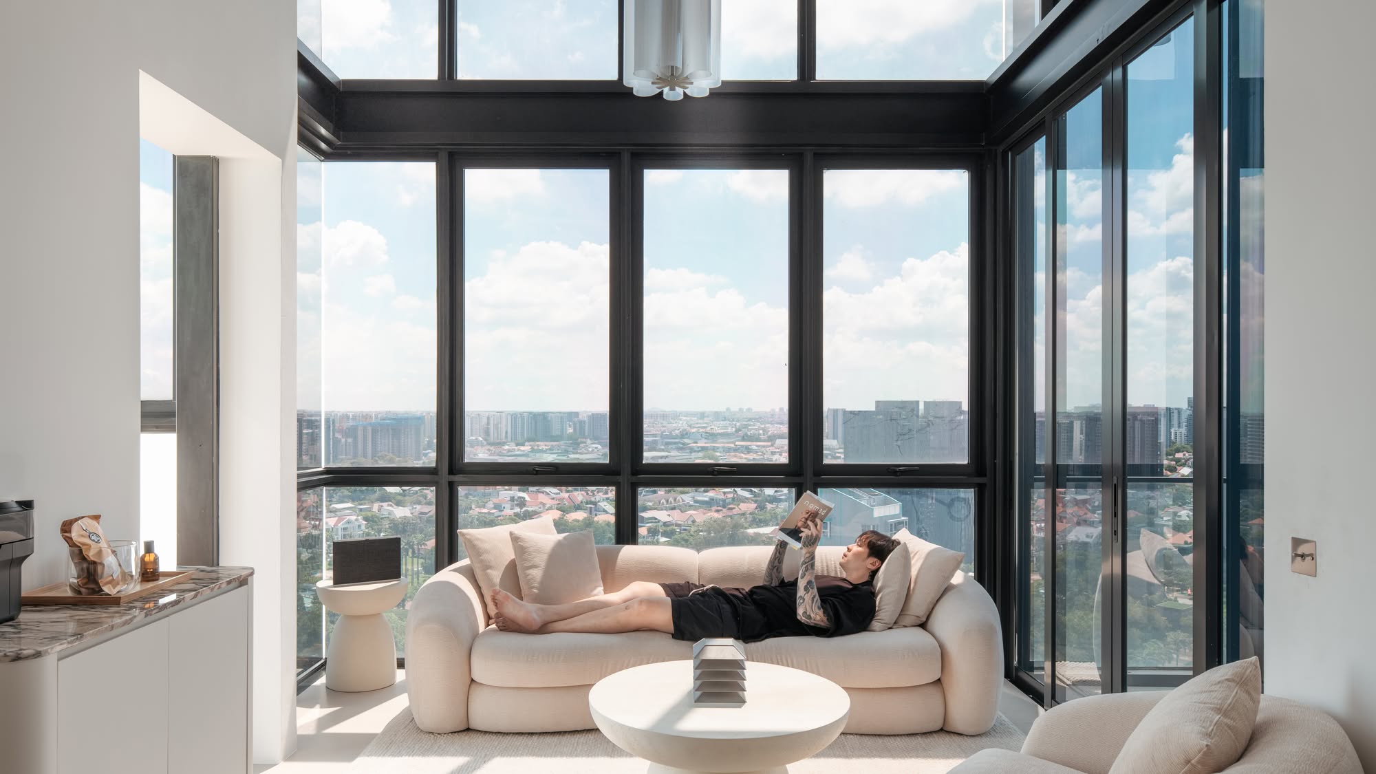
Besides this, there’s also void space. When the ceiling is very high, such as in a loft-style apartment, there may be strata void space. This is the space between the floor and the ceiling, which of course isn’t usable (but which you do pay for). This isn’t always a bad thing, as some home buyers enjoy high ceilings and loft-style apartments; but just be aware of the added cost (do note that this practice of strata void space will change).
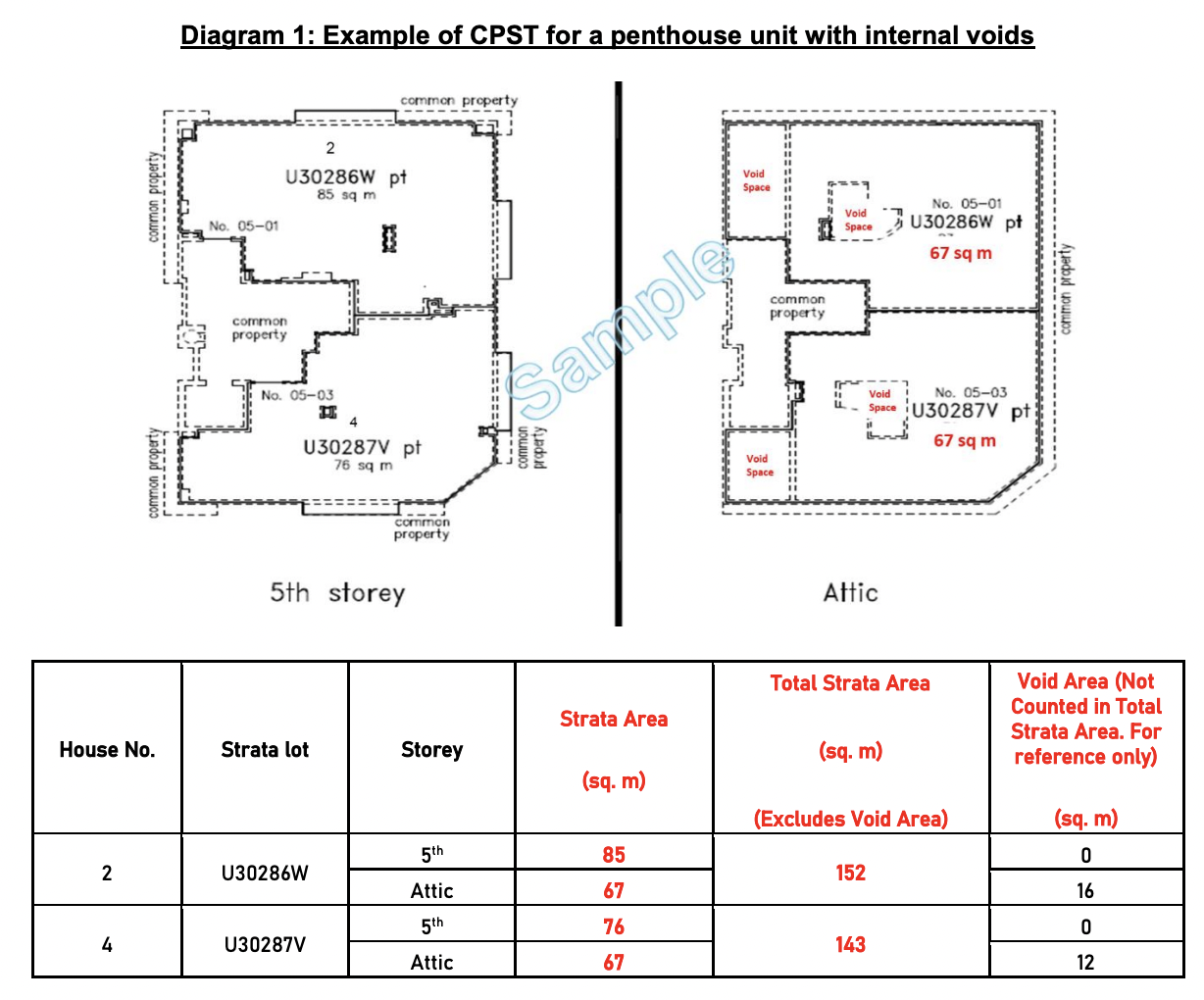
Of course, this space isn’t totally unusable. You can build a mezzanine level, but designing and building the space will be more expensive, and it may not be possible to build one (depending on your home). There are certain regulations that have to be fulfilled around fire safety and load bearing, so you will need to check with URA/BCA.
(For reference, the average ceiling height is around 2.6 metres, so if it’s any higher you may want to inquire about void space)
Finally, for dual-key layouts, remember some utility rooms need to be doubled. There must be toilets for each sub-unit, for example, as well as two kitchen spaces (or at the very least, one kitchen, but a smaller pantry in the sub-unit). Due to these reasons, the actual living space in a dual-key unit may be less than the total square footage suggests.
2. Check how versatile/squarish the layout is
In some newer launches we’ve seen, like TMW Maxwell or Sceneca Residence, the layouts are designed for flexibility – you can add or remove partitions easily (to add rooms or combine them).

Editor's PickTMW Maxwell Review: Unique Space-Saving Furniture & Vertical Landscaped Gardens In The CBD
by Matthew KwanIn older condos, you may find more load-bearing walls (which can’t be moved), or unusual shapes like circular/semi-circular curves. Hawaii Tower is a famous example of this, although we note that One Pearl Bank – a more recent condo – also did it in tribute to its predecessor.
To be blunt, curved living rooms are a challenge for Interior Designers, and tend to require a lot of custom work. Also, when it comes to furnishing, bear in mind most furniture is meant to fit square or rectangular rooms. As such, curved rooms tend to be harder to work with, although they can be very eye-catching and unique if done right.
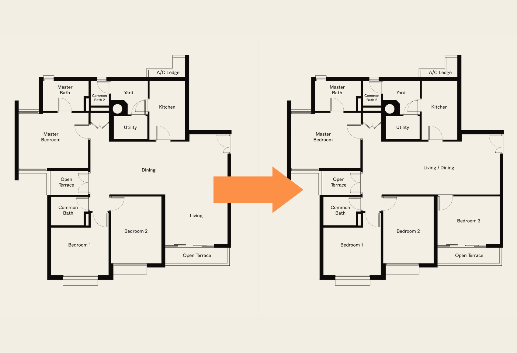
Regardless, if you want more flexibility in the unit in the future (like to be able to add an additional room), having a squarish or regular layout makes reconfiguration a whole lot easier.
3. Note the main points of ventilation
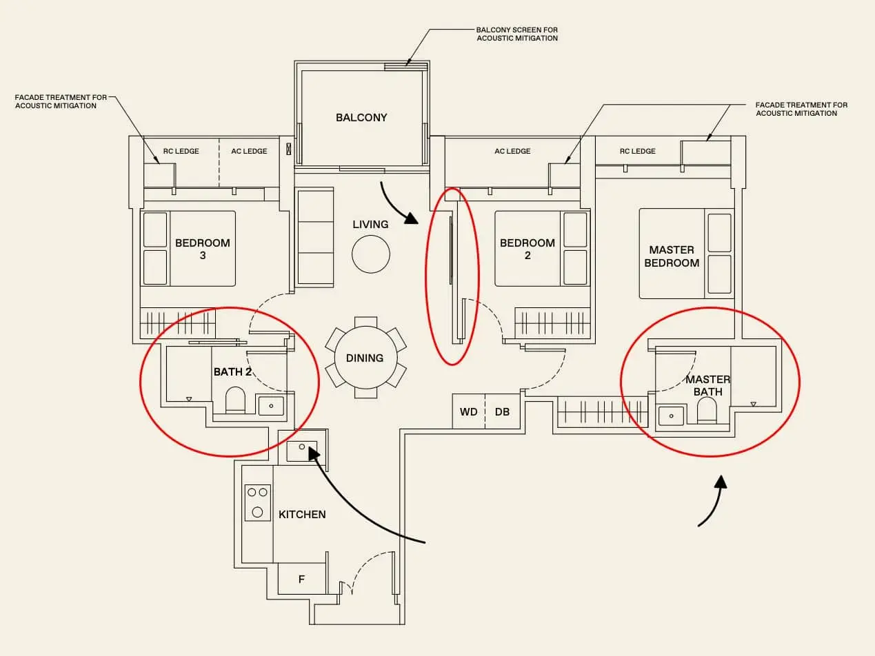
This is most important for toilet and bathroom areas. Singapore is tropical, so these areas can turn into a virtual sauna after a hot shower. Some units have ventilation windows in bathrooms and toilets, but some don’t (and in some cases, you want to inquire if the windows are sufficient).
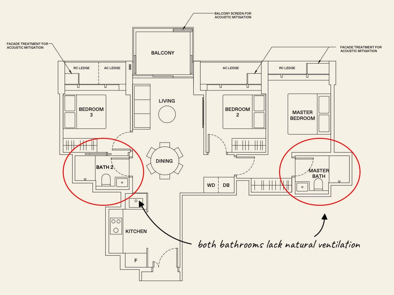
This may sound really obvious, but we do know of many first-time homeowners who’ve been surprised that their bathroom doesn’t come with a window.
Ideally, there should be a natural flow of air from areas like balconies or the main window, down throughout the living area and kitchen. Units with a lot of twists, turns, and corridors tend to have worse natural ventilation; and you’re more likely to have to blast the air-conditioner.
Wind ventilation and natural light also tend to go hand-in-hand, as anything obstructing airflow probably also blocks off light. This will necessitate a higher power bill, so you may want to avoid layouts with excessive partitioning and corridors.
4. Not all dumbbell spaces are equal
The dumbbell layout uses a main area, such as a living room, to connect the various bedrooms. A good example of this is Forett @ Bukit Timah.
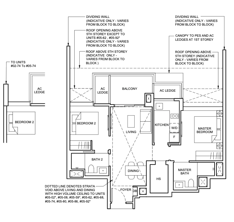
However, not everything with a dumbbell layout is great for everyone. Some of these layouts have front doors opening right into the middle of the living/dining area, with nothing intervening. Some people may find this uncomfortable, especially traditionalists who expect some kind of antechamber or partition before visitors step in.
(Also, if you’re in the habit of leaving the front door partly open, people may be able to look right into your living room.)
The key is to find a balance between efficiency and comfort. Dumbbell layouts are more efficient, but may be lacking in privacy.
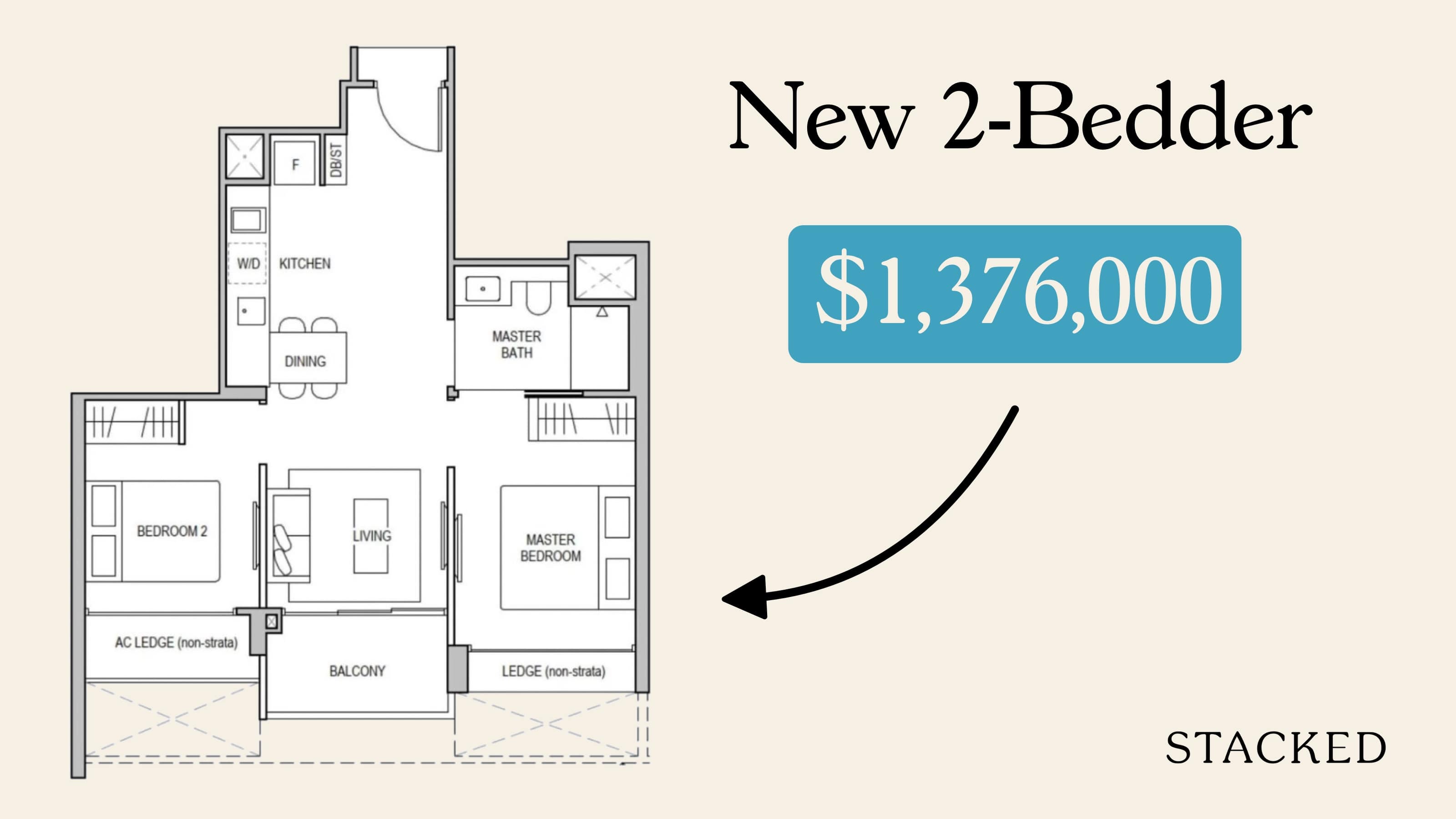
5. Look out for doors, walls and windows
Another thing useful with floor plans would be to plan for your furniture and fittings.
Unless you’re very experienced, it’s hard to get a sense of where the furnishings can fit. This is especially the case for bedrooms, as you’ll want to know if each room can take a queen size, king size, single mattress, etc. If the beds are in the floor plan, they’re often misleading, as it rarely says what kind of bed is in it.
As such, you want to make sure that your doors (how much they swing out, and from which direction) are able to still be useable. This is the same case with your bathroom doors and kitchen (some may be sliding).
Likewise, your floor plan would be able to give you some indication of the type of walls of your unit. This is important if you are planning to do significant renovation (knocking down walls for an open-plan layout, for example).
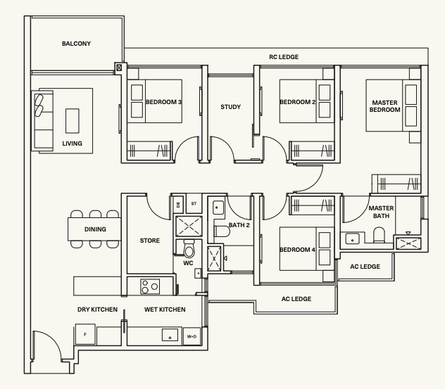
Structural walls are usually thicker, bolder lines as compared to normal walls which are thinner. Do note that if your unit is a PPVC construction, you may not be able to hack any walls due to their structural nature.
6. If you have intentions of resale, check the Feng Shui even if you don’t believe in it
We’re not experts in Feng Shui, and this section is not meant to give you Feng Shui tips – but we can tell you there are certain important rules, like not letting a toilet be visible from the entrance, not having beds under beams, etc.
We’d advise you to take note of this even if you’re not a believer yourself. On a practical level, you have to consider that your future buyer may care. We have heard of an actual instance where a sale fell through, simply because a unit had bedrooms where the doors faced each other (this was believed to promote conflicts between the two occupants).
We’re also told that Feng Shui leans toward the inclusion of balconies, although many home buyers may dislike those (balconies are hard to maintain and eat into living space). You’ll need to find some moderation here; but if resale gains are your goal, you may want to take into account the potential beliefs of future buyers.
7. Ensure the service yard is sufficient for your needs (or if there even is one!)
Whether a service yard is “good” depends entirely on the individual buyer.
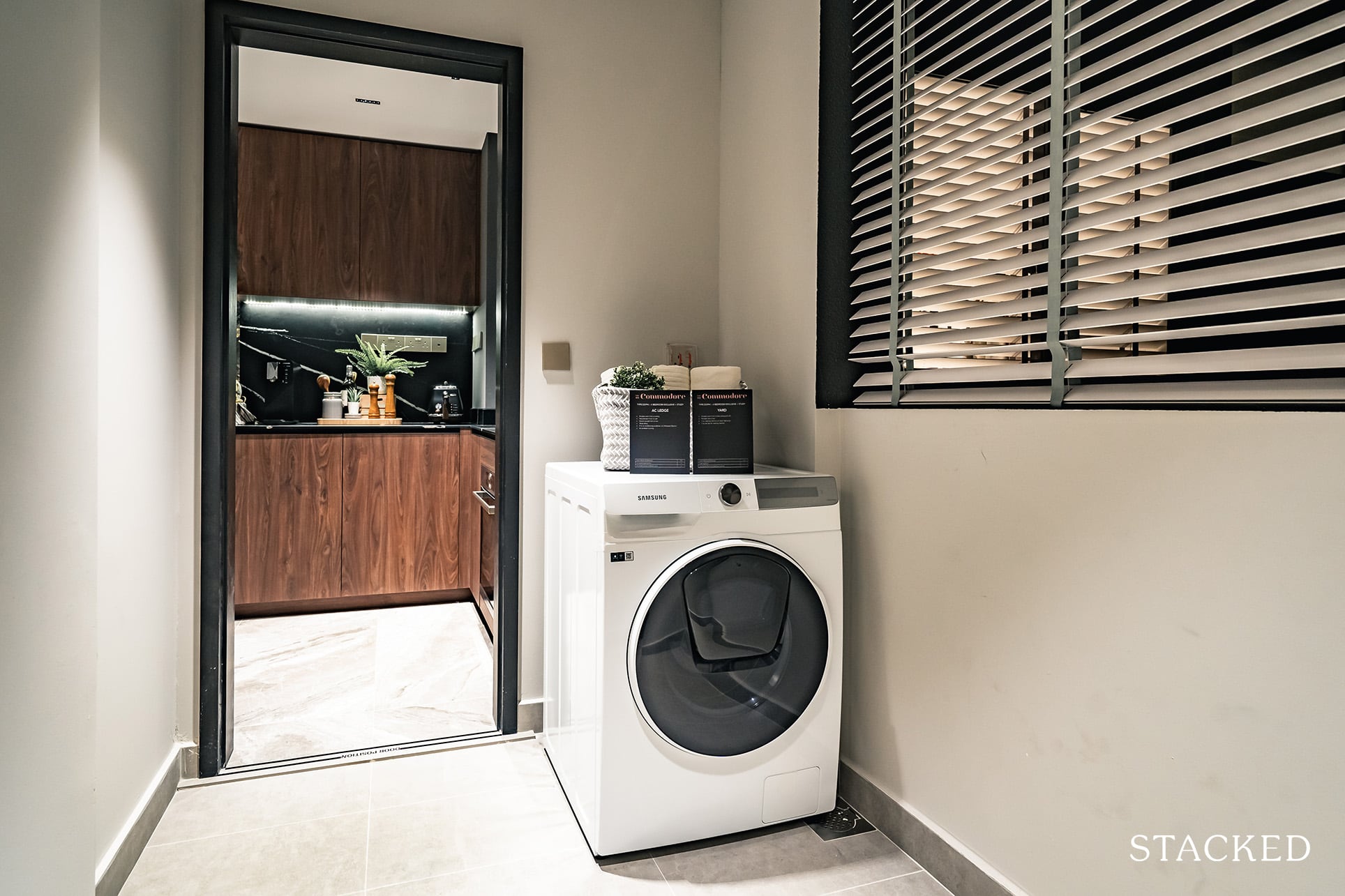
Some home buyers don’t do laundry in the service yard at all, and instead convert it into a balcony-type area. If you enjoy this, you’ll probably want a service yard that’s a bit bigger than normal; enough to fit a few chairs and a table at least (also, maybe look outside the floor plan and see if it’s a decent enough view. Be warned that most service yards look into, well, other people’s service yards).
Alternatively, small families or couples – who do light amounts of even laundry – may need little more than a nook with a washer and dryer. This means more living space, or a bigger kitchen, which you may prefer to a large service yard.
On another note, we know some hardcore home cooks who extend the kitchen all the way into the service yard; to the point where they have extra shelving or storage in their service yard for their spices, sou-vide machine, and other elaborate cooking things.
This is a more valuable space than many give it credit for, so do give it a think when picking layouts.
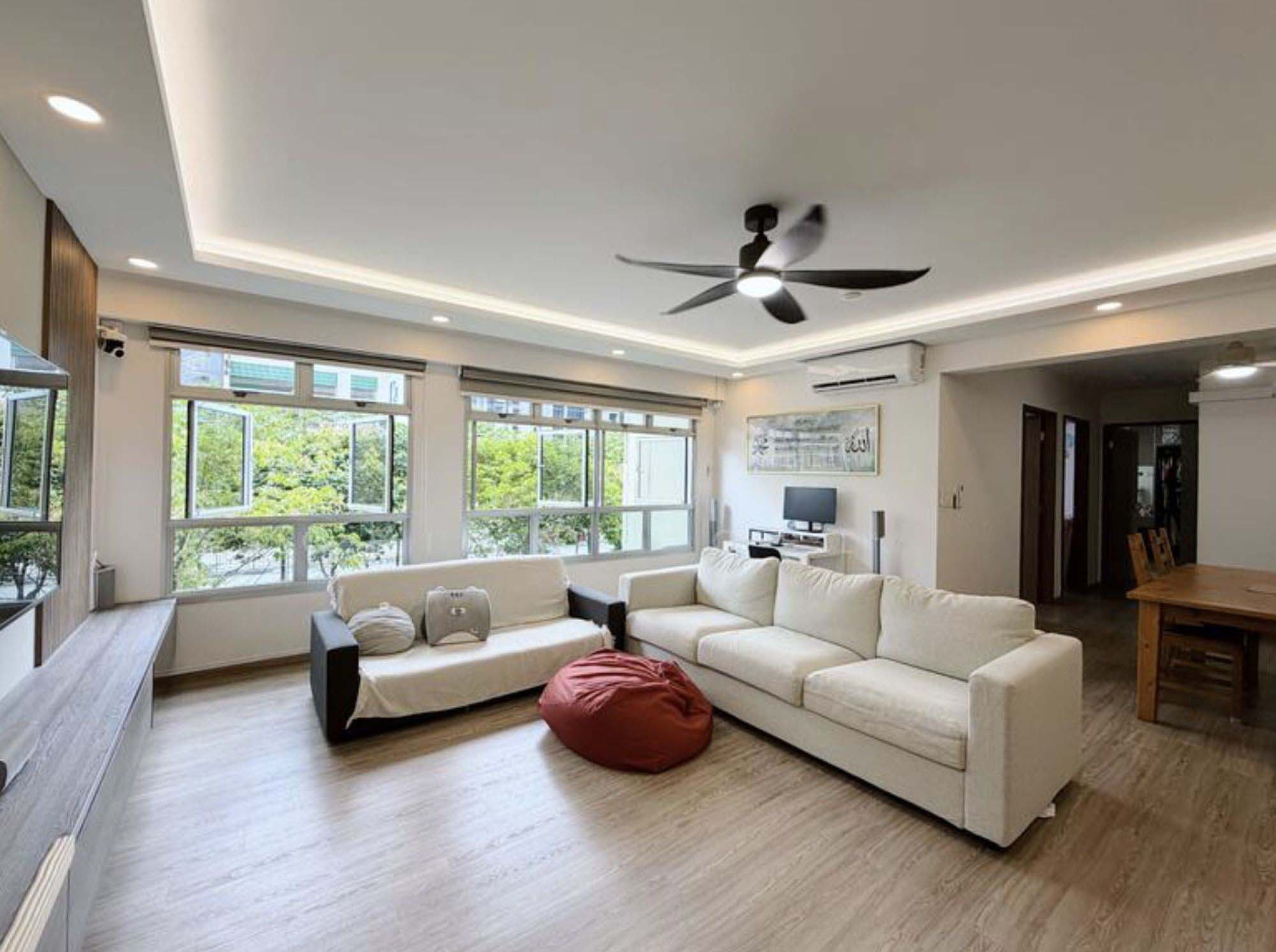
In summary, while floor plans are crucial in guiding your unit selection, they should not be relied upon exclusively. They provide valuable information on layout and space distribution but fall short of conveying the true sense of spaciousness, ceiling heights, and structural details like ceiling beams.
So to ensure you make the most informed decision, complement the floor plan with a physical walkthrough. By integrating both the tangible insights from an onsite visit and the logistical details provided by the floor plan, you’ll be better equipped to choose the right unit.
For more help with interiors, you can contact us directly at Stacked. We’ll also provide you with in-depth reviews of new and resale projects alike.
At Stacked, we like to look beyond the headlines and surface-level numbers, and focus on how things play out in the real world.
If you’d like to discuss how this applies to your own circumstances, you can reach out for a one-to-one consultation here.
And if you simply have a question or want to share a thought, feel free to write to us at stories@stackedhomes.com — we read every message.
Ryan J. Ong
A seasoned content strategist with over 17 years in the real estate and financial journalism sectors, Ryan has built a reputation for transforming complex industry jargon into accessible knowledge. With a track record of writing and editing for leading financial platforms and publications, Ryan's expertise has been recognised across various media outlets. His role as a former content editor for 99.co and a co-host for CNA 938's Open House programme underscores his commitment to providing valuable insights into the property market.Need help with a property decision?
Speak to our team →Read next from Property Advice

Property Advice Hundred Palms, Riverfront Residences Or Tampines Trilliant — Which Is The Better Buy For A Young Family Today?

Property Advice Selling Our Holland Village HDB To Buy A Freehold Marine Parade Condo – Should We Wait?

Property Advice Should We Sell Our Freehold Condo For A $2.2M Leasehold Landed Instead?

Property Advice Should I Buy A Freehold Condo In A Landed Enclave — Or Look Elsewhere For Better Growth?
Latest Posts
Singapore Property News 4-Room Flat at Bedok South Horizon Sets New Bedok Record at $1.17M

PRO Pro Where To Buy A Condo In Serangoon: Prices, Best Areas And Growth Trends In 2026
New Launch Condo Reviews Vela Bay Review: 515-Unit Bayshore Condo Launch Next To Bayshore MRT That Starts From $1.2M



















0 Comments