Despite being a public housing scheme, HDB is surprisingly experimental; over the years they’ve come up with many ingenious designs. And uh… some that aren’t. While all of the following are perfectly functional, they may pose additional challenges, and give your interior designer a bit of a headache. Here are some of the layouts which you might be better off avoiding if you want an easier time with renovations:
Table Of Contents
- A quick explainer on why we like squarish rooms
- 1. Goodview Gardens at Bukit Gombak (Blocks 393 to 395)
- 2. Sembawang Blue Riverview (Blocks 468A to 468D)
- 3. Block 288A to 289G, Bukit Batok Street 25
- 4. Block 288A to 289G, Bukit Batok Street 2
- 5. Sembawang Sun Bliss and Sun Trellis (Block 356A to 360C, and Blocks 340A to 341C)
- 6. Block 733, Sembawang Close
So many readers write in because they're unsure what to do next, and don't know who to trust.
If this sounds familiar, we offer structured 1-to-1 consultations where we walk through your finances, goals, and market options objectively.
No obligation. Just clarity.
Learn more here.
A quick explainer on why we like squarish rooms
Much of the criticism here is centred around odd nooks and corners, and on circular or curved walls. While these can look novel (at first), they are challenging from an interior design perspective, and tend to be pricey.
The simple fact is that most building materials and furniture are manufactured in squarish shapes. Steel frames, countertops, flooring tiles, etc. are squarish. Bed frames and sofa sets are almost always rectangular. This is so intuitive, that even the sample tiles or fabrics are presented to us as squares.
So, when you have a curved interior, or one with a lot of angles, your contractor needs to make more measurements, cuts, and adjustments to get things flush against the walls. Floor tiles also tend to have more alignment problems, when your room has odd or circular shapes. Some contractors even charge extra if they need to do flooring for weird-shaped rooms.
For circular walls, you’re more likely to need custom furnishings, unless you’re happy to push a square desk or bed up against a curved wall. That will mean a waste of space behind the furniture, and the spot is a pain to clean.
Also, circular rooms can create a “booming” effect (that’s why some concert halls and opera houses have curved walls). Great if you want to hear an orchestra; less so if you’re holding a dinner party and every conversation gets amplified.
Finally, twists and turns make a room less spacious, and are less conducive to natural lighting. Between a square 200 sq. ft. room, and a 150 sq. ft. room with a 50 sq. ft. corner, the square room will look and feel more spacious.
1. Goodview Gardens at Bukit Gombak (Blocks 393 to 395)
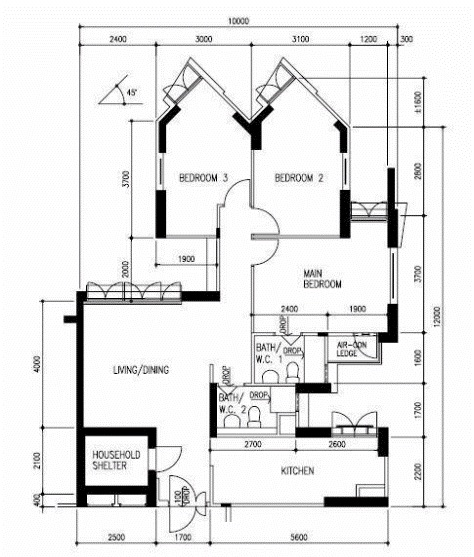
The units in this project consist mainly of four and five-room flats. They were one of the replacement options for Hillview Avenue residents, whose homes underwent the Selective En-Bloc Redevelopment Scheme (SERS) in 2003.
The 5-room flats here are a bit bigger than usual, as the typical size is between 107 to 113 sqm. However, the layout of the bedrooms is clunky and hard to work with. For unverifiable reasons*, all common bedroom windows were made to jut out at a bizarre 45-degree angle.
This makes it harder to use the space efficiently, and obstructs some of the natural lighting.
*We’re told the flat is close to Gombak Camp, which is a sensitive military area; so the windows are angled to look away from the hill.
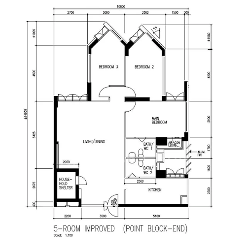
As an aside, we found a similar design at blocks 11 to 15 on Farrer Park Road. The windows seem to be angled away from the Istana, perhaps for similar security reasons. Here, the layout is found in 3, 4, and 5-room flats.
2. Sembawang Blue Riverview (Blocks 468A to 468D)
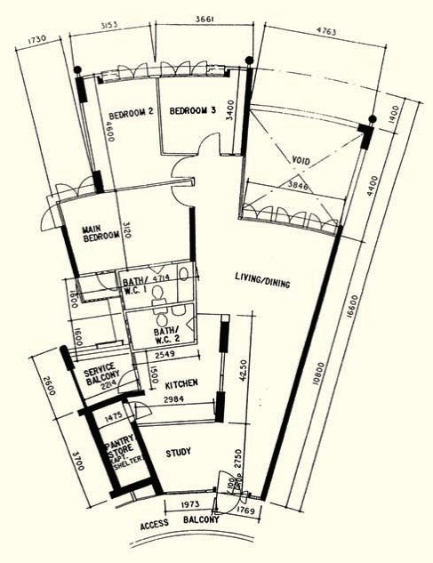
This project has roomy 5-room flats at 118 sqm., as well as Executive flats at a generous 137 sqm. Unfortunately, the spaciousness is offset by the “pizza slice” configuration.
The funnel-like shape makes it hard to position furniture, and something just feels off about a huge living room that tapers to a point. Visually, the layout is uncomfortable because it’s difficult to process where the centre of the living room is. Consider how awkward it would be to find a spot to centre the coffee table/sofa set.
The space toward the tapering end easily looks cluttered, as it narrows down its length; but at the same time, it’s a lot of wasted square footage, if you leave it bare.
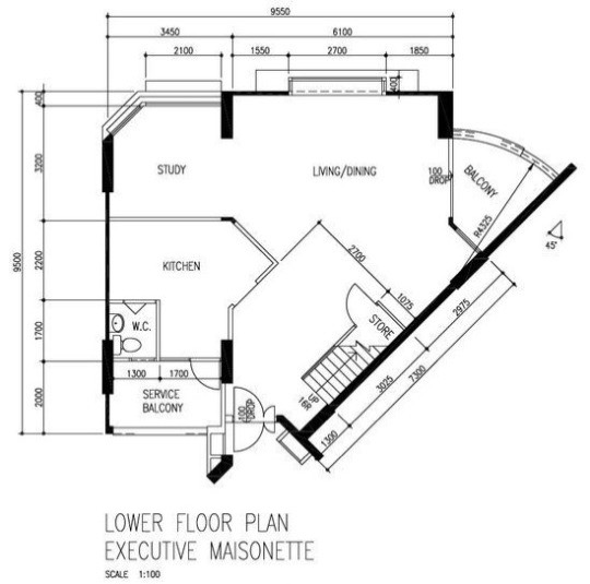
3. Block 288A to 289G, Bukit Batok Street 25
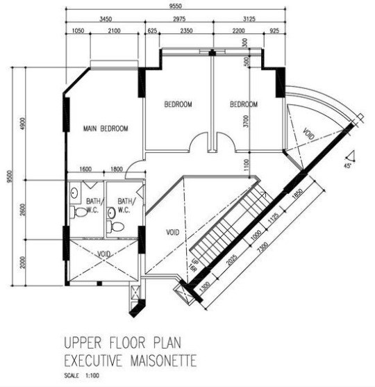
This is a rare, double-storey executive maisonette; huge at 165 sqm. The layout features an odd angle, with the stairwell cutting diagonally in front of the living room.
The two bedrooms on the upper floor feature odd corners; and when you climb to the top of the stairs, you’re facing an odd corner rather than a wide landing, or the rooms.
With so many odd corners, these units are a challenge to furnish.
4. Block 288A to 289G, Bukit Batok Street 2
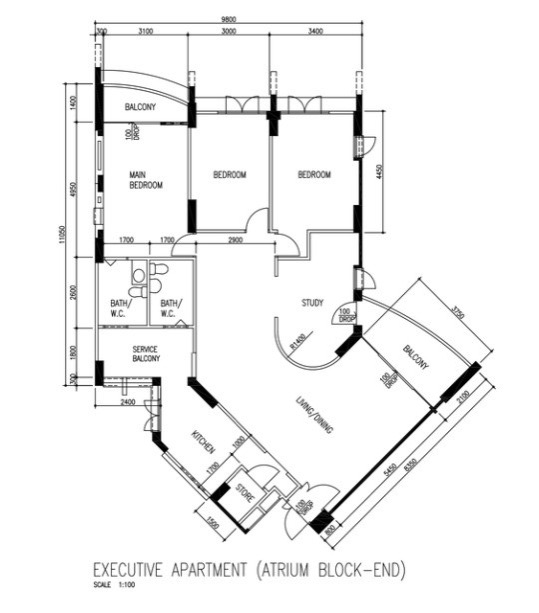
This Executive Apartment has one of the oddest study areas we’ve seen. One of the study room walls is curved; and while it may look interesting, there are few pieces of furniture (that aren’t custom-made) that are designed to fit such spaces.
Also, the part of the living room that’s between the study, bathroom, and bedrooms isn’t very large. The space will quickly look cluttered if you try to furnish it; but if you leave it empty, it’s a significant waste of space.
5. Sembawang Sun Bliss and Sun Trellis (Block 356A to 360C, and Blocks 340A to 341C)
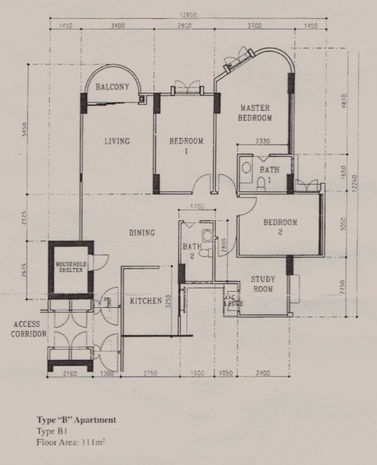
The 5-room layouts are some of the oddest we’ve seen. The semi-circular balcony is novel, but the master bedroom features a lot of dead space. Notice the corridor between the entrance of the master bedroom, and the bathroom next to it – this is pure waste space, as putting anything here will block the entry.
The slightly curved wall in the Master Bedroom is, as we’ve mentioned above, quite tough to furnish. Few pieces of furniture fit well in rounded corners.
Finally, note the uncomfortably cramped bottleneck, which forms at the nexus of the bedrooms, bathroom, and study room. This area is also bound to be quite dark, as it doesn’t admit much natural light.
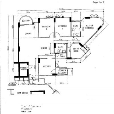
This is another layout, which can be found in the same project. Like the one above, this is a layout that features a number of odd corners. The master bedroom has one curved corner, while the other corners are at straight angles: and it’s not a neat circle either. This is likely to look odd no matter how you dress it up.
The same development also had the layouts below, which much of the same issues. Note the common bedroom windows, which are pushed to one side of the wall rather than being centred (bedrooms 1 and 2).
6. Block 733, Sembawang Close
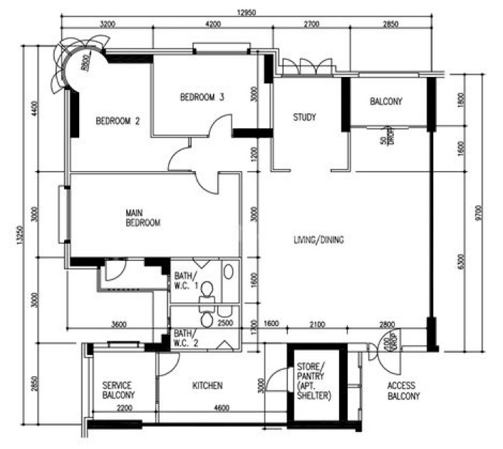
This roomy 139 sqm unit is alright in most respects, although there’s a bit of wasted space between the three bedrooms. The most unusual feature here is the bedroom windows in bedroom 2, and the circular corner it creates.
To be clear, these layouts aren’t terrible, and a good interior designer can still work around them. But they’re likely to cost more, and suit a smaller range of themes. For help on these issues reach out to us at Stacked; and you can also follow us for reviews of new and resale developments to be forewarned.
At Stacked, we like to look beyond the headlines and surface-level numbers, and focus on how things play out in the real world.
If you’d like to discuss how this applies to your own circumstances, you can reach out for a one-to-one consultation here.
And if you simply have a question or want to share a thought, feel free to write to us at stories@stackedhomes.com — we read every message.
Ryan J. Ong
A seasoned content strategist with over 17 years in the real estate and financial journalism sectors, Ryan has built a reputation for transforming complex industry jargon into accessible knowledge. With a track record of writing and editing for leading financial platforms and publications, Ryan's expertise has been recognised across various media outlets. His role as a former content editor for 99.co and a co-host for CNA 938's Open House programme underscores his commitment to providing valuable insights into the property market.Need help with a property decision?
Speak to our team →Read next from Property Advice
Property Advice Should We Sell Our Freehold Condo For A $2.2M Leasehold Landed Instead?
Property Advice Should I Buy A Freehold Condo In A Landed Enclave — Or Look Elsewhere For Better Growth?
Property Advice We Own A 2-Bedder Condo In Our Early 30s: Should We Upgrade To A New Launch Or Resale With $2.2M?

Property Advice What A Family Of 5 Can Really Buy With $2 Million In Newton And Redhill
Latest Posts
Singapore Property News HDB Resale Prices Fell — But A Third Of Buyers Still Paid $800K+ Last Quarter. Here’s Why
Singapore Property News Three Strata Office Floors In Suntec Priced From $135M
Singapore Property News This Freehold Desker Road Shophouse Is Going For $10.5M








0 Comments