


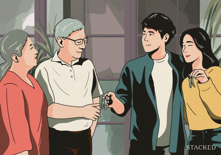


Apple is now the first company ever to reach a $3 trillion market cap. And if you’ve been following them closely, that’s a 5,800% gain since the debut of the iPhone.
To those struggling to make sense of the numbers, here’s a great example:
A million seconds is roughly 12 days long. A billion seconds, 31 and a half years.
A trillion seconds?
That’s a staggering 31,688 years. It’s almost mind-boggling to think about.
There are many reasons for their success so far, some may say that it’s the tech, or how beautiful their minimalist designs are. Or just how reliable their products are.
All that may be true, but one of the main reasons for their retail dominance is “Apple’s best-kept secret”, the know-how behind the success of their retail stores.
Except that it’s not actually a secret recipe or a secret sauce – it’s Eight Inc, a global award-winning strategic design firm.
(For the full story on how they came to work together with Steve Jobs to build their retail empire, you can read it here).
Here’s the key takeaway – Apple is best known for making technology human. And so with that guiding principle, that was used to frame how their first retail stores would be carried out.
In the words of Tim Kobe (the founder of Eight Inc):
“You had to have a store that was easy to use. It meant making everything comfortable and inviting. In contrast to, say, traditional apparel retail, which is very dense, the Apple Store is very open, intuitive – like the products themselves – and we were trying to present those qualities through a variety of touchpoints.”
And so the continued success of Apple’s stores is no less due to their carefully curated design language that appeals to the masses no matter the location. Be it commercial or residential, Apple has sparked quite the fever when it comes to aesthetic trends. As a result, there’s a lot you can learn from the king of retail design stores that you can take away when it comes to designing your own home.
Here, we lay down 6 takeaways from Apple store designs to consider when designing your humble abode.
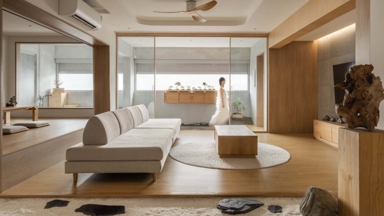
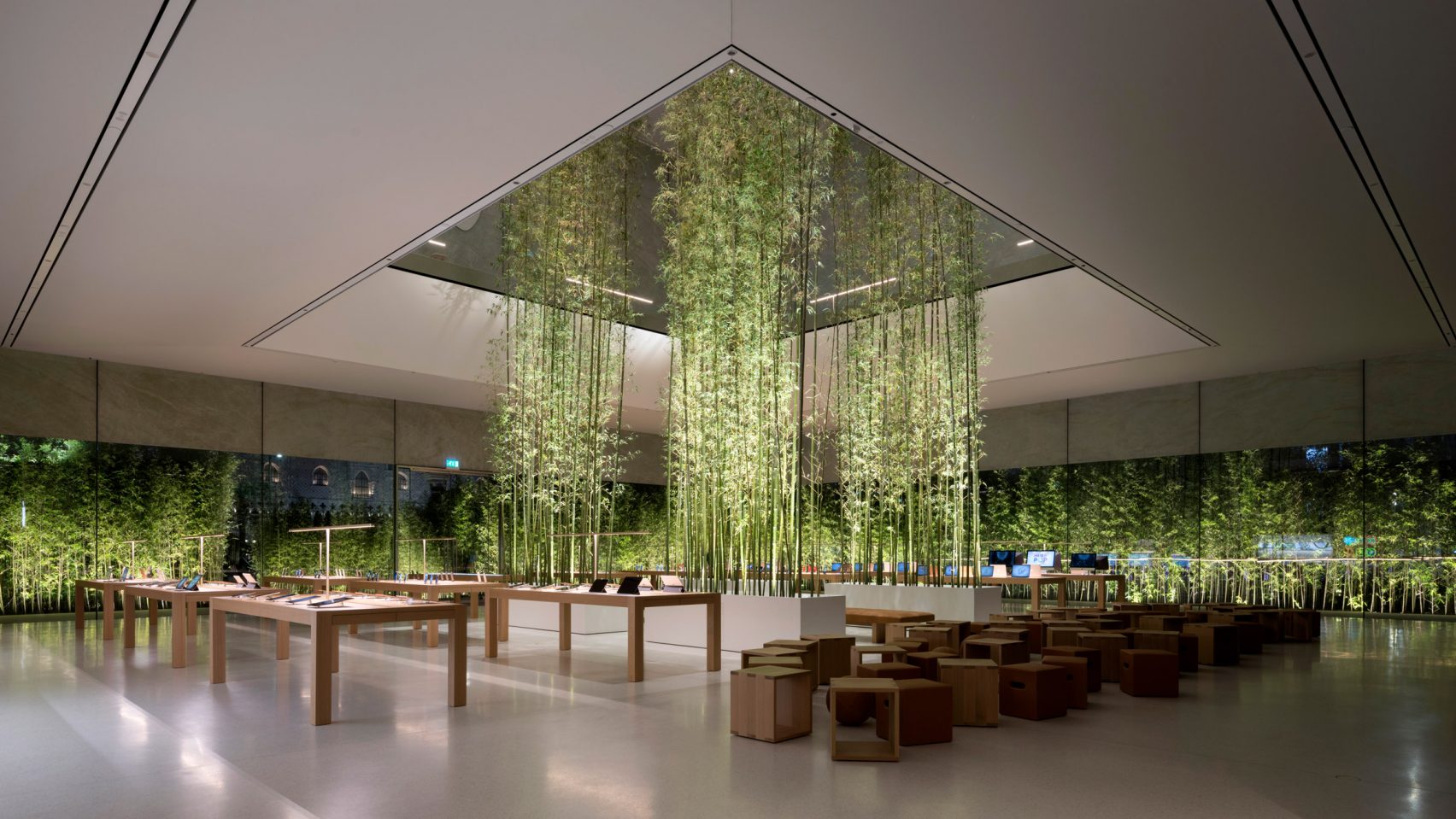
1. Introduce elements of nature
As it stands, many of their stores consist of industrial materials such as glass and metal. These often come highly refined and pieced together to create a sleek and seamless look. However, Apple knew that this would come at the cost of the space being dull and lacking warmth. To address this, elements of nature are introduced into the space, with some stores even being designed around the concept of nature itself. This maintains a healthy aesthetic balance, preventing the place from feeling too cold and harsh.
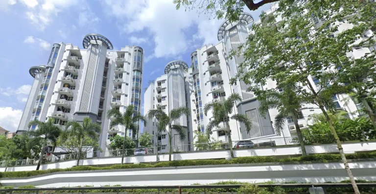
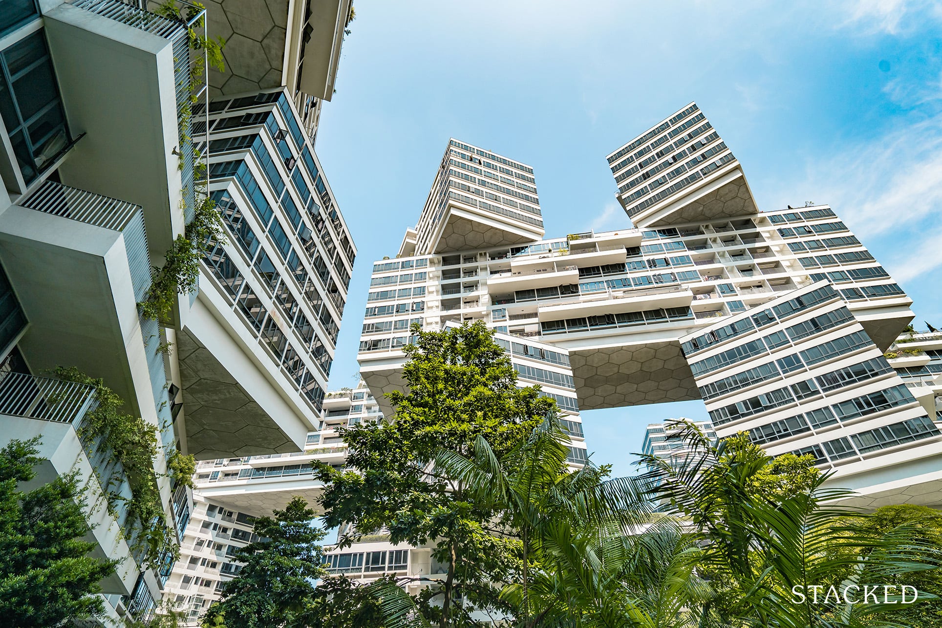
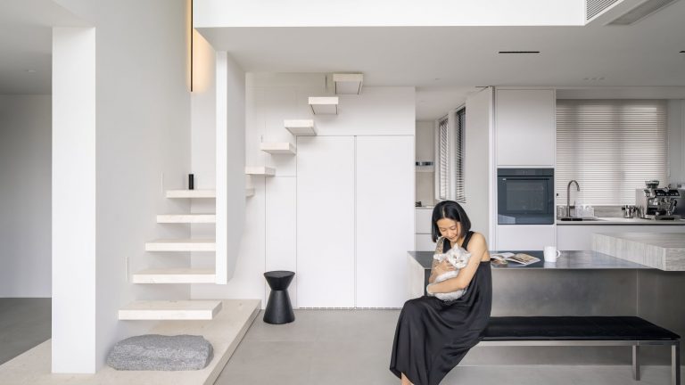
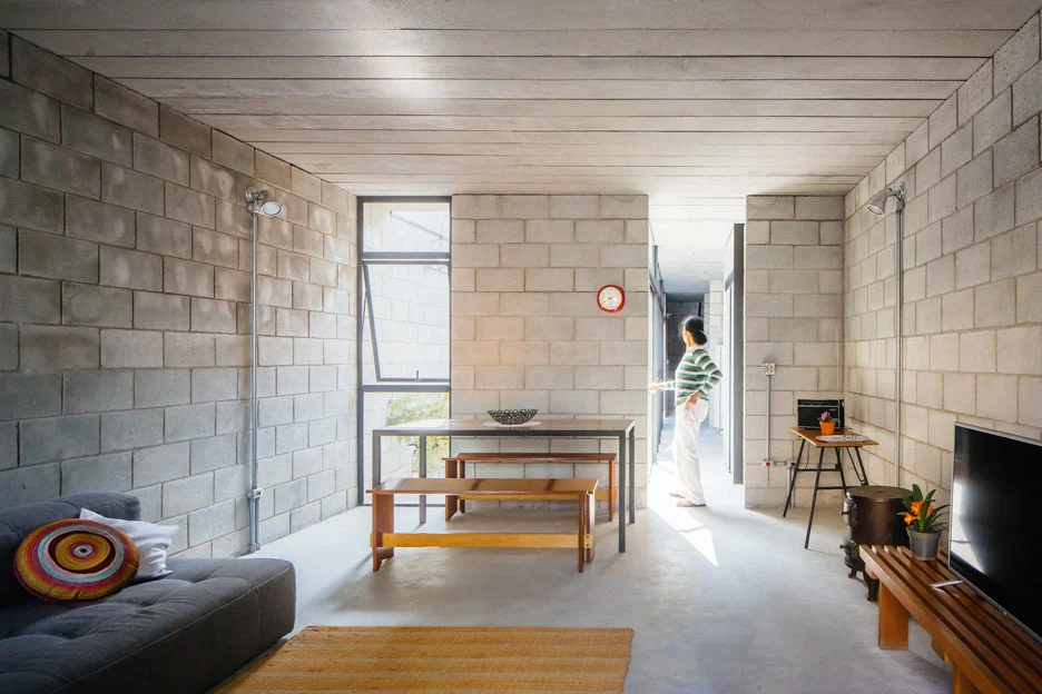
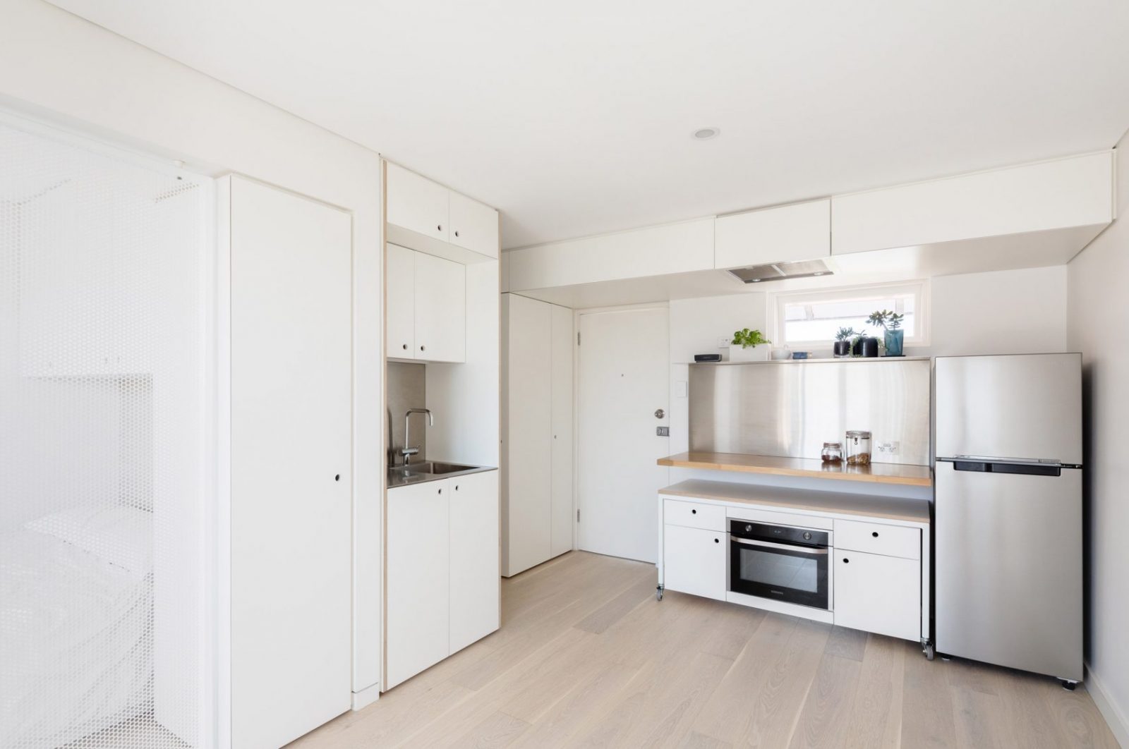
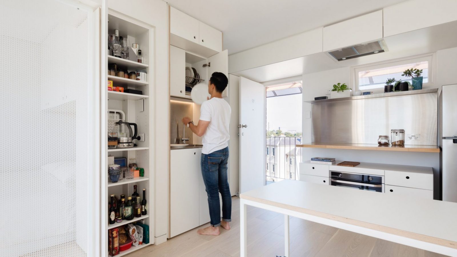
Likewise, most homes would look very bare and cold without the addition of plants – especially if you are going for a minimalist or industrial look. See this home below for a great example of how plants can add a lot more vibrancy and warmth to a space.
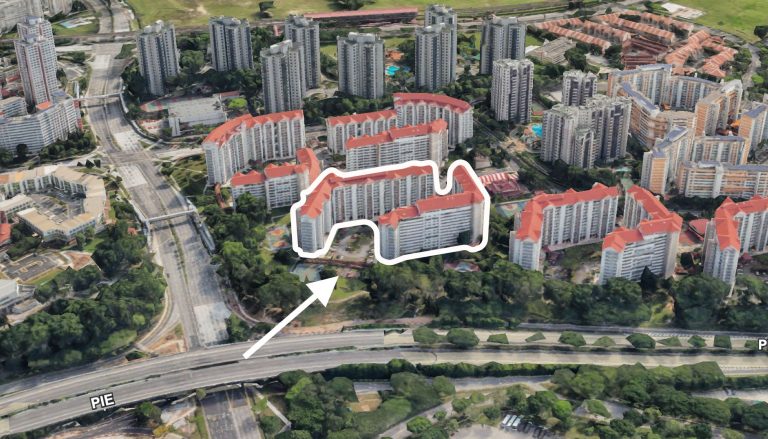
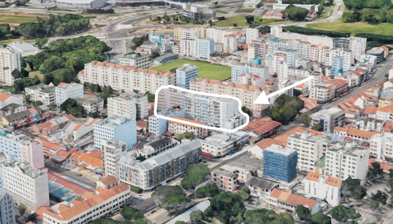
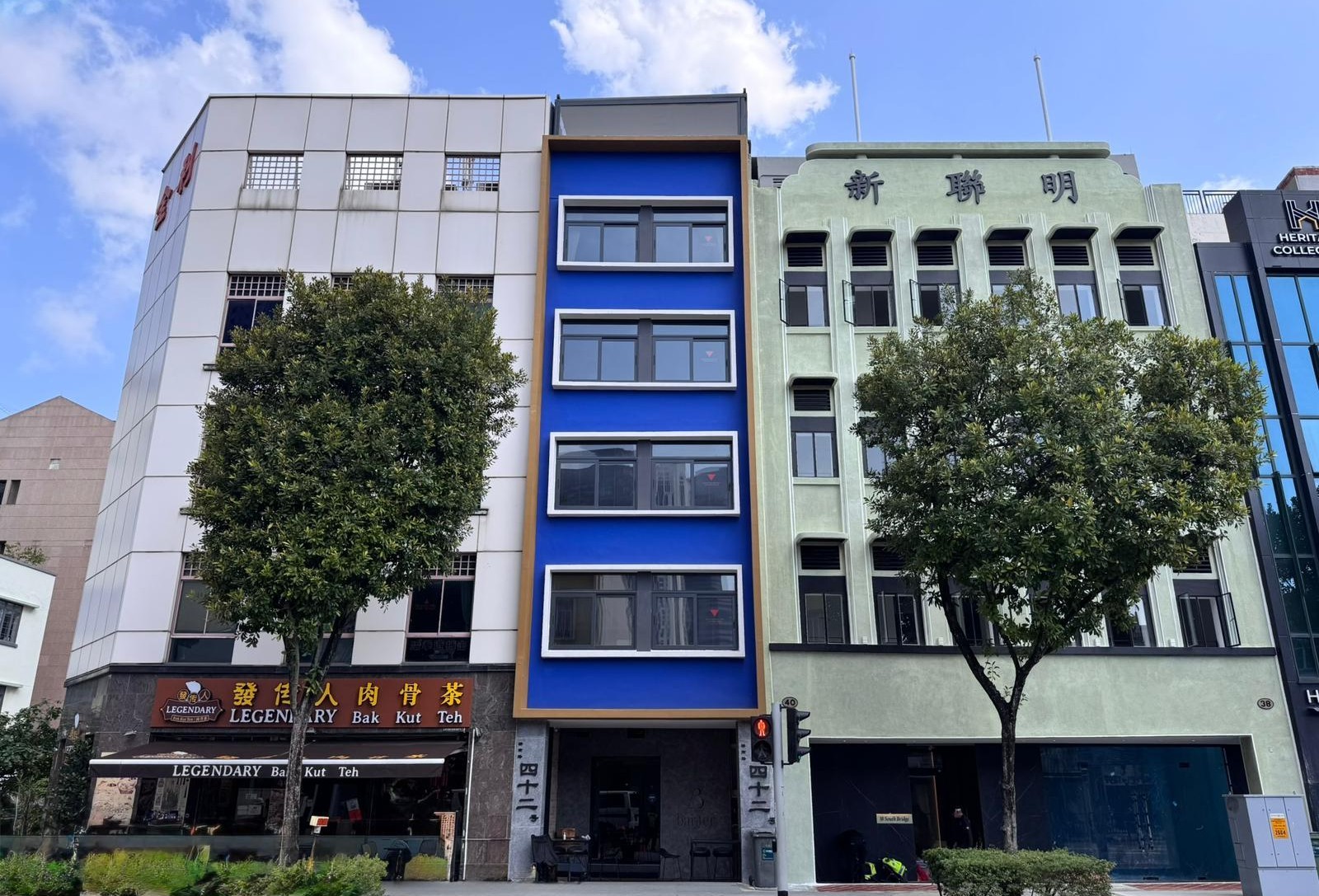
2. Take on unique characteristics of existing space
While Apple stores are known for their simplistic designs, the company doesn’t shy away from the unique characteristics of a location. Instead, some stores are built around these features, transforming them into one-of-a-kind spaces.
So if you have an odd-shaped unit or an unusual location, try taking on the unique characteristics of the space instead of forcing a design language that might not be feasible. You’d be surprised with what you might end up with.
Likewise, with unique spaces like loft units in Singapore – you could think about the intentional exaggeration of a loft space and its structural elements to further accentuate the height and look of the space.
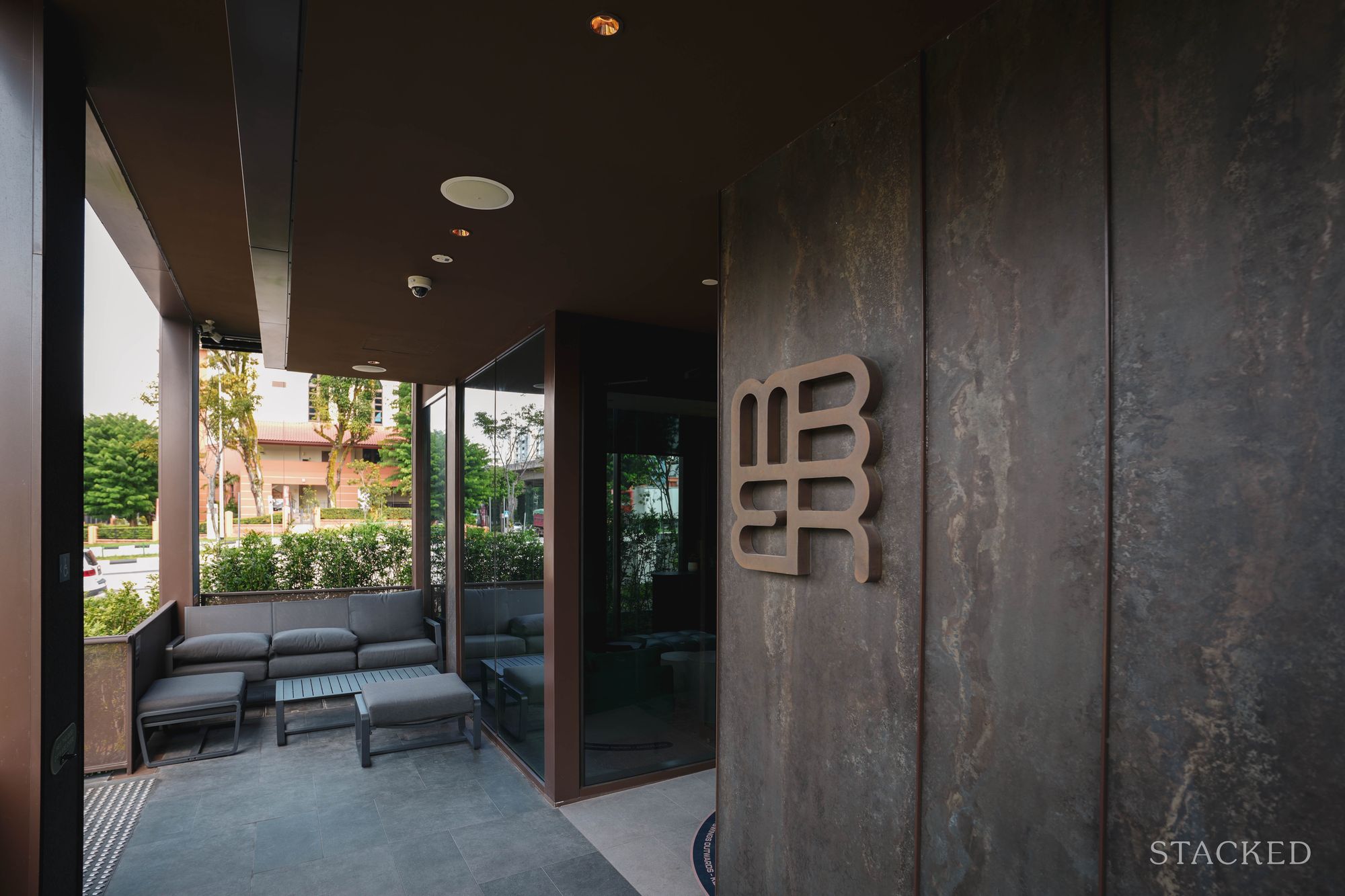
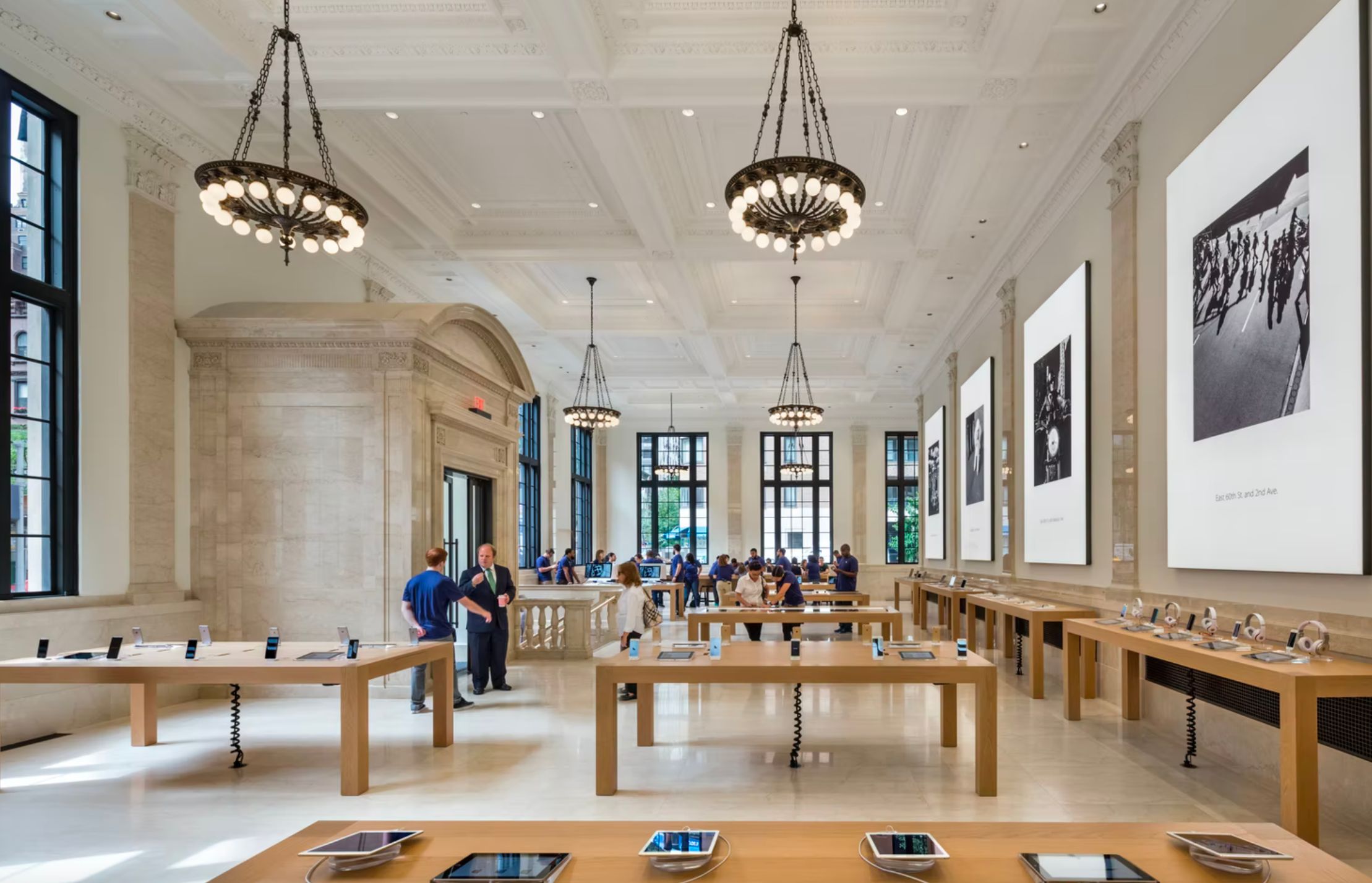
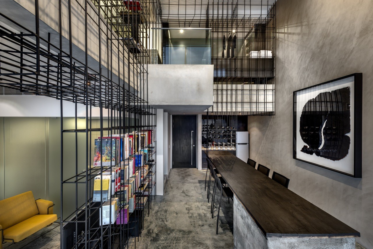
3. Coherent design language
As you enter an Apple store, you might have noticed how various elements blend in with one another seamlessly. Being coherent in design choices is crucial in providing that refined Apple look that many people pay a premium for in design. Generally, Apple tends to refrain from elements that stick out too much in their stores. When there are such elements at play, they take extra care to ensure that it does not take away from other elements of the space which are equally impressive. If anything, these unique elements bring the space together, elevating the experience as a whole.
Likewise, be coherent with your design choices when it comes to home planning. Ensure that unique components pair well with their surroundings. Doing so will prevent parts of your home from feeling out of place.
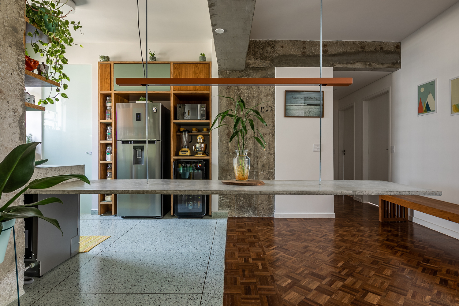
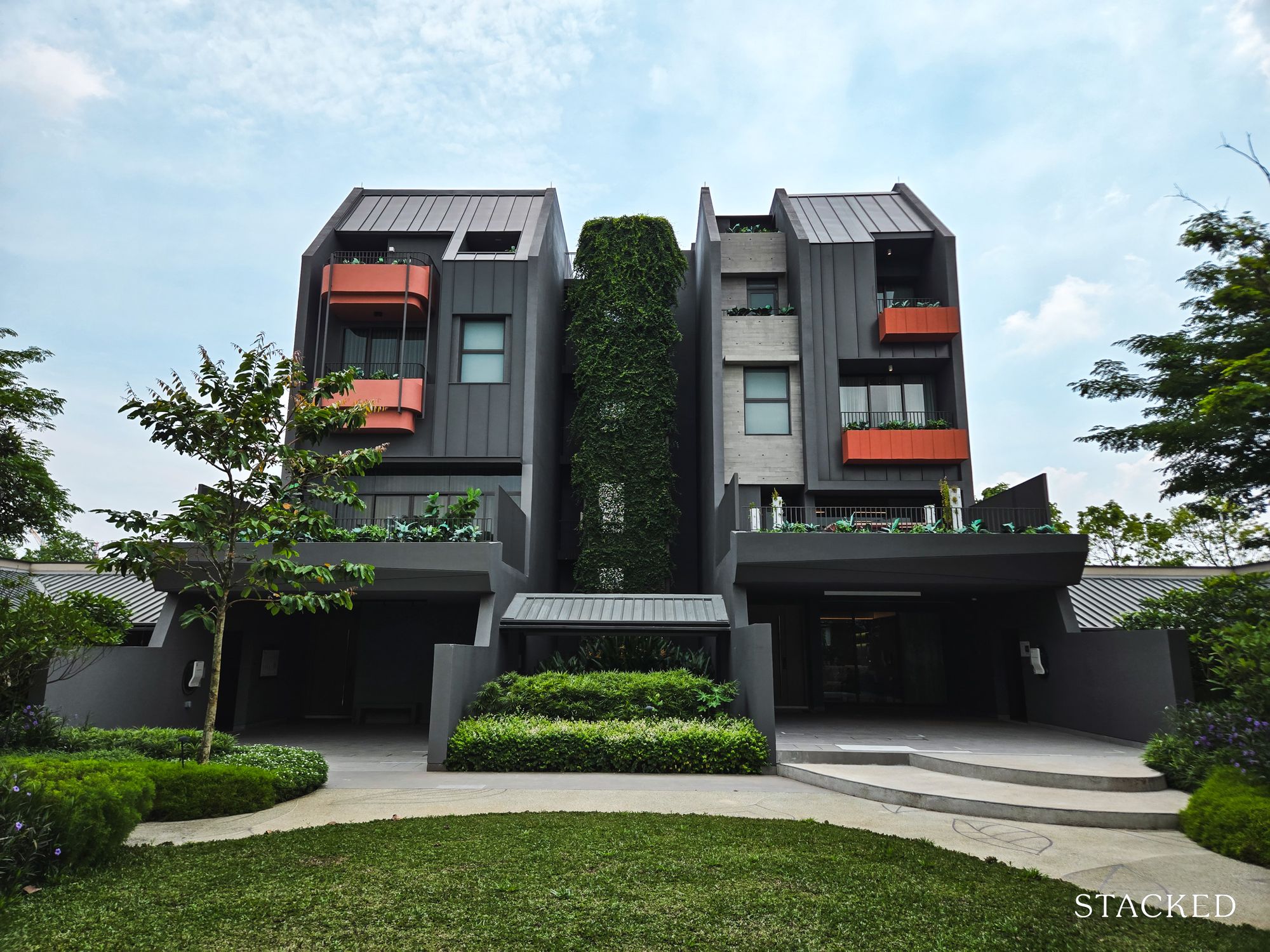
To show you an example, the floating table here is unique but it blends in nicely with the other elements. It shares a similar material and texture with the concrete columns, giving the language a good degree of consistency.
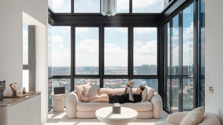
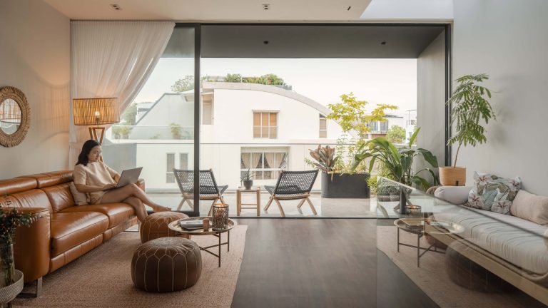
4. Negative space
While many businesses tend to cramp as much as they can into a retail store, Apple stores tend to have lots of open spaces in comparison and intentionally so. Sometimes less is more, and adopting negative spaces will allow much-needed breathing room for spatial qualities to shine. Jam packing spaces with features, on the other hand, may cause elements to fight for attention.
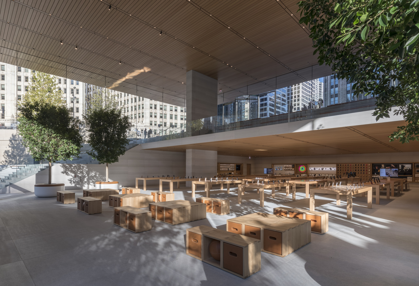
Bear in mind that you are designing a liveable space to dwell in. Human traffic should be taken into account in your spatial planning as that can fill up the negative space rather quickly.
Unfortunately, space in Singapore is at a premium, and hence most people tend to cram in as many things as possible to fully utilise it. I’d avoid bulky furniture for one, and look for pieces that offer more than one use. Rather than just aesthetic value, make sure that it has a functional purpose as well.
One more tip is to leave pathways clear. You should be able to move around the house without issue, having items or furniture sticking out and blocking the way is not a good look as it would invariably look cluttered.
5. Turn limitations into design opportunities
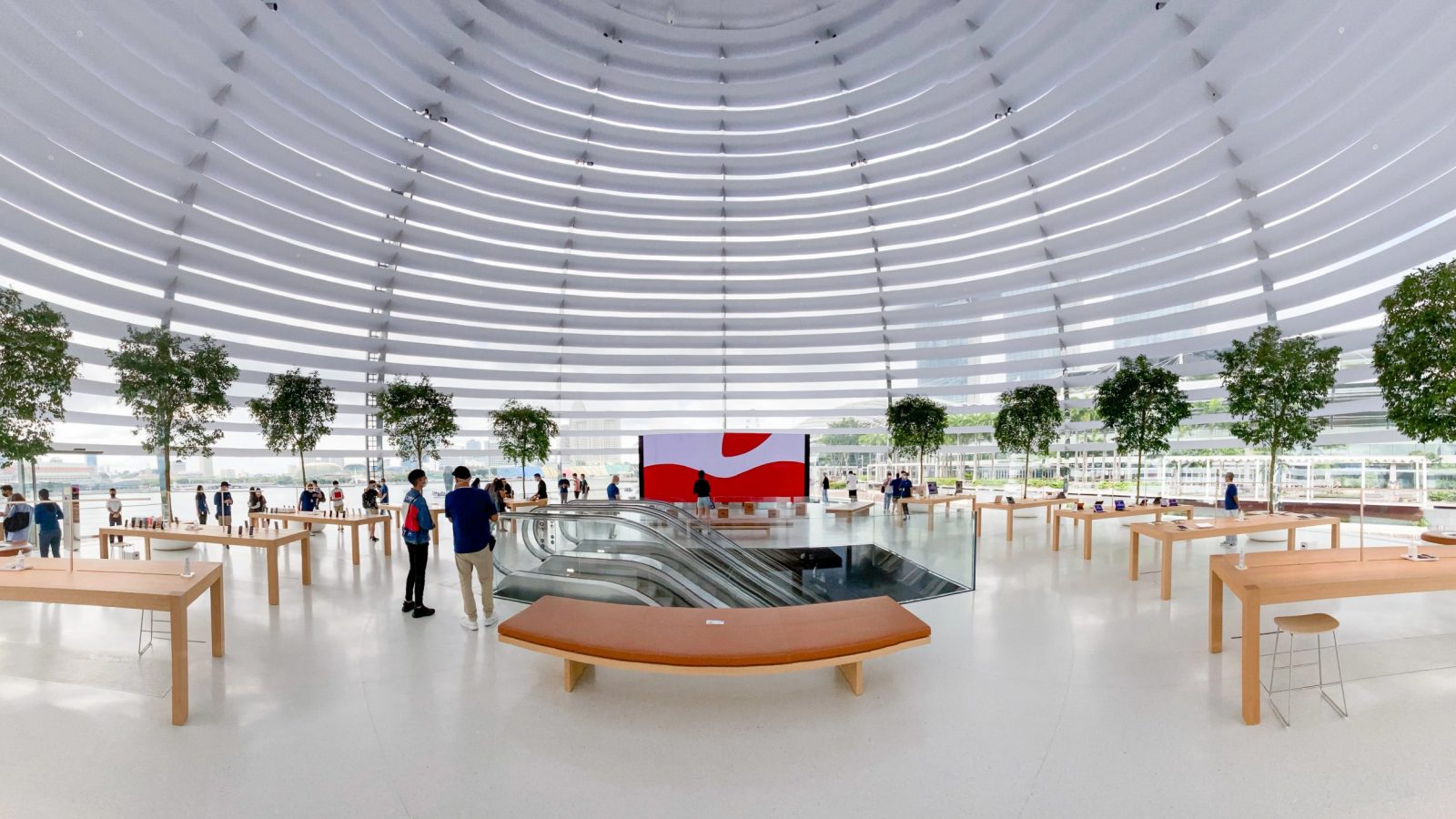
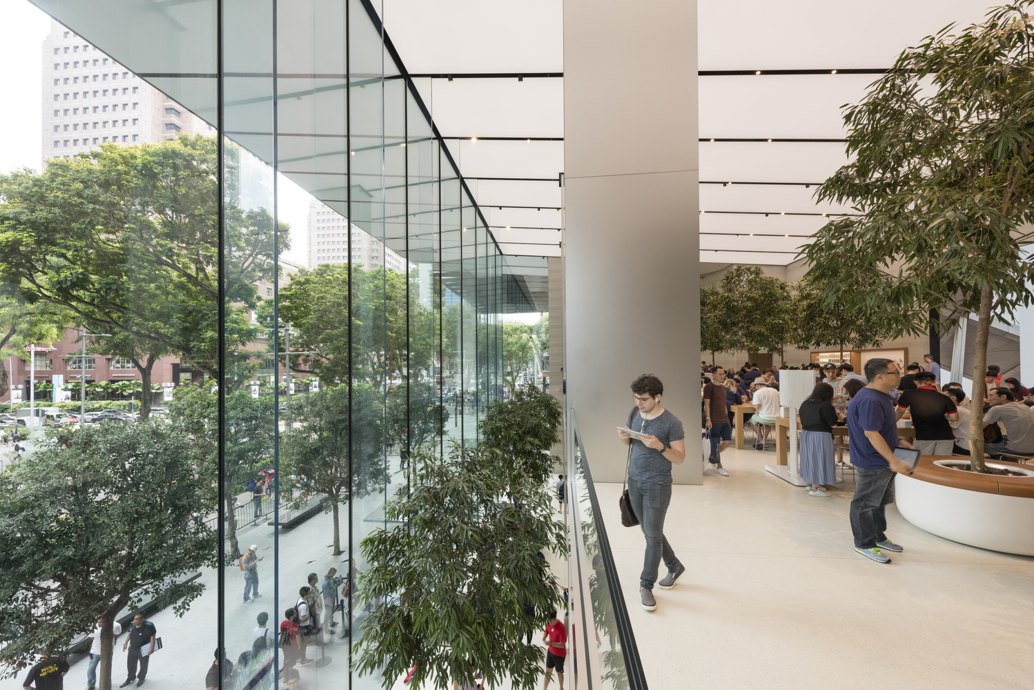
Apple is known for using large quantities of glass in its store designs. However, this exposes their designs to the greenhouse effect which can be especially problematic in hot tropical climates. Instead, Apple and their partners turn limitations into design opportunities.
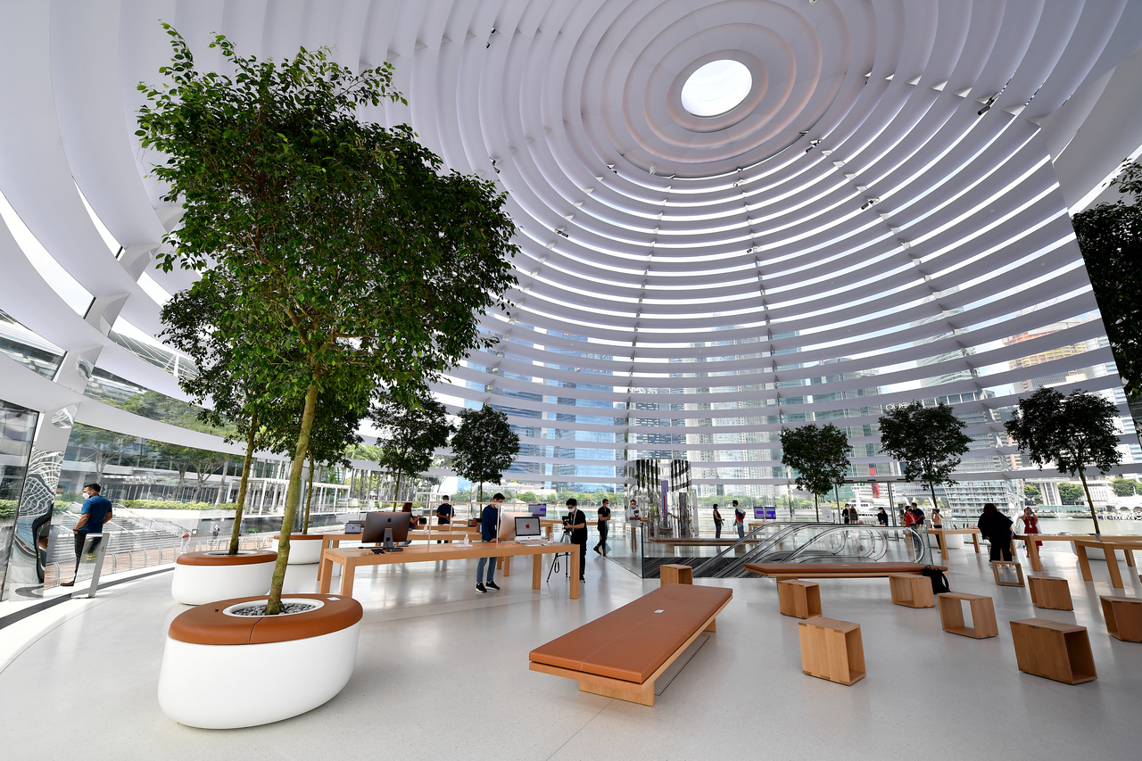
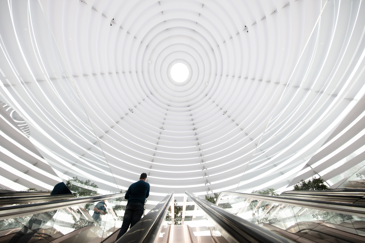
Floating gently on the waters of the Marina Bay Sands lies a steel-glass hybrid dome, home to one of Apple’s latest flagship stores. It is fitted with multiple horizontal planes that wrap around the entire space from the inside, creating a louvre like shading device. The panels shade off direct sunlight which can be harsh, allowing for a softer, more comfortable lighting experience in the glass dome. Despite the obvious thermal limitations, it is impressive that an opportunistic solution was implemented without compromising on the original design vision. To top it off, it even gives the design its own very distinct look.
So when faced with limitations in designing your home, fret not! Instead, be opportunistic and look for creative solutions to work around these limitations. However, knowing when to take a step back and admit failure is half the battle.
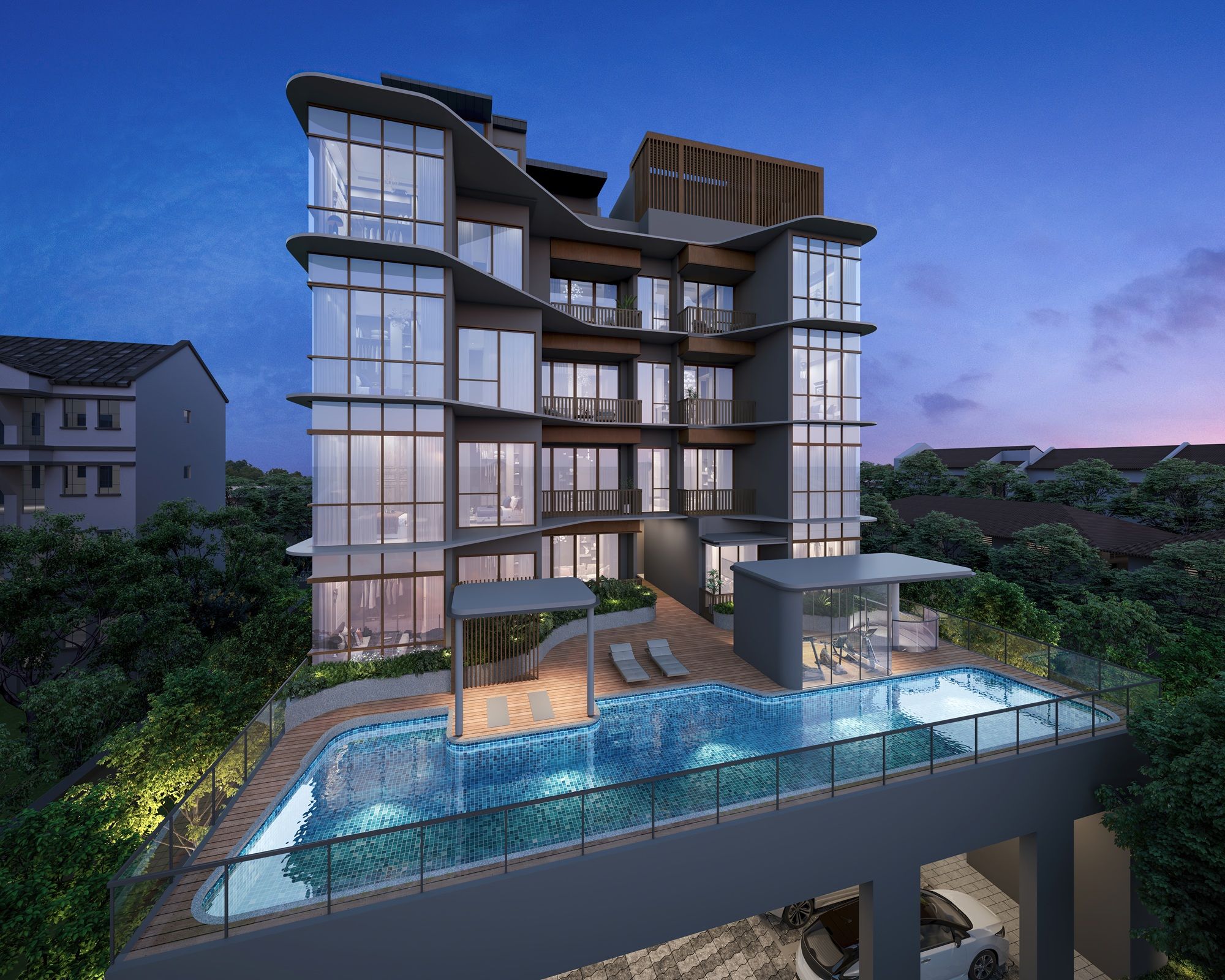
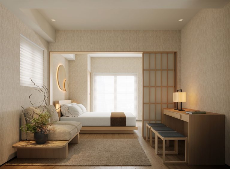
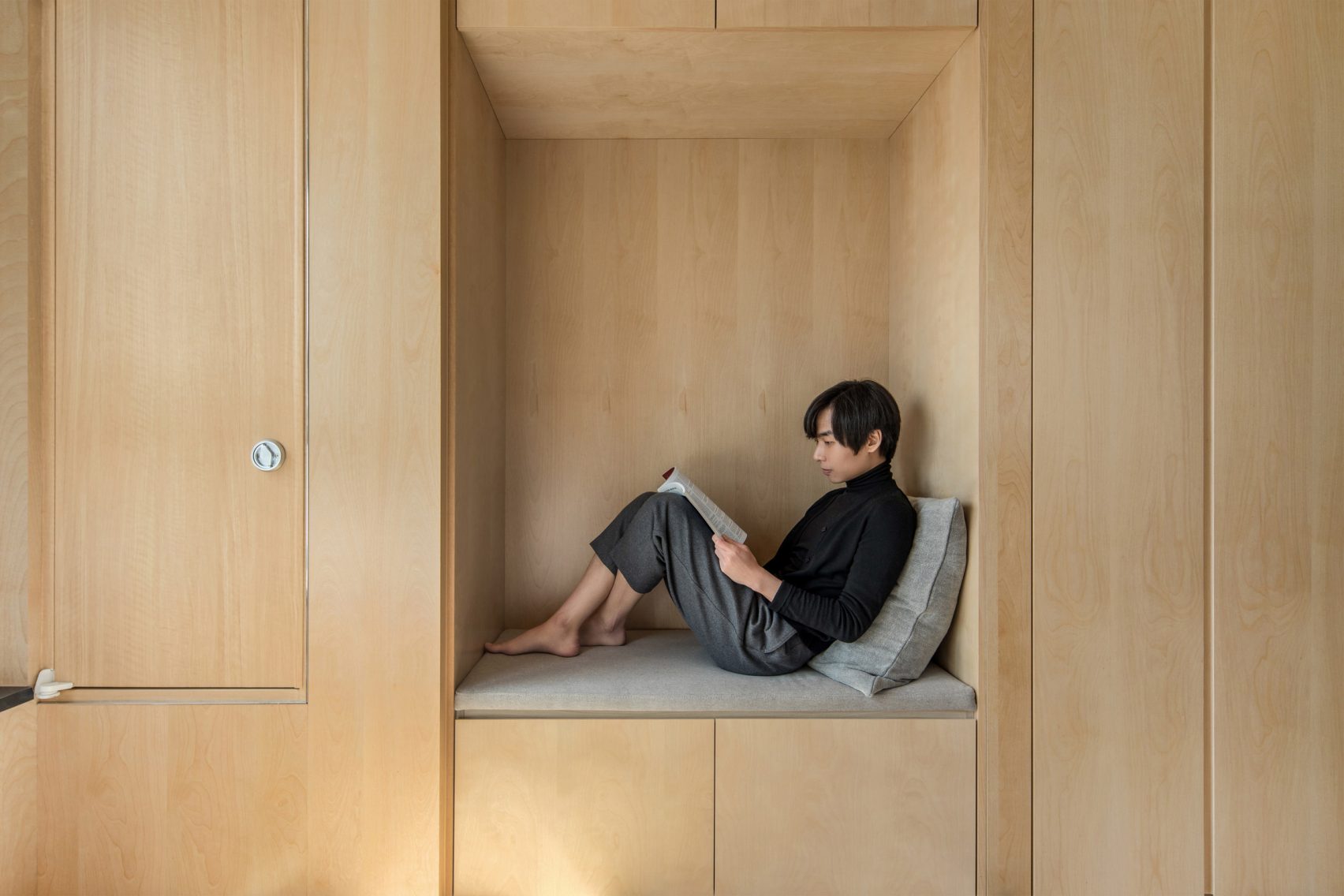
In the example above, look for opportunities to carve out little nooks of space. Here this becomes a cosy reading nook in a micro apartment, which makes good use of awkward leftover space.
6. Keep it simple
An often overlooked aspect of designing a space is the beauty of simplicity. As tempting as it is to attempt something extravagant, simplicity can sometimes be the answer. With clever decisions, a sophisticated look is still achievable without the physical noise. Moreover, design depth can still be expressed through simplicity as exemplified by Apple.
When planning your home, take time to consider what is essential and weed out those that can be excluded. Start with a simple concept as a guide and build off it while maintaining focus on key elements.
Again, while most apartments in Singapore will face the constraints of space and it may seem hard to keep things simple it’s all about proper space planning from the beginning. You’ve to be really aware of what is truly necessary, and leave out the fluff that you don’t need. Singapore isn’t the only city that feels the squeeze of a small space, and there are various other inspirations to take heed from other countries (Hong Kong and Japan is a good start).
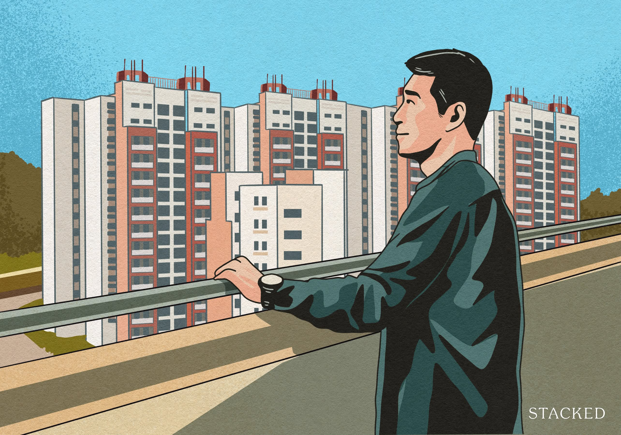
The challenge for many buyers today isn't access to information.
It's interpreting that information in a way that makes sense for their finances, goals, and stage of life.
Over time, that's also why we decided to work with agents who shared the same data-driven and advisory-led approach behind our editorial, consultants who could help readers think through decisions more objectively, rather than simply push transactions.
Today, the team has worked with more than 2,000 clients across over $5B in property transactions.
Final words
Did you know that Apple has actually removed the word “store” from the names of its new locations? For example, “Apple Store, Valley Fair” has become “Apple Valley Fair”, as did the same for “Apple The Grove” and “Apple Union Square”.
Clearly, Apple doesn’t want its retail locations to be considered as “stores” any more.
It’s the same as the trends that we see in various designs today. More and more people are looking for hotel-esque amenities in their homes, and workplaces are moving towards a residential feel, the lines between commercial and residential design are getting increasingly blurred.
At Stacked, we like to look beyond the headlines and surface-level numbers, and focus on how things play out in the real world.
If you’d like to discuss how this applies to your own circumstances, you can reach out for a one-to-one consultation here.
And if you simply have a question or want to share a thought, feel free to write to us at stories@stackedhomes.com — we read every message.


0 Comments