A 23-Year-Old HDB In Kallang Gets A Major Transformation Into A Calming Gallery-Like Space
November 12, 2022
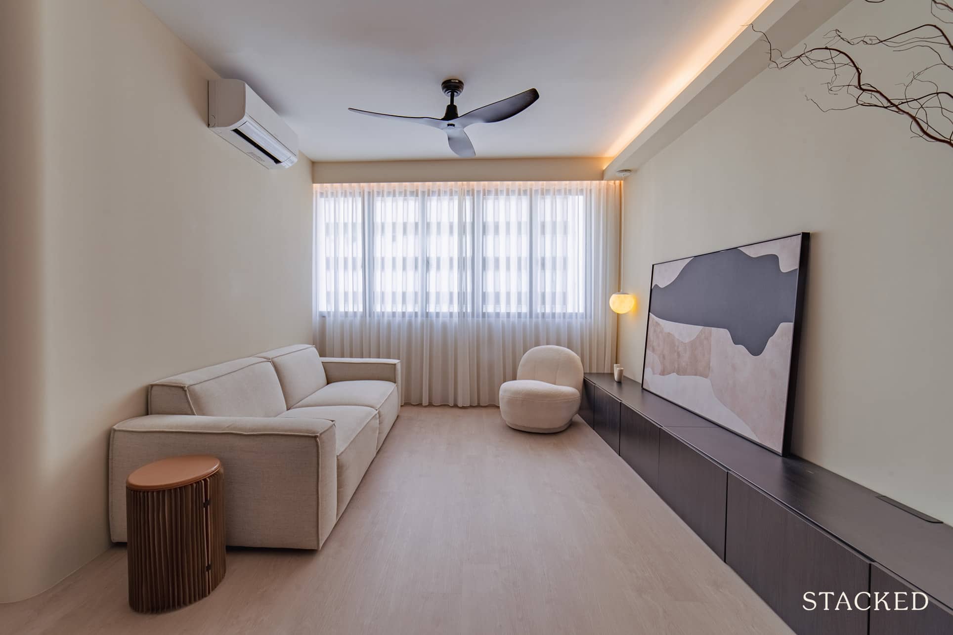
Buying an older home, while more affordable, can come with its own set of problems as well.
Sometimes they may look good on the surface, but behind the exterior facade, the electrical wiring may be problematic, the plumbing system might need to be replaced, or worse, there might be mould issues.
When P and her husband, N (@sanbalingling) purchased their 4-room flat at Kallang, they were already the third owner of the place. This 1,087 square foot flat was already about 23 years old at that point.
“To be honest, it was quite in a terrible state when we received it,” she said.
But after about ten viewings across the whole of Singapore, they decided to go ahead with this unit because of its convenient location. The place is near the MRT, has sufficient amenities and food options nearby, and is close to the city centre and park connector.
Currently, only the couple resides in their home, but they sometimes dogsit for their friends. Let’s see how they were able to convert this old home from its previously poor state to its now surrealistic condition.
So many readers write in because they're unsure what to do next, and don't know who to trust.
If this sounds familiar, we offer structured 1-to-1 consultations where we walk through your finances, goals, and market options objectively.
No obligation. Just clarity.
Learn more here.
How The Renovation Journey Turned Out
The couple initially allocated a $70,000 renovation budget, which also included furnishings. However, things didn’t go exactly to plan as their expenditure was higher than expected. “Our total budget did exceed $100,000 eventually. No thanks to Taobao… it’s not that cheap leh,” P said.
She revealed that one of their biggest costs was due to electrical wiring, amounting to almost $10,000.
But despite these unforeseen issues, the couple was able to arrive at a home that they love.
For the couple, it was hard to really pin down the style of their home as they didn’t have a particular source of inspiration.
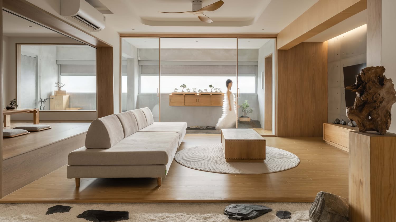
“We can’t really put a name to our style but we definitely like something minimalist yet organic. We wanted a very neutral palette,” P shared.
She did add though, that the Nordic style did have some influence since they experienced it first-hand during a 6 month exchange in Sweden.
However, they didn’t want to go down the conventional route with the typical Scandinavian theme.
The final result was something more of a museum or gallery like space, which N said was usually one of the first words people come up with when they visit their home.
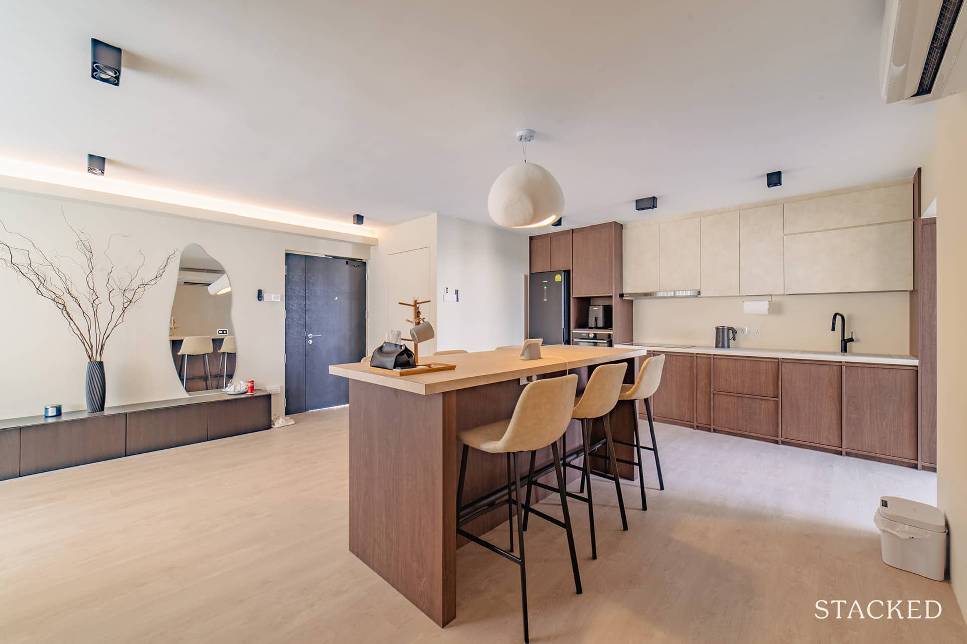
With regards to major changes to the home’s layout, P said they had to hack one wall. Doing so helped them separate the kitchen from the living so they could have an open kitchen concept. The rest remained largely the same as they wanted to keep things flexible in case they had to change their lifestyle.
Living Room
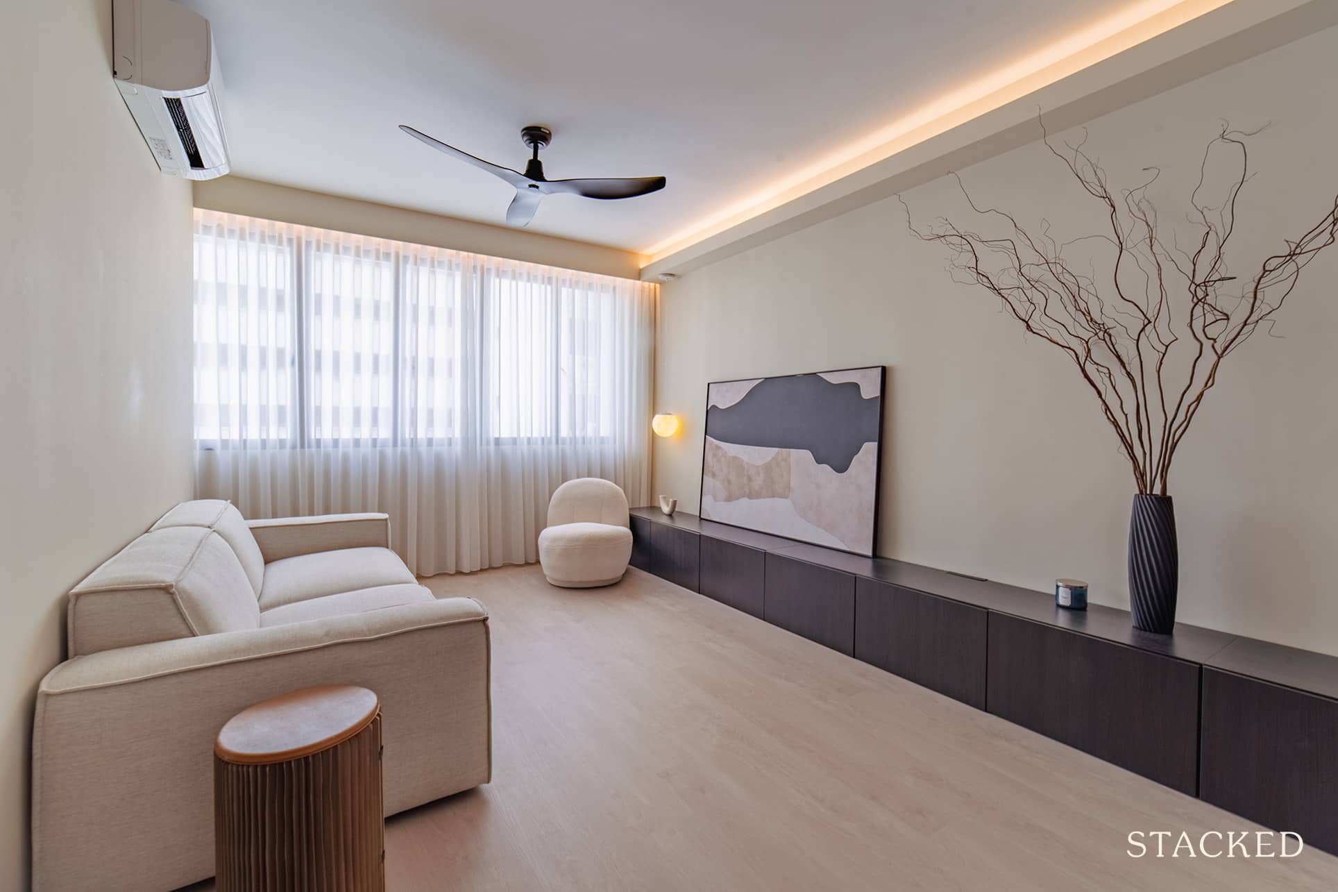
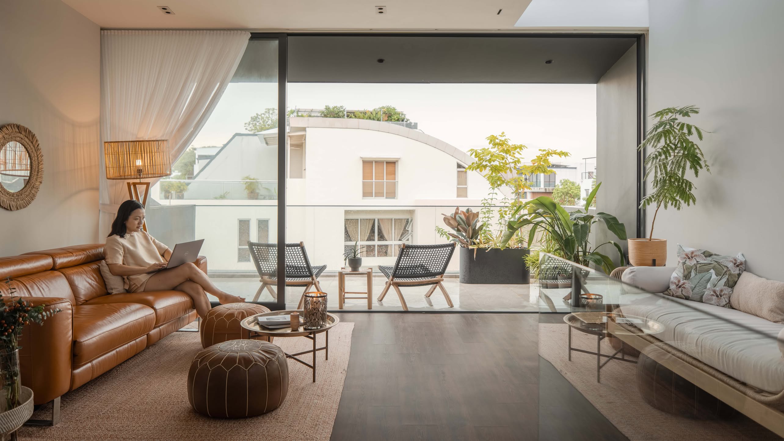
P said they basically had to hack everything down – feature wall, recess shelves, etc. They also refused to have any built-ins in the living so they could have the flexibility to move things around if they ever got bored.
Dining Room
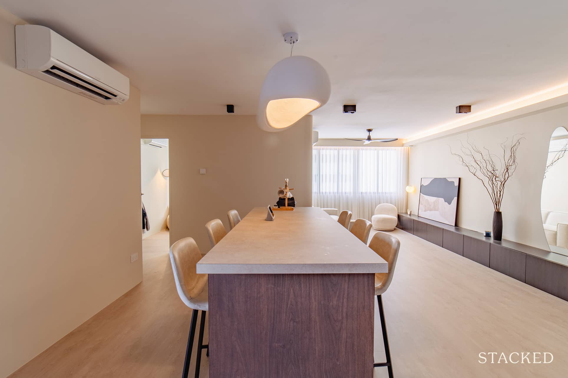
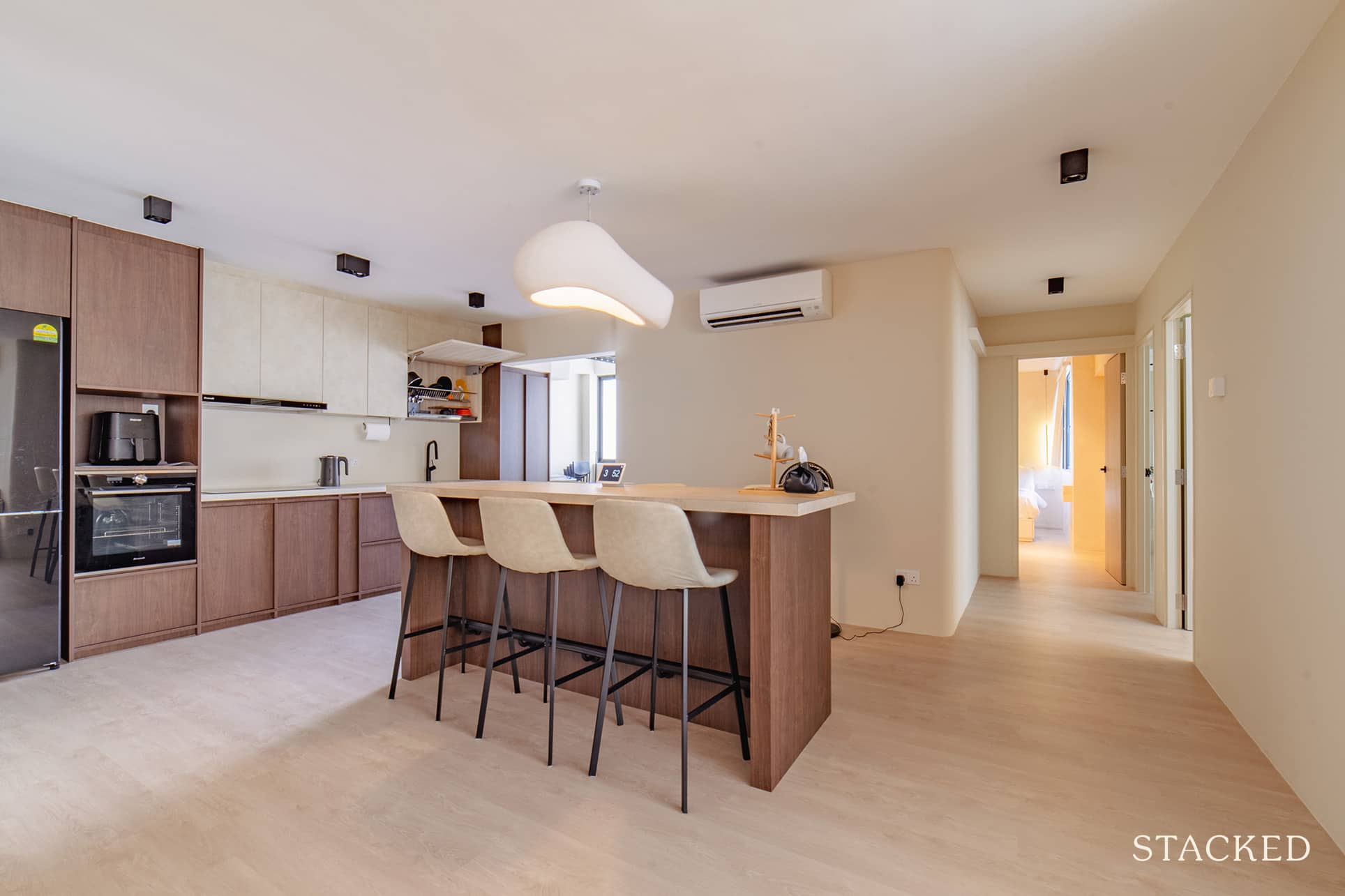
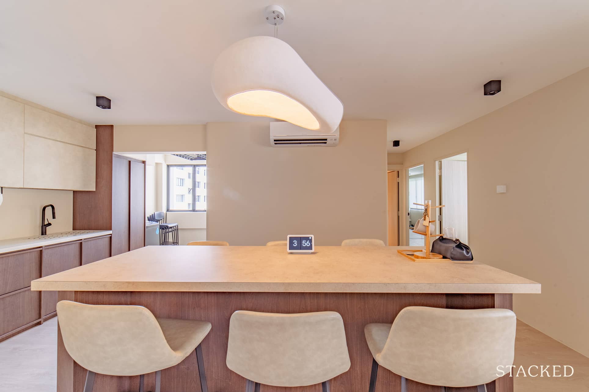
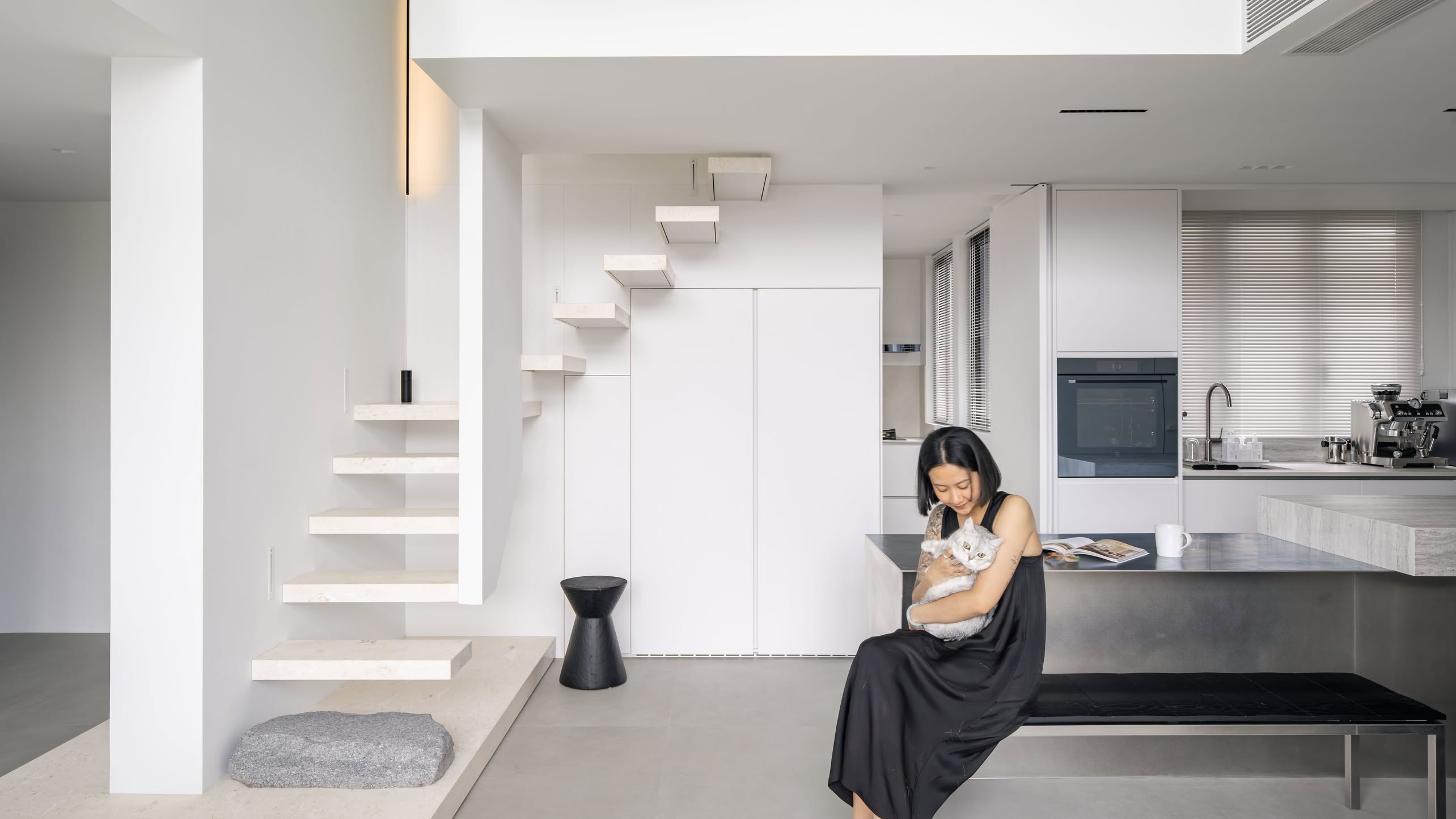
Here you’ll see how they were able to transform the kitchen from a closed to an open concept. They specifically designed a large island in the center of their home where they would host guests and have dinner parties. The same large island is also a great area for post-dinner conversations and games.
Kitchen
The couple hacked down the existing fixtures in the kitchen and also built a new storage area from scratch.
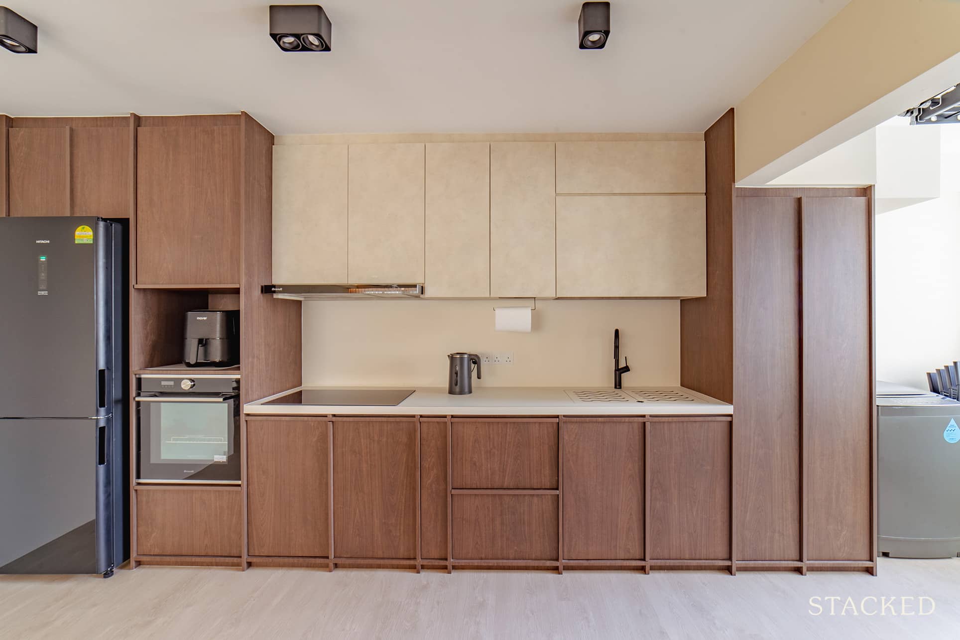
Compared to the original layout, they changed the positions of several major appliances, such as the fridge and the oven. They were actually aiming for the ‘golden triangle’ layout, so everything is much more accessible to them while they’re prepping food.
Master Bedroom
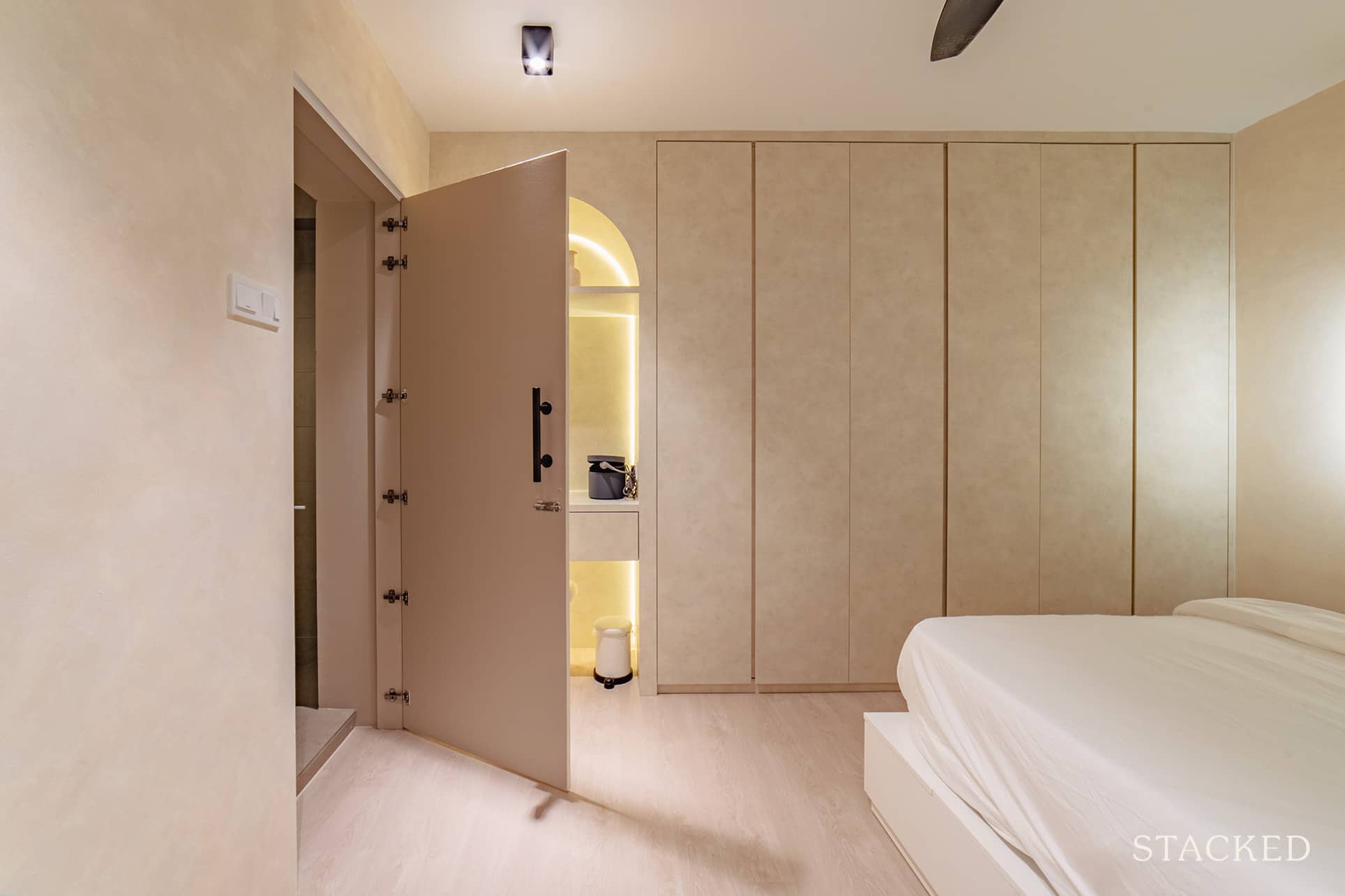
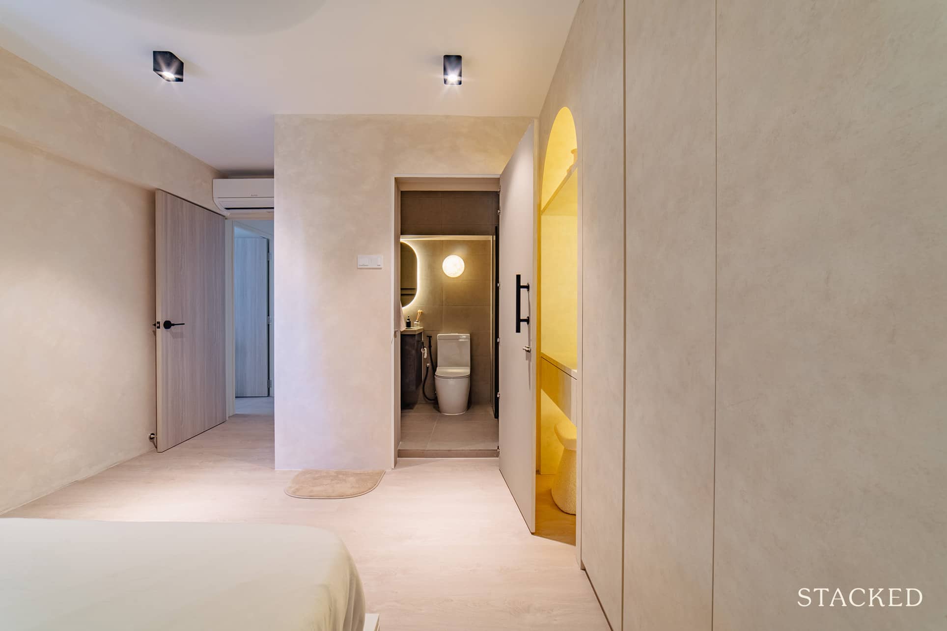
P said their master bedroom gave them the most headache as they only had two options to choose from based on the layout. One option was to intentionally defy her mom’s Feng Shui warnings and have the bed face the toilet door.
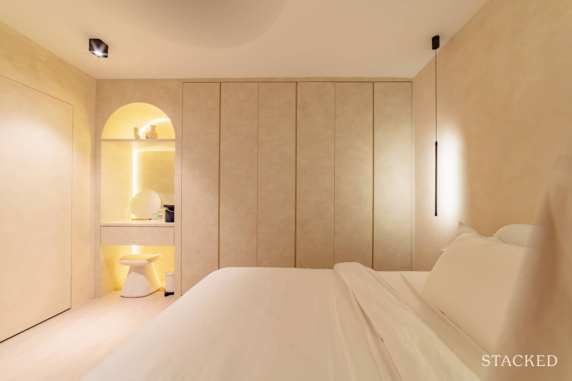
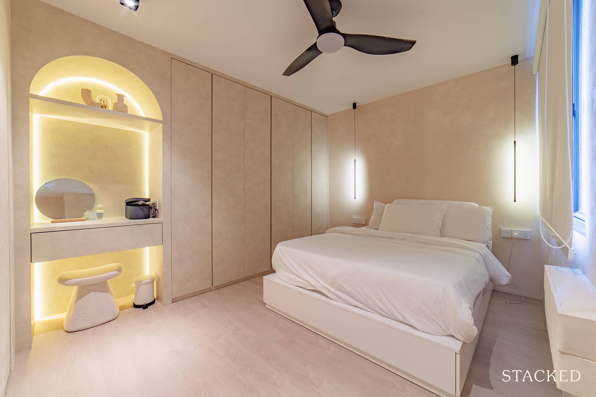
On the other hand, if she decided to be an obedient daughter, the wardrobe would end up blocking part of the window. “We chose the former,” P added, “but had to compromise by having a concealed door so it didn’t look that obvious.”
Common Bedroom
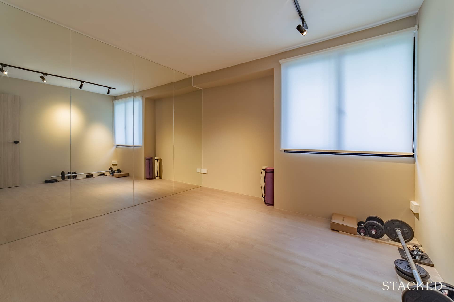
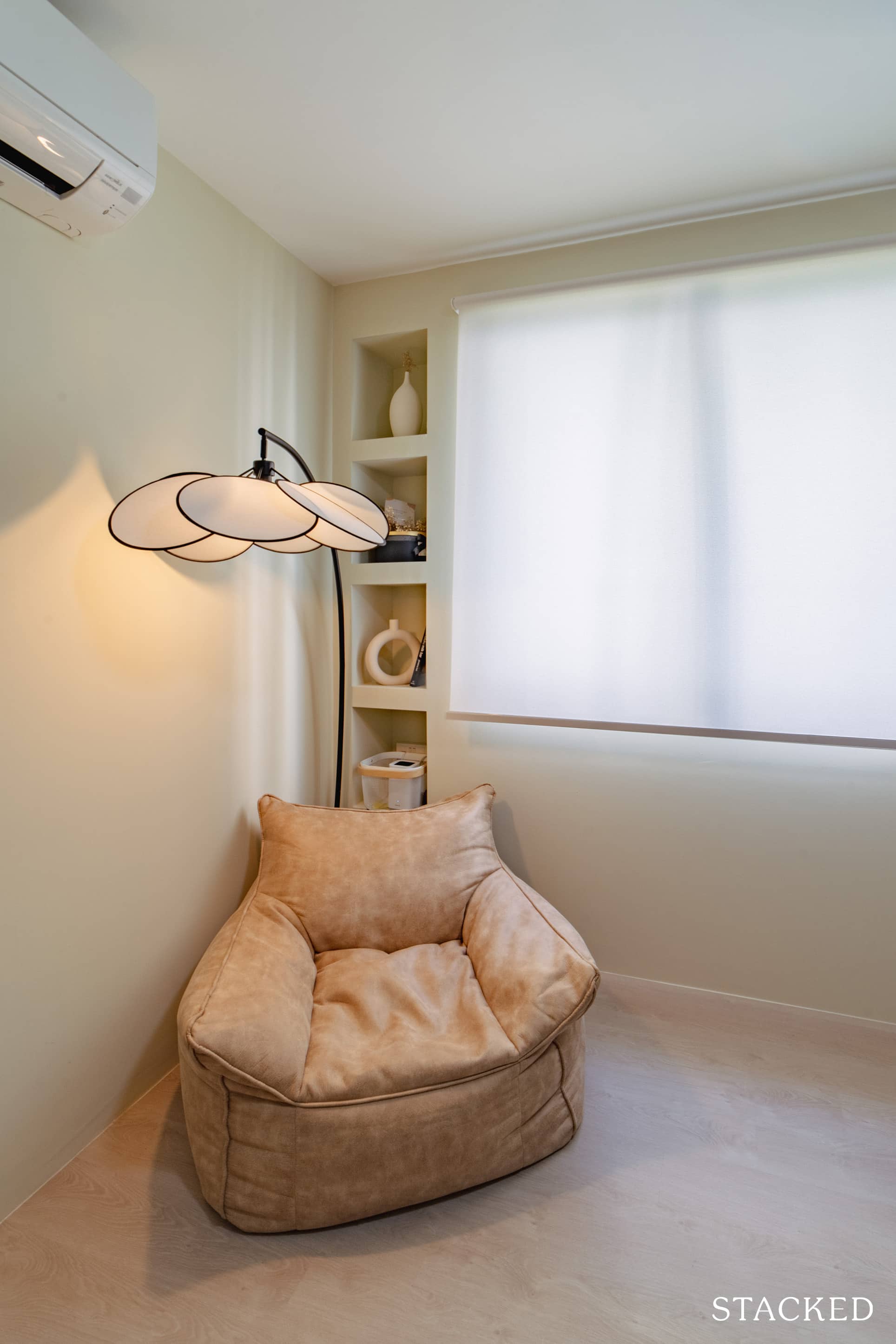
They also had the luxury of turning one of the common bedrooms into a minimal yoga studio/gym. Painted in the same soothing tones as the rest of the home, the mirrored wall also helps to make the space appear bigger (along with its functional use as you workout, of course).
Bathrooms
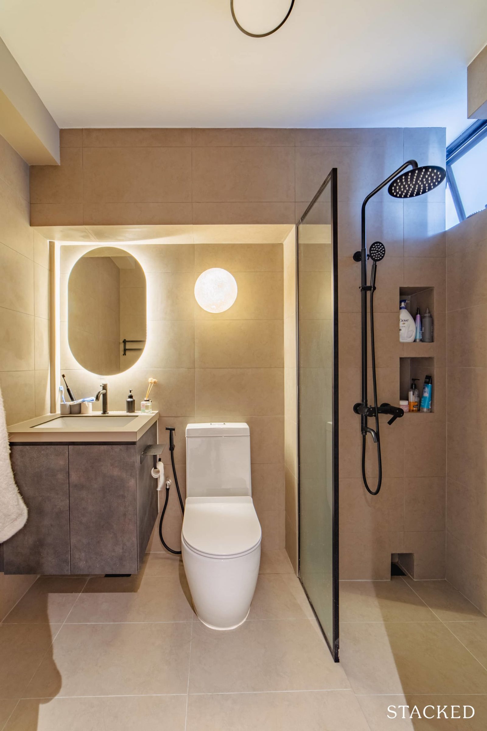
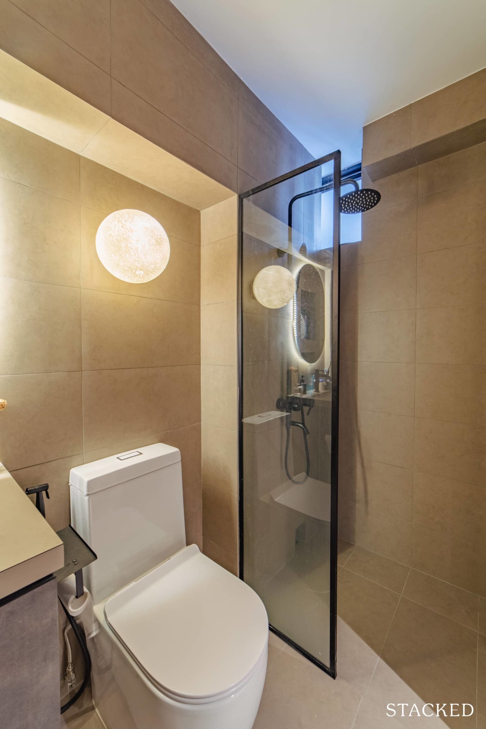
Both bathrooms, the common and the master, went through a complete overhaul as they had to hack away and redo all the tiles. They also concealed the pipes and added an integrated sink in the common bathroom because a typical sink would be too big.
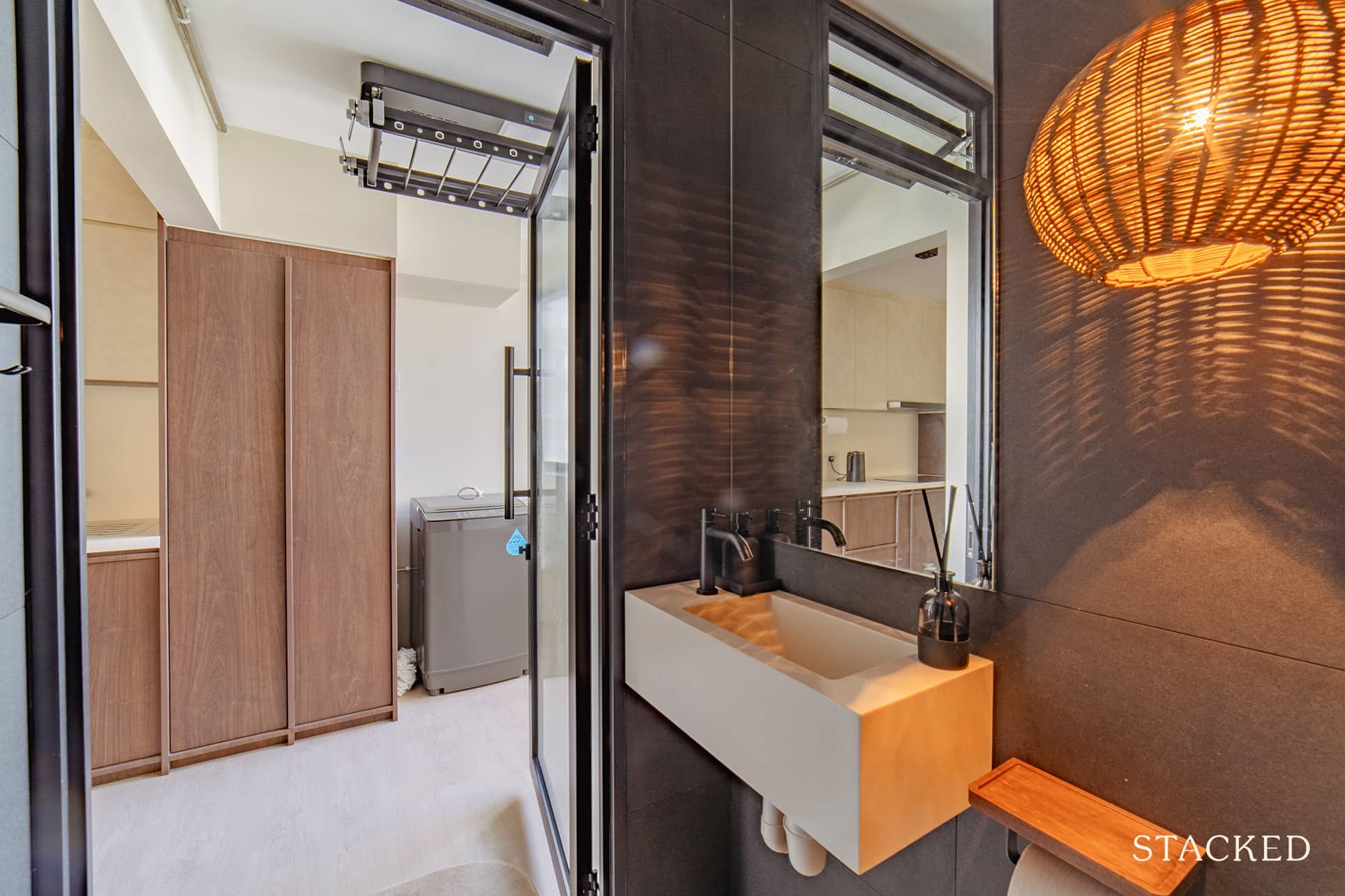
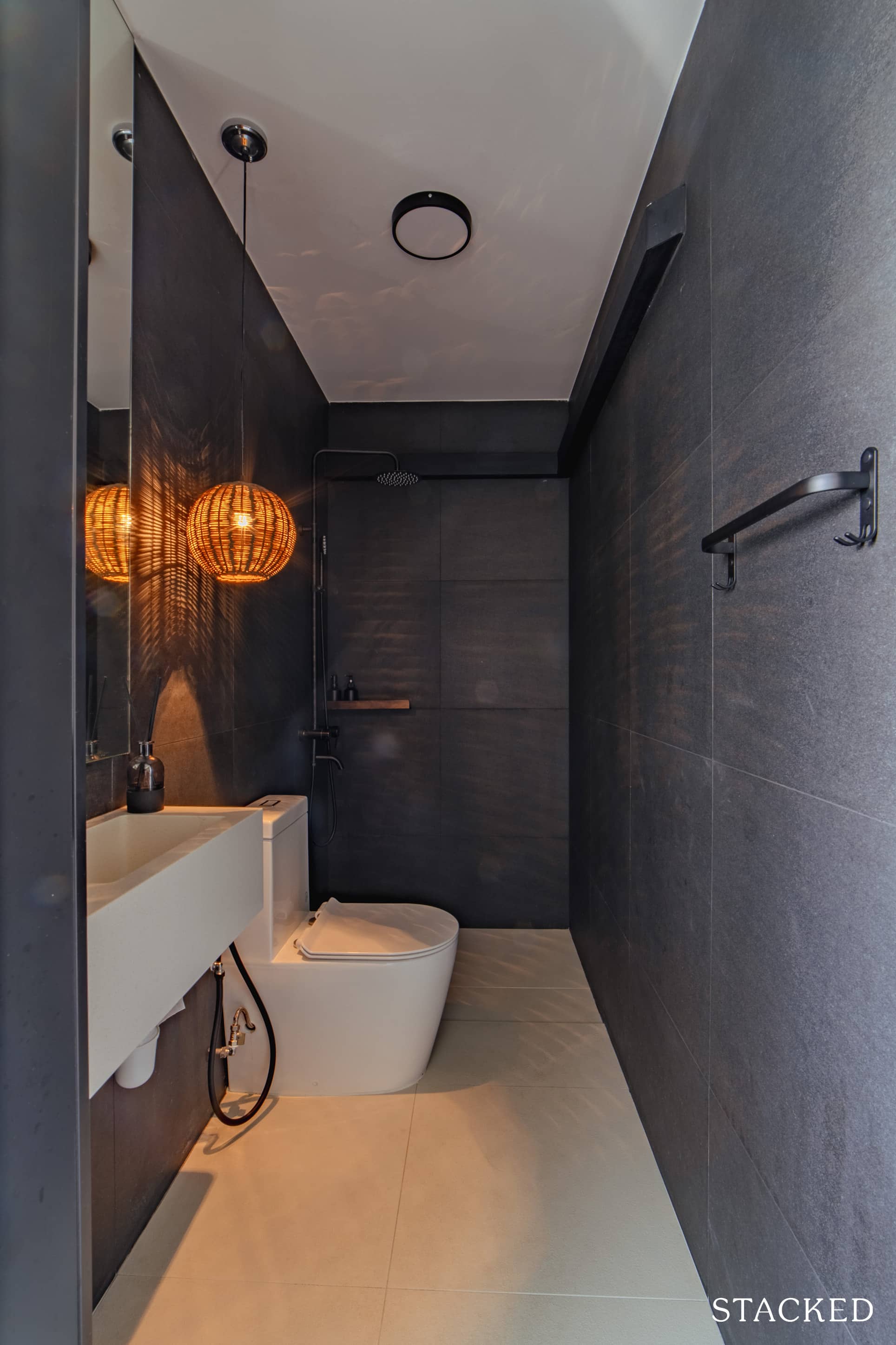
What really stood out to us were the lighting elements in the bathrooms, which really helps to evoke a sense of calmness to the space.
One of which was the moon-like lamp, with the craggy-like exterior mimicking the surface of the moon.
More from Stacked
Landed Home Sales Hit a Four-Year High — Here’s What That Could Mean for Prices in 2026
Singapore’s landed home market recorded a stellar year in 2025 when 1,852 landed homes were sold over the 12 months,…
Bringing The Vision To Reality
Like most homeowners, P and N created a full mood board prior to meeting the different ID firms. So when we asked if the final outcome was similar, they were both in agreement. “To be honest, during the renovation phase, when everything started to unveil, we already started seeing elements that were from our mood board,” he shared.
The couple were clear about what they wanted for their home. However, as their inspiration mainly came from homes outside of Singapore, translating those ideas was not easy as they thought. It’s a challenge, especially if you consider that the layouts and spaces overseas are very different. It was one of the biggest reasons for needing help from an ID.
So how did they end up choosing their ID? N said that they focused more on a particular designer instead of an ID firm.
“We looked for Instagram profiles of specific designers from any ID firm and browsed through their portfolio.” It’s a more concise way of finding the right designer for you, as you can indicate the designer you want instead of randomly receiving one from the firm.
Ultimately, they were looking for someone who could execute the concept and style they had in mind, but who also understood the flexibility they needed in their home.
The ID they finally picked was Ascend Design. They shared that it was mainly because they’re generally very chill and jokingly added that it was the two furry cats at their office that actually sealed the deal.
We asked what their furniture sourcing process was, and she immediately answered, “Taobao was a nightmare. It honestly wasn’t that cheap when we included the shipping fees.”
In hindsight, she thought that her unsavoury experience was perhaps because she was looking for very specific items, mainly using only the image function. However, for those going more for functionality instead of specific aesthetics, shoppers can find cheaper things at Taobao.
The pair spent most of their time searching for their bar chairs as they wanted to try them for themselves first before purchasing. “It’s really hard to find comfortable bar chairs in Singapore,” she said, “but we eventually got ours custom-made from a shop in Tan Boon Liat.” For the sofa, they turned to Castlery, and for the console, they found one at IKEA.
As for their favourite area in the house, N said it’s the entire flat.
“Honestly, because the house looked so bad before the reno, every space looked like it had gone through a massive glow-up.”
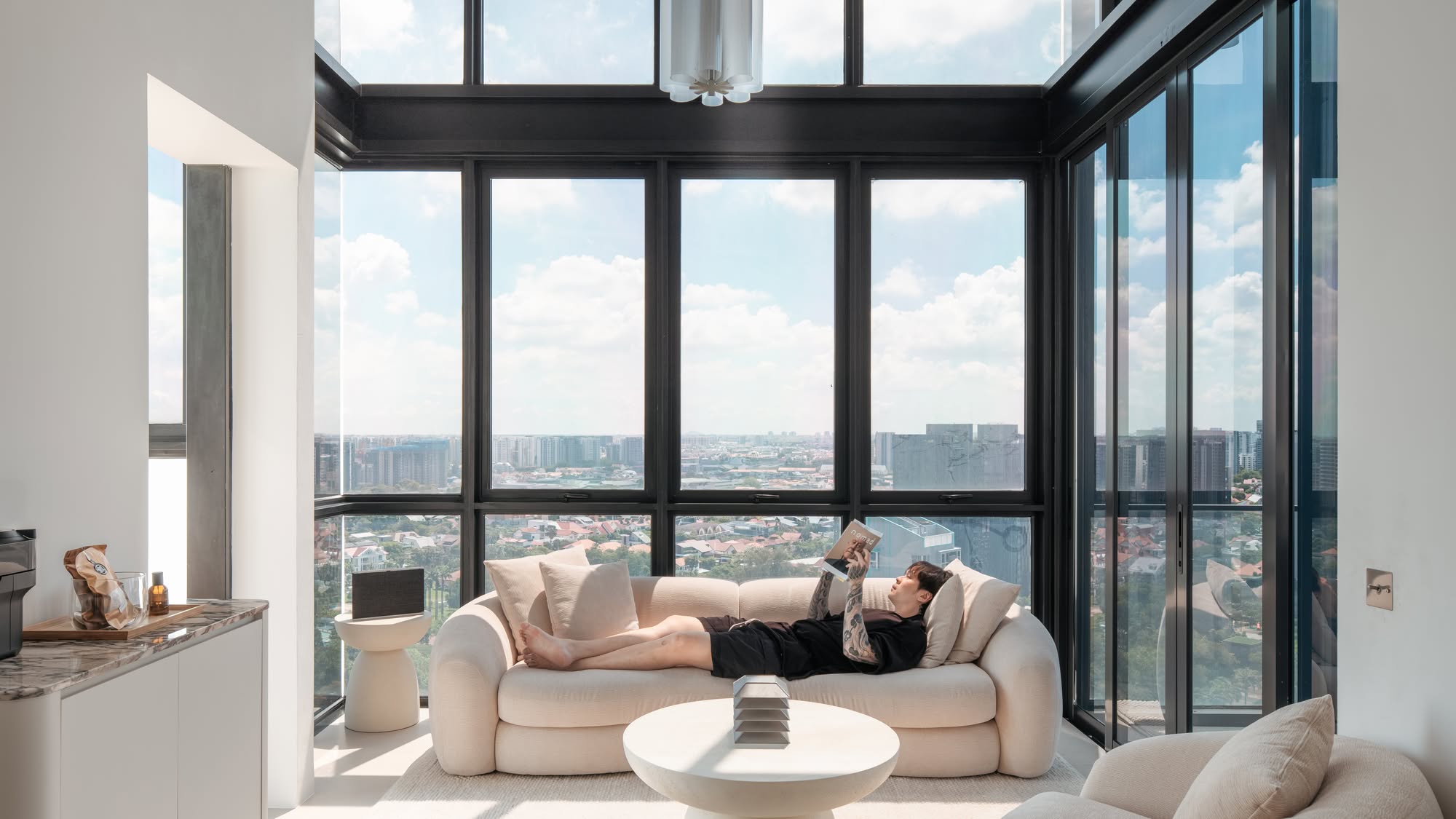
He particularly loves how the living room is best for naps and nuah-ing. And he liked how the island is good for work or conversations.

Lessons Learned From A Successful Reno Journey
P and N said that the greatest challenge they experienced was not during but before the actual renovation process.
They had to visit IKEA and Tampines T-Space as much as 10 times in a single month. “We went on different occasions to look for vinyl floors, doors and gates, and console.” They had to do it when they were looking for their bar stools as well, which ended up making them so sick of returning every single time.
To this effect, N advised using Google maps to pin down the specific locations of shops and showrooms you’re planning to visit. This will help you maximise your time when you’re there.
If they were to pick their biggest regret from the entire experience, it would be the white tiles on their toilet floor. While it helped them achieve that coastal Bali vibes, she said she has to scrub the toilet three days a week. “Listen to your mum and avoid light-coloured tiles, kids!”
She has summed up the lessons she learned into one – balance out the cost and aesthetics as much as possible. She recalled that it was her decision to curve many walls in the house to soften the whole look. But unfortunately, it did add up to their reno cost, and she didn’t notice it until later.
In closing, P shares this valuable piece of advice with those who are about to renovate their home.
“If anything goes wrong or something isn’t up to your expectations in the reno process, try and remember your first reason for owning a home. For me, it’s about building a life with my partner. So, I guess the stained whitetails don’t matter that much to me after all, despite being extremely bothered by it initially.”
At Stacked, we like to look beyond the headlines and surface-level numbers, and focus on how things play out in the real world.
If you’d like to discuss how this applies to your own circumstances, you can reach out for a one-to-one consultation here.
And if you simply have a question or want to share a thought, feel free to write to us at stories@stackedhomes.com — we read every message.
Need help with a property decision?
Speak to our team →Read next from Homeowner Stories

Homeowner Stories We Could Walk Away With $460,000 In Cash From Our EC. Here’s Why We Didn’t Upgrade.

Homeowner Stories What I Only Learned After My First Year Of Homeownership In Singapore

Homeowner Stories I Gave My Parents My Condo and Moved Into Their HDB — Here’s Why It Made Sense.

Homeowner Stories “I Thought I Could Wait for a Better New Launch Condo” How One Buyer’s Fear Ended Up Costing Him $358K
Latest Posts
Property Market Commentary 18 Upcoming New Launch Condos In 2026 — Where They Are And The Ones To Watch
Property Advice Should We Sell Our Freehold Condo For A $2.2M Leasehold Landed Instead?

Singapore Property News Kallang Close GLS Site Sold For $610.8 Million: New Waterfront Condo Could Launch From $2,900 PSF











0 Comments